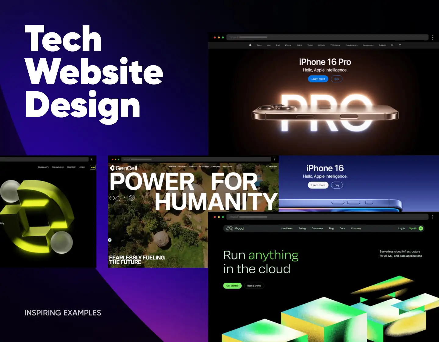
A tech website design isn’t just about aesthetics – it’s about functionality, user experience, and ensuring your site stands out in the crowded online world. That’s why understanding how to effectively showcase your brand online is crucial. Businesses face a huge difference in engagement and conversion rates when their websites lack clarity, aesthetics, or user-centric designs. So, to have a quick-loading, modern website with responsive design is an integral part of any business wishing for success. Most users tend to leave a badly designed tech site within seconds because poorly executed web design doesn’t just fail to convert – it actively drives away potential customers, jeopardizing revenue and brand image. But what can you do then? Well, by learning from the best tech websites, you can inspire yourself with ideas and inspiration for your design.
So, that’s why, in today’s article, we will explore tech website design through 24 inspiring examples, break down the elements that make these websites shine, and gather insights to apply to your projects. Now, let’s dive in!
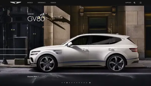
1. Genesis – Amazing Automotive Corporation Tech Website Design
Genesis combines luxury with cutting-edge interactivity. The full-screen, high-end visuals and cinematic car showcases immediately captivate visitors, while intuitive navigation effortlessly guides them through the brand’s story and product details. Highlighting cool features like the interactive elements on the site providing a preview of the cars further enhances the customer journey and conversion funnel. As a result, the smooth transitions, cohesive color scheme, and overall design choices create a sleek, modern design that exudes luxury and sophistication.
What we like:
- Luxurious visuals and cinematic car presentations.
- A balanced layout that combines storytelling with product discovery.
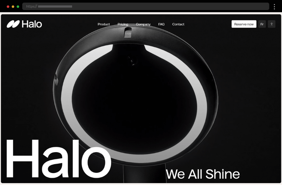
2. Halo Dental – Awesome Website Design for Dental Technology Gadget
Halo Dental’s modern still soothing design ensures trust and ease for a business traditionally associated with a stressful service. A minimalist, calm color palette and clean, friendly fonts make the site feel welcoming. Emphasizing professional video and photo content creates a strong impression while building trust with website visitors. A smart copy and transparently shared information help in fostering connection which along with the clear CTAs work towards further optimizing conversions. Coming with also a mobile-friendly design, Halo Dental easily provides one of the best tech websites out there.
What we like:
- Warm, pastel palette and friendly fonts create a welcoming vibe.
- Clear call-to-action for appointment booking right on the homepage.
3. Xapo Bank – Modern Bitcoin Bank Tech Website Design
The minimalist hero section on Xapo Bank’s website immediately conveys its unique value proposition with a clean, modern look. Subtle animations and scroll-triggered effects create an enjoyable user experience, enhancing engagement without distracting from the message. The smartly chosen color palette helps accentuate key points of interest while the smart copy expertly simplifies complex banking services into digestible bits, targeting a global audience. In addition, the design perfectly balances ample space to emphasize its simplicity and sophistication, catering to users looking for clarity.
What we like:
- Strategic use of whitespace and bold typography to highlight key features.
- User-friendly navigation and CTAs optimized for conversion.
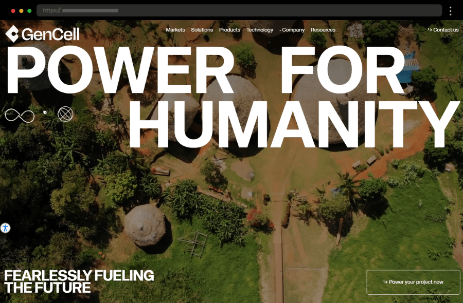
4. GenCell Energy – Inspiring Website Design for Innovative Fuel Cell Technology
GenCell Energy’s website speaks innovation through its futuristic color scheme and sleek interface. The homepage integrates video content that demonstrates the technology in action, thus providing users with an immersive experience. Soft design elements with rounded shapes convey friendliness and innovation, thus making technical information more approachable. Eye-catching graphics explain complex energy concepts simply, and strategic CTAs like “Power Your Project Now” encourage further engagement. Balancing professionalism and accessibility effectively positions it as one of the top technology websites, a leader in clean energy tech, too.
What we like:
- High-quality graphics and animations illustrating energy solutions.
- Intuitive layout with key benefits highlighted prominently.
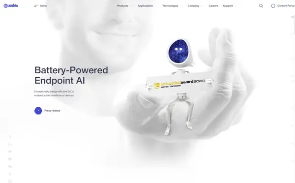
5. Ambiq – Bright and Modern Technology Web Design Example
Further comes Ambiq, showcasing its expertise in ultra-low-power electronics through a visually light and mobile-friendly design. Their subtle animations complement a mainly white-and-blue palette, while concise, jargon-free copy makes their niche offering approachable. Ambiq also incorporates eye-catching, tailored visuals that add to the overall aesthetic without overwhelming the white space. Smooth animations reflect cutting-edge technology while custom graphics and high-quality photos enhance the storytelling, establishing credibility and trust with visitors.
What we like:
- Sleek and modern design with smooth scrolling.
- Simplified copy that makes technical concepts accessible.
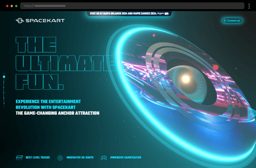
6. SpaceKart – Futuristic Tech Website Design for Fun SpaceKart Experiences
SpaceKart’s bold aesthetic pairs dynamic 3D visuals with energetic copy to capture the excitement of its fun offerings. A dark background, paired with neon highlights, exudes a futuristic vibe, that aligns with its product offerings, thus adding to the brand’s unique identity. In addition, a clear and strong value proposition and many animated graphics amplify curiosity and entice visitors.
What we like:
- Dynamic 3D graphics create an engaging first impression.
- A futuristic color scheme with neon accents enhances appeal.
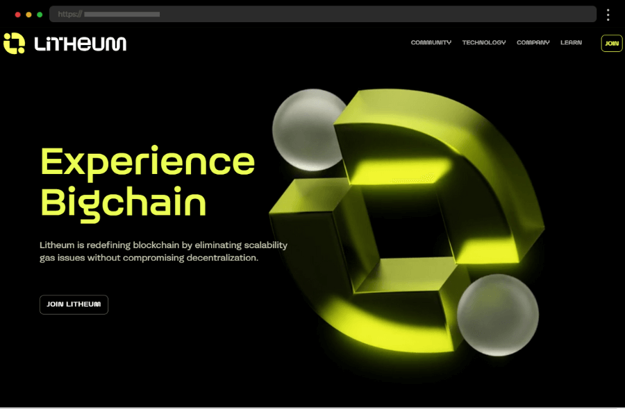
7. Litheum – Great Website Design of a Blockchain Company
Litheum’s homepage is all about communicating stability and cutting-edge solutions for blockchain applications. A combination of a muted color palette with bold accents keeps the design visually appealing without overwhelming the senses. The geometric layout exudes a convincing, forward-thinking vibe while subtle animations provide an interactive element, making the site feel dynamic and engaging. In addition, simple navigation and ample white space ensure a clutter-free, user-friendly browsing experience.
What we like:
- Effective use of colors and scroll-triggered animations to grab attention.
- The clean, easy-to-follow layout exudes professionalism and innovation.
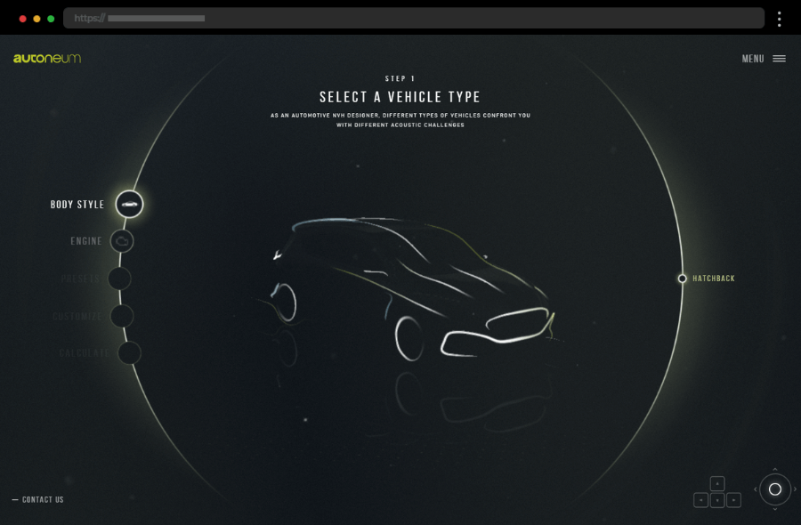
8. Autoneum Acoustics – Top Interactive Website for Car Acoustics Design
Autoneum Acoustics provides automotive acoustic engineers with a highly interactive, fun, and engaging experience. The site gives users a chance to customize and calculate the materials needed for a given automobile’s noise reduction. Autoneum’s focus on engineering innovation is evident in its structured design which effortlessly stands out as both educational and fun.
What we like:
- Clear and logical navigation, perfect for a technical audience.
- Unique interactive noise-reduction calculations.
- Minimalistic design with precise technical content.
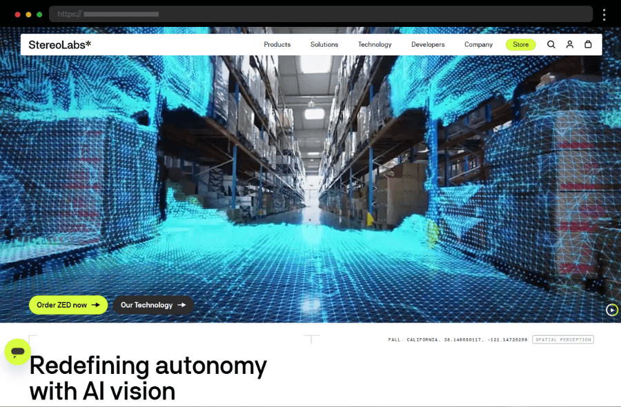
9. StereoLabs – Inspiring Website Design of a Tech Company
StereoLabs’ site immediately grabs the visitor’s attention with its landing page video showing its products in action. Embedded product demos and crisp images help StereoLabs educate visitors and visualize the benefits of its spatial computing technology. In addition, the clean layout adds a modern touch without distracting from the extensively shared tech specifics while a prominent “Order ZED Now” ensures smooth navigation for decisive minds.
What we like:
- Smart use of color, ample space, and content to achieve a high-tech vibe.
- Clear product breakdowns with immersive videos and animations for easy understanding of offerings.
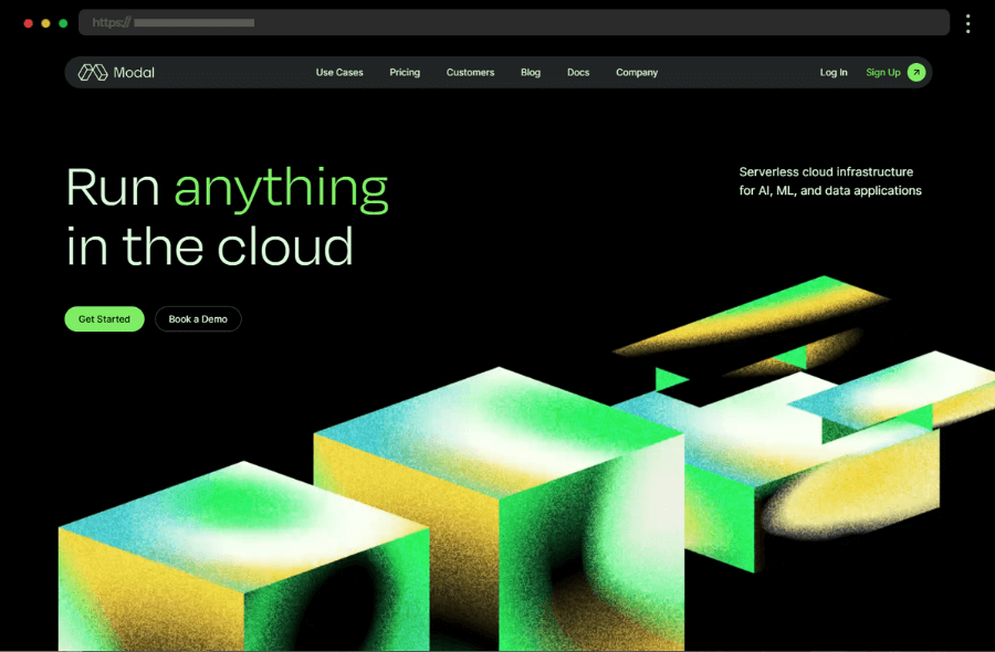
10. Modal – Cloud Development Company Tech Website Design
Modal excels in clarity and focus, showcasing its platform benefits with dynamic scrolling and striking contrasts. Bold typography and minimalistic design create an easy-to-read layout that drives attention to the core content. With an overall clean design and CTA buttons that stand out, this technology website is optimized for conversions making the user journey seamless.
What we like:
- Clean, tech-oriented design with contrasting colors.
- Smooth animations that guide users through the site.
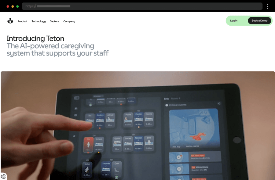
11. Teton – Inspiring AI-powered Technology Website Design
Teton AI merges human-centered healthcare with cutting-edge design. Their site uses clean, open spaces, and impactful imagery of healthcare environments to underline their mission. The hero section tells a story that effectively introduces the brand’s purpose, pulling visitors in with storytelling. Vivid images establish credibility, which along with the thoughtful placement of CTAs engages and directs medical professionals toward action, optimizing conversion rates.
What we like:
- A calm, spacious layout that highlights healthcare focus.
- Smooth scrolling transitions and well-organized content.
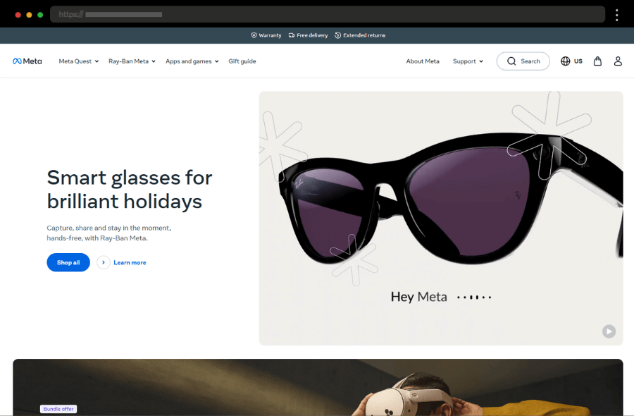
12. Meta – Electronics and Technology Company Cool Interactive Website Design
Meta’s website embraces its rebrand through fluid visuals and vibrant animations that signify its journey into the metaverse. Immersive product showcases and visionary storytelling create a sense of inevitability about its technology. The clean yet bold typography adds to its futuristic aesthetic while smooth transitions reinforce Meta’s emphasis on innovation and forward-thinking. Additionally, simplified navigation allows users to access information intuitively, enhancing user satisfaction.
What we like:
- Visually captivating animations that bring the metaverse to life.
- Strong storytelling that aligns with Meta’s visionary positioning.
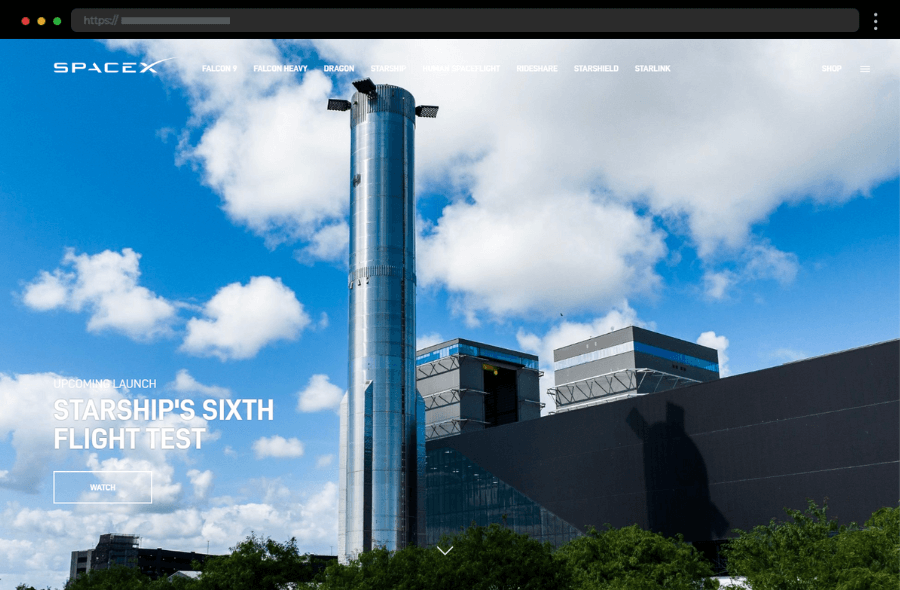
13. SpaceX – Modern Design of Rocket and Space Technology Company Website
SpaceX’s website is a masterpiece of simplicity and ambition. Large, high-quality visuals of rockets and missions instantly create an emotional connection while animated graphics and videos keep visitors engaged. The modern design with a simple, intuitive layout reflects the cutting-edge nature of the company while enhancing usability. In addition, minimal text paired with striking visuals emphasizes the monumental nature of their work, fostering awe and credibility.
What we like:
- Heroic visuals of rockets and missions inspire awe.
- Minimal text paired with sharp headlines delivers impact.
- A clean design that balances inspiration with functionality.
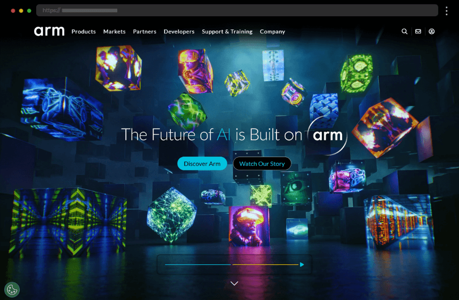
14. ARM – Computing Technology Company Website Design
Further comes Arm’s site, reflecting its deep technical roots. With a structured layout and plenty of negative space, it’s both visually clean and information-dense which gives the web design a professional look and allows users to focus on essential content. In addition, their targeted copy breaks down complex offerings, while strategic CTAs invite businesses to explore collaboration opportunities.
What we like:
- A highly structured layout that simplifies complex topics.
- Targeted CTAs for different audiences.
15. Evolutionary Scale – Great Tech Website Design of a Research Company
Evolutionary Scale’s platform uses bold typography and subtle animation for its eye-catching hero section to create an immediate impact on visitors. The design features smooth animations and streamlined navigation to enhance its overall tech appeal and reflect progress and innovation. In addition, the site is mobile-friendly and the “Start working with ESM3” button adds a conversion-friendly touch, ensuring a smooth experience across devices.
What we like:
- Eye-catching gradients and smooth animations.
- A clear focus on product benefits with straightforward, engaging copy.
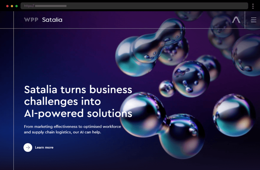
16. Satalia – AI Solutions Company with Vibrant Tech Website Design
Satalia’s fun, people-centered approach is apparent in its casual fonts and overall vivid design with vibrant colors. The aesthetically pleasing concept makes the business look approachable while the conversational tone of the copy simplifies the essence of their technical AI solutions, making them accessible to non-experts.
What we like:
- Playful design with vibrant illustrations and casual fonts.
- Engaging, intuitive layout
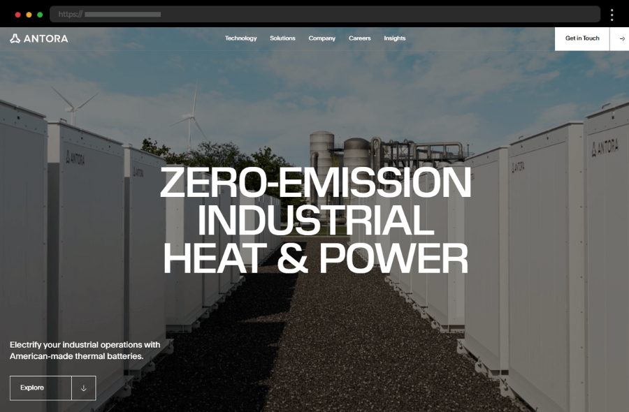
17. Antora – Innovative Electricity Solutions Company Website
Antora’s website is all about the clear presentation of its cutting-edge innovative electrical solutions. The site’s ample white space ensures a clean, professional look that doesn’t overwhelm while its streamlined design makes it easy for visitors to navigate to information quickly. In addition, larger fonts draw attention to key messages, creating a modern, clear user experience and proving that mixing technical depth and usability is a winning formula.
What we like:
- Sleek, modern design that feels innovative and technical.
- Clear “Get In Touch” call-to-action encourages engagement.
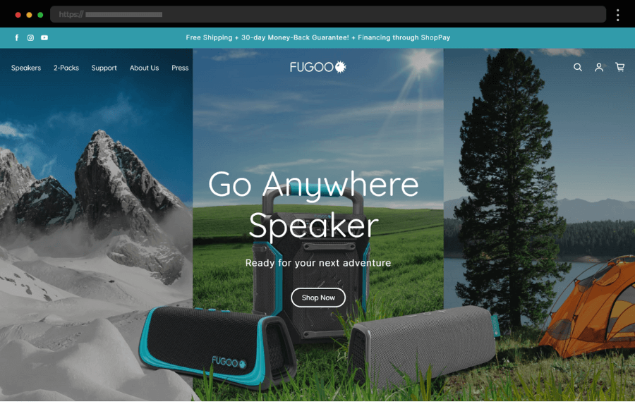
18. Fugoo – Great Tech Website Design for Electronics Company
Fugoo’s tech web design screams rugged portability. Bold, outdoor visuals showcasing their speakers in action instantly resonate with their target audience. A lively palette with bright accents highlights the energy of the brand and appeals to web visitors. With also straightforward navigation and “Shop Now” buttons scattered across the page, this technology website creates urgency while encouraging exploration.
What we like:
- Outdoor product visuals that resonate with an adventurous audience.
- Intuitive navigation and shopping options enhance user experience.
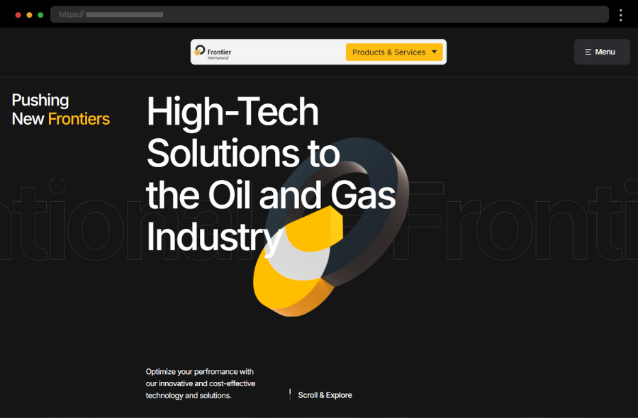
19. Frontier – Innovative Advanced Technology Manufacturer Website
Next, Frontier’s site focuses on visual impact and fuses art with performance in bold, full-screen graphics and a dynamic scrolling experience. The clean design’s intuitive layout provides an enjoyable browsing experience while making navigation simple and engaging. Using bright colors for accents easily guides user attention to the strategic calls-to-action (CTAs) thus helping the conversion path and optimizing for lead generation.
What we like:
- Cinematic scrolling and a unique layout that blends creativity with interactivity.
- Bold visuals and an avant-garde design.
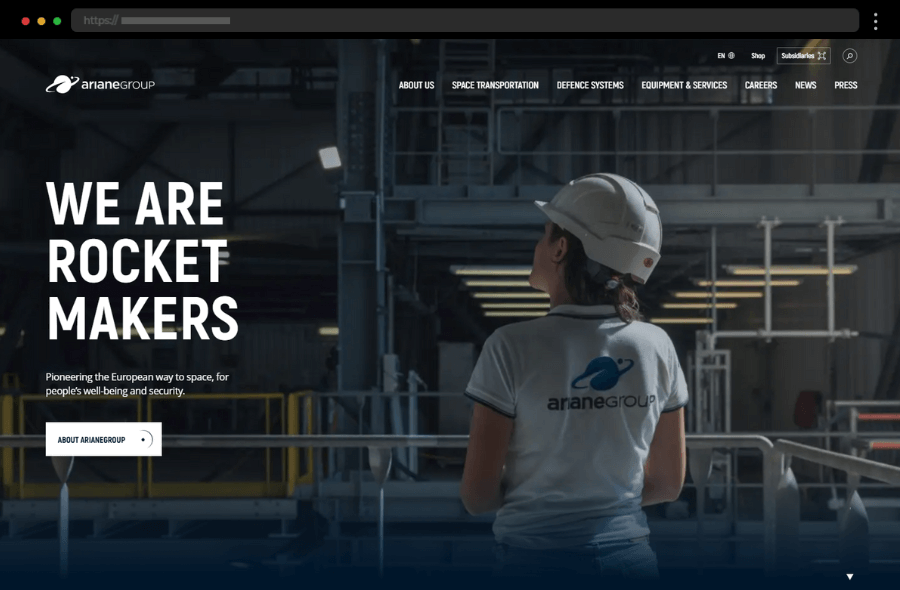
20. ArianeGroup – Space Tech Building Company Website
ArianeGroup’s web design exudes expertise in aerospace through its structured layout and interesting content. The engaging tech website showcases ArianeGroup’s brand story with impactful visuals while modern animations and scrolling effects convey the company’s tech-forward image. In addition, simple, intuitive menu options ensure a seamless browsing experience for potential clients and partners while direct CTAs ensure that users can dive deeper.
What we like:
- Impressive visuals that immerse visitors in the beauty of space and rocket engineering.
- Modern, polished, and also highly engaging design evokes precision and professionalism.
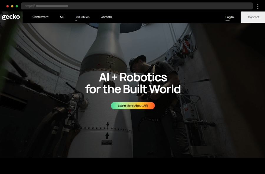
21. Gecko Robotics – Robotics Technology Company Website Design
Further on our list, Gecko Robotics’ industrial tech shines with a strong yet clean interface. Hero images of their robots in action in real-world environments pair in perfect balance with focused, benefit-driven headlines. In addition, clear fonts and professional photos exude credibility and establish authority. As a result, this tech web design emphasizes customer needs, from a clear value proposition to easy-to-find contact options.
What we like:
- Real-world applications are demonstrated through video and imagery.
- Rugged visuals that align with their industrial tech focus.
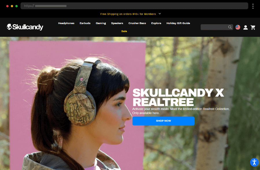
22. Skullcandy – Cool Electronics Company Website Design
The Skullcandy website captures the spirit of youth with vibrant colors, bold fonts, and edgy visuals. Attractive product images and an intuitive shopping experience are complemented by social proof, limited-time offers, and user-friendly checkout so to provide an engaging experience. All combined, this easily is an excellent example of a fun and highly conversion-focused site, certainly one of the best tech websites.
What we like:
- Vibrant, youth-focused design with bold fonts and dynamic imagery.
- Great use of social proof and limited-time offers for urgency.
23. Apple – Cool Electronics and Software Tech Website Design
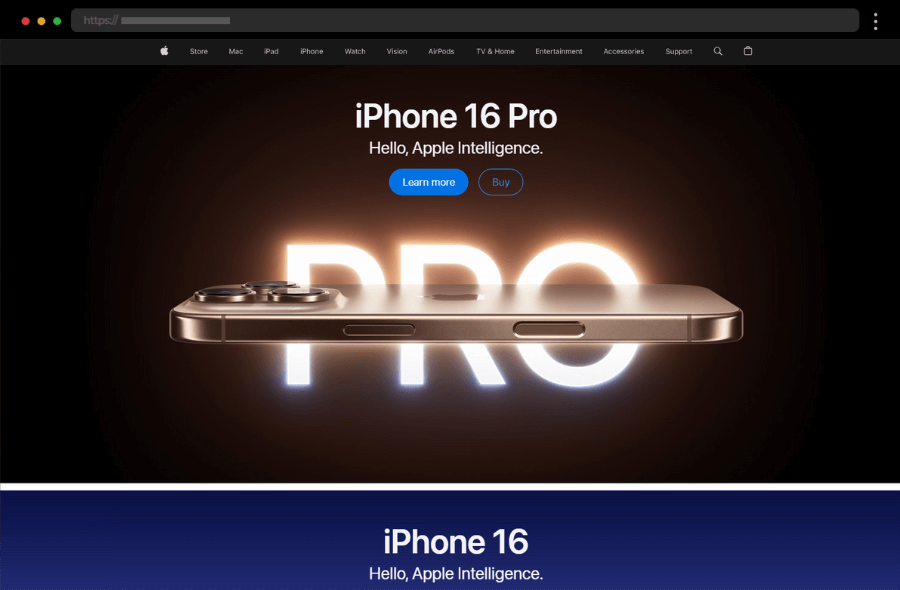
Apple’s website is like a gold standard for tech design – clean, intuitive, and product-focused. The homepage hero is dominated by attention-grabbing images of their latest devices, paired with compelling microcopy like “Gift magic.” Overall, the design prioritizes high-quality photography to emphasize Apple’s sleek products. With also simple navigation and dynamic scrolling effects exploring is a seamless and delightful experience. The site’s obsession with detail mirrors its product philosophy while subtly reinforcing brand loyalty.
What we like:
- Stunning, immersive visuals, showcasing the products.
- Engaging interactive features and smooth transitions.
- Great product listing structure.
24. Quantango – Technology Company with Dark Website Design
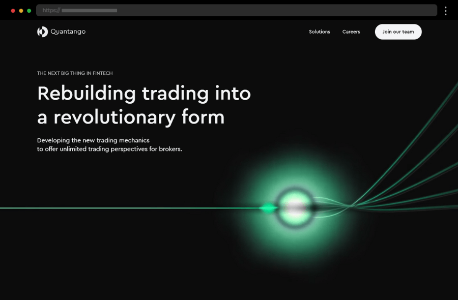
Quantango’s polished tech website exudes futuristic vibes with its dark palette and animated visuals with bold colors. With also a well-thought-out copy the design explains effortlessly the platform’s concept and the offered solutions. In addition, the web design adapts well to various screen sizes, maintaining functionality and appeal across all devices.
What we like:
- Dark, futuristic theme complemented by animated elements.
- Conversion-focused CTAs like “Contact Us” for lead nurturing.
Tips for Crafting an Awesome Tech Website Design
Creating the best tech websites requires the strength of both your imagination and skills. Let’s see then where you should harness their power for the best results:
1. Create a User-Friendly, Responsive Design
Firstly, a responsive design ensures that users have a consistent, optimized experience on any device. So, incorporate simple, intuitive navigation and a conversion funnel to guide users effectively toward actions.
2. Emphasize Visual Storytelling with High-Quality Imagery and Videos
For technology websites, high-resolution imagery and video content are undoubtedly invaluable in showing off products and services in action. Clear visuals not only engage visitors but also communicate the quality of your tech product.
3. Utilize White Space and Bold Typography
Ample white space keeps the site uncluttered, thus allowing visitors to focus on essential information. On the other hand, bold typography draws attention to key messages, making content easy to read and impactful.
4. Add Subtle Animations for an Engaging Experience
Thoughtfully placed subtle animations can add life to your website design without overwhelming visitors, however. Movement draws attention and encourages exploration, but it’s crucial to avoid excessive animations that could distract from the main message.
5. Highlight Social Proof and Client Testimonials
Integrating social proof in web design builds credibility and reassures potential customers of technology companies’ value. Testimonials provide firsthand experiences, which can certainly have a strong influence on conversion rates.
6. Showcase Unique Value Propositions
Make your brand’s value proposition clear in the hero section and also throughout the landing pages. It’s essential to communicate why your tech solution is the best choice quickly and effectively.
7. Use Bright Colors, but Keep the Palette Balanced
Many modern tech websites use bright or bold colors as accents while maintaining a minimal color palette overall. The color design choice should draw attention without overwhelming the visitor.
FAQs about Technology Websites Design
► 1. What makes a tech website design stand out?
A combination of modern design, user-friendly features, and also engaging design elements helps a tech website excel in its game.
► 2. Why is responsive design important for tech websites?
A responsive design ensures that custom websites function well across all devices, offering a consistent user experience and maximizing reach to both mobile and desktop users.
► 3. What are the key elements of modern tech websites?
There are certainly a few web design elements that a successful tech website can’t go without. This means incorporating subtle animations and intuitive navigation while showcasing high-quality images and video content. An absolute must-have is also a clear value proposition in the hero section to capture website visitors’ attention.
► 4. How can social proof impact tech website visitors?
Social proof, such as client testimonials and reviews, helps tech companies build trust with new visitors. Demonstrating previous customer satisfaction can increase conversions by thus validating your brand’s reliability.
Final words
To succeed in the tech world, tech companies need a great site to differentiate their brand, communicate their value propositions, and above all convert website visitors into customers. Gathering inspiration from efficient tech websites and following best practices is a great starting point for web designers to craft stunning and conversion-focused concepts. So, embrace your imagination and go captivate your audience!
We hope our article gave you the inspiration and creativity boost to start designing your tech website! Before you go, check out our other articles sharing loads of amazing tips, insights, and examples:


