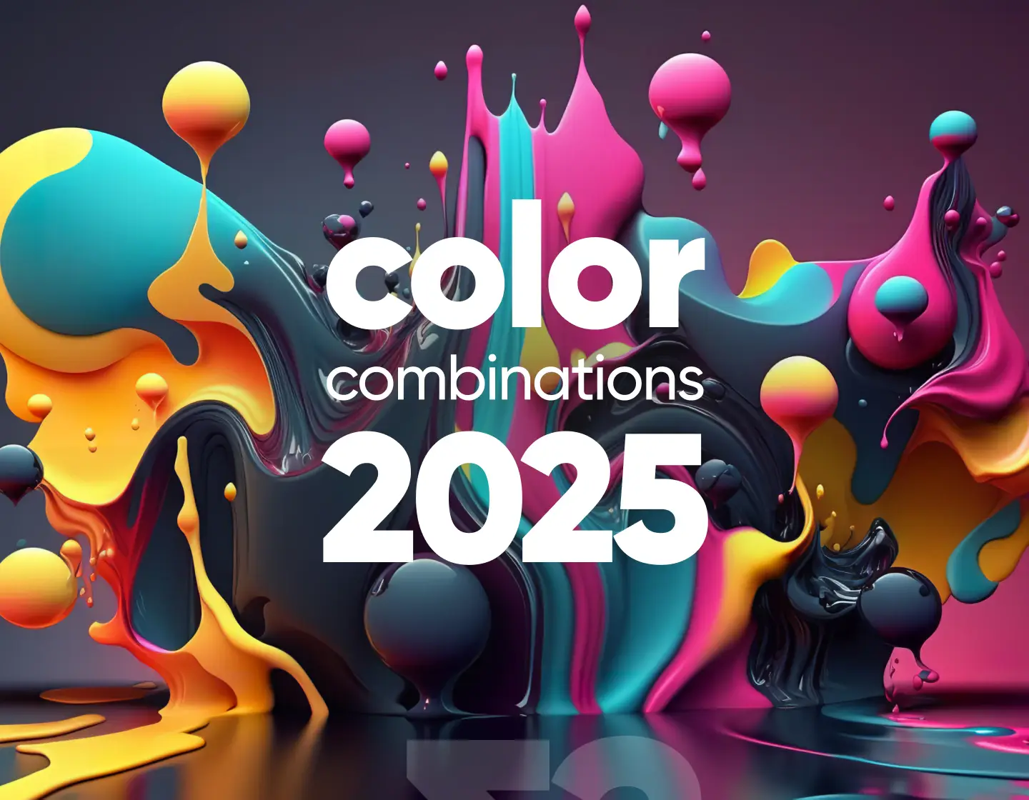
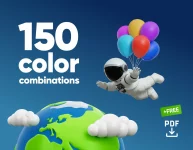
Introducing the top color combinations 2025 has to offer, with examples and insights on how designers are using them across branding, web, and digital design to make bold, fresh visuals.
Color combinations can say a lot with very little, and when done right, they do some serious heavy lifting in a design. 🎨🎨🎨
Every year brings new favorites, and 2025 is no exception. Designers across branding, packaging design, book covers, digital art, layouts, motion graphics, and UI have already picked their go-to color duos for the year, and I’ve spotted some patterns you’ll want to remember.
Some feel warm and nostalgic, others bold and splashy. A few lean, natural, and grounded. But all of them have something in common, and that is they’re everywhere right now, and they just work. So, I took a deep dive into the loudest, softest, most surprising, and most satisfying color combos from the design world in 2025 and hunted down the top eight picks, each paired with examples that show them in real action.
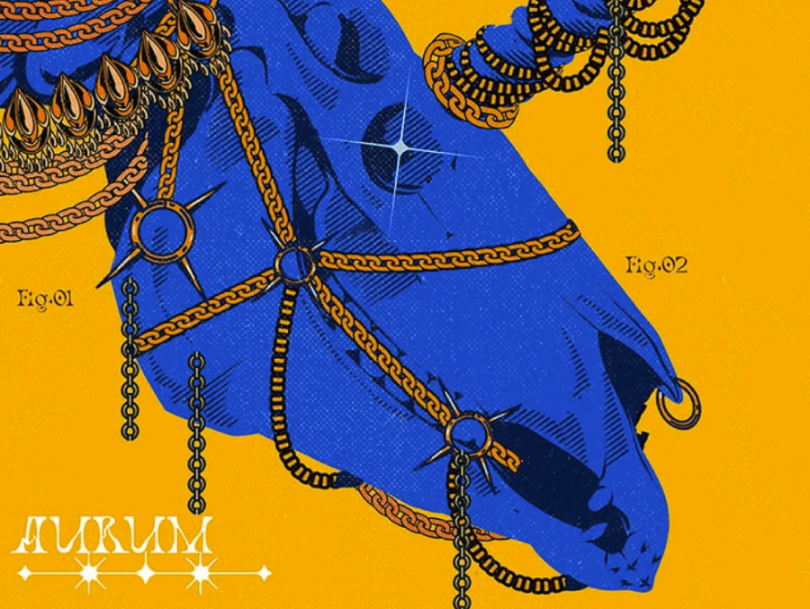
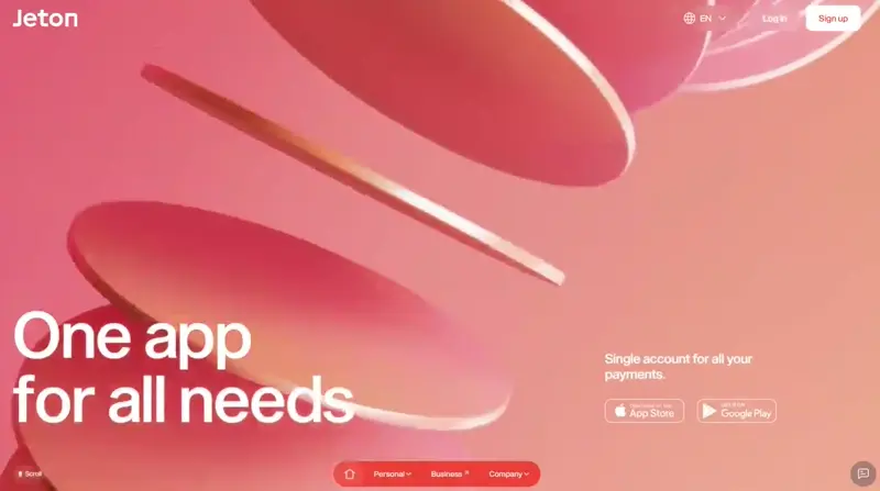
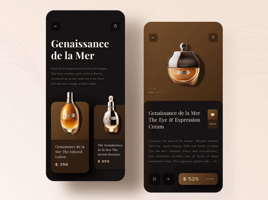
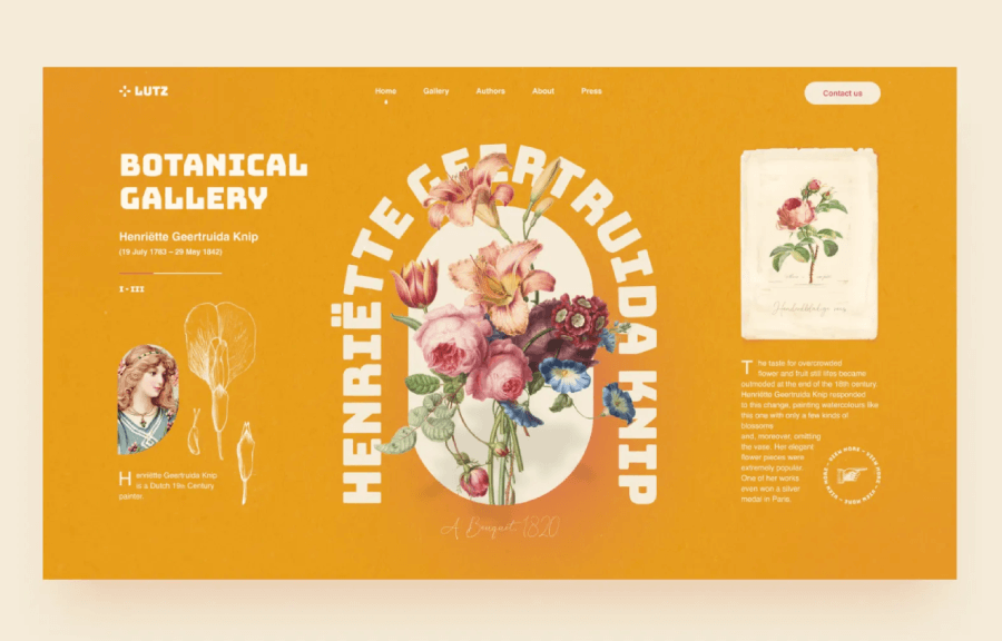
Trend 1: Gold and Navy
Let’s kick things off with a pair that’s been quietly commanding attention in everything from branding to digital layouts. The first trend in color combinations 2025 is Gold and Navy. These two aren’t new to the spotlight, but their staying power is no accident. You’ve probably seen this combo on luxury packaging, fashion runways, or even minimalist interiors. Graphic design just followed suit.
Navy brings depth, seriousness, and calm. It’s the color of authority—but without the stiffness. Gold, on the other hand, leans flashy in the best way. It gives the feeling of prestige, celebration, and something a little extra. Together, they create this polished, grown-up aesthetic that doesn’t scream for attention, yet still feels rich and confident.
Emotional tone and cultural relevance:
Think quiet power. Sophistication without the fuss. Designers often use this pairing when they want something that feels both premium and grounded. You’ll see it in brand identities for boutique agencies, high-end products, or editorial design that needs to feel elevated without going over the top.
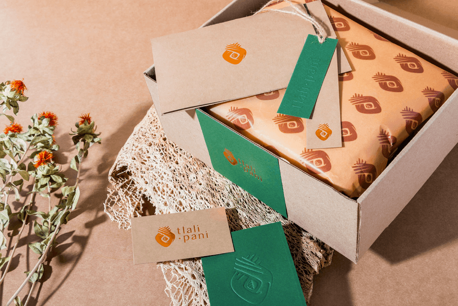
Now, when it comes to balancing this duo, textures and finishes do a lot of the heavy lifting. In digital work, designers might mimic metallic gold with gradients or subtle sheens. When used in print, a matte navy background makes gold foil pop without looking too flashy. And when the combo needs softening, neutrals like cream, taupe, or muted greys round things out beautifully, keeping the luxe vibe without tipping into gaudy.
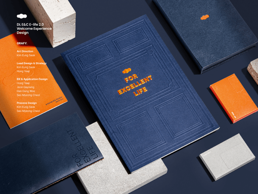
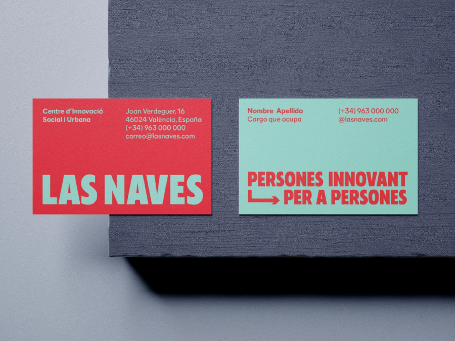
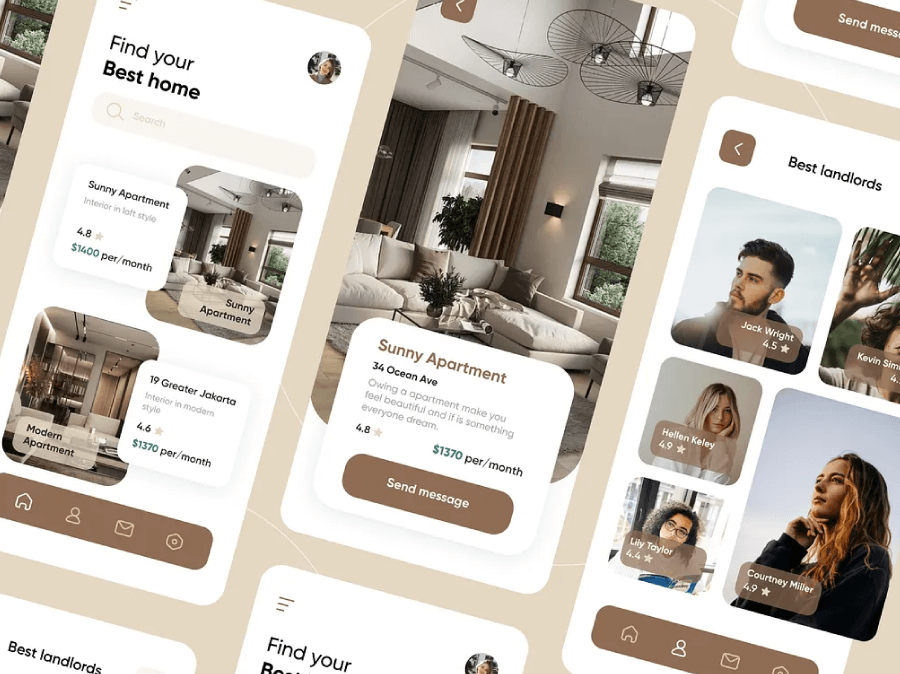
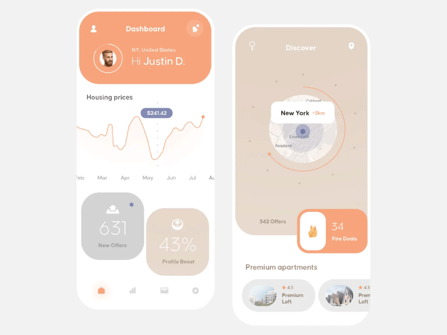
Gold and Navy Color Combination Examples:


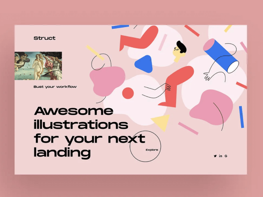
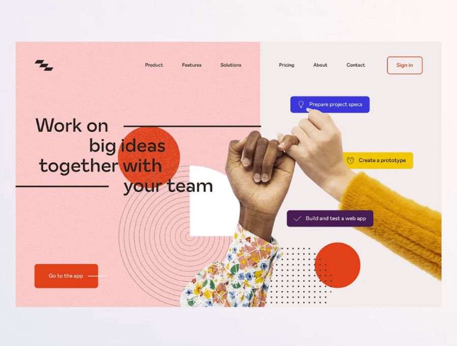
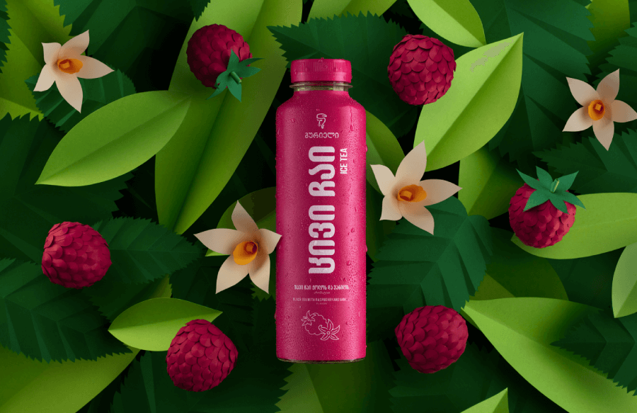
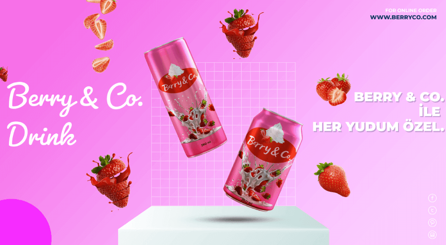
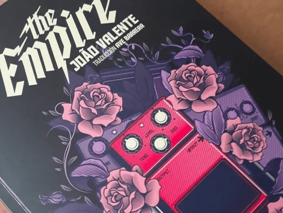
Trend 2: Rose and Cherry Red
This one brings the drama. Rose and Cherry Red is a clashing combo, and that’s exactly the point. It’s romantic, loud, and a little bit nostalgic. Designers aren’t using this duo to play it safe because this is the duo from color combinations 2025 that plays into emotion, passion, and visual heat.
Now, this combo works because it plays with contrast within the same color family. Rose softens the blow. It’s sweet, delicate, and full of personality. Cherry red takes over the room because it’s bold, attention-grabbing, and hard to ignore. When they’re paired, you get this layered, dynamic look that feels expressive and playful but still mature.
Emotional tone and cultural relevance:
Culturally, red has always been tied to power, love, energy, and rebellion, depending on the context. Rose tones, especially the more muted or dusty ones, add a contemporary twist that feels more in tune with the emotional side of design. You’ll spot this combo a lot in editorial layouts, album covers, creative portfolios, and bold ad campaigns.
Designers often bring in neutral textures to tone things down when needed. A soft blush background or off-white canvas gives the reds space to breathe. For a more tactile look, rose and cherry red feel right at home layered over organic shapes, grainy textures, or even rough paper effects in print.
Used right, this pairing captures attention without looking like a Valentine’s Day card. It’s confident and expressive, and it gives you plenty of room to experiment with mood and tone.
Rose and Cherry Red Combination Examples:


Trend 3: Aqua and Sand
Aqua and Sand brings a whole different energy to the table. Compared to the louder combos from the previous sections, this one feels calm, clean, and kind of like a deep breath. It’s been showing up a lot in branding for wellness, lifestyle, and travel but it’s just as effective in UI design or editorial layouts when you want something that feels fresh without trying too hard.
Aqua taps into clarity, coolness, and a touch of playfulness. It’s not quite blue, not quite green, somewhere in between, and that makes it super versatile. Sand, on the other hand, adds warmth and balance. It gives the aqua a place to land, keeping things grounded and approachable.
Emotional tone and cultural relevance:
Emotionally, this combo speaks to ease and clarity. There’s a lightness to it that feels inviting but still polished. It’s become especially popular in 2025 as more brands steer away from high-saturation, ultra-contrasty palettes and toward color schemes that feel easier on the eyes, especially in digital spaces where people spend a lot of time.
What really helps this pairing shine is texture. Grainy backgrounds, natural paper tones, or soft gradients make it feel less flat and more tactile. Designers often work in a soft sand or beige base with aqua accents—think call-to-action buttons, graphic elements, or interactive UI highlights. You get contrast, but it’s quiet and refined.
And when you want to push it a little further, adding a darker shade of teal or a touch of coral can create nice depth without disrupting the calm.
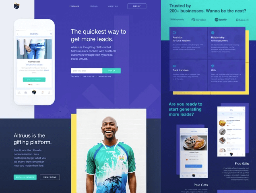
Aqua and Sand Color Combination Examples:


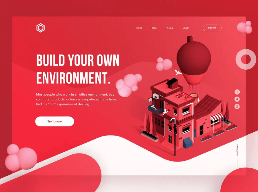
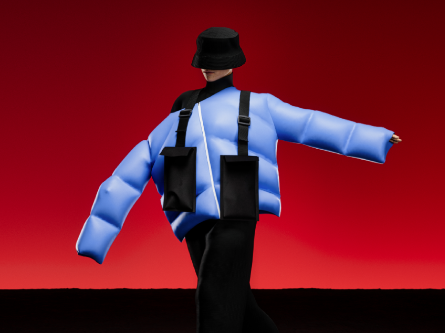
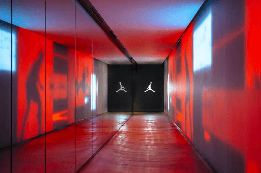
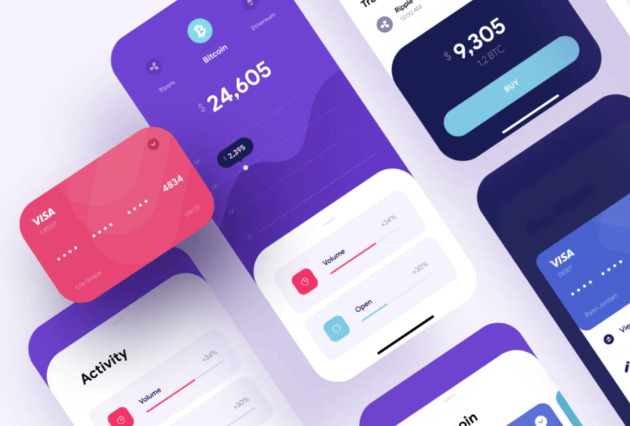
Trend 4: Crimson Red and Light Blue
Proceeding with color combinations 2025 that love clashing, Crimson Red and Light Blue feels like conflict and harmony rolled into one. It’s a high-contrast pairing that somehow manages to feel both bold and balanced. These two colors sit far apart on the color wheel, which gives them a natural tension but that’s what makes them interesting. Designers have been leaning into this contrast to create visuals that pop without feeling aggressive.
Emotional tone and cultural relevance:
Crimson brings intensity. It’s deep, emotional, and full of energy. Light blue, on the other hand, cools everything down. It’s calm, clean, and just a little bit nostalgic. When they’re used together, you get this striking balance—warm and cool, energetic and serene. It’s a combo that can go in multiple directions depending on the tone you’re after.
In 2025, this pairing has been popping up in campaign work, digital art, packaging, and even corporate design where a touch of personality is welcome. It works especially well when you’re trying to grab attention but still keep things polished. You’ll often see crimson used for highlights intypography, icons, graphic accents, while light blue carries the background or more neutral elements.
Designers often layer this duo with whites, soft greys, or subtle gradients to let the contrast breathe. Textures like paper grain, brushed patterns, or layered transparencies can also help tone down the visual tension, especially in print or editorial layouts.
If you’re using this pair in web design, spacing and font weight matter. Too much saturation and not enough breathing room, and the combo starts to feel cramped. But handled right, crimson and light blue deliver a clean, high-impact look with a ton of personality.
Crimson Red and Light Blue Color Combination Examples:


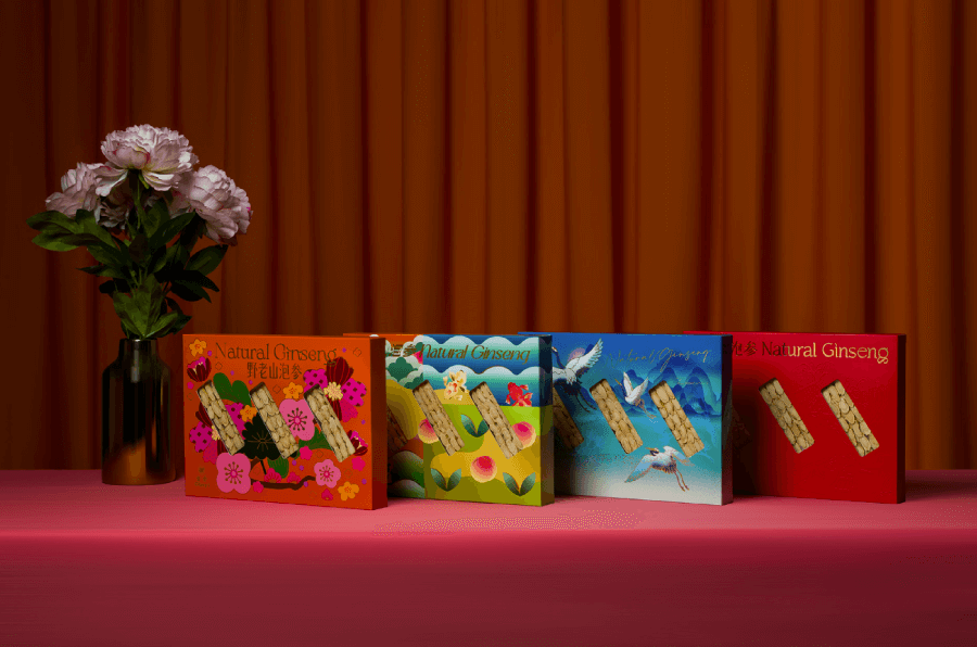


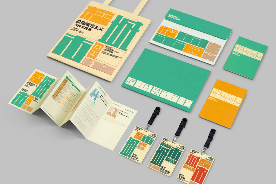
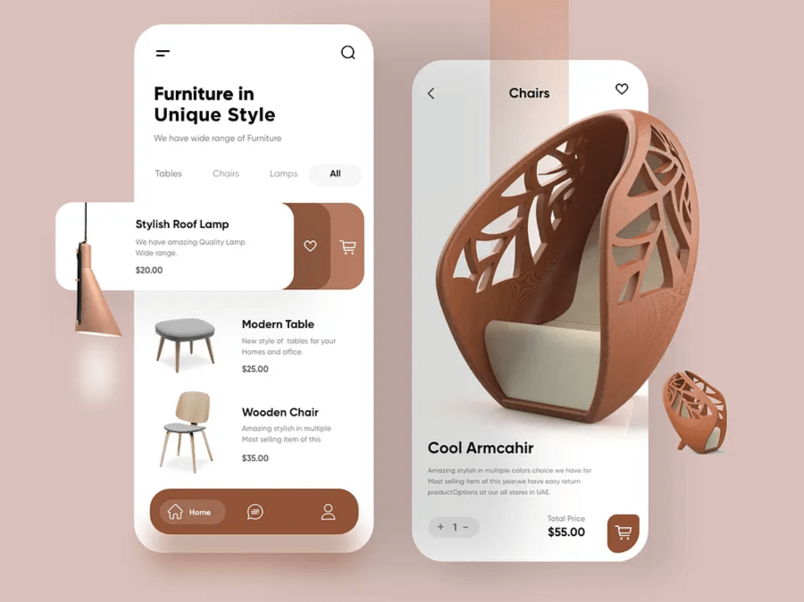
Trend 5: Mocha and Neutrals
Mocha alone is already a huge trend considering the Pantone Color of the year is literally Mocha Mousse. Needless to say, any combo with mocha is a trendy color combo of 2025. Combined with neutral colors, Mocha leans into warmth, softness, and that timeless, lived-in feeling that’s become even more popular in 2025. It’s the kind of palette that feels immediately familiar and trustworthy without looking tired. Think modern café menus, boutique brand identities, editorial design, and lifestyle product packaging, this one shows up in all the right places.
Mocha covers a range of warm browns. think espresso, cinnamon, milk chocolate, rich without being flashy. Pair that with creamy neutrals like beige, off-white, taupe, or even light greys, and you get a grounded, low-contrast look that still feels curated and thoughtful. It’s not boring. It’s cozy, calm, and polished.
Emotional tone and cultural relevance:
Culturally, this palette speaks to comfort, connection, and earthiness. It’s everywhere in fashion and interiors; natural fabrics, muted tones, minimalist aesthetics; and that influence has definitely bled into graphic design. Brands that want to feel human and grounded are using this combo to create visual identities that don’t scream for attention but still hold it.
The secret to making this pairing work in design? Layering. Play with shadows, textures, grain, or subtle gradients to add depth. Mocha tones make great backgrounds or typography colors, and the neutrals fill in the rest- space, structure, balance. Designers often use this combo with oversized layouts, generous spacing, and clean type to keep it modern.
For contrast, a little touch of metallic gold or soft olive green can improve the look further without clashing. But honestly, mocha and neutrals do plenty on their own. It’s a grown-up palette, but it doesn’t feel stiff.
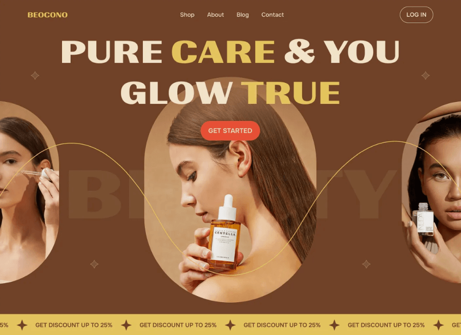
Mocha and Neutrals Color Combination Examples:


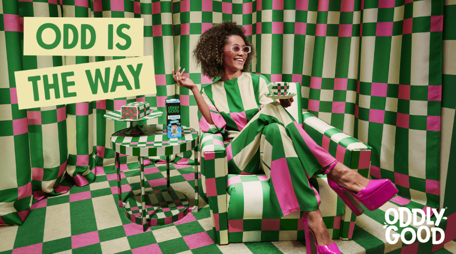
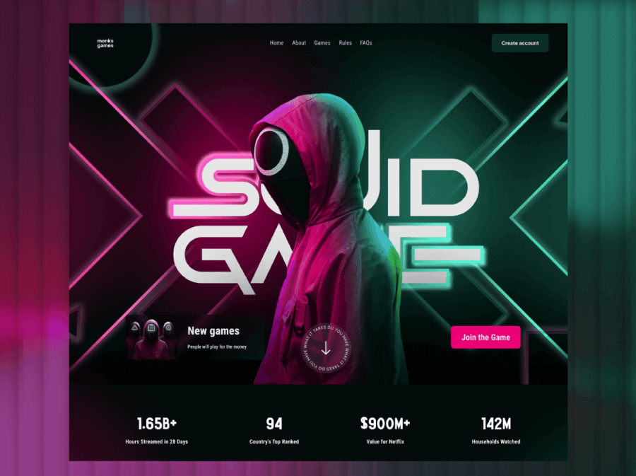
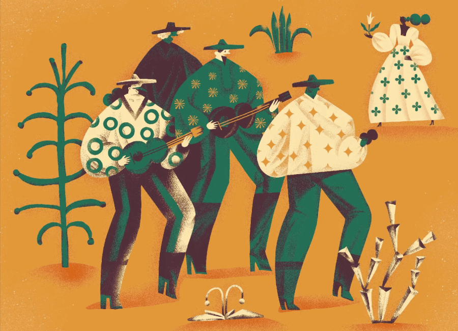
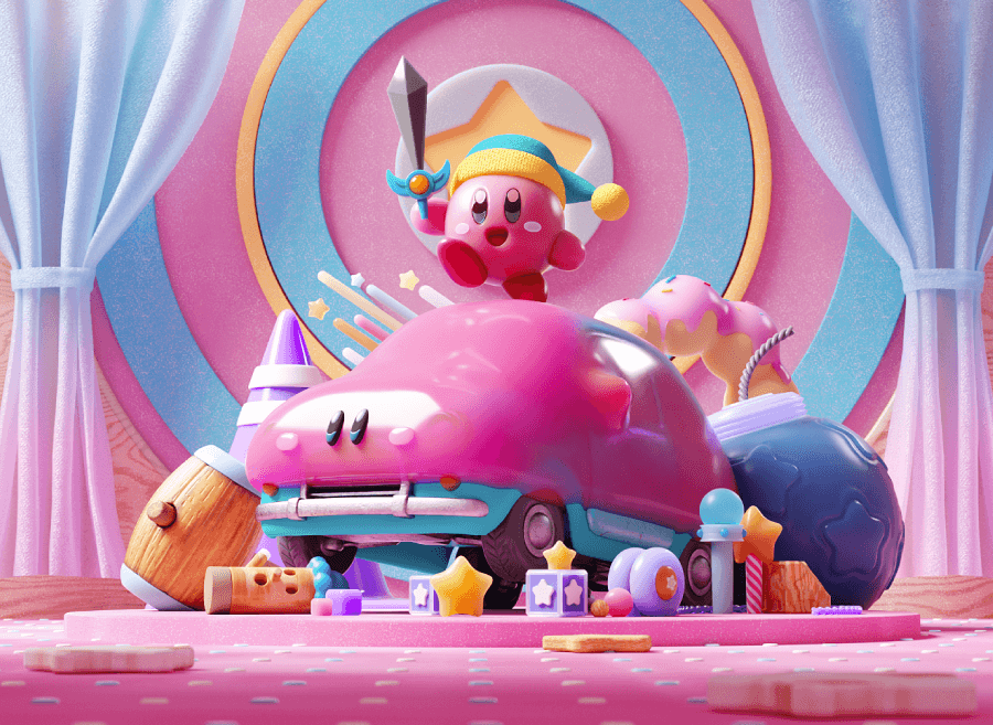
Trend 6: Frog Green and Hot Pink Color
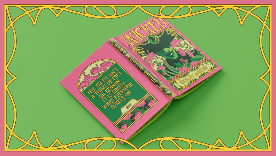
I can’t talk about color combinations 2025 without addressing the elephant in the room- Frog Green and Hot PinkIt’s sharp, loud, just a little bit rebellious, and it’s everywhere. You’ve probably already seen it out in the wild. Squid Game used a striking pink-green contrast in its visual branding. Wicked flipped the idea on its head, pairing vibrant greens with dramatic purples and pinks in newer promo art. This combo feels theatrical, almost surreal. In 2025, it’s everywhere from music posters to indie game interfaces and edgy fashion labels.
Frog green is unapologetically bright and it’s sharp, zesty green that doesn’t really do “subtle.” Hot pink sits right beside it with equal energy. Together, they give off a kind of synthetic-meets-natural vibe. It’s bold, it’s clashing, and yet… it works. They don’t complement each other in the traditional sense, but that unexpected tension is exactly what designers are leaning into.
Emotional tone and cultural relevance:
The emotional tone is loud, playful, and maybe a little aggressive. It’s perfect when you want your design to feel charged, full of life and just a touch chaotic. In web and UI design, this combo can create hyper-visual layouts for brands that don’t mind being a little polarizing. Think Gen Z-focused fashion, experimental art collectives, or apps with a fun-first approach.
Because the contrast is so high, most designers avoid using both shades in large fields. Instead, one color typically dominates (often a neutral background with pops of frog green or hot pink). You might see green as a hover state, CTA button, or header accent, while pink brings in highlights or animations.
To tone it down without losing personality, neutrals like charcoal, off-white, or even raw textures like grainy paper or plastic-inspired effects help. This combo is clearly for moments when subtlety isn’t on the moodboard.
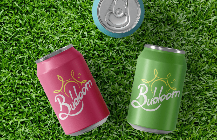
Frog Green and Hot Pink Combination Examples:


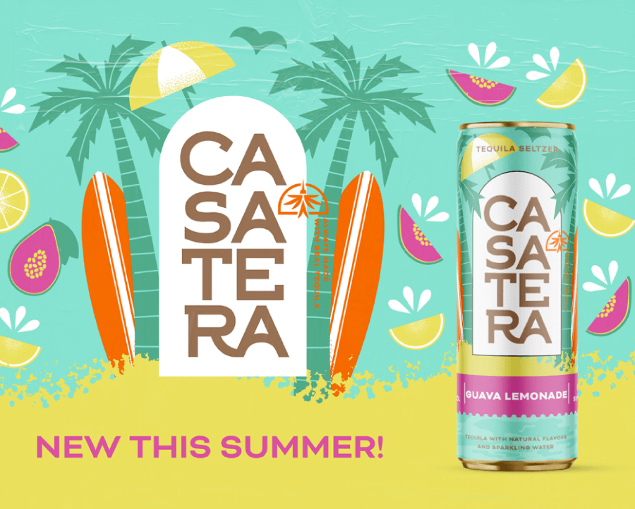
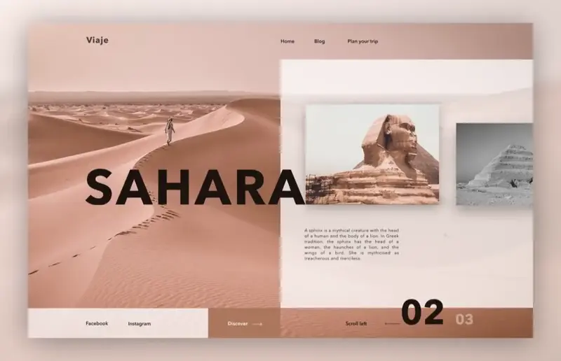
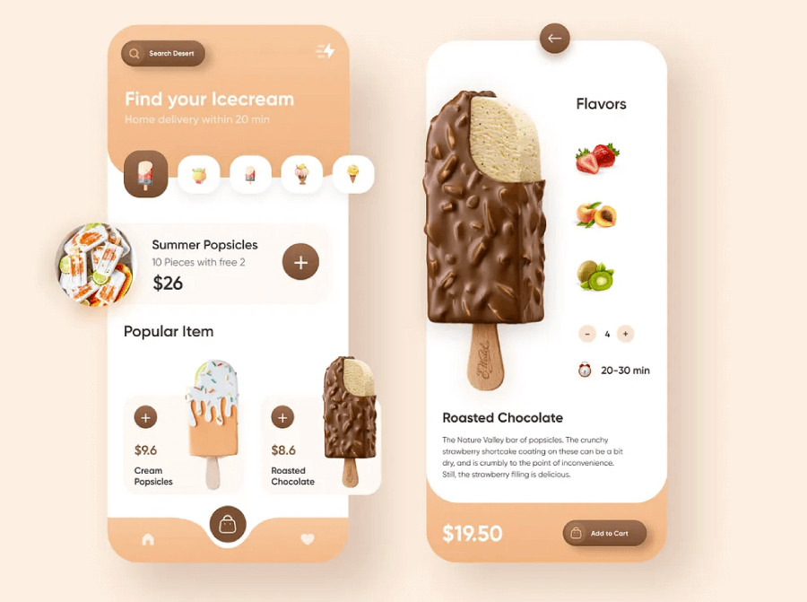
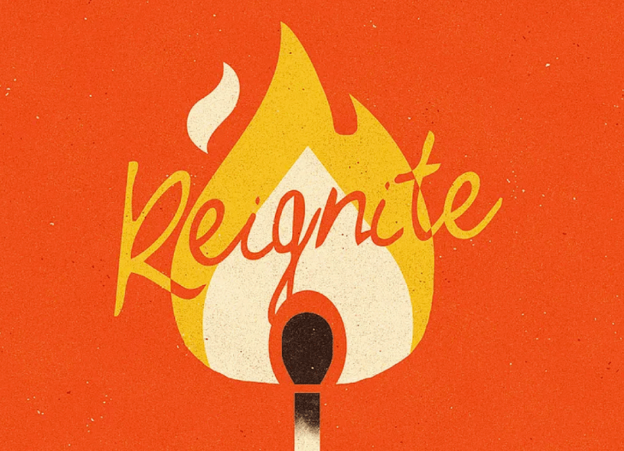
Trend 7: Clementine and Off White
Clementine and Off White brings sunshine into graphic design without going full neon. This combo is fresh, friendly, and surprisingly flexible. Clementine lands somewhere between orange and peach—juicy, soft, and just warm enough to grab attention without shouting. Off white tones it down with a quiet, airy presence that keeps everything feeling light and breathable.
In 2025, this pairing is showing up in everything from DTC packaging to landing pages and digital illustrations. It’s especially popular among wellness brands, lifestyle startups, and modern product labels looking for a clean but cheerful vibe. It has a slightly retro softness, but it feels more like a nod than a throwback. Think natural textures, sun-drenched palettes, and UI elements that feel easy to interact with.
Emotional tone and cultural relevance:
The emotional tone is upbeat and calm at the same time. Clementine adds optimism without the harshness of true orange, while off white gives plenty of breathing room. Together, they feel positive, clean, and approachable. Designers love using this combo for brands that want to build trust while still keeping things playful.
When it comes to layout, clementine works great for accents—buttons, icons, headers—while off white supports large background areas, cards, or empty space. Want to warm things up further? Add in muted corals or dusty pinks. Want contrast? Try layering it with olive green or a chalky charcoal for a modern edge.
Clementine and off white make it easy to create clean compositions that still have a little soul. It’s soft enough for editorial, fun enough for eCommerce, and modern enough for any digital brand that doesn’t want to take itself too seriously.
Clementine and Off White Color Combination Examples:


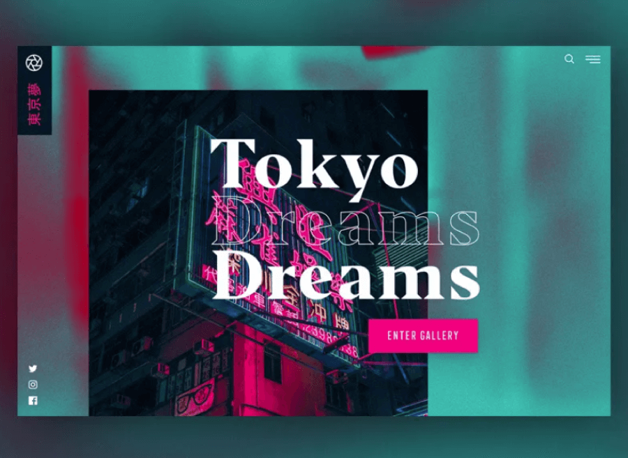
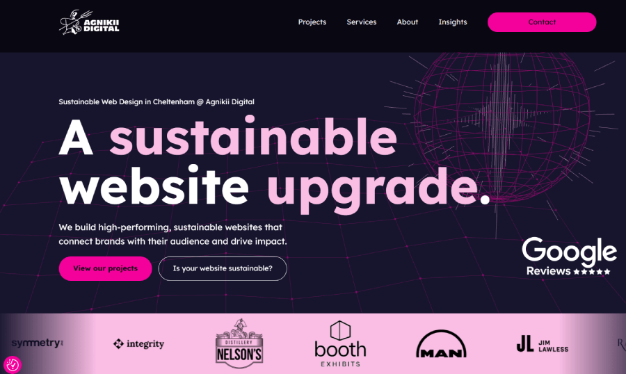
Trend 8: Violet and Pink
Violet and Pink is a dreamy, digital, and slightly nostalgic combo all at once. This combo carries the energy of Y2K aesthetics, vaporwave vibes, and modern fantasy branding, but with the polish and softness that’s made it huge in 2025. You’ll find it in beauty brands, boutique SaaS products, virtual influencers, and anywhere that wants to lean into surreal, expressive, slightly otherworldly visuals.
Violet isn’t as moody as full-on purple, and pink here leans more magenta than bubblegum. The result is a vibrant-but-not-jarring gradient of emotion. It’s soft enough to look elegant, bold enough to stand out in a scroll-heavy feed, and weirdly comforting for digital-first audiences.
Emotional tone and cultural relevance:
Emotionally, this combo hits a sweet spot: dreamy but confident, gentle but expressive. Culturally, it taps into themes of identity, escapism, and hyper-personalization—big themes in design this year. There’s also a touch of androgyny here. Pink and violet don’t skew heavily masculine or feminine, so this palette often shows up in gender-neutral branding or projects that want to feel inclusive without being too on-the-nose.
Designers often use the combo in gradients—soft transitions from pink to violet across backgrounds or typography. Or they’ll pair flat violet backgrounds with chunky pink type or animated elements. It’s big in UI/UX, especially when paired with dark modes, blurred-glass effects, and soft glowing highlights.
To balance the sweetness, neutrals like graphite, off black, or stone gray can ground the look. Or, to really lean into the soft futuristic vibe, textures like light grain, soft blurs, or neon glows give it that polished-but-ethereal finish.
Violet and Pink Color Combination Examples:


And there you have it!
Color makes a huge difference. It sets the mood, shows personality, and makes designs stick. The combos we’re seeing in 2025 don’t hold back. They’re confident, expressive, and sometimes a little unexpected—in the best way.
Some feel soft and comforting. Others bring heat and contrast. A few mix both and still manage to look good. Designers are having fun again, trusting their instincts, and getting more comfortable with color that says something, without having to explain it.
These palettes work across all kinds of design- brands, websites, packaging, digital art—because they leave room to play. There’s freedom in picking a bold color and matching it with something calm. Or flipping that around.
When a combo feels right, that’s usually a good place to start. No need to overthink it.
In the meantime, check out the blog for more inspiration and insights, or jump straight into these articles: