

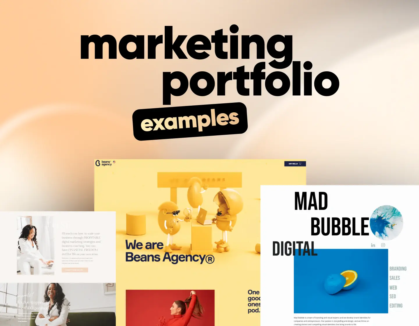
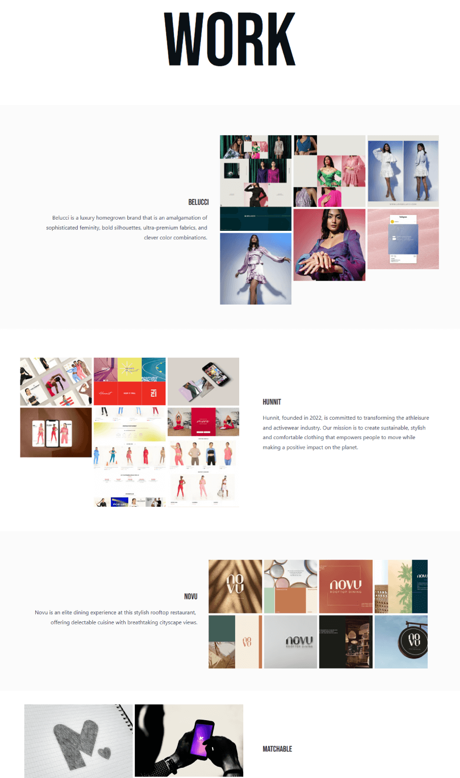
A collection of 20 marketing portfolio examples that show how freelancers and agencies present their work with clear layouts, strong messaging, and smart design.
Building a portfolio as a marketing strategist shows you get it. You understand messaging, you know how to make things look good and make sense, and you can walk the talk when it comes to strategy. If you’re freelancing, running your own agency, or somewhere in between, your portfolio does a lot of the heavy lifting before anyone even speaks to you.
This is why I hunted down 20 smart, modern marketing portfolio examples from freelancers and agencies doing things their own way. Each one comes with quick notes on what makes it work like layouts that feel easy to navigate, content that gets to the point, and messaging that speaks clearly. You’ll get inspo and solid ideas you can borrow, tweak, or build on for your own site.
1. Mad Bubble Agency
Mad Bubble’s portfolio skips the fluff and focuses on what matters, which is clear visuals and clean design. Projects sit front and center, each one backed by sharp images and short, snappy summaries that give you a good sense of the agency’s style and thinking.

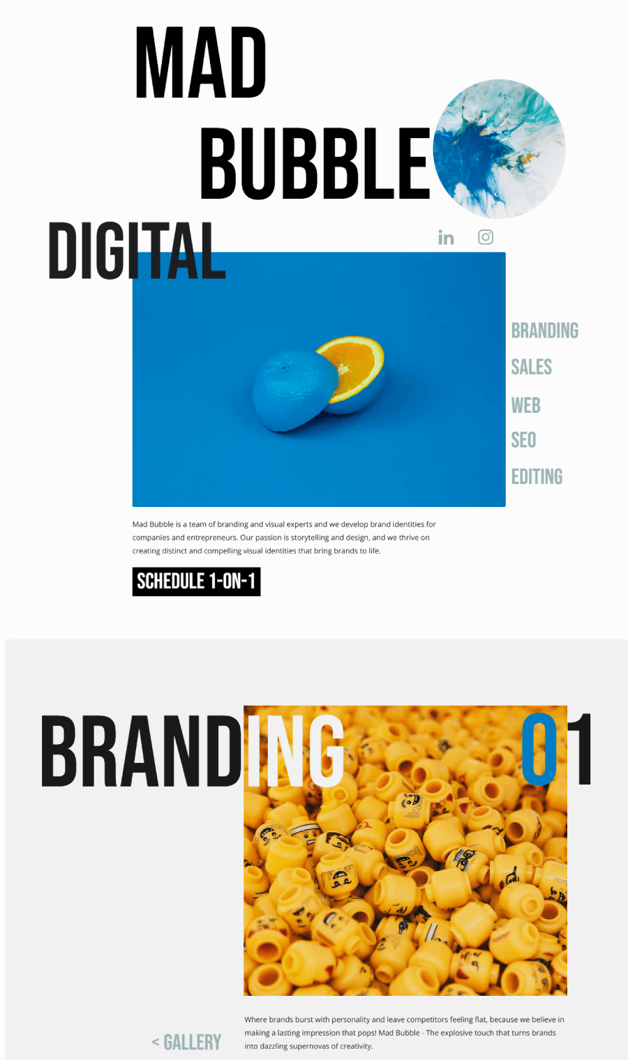

The site feels lively without being chaotic, thanks to smooth interactions and a well-organized layout. There’s also a thoughtful About page that ties it all together, giving visitors a better feel for who’s behind the work and what they’re all about.
2. Beans Agency Portfolio Website
Beans Agency builds an entire experience around their work. The site feels like flipping through a designer magazine, full of bold visuals and quirky charm. Each case study fits right into the overall theme, with magazine-style spreads that pair big, confident titles with two-column layouts and glossy imagery.

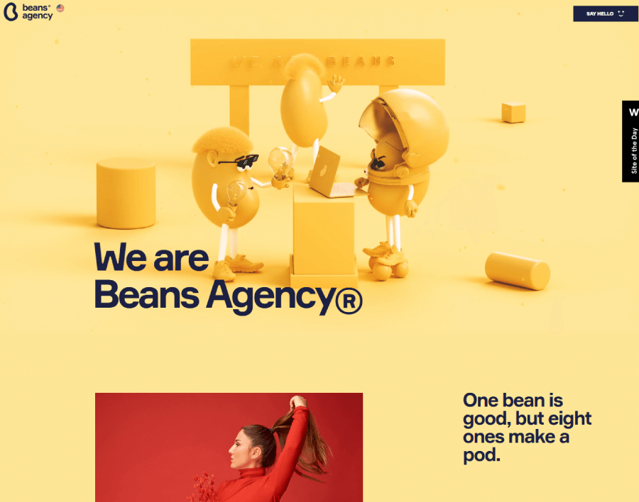
Even the team intro leans into the branding, with editorial-style portraits and playful nods to their name. The work itself lives inside an accordion-style section that switches things up visually as you explore, keeping the portfolio page from feeling stiff or repetitive.

Every project page feels custom-built, and there’s an easy way to keep reading through their work with a scrollable navigation menu at the bottom.
3. Major Tom Marketing Portfolio
Major Tom’s portfolio takes a smart, pared-down approach that keeps the focus on the work. The site sticks to a mostly black-and-white palette, which makes the splashes of color in their case studies and services really stand out.

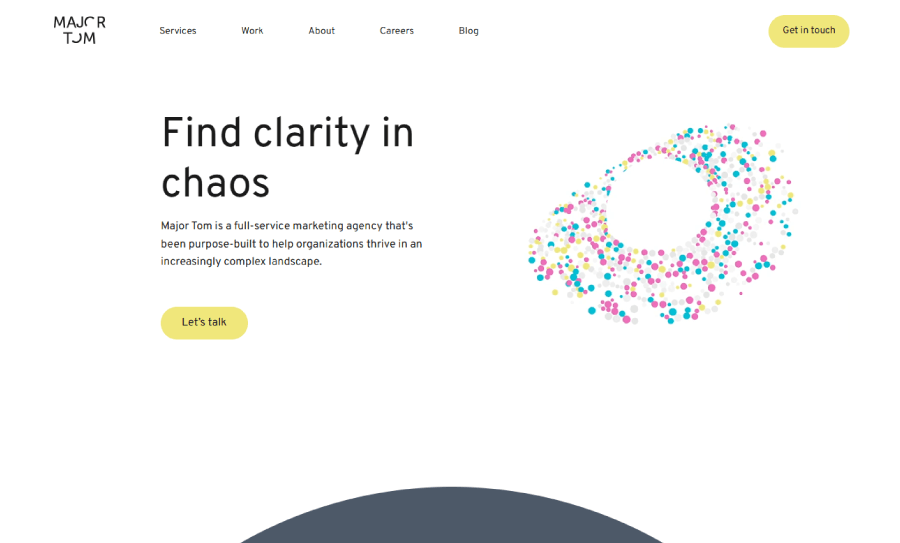
The desktop version gives you the full effect, while the mobile version keeps things light and easy to browse. Their portfolio page breaks away from the usual grid, arranging projects in circles for a fresh look.


Each one opens into a deeper dive, with just enough detail to get the point across. Everything’s easy to get to, and nothing feels cluttered. It’s clear they’ve put thought into structure as much as style.
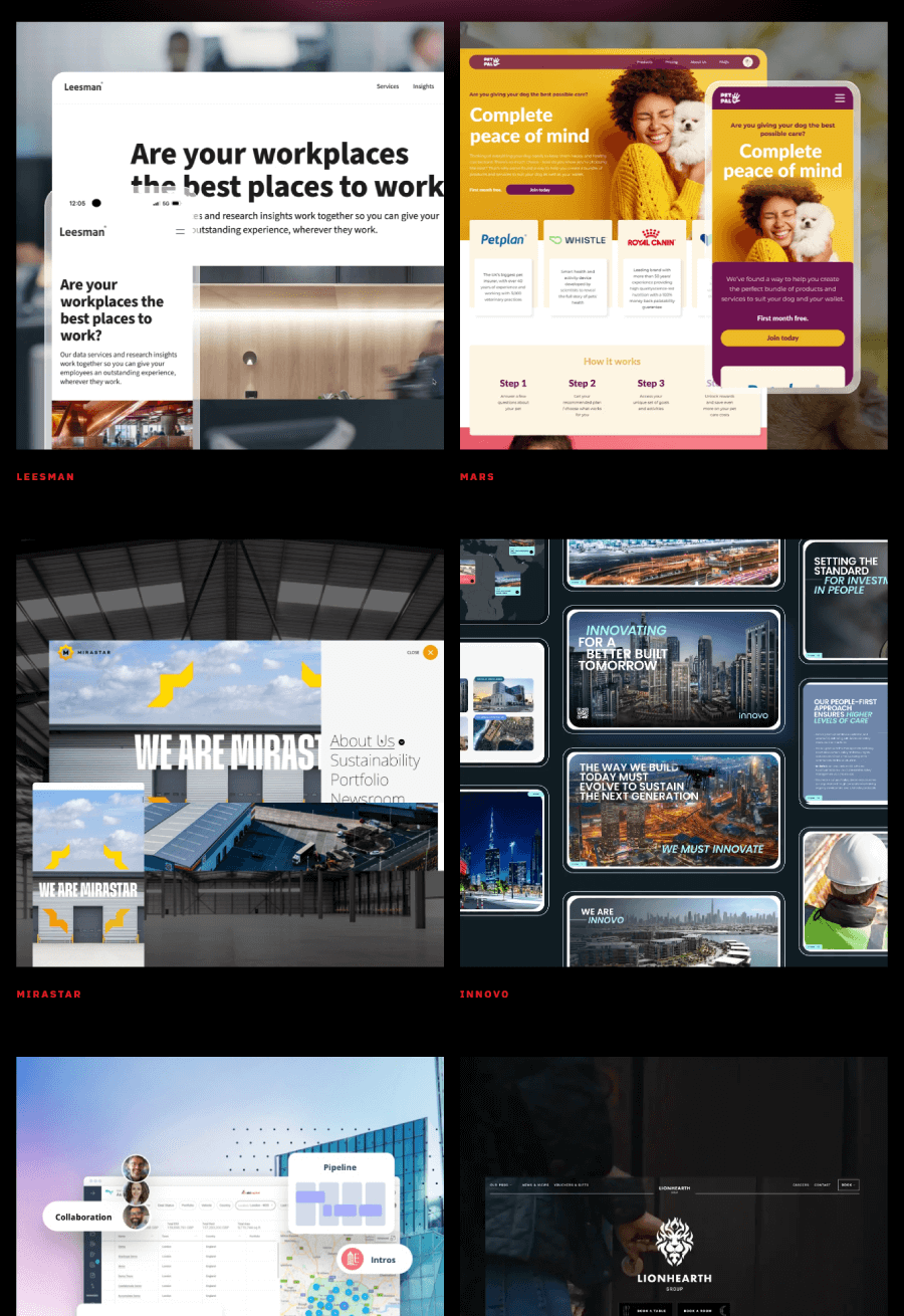
4. Epik Digital Marketing Portfolio
Epik’s site takes a pretty different route from your usual agency portfolio. For starters, there’s no “Our Work” grid with long blurbs. Instead, you scroll through looping GIFs of their projects, each one labeled with the client’s name.
It’s all about showing the end result without dragging you through paragraphs. The setup keeps things moving and gives you a quick look at what they’ve built.

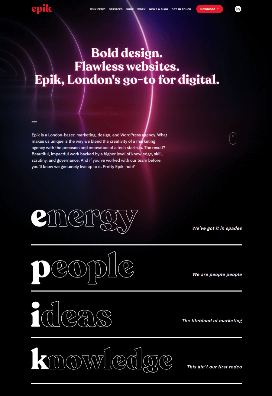

It fits with the rest of the site, which leans into a futuristic style, full of movement and slick animations. They’ve even turned their services into products in a “Shop” format, complete with names like “Coffee with Andy”, just to keep things playful. It’s not a typical portfolio, and that’s kind of the point.
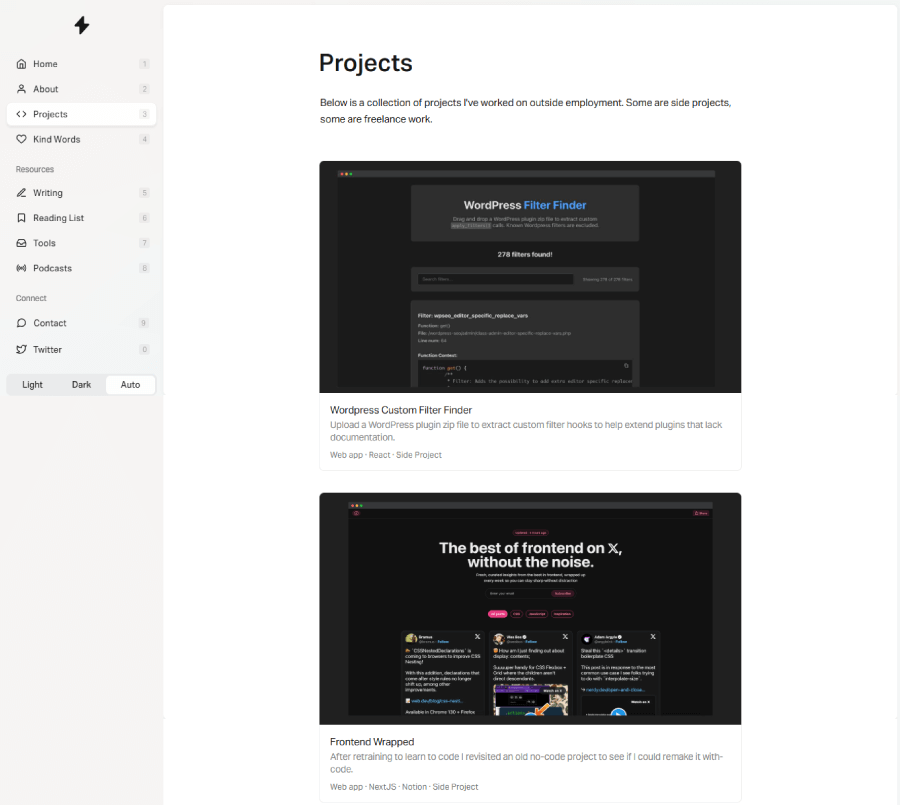
5. Adam Durrant SEO Consultant
Adam Durrant’s portfolio keeps things clean without being boring. The left-hand navigation gives the site a personal feel, and it’s easy to flip through his case studies, testimonials, and side projects without getting lost.

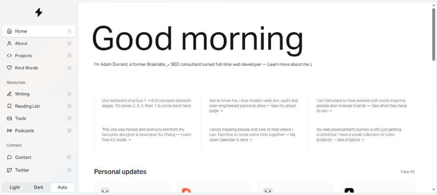
The portfolio section highlights real work in a way that feels approachable, not overly polished. You get a sense of how he thinks through SEO and web development without needing a deep dive into jargon.

The mix of live examples and kind words from past clients brings the whole thing together in a way that feels honest and human.
6. Brad Mace, Luxury and Automotive Marketing Expert
Brad Mace’s portfolio doesn’t mess around. It opens with sleek, high-end car photography that immediately tells you what kind of clients he works with Bentley being the standout.


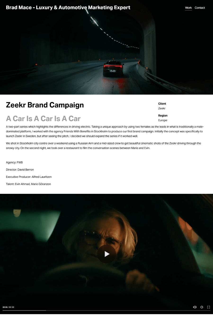
Each project page sticks to the luxury vibe, starting with dramatic visuals and then rolling into a short, focused breakdown of the work. Instead of long write-ups, the case studies rely on galleries and snapshots that do most of the talking. Navigation stays simple with a clean menu between cases, and every bit of the site keeps the spotlight on the visuals. It’s sharp, polished, and true to his niche.
7. Digicoms
Digicoms keeps things simple but effective. Right on the homepage, they lead with the brands they’ve worked with, which include some pretty recognizable names.


The portfolio leans heavily into this, using client collaborations as a way to build trust fast. You won’t find long breakdowns or dramatic case studies here.


Instead, the focus stays on the logos, the work done, and the sense that this team knows how to handle big clients. It’s a clear, client-first approach that puts their experience front and center.
8. Iceberg Projects
Iceberg Projects built their portfolio around showing range. Branding, social media, web development, digital security, it’s all there, and the way they’ve laid it out gives you a feel for how these services come together in real client work. Unlike most portfolio websites, however, Iceberg store their case studies at Behance.

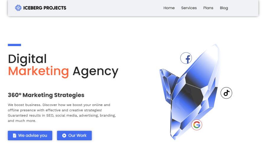
The portfolio isn’t just about style, however, as it’s also about showing they’ve got the technical side covered too. Every project reflects that mix of creative thinking and practical skill.

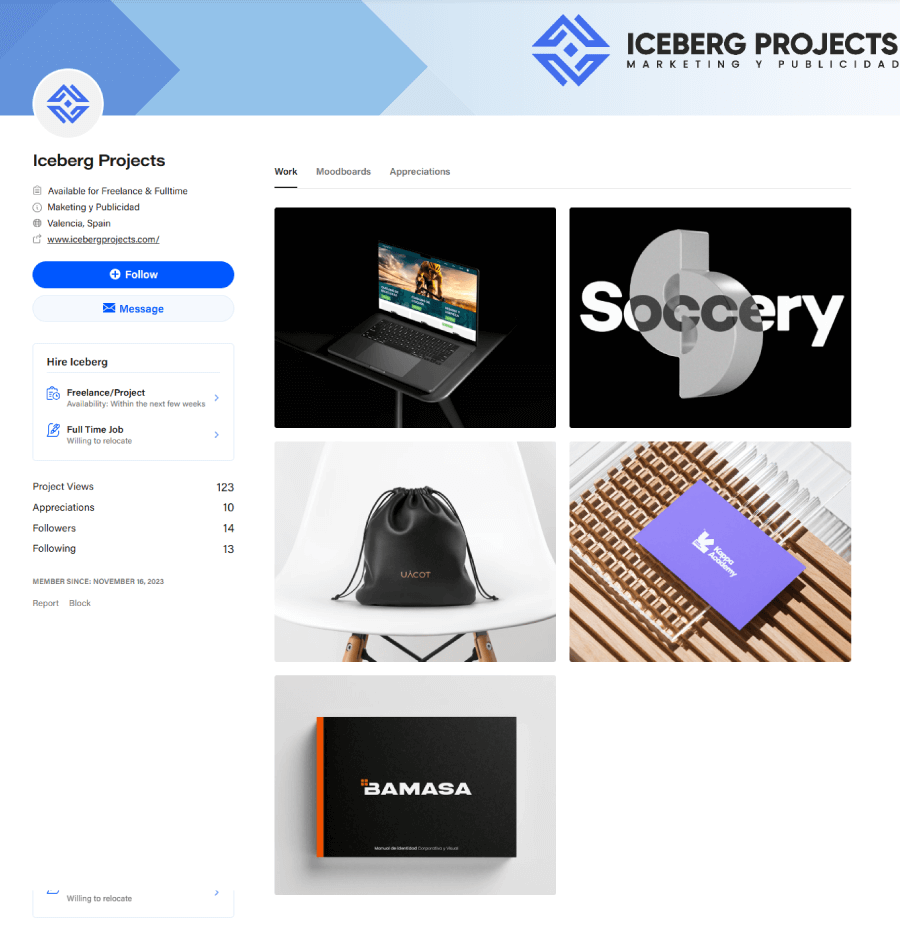

If someone’s looking for a one-stop shop that doesn’t just make things look good but also work smoothly, this site makes that clear without overexplaining.
9. Greg Kaplan Agency
Greg Kaplan’s site has that confident, no-frills style that only comes with experience. The portfolio is broken into clean sections, with a photo archive on one side and client work on the other.

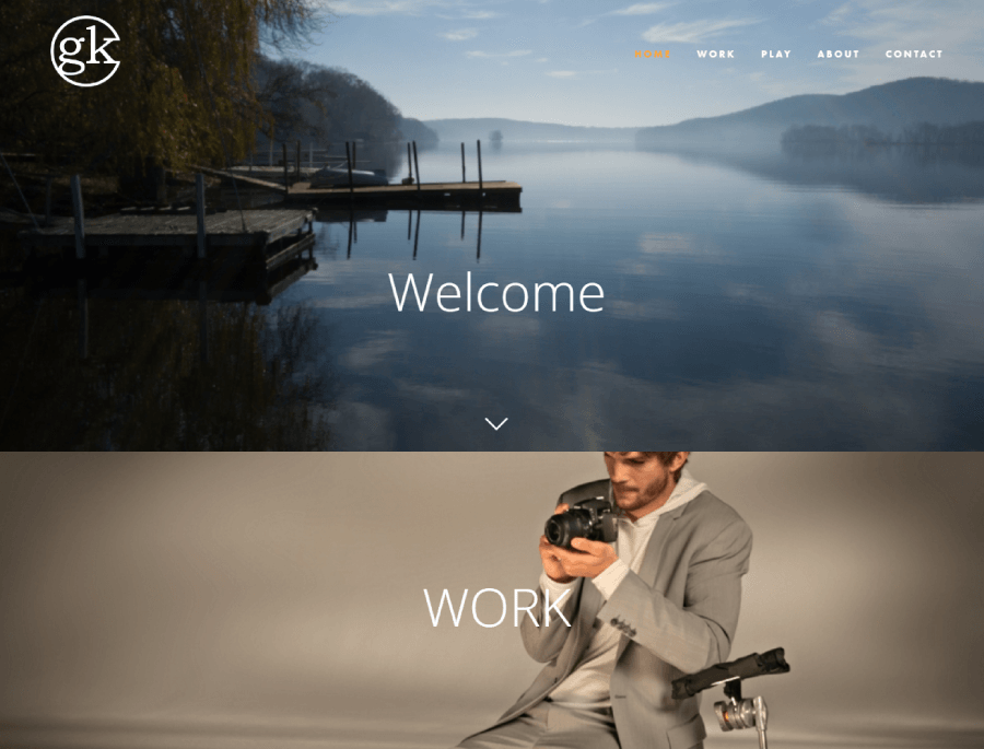
Big brands like IBM and Nikon each get their own page where you can scroll through the projects he handled for them. Instead of trying to impress with buzzwords, the focus stays on the work, sharp visuals, project context, and a consistent visual style that ties it all together.


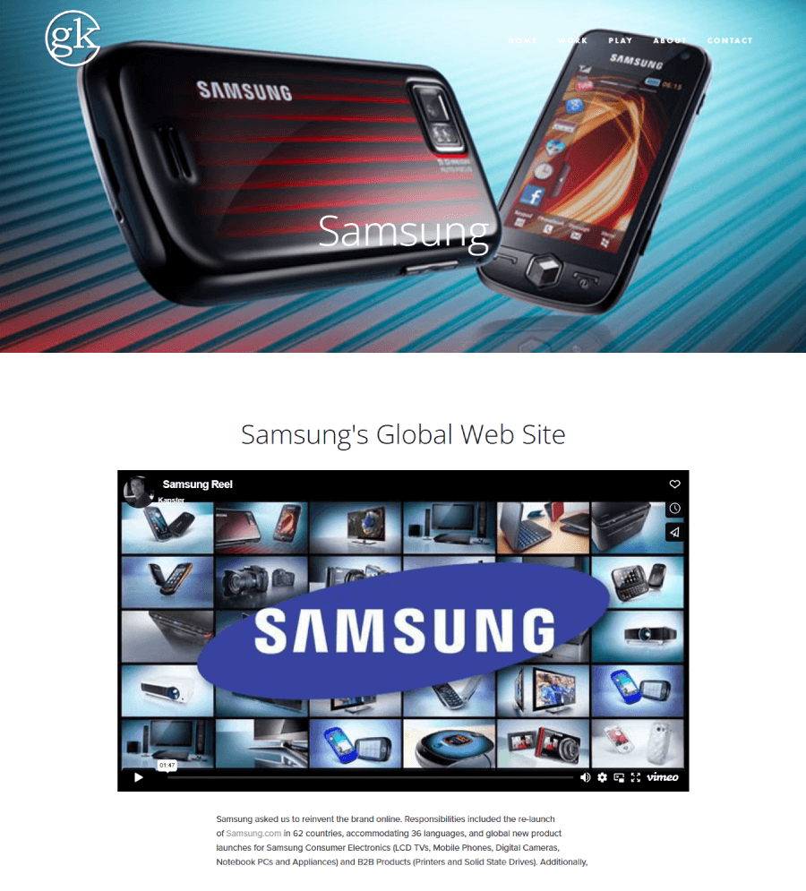
There’s even a strip of industry awards and logos tucked in, which speaks volumes without needing much text.
10. Hive Creative Group
Hive Creative Group’s portfolio is bright, playful, and full of personality. The work sits in clearly labeled sections like branding and social media, so visitors can find what they’re after without any digging.

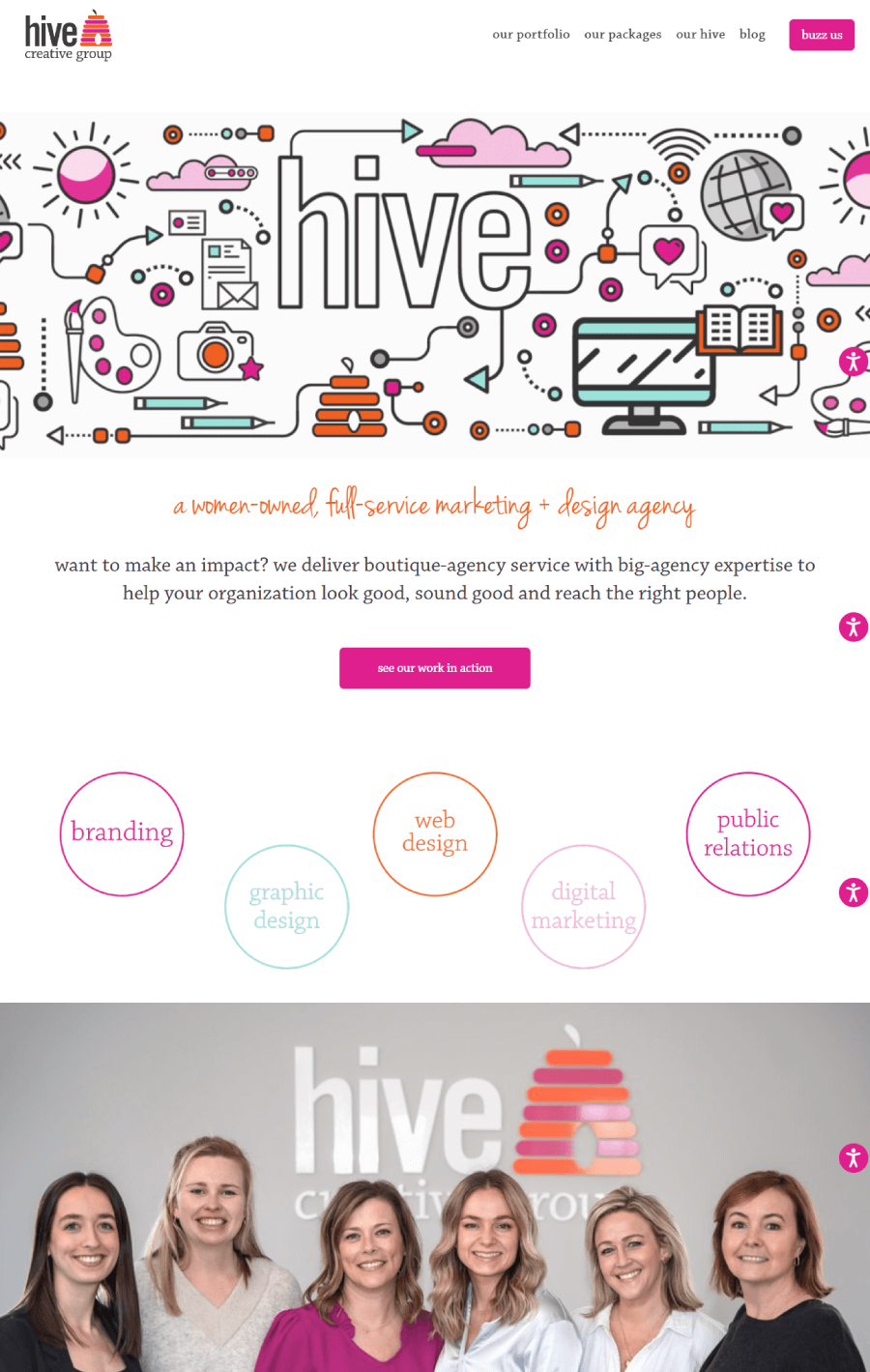

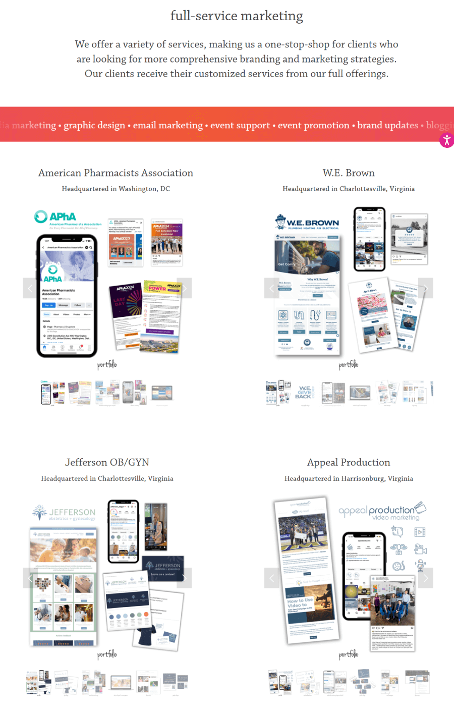
Every project page pops with bold pinks and oranges, and animated icons scattered throughout the site add a nice touch of energy. The case studies don’t just look good—they’re packed with quick stats and numbers that show how each project performed. It’s a fun, colorful space that still gets straight to the point about what this team can do.
11. Incast Marketing Portfolio Example
Incast’s portfolio takes you behind the scenes of live brand activations. Each project lives on its own page, complete with event photos, quick breakdowns of what the team did, and a follow-up section that shows how things played out.


There’s a strong visual rhythm to it—scroll effects, gradients, layered layouts, all pulled together with bright, polished design. You get a clear sense of the agency’s focus on event staffing and planning, but the real draw is the gallery-style storytelling.

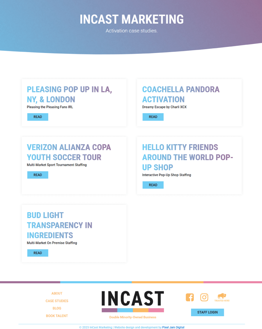

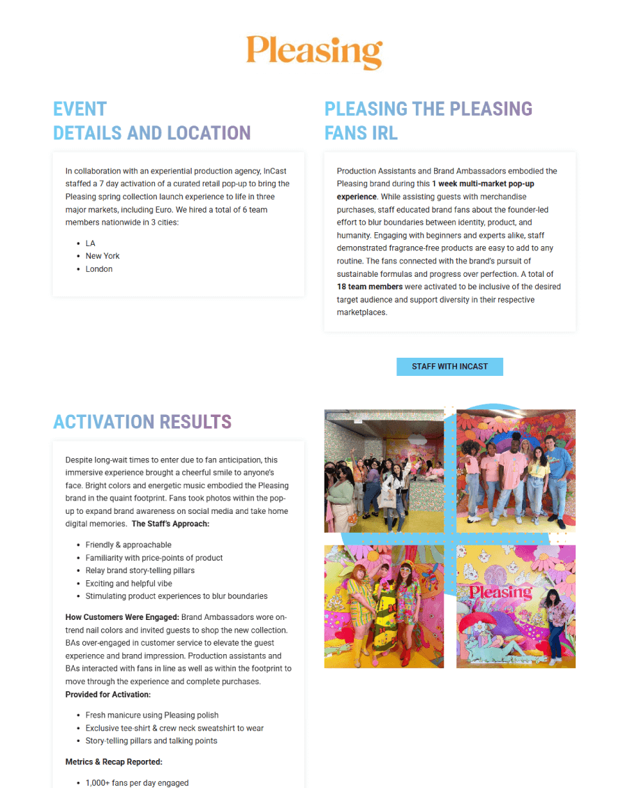
You see the events unfold visually, then get the results right after, all wrapped into a crisp case study format.
12. Lisa Hannam
Lisa Hannam keeps things clean and easy to browse. Her homepage introduces who she is and what she does, with four simple cards that split her portfolio into journalism, marketing, social, and a general “more” section.

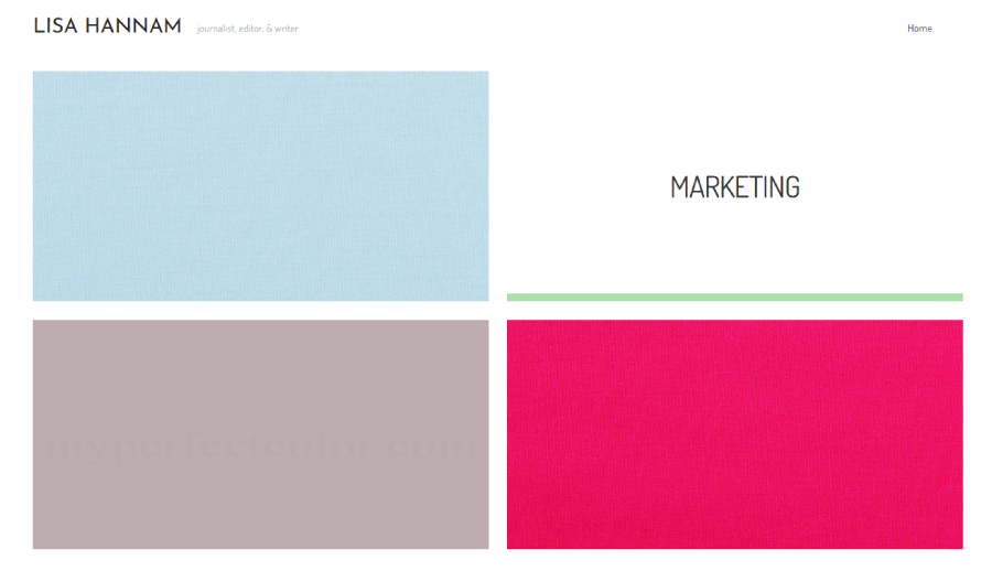
Each link opens into a gallery-style view packed with published work, laid out like a digital magazine. The site doesn’t try to be flashy—it focuses on the content, letting her writing and marketing projects do the talking.

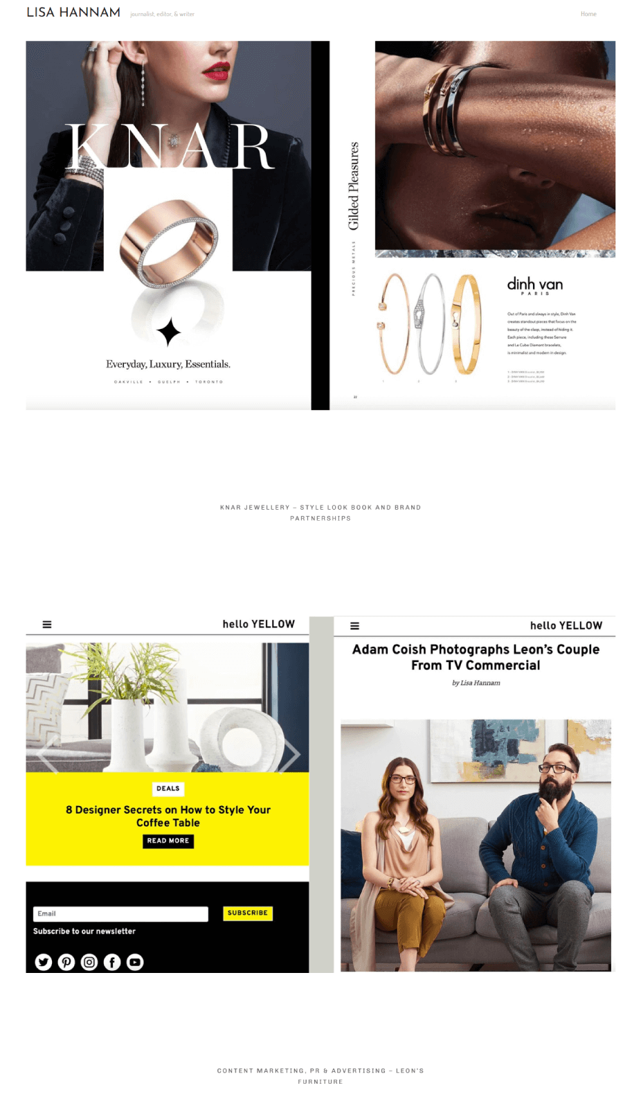

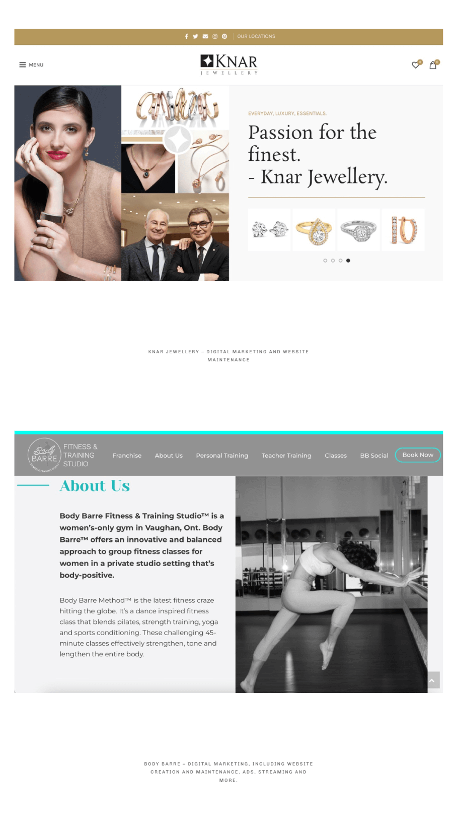
The portfolio covers a lot of ground but stays organized and inviting, so visitors can quickly see the depth and range of her work.
13. Modern B2B Agency
Modern keeps things clear-cut. Instead of layering the site with abstract messaging or overdone branding fluff, the homepage cuts straight to what matters. A quick services list, a short video from the team, and a few client logos set the scene.

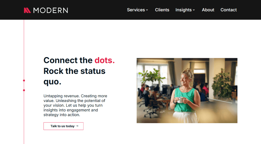
The real standout is the way they handle work examples. They don’t spread them across countless pages—instead, you get snippets of what they’ve done worked into the flow of the homepage. It’s a portfolio that doesn’t feel like a separate section; it’s part of the pitch, part of the experience.

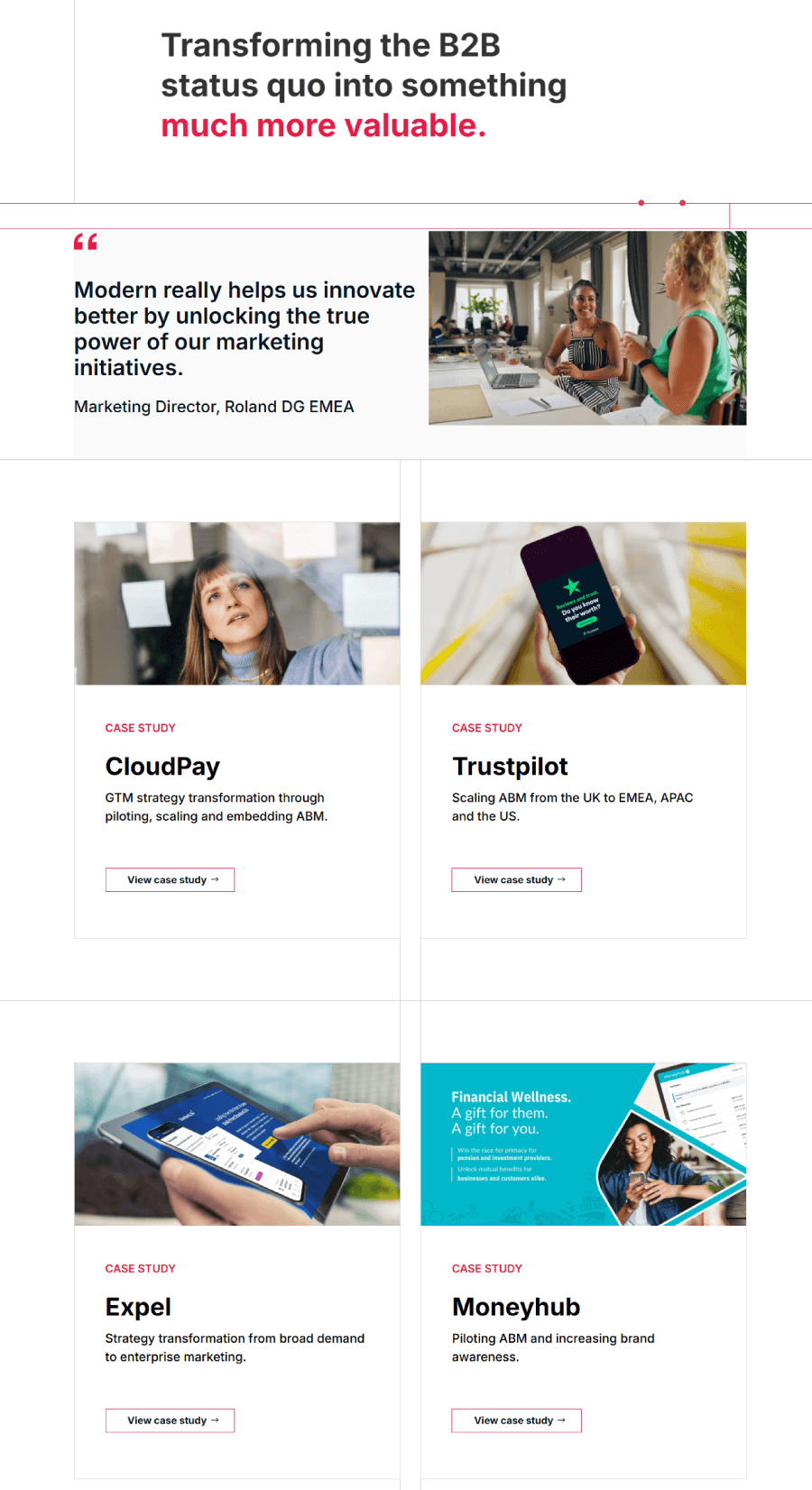

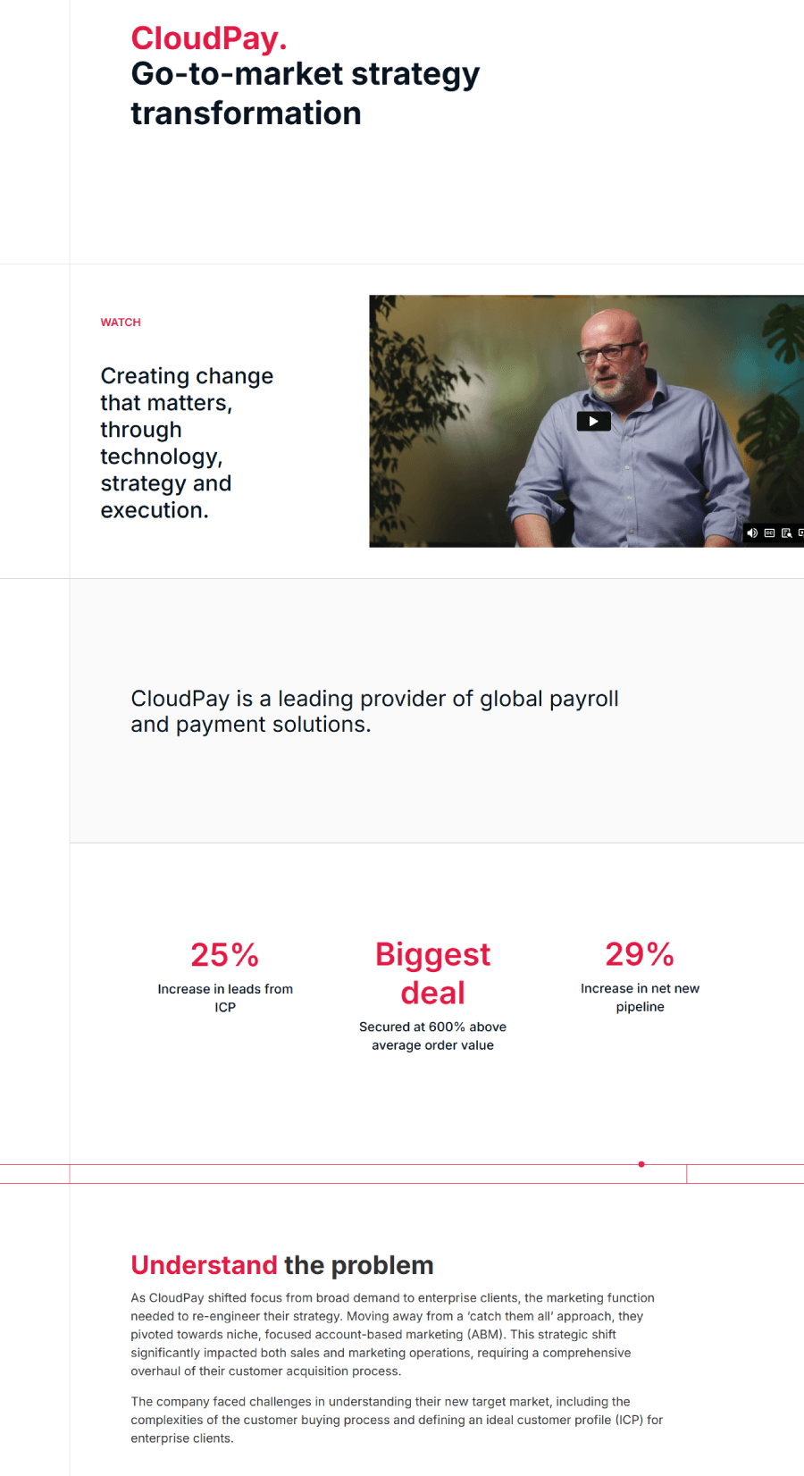
That approach, paired with their sharp white layout and subtle grid structure, makes it easy to get a sense of what the agency does, and how they do it.
14. Natania Creates Marketing Portfolio Example
Natania built a portfolio that walks the line between personal and professional. Instead of pushing everything under her name, she developed a brand that stands on its own.

That choice gives her the flexibility to shape a voice that feels bigger than a solo operation but still has her fingerprints all over it. Her work page brings together different marketing projects tied to helping women grow their online businesses in the form of courses.

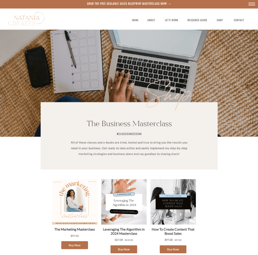
It’s styled in a way that feels modern without trying too hard.
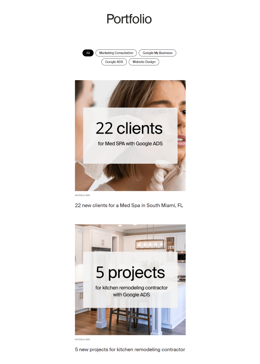
15. Offer Marketing Agency for Local Businesses
Offer’s portfolio sits right on the homepage, so you don’t have to dig to find out what they’ve worked on. A clean image slider shows off a few local projects with quick stats and campaign goals, giving you an idea of what kind of results they aim for.

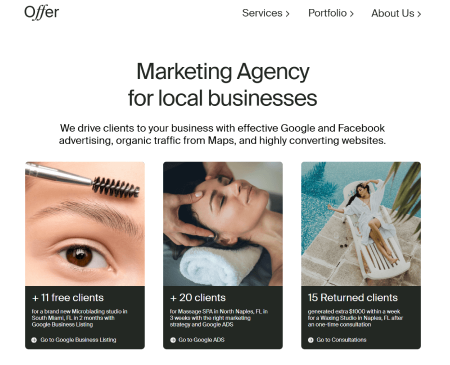
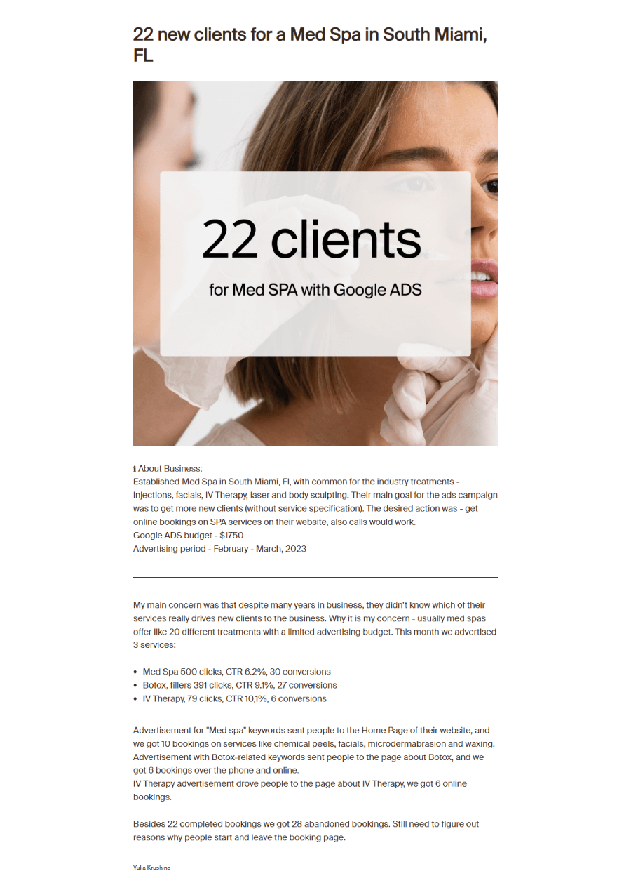
Jump into any project, and you’ll find a short story behind it, what the client needed, what Offer did, and how things turned out. The case studies aren’t overwhelming, just focused and practical. You can also filter them by service, which makes it easy to explore specific types of campaigns like web design or Google Ads.


It’s a tidy setup that fits their no-fuss, small-business-focused style.
16. RNO1
RNO1’s website makes its creative chops obvious right away. Animations, dark gradients, and that soft violet hue set the mood—but what’s really worth a closer look is the work section.

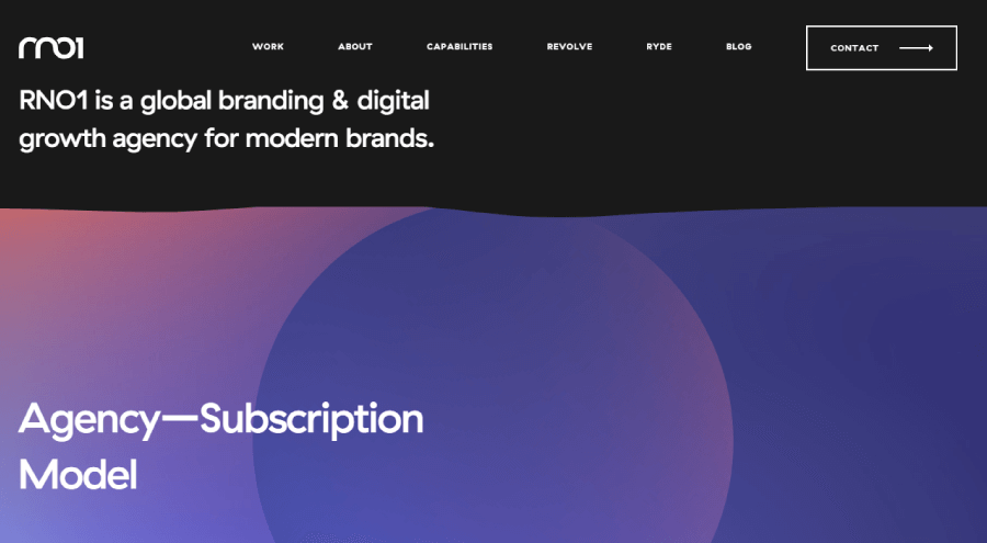
The portfolio blends bold visuals with a scroll experience that doesn’t feel like a chore. Each project page lays things out clearly: what the brand needed, how RNO1 tackled it, and the kind of result that came out of it. You’ll see a mix of tech, eCommerce, and experience design work, with interactive elements baked in to keep things engaging.

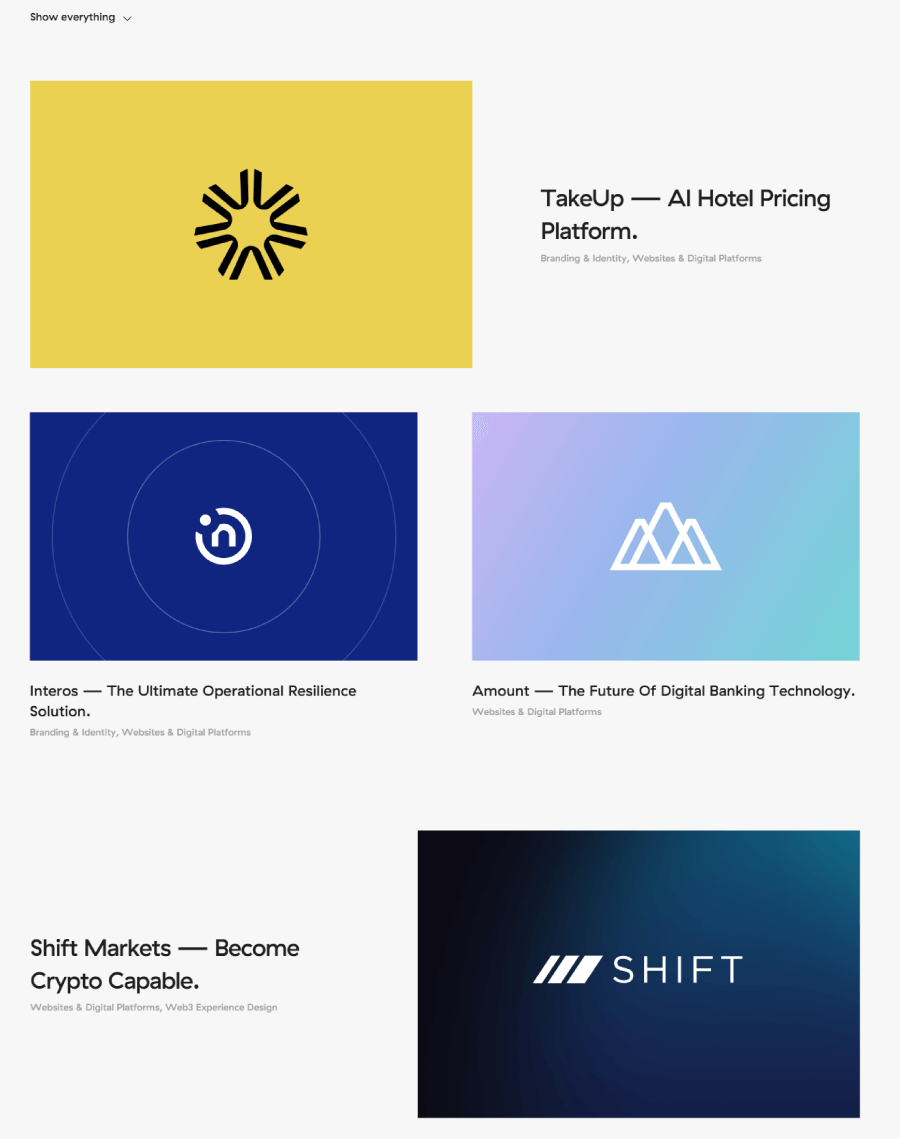

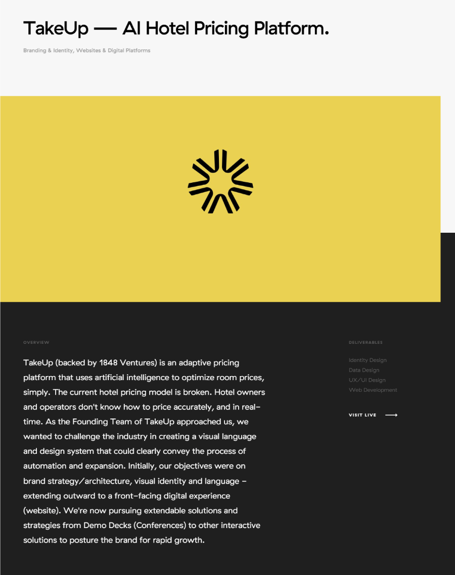
They don’t overload you with words; instead, it’s about showing what they’ve done and letting the design speak for itself. It’s clear they know their way around Web3 and immersive platforms, and the portfolio backs that up with actual examples, not just claims.
17. Space Oddity UAE One-Pager
Space Oddity keeps it all on one page and skips the overexplanations. Their site reads like a visual pitch, fast, clean, and just enough. You scroll, and the story unfolds: bits of their work, a few hints at their style, and an overall vibe that’s hard to miss.


The portfolio doesn’t sit in a separate section as it’s baked right into the site’s flow, with visuals doing the heavy lifting. Instead of listing out every project in detail, they treat the whole page like one big case study, showing what they’re capable of through the design itself. It works. You leave with a feel for what they do, even if they never say it outright.
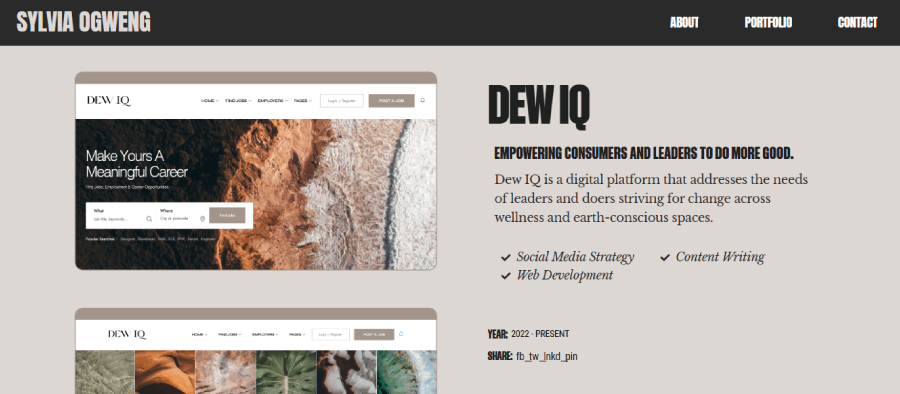
18. Sylvia Ogweng, Digital Strategist
Sylvia’s portfolio goes for clarity over flash. Her homepage gives you a shortlist of hand-picked projects, each one paired with a visual that shifts on hover,a small detail that makes it feel polished.

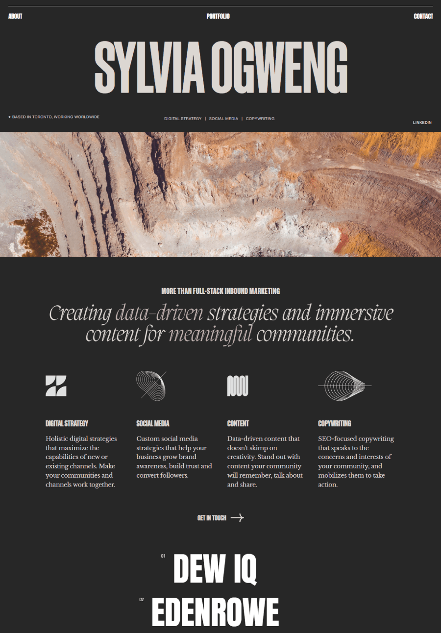

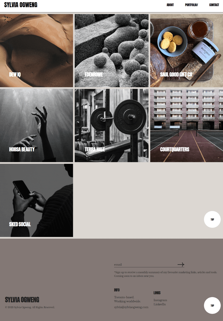
The case studies aren’t just galleries of finished work. She breaks down her role, explains the process, and adds just enough context to show the thinking behind it. She also includes a few stats and outcomes without overselling them.

The overall site keeps things sharp: bold headers, a dark theme, and just the right amount of space around everything. It’s a small portfolio, but every piece earns its spot.
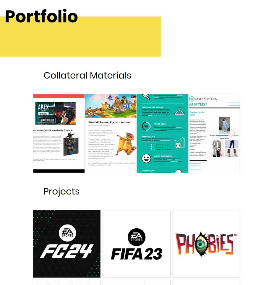
19. Victoria Nikolaeva, Digital Content and Project Manager
Victoria Nikolaeva keeps things clean and straightforward with a portfolio that feels easy to navigate and refreshingly to the point. Her work sits in tidy categories, with each project paired with a short description and a supporting image.

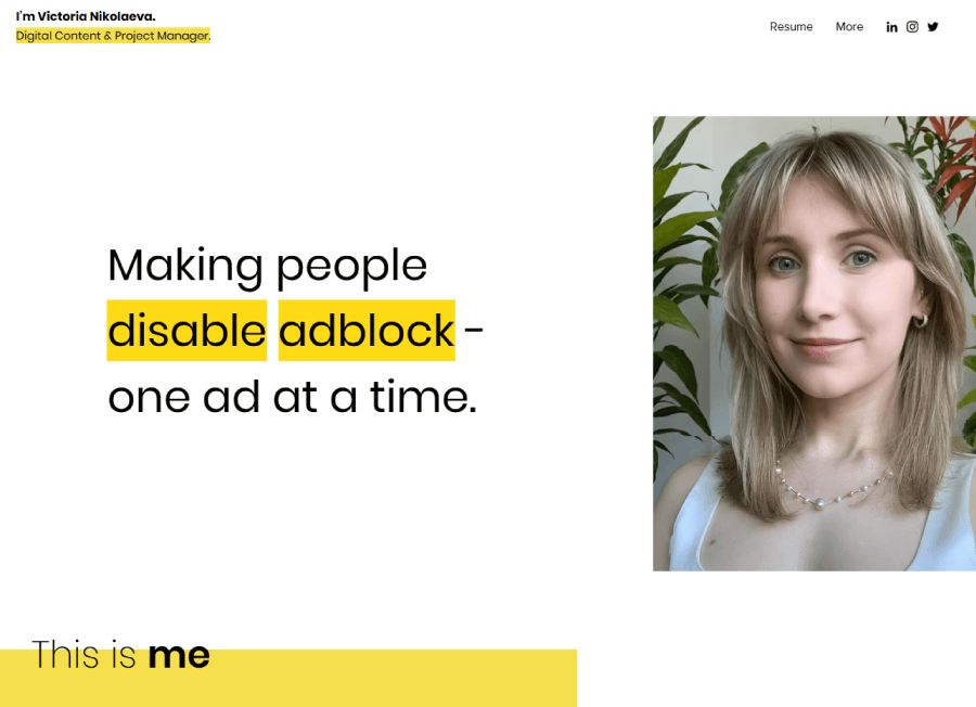
You’ll find everything from marketing collateral and campaign work to product videos, all laid out without any filler. Her site includes a full CV too, which adds context without crowding the visuals.


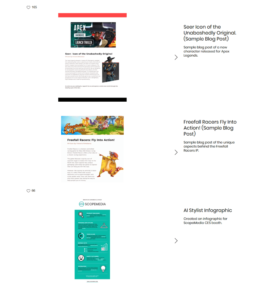
It’s minimal, but not bare, just enough design to keep you focused on the projects themselves.
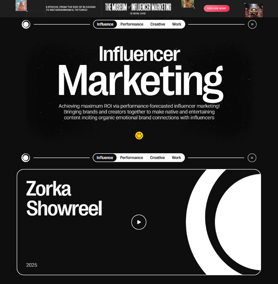
20. Zorka Agency Influencer Marketing
Zorka’s portfolio doesn’t hide behind buzzwords. Once you scroll past the cosmic animations and bold black visuals, it gets right to the point with a long list of client work.

The main portfolio section breaks things down with clickable cards, each one opening up project details right there on the page. It’s a quick way to explore their take on influencer campaigns, creative concepts, and cross-platform marketing efforts.

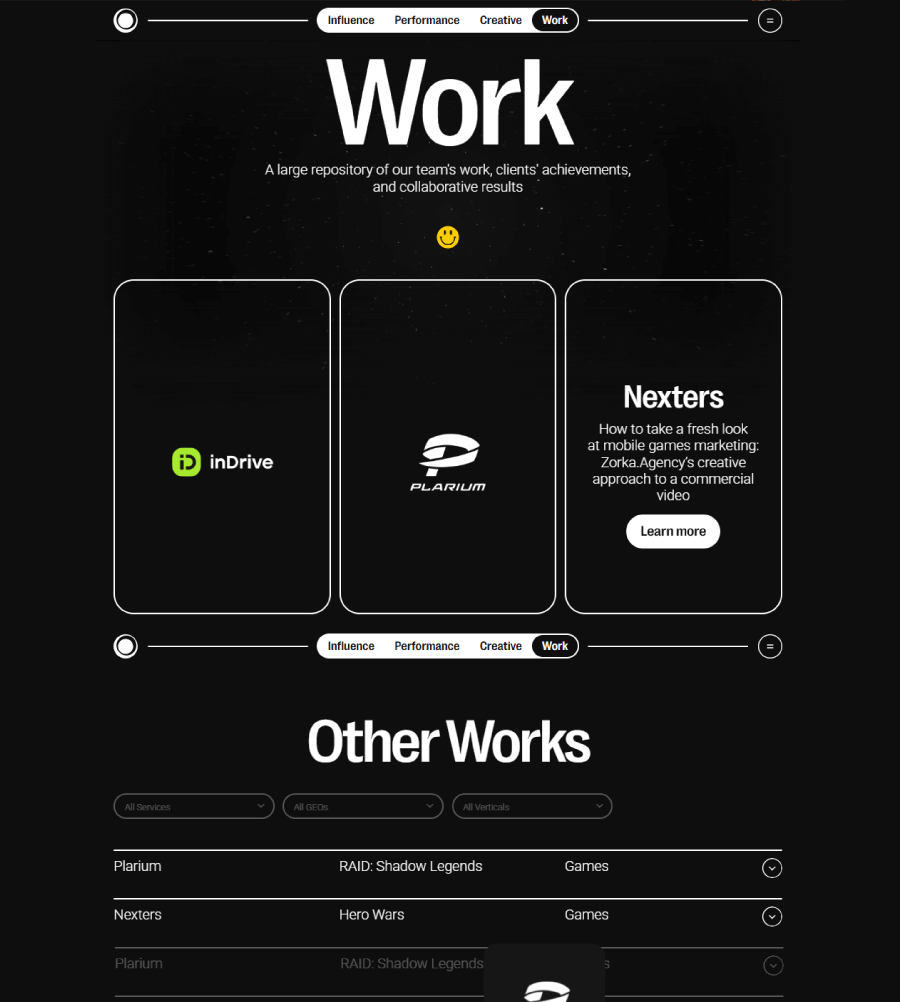

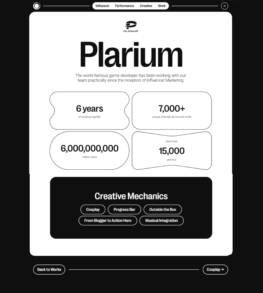
If you’re after examples, there’s plenty to look at. Some featured cases are called out with extra flair, but the overall layout keeps everything accessible and smooth to explore.
And there you have it!
That’s the lineup with 20 marketing portfolios that actually show strategy in action. Some are bold and flashy, others stay clean and minimal, but all of them make their point without overexplaining. If you’re working on your own site, hopefully you’ve spotted a few ideas worth stealing (or at least screenshotting). Keep it simple, stay true to your voice, and make sure your work speaks for itself. That’s really what it all comes down to.
Hope this gave you a bit of inspiration for your next project. If you’re still in the mood to explore, I’ve got a few more web design and marketing reads you might like: