

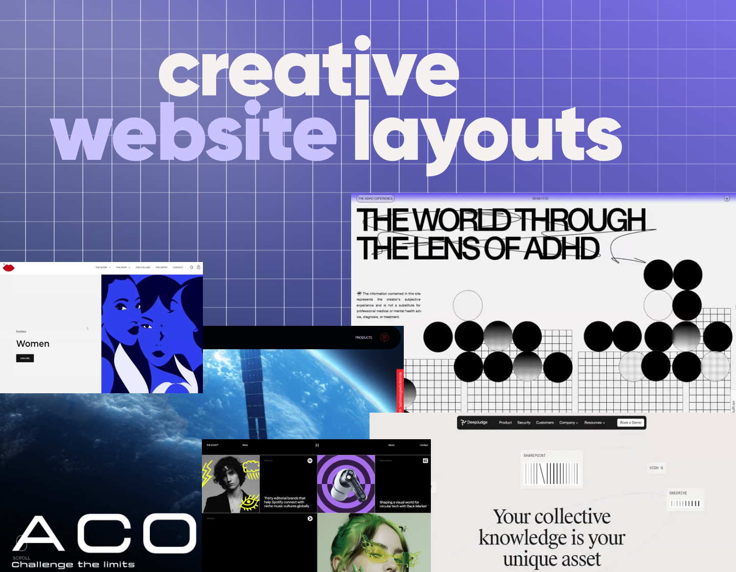

Check out these website layout ideas with a lot of real examples to help you choose the best structure for your next web design project.
When I look at a website, the layout is the first thing I notice, even before the colors or fonts. After all, it’s the structure that holds everything together as a strong layout gives the content a clear path, sets the tone, and shapes how people move through the site.
As designers, we think about things like eye movement, visual weight, and content hierarchy, because if those don’t feel natural, users get confused fast. Eye-tracking studies show that people usually start scanning from the top left, follow a Z-pattern, and focus most on what’s “above the fold”. Bigger elements grab attention first, and white space adds focus in all the right places.
With this being said, I’ll walk you through different types of website layouts, show real examples (a lot of them), and give you ideas to help choose the right structure for your next project.
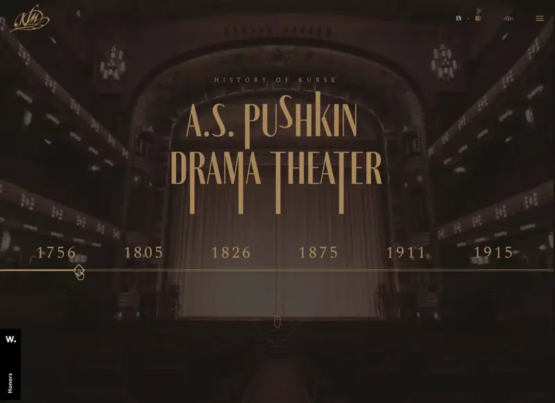
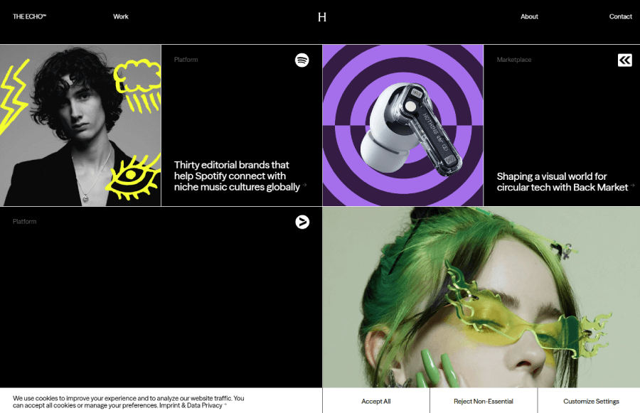
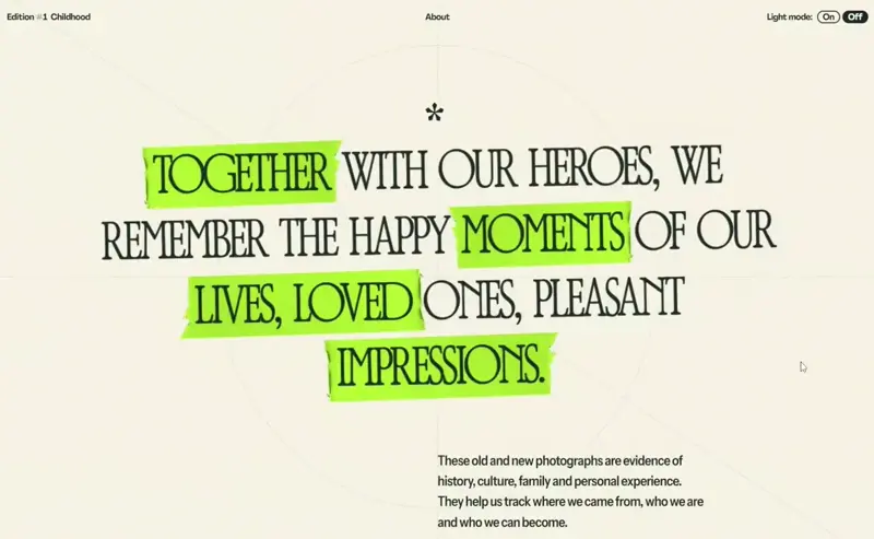
Full-screen layout ideas
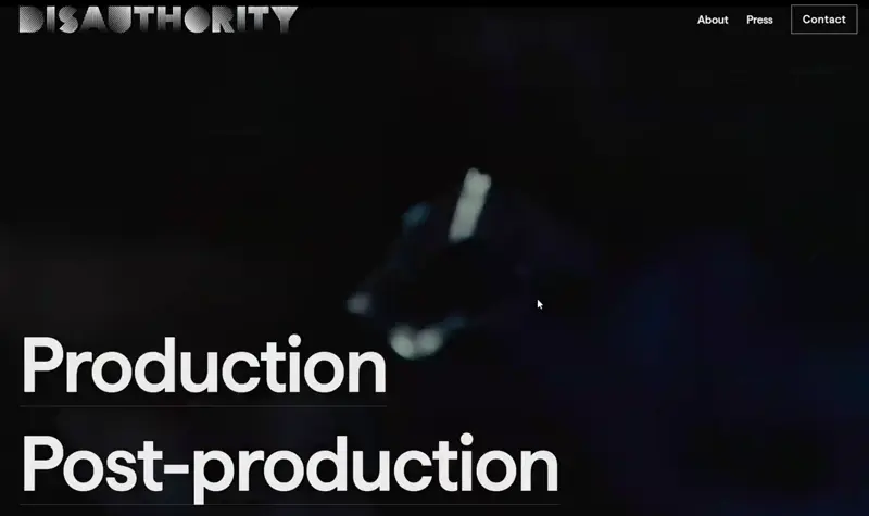
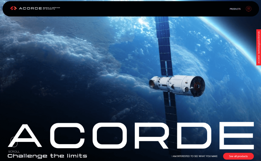
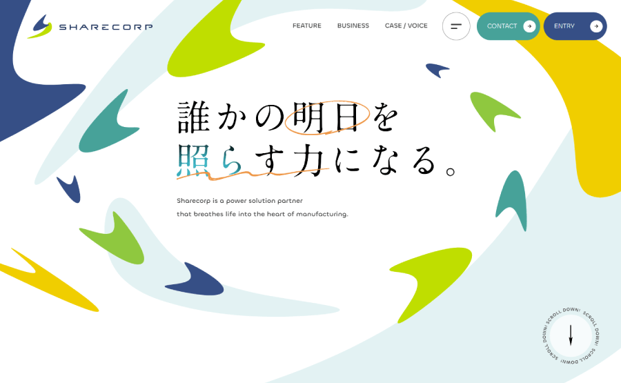
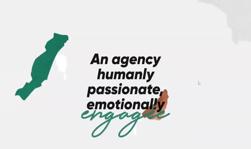
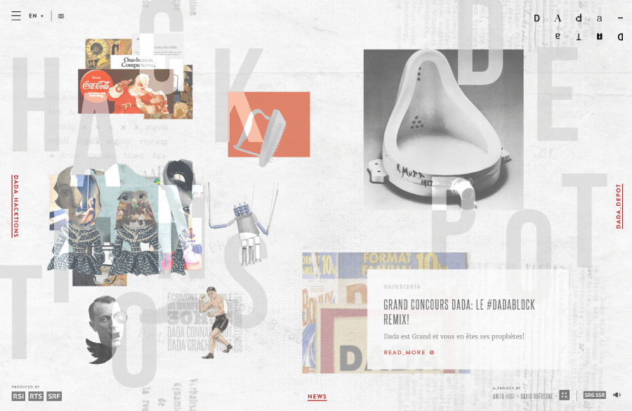
This one’s a favorite for modern websites. A full-screen layout covers the entire screen without showing a scrollbar by default. You might still scroll to get the full story, especially on sites with scroll,triggered animations, but the design feels clean and immersive right from the start. Below, I’ve included a few cool examples that use powerful visuals and animations to make the most of the full-screen setup.

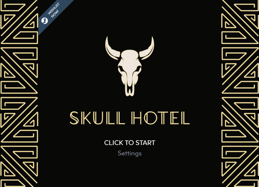

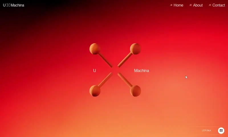
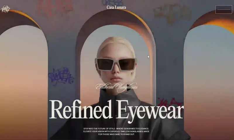
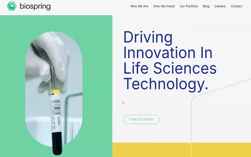
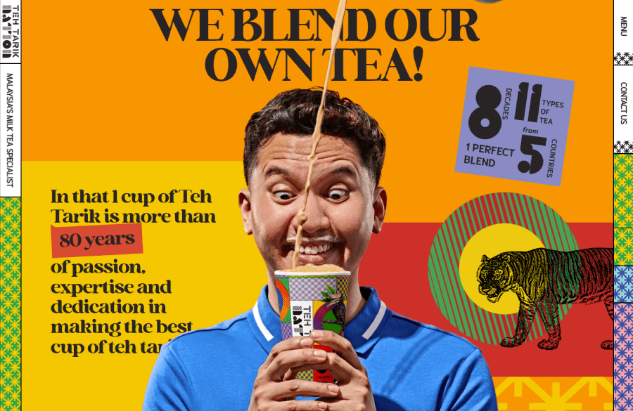
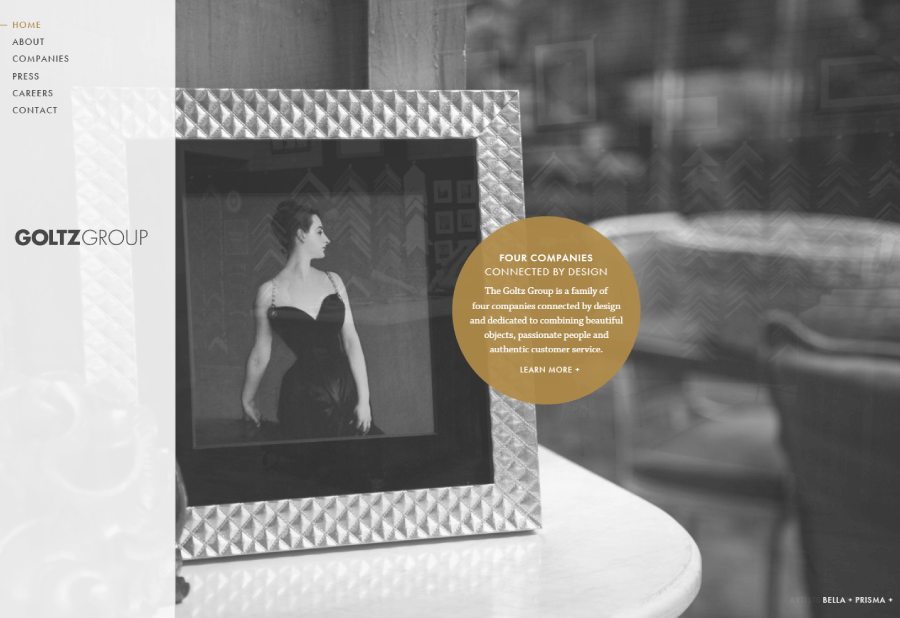
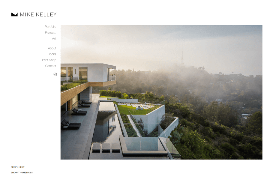
Hero layouts
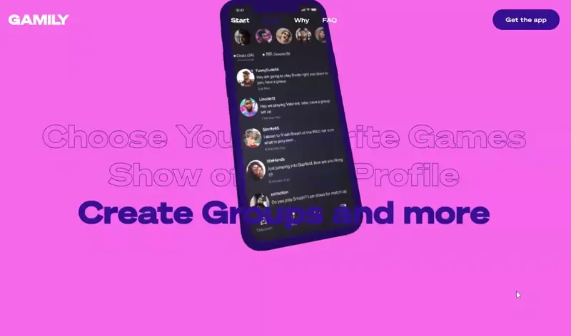
You’ve definitely seen this one around. The layout centers everything around a big, bold hero image, usually paired with some text or a headline. It sets the tone right away and grabs attention instantly. Think of Apple’s product pages with those crisp, minimal designs and full-width images; that’s the vibe.
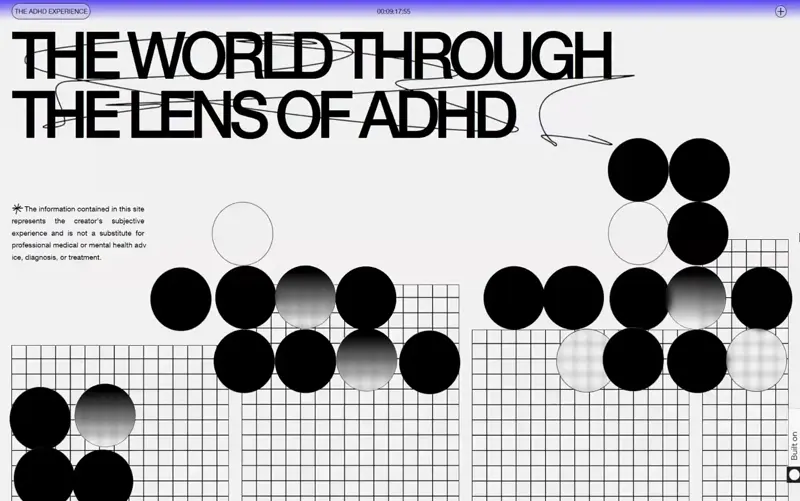
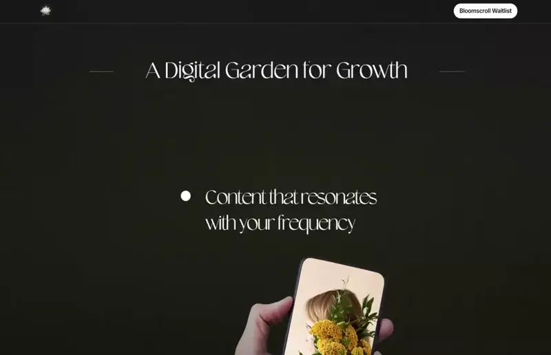


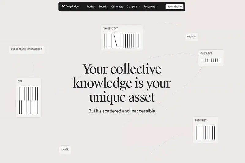
Single-column layouts
Simple, focused, and super readable. A single-column layout stacks everything in one straight line, which makes it great for content-heavy sites like blogs or news feeds. It’s easy to scroll through and works really well on mobile too, since you don’t need to adjust much for smaller screens.

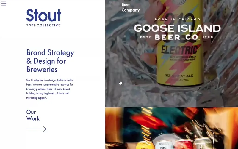
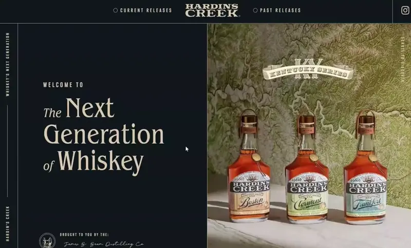
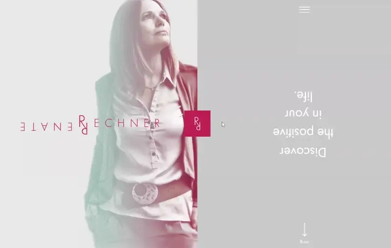
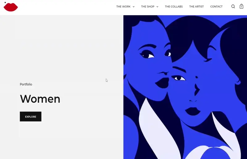
Vertical split-screen layouts
This layout splits the screen down the middle (sometimes horizontally too), creating two separate areas that share the spotlight. Since both sides pull attention equally, these designs usually keep things clean and minimal. One of the best uses? When a site needs to offer two clear paths. Think: design services on the left, development on the right. It’s visually interesting and super functional.
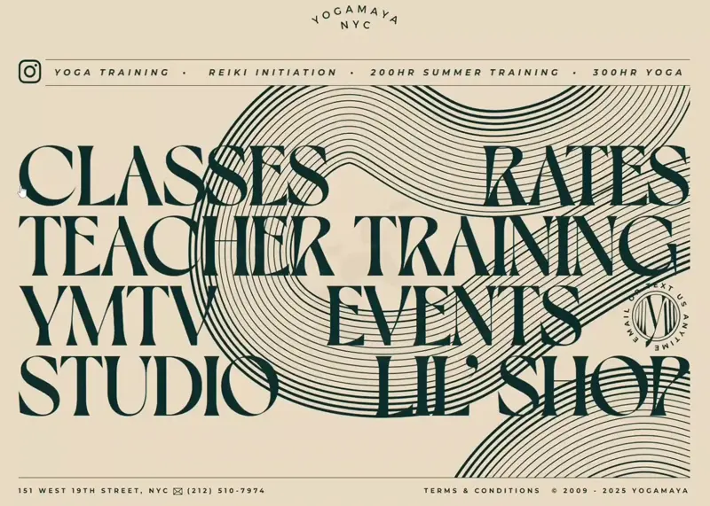
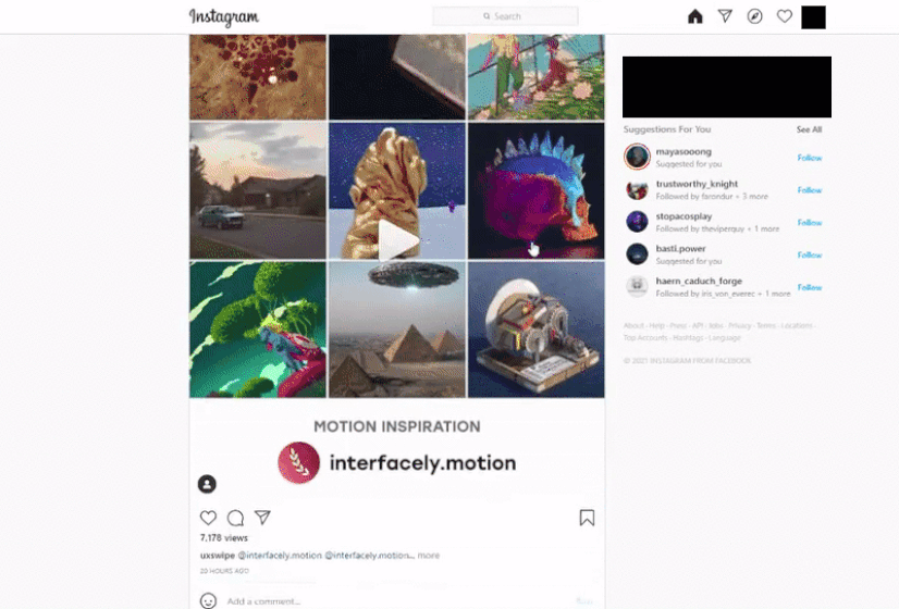
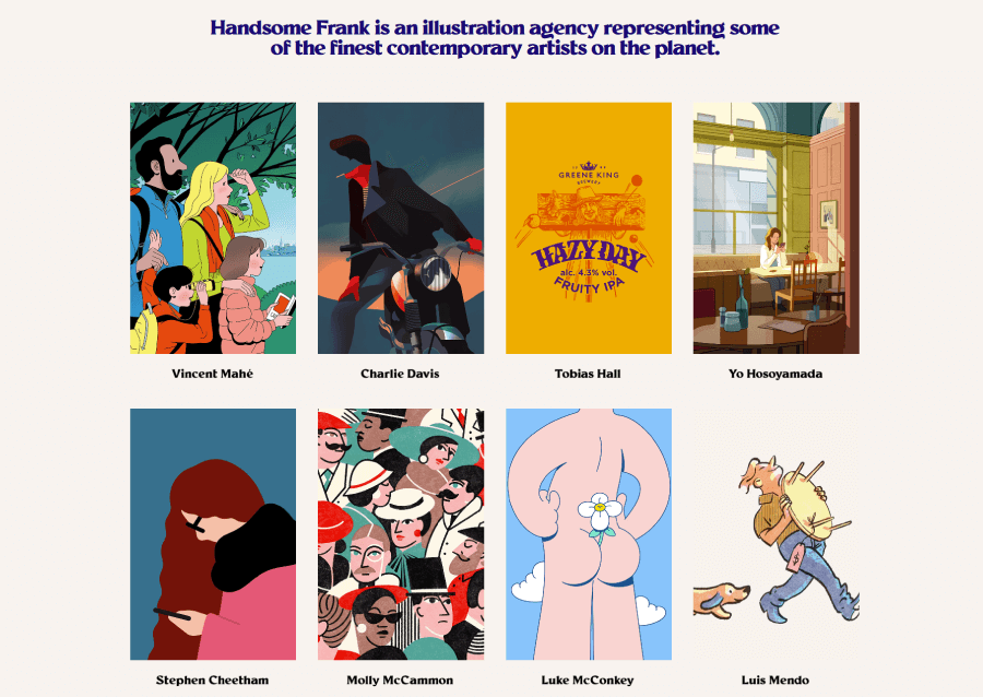
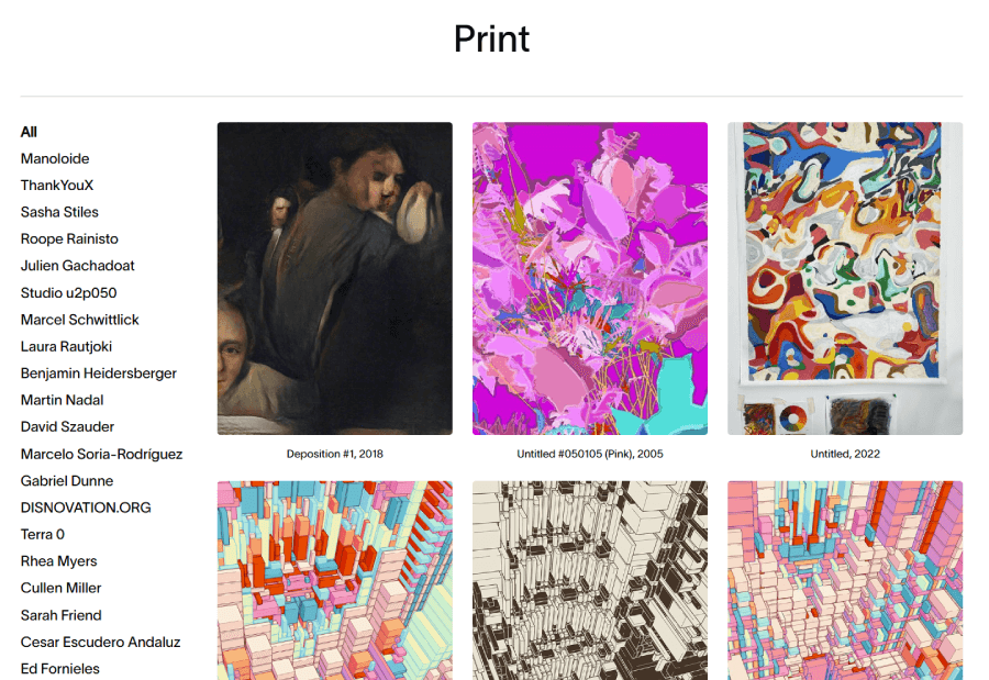
Modular grid layout ideas
Picture a page broken into neat blocks—that’s the modular grid. The structure uses both columns and rows to build flexible, evenly spaced sections. You’ll see it a lot in online stores, image galleries, or even app menus. It’s perfect for showcasing lots of content without things feeling cramped or chaotic. This kind of layout works especially well for card-based designs where visuals and short bits of text need to live side-by-side.


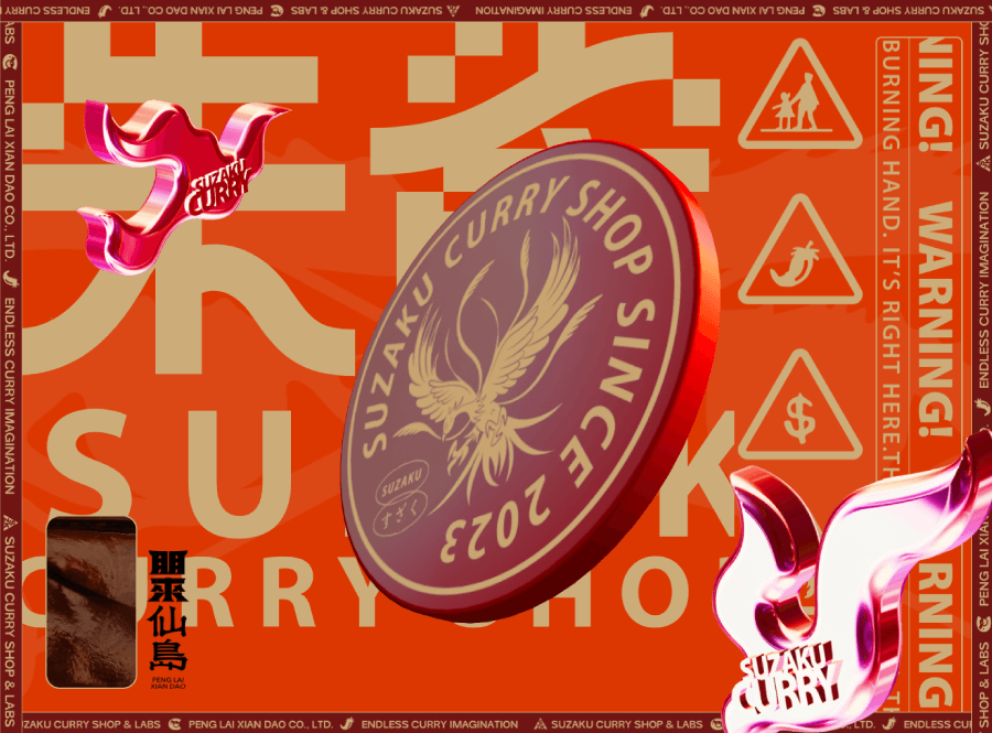
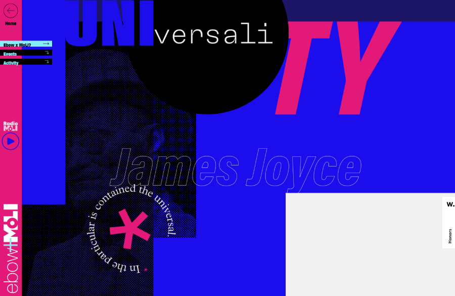
Broken grid layout ideas
Most grid systems follow a neat, predictable structure, which is great for usability but not always exciting. That’s where broken grid layouts come in. They break away from the usual rules and open up room for more creative, eye-catching designs. Think uneven alignments, overlapping elements, or surprising placements.
When done well, this kind of layout feels bold and fresh. Asymmetry, high contrast, and generous spacing help key content stand out, giving the design a sense of rhythm and visual flow. It works best when the page isn’t too crowded, so each element has room to shine.

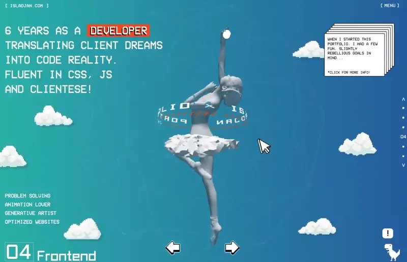


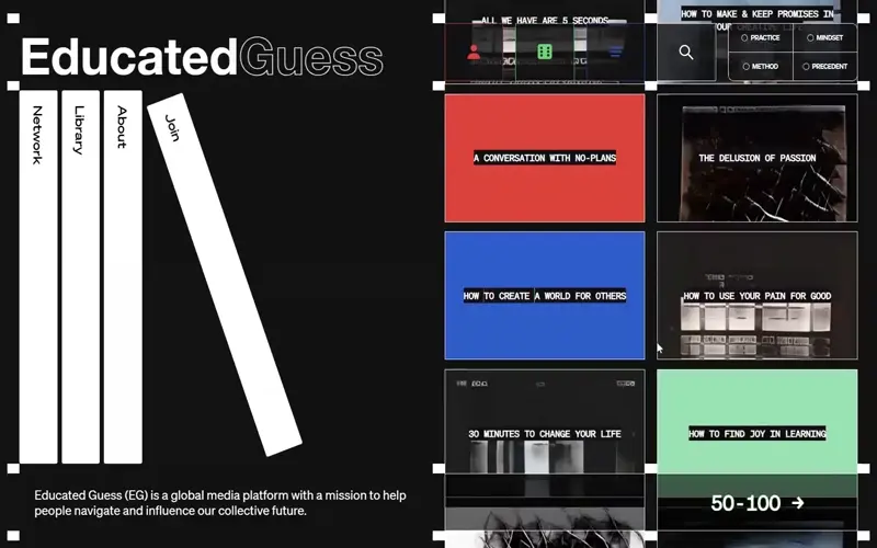
SPA-style layouts with fixed sidebars
In the case of Single Page Applications (SPAs), everything happens on one page with no reloads, just smooth transitions and dynamic content updates. One common layout style here includes a fixed sidebar. You’ve seen it: the menu sticks to the side, often on the left, and stays in place as you move through the page.
It’s a practical choice for sites with a simple structure and just a few main sections. Visitors can jump around quickly without hunting for the nav. It keeps the experience grounded, even as the rest of the page updates in real time.


Pattern-based layouts
Not all layouts are built around grids or columns, some follow the way our eyes naturally move across a screen. These are pattern-based layouts. They guide the viewer’s attention based on typical scanning habits. If your content is structured to match how people already look at screens, it’s easier to highlight what matters most.
Two common patterns show up a lot in web design:
Z-pattern

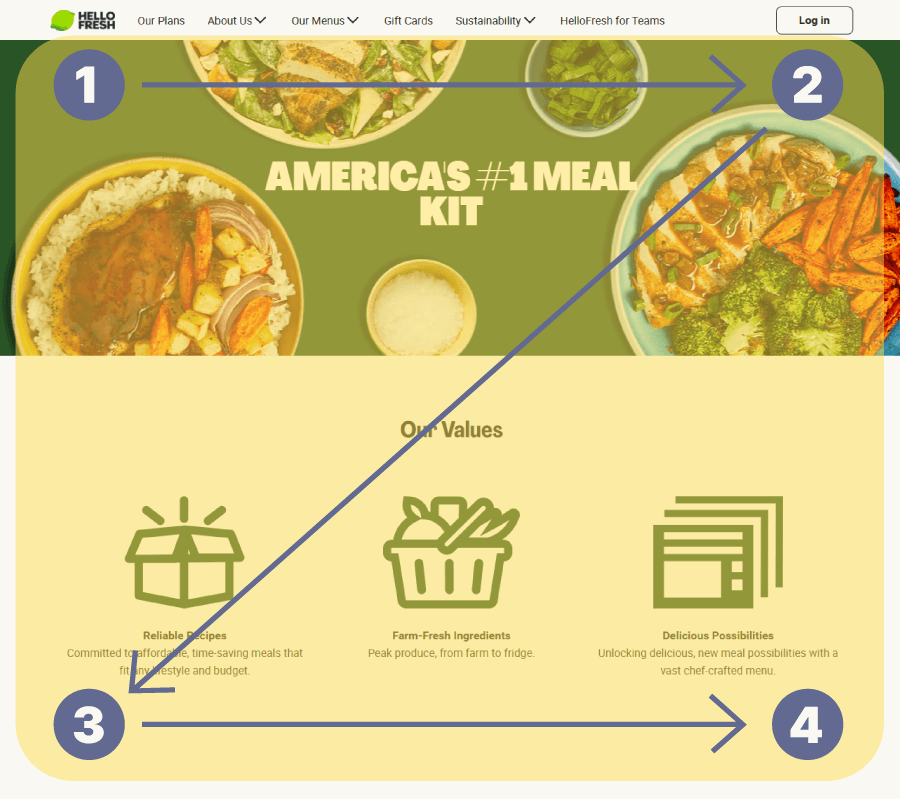
Here the eye starts at the top left, moves right, then drops down and repeats the motion. Picture a zig-zag. It’s a popular choice for landing pages or layouts with minimal text, since it leads the viewer straight through the key points.


F-pattern

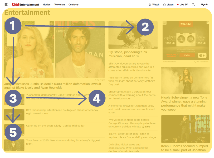
When there’s more text involved, the eye tends to scan like it’s reading left to right at the top, then down a bit, then left to right again (but usually for a shorter distance). Over time, this creates an F shape. That’s why you’ll often see headlines and menus at the top, and key navigation on the left, it just matches how people read.
And there you have it!
That’s a wrap on some of the most popular (and actually useful) website layout ideas out there. Each one has its own strengths, and the right layout can seriously shape how your content works (and feels) for your visitors.
Hope this gave you a bit of inspiration for your next project. If you’re still in the mood to explore, I’ve got a few more web design and marketing reads you might like: