

If you’re wondering about the difference between UI vs UX design, this pocket guide clears things up with everyday language, real examples, and tips from a designer’s point of view.
There are some apps that just work and others… well, that don’t. We’ve all opened an app and immediately thought “Yep, this feels right” because the app simply makes sense, the layout’s clean, and you know exactly what to do next. Then there are those other ones that make you want to toss your phone across the room. And you immediately know the difference comes down to UX and UI design.
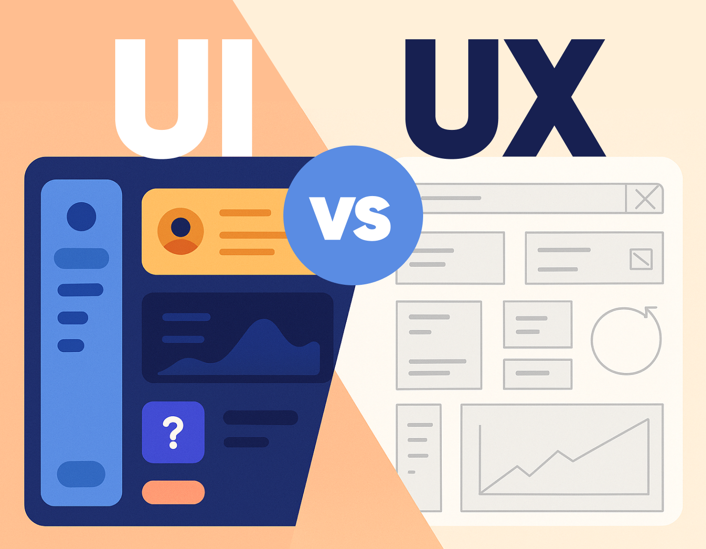
UX (user experience) and UI (user interface) are often lumped together, but they’re two different things that work side by side. The first one focuses on how things function and feel, while the other handles how they look and guides you through the experience.
If you’re not exactly sure what’s the difference between UI and UX, don’t worry, because in this pocket guide I’ll walk through what each does, how and where UI and UX connect, and what the actual work looks like for someone in either role. I’ll also run through the design process I follow when building any product that (hopefully) doesn’t drive people crazy.
Let’s start with the behind-the-scenes part of things, the UX.
What exactly is UX design?
When I think about UX, I think about the entire experience someone has while using a product such as an app, a website, or even something offline like a self-checkout machine at the grocery store. UX stands for “user experience” and its goal is to create products that are clear in their purpose and don’t make users stop and wonder what to do next.
UX isn’t limited to digital stuff either. You’ll see good UX in smart home devices, ticket kiosks, even kitchen appliances. The tech might change, but the goal stays the same- to make things make sense.
So, what do UX designers actually do?
If you’re a UX designer, you will spend a lot of time figuring out what users need, what frustrates them, and what keeps them coming back. Let’s say you’re working on a mobile banking app. First, you’ll talk to users and gather feedback to understand how they usually manage their finances. This will give you a plan for what features go where, and how they’re grouped.
From there, you’d sketch out wireframes that show where each part of the app will live. You’ll also map out how someone might move through the app, from opening it to transferring money or checking their balance.
Once that’s set,you’ll move to testing the app with real people b giving them the early version so they could point out what feels clunky or confusing. Obviously, you’ll consider the feedback and improve the app accordingly.
The UX designer’s to-do list
There’s a bit of everything in there, but here are the basics you’ll usually cover:
✔️ Planning and strategy
Start by defining user goals and thinking through how someone might interact with the product from start to finish. Everyone involved in the project needs to be on the same page before anything else happens.
✔️ Research
Talking to users, digging into pain points, checking out competitors. It all helps me understand what’s working and what isn’t.
✔️ Organizing content
This is where information architecture comes in. You will structure the content so it’s easy to find and understand.
✔️ User journey mapping
Here you lay out the steps users take to reach their goal. If there are any roadblocks, you will be able to spot them early.
✔️ Wireframing
These are basic outlines of screens that show where everything goes. It’s low-pressure and easy to adjust as well as very useful for early feedback.
✔️ Testing and adjusting
Once you have something that works on paper, put it in front of real users and take notes on what works and what doesn’t, then keep tweaking until it flows.
What exactly is UI design?
UI design is when you land on a website or app and immediately know what to do simply by the arragement of shapes and colors. It involves the design of the screens, buttons, text, and visuals you interact with, how it reacts when you tap, scroll, or hover. UI also makes sure you’re not squinting at text, hunting for a menu, or wondering what a random icon is supposed to mean.
Think about any app you use regularly. The font size, button shapes, colors, spacing, animations, all of it has been picked and placed for a reason.
What do UI designers actually do?
If you were designing, an online store, most likely your first instinct wouldn’t be to slap a bunch of pretty buttons on the page. Instead, you’d start by figuring out how people are likely to browse, what they’re looking for, and how to get there as quickly as possible just by a single glance at the screen.
You’d look at things like:
- Which colors and fonts match the brand and still keep things readable
- Where buttons should go so they’re easy to find (and easy to tap on mobile)
- How to keep everything accessible for different users
- Which little animations or transitions could make the whole experience better
And once the design’s in a good spot, I’d be building out detailed mockups, testing out prototypes, and working side-by-side with developers to bring the whole thing to life.
The UI designer’s to-do list
Here’s a more organized breakdown of what usually falls under the UI designer’s job:
✔️ Research
Before touching a single pixel, you can start digging into what users expect, check out what competitors are doing, and scroll through loads of design examples for inspiration.
✔️ Visual design
This includes laying out pages, choosing typefaces, setting up spacing and grid systems, picking colors, and designing icons, buttons, and graphics that feel cohesive.
✔️ Animations and micro-interactions
These are the little touches like hover effects, click animations, subtle transitions.
✔️ Branding
A product’s visual style has to match its brand. That means taking things like logo colors, fonts, and tone, and working them into the interface without going overboard.
✔️ Style guides
The best practice for creating any sort of digital product is to build a style guide or design system that spells out exactly how every element should look and behave so everyone’s on the same page. This will keep the design consistent across the entire product and other products from the same brand.
✔️ Prototypes
Before a design goes live, you can build high-fidelity mockups and clickable prototypes to test with users and tweak based on feedback.
✔️ Collaboration
Nothing gets built in a bubble so talk with your developers constantly to make sure the design is doable.
Where do UI and UX overlap?
People mix up UI and UX all the time and I get why. They’re both part of the same design process, and they often happen side by side. Even though the focus is different, the two roles are closely connected.
Here’s where they overlap, in a nutshell:
- Both UI and UX keep users front and center.
- We’re both involved in planning how a product works.
- Research is a big part of the process for both roles.
- UI and UX designers work together to make sure things look good and feel good.
- Each step they take adds up to the final product.
Take a website, for example. I might start with the UX side by figuring out what people need from the site, what features are must-haves, and how users should move through it. Once that’s in place, a UI designer will decide on the layout, pick the colors and typography, and make sure everything is consistent and clickable.
Where do UI and UX differ?
I like to think of UI as everything users see and touch, while UX is more about what they feel as they interact with a product.
A UI designer would break things down into steps:what the user sees and does at each stage.The UX designer, on the other hand, would take a step back and think: What’s the actual goal here? Why is the user even on this page?
There’s a technical side too. UX usually starts with wireframes and flows, while UI comes in later with the high-fidelity designs, where everything looks polished and ready for real-life testing.
So to sum it up:
- is what people see and interact with.
- handles the details of each screen.
- follows visual trends and user preferences.
- brings in the art.
UX…:
- is what they go through while using the product.
- shapes the structure, flow, and feel of the whole product.
- dives into user behavior and market context.
- brings in the empathy.
A step-by-step UI/UX design process
There’s a pretty reliable process that is a mix of research, wireframing, design, testing, and collaboration. While the steps stay mostly the same, how deep you go into each part depends on the project. Here’s how you will usually approach it:
Step 1: Start with research (UX)
Begin by digging into the basics: what the market looks like, who the competitors are, and what users actually need because you’ll want to make sure I’m solving the right problem from the start.
Step 2: Talk to stakeholders (UX)
Next, chat with the people behind the project. That could be clients, product managers, or whoever is driving the vision. Together, you will figure out what goals you’re targeting and what success should look like for both the users and the business.
Step 3: Build the information architecture (UX)
Time to start working on the layout of the content and the navigation. During this part you will organze things in a way that makes sense to the user. You can sketch out some wireframes to show the rough structure and flow.
Step 4: Test the Flow (UX)
Once those early sketches are done, try out the user journeys. Here you can look for anything that feels off or confusing and make adjustments. This phase helps catch issues before they turn into big design problems later.
Step 5: Bring in the UI designer (If It’s a Team Project)
At this point, if you’re working with another designer, this is usually when they take over on the UI side. If you’re doing both roles, you’ll shift your focus from structure to style.
Step 6: Explore visual styles (UI)
Now it’s time to figure out the look. Start by researching current design styles, experiment with color palettes, test out fonts, and think about which visuals will best match the brand and audience.
Step 7: Style the screens (UI)
With the groundwork done, you can start applying the visual elements: page layout, spacing, typography, imagery, icons, and all the rest. This is where everything starts to look real.
Step 8: Add the micro- interactions (UI)
Add subtle animations, hover states, and transitions to make things feel smooth and responsive. Once that’s done, you have everything you need to build a high-fidelity prototype that shows what the final experience will feel like.
Step 9: Test the final prototype (UI)
Back to testing. I review how everything works together and check for any friction in the flow. If something needs fixing, I revisit the design and make changes before moving forward.
Step 10: Handoff and developer collaboration (UI)
Once everything is good to go, pass the final prototype to the dev team. But I don’t just hand it off and disappear. It’s important to stick around to answer questions, make tweaks, and make sure the final build matches the design.
A practical example of UI/UX design process for a social media app
Let’s say you’re a UX designer on a team building a new social media app for niche hobbyists, something like a mix between Reddit and Instagram. Here’s how you might approach it:
1️⃣ You start with research.
Before you touch a screen or make a wireframe, you run a competitive audit. You check what platforms like Reddit, BeReal, and Discord are doing well and where users feel frustrated. You run user interviews (or at least scrape reviews and feedback from Reddit or app stores) to understand pain points like content overload, awkward onboarding, or confusing privacy settings.
2️⃣ Then you define the core user flows.
You map out what needs to happen in the app: creating a post, browsing content, commenting, following others, managing privacy, etc. Then, build simple user flows using tools like Whimsical, FigJam, or even just pen and paper. You identify the “happy path” but also outline edge cases like what happens when a user tries to comment without logging in.
3️⃣ Next, you structure the product.
You make a sitemap and layout the information architecture. You decide how to group screens and which features live in the main nav. Maybe you’re going with a bottom tab bar: Home, Discover, Create, Messages, Profile. You justify it based on how people hold their phones and prioritize the features they’ll use daily.
4️⃣ Now you wireframe.
You build low-fidelity wireframes in Figma. You block out the layouts for core screens like the post feed, comment threads, direct messages, and onboarding. You’re not picking colors or icons yet, because you’re focused on layout, hierarchy, and interaction patterns. Note that you should also annotate the wireframes to explain intended behaviors (for example, “tap to expand comment thread”, “Swipe left to dismiss”, etc).
5️⃣ You test early.
You run quick hallway usability tests or remote feedback sessions using Maze or Useberry and watch where people get stuck. Maybe no one notices the “Create Post” button because it blends into the nav. You adjust the placement or the icon to fix that.
6️⃣ You hand it off to the UI designer.
Or (if you’re also doing UI) you shift into visual design. You research what kind of look fits the target audience. If your app is for collectors and hobbyists, maybe you go with a muted color palette, big readable fonts, and clean card-style posts. Next, you create a style guide with brand colors, font pairings, border radius standards, and reusable components like buttons, avatars, and badges.
7️⃣ You mock up high-fidelity screens.
You design each screen at 1:1 scale, using real content (not lorem ipsum) and show how it looks with full posts, long comment threads, user-generated images, and alerts. Then you design mobile-first but also prepare tablet layouts if needed.
8️⃣ You build a clickable prototype.
Using Figma’s prototyping features or a tool like Protopie, you simulate the flow: sign-up, create a post, interact with another user. Then you show transition animations such as slide-ins, fades, and bottom sheet behaviors, so the devs see exactly how it should feel.
9️⃣ You test again.
You run another round of usability tests with the high-fidelity prototype. If users still hesitate at a key screen, you fix that. If they breeze through the flow, you document what worked.
1️⃣0️⃣ You prepare dev handoff.
Next, you organize your Figma files: use auto layout, name your layers, set up component, export assets and create dev notes for font sizes, spacing rules, hover/active states. You can work with devs in a shared Slack channel or Notion doc to answer questions as they build.
Well, that’s the full loop from zero to dev-ready.
And there you have it!
UI and UX go hand in hand and when you understand both, it gets easier to make design choices that actually work and feel good to use without much effort.
Even if you’re focused more on one side, knowing how the other works helps a lot becase the more you understand how everything connects from wireframes to final visuals, the more confident you’ll feel working on different kinds of projects.
If this helped clear things up a bit, I’ve got more articles on UI/UX that go into tools, tips, and solid examples you can pull ideas from. Take a look if you’re curious.