

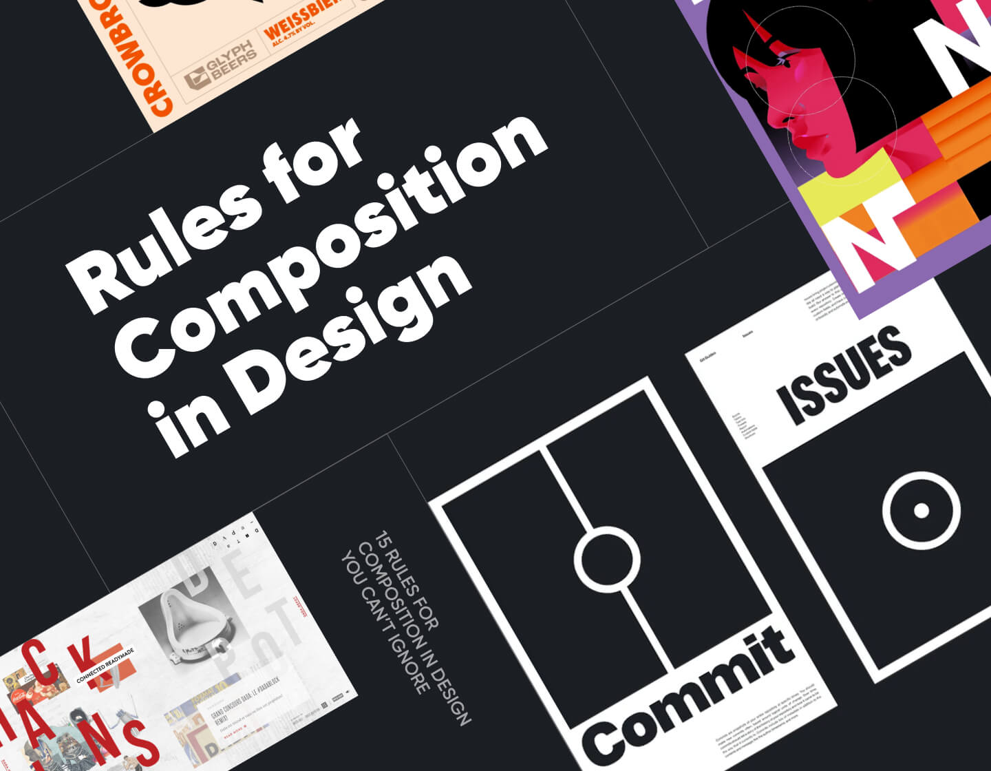
Composition plays a big role in making any design work well. When your composition is off, everything feels a bit messy and confusing. This is why I’ll share 15 tips to help you improve your composition, and you can apply all of them in web design, photography, illustration, or any graphic design project. Each tip comes with real examples, so you can see how they work in the wild and get inspired for your own work.
1. Keep your colors on point
How colors show up depends a lot on what they’re sitting next to. This is why the first rule is to know how to choose them wisely and sparingly. There are a few things you can consider here for your palette.

First, think about how much contrast you want between your colors. Unfortunately, there’s no right answer here, because it all depends what you’re going for.
For example, high contrast can be striking, but low contrast might feel more natural, especially if you’re aiming for a softer look.
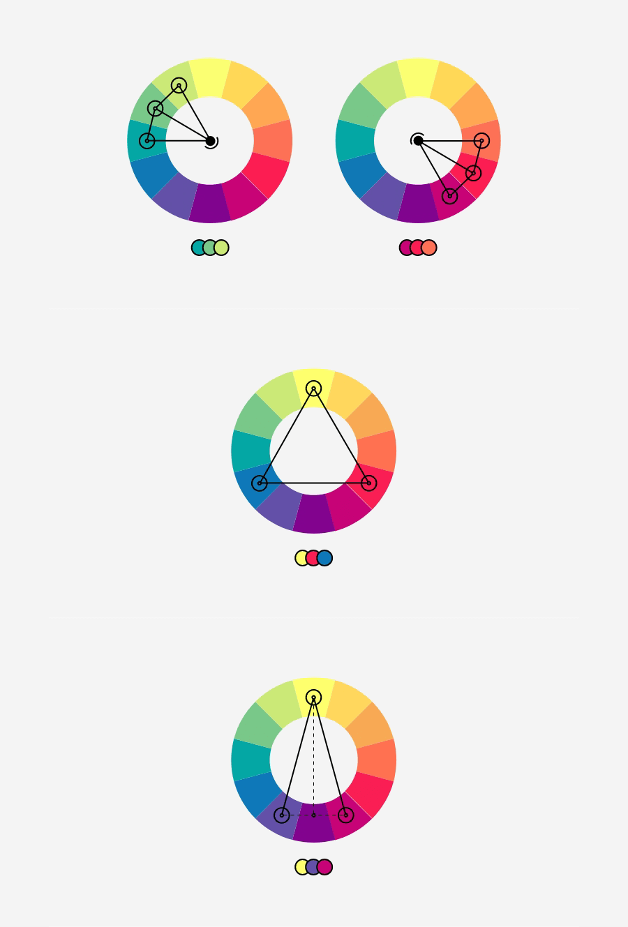
Next, if you’re unsure where to start, a color wheel is still one of the easiest tools out there. It’s handy for building complementary schemes (opposites on the wheel) or more mellow analogous ones (neighbors on the wheel). You can also go fully monochrome for something clean and minimal.
My colleague designers and I have already written a lot of short guides on color theory, so just select a topic you need:
- Color symbolism
- Color theory
- How to use the color wheel (to create color combinations)
- 45 trendy website color schemes (for inspiration)
- 150 fresh color combinations you’ll want to steal (+free resource)
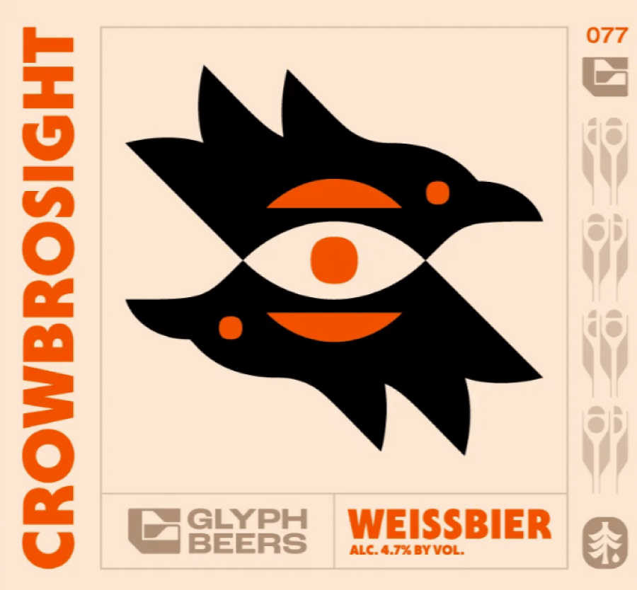
FlowFest 2025 uses an analogous color scheme with saturated oranges and reds that contrast over a pale yellow background.

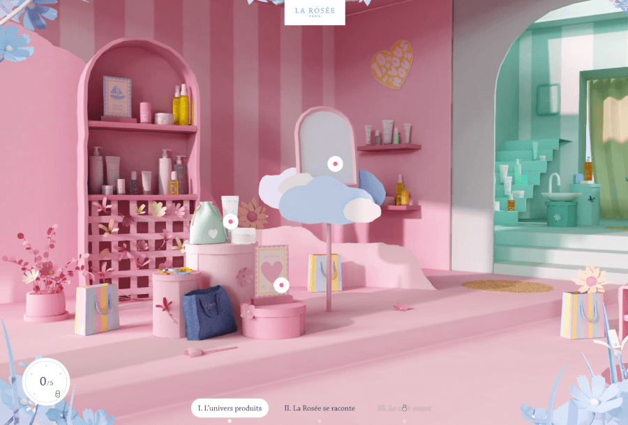
La Rosée uses complementary colors (rose and green) to separate each “room” from the VR experience with contrast.

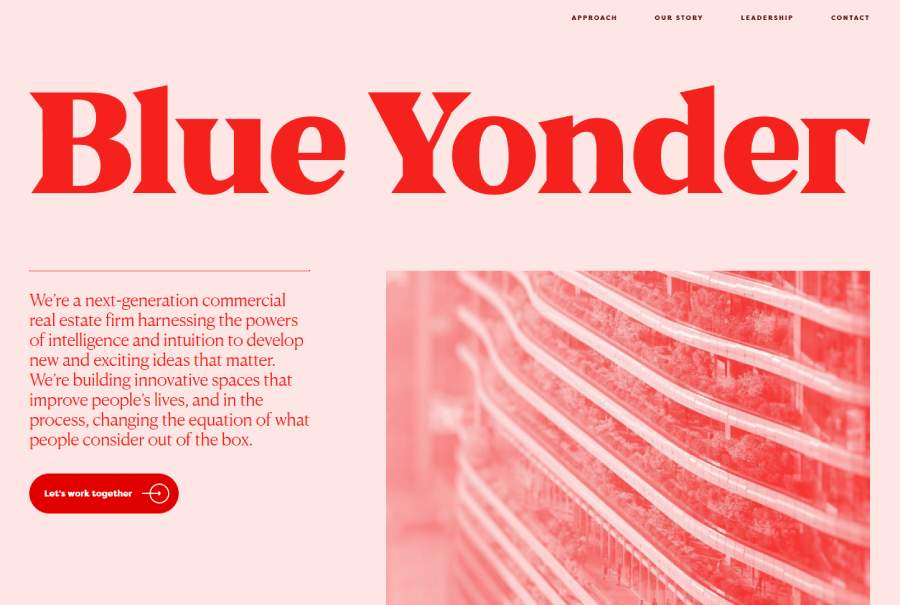
Blue Yonder uses a monochromatic color scheme
2. Guide the viewer with leading lines
When someone looks at your design, their eye always lands somewhere first which is usually the boldest or most eye-catching part. And then what?

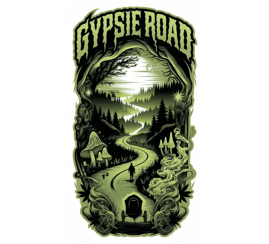
Gypsie Road, illustration that uses a literal road to guide the viewer’s eye.
That’s when you use leading lines to guide the viewer from one part of the layout to another without them even realizing it.
You can use actual lines, like arrows or paths, or implied ones with shapes and edges that naturally pull the eye across the space.
Another great way, especially if you’re designing a website, is to use motion itself through parallax effects or animations to show the way.
Here are some examples where the layout uses different methods to guide the viewer’s eyes.
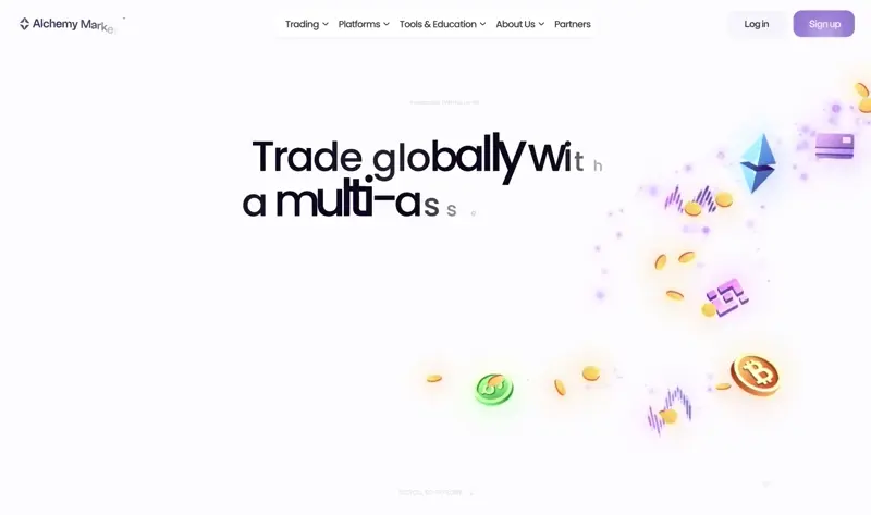
Alchemy Markets’ Landing page uses parallax animation to create motion and show the flow
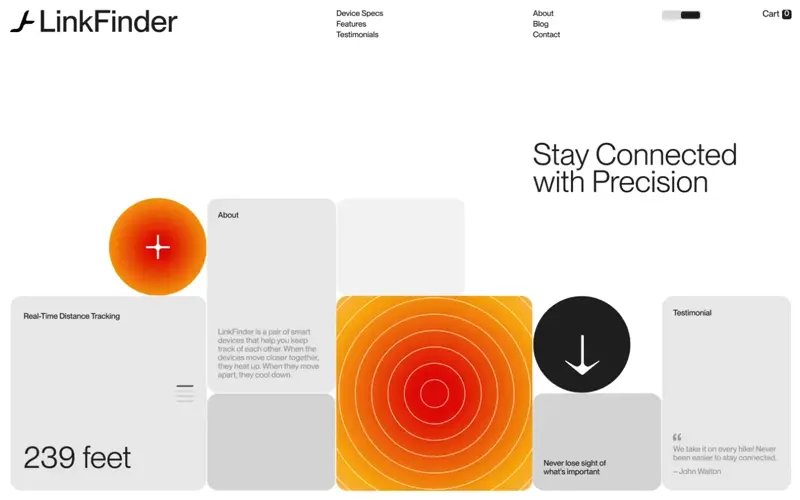
LinkFinder uses literal arrows and shapes to guide the flow
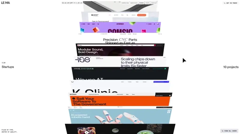
LE:MA’s interactive file storage immediately shows you what to do next
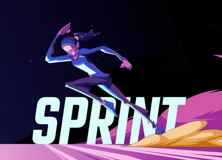
3. Add movement
Similar to the previous rule, you know your design has a good flow when it pulls your eye from one element to the next.

That can happen through the curve of a line, the rhythm of repeated shapes, or just smart spacing.
Humans are drawn to motion, even if it’s only suggested, so layouts that feel like they’re going somewhere tend to hold attention longer.
If things feel too static or jumpy, I recommend you tweak the structure until it reads more naturally.
Here are some examples of websites that use animations to move the flow forward as well as artworks that manage to do that simply with shapes and colors.
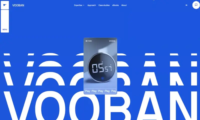
Vooban uses scrolling and hover animations to create a path for the homepage experience
Blog design concept with lazy scrolling animation

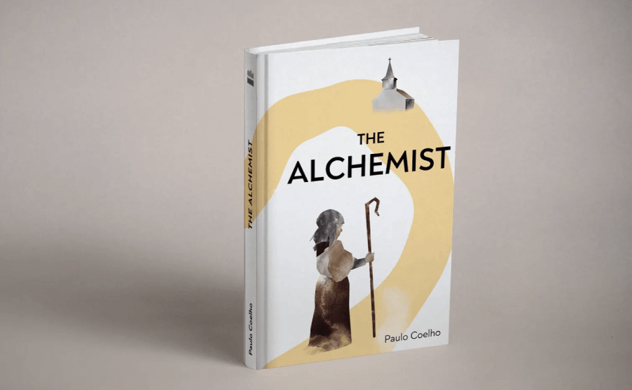
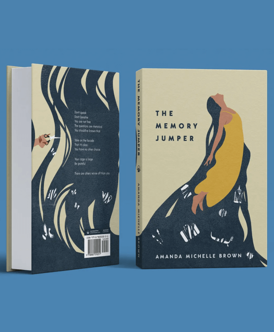
The Alchemist Book Cover uses shapes to create motion that guides the eye from the character to the building
4. Use negative space
White space is another design rule that keeps things from feeling cramped.

You can use it to put the spotlight on what you want users to notice and to also give your layout some calm.
Think of it like walking into a clean room where everything has room to be noticed. When your layout feels too packed, nothing stands out, but a little space around your elements will let people focus and make the design easier to take in.
Here are some projects that perfectly show how to use white space to give focus to particular elements.

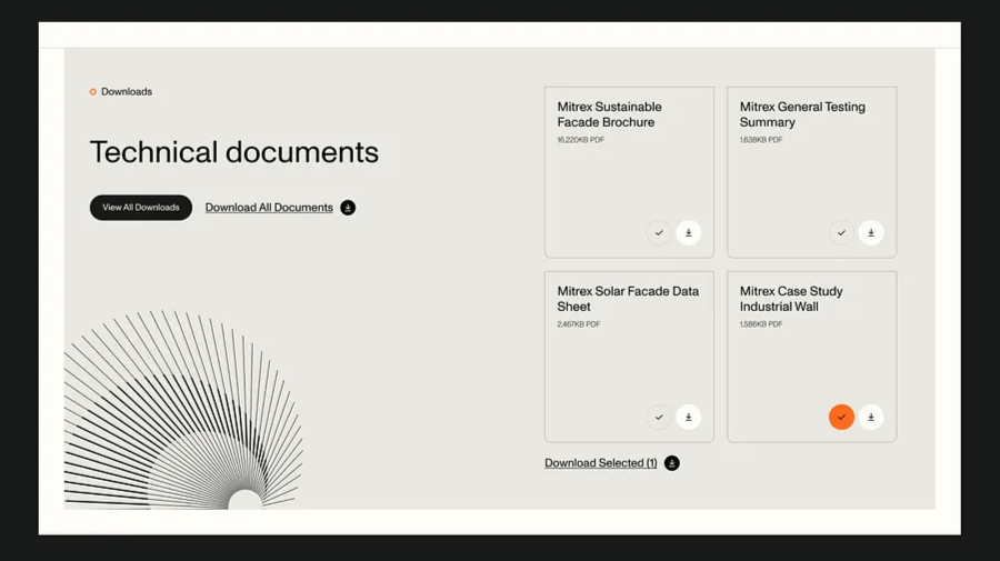
Minimalist UI using a lot of negative space to separate the section title from the documents


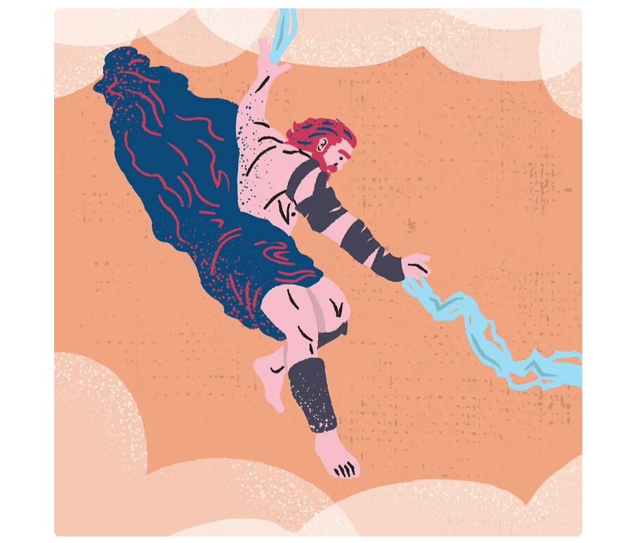
Zeus Artwork using white space to create focus on the hands and lightning motion
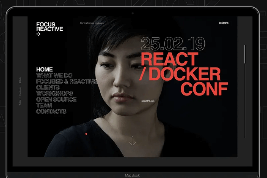
5. Play with contrast
With white space out of the way, contrast is the easiest way to guide attention. You can make anything stand out by making it darker, brighter, bigger, or shaped differently. Basically, high contrast helps things pop while low contrast lets them fade into the background. However, you still need to find the right mix, because if everything is loud, nothing will actually stand out.
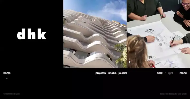
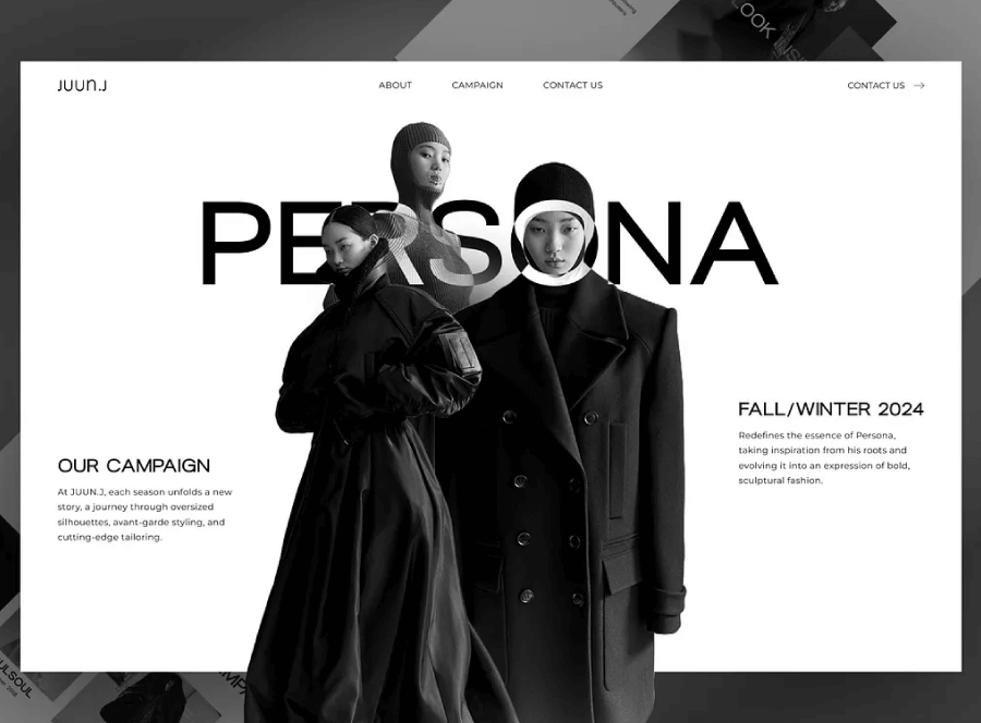
DHK Architects uses a very high contrast (black and white) to separate content from the background, as well as sections from one another

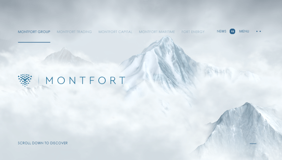
Montfort goes for a specific dream-like atmosphere with lower contrast and a monochrome scheme
6. Stick to the grid
Alignment makes your content feel organized, especially when there’s a lot going on. Left-aligning text blocks, for example, are usually the easiest to read.
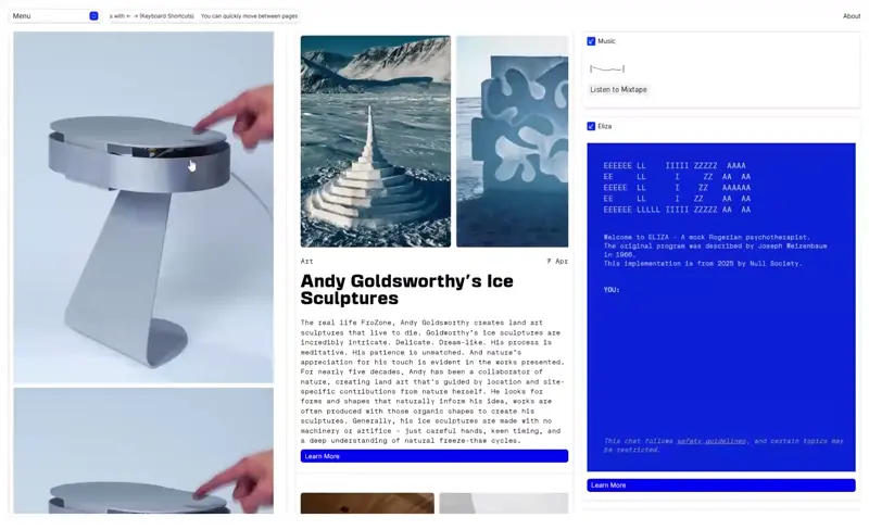
Null Society Multicolumn grid layout
Of course, don’t stuff everything in boxes, you can always break parts of the grid to make your design more dynamic, but always consider the main grid as your guiding point because it keeps your layout from falling apart. Even messy-looking designs usually follow some kind of structure.

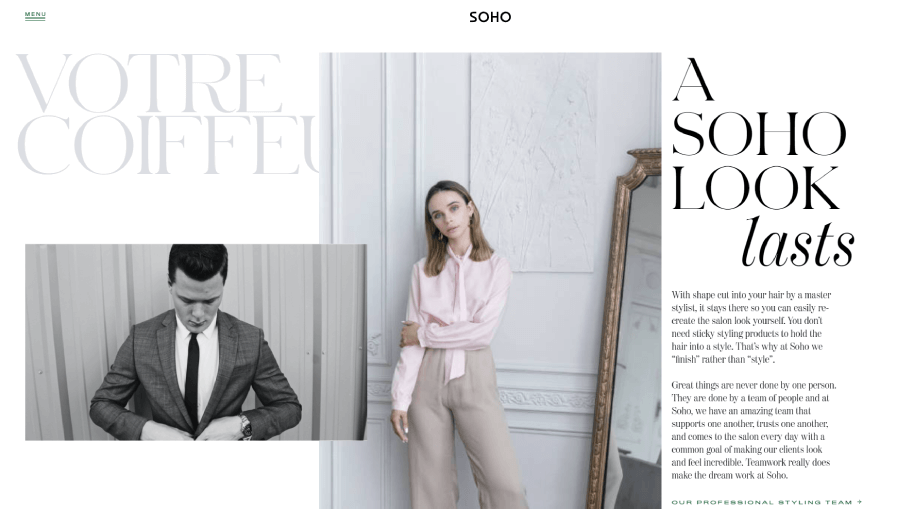
Soho Hair has an asymmetrical layout that goes just a bit off-grid but still follows a main multicolumn grid
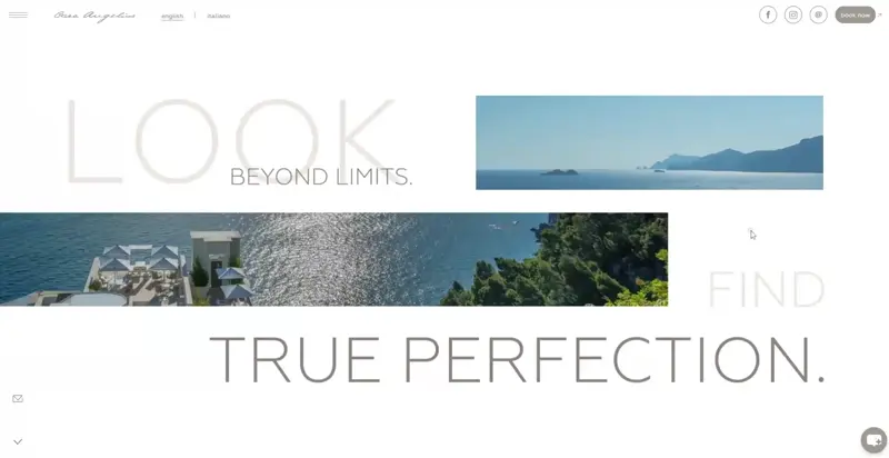
Casa Angelina Asymmetrical Layout

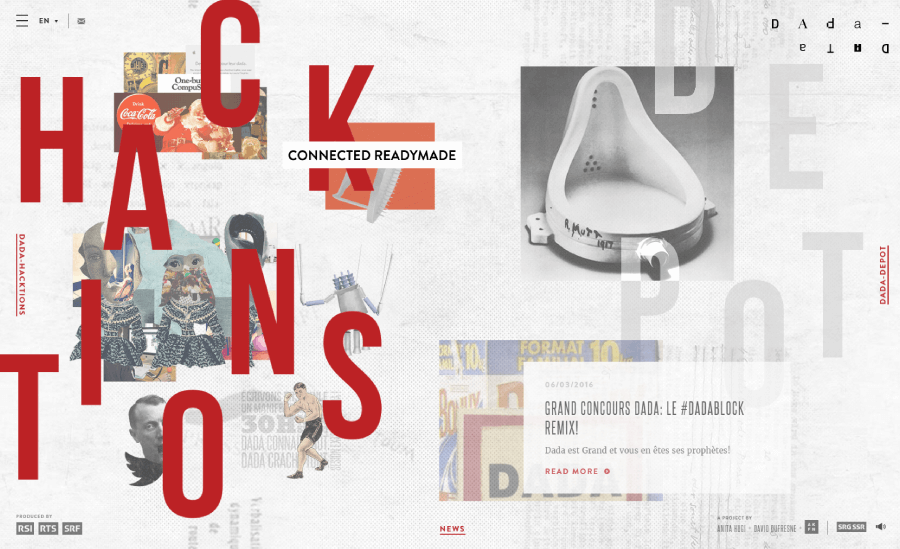
Data Data Broken Grid
7. Divide it into thirds
The rule of thirds is an important rule of composition in design and is also a quick way to organize your layout. Just imagine your canvas split into a 3×3 grid, and place your main elements where the lines cross.

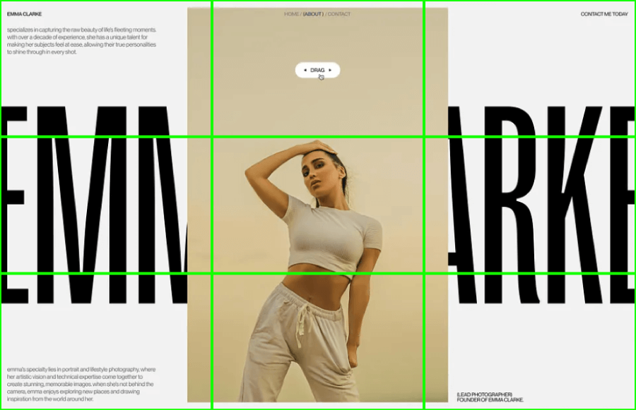
Rule of Thirds Photography Portfolio About page
This tends to create layouts that feel balanced without being too predictable. It works well for visuals, headlines, or anything you want people to notice first. It’s a great starting point, especially when building around a strong image or key message.

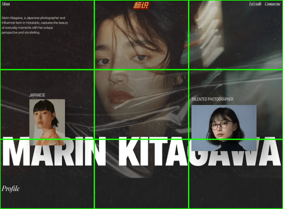
Rule of Thirds Marin Kitagawa Photography Portfolio

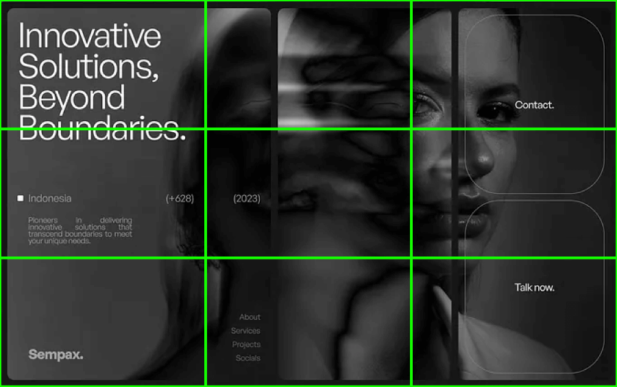
Sempax Photography Portfolio Website
8. Balance the edge game
This basically refers to how your elements sit near the edges of the layout. It matters more than most people realize because if you cram everything toward the borders, you design will immediately start to feel boxed-in or heavy, but if you give it some breathing room, things will open up.


9. Repeat your elements
When you use the same font, color, or layout style across different sections or pages, it gives users something familiar to follow. It’s also what it takes to create a theme.


10. Less is more
When too many things fight for attention, nothing really stands out. If something doesn’t support the overall idea or message, it probably doesn’t need to be there. It’s usually better to take something out than to try and squeeze one more element in.
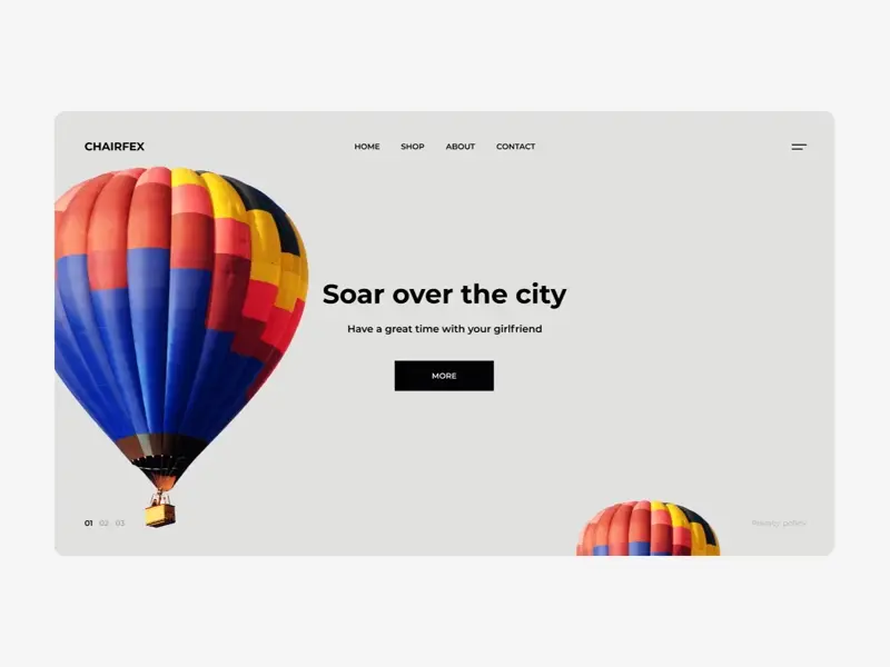
Rent a Balloon Minimal Hero by Fedorov Maxim

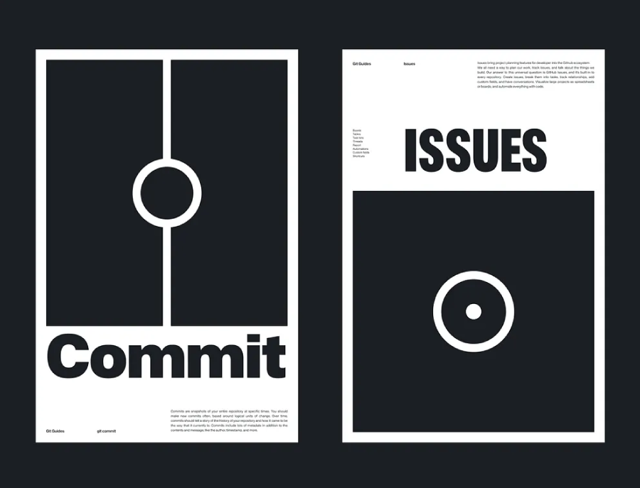
GitHub Minimal posters by Nicolas Solerieu
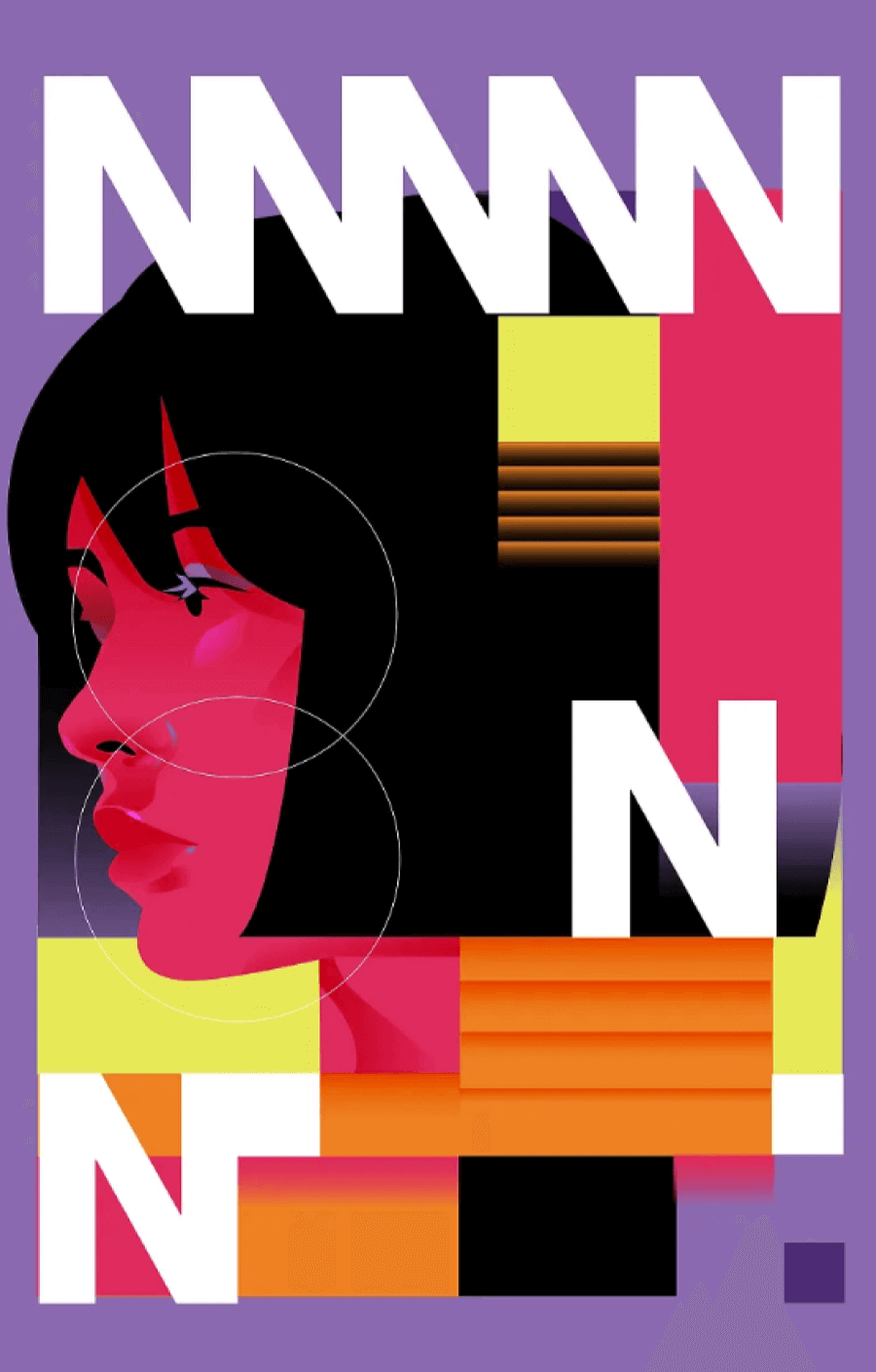
11. Use shapes that work (Pssst! Triangles!)
Shapes help organize the layout and influence how someone moves through the design without realizing it. For example, circles feel softer and tend to highlight or group things together, and squares add stability and structure. Not a rule for composition in design, but to tell you an absolute fact, people really love triangles!
J’élégance Triangle logo by Breno Bitencourt
This isn’t random, because triangles naturally guide the eye, they can point, divide space, or create movement without being loud about it. You’ll find them all over the place in layouts, especially in compositions where direction and balance matter.

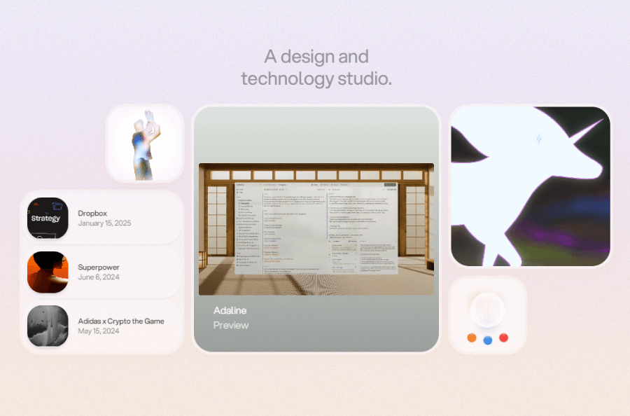
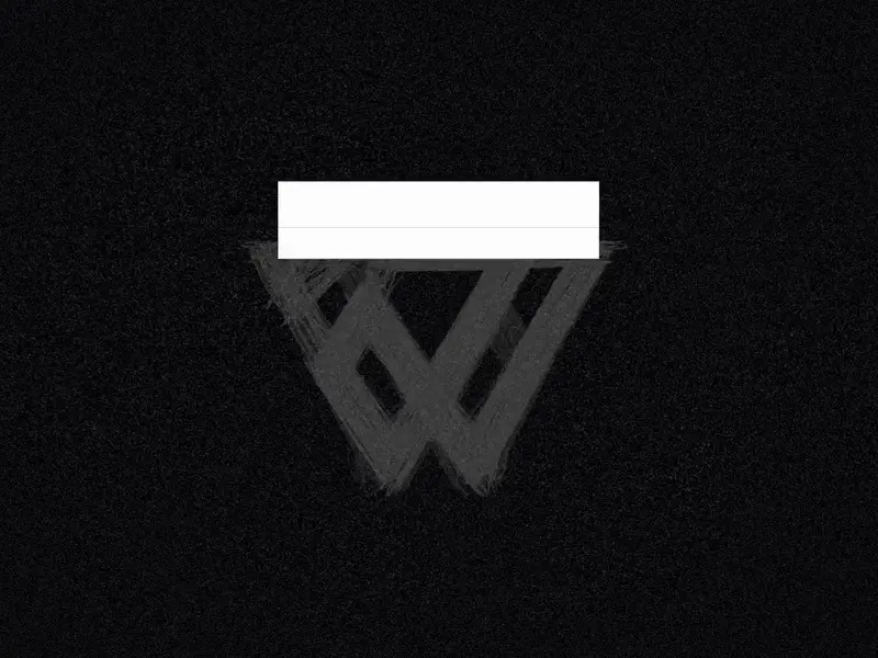
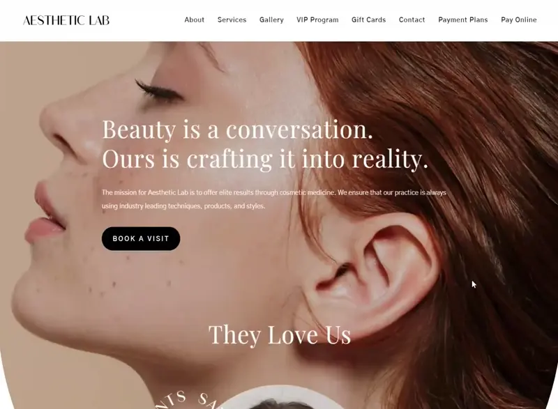
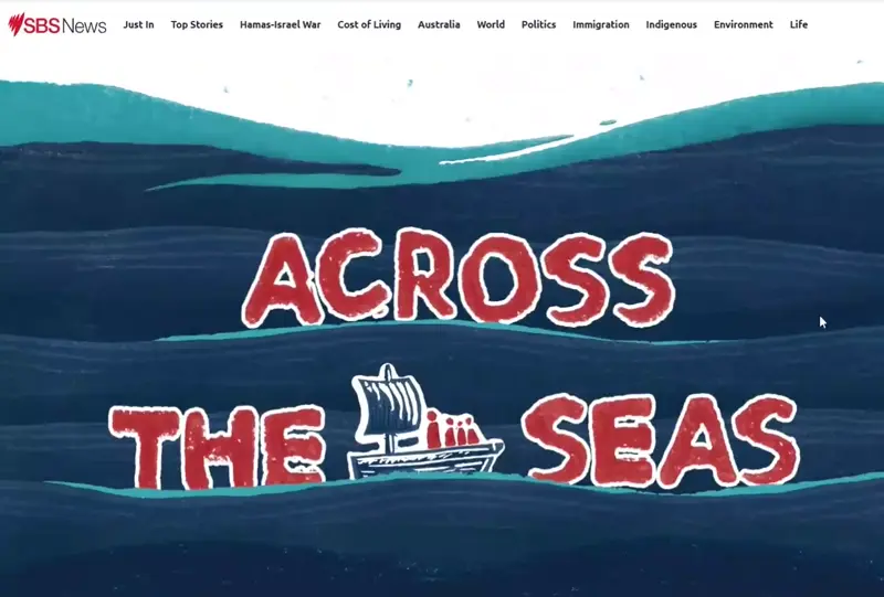
12. Smooth out the transitions
Transitions include everything that helps the eye move from one part of a layout to another. You can ease that shift with lines, curves, fading colors, or gradual changes in shape or size. The idea here is just to keep the flow going so everything feels connected, instead of jumping from one block to the next.
Aesthetic Lab seamless sections transition
Across the Seas Transition between sections
13. Create focus
Every design needs something that grabs attention first. That might be size, bold color, or just contrast. No matter how much is going on, there has to be one main element that says: start here. Without that focus, the whole thing may feel too chaotic and the message gets lost.


14. Prioritize
Once you’ve picked what should catch the eye first, the rest needs to follow in a clear order. That usually means setting up a visual ladder using size, weight, shape and color. Headline goes high, subheadings follow, then extra bits like dates or details fall in line. You don’t need to follow strict rules here because only you decide the hierarchy based on what you make a priority.


15. Keep your elements balanced
And last, balance. This rule for composition in design is more abstract because design balance can mean anything. Sometimes it means a clean, mirrored layout, other times it means more contrast. A large element on one side might need a few smaller ones to even things out. Thinking in terms of “visual weight”.

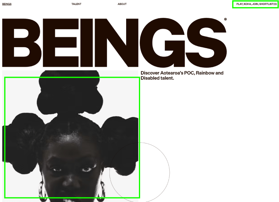
Beings hero section balance
And there you have it!
And that’s the scoop on composition in design! Even Picasso probably started with some messy sketches before finding his flow. So, don’t stress if it feels tricky at first, just keep playing around with these tips and watch your designs fall into place.
And if you’re curious about more design tools or need inspiration, we’ve got plenty of other guides worth checking out, just like the following: