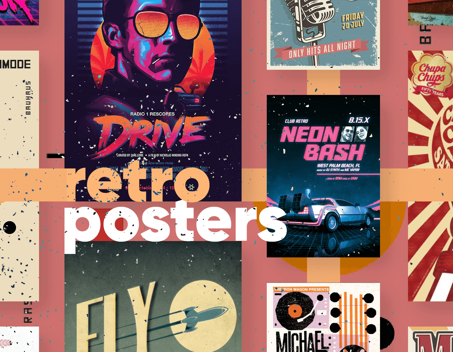
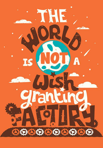
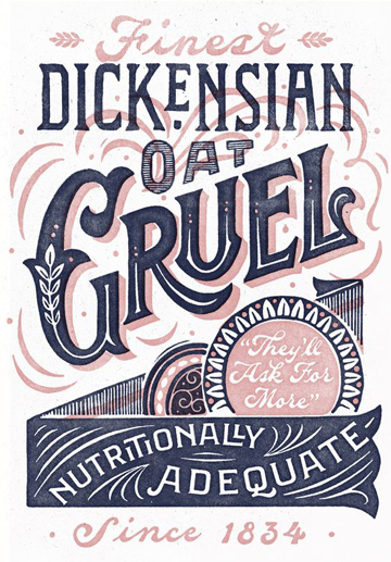
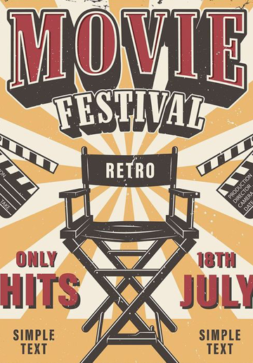
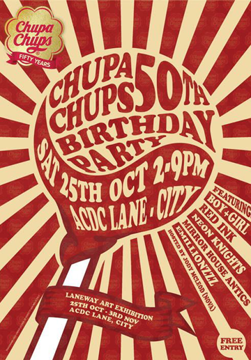
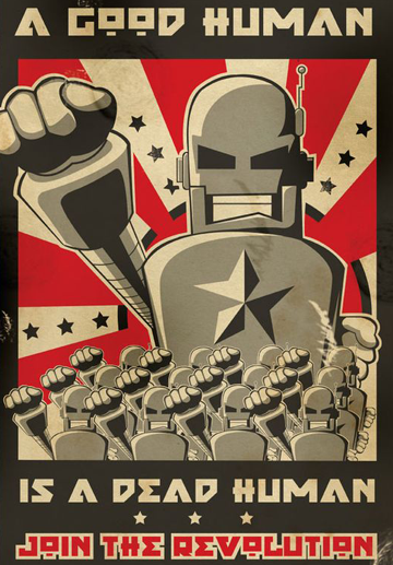
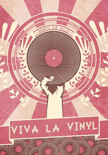
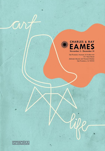
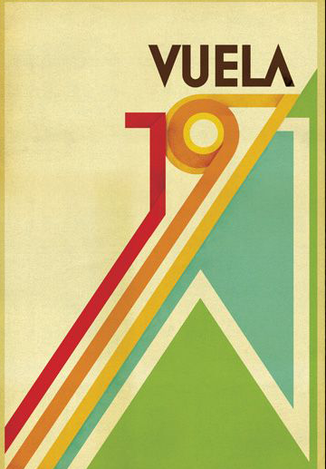
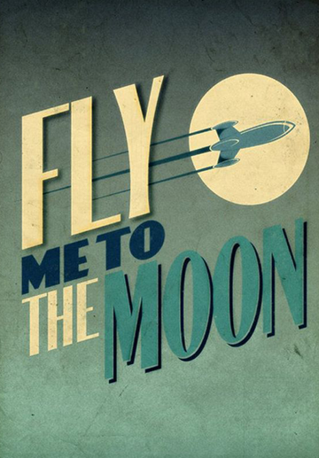
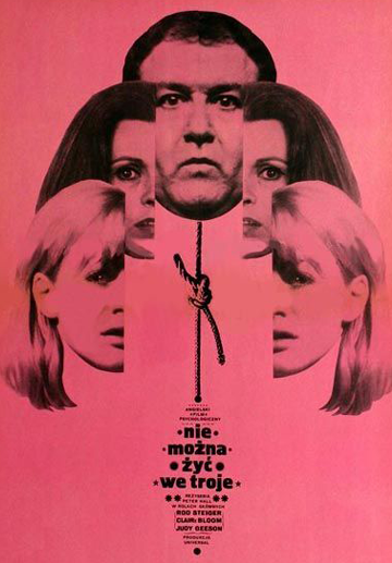
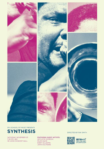
Retro style imitates designs from the past; this includes music, modes, fashions, art, and attitudes. The term is also known as “vintage-inspired” or “old school”. In this collection of inspirational examples, I’ve gathered some classic components that bring back childhood memories and nostalgia. These retro posters still look cool today and check out the way they did decades ago. So, let’s get you inspired by some great looking retro posters and the words of Confucius “Study the past if you would define the future.”
Minimalistic Retro Posters
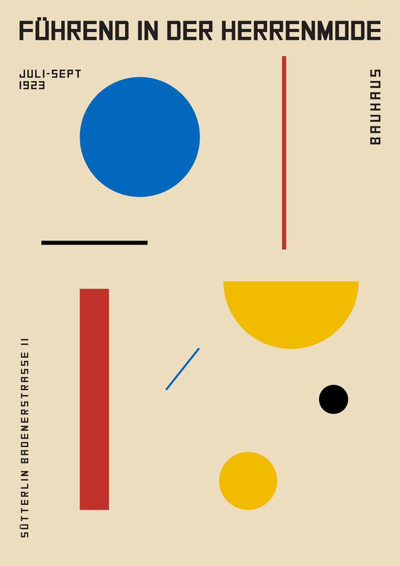
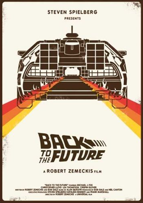
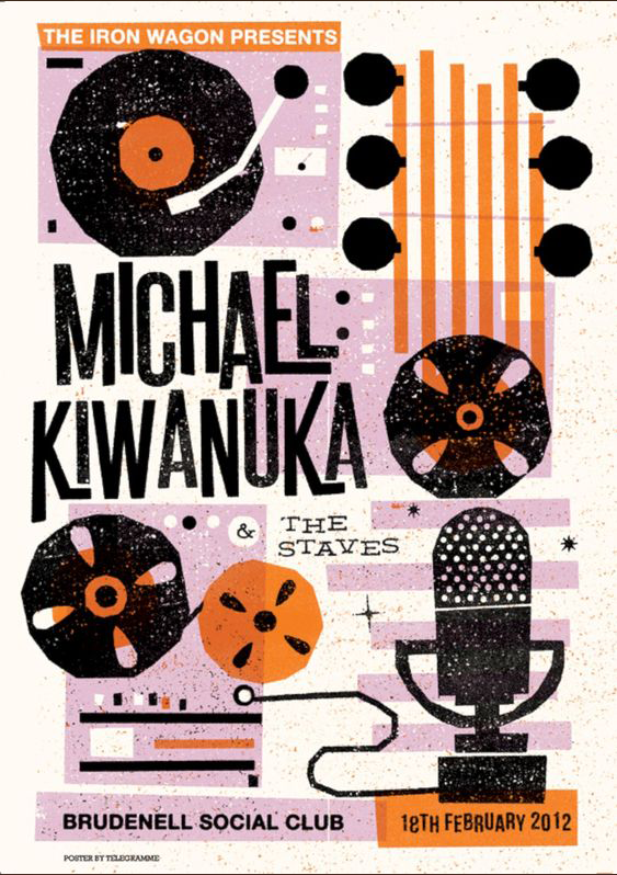
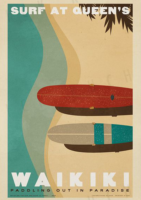
Less is more in these classic examples of minimalist poster art. ~If we rid the poster of everything apart from its core essence, there are just the key components left with s clear focus. There is a minimal amount of colours in large blocks. The posters sport simple and easy-to-read typography with simplified images. They communicate the message clearly.
Futuristic Retro Posters (Retro Wave)
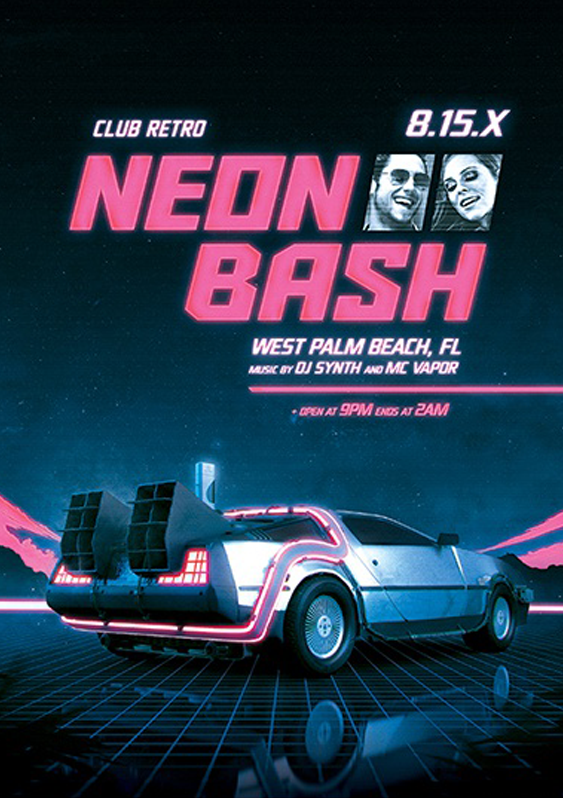
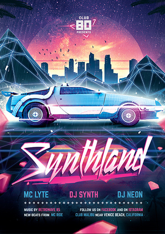
This collection embraces what the future could have been, as imagined from the past. As expected, the visuals are way better than what we have in reality. Retrowave is often used in posters to create an ultimate cool vibe. Perfect for parties, gigs and festivals. They typically use wild brash colours, neon pinks and blues, combined with bold fonts and far out images. We also can’t forget the futuristic cars, cities, robots and the entire aestetics that is instantly recognisable.
Pinup Girls
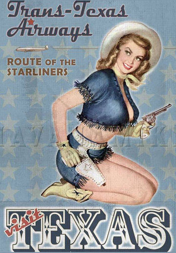
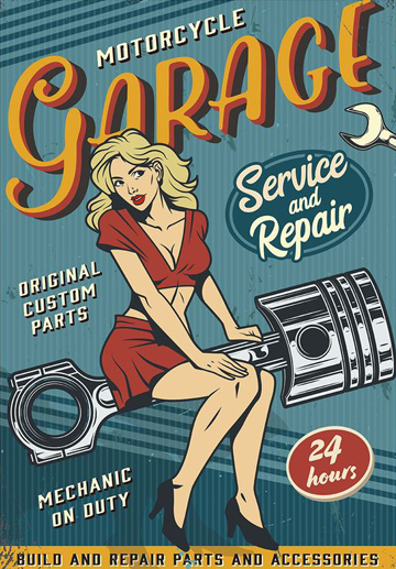
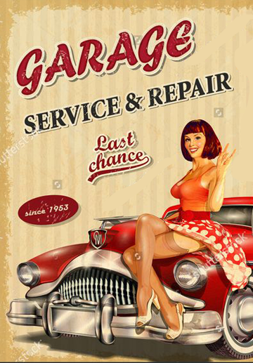
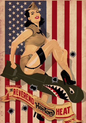
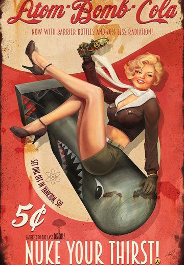
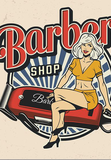
One area that especially lends itself to the retro style is the traditional pinup poster, be it in the garage, man cave or coffee shop, the old school nostalgic style suggests a fantasy past world long gone. The pinup posters create an atmosphere that takesyou back to the old times. Pretty girls (fully clothed) astride cars, bikes, electric razors, planes and even bombs. These wouldn’t work if they weren’t retro, those gorgeous unrealistic curvaceous ladies in classic poses mixed with long lost Americana.
Typography
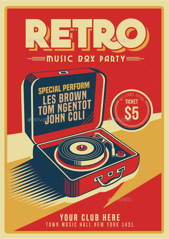
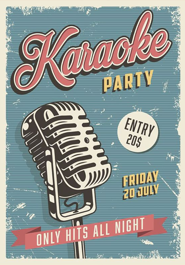
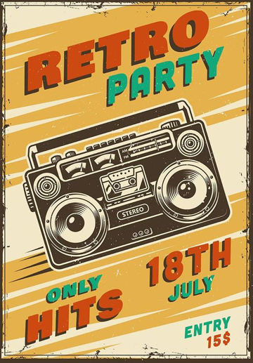
Clear, bold, even fearless use of typography shows how effective the correct use fonts can be. They can be shaded, shadowed, higher case, lower case, cursive or block. You can go wild as there are many styles and variations.
Retro Posters with Washed Colors
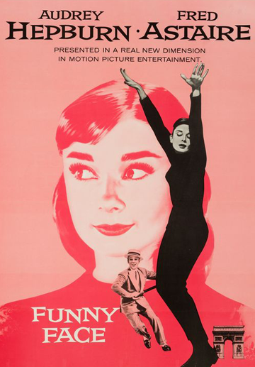
We so often associate Retro with bright, bold blocks of colour, however the subtle approach pays off handsomely too. A sepia Louis Vuitton or the film poster of Hepburn and Astaire? Nothing says aged as much as faded washed out colours, like the pages of your favourite second hand novel, well used but all the more precious for it. A classy collection.
Final Words
In conclusion, this collection shows some fine examples of retro, vintage, old school designs that fit perfectly into today’s schools of thought. The original posters that inspire the trend were often actual works of art, masterfully-crafted, and planned to create exactly the right image and tone.
In the meantime, I’d love to inspire you even more, so why not check out some more atmospheric vintage posters.


