Art and design go hand in hand, and nowhere is that more evident than in art gallery websites. The best ones feel like an extension of the art itself, with thoughtful designs that make you want to explore every corner. Some are bold and experimental, while others keep it simple and striking. Each one has its own personality, and together they’re a treasure trove of design inspiration.
Today, we’re diving into 22 art gallery website examples that nail the balance between art and design. These aren’t just beautiful—they’re clever, intuitive, and full of personality. We’ll explore sites that wow with clean simplicity, and others that feel bold and experimental. If you’re looking for out-of-the-box ideas or just want to geek out over stunning web design, you’re in the right place. Let’s get started!
1. 5Art Gallery – A Modern Platform for Contemporary Art
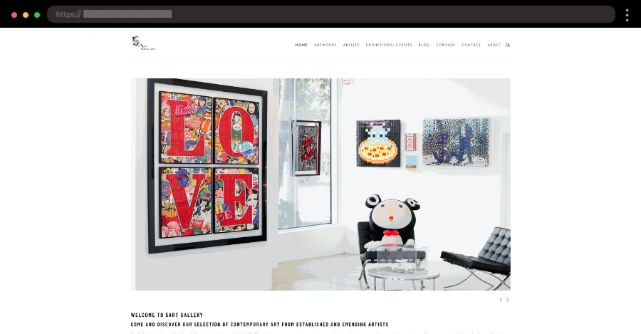
The 5 Art Gallery is all about showcasing cutting-edge contemporary art, and its website perfectly reflects that energy. The minimalist design, with its bold black-and-white theme, creates a sharp contrast that makes the vibrant artworks pop. From the homepage, visitors can easily browse exhibitions and collections, thanks to the simple navigation menu. The clean sans-serif typography pairs well with high-quality visuals for a polished look.
🎨 What we love:
- Monochrome color palette.
- Clean navigation with search functionality.
2. Esther Schipper – Minimalist Art Gallery Example

The Esther Schipper website is all about simplicity and space, with clean and minimal design elements. The focus here is squarely on the artwork, with each piece displayed in high-quality visuals that draw you in. Visitors can browse artists, fairs, and even purchase items from the available bookstore.
🎨 What we love:
- Bookstore with vinyl records and other products.
- Subtle scrolling animations.
3. The Walters Art Museum – A Timeless Online Experience


The Walters Art Museum’s website is an excellent in-action for accessible art. From the moment you arrive, the simple inviting design encourages exploration. The site features clearly defined sections for exhibits, programs, and even a podcast. The event calendar is a standout feature, keeping users updated on everything happening at the museum. Paired with a soft color palette and clean typography, the design feels timeless yet modern.
🎨 What we love:
- Well-structured layout.
- Handy event calendar for visitors.
4. Staatsgalerie – Fresh Art Gallery Inspiration

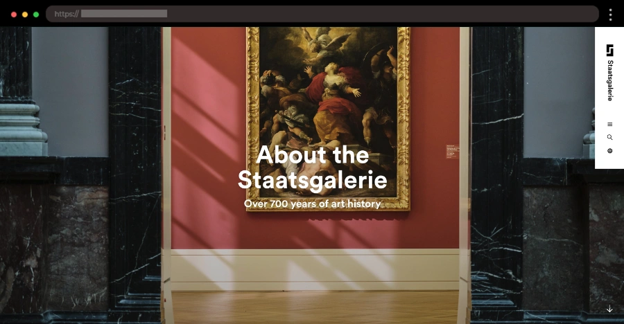
Step into the Staatsgalerie’s world, where vibrant colors and fresh design set the stage for a lively experience. This dynamic website uses bold yellows to infuse energy, while the playful typography adds a modern twist, perfectly complementing the museum’s blend of classical and contemporary art. The homepage makes it easy to explore the gallery’s exhibits, collections, and events. Everything feels thoughtfully organized and user-friendly.
🎨 What we love:
- Eye-catching vibrant colors.
- Playful, fun typography.
- Large, full-screen image sections.
5. Van Gogh Museum – Bringing Art to Life


The Van Gogh Museum’s website takes you straight into the artist’s vibrant world. The homepage grabs your attention with full-screen displays of Van Gogh’s legendary works. The website offers an interactive zoom feature, letting visitors explore every fine detail of Van Gogh’s masterpieces. When an image opens in full-screen mode, the vibrant textures and brushstrokes come alive. What truly sets this site apart is its focus on education and discovery. Visitors can dive deeper into Van Gogh’s techniques and learn about the stories behind his masterpieces.
🎨 What we love:
- Full-screen artwork displays.
- Interactive painting tools.
6. Lehmann Maupin – Futuristic Art Gallery Vibes

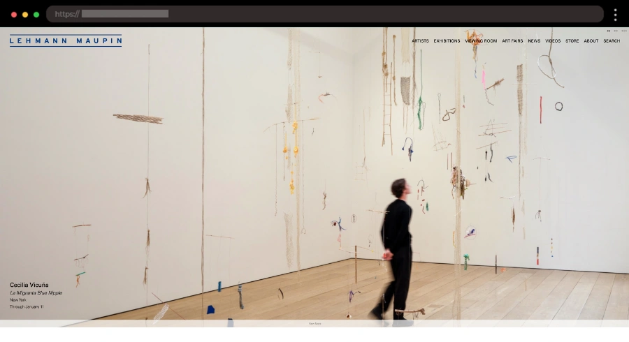
Lehmann Maupin’s homepage features striking visuals paired with clean sans-serif fonts that give the site a cutting-edge feel. The site’s structure makes it easy to explore artists, exhibitions, news, videos, etc. Additionally, you can purchase featured collection items from the store.
🎨 What we love:
- Well-arranged news and events section.
- Compact sticky header.
7. Te Whare Taonga – A Digital Gateway to New Zealand’s Culture

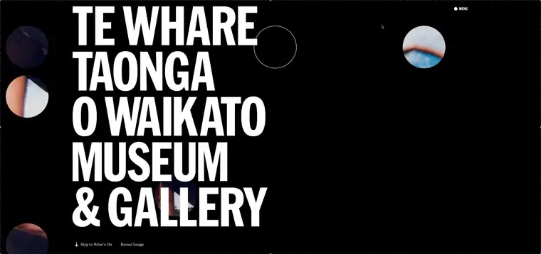
Showcasing the rich heritage of New Zealand, Te Whare Taonga’s website feels like an invitation to explore. The homepage welcomes visitors with earthy tones and authentic typography that reflect the museum’s connection to history and culture. Every section feels carefully crafted to guide users through exhibits, events, and educational resources. One standout feature is the multimedia integration, offering interactive elements that bring the stories behind the artifacts to life.
🎨 What we love:
- Earthy colors with a mainly black-and-white theme.
- Trendy typography.
- Engaging interactive and other design elements.
8. RZ Collection – A Contemporary Art Experience You Can Explore

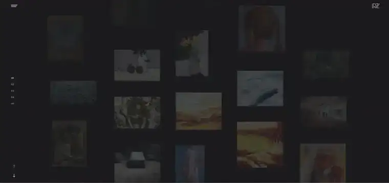
RZ Collection’s website turns visiting an art gallery into a digital adventure. The homepage stands out with its grid asymmetrical layout, offering multiple ways to explore it. The dynamic animations give it a polished, modern vibe that draws you in right away. Scrolling reveals even more hidden gems, while gallery transitions feel smooth and intuitive. It’s a site that makes browsing feel like an experience.
🎨 What we love:
- Eye-catching homepage grid layout.
- Interactive scrolling and animation effects.
- High-quality visuals of the art.
9. How to Time Travel Exhibition – A Playful Take on the Concept of Time

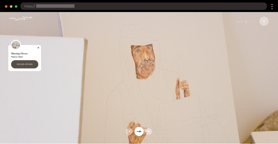
This isn’t your typical gallery website – it’s a wild, creative journey through time itself. For each of their art pieces, “How to Time Travel” has prepared a dedicated page with a cool zoom-in feature, creative scrolling animations, and information about the artist. The typography mixes playful and experimental styles while interactive elements and animations keep you engaged as you scroll, making every section feel alive.
🎨 What we love:
- Impressive full-screen homepage video.
- Engaging animations and interactive features.
10. Musée Rochechouart – Modern Contemporary Art Gallery Design

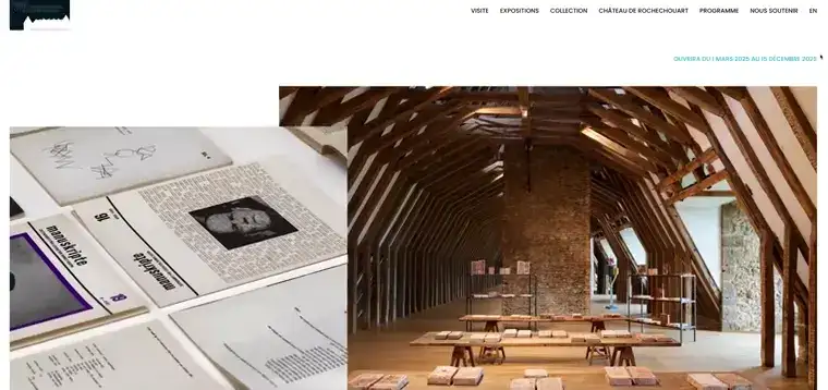
The website for Musée Rochechouart is a perfect blend of tradition and modernity, much like the gallery itself. It showcases both historical and contemporary art and its design leans into a clean, structured layout with soft, earthy tones. The site’s clear sections guide visitors seamlessly through exhibitions, events, and historical archives. A standout feature is the interactive exhibit previews, allowing potential customers to dive deeper into the museum’s collection before stepping through its doors.
🎨 What we love:
- Elegant design with serif typography.
- Exhibit previews.
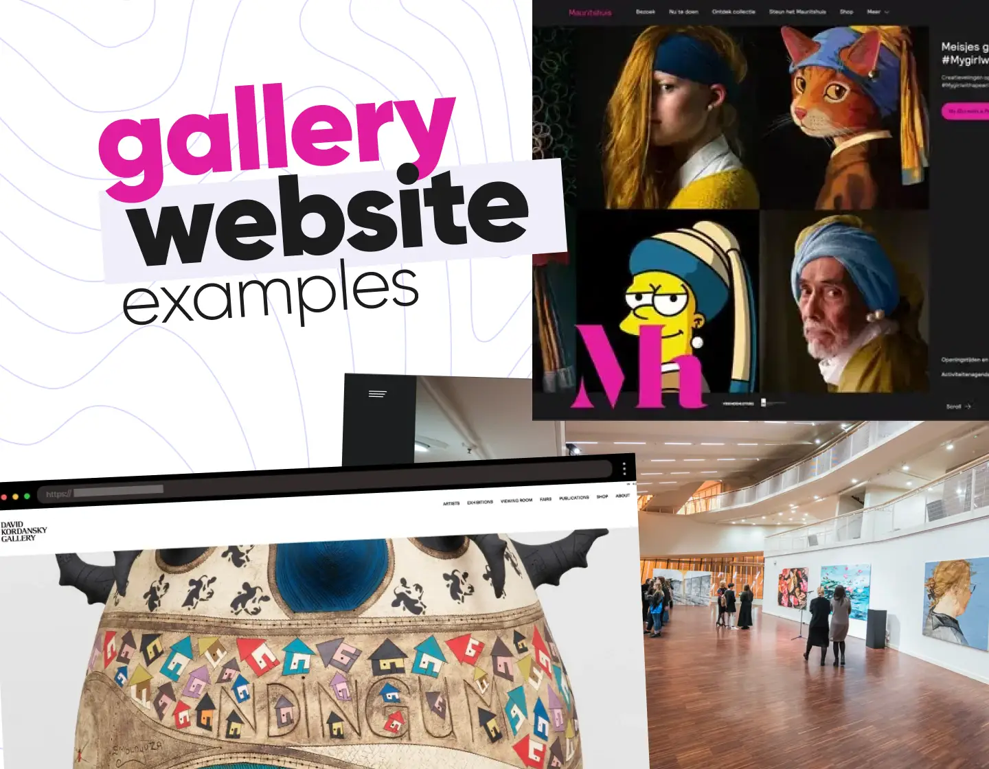
11. Mauritshuis – Horizontally-Based Gallery You Can Scroll Through

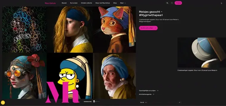
The Mauritshuis website offers a fresh, dynamic take on browsing art, with its standout feature being the smooth horizontal scrolling. As you move through the site, the artwork flows seamlessly into view, similar to strolling through the gallery itself. The design mixes classic and modern, pairing bold color choices like white, black, and pink with elegant typography that echoes the Dutch Golden Age aesthetic.
🎨 What we love:
- Unique horizontal scrolling experience.
- Striking color combinations.
- Engaging hover effects.
12. David Kordansky Gallery – Dynamic Art Gallery Design

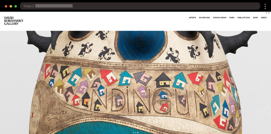
The David Kordansky Gallery’s website makes a bold statement with its contemporary art it features. The homepage uses full-width visuals and bold typography while the color scheme stays minimal. The Viewing Room page is packed with beautiful art pieces, making the site come alive.
🎨 What we love:
- Full-screen visuals.
- Bold modern typography.
- Smooth hover effects and transitions.
13. Thaddaeus Ropac – A Sophisticated Digital Showcase

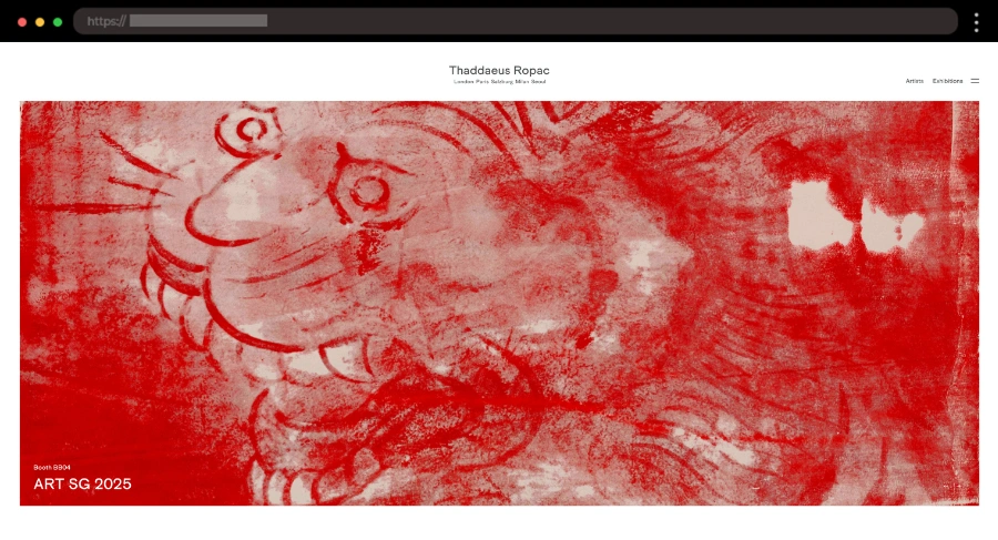
Sophistication defines the website for Thaddaeus Ropac, an art gallery known for its impressive artists. The homepage greets visitors with a refined design featuring muted tones and large, high-resolution images. Visitors can never get lost thanks to the footer’s interactive map that neatly displays each gallery address for easy reference.
🎨 What we love:
- Muted color palette.
- Clean, minimalist design.
- Map with gallery addresses.
14. Kodl Contemporary – A Journey Through Contemporary Art

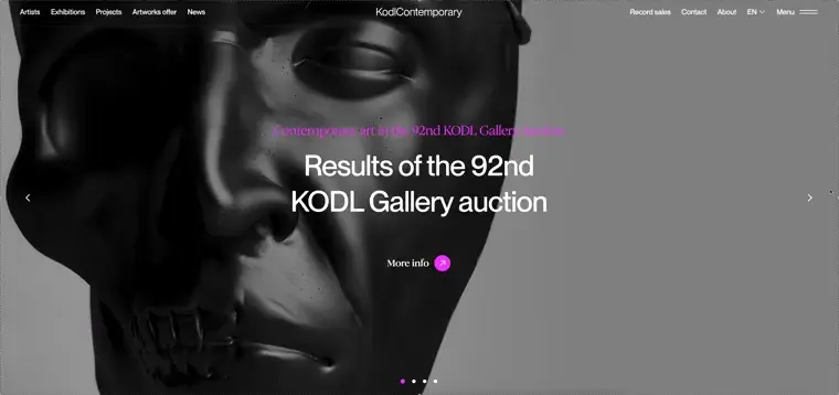
Kodl Contemporary’s website takes you straight into the heart of modern art. The design is sharp and polished, with a monochrome palette that makes the colorful artworks feel even more striking. The typography is clean, letting the art take center stage while maintaining an elegant, gallery-worthy vibe. From the homepage, users can easily browse featured artists and exhibitions.
🎨 What we love:
- Monochrome design that highlights bold artworks.
- Intuitive navigation structure.
15. Philip Mould – A British Classic Art Gallery

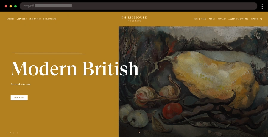
Philip Mould’s website is as timeless as the British fine art it represents. Specializing in works from the 16th to 20th centuries, the site has an elegant sophisticated design. The homepage greets visitors with large, striking images of paintings and sculptures, while individual pieces have dedicated pages packed with details about the art and its history. It’s a seamless blend of traditional and digital craftsmanship.
🎨 What we love:
- Classic polished layout.
- Gorgeous, high-quality British art visuals
16. Eden Gallery – A Vibrant Digital Space for Contemporary Art

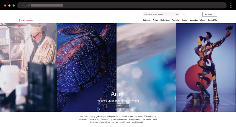
Through its sleek design and high-quality visuals, Eden Gallery’s website communicates a bold, modern identity that reflects its vibrant contemporary art collection. A clean white background highlights colorful artwork. The homepage feels dynamic and engaging, with a well-structured layout that guides visitors to explore exhibitions, artists, and events. The footer offers quick access to social media links and essential information, keeping everything accessible and tidy.
🎨 What we love:
- Artists section with an engaging hover animation.
- Wishlist and a search functionality in the header.
17. Tate – A Gallery Portal to the Best of British Art

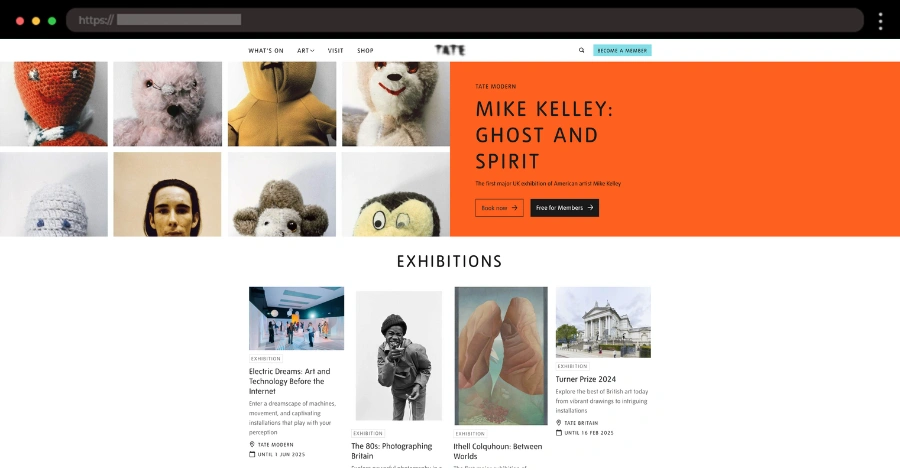
Another great website is Tate’s, offering a seamless journey into the world of British and international art. The design is bold and clean, with large, impactful visuals and lots of whitespace around. The site’s content is thoughtfully organized, with dedicated sections for exhibitions, collections, and learning resources.
🎨 What we love:
- Large, impactful visuals.
- Thoughtful content organization.
- Colorful sections and CTAs.
18. National Gallery – A Timeless Showcase of Art Masterpieces

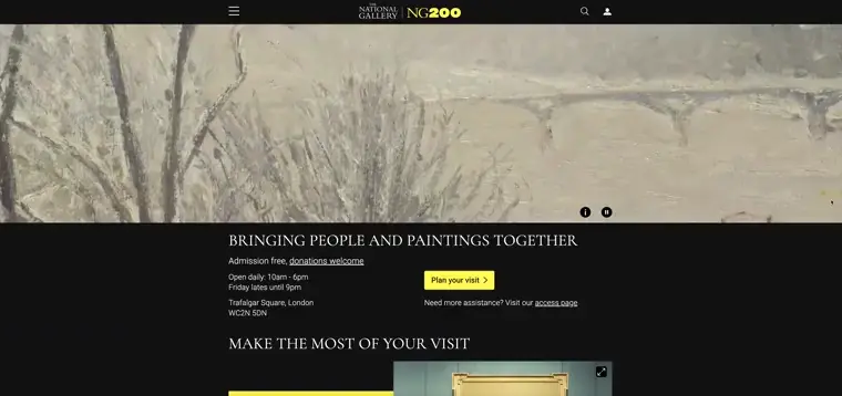
A mix of black, white, and yellow sets the tone for the National Gallery’s modern website. The centered layout uses generous whitespace to focus the visitor on the content. Cool design touches, like bold typography and well-placed visuals, make navigation a breeze. With features like a membership option and a social media section at the bottom, the site feels fresh and user-friendly.
🎨 What we love:
- Contrasting color palette.
- Centered website with lots of whitespace.
- Membership feature.
19. Rachel Uffner Gallery – Sleek Art Gallery Website Design

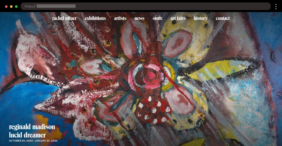
The Rachel Uffner Gallery’s website is a masterclass in contemporary design. The homepage features a clean grid layout showcasing current exhibitions alongside past collections, for a spacious and inviting feel.
With ample white space and crisp visuals, the art takes center stage. The simple top navigation makes it easy to explore exhibitions, artists, and news. It’s stylish, straightforward, and effortlessly elegant – perfectly reflecting the gallery’s identity.
🎨 What we love:
- Organized grid layout.
- Stunning high-quality artwork images.
- User-friendly sticky navigation.
20. National Galleries of Scotland – A Colorful Hub for Art Enthusiasts

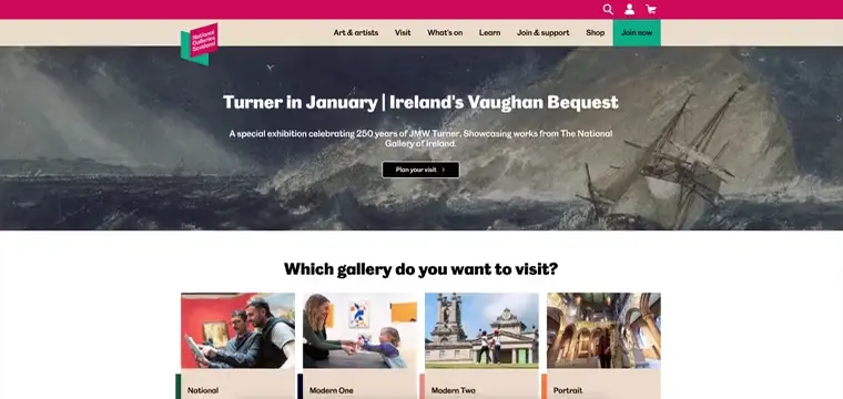
A lively palette of pink, green, beige, and blue brings the National Galleries of Scotland’s modern website to life. The design feels fresh with handy tools like a search bar, profile, and cart conveniently placed in the header. The Shop section gets its own dedicated page, making browsing for art-inspired products a breeze.
The standout feature is the What’s On section, complete with search functionality that allows visitors to explore upcoming events or filter results to match their interests. It’s a vibrant and functional site that’s as dynamic as the galleries themselves.
🎨 What we love:
- Bright and playful color palette.
- “What’s On” section with customizable search options.
21. Museo del Prado – A Spanish Art Masterpiece

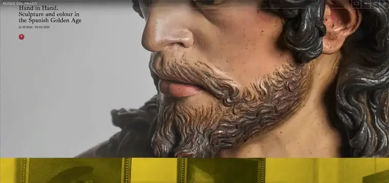
With a luxurious color palette and grandiose design, Museo del Prado’s website offers a digital reflection of Spain’s royal art collection. The homepage greets you with large, stunning visuals of world-renowned masterpieces. What sets this apart from other websites is the scrolling animation revealing different sections with ease. Visitors can explore exhibitions, collections, and in-depth artist profiles, with interactive features that add a layer of engagement.
🎨 What we love:
- Large visuals that make the masterpieces pop.
- Interactive features for an immersive experience.
22. Acquavella Galleries – Timeless Showcasing of Fine Art

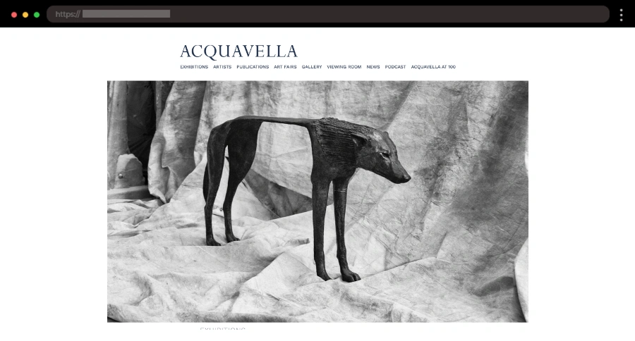
Acquavella Galleries specializes in fine art, and their website perfectly balances classic and modern design. The soft neutral color palette of whites and grays creates a serene backdrop, while large visuals on the homepage draw you into current and upcoming exhibitions.
🎨 What we love:
- Neutral tones and a blue-ish footer for a pop of color.
- Elegant serif fonts.
- High-quality art visuals.
How to Stand Out as an Art Gallery Online
With so many incredible art gallery websites, it can be challenging to make your digital presence shine. It is all about finding your unique brand’s story and bringing it to life online. Here are some tips to help your art gallery create a memorable website:
- Showcase Your Personality
Let your gallery’s identity shape the website design. If you focus on contemporary art, opt for bold visuals and interactive features. For traditional collections, a timeless layout with elegant typography can create a classic feel.
Pro Tip: Use a custom color palette inspired by your most iconic pieces to make your site feel like an extension of your gallery walls. - Tell Your Story
Every gallery has a unique history or mission. Highlight what makes your space special with an engaging “About” page or a video walkthrough. Share behind-the-scenes moments, like setting up an exhibit or interviews with featured artists, to deepen the connection with your audience. - Embrace Virtual Experiences
Adding interactive features like virtual tours, zoomable artwork, or augmented reality (AR) previews can give visitors an immersive experience and keep them engaged for longer, even from home. - Prioritize High-Quality Visuals
Your artwork is the star, so make sure it shines. Use high-resolution images, offer zoom functionality, and allow users to explore every brushstroke. - Build a Community
Incorporate elements like blogs, event calendars, artist Q&A sessions, and newsletter signups to engage your audience. Highlight social media links prominently and encourage users to follow and share your content. - Add an E-Commerce Component
A sleek and secure online shop where visitors can buy prints, merchandise, or tickets online can expand your revenue streams.
Need help creating your art gallery website like this?
We can build it for you→
Conclusion
With creative design, user-friendly features, and engaging content, these websites make it easy for visitors to connect with art on a deeper level. By exploring the examples shared, you’ll discover how well-used design features can enhance the art experience. Take the opportunity to get inspired and see how these galleries are reshaping the digital space.
Next steps:
-
Browse a gallery of 26 Beautiful Art Portfolio Website Designs, or
-
Jump right into our complete WordPress Website Examples Hub.