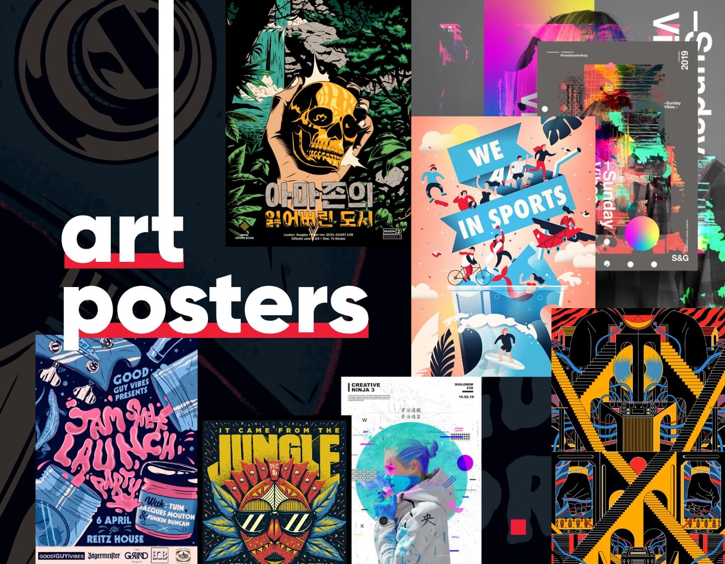
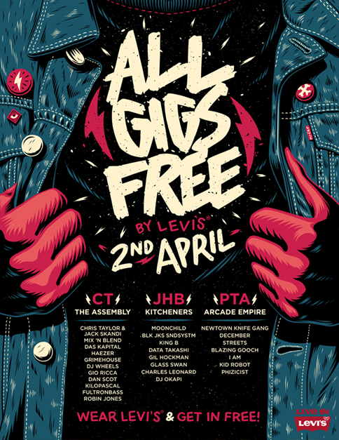
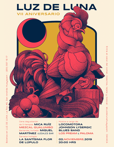
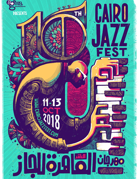
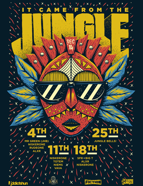
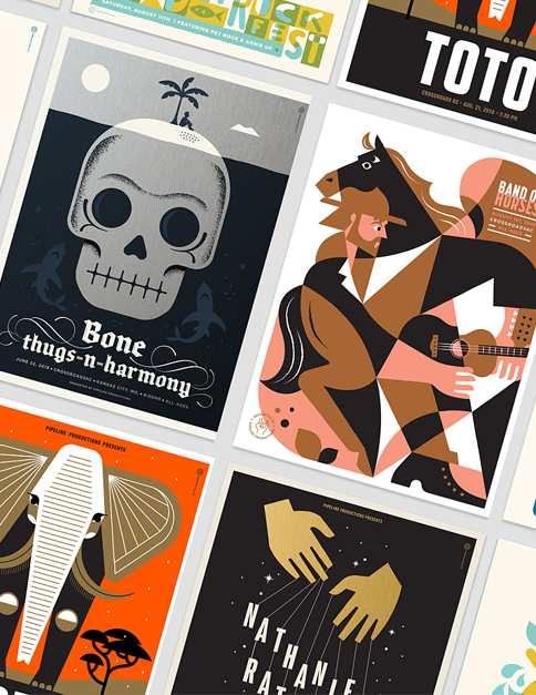
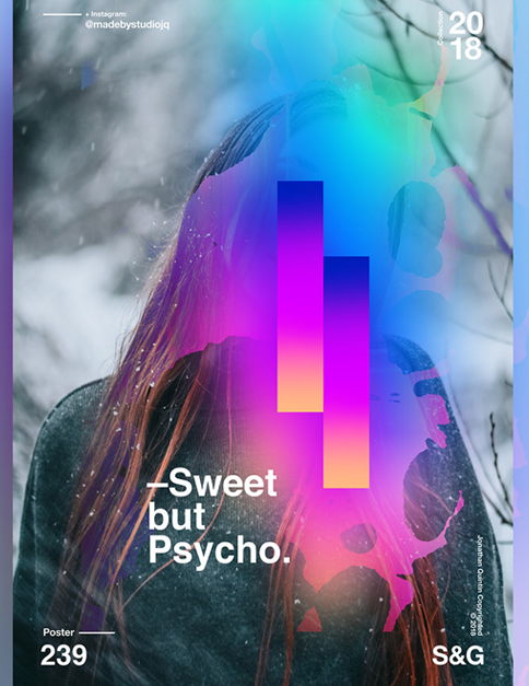
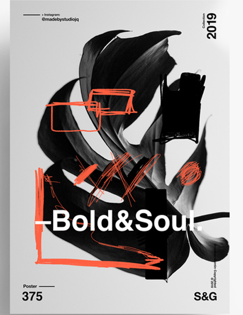
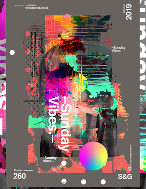
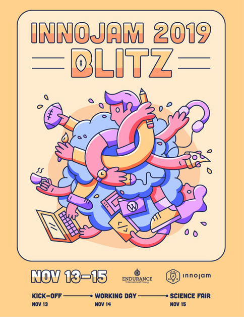
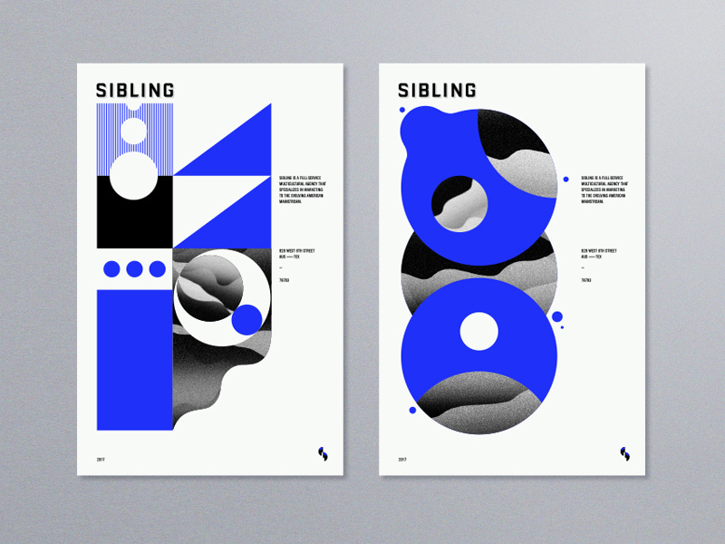
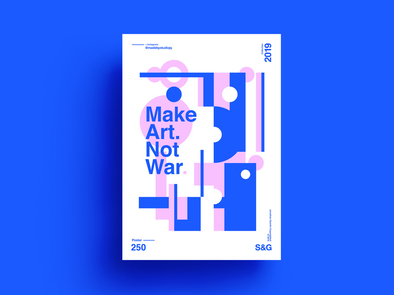
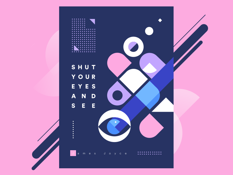
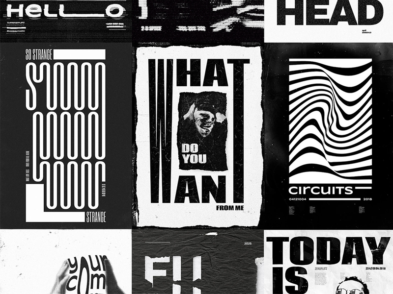
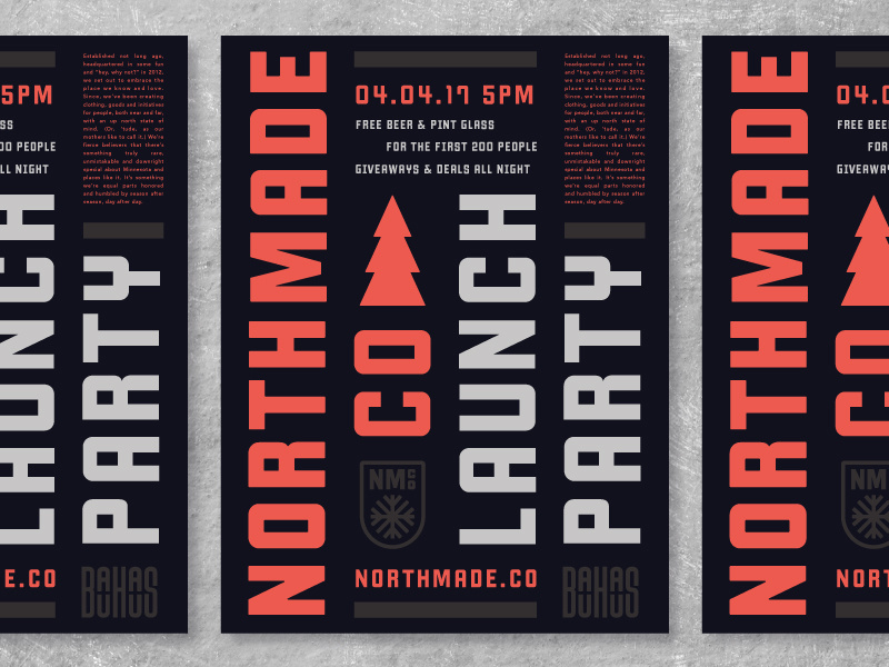
Posters have different messages and different targets. They all want to be noticed and remembered for how they communicate a message. Whether you’ve landed here for an inspiration to design a poster of your own or you just love to browse artwork for personal enjoyment, I got you covered today. I collected a nice gallery of art poster examples that can definitely be used as a means of inspiration.
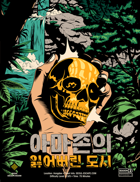
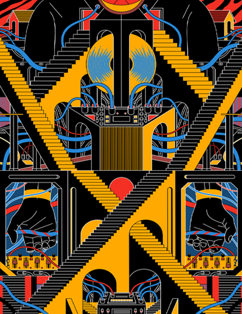
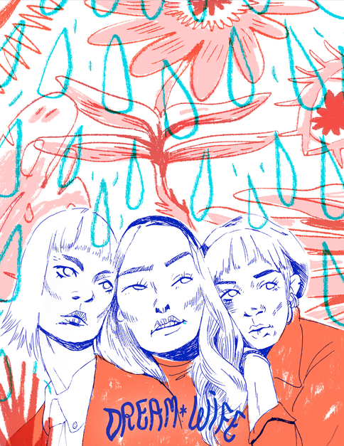
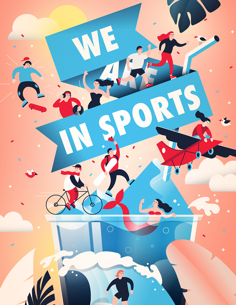
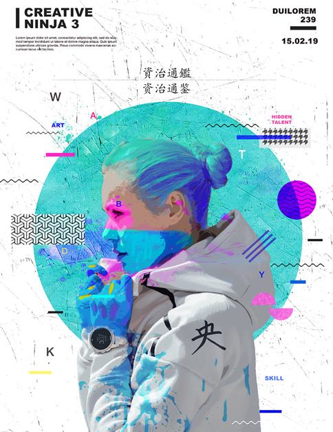
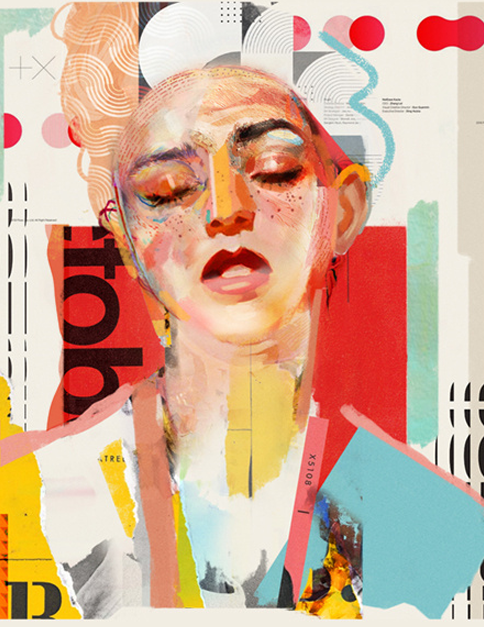
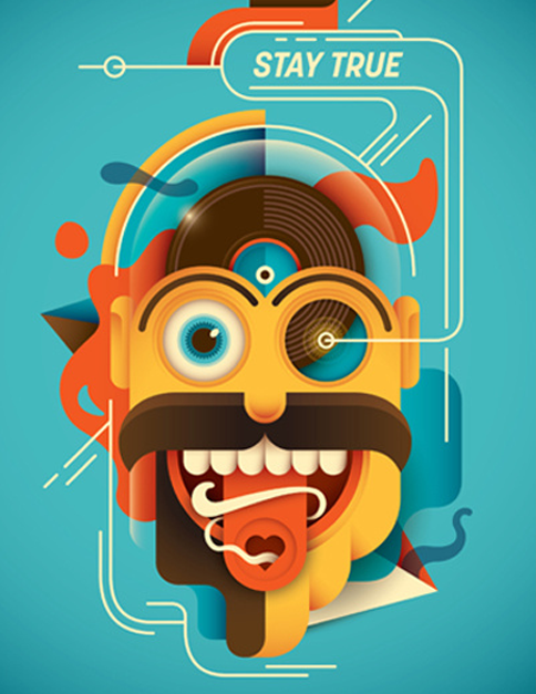
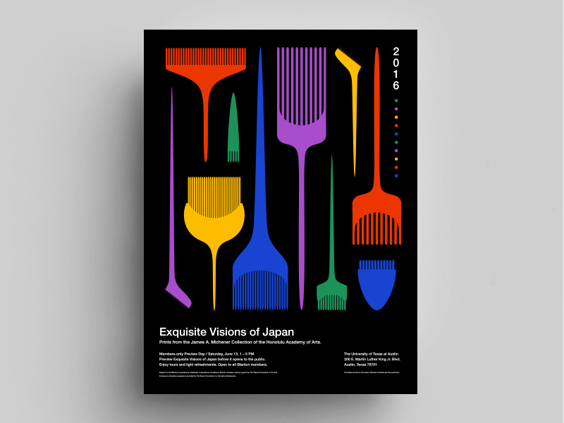
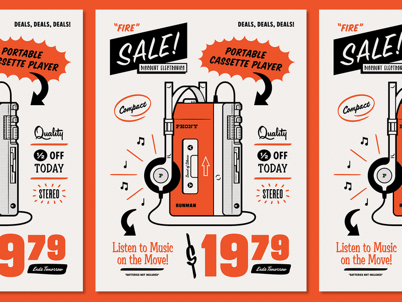
What these art posters have in common is abstract shapes, as well as strong contrast between vibrant colors. They have an indie and alternative vibe that reflects modern design trends. The respective artists used digital tools and traditional pens for designing the presented artistic poster examples. By mixing different flavors they successfully gave the artwork character. They definitely transfer the energetic spirit to the viewer.
In some of the sources where I took the posters from (each poster includes a link to it), you can also view the steps taken during the process of creating those digital artworks.
Art Poster Examples with Deep Contrast
Art Poster Examples with People
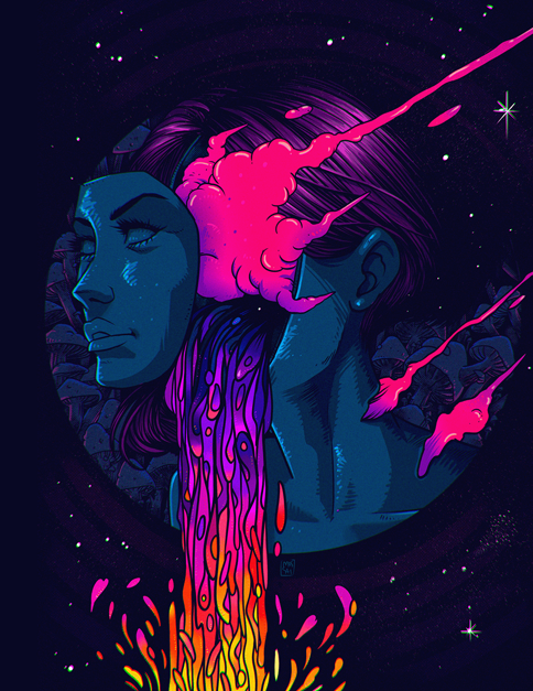
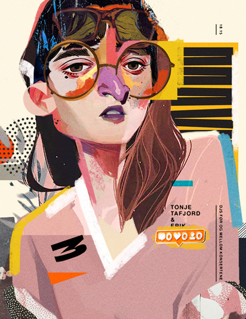
The following poster examples revolve around people. Some of them represent a combination of very natural-looking portraits and simplified geometric shapes. The abstract details increase the emotional level of the featured characters. This real and fictitious composition of shapes and colors is eye-catching with a wave of creativity.
Art Poster Examples with Vibrancy and Celebration
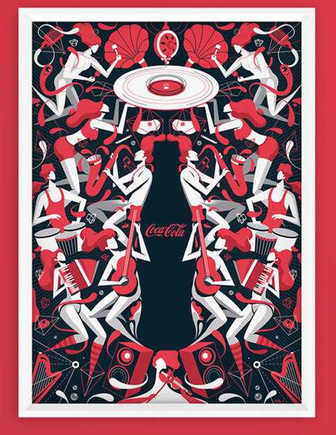
Do you want to feel the spirit of celebration through music and vibrant colors? If yes, then the following abstract poster example do just that. The bold and geometric shapes with bright colors take us to the music festival of our wildest dreams. Colors, new technologies, and relaxing sounds come to mind when one goes through these posters.
Minimalistic Art Posters
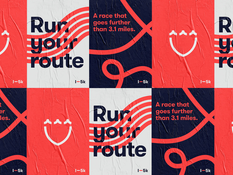
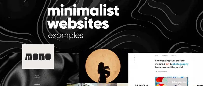
Minimalism and clean shapes combine with direct text-based messages. In fact, many companies take a minimalistic approach when creating their visuals for communicating information to their audience. Abstract, yet minimalistic designs are easily understood and memorized. If you are interested in what minimalistic, simplified, and abstract designs might look like, the following are some examples representing those concepts.
Typography Art Posters
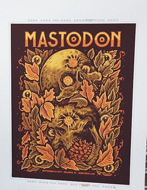
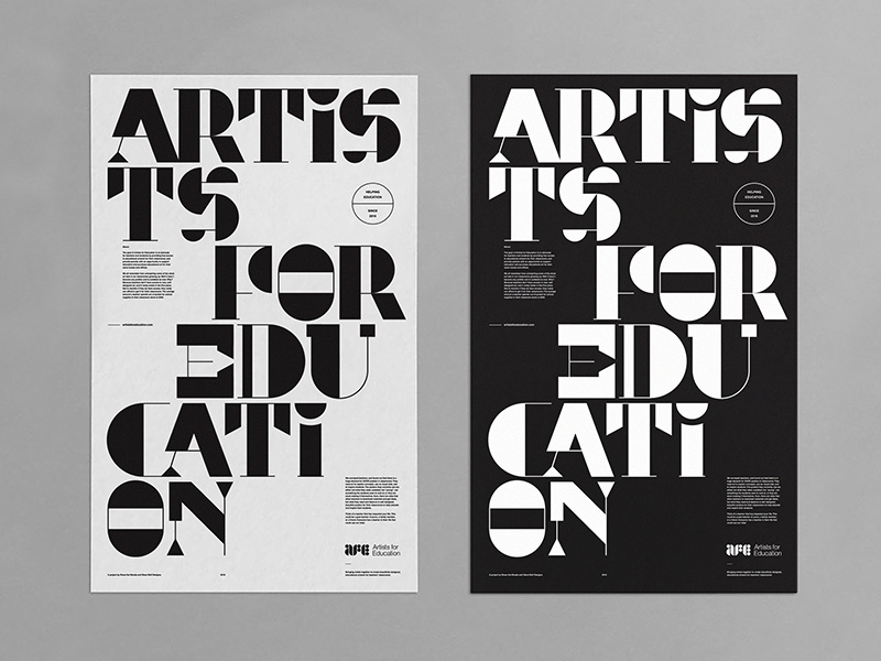
Visual art is just a form of beautiful communication. Pictures, figures, and colors speak just as loud as words. So why not have both and combine texts with creative shapes? The following typography art poster examples certainly implement the idea.
Final Words
In conclusion, these were just a small part of art poster examples that merely scratch the surface. I hope this collection would inspire you to give freedom to your mind and imagination and play with colors, figures, and shapes.


