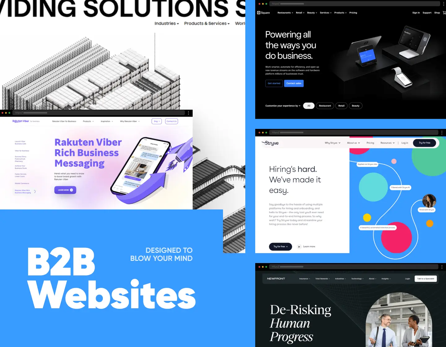
In the modern world, it seems that no business can flourish without a strong online presence. Building an effective website is truly important for attracting potential clients and caring for loyal customers. And because this is valid for any business field, today we turn our eyes to B2B website examples and see how they excel in this undertaking. A well-designed B2B website not only enhances user experience but also drives business growth by converting visitors into leads.
So, in this article, we will explore 28 outstanding B2B website examples that illustrate effective design, usability, and strategic content. These examples can serve as inspiration for web designers and business owners aiming to create or improve their own B2B websites.
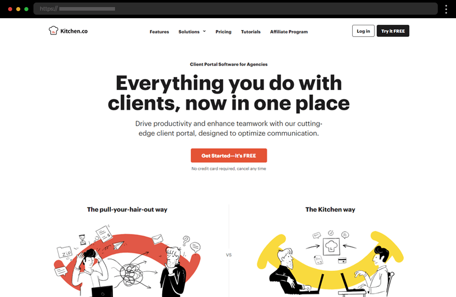
1. Kitchen.co – Client Portal Software For Agencies
Kitchen.co provides a seamless experience for managing projects and communication, showcasing an intuitive web design that prioritizes user experience. Its clean, modern interface simplifies navigation, making it easy for users to find and utilize various features. As a result, this site exemplifies how a clear layout and focused content can drive user engagement and satisfaction. Also, the alternating testimonials and tool descriptions sleekly build trust as the visitors scroll the homepage, solidifying Kitchen.co as an amazing B2B website example.
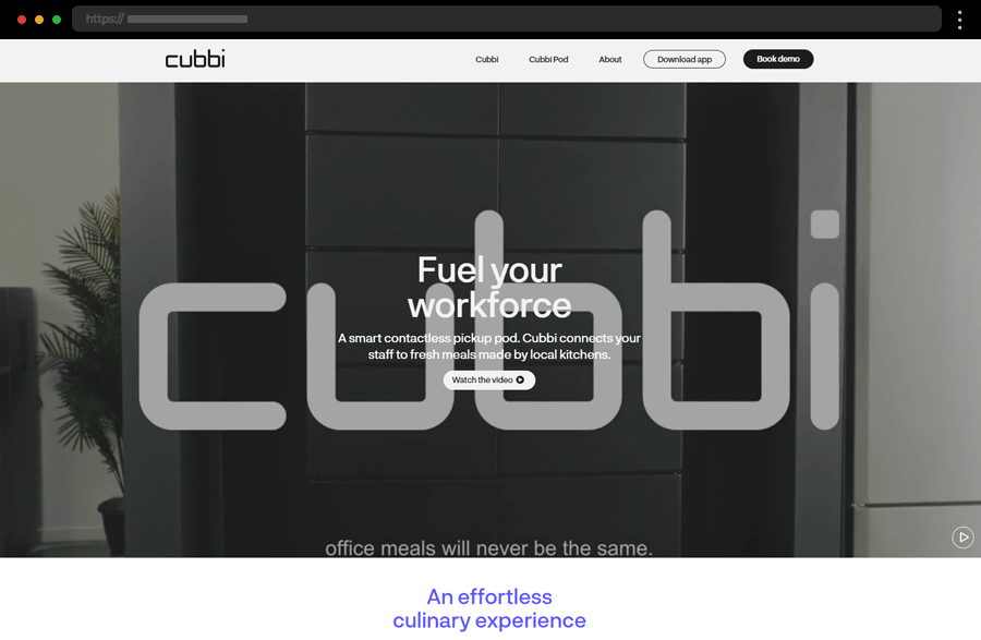
2. Cubbi – A Food Delivery Solution
Cubbi’s site uses bold visuals and dynamic content to capture the attention of businesses seeking clever office solutions. The full-width homepage video succeeds in immersing visitors in the presentation of Cubbi’s innovative service. In addition, the design is easy to follow and engaging, with a user-friendly interface that highlights the product effectively. It’s a great example of how creativity can be combined with functionality in B2B website design.
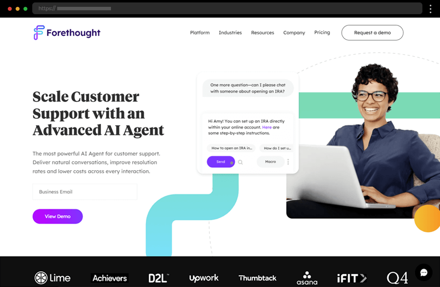
3. Forethought – AI Customer Support Solution
Providing innovative AI-driven solutions for customer support, Forethought’s site is modern, sleek, and professional, exuding transparency and credibility. Its homepage immediately communicates the company’s value proposition through concise texts and compelling animations. Meanwhile, the light, airy design allows for an accent on the important details and along with the colorful graphics serves as an example of how B2B companies can effectively communicate their solutions in an easily digestible and visually appealing website design.
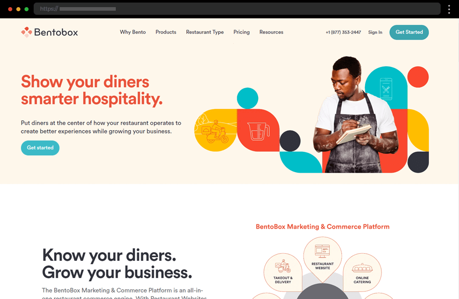
4. BentoBox – Marketing & Commerce Platform
Our next example is BentoBox coming with a website designed to help restaurants build an online presence and manage their processes more easily. Featuring vibrant imagery, clear calls to action, and a neat structure the site serves as a showcase of Bentobox’s services. Its layout is intuitive, guiding users through its offerings with ease. It is a great example of a B2B website that has effectively tailored its design to be appealing and compelling to its target audience.
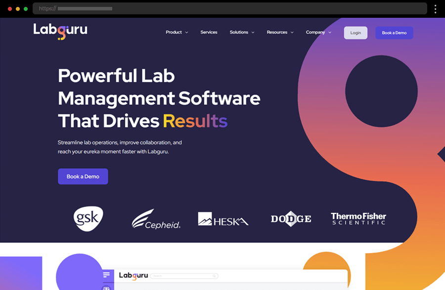
5. Labguru – Lab Management Software
With a colorful and professional look, Labguru’s website shares the company’s services in an approachable and easily digestible way, thanks to its neat layout and engaging graphics. The site’s anchored navigation, organized structure, and detailed content make it easy for users to understand and access the offered solutions. With its consistent design and clean, professional appeal, this example conveys trust and reliability, thus underlining the significance of clarity in designing narrowly specialized B2B websites.
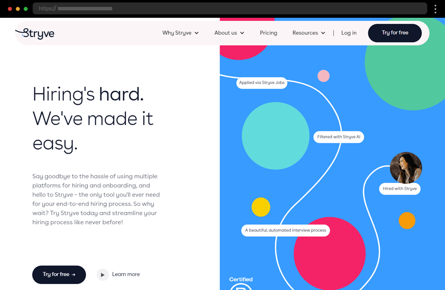
6. Stryve – Hiring Process Management Tool
Catching the eye with its colorful design, Stryve’s website is visually appealing and engaging, emphasizing the company’s tool facilitating the hiring process of businesses. Its site is modern and user-friendly, with easy navigation, lots of imagery, and convenient access to detailed service information. Combining aesthetics with functionality in all the features that the Stryve website boasts works for a comprehensive and satisfying user experience.
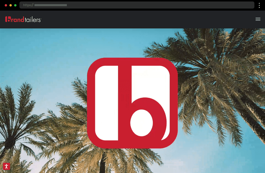
7. BrandTailers – Branding & Advertising Solutions
Brandtailers’ website combines striking visuals with compelling content to attract businesses looking for branding and marketing solutions. In addition to the many videos working to win the users’ trust, the site’s clean design and strategic use of color make it visually appealing while maintaining professional credibility. As a result, this example beautifully illustrates the powerful effect of balancing creativity with clarity in B2B website design.
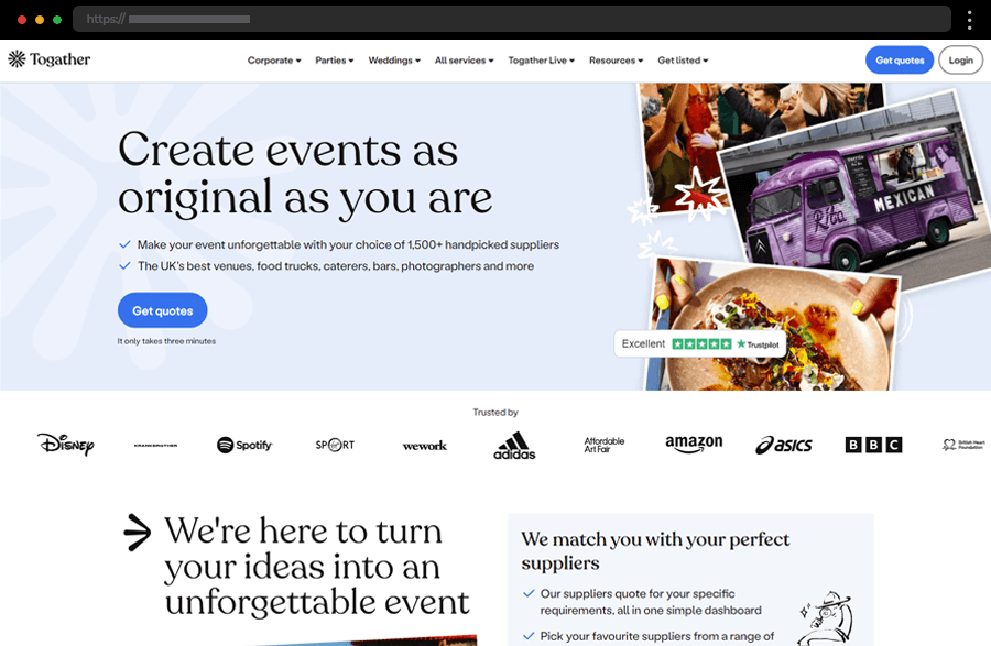
8. Togather – Event Management Platform
Togather offers a platform for event planning management, and its web design reflects the vibrant and dynamic nature of events. Straight from the start, the site instantly wins the visitors’ trust by sharing highly positive reviews and an impressive list of notable clients. The design is inviting and interactive, encouraging user engagement through many well-placed calls to action, quick links, and vivid images. As a result, Togather provides an excellent example of how to create a compelling and engaging B2B website.
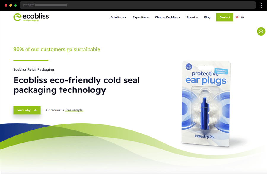
9. Ecobliss – Retail Packaging Solutions
Next comes Ecobliss with a sleek and clean website exuding professionalism and sustainability through its design and color palette. With the company’s business providing innovative packaging solutions, its site uses high-quality visuals, straightforward navigation, and many CTAs to present its products and services effectively. As a result, this website is an amazing example of how to present a B2B company’s complex products in an accessible and appealing way.
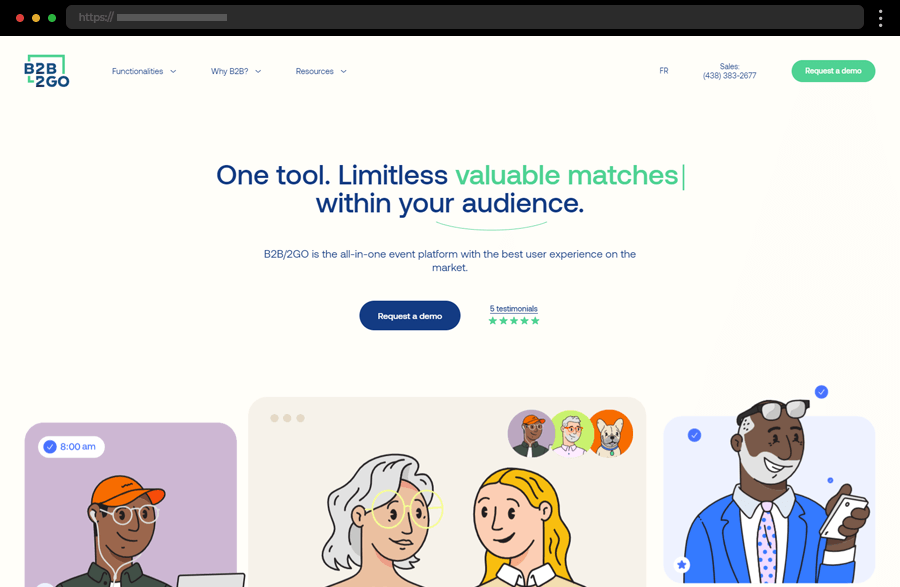
10. B2B 2GO – Event Organization Platform
B2B-2GO, an intelligent platform facilitating the organization of networking events, sports a website with a clean and straightforward design that emphasizes functionality. The site’s clear navigation and comprehensive service descriptions ensure user satisfaction while subtly building credibility. As a result, B2B 2Go’s website is a perfect example of how simplicity and efficiency can enhance user experience.
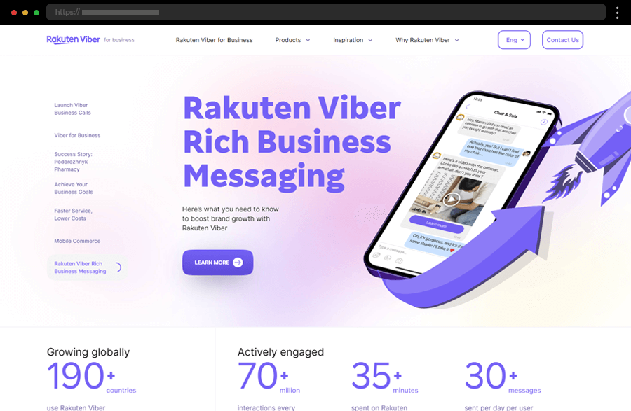
11. Viber For Business – B2B CRM Tool
For its multilingual website, Viber for Business uses a simple yet effective design to communicate its messaging solutions. The site’s layout is user-friendly, with clear sections highlighting different features and benefits and distinct call-to-action buttons inviting users to engage further. Thus, Viber provides a worth-following example of how to effectively use simplicity and clarity in B2B website design.
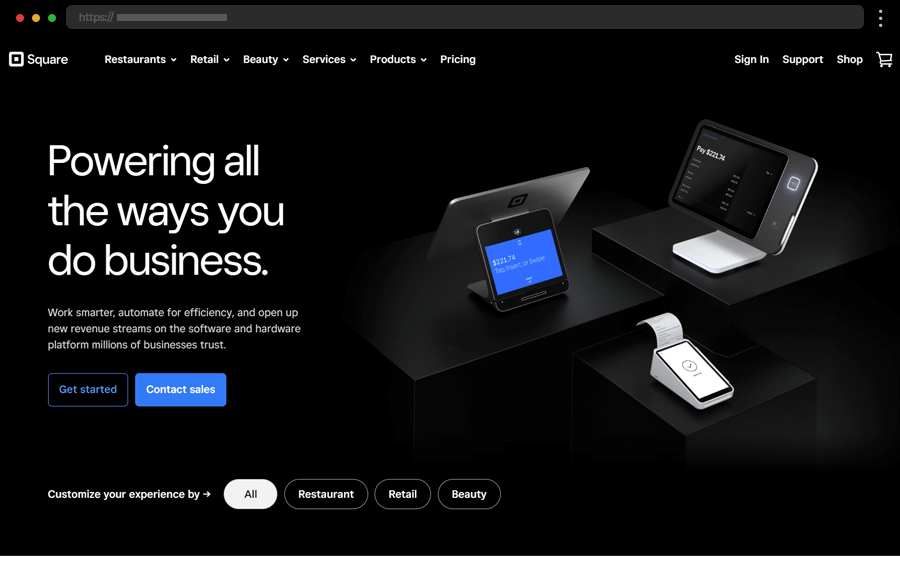
12. Square – Payment Processing & Business Management Tool
Square’s modern website is polished and professional, offering a wide range of business solutions through its clean and organized interface. In addition, the site is attractive and a pleasure to explore with its compelling messaging and visuals. Taking the most out of call-to-action buttons, quick links, and smart internal linking this site exemplifies how a well-thought-out design can enhance both user experience and business growth.
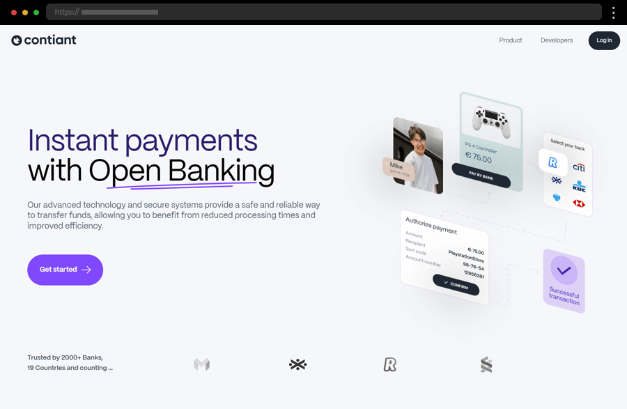
13. Contiant – Open Banking Services
Contiant, offering open banking solutions, has a website with a clean, modern design greeting visitors in its calm, inviting, pastel-colored atmosphere. The site’s layout is intuitive, providing easy access to detailed service information and resources with vibrant CTAs enhancing the user experience. With its content-rich yet user-friendly homepage, Contiant provides an example of how to craft a B2B website that effectively conveys trust, approachability, and reliability.
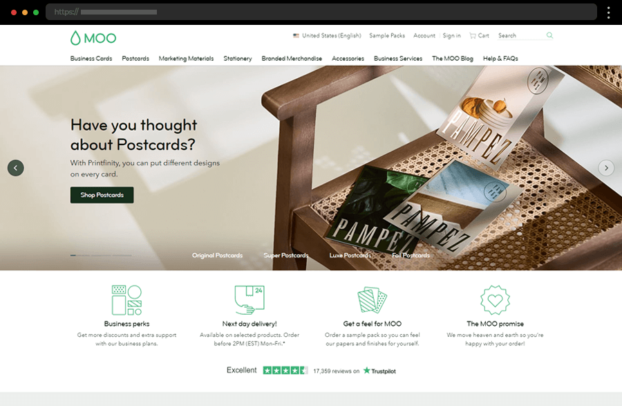
14. Moo – Custom Printing Solutions For Businesses
Moo stands out with a website sporting a clean design in neutral colors, that cleverly shifts the focus on the vibrant imagery depicting the company’s custom printing solutions for businesses. Despite the extensive menus describing Moo’s many offerings, the site is neatly structured and visually appealing, with a user-friendly interface that enhances the overall experience. As a result, Moo gives us a perfect example of practicality and how to creatively use compelling imagery and messaging to drive engagement in B2B website design.
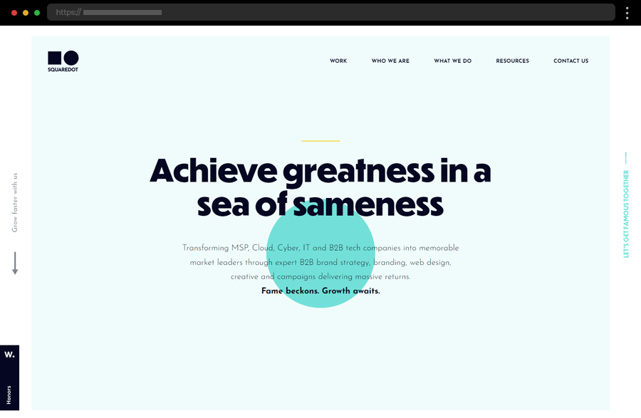
15. Square – B2B Marketing Agency
The dynamic design of Squaredot’s website immediately catches the visitor’s attention. This B2B site shines with attractive animations on every page, creating a memorable experience. Its engaging layout naturally guides the eye to key details, while the vibrant elements make the extensive information easy to digest. In addition, the convenient preset integrated contact form further enhances user experience turning this B2B website into an inspiring example.
16. Voluum – Ad Tracking Tool For Businesses
Voluum, offering an ad tracking tool, has a website designed for performance marketing, featuring a dynamic and modern design. Embracing a bright design, the site utilizes vibrant colors to accentuate important details, metrics, and design elements. In addition, it has a user-friendly layout with clear calls to action and comprehensive service information. All this combined makes Voluum’s website a great example of how to create an engaging and informative B2B website.
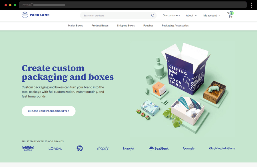
17. Packlane – Customizable Packaging Solutions
Packlane’s website offers custom packaging solutions, with a bright and inviting pastel-colored design. Its compelling hero section features an appealing product image with concise text, and a CTA, complemented by logos of trusted brands, thus instantly winning the visitor’s trust. With its easy navigation and clear product descriptions facilitating businesses to find the solutions they need, this example embodies the power of a visually appealing and functional design in B2B websites.
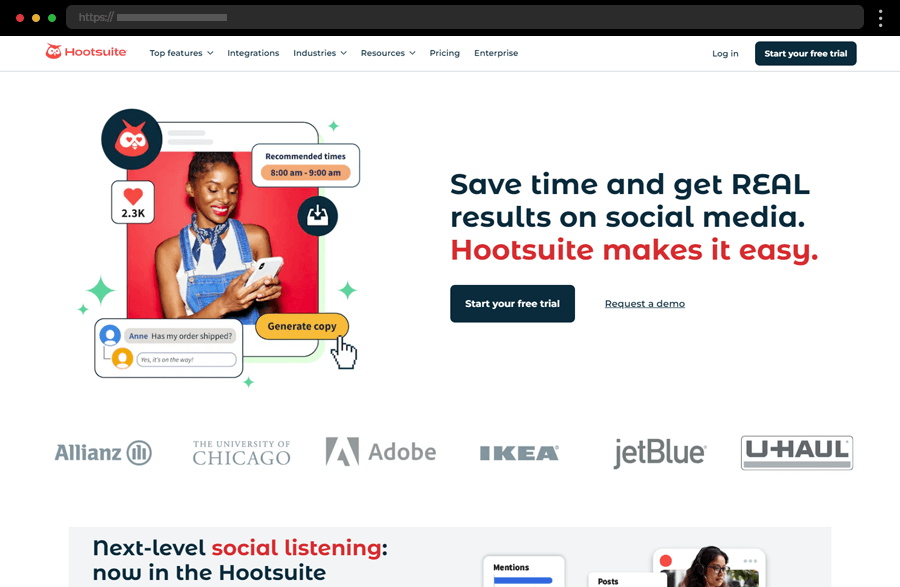
18. Hootsuite – Social Media Management Platform
Hootsuite’s website features a clean and modern design and presents the company’s social media management services. The site’s layout and intuitive navigation are easily used and user-friendly, thus facilitating businesses with their solution searches. Showcasing also many metrics and graphics, testimonials, and Hootsuite’s impressive list of clients builds instant credibility, illustrating how to successfully attract clients and win their trust.
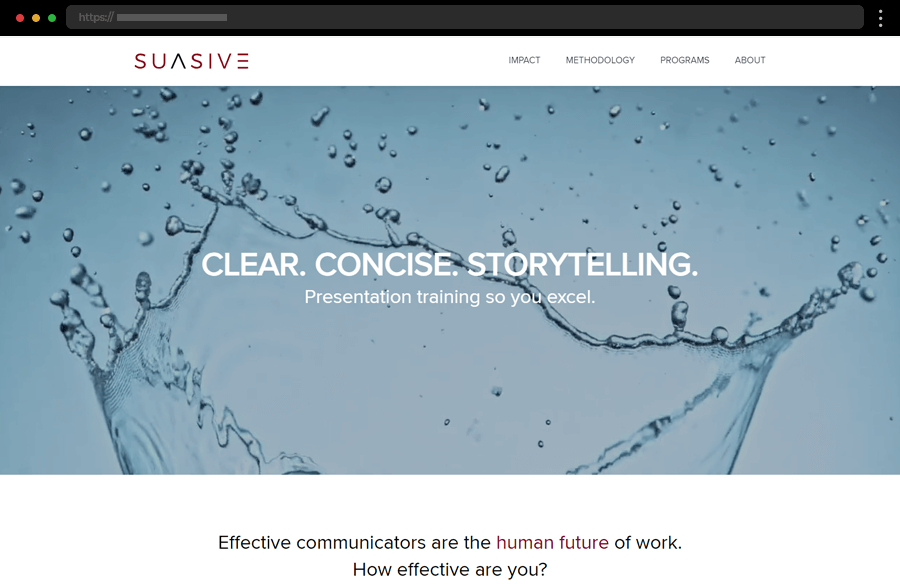
19. Suasive – Communication Consulting Company
Suasive, a company providing communication consulting services, presents itself with a website sporting a professional and polished design. The site’s centralized layout is clear and organized, thus facilitating visitors to understand the company’s mission and its offered services. Every element of this B2B website example is carefully thought out to convey expertise and credibility, thus resulting in an effective and compelling web design.
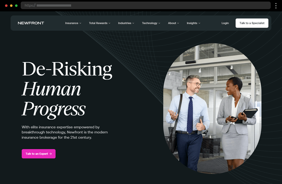
20. Newfront – Insurance Solutions Platform
Exuding professionalism and reliability, Newfront’s website offers insurance solutions with a sleek and modern design. The site’s layout is intuitive, with clear navigation aiming to facilitate the visitor’s journey within the sea of broadly presented information. Meanwhile, the alternating backdrop colors keep the users’ attention while getting familiar with the comprehensive service descriptions, thus further enhancing the user’s web journey on Newfront’s site.
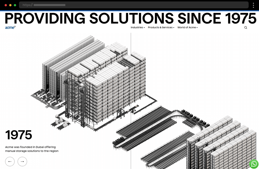
21. Acme – Manufacturing And Warehousing Solutions
Next comes Acme, a company offering manufacturing and storage solutions for the region of Dubai. Its website utilizes a clean and straightforward design to present Acme’s complex services. Each page is engaging and informative with interactive graphics and comprehensive descriptions. Moreover, with its intuitive navigation and broad menu, providing easy access to detailed product information, this example shows how simplicity and efficiency can enhance the user experience in B2B websites.
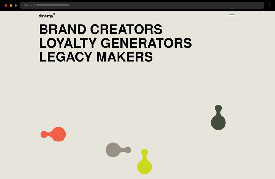
22. Dinergy – B2B Branding And Marketing Services
Our next example, Dinergy, greets us with a clean, creative, and stylish website presenting the agency’s branding and marketing services. On its homepage, featured highlights of projects attract the attention and engage visitors to browse further while the list of numerous notable clients wins the visitors’ trust. The site also comes with an easy-to-follow layout with simplified anchored navigation, strategic CTAs, and comprehensive information ensuring a satisfying user journey.
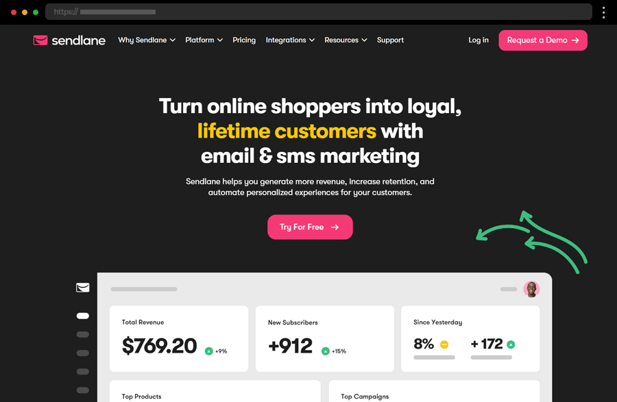
23. Sendlane – E-mail & SMS Marketing Solutions
Sendlane, a company offering email and sms marketing solutions, sports a website with a sleek and modern design. The homepage’s hero section shines with a clear value proposition and distinct call-to-action buttons. Further, its colorful design cleverly utilizes contrast to accentuate different sections and important details. With its intuitive navigation and comprehensive information, this B2B website example ensures an effective and engaging user experience.
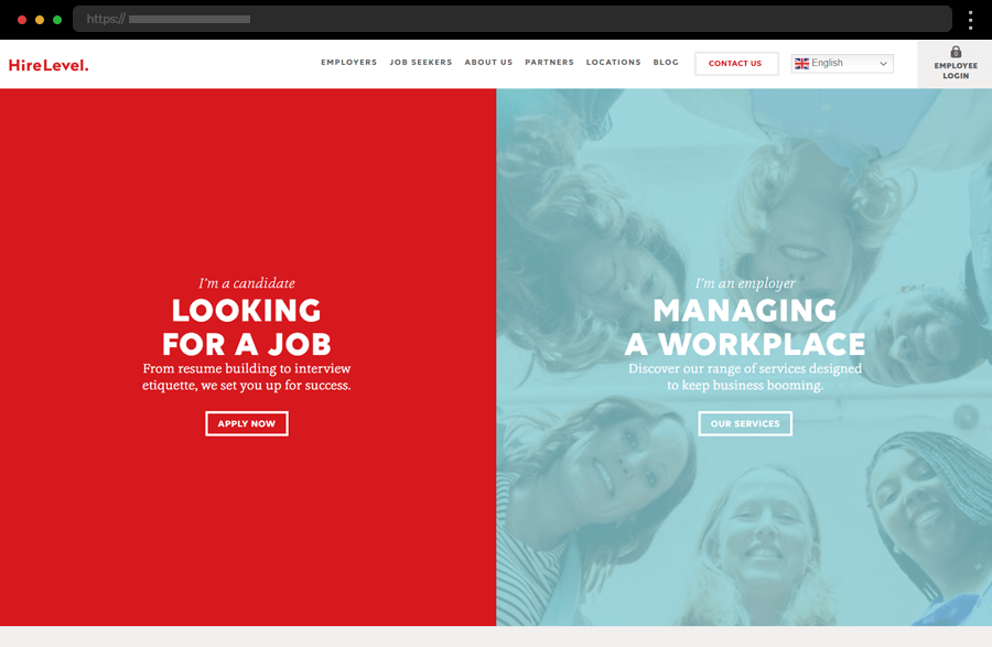
24. HireLevel – Workforce Management Services
HireLevel, a company providing workforce management solutions, greets us with a split-screen homepage straightly communicating its services and guiding visitors to their desired destination. The site’s centralized layout is clear and organized, complementing the overall design and facilitating users with their search for information. Coming with many resources for job seekers and employers, this example illustrates the importance of clarity and professionalism in industry-specific B2B websites.
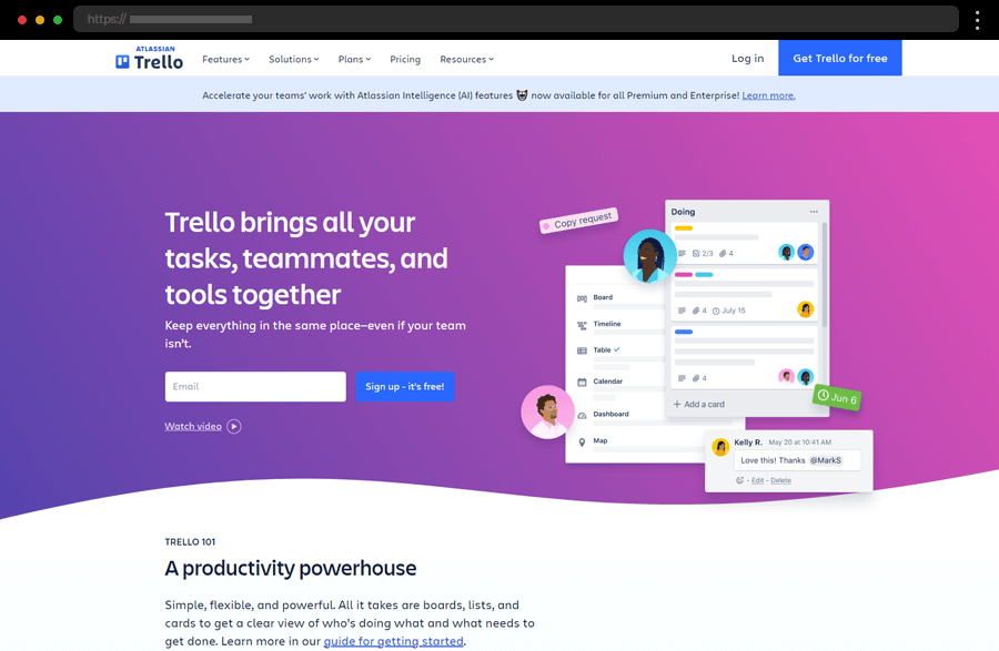
25. Trello – Project Management Tool
Trello’s website boasts an engaging, clean design with strategic bursts of color to highlight key information. The hero section is direct and effective, featuring concise descriptions and well-placed calls to action. In addition, the anchored top menu is comprehensive, detailing the company, pricing, and products. Overall, this B2B website example is well-designed and intuitive, providing all the essential information a first-time visitor needs to understand Trello’s services.
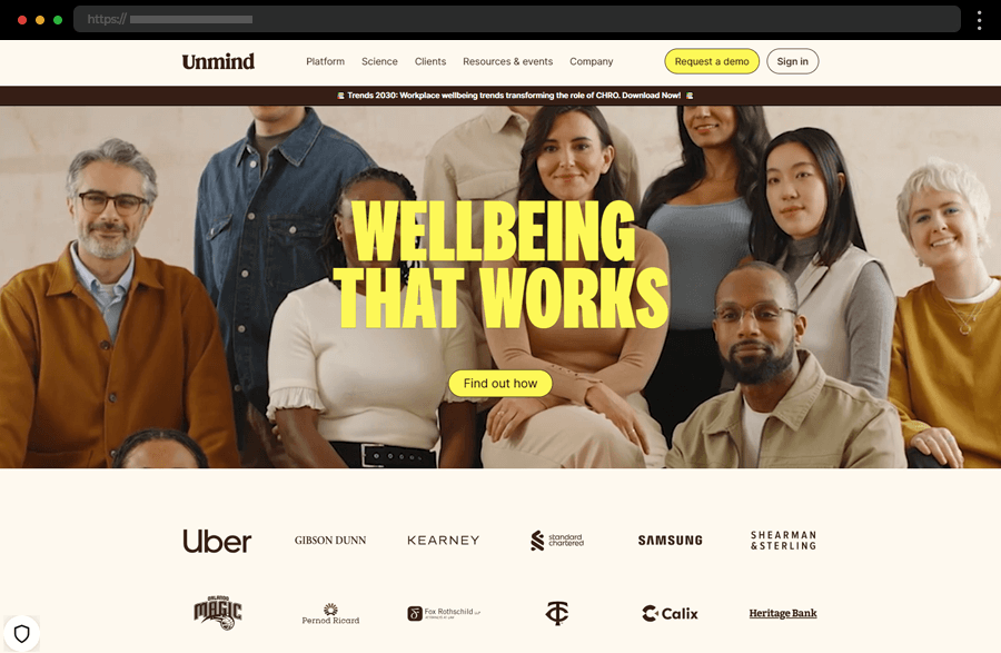
26. Unmind – Workplace Wellbeing Platform
Unmind’s website offers mental health solutions for businesses, with a sleek and modern design. The homepage’s background video, bright yellow messaging, and CTAs capture the user’s attention. Meanwhile, the display of prestigious client logos below enhances the brand’s credibility and boosts engagement. The overall design with an intuitive layout, the featured podcast, and blog articles efficiently introduce users to the company’s services, altogether depicting this example as a user-friendly and professional health-focused B2B website.
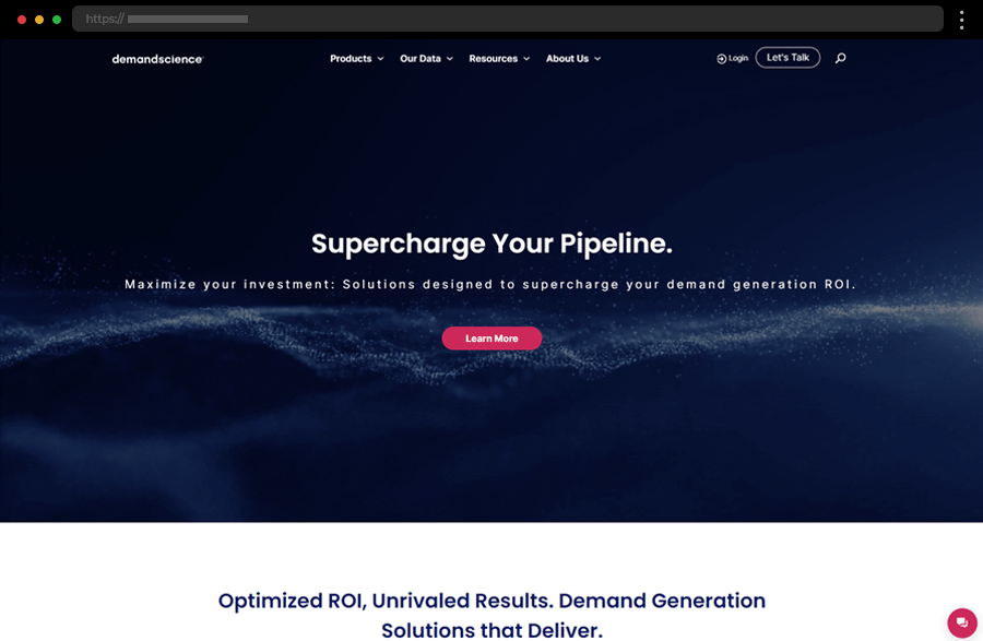
27. DemandScience – Marketing And B2B Data Solutions
DemandScience’s website provides data-driven marketing solutions, featuring a clean and professional design. Its layout is well-organized, packed with various CTAs and a comprehensive drop-down menu, thus facilitating businesses with their web journey. As a result, the well-structured site delivers clear and engaging information, complemented by graphics, text, and statistics, effectively building user trust and encouraging them to stay.
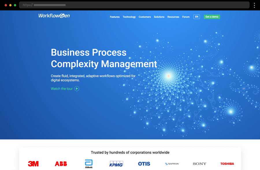
28. WorkflowGen – Digital Process Automation Software
WorkflowGen, our last B2B website example, sports a clean, minimalist design that highlights their services and showcases their prestigious clients. In addition, the site’s bilingual interface and streamlined menu ensure an enjoyable browsing experience. It also offers extensive information for businesses seeking to understand and access the workflow management solutions that the company provides.
Need help creating your professional business website like this?
We can build it for you→
Tips on crafting example-worthy b2b websites
- Ensure your website is designed with the user in mind because a user-friendly website encourages visitors to stay longer and engage with your content.
- Your website should straightforwardly communicate what your business offers and how it can benefit potential clients. So, use concise messaging and impactful visuals to convey your value proposition effectively.
- Further, use high-quality images, graphics, and videos to create a visually appealing website. This not only enhances user experience but also builds credibility and professionalism.
- Provide engaging content that addresses the needs and interests of your target audience. For example, blog posts, case studies, whitepapers, and other content to establish your authority and attract more visitors.
- Also, include clear and compelling calls to action (CTAs) throughout your website to guide visitors toward taking desired actions.
- Take care of your website’s SEO(Search Engine Optimization) to increase its visibility. Use relevant keywords throughout your content, and ensure your site is technically sound for SEO purposes.
- Oh, and make sure your website is responsive and looks great on all devices to reach a wider audience because the majority of people will access it from their mobile devices.
Final words
To sum it up, a well-designed B2B website is a powerful tool for driving business growth and managing client relationships. The B2B website examples in our article not only look great but also deliver exceptional user experiences. So, whether you’re a web designer or a business owner on your way to creating a memorable and effective B2B website, make sure to follow the best practices to ensure your website truly stands out among its competition.
Next steps:
-
Browse a gallery of 40 small business website designs, or
-
Jump right into our complete WordPress Website Examples Hub.


