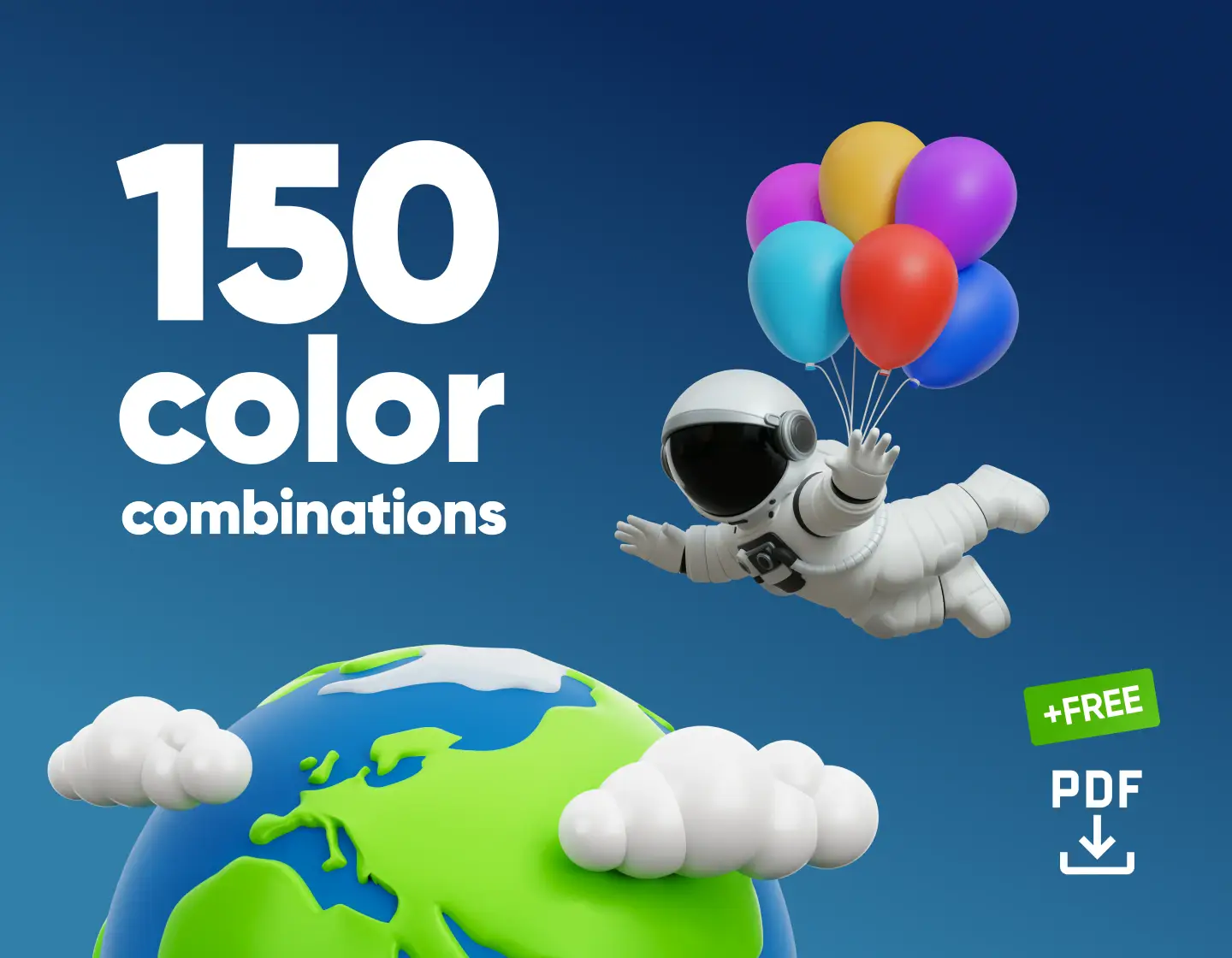
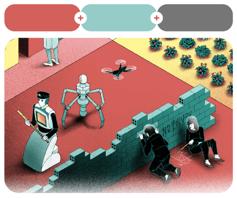
Here, you’ll find 150 color combinations separated into different categories based on color or the number of colors in a pallete, gradients and a free template with all the palettes from the article.
Picking colors shouldn’t feel like solving a Rubik’s cube blindfolded, even though sometimes it kinda does. You think you’ve nailed a combo, and then bam! It looks like a ’90s bowling alley carpet. Been there.
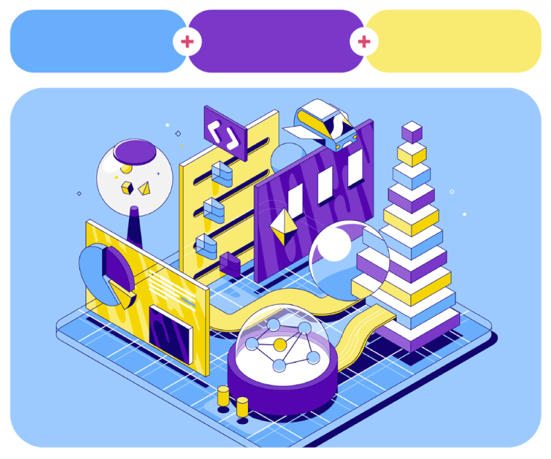
That’s why I put together this collection of 150 color combinations for inspiration so you can skip the guesswork and see these palettes in final products. The combinations are separated into categories for 2-color, 3-color, and 4-color combinations and gradients, and then they get more specific like palettes with blue, red, green, mocha, etc.
Oh, and because I know the struggle of scrambling to find hex codes later, I also made you a free PDF template with all the combos, ready to download. It’s a good time-saving tool for presenting color palettes to your clients in a clear, persuasive, and professional way. Enjoy.
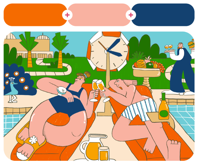
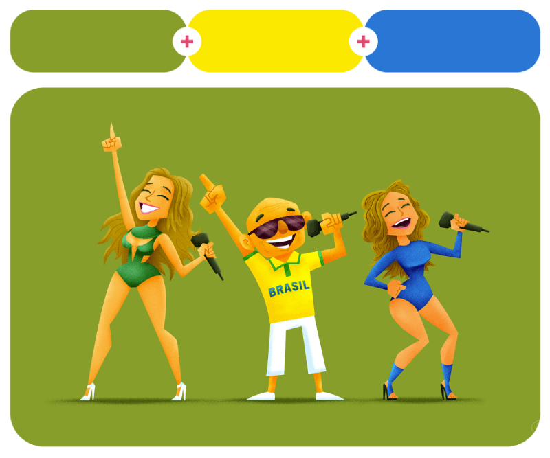
Combinations with Two Colors
Two colors might not seem like much, but the right pair can work magic. Some pairs are bold and punchy; others are soft and subtle. Here are 20 awesome two-color combos from artworks, packaging, websites, and more as proof that sometimes, two is all you need!
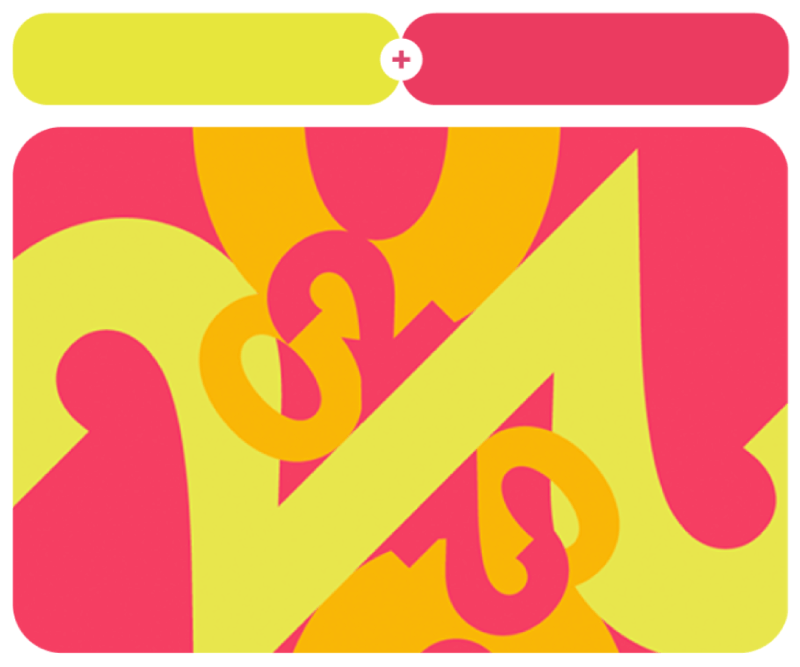
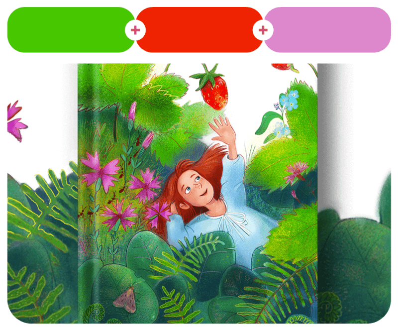
1. Leo Royal Fuchsia + Yellow Chalk
#ec3dc5 – #f3fdad

We’ll start with the personal work of Dia Pacheco, where the artist shares amazing illustrations with vivid, contrasting colors.
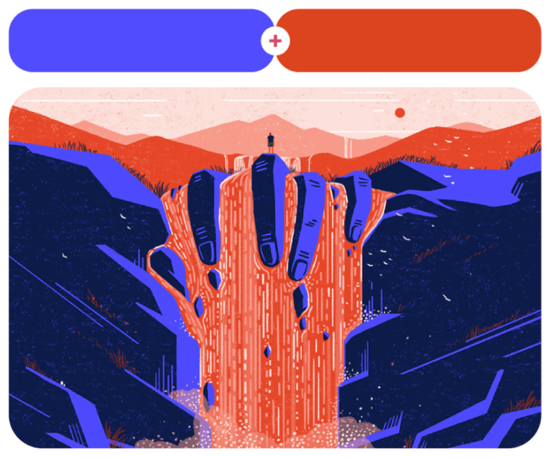
2. Lemon Dream + Dragonlord Purple
#f1a200 – #6039cc

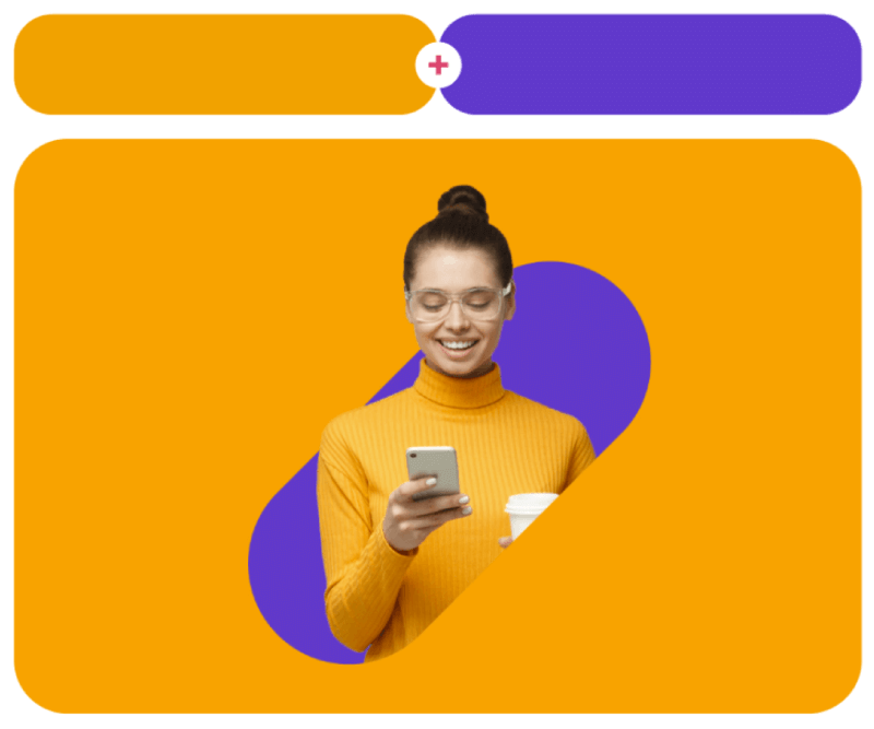
3. Exotic Violet + Snappy Happy
#e3a3d3 – #ed7f38

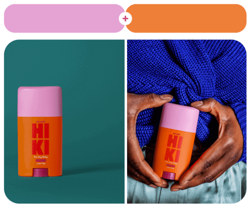
Next, we have the Hycom rebranding project, where the design team of Kuba Horna and Katarzyna Motyl Turkowska brings out the joyful DNA of the brand. Similarly, Kirsten Collins creates a visual identity for HIKI with amazing two-color combinations for the different deodorant packaging.
4. Snappy Violet + Turtle Lake
#d40683 – #73bba3


5. Love Potion + Scenic Path
#d10c5c – #cec6b5

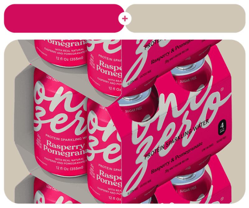
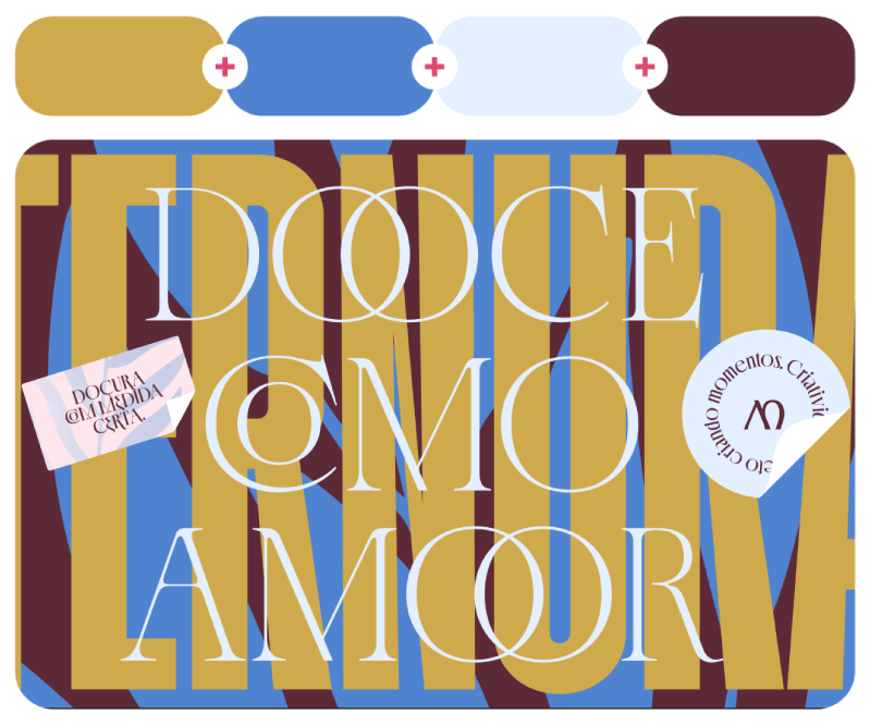
The delicious typography on the left is Funjuan dg’s logo concept for Dulce Antojo, a brand responsible for developing rich, sweet, and fun presents for children’s parties. On the right, you see Erika Luisetto’s packaging design for Onezero protein sparkling water.
6. Taisha Brown + Abaddon Black
#b8511e – #231e1e


Kokoro comes from the Japanese word for “heart,” and the illustrations for the brand also show affection and love with heart symbols. The brand identity and package design for Kokoro was created by ARTSBY EMDE.
7. Aqueduct + Victorian Valentine
#5db3b6 – #af63a6

8. Fever + Toxic Steam
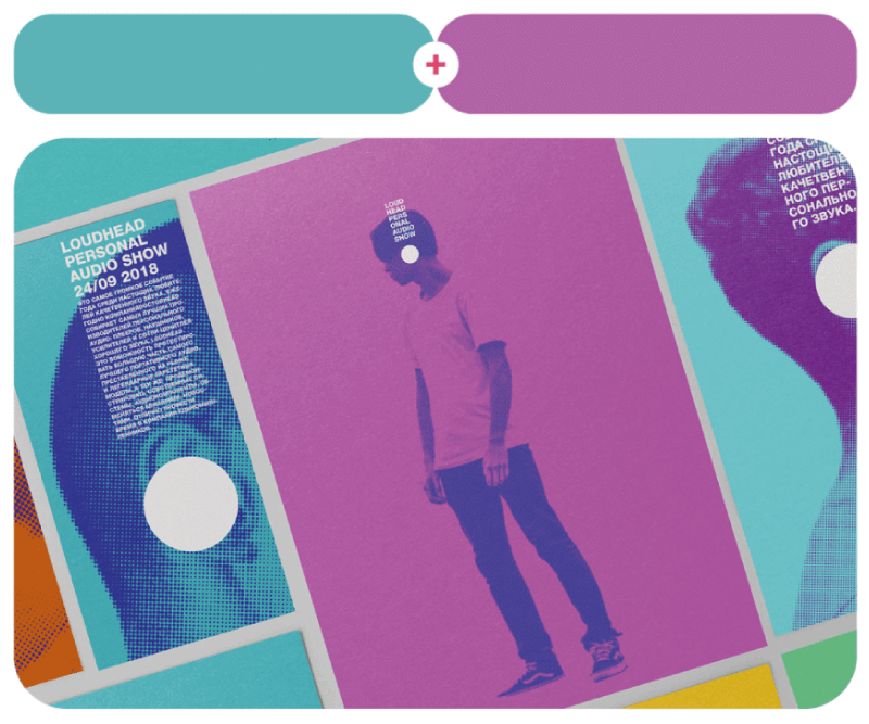
#eb4c48 – #c2ffd0

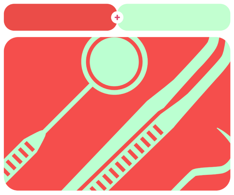
Two-color grunge brand identity for Loudhead headphones by Suprematika Agency and odontology icons in red and mint by Daniela Hernánguez.
9. Red Bell Pepper + Tlāloc Blue
#e53500 – #33737f

10. Welcoming Wasp + Dover Straits
#f1aa00 – #3667b7

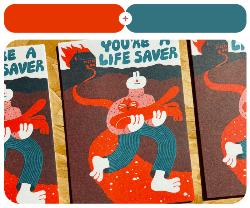
A collection of greetings cards by YUK FUN with fun, colorful illustrations and trippy classic cartoon characters by Violetta Derlemenko.
11. Diva Violet + Almond Biscuit
#5077b9 – #e8cba7

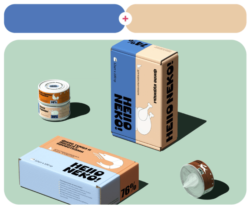
Hello Neko is a popular pet food company in Russia with a brand new line of wet food, the visuals and packaging of which were designed by COOOT Studio. All products have different two-color combinations, depending on the main ingredient.
12. Vibrant Arsenic + Eugenia Red
#e7e63c – #eb3b60

13. Lán Sè Blue + Tomato Queen
#524cff – #db441e

Next, a creative typography design by J. Jonathan H. Viveros for 02022020, and the Antology illustration series in blue and red by Yukai Du.
14. Saltwater + Ageless Beauty
#c0d0dd – #e7a994

15. Pale Purple + Jaffa
#ba92d3 – #e4764b

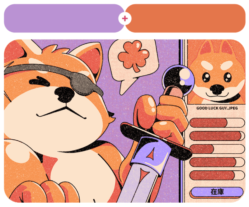
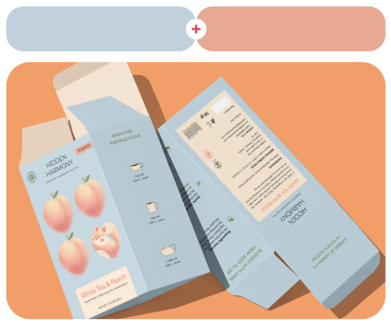
Alona Haidash chose soft, peachy colors for her Hidden Harmony tea packaging design. The Shiba Inu illustration on the right comes from Ilustrata studio, and if you check the entire project, there are more where this came from.
16. Green Serum + Grass Pink Orchid
#94d71b – #c785ff

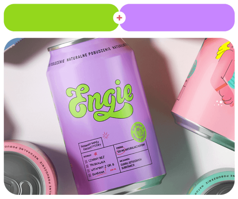
Two-color combinations work great for packaging, as you can see in the Engie energy drink can design by PG Branding. The project offers 5 different color combos for the different drinks, depending on the taste.
17. Onsen + Bright Lilac
#6bedc1 – #e097eb

18. Cosmic Cobalt + Mountain Ash
#302f8b – #c97300

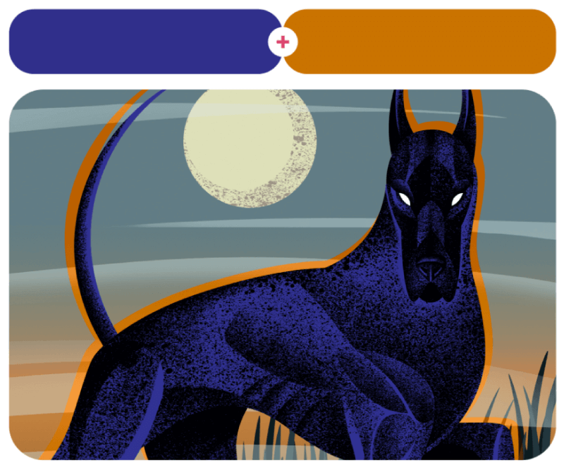
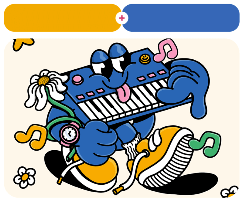
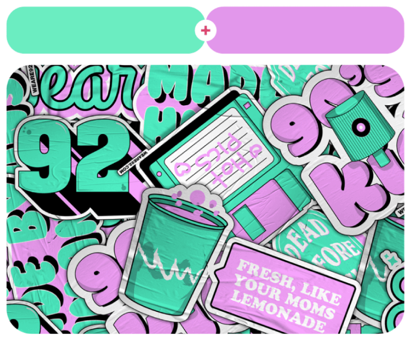
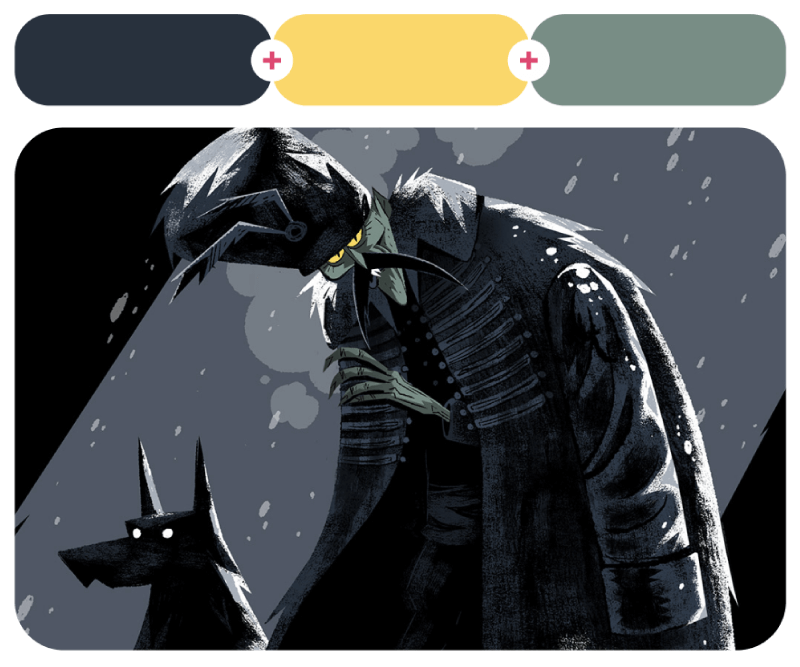
WEARE92.COM’s brand voice stickers by Felipe Salcedo go full 90’s street style. But if you’re up for something more classic, check out Lina Serzhan’s illustrated book project based on The Hound of Baskervilles.
19. Golden Yellow + Light Lavender
#ecba00 – #eac2fe

20. Aniseed + Slow Perch
#cba73c – #d3d4ce


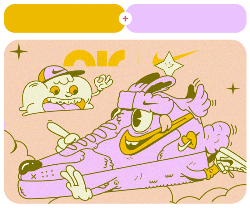
And last, here are some fun cartoon Nike Air Characters in lavender and yellow by Mucho Zorro, and Antiche’s brand identity and packaging by Estudio Nuar.
Combinations with Three Colors
Three-color combos hit that sweet spot—more dynamic than two, but not so many that things get messy. If they got the right mix, you get balance, contrast, and just the right amount of personality. Here are 20 awesome three-color combinations from designs that nailed it!
21. Distant Flare + Dark Sienna + Wild Rose
#ebd4da – #390c15 – #cd7897

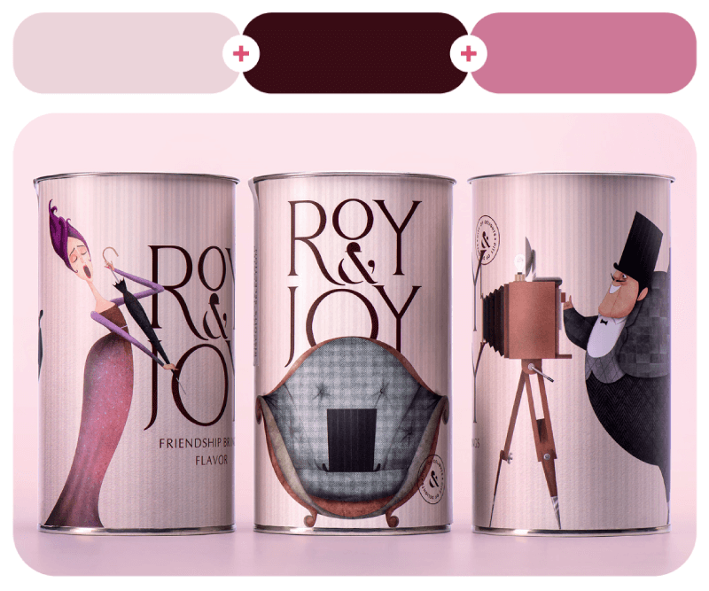
‘Roy & Joy’ is a unique confectionery tea brand. The design was done by Stepan Azaryan, Mane Budaghyan, Liana Mazmanyan. Illustrstions by Rafayel Hovhannisyan.
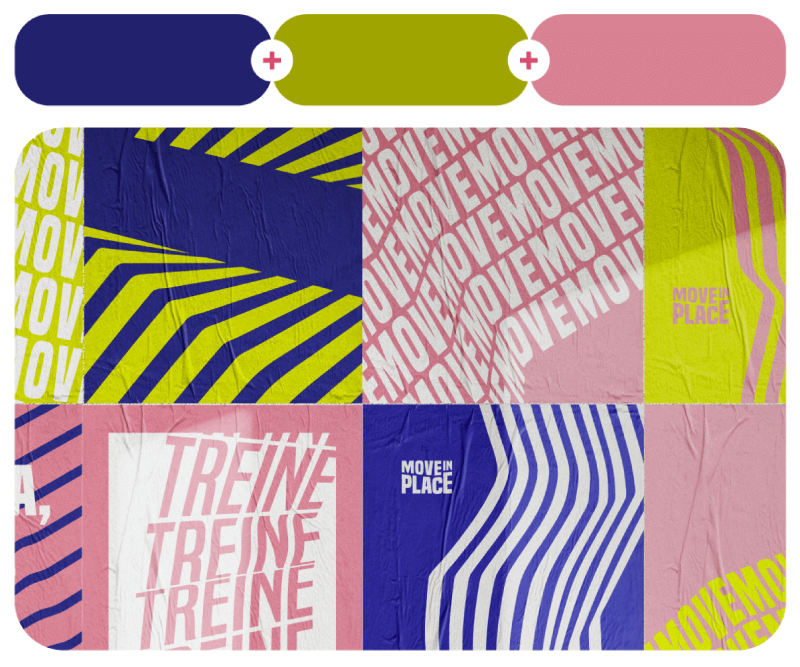
22. After Work Blue + Countryside + Shimmering Blush
#22216d – #9fa400 – #d88292

23. Purple Illusion + Spleen Green + Mysterious Depths
#b6b2ef – #d0e800 – #090c28

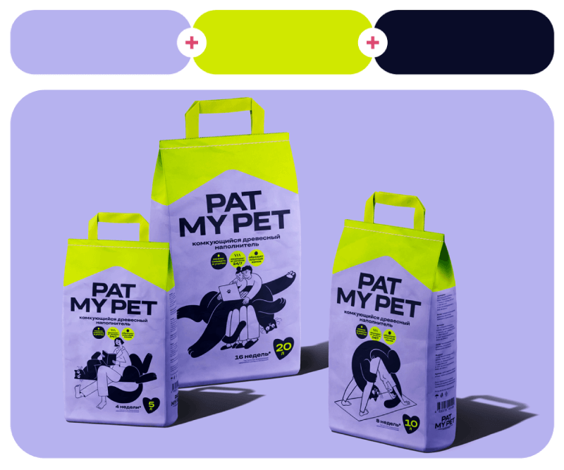
Next, we have Move in Place posters by Fábio Santana and Pat My Pet Cat litter brand design by Funky Agency.
24. Hawaiian Ahi Poke + Mountain Meadow Green + Zhohltyi Yellow
#d74635 – #3c8036 – #e4c400

25. Fire Dragon Bright + Zomp + Ocean Abyss
#f66f00 – #36aa90 – #230c67


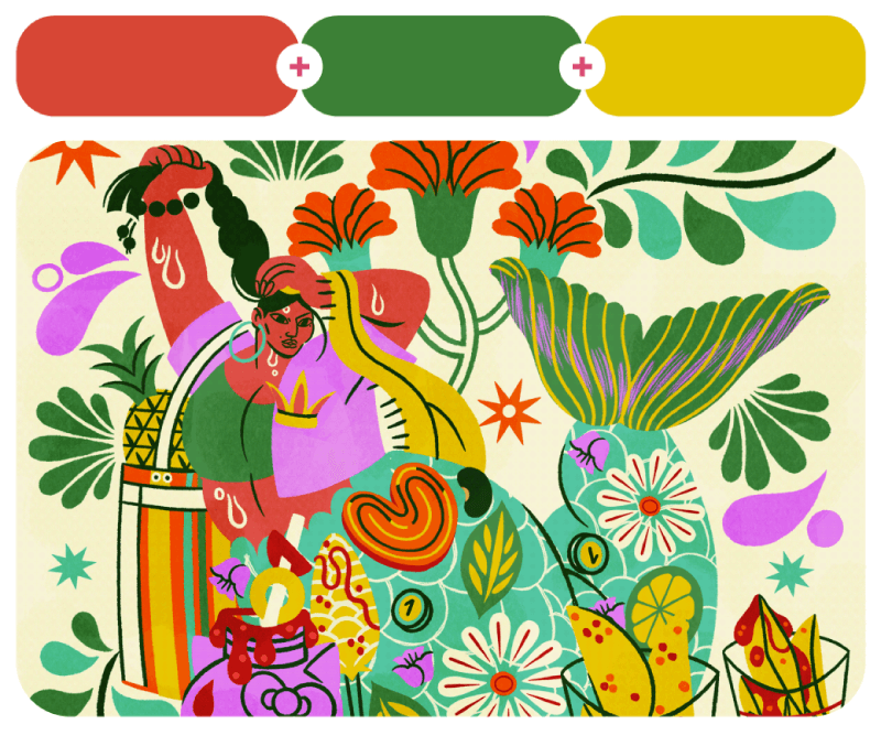
CAPIROTADA is a collection of personal illustrations by Dia Pacheco in an amazing color scheme to take inspo from. On the right, you have UNDURRAGA Sparkling Mixed Drinks packaging design by Emi Renzi Studio.
26. Demonic Yellow + Cigarette Glow + Majestic Magenta
#fae900 – #f15000 – #f23f8e

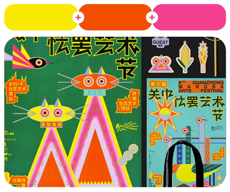
These colorful illustrations and posters were designed by Au Chon Hin for the 6th Guanzhong Mangba Arts Festival event.
27. War Paint + Brown + Bilious Brown
#d95a17 – #8f511c – #db9e08

28. Flower Girl + Blue Radiance + Corn
#f895ac – #5acace – #fcea5b

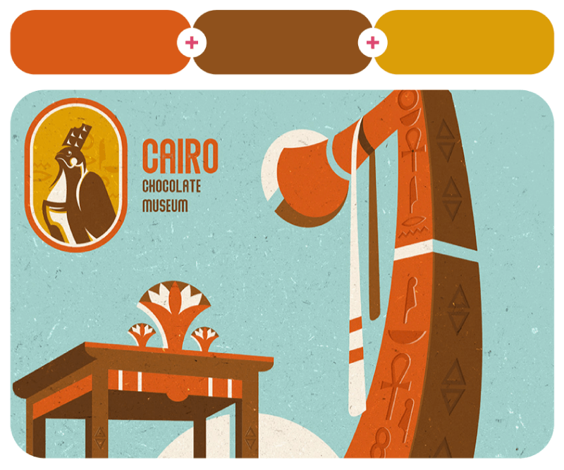
Muhamed Loutfy made these delicious designs for the Cairo Chocolate Museum identity. Next, this is the “Poptypes!” video project by Álvaro Studio, where the animated onomatopoeias appear in surprising and fun environments.
29. Corsair + Harvest Eve Gold + Ballet Rose
#195567 – #da9500 – #d0aab2

30. Crumbly Lipstick + Screen Glow + Key Lime Water
#ed62b3 – #5ee8a8 – #e9f48a


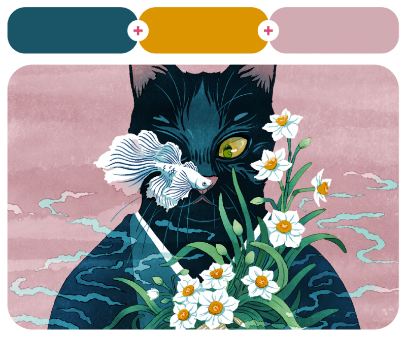
A Floating World by Tùng Nâm is a collection that features five captivating illustrations of cats inspired by the Ukiyo-e style. Following is the Saudi Arabian brand Elehoopoe, which sells unique and trendy items. Design by Baianat.
31. Uldum Beige + Barbarian + Baby Cake
#fac680 – #f98b58 – #84c1a3

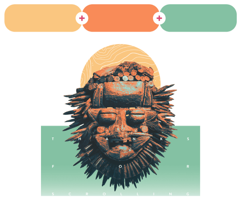
Beautiful African masks design by Rafael Ramirez.
32. Bluebonnet + Blushed Bombshell + Nasturtium Flower
#2117fb – #f08ec7 – #eb4f20

33. Bright Blue Violet + Happy + Kriss Me Not Fuchsia
#9a2fe7 – #fad564 – #ec26d0

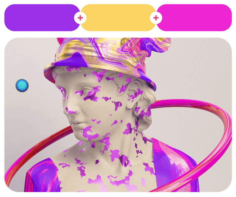
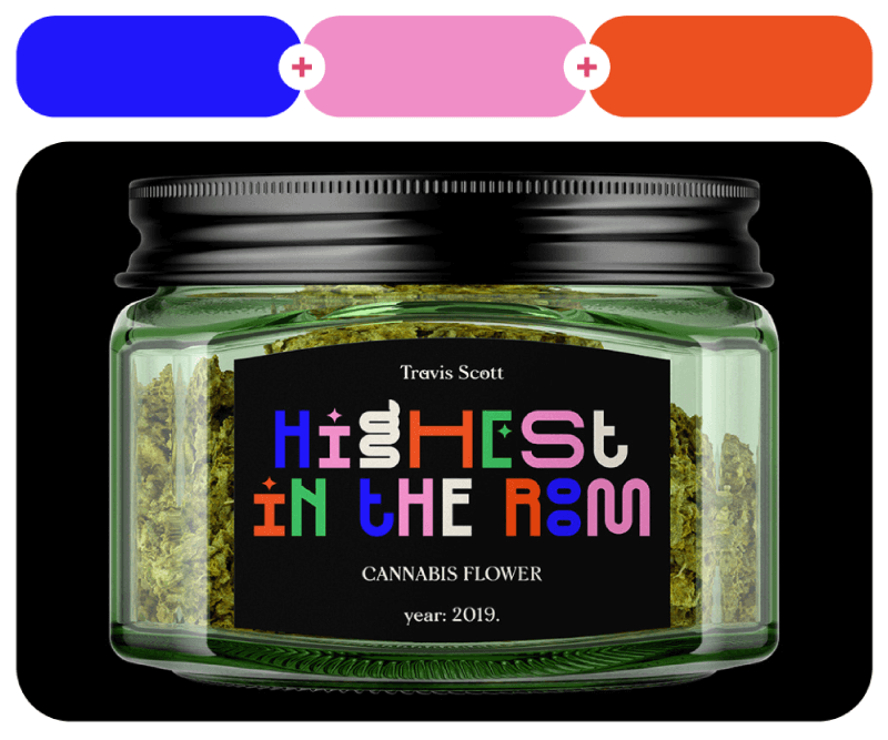
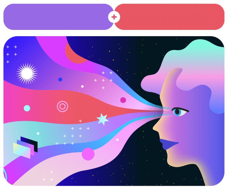
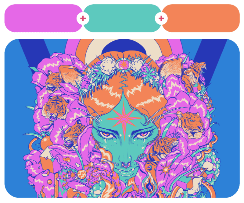
This is a creative Music Packaging design project by Jasmina Zornic. The explosion of purple and pink over Ancient Greek art, on the other hand, is a project for 4 am Saatchi & Saatchi People First.
34. Kuro Green + Piment Piquant + Modern Ivory
#1e2d1d – #c72700 – #f5eddc

35. Diamond Black + Huáng Jīn Zhōu Gold + Chinois Green
#28313d – #fad76b – #788d85

This classic green, red, and ivory palette comes from the visual identity for Global Alliance by Motora Design. Next, a very cool dark colored fanart illustration of Count Orlock by Hugo Cuellar.
36. Limo-Scene + Lovely Euphoric Delight + Lady Luck
#4c4b4f – #feedff – #45603a

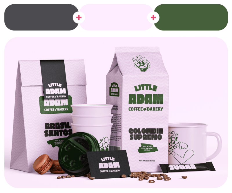
Little Adam Coffee & Bakery is a coffee shop whose visual identity by Yernaz Ramazanov comes in a fresh high-contrast palette of dark grey, pink, and green.
37. Magnificent Magenta + Photon Barrier + Dancing-Lady Orchid
#f218ae – #88dbf0 – #e0fd00

38. Sea Ridge + Martian Colony + Red Salsa
#40a3c8 – #e77614 – #f53748

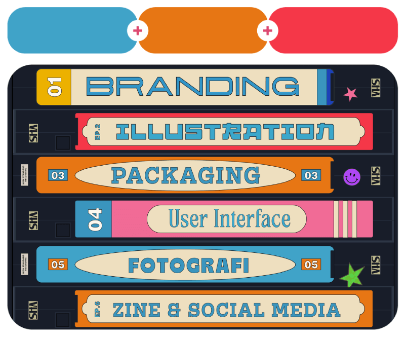
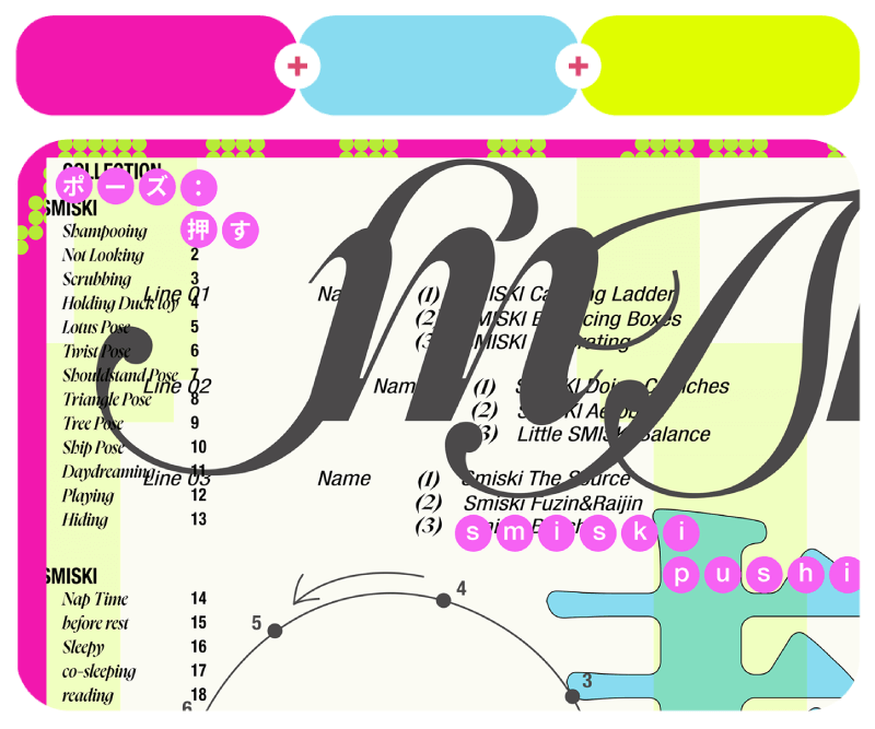
This couple of examples bring nostalgia design. On the left, we have SMISKI poster series in neon green and pink by Sofya Douhel. On the right, Nathan Wijaya’s portfolio design gets creative with categories designed like old videotapes.
39. Artemis + Wipeout + Chocolate Plum
#d4a86c – #408098 – #402e30

40. Raspberry Rave + Montego Bay + Endless Summer
#f41e18 – #3bb2bd – #facf00

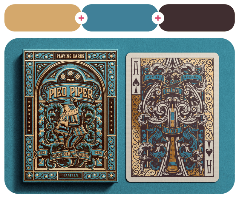
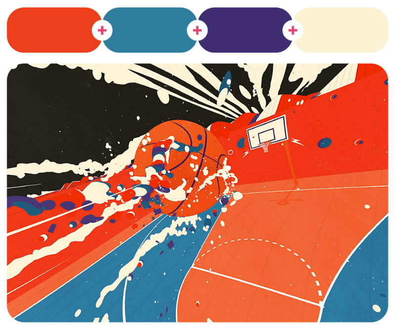
And the last couple of examples for 3-color combinations come from Russ Gray’s awesome Pied Piper Playing Cards design and Danii Pollehn’s colorful sports illustrations.
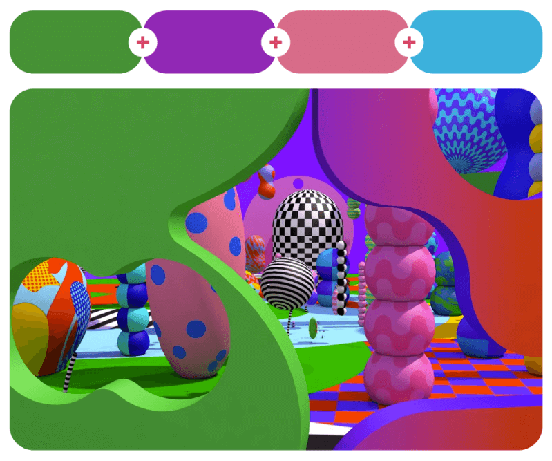
Combinations with Four Colors
More colors don’t have to mean more problems! Four colors can work together to create pure magic. As you will see, the right mix adds depth, energy, and just the right amount of chaos (the good kind). Here are 20 awesome four-color combos that prove
41. Purple Heart Kiwi + Rich Gardenia + Prominent Blue + Sweet Escape
#ce1a8b – #f67e4a – #277aa6 – #8b41f9

This is one of Mink Couteaux’s experimental illustrations where the artist tries out a more abstract style.
42. Heating Lamp + Fun and Games + Her Highness + Lemon Popsicle
#ea3f1a – #2e7c9c – #402c71 – #faf2d2

43. Benifuji + Moonstone Blue + Ebony + Astroturf
#ba7697 – #6da8c0 – #313237 – #62a058

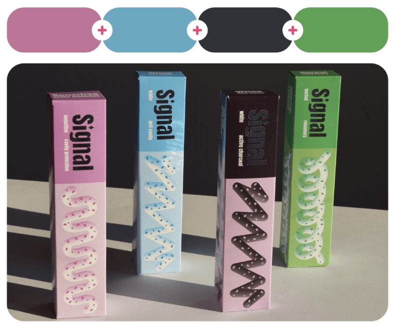
ESPN Basketball illustrations by Sebastian Onufszak in high contrasting colors, and Signal toothpastes packaging redesign by Mia Maurović in 4 different color variations.
44. Tree Sap + Acoustic White + Off Black + Italian Plum
#cc7618 – #f0ece1 – #303030 – #55364b

45. Conspiracy Velvet + Sweet & Sour + Kanafeh + Czarina
#58485b – #cdab3a – #e28936 – #785b58

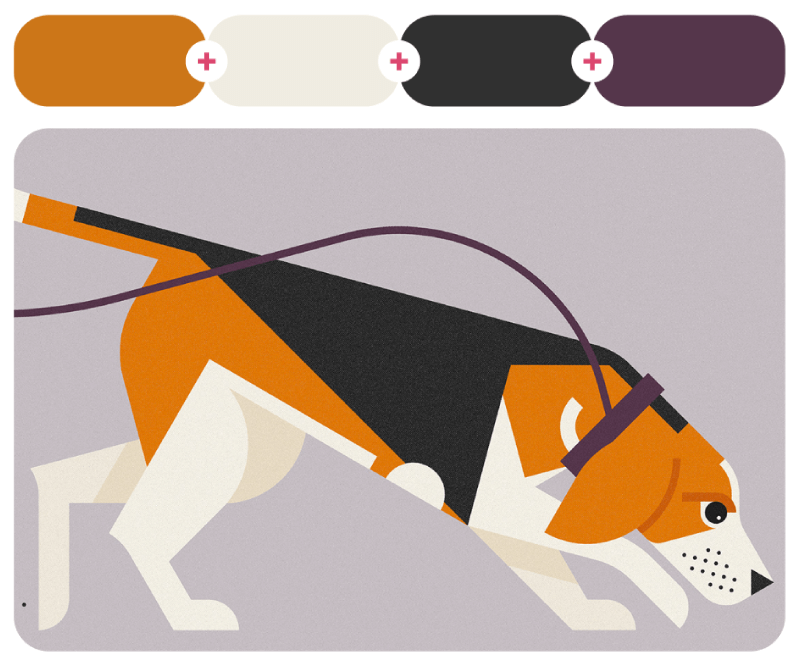
Beagle illustration by Emma Clinton and Still Wines packaging design and brand identity by Yido Lab.
46. Strike It Rich + Flame of Prometheus + Vegetation + Back In Black
#dab760 – #d83f04 – #4ed992 – #130f1a

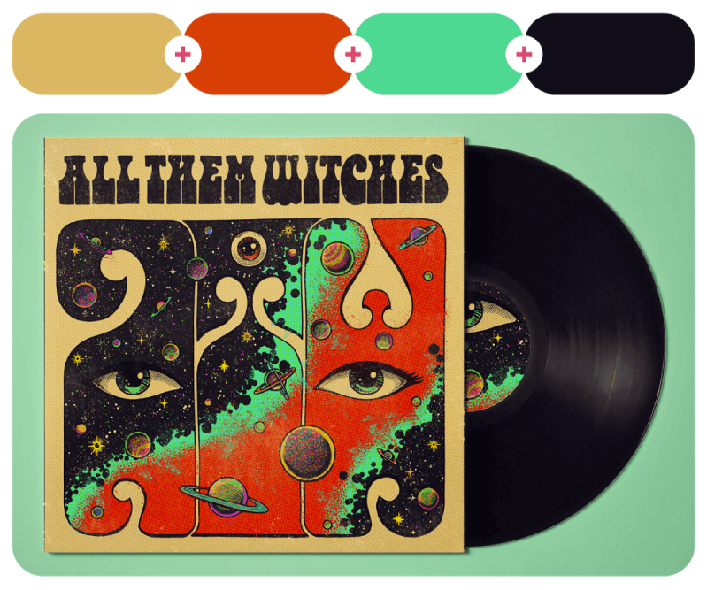
This is a cover project inspired by the album All Them Witches, designed by Erick Solar.
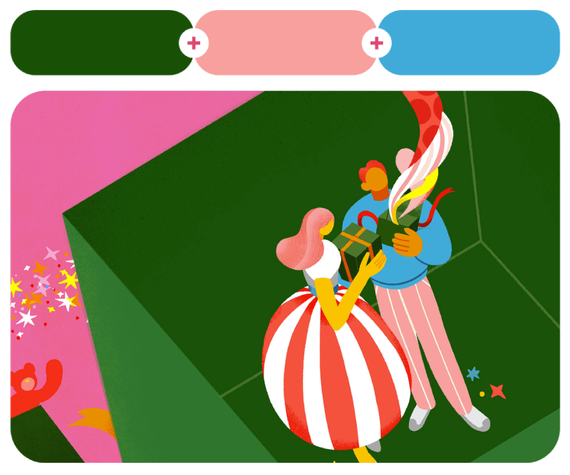
47. Morning Pink + Curious + Beastly Red + Redeye
#c898b4 – #dce4a1 – #671207 – #b13932

48. Electric Blue + Candy Corn + Pinkalicious + Cobalt Green
#80feff – #feff5a – #f999ff – #99fb8a

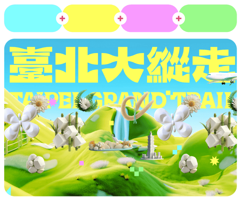
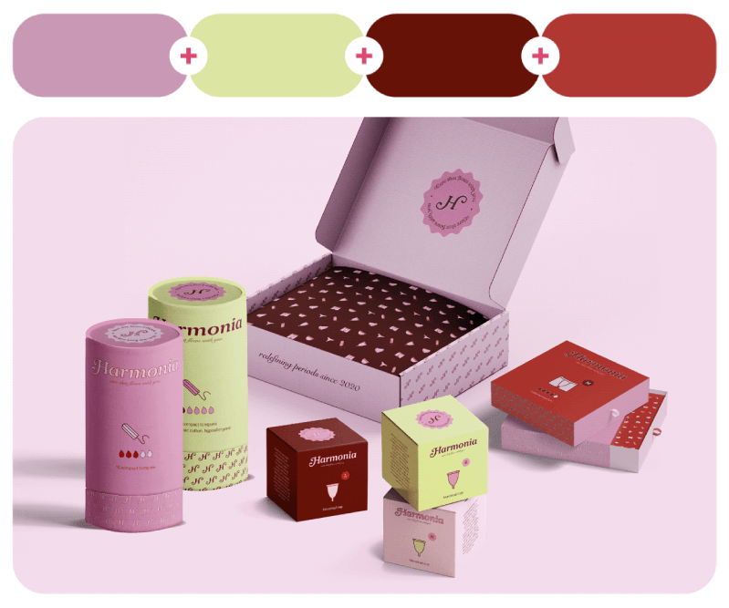
Harmonia branding and packaging design in pastel colors by Eloïse Chapuis. The Taipei Grand Trail Rebranding by The Rebranding Lab.
49. Slippery Salmon + Teal Mosaic + Peach Amber + Elk Skin
#f67d60 – #406b74 – #f89d91 – #eae6dd

50. Spiced Coral + Pure Mauve + Message Green + Grapefruit Yellow
#d3505c – #664e92 – #3cb9ab – #d9a215

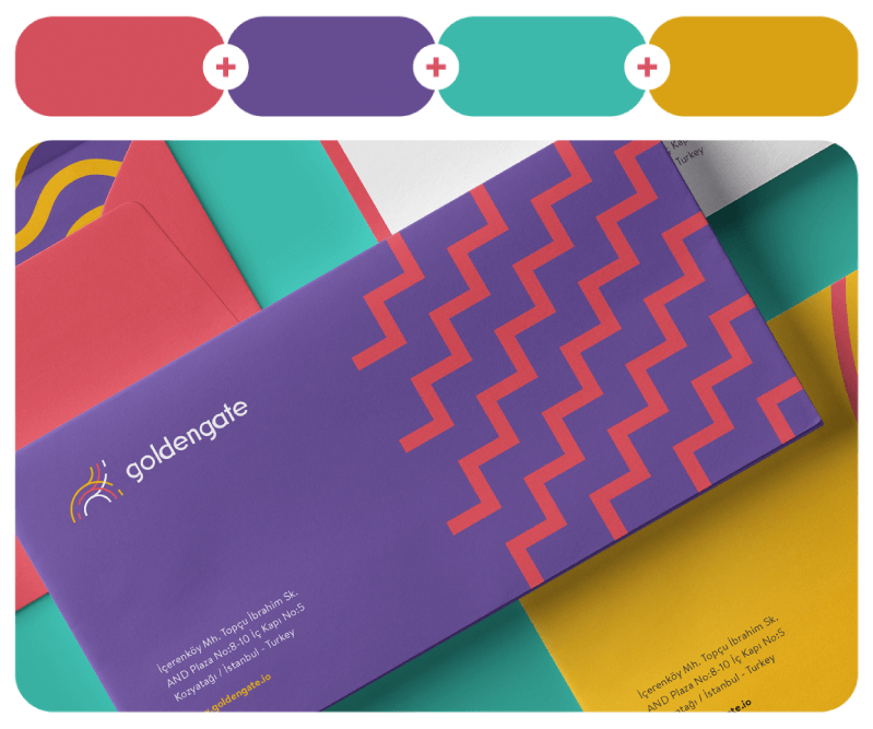
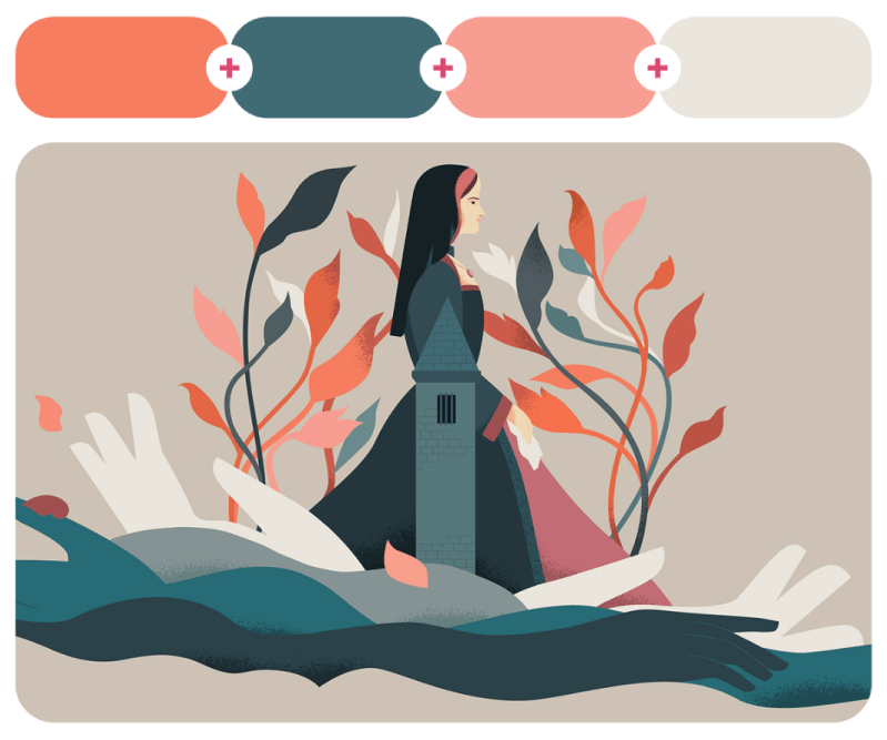
Comunero Rebellion is a feature-length documentary about the history of the Communards of Castile, “the first modern revolution in history.” Illustrated by Sandra Rilova and animated by Elora Post House. On the right, brand identity design for Goldengate by Curious Brand.
51. Re-Entry + Black Cherry + Spartacus + Mango Cheesecake
#dc4a51 – #2b1120 – #77a4a7 – #fcebdb


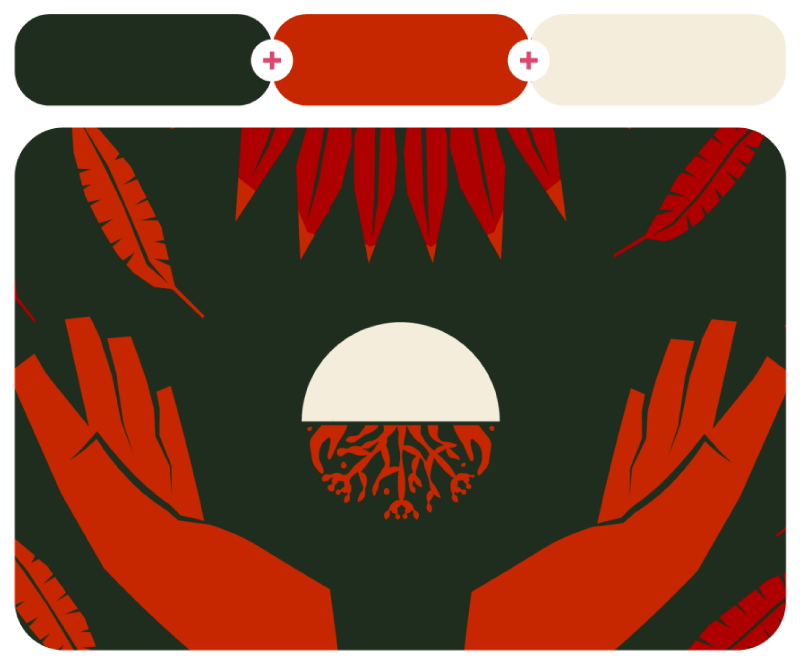
Next, this is a personal work named Hands by Tomasz Woźniakowski.
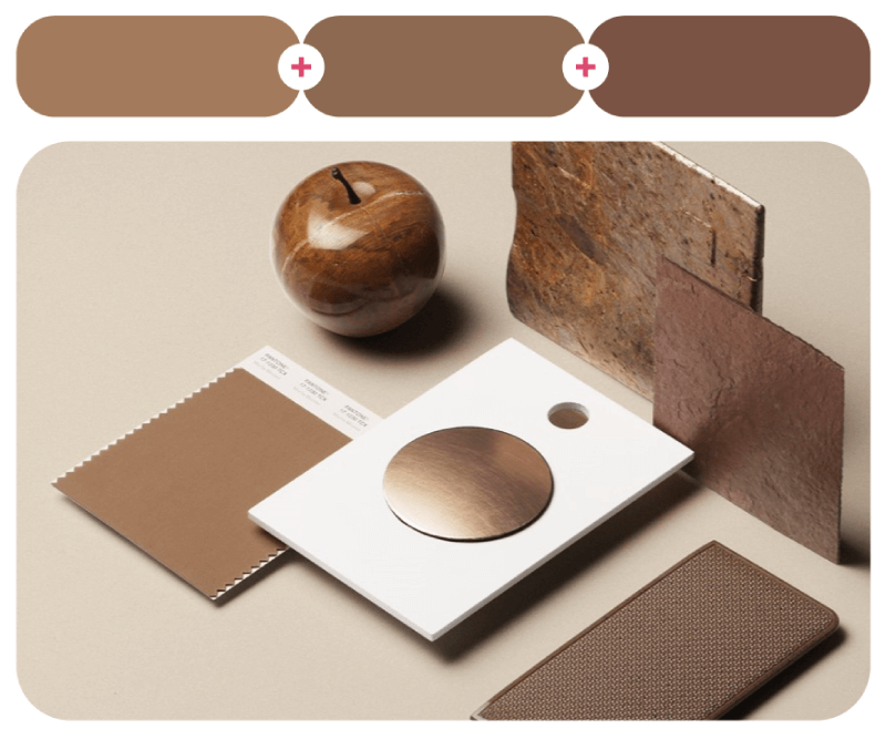
52. Taos Taupe + Corn Poppy Cherry + Rokushō Green + Charismatic Red
#bfaa7e – #f54213 – #427954 – #f42347

53. Pink Plastic Fantastic + Camellia + Costa Rica Blue + Fistfull of Green
#f57cc9 – #f56756 – #7bb9e1 – #a2a319


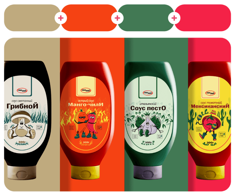
Mak-Mai sauce package design by Katti Mood. Risograph Wall Calendar by Hendrik and Julian Klein.
54. Backlight + Spanish Orange + Spanish Yellow + Seljuk Blue
#fcefe6 – #e96100 – #f8b515 – #3d89ec

55. Calypso Coral + Syndicalist + Almost Royal + Momo Peach
#f5485f – #fac500 – #6729ee – #f67d83

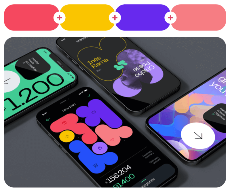
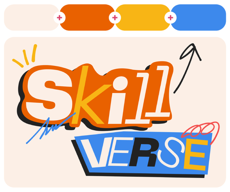
Skill Verse talent event Identity by Yelisei Loboda. Banking app exploration by Agustin Posse.
56. Dahlia Matte Red + Crystalsong Blue + Blush d’Amour + Kon
#744e66 – #4db1b4 – #e45d80 – #191f32

Dear Spring is a beautiful soft and emotional illustration by Kensuke Okazoe.
57. Yellow Lupine + Blue Sonki + Brilliant White + Zinfandel
#cfaa4c – #4f83cf – #e4efff – #5c2937

58. Magical Merlin + Easter Green + LA Vibes + Snow White
#3a8bd5 – #8bff77 – #efc9de – #eefeef


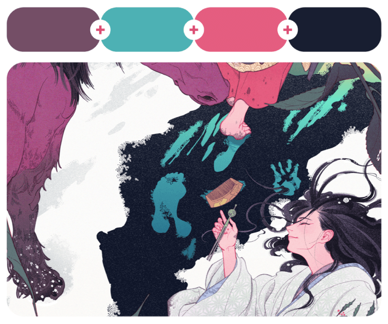
Jean Rosa’s typographic poster design for Maíra Daloia, next to ‘Snake and the Angel of Healing’ illustration by Sehee Chae dedicated to the Chinese Lunar New Year 2025, Year of the Snake.
59. Bronze + Lifeguard + Cigarette Glow + Eyes White Shut
#a27500 – #e50000 – #e95300 – #eee9ea

60. Feasty Fuchsia + Saint Seiya Gold + Retro Blue + Chaos Black
#f1008b – #eaf200 – #2d5bf6 – #0f0f0f

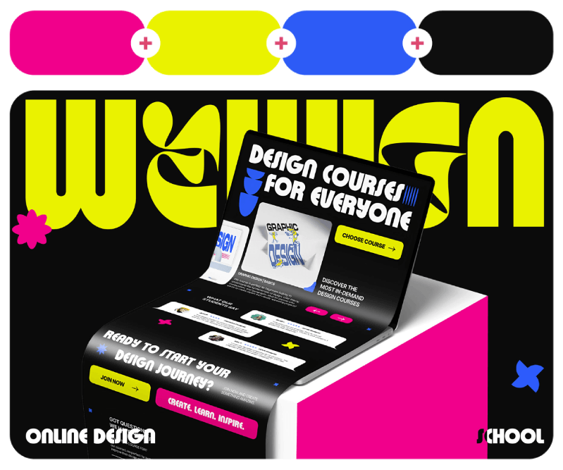
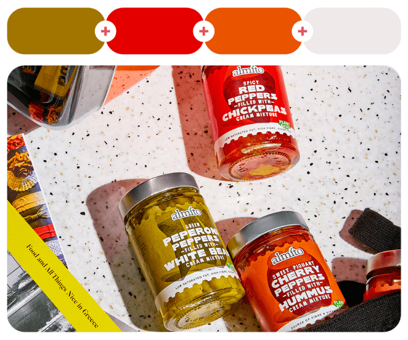
Vibrant pepper hues for Almito Vegan antipasti’s visual identity by Boo Republic. Online Design School web design by SIVE STUDIO.
Colorful Gradients
Gradients are the cheat code of color design because they instantly make anything look more dynamic and polished. They can be high-contrast and electric or soft and dreamy. Here I added both types so you can fall in love with gradients all over again.
61. Dead Sea + Safety Yellow
#72f0f5 – #f2d000

Magical Birthday Graphic Poster by Michael Cabugatan, whose obsessive-compulsive tendencies on graphic designs hit hard.
62. Juzcar Blue + Banana Propaganda + Glowing Meteor
#9fd1f5 – #f5d900 – #e84400

63. Red Bean + Calypso Coral + Apricot
#410906 – #ea5060 – #efac22

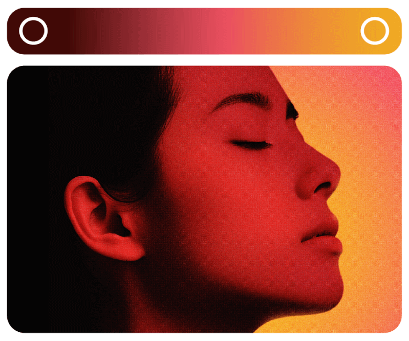
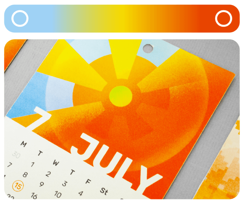
A personal calendar by Diana Zhurakivska for her sister with beautiful risograph colorful design. And the photography project Desire by Kerv Buenafe with dark to light fiery gradients.
64. Fuchsia Flash + Red Spirit + Prehnite Yellow
#d254cb – #b53638 – #d1a700

65. Midnight Express + Parfait Pink + Go To Grey
#22203c – #e6b1c4 – #dcd8d7

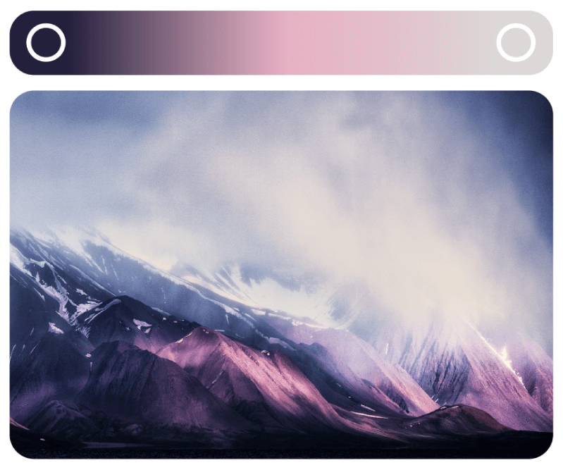
Arrangement of gradient branding card by Sagesmask and Svalbard Square Landscapes by Henk Leijen.
66. Lap Pool Blue + Chardon + Light Rose Beige
#97baba – #f8eae0 – #f9ebe3

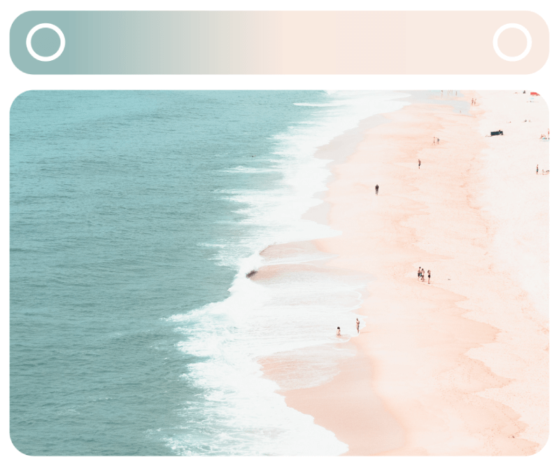
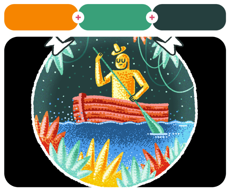
I took this sea-to-sand gradient from this Nazaré photography for Instagram by Ariana Pita because the best inspiration comes from real life.
67. Reef Green + Sweet Taffy
#a3e1c2 – #ebbad3

68. Windjammer + Mulberry Yogurt
#5faae0 – #c8498f

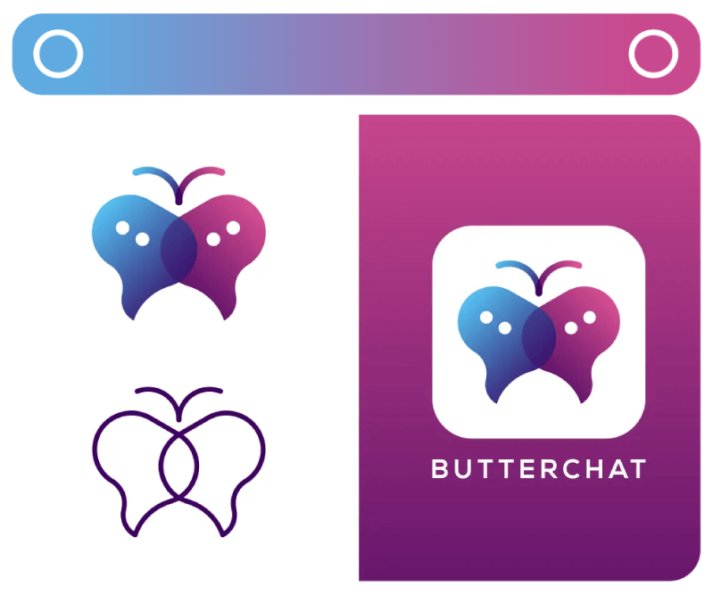
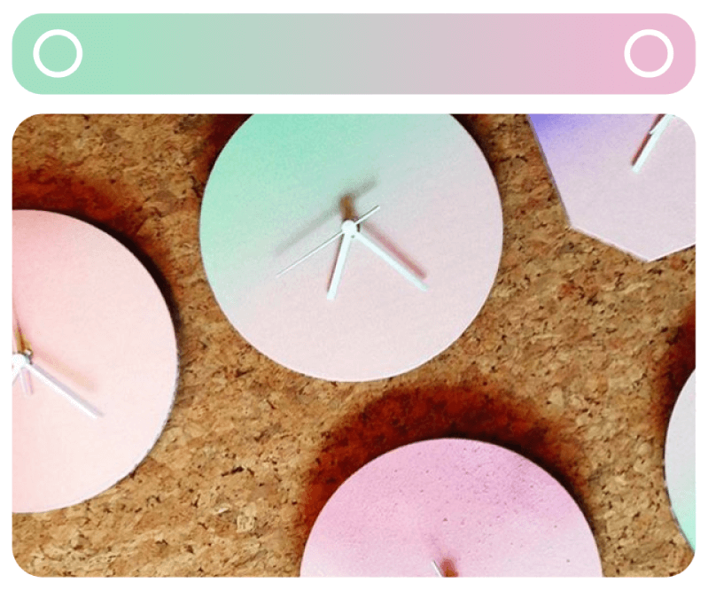
Pastel cardboard clock gradients by Kristi Tamming and ButterChat gradient Logo by Garagephic Studio.
69. Luminescent Lime + Pineberry
#bcfa69 – #f1d8dd

70. Borderline Pink + Sapphire Siren
#ed1067 – #6b218b

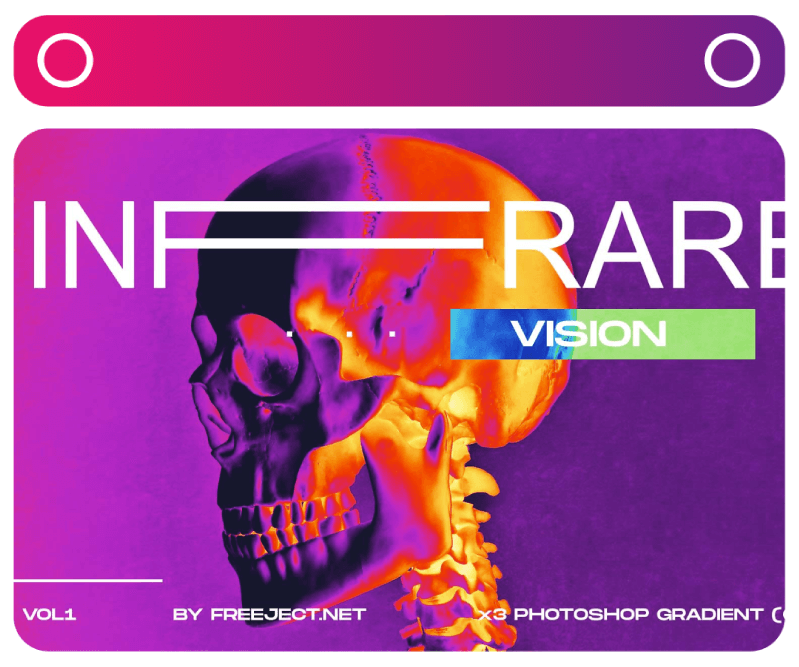
Phương Uyên’s background gradients for her portfolio combine lime and pastel pink in a very fresh, vibrant gradient. Next, we have the Infrared Vision gradient by Freeject Design.
71. Electromagnetic + Burgundy + American Yellow
#303a41 – #8f0420 – #f1b400

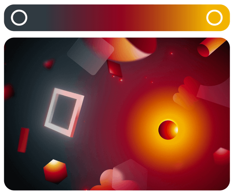
These gradients were captured from Gloat’s Brand Video, designed by André Leite and Bianca Baderna.
72. Almond Cream + Harmonious Rose + Herb Robert
#f4c49c – #f19eb7 – #dc93e2

73. X Marks the Spot + Bee + French Porcelain Clay
#eb4748 – #f3bd54 – #fbf1d8

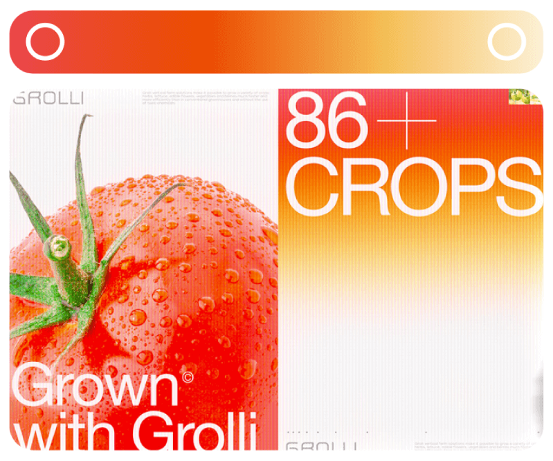
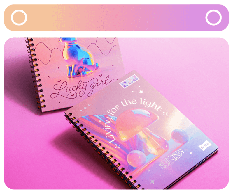
On the left, we have Notebooks Scribe designs by Santiago Álvarez Palacio. And GROLLI’s Website UI/UX design by Liza Dushnota.
74. Purple Sand + Flaming Orange
#c0b3ec – #ec6233

75. Incubation Red + Deadly Yellow
#da1e36 – #deae00

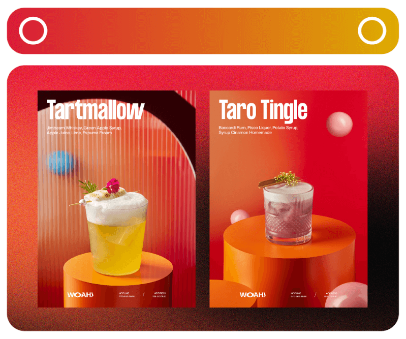
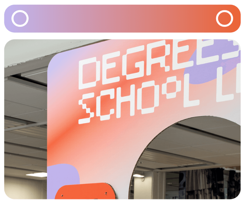
Degrees of a School Lunch 2060 event design by Lina Forsgren. WOAH! Cocktail Club food photography by Tuyết Anh.
76. Grey Blue + Vertigo Cherry + Acapulco Sun + Midnight Mirage
#74a3b7 – #990050 – #e88e48 – #081f40

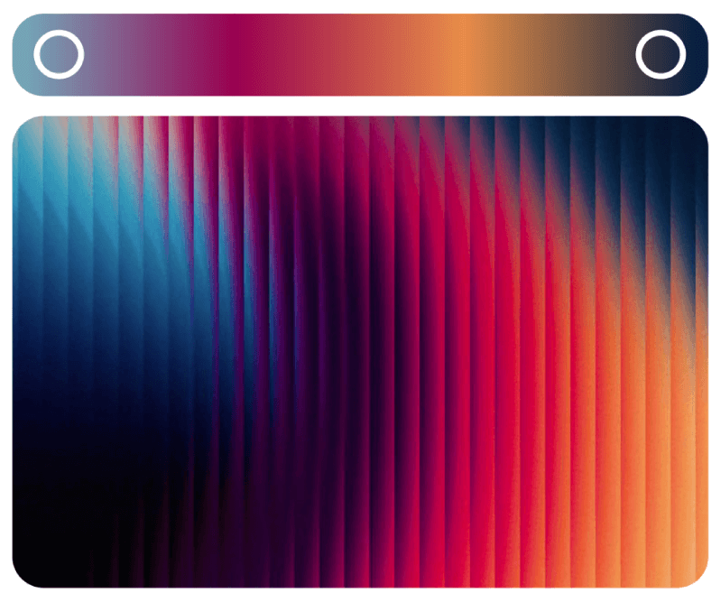
Fractal Glass Gradients by Content Case with high contrasting dark and light colors.
77. Alpenglow + Green Fog + Dazzle
#f2c0b7 – #989987 – #d99d7e

78. Dried Lilac + Sunburst
#c0bcff – #f8b47d

Surréalisme gradients posters about feelings by luana lloyd. Human Innovations app design by The Branding People.
79. Berries + Goblin Eyes + Lemon Pie + Woods
#d0559c – #e98935 – #d3b902 – #3bae8d

80. Aquarelle + Prunus Avium + Cabana Melon
#60abad – #d63d8f – #c48368

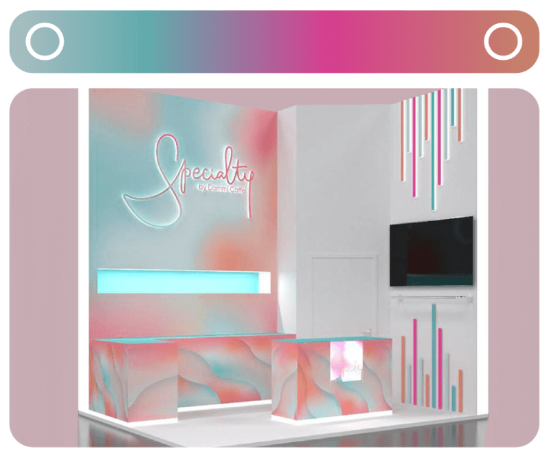
Colorful gradients calendar design by Anastasiia Nam. Specialty by Dammi Caffe` packaging and identity design by Liana Bubnova.
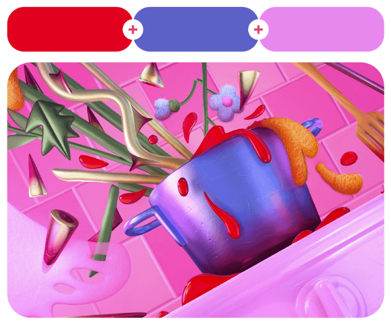
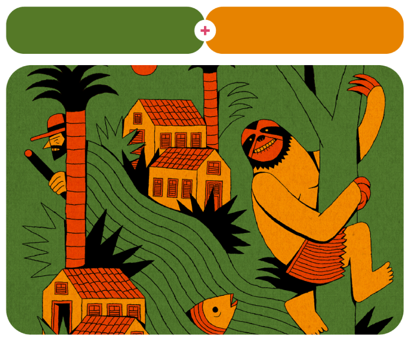
Combos in Red
Red is an attention magnet because it’s fiery and impossible to ignore. It can bring passion, energy, or even a sense of warmth to a design. Pair it with black for drama, white for a crisp and modern look, or soft pinks for something more playful. Here are some red-based combos that show just how versatile this powerhouse color can be!
81. Cadmium Red + Borage Blue + Frail Fuchsia
#e1001e – #5b61c5 – #e688ee

This flower illustration by Polina Kirilenko is part of a whole series of floral pieces by the same author dedicated to 8th of March and women’s rights.
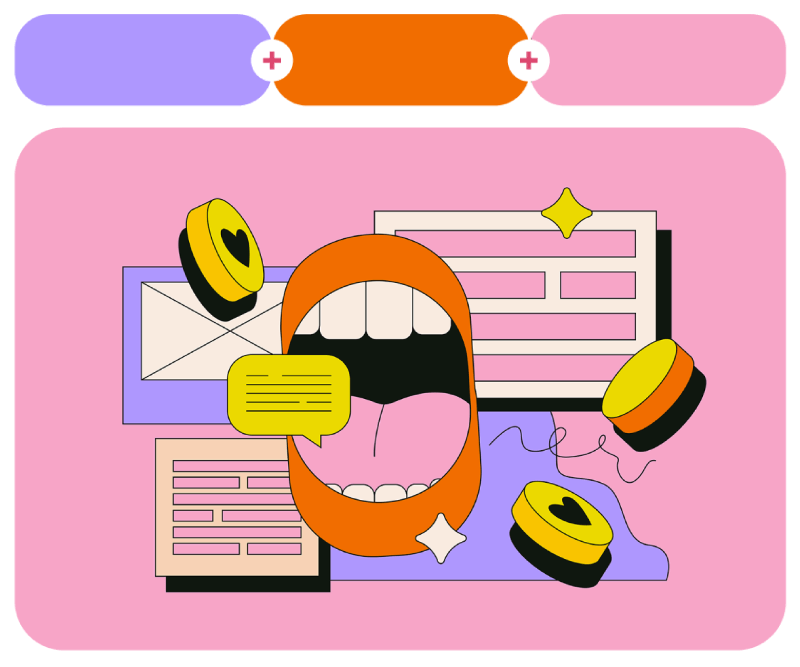
82. Solar Orange + Carmine Rose + Dull Yellow + Rifle Green
#e34402 – #e75f94 – #e8d95d – #3f492f

83. Romantic Embers + Syndicalist + Heavy Blue + Aquarium Blue
#ad3952 – #fac500 – #305273 – #69d5ae

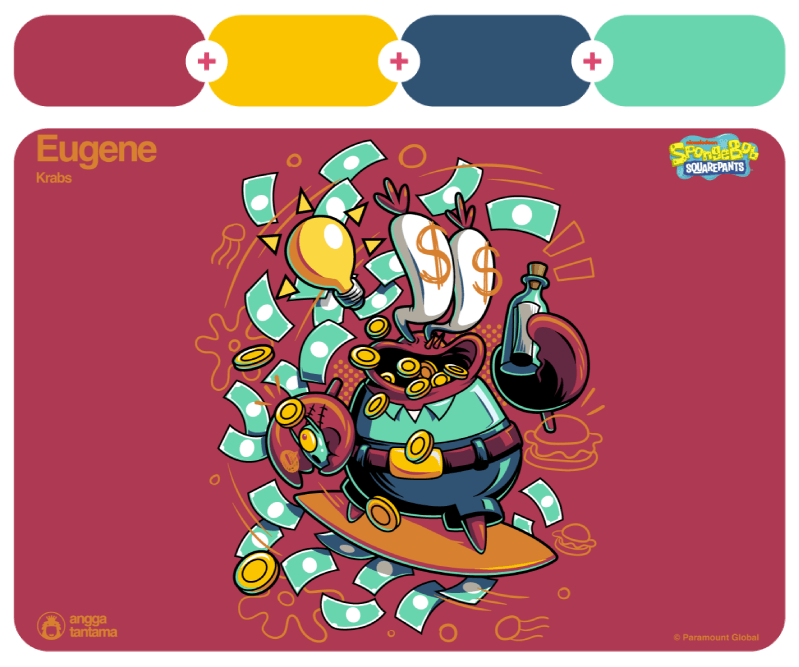
Personal, commercial, and editorial work by Sebastian Cestaro and SpongeBob SquarePants character illustration by Angga Tantama.
84. Pottery Red + Purple Silhouette + Bauhaus Buff
#b35a5b – #796d90 – #cfb4a0

85. Firebug + Kilimanjaro + Lemon Surprise
#cf5b52 – #3b352f – #dfbf5d

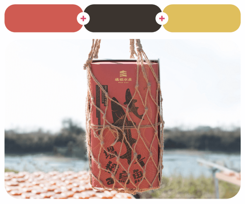
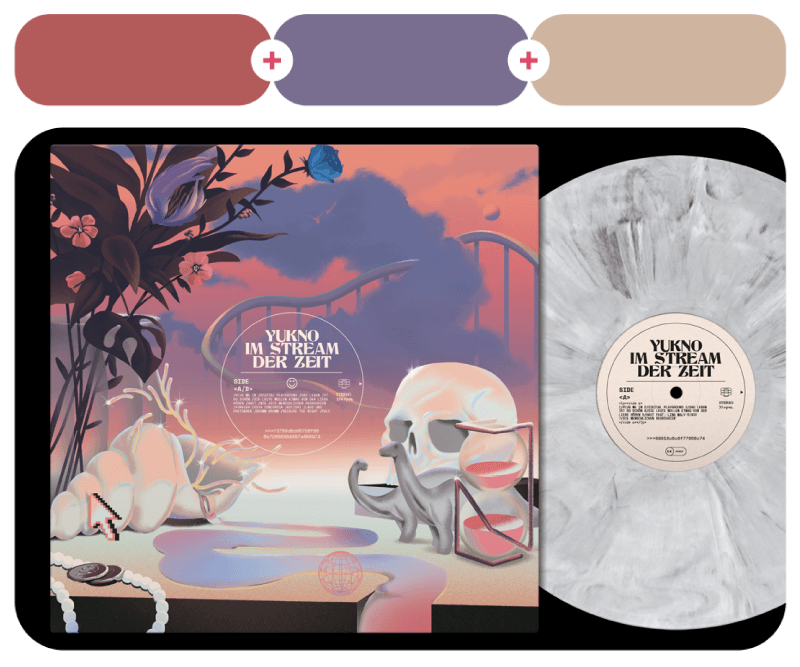
Im Stream Der Zeit’s Yukno Vinyl Cover design by Sandro Rybak and Wen Dau Mullet Roe brand identity by Bc Huang.
86. Desert Coral + Jamaica Bay + Lucky Grey
#d3605a – #95ccc7 – #767676

This is an illustration by Laura Wächter for the Telos Magazine on the topic of future scenarios.
87. Cute Crab + Good Karma
#d74241 – #363576


88. Gory Movie + Apple Infusion
#b4243a – #e1abb9

Sofia Graffiti Map posters design by FourPlus Studio and “Eliza”, an artistic photography project by Anastasia Popova and Eliza Photo.
89. Cranberry Splash + Yellow Yarn + Rurikon Blue
#d64d64 – #fef6bd – #152a48

90. Flamboyant + Adamantine Blue + Empire Yellow
#f44139 – #47adff – #fad100

Illustrations for Douban book weekly calendar by Hao Hao, and Tooniverse Channel Manifesto animation by Yongmyung Kim.
Fresh combos in orange
Orange has a way of making designs feel lively and inviting. It can be fiery and bold next to deep blues, bright and playful with greens, or rich and earthy with warm neutrals. Some combos feel zesty and fresh, while others lean into a more cozy, autumn vibe. No matter the mood, these orange-based palettes bring plenty of energy to any design.
91. Deep Orange + Iridescent Purple + Sanskrit + Lollipop
#d45004 – #a175d5 – #e69433 – #d6253f


“Peligro”‘s taste is slightly changing in each lot with each season. The package design and brand identity were designed by Mayuko Kanazawa.
92. Royal Flycatcher Crest + Mystic Tulip + Ashenvale Nights
#f56b00 – #f9b2a1 – #134170

93. Temple of Orange + Golden Banner + Ancient Pine
#ed7752 – #f9c62b – #434a43

Next, we have The Rise of Hotel Day Passes, which is an illustration by Ellice Weaver for the Washington Post. On the right, this is a serene illustration for the book History of a Synthesizer, illustrated and written by Andreaga.
94. Romesco + Violet Frog + Poster Yellow + Outrageous Green
#f48000 – #9271ad – #ecc100 – #82bb36

95. Fire Dragon Bright + Myoga Purple + Golden Gun + Fairy Sparkles
#f47100 – #e32391 – #dae100 – #abdef9

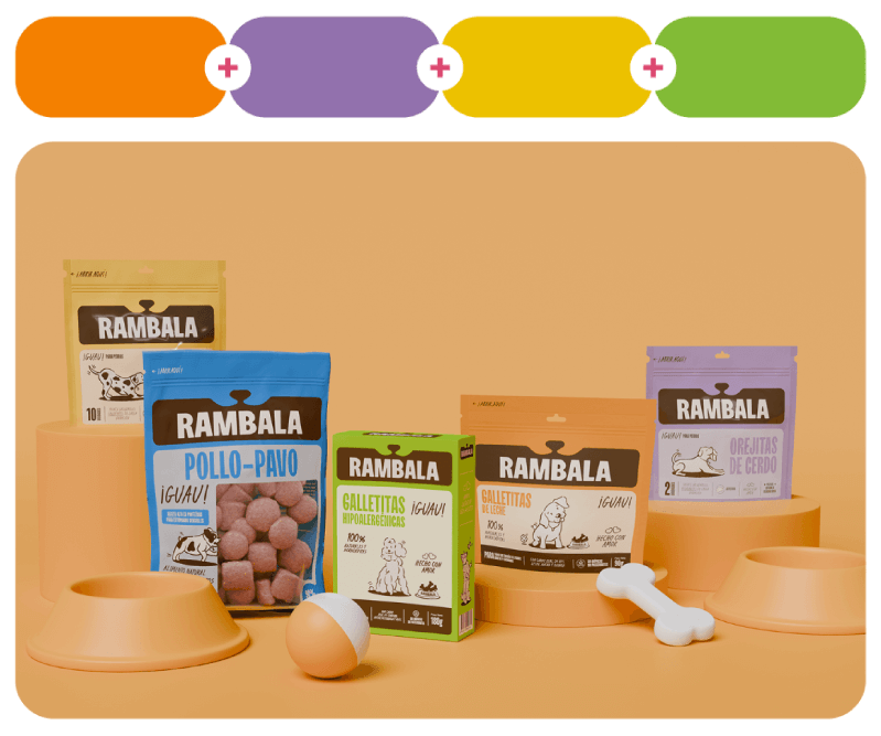
Rambala dog treats brand identity design by Sed Estudio and Happy Plant Botanicals branding by Fulya Kuzu.
96. Martian Colony + Blue Racer
#e7720c – #4caaa9

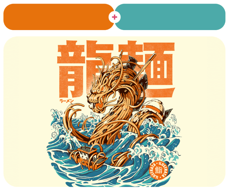
Kaiju Food on the Waves design for t-shirts, prints, and home decor by Ilustrata studio.
97. Tangerine Skin + Linoleum Green + Cascades
#f68500 – #39a079 – #25403e

98. Knockout Orange + Sour Cherry + Goldzilla
#e3703c – #e14d39 – #cae010

This is one of the many Book of Resilience Game illustrations by Murat Kalkavan that you can check out on his full project page. Next, this is a screenshot that shows off Fizz, Jiwon Jung, and Jungeun Lee’s character design from a video they created for a Hyundai Digital Art Contest.
99. Poppy Flower + Slumber Pink
#e75b00 – #f6bff5

100. Leopard + Bodega Bay
#d49a00 – #5f7fca

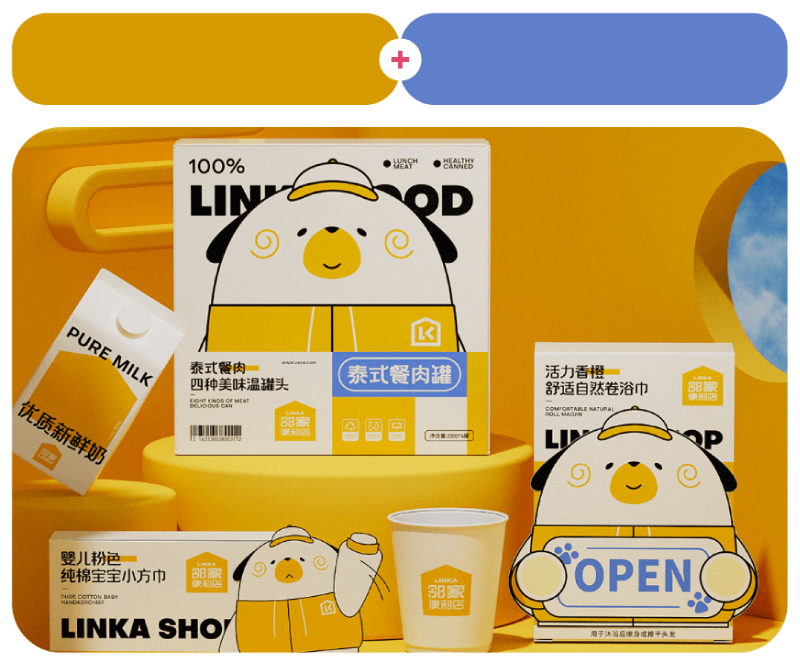
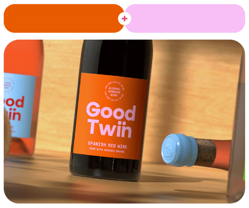
Good Twin is an alcohol-free wine made from organic grapes. The package design comes from Forth+Back Studio. And last, in orange, we have LINKA’s branding by CRY LAB.
Yellow Color Pallettes
Yellow can feel soft and cheerful with pastels, bold and high-contrast with deep purples or blues, or warm and vintage with browns and oranges. Some combos feel like pure sunshine, but others have a more refined, golden touch. These yellow-based palettes prove that a little sunshine makes everything better.
101. Tibetan Yellow + Diva Pink + Spritzig
#fbdf00 – #f53e78 – #79c0ea

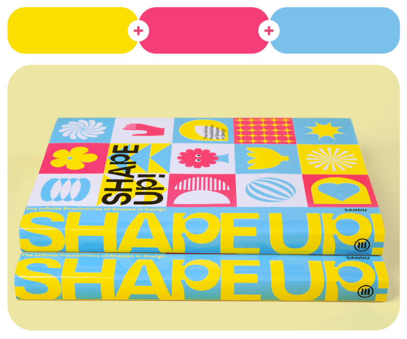
Shape Up!: The Infinite Possibilities of Shapes in Design is a book about geometric shapes. The book was designed by Antiny, Wu Yanting and Sandu Publishing.
102. Funky Yellow + Faded Grey
#eccf72 – #eae7e4

103. Festival + Galactic Cruise
#e9ce4c – #14178c

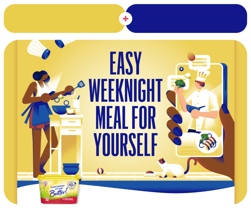
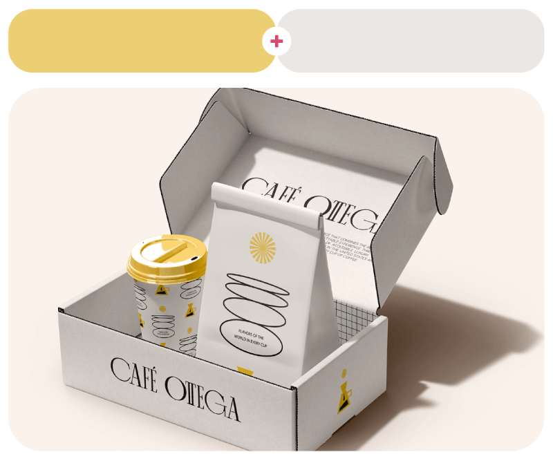
Café Ottega’s brand identity design by Larìssa Graboskì and a landing page design for the brand I Can’t Believe It’s Not Butter! by Elen Winata.
104. Sunny Mood + Beef Bourguignon + Sky Magenta
#f8c947 – #b54700 – #d46fae


105. Golden Raspberry + Sohi Red + Medium Green
#fad678 – #e8583c – #3c8f52

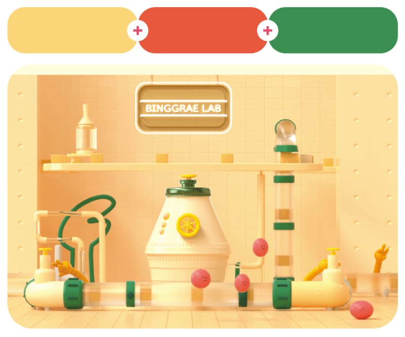
‘One Step Closer ’ is a commercial for the Colorado Lottery, designed by Niceshit Studio and Facundo Capece. Next is a conceptual video for BINGGRAE LAB by Heo Chang Jeong.
106. Anna Banana + Turquoise Chalk + Pink Prestige
#f7d64a – #78e7d8 – #ee9aaa

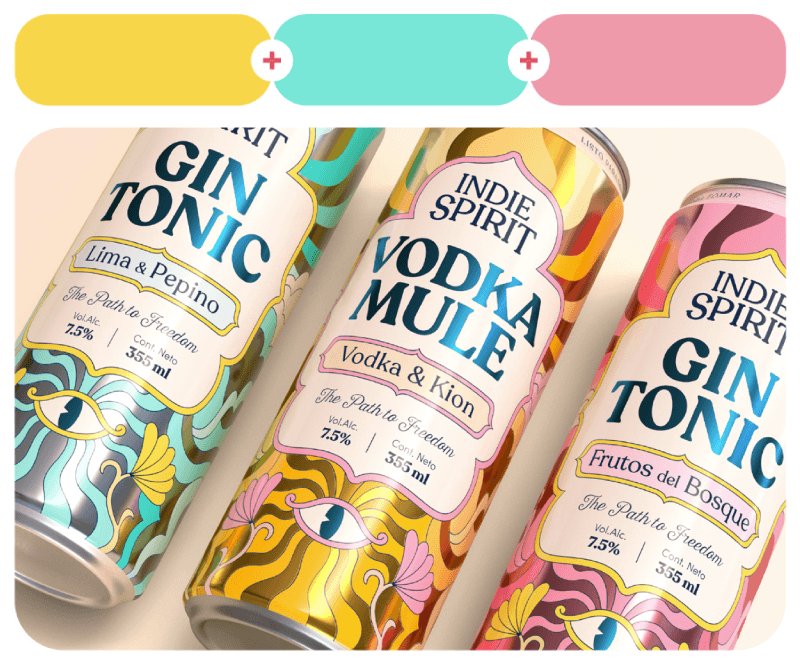
Indie Spirit branding design by Fibra in three different can designs you can see in detail on the project page.
107. Busy Bee + Flattered Flamingo + Nuclear Mango
#f3f700 – #ef6558 – #ee9933

108. Award Winning White + Lady Anne + Garden Fairy
#fdf0df – #fce3df – #ced4ed

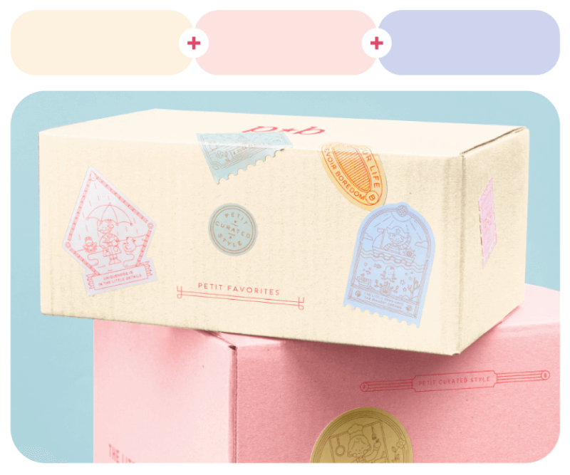
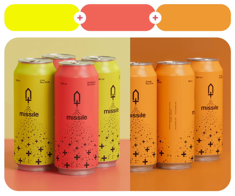
Missile Plus Drinks brand visual identity by Robinsson Cravents and branding design for kids apparel brand Petit Bazaar by Heavy.
109. Cheese It Up + Straw Hut + First Day of School
#f6dd45 – #bead6a – #fbdaa2

110. Lemon Surprise + Foliage Green + Red Revival
#e1bd5c – #3f7155 – #a6463a

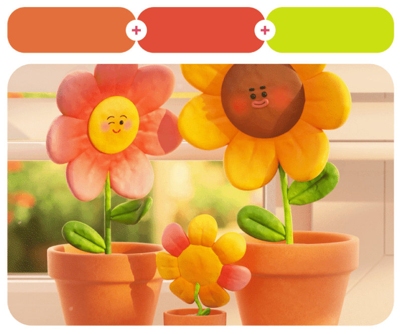
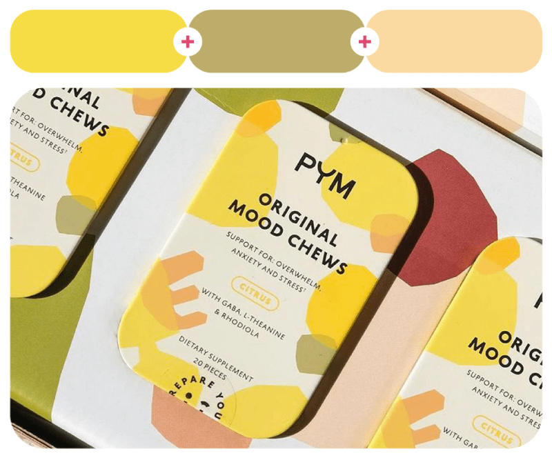
Lastly, yellows work amazingly for PYM Mood Chews’s package design by Night Shift and in this lovely illustration for Paulie Garand & DJ Wich’s album cover by Jindřich Janíček.
Color Combinations with Blues
Blue is calming, trustworthy, and always looks good with just about anything. It creates awesome contrasts with oranges and reds and more serene pairings with greens and grays. Blue knows how to show up and make an impact.
111. Aroma Blue + Yuzu Jam + Trout Caviar
#94d4d5 – #fad500 – #f45700

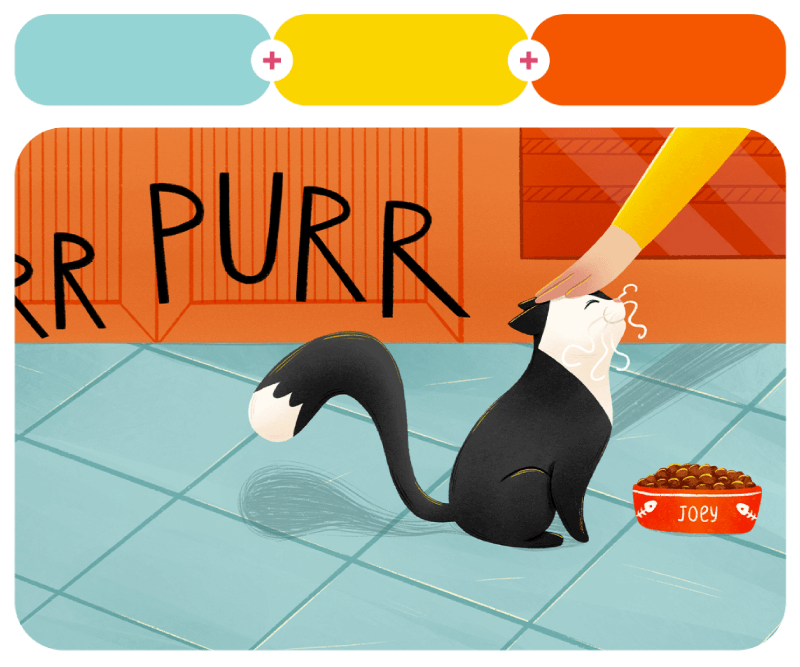
This is a lovely book illustration by Nadiia Makarova for Joey, the Stowaway Cat. Check out the entire project for sketches, more color palettes, and more furry pages from the book.
112. Broken Blue + Taffy Pink + Soaked in Sun
#6cb6fa – #f9a5c8 – #facf66


113. Blue Dart Frog + Berry Good + Honey Bees
#387995 – #efc5c7 – #fbd580

Baskin Robbins LED media wall-motion graphic video by BICTURE studio and Baekje illustrations by Go Yewon.
114. Tiān Lán Sky + Purple Rain + Limon
#69adfd – #7a37c8 – #f9ea72

115. Broad Daylight + Submersible + Chewing Gum
#bbdcff – #00566d – #e7b3ad


Data and technology isometric illustration for Sabio Group by Patswerk and a landscape illustration by Harry Goldhawk.
116. Adamantine Blue + Sango Red + Yellowy Green + Light Shōtoku Purple
#47b0ff – #f66a48 – #c4f627 – #b959ef

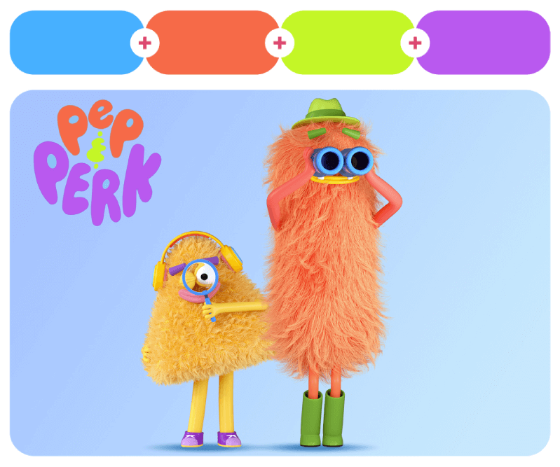
Here you have two hairy and fun characters Pep and Perk, for a kids video by Jungmin Studio.
117. Atlantic Navy + Brilliant Azure + Pollen Storm
#122f72 – #3791f8 – #baa12e

118. Sea of Tears + Give Me Your Love + Camellia
#1c4d9a – #f58efe – #f56d5b


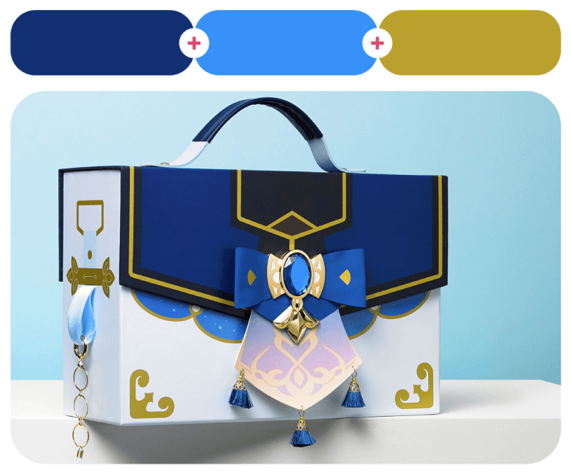
Samsung X Genshin Impact Edition accessory case design by HEAZ and a colorful abstract illustration by Yo Az.
119. Muted Lavender + Candle Flame + Velvet Cupcake
#3c5997 – #fef7a3 – #af006b

120. Palatinate Blue + Green Cow + Irish Mist
#3242db – #c0e864 – #e6e6da

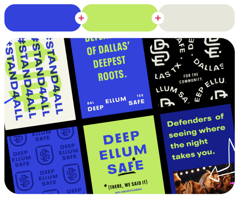
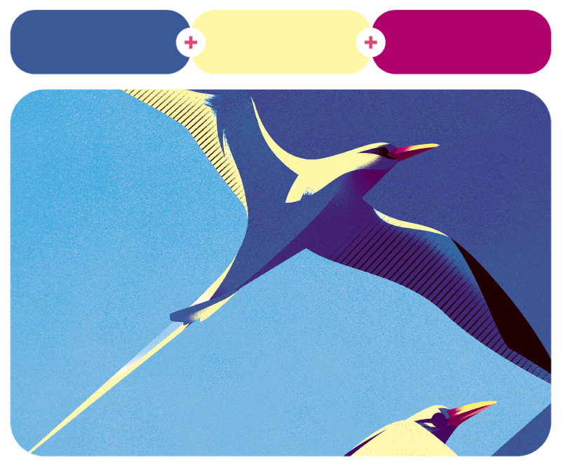
Last in the blue color palettes section, we have a sample from an illustration series created around the subject of birds by Charlie Davis. And on the right, Deep Ellum Safe branding by Matchbox Studio.
Green Color Combinations
Next, we have green that is chill, refreshing, and full of life. You can combine it with earthy tones for a grounded vibe or mix it with brighter shades to give more contrast to your design.
121. Midsummer Field + Sunset Peach + Peaty Brown
#8acb45 – #f7aa7e – #582309

Illustrations for a fun recipe website called Rapadura by Anushka Tendolkar.
122. Siren of Nature + Lemon Sherbet + Grubby Red
#68a23a – #eefca3 – #7f1411

123. Gecko’s Dream + Early Spring Night + Pure White
#629100 – #3e36b0 – #f7f8f2

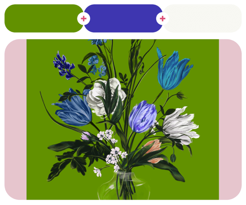
A book illustration by Micah Barta from The Talented Mr. Wrigley book and Bouquet artwork by Spiros Halaris.
124. Master Chief + Master Round Yellow
#567926 – #e78300

125. Scorpion Venom + Mulberry Mauve Black
#95e50a – #433b63

An illustration from the Bichos artwork series by Victor Vilela and a totem face design by Diego Della Posta.
126. Beer Garden + Pheromone Purple + Strawberry Milkshake + Highlighter Blue
#479235 – #9229b5 – #d76c89 – #3cb1dc

Music To Your Eyes VR simulation experience design by Wade Jeffree, Leta Sobierajski, and Brian Banton.
127. Vigorous Wasabi + Demonic Yellow + Soothing Sapphire
#889e2b – #fce900 – #2a76d4

128. Enchanted Glen + Matt Green + Candy Corn
#1c682a – #35ae48 – #feff5a


Moments of The FIFA World Cup Brazil 2014 illustration by Dipanjan Biswas and sizzle reel for NerdWallet+ by Champ Panupong.
129. Composite Artefact Green + Hestia Red + Lavender Pink
#46c700 – #ef2300 – #dc87cd

130. Lincoln Green + Young Crab + Thalassophile
#195105 – #f8a09e – #40abd9

“Borrowers Afield” book illustration by Olga Smirnova and The Magic of Love from Harrods illustration by Yulong Lli.
Color Combinations with Purples
Purple is a luxurious color that adds drama and a lot of personality. It works great with soft pinks for a dreamy, romantic feel, but if you combine it with yellows and oranges, you’ll get pure energy.
131. Gumball + Raspberry Sorbet + Perrywinkle + Kiwi Pulp
#e6b2d1 – #d63868 – #998cdb – #a5fc45

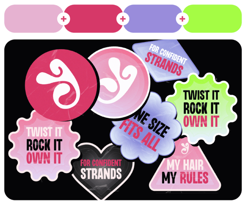
Untyped is a haircare brand for bold and ambitious women of color with textured hair. This awesome brand identity design was created by Oke Adewunmi.
132. Méi Hēi Coal + Violet Tulip
#9e8cc7 – #183519

133. Graceful Garden + Blonde Lace
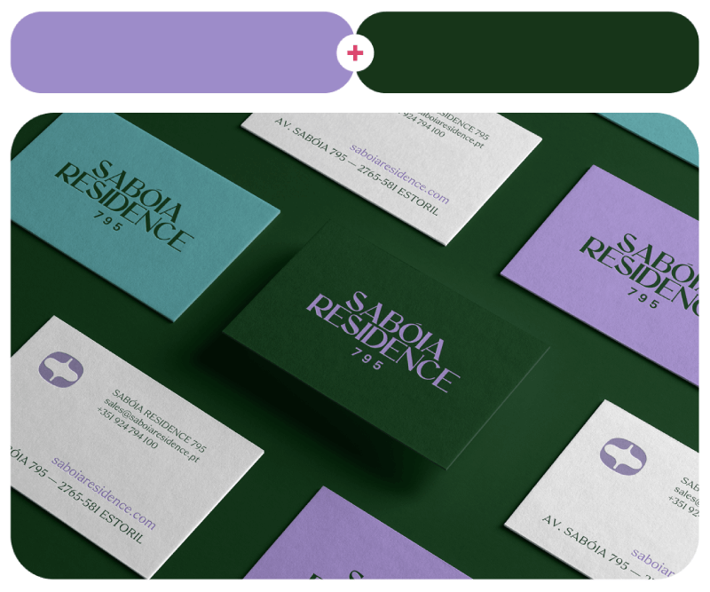
#ccaad1 – #dab293

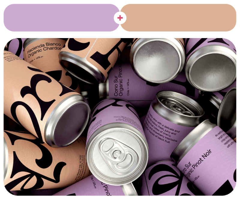
Sabóia Residence 795 Real Estate branding design by Musa WorkLab and Kork Organic Chardonnay drink package design by Foundry Studio.
134. Lavender Tea + Green Glitter
#dc86f9 – #dfe565

135. Matt Purple + Aphrodisiac
#9869e5 – #e65861

Silly Berets fashion design by So Lazo and Samba TV illustration by Minji Moon.
136. Shy Moment + Royal Flycatcher Crest + Rose Mallow
#ae97fe – #f16d00 – #f7a5c7

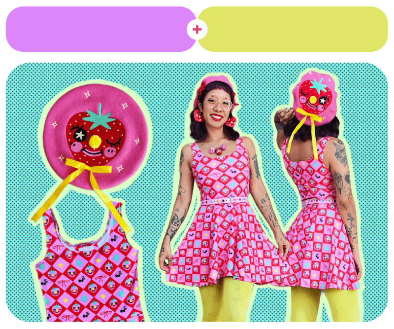
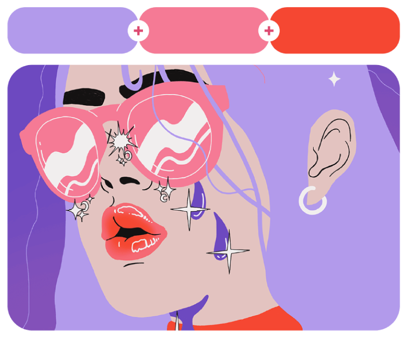
Digital illustrations for Tubik Academy with purple and pink primary colors.
137. Pink Fever + Deep Daishin Yellow + Highlighter Red
#cb55ff – #f3cb00 – #ec535b

138. Dreamy Candy Forest + Embarrassed + Vermilion Bird
#b29aeb – #f57a95 – #f54732

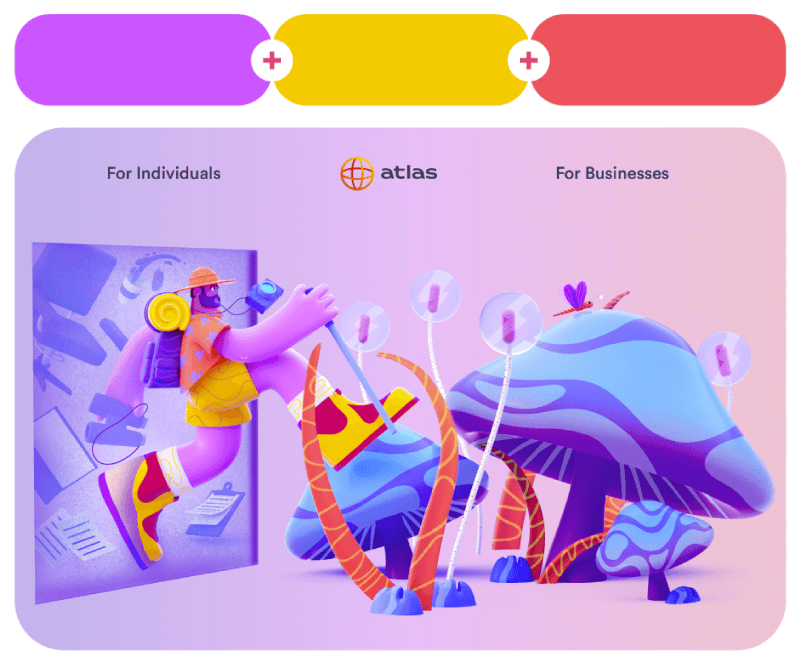
A 3D illustration for Atlas Explorer’s landing page by WOAO 3D and a flat style portrait by Dorota Liwacz for a personal project.
139. Pink Ping + Bayside + Autumn Sunset
#e568e7 – #5dc9be – #f38458

140. Illicit Purple + Tangelo + Banana Clan
#c373f3 – #f54a00 – #efda00


A merch items design for Unknown Mortal Orchestra by POGO and Jolly Jamming 3D illustrations by Five Three Five Design.
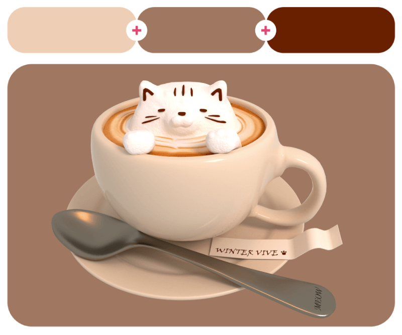
Color Combinations with Mocha
I put this one here instead of brown, because just like anyone else, I’m obsessed with the new mocha mousse by Pantone. Of course, this is just an inspiration, so I included different palettes that bring a similar vibe, not the Pantone color itself. Mocha is the perfect mix of cozy and sophisticated because it’s warm, rich, and paqirs amazingly with soft creams and pastels.
141. Sugared Almond Mocha + American Yellow
#B39B7B – #F0B700

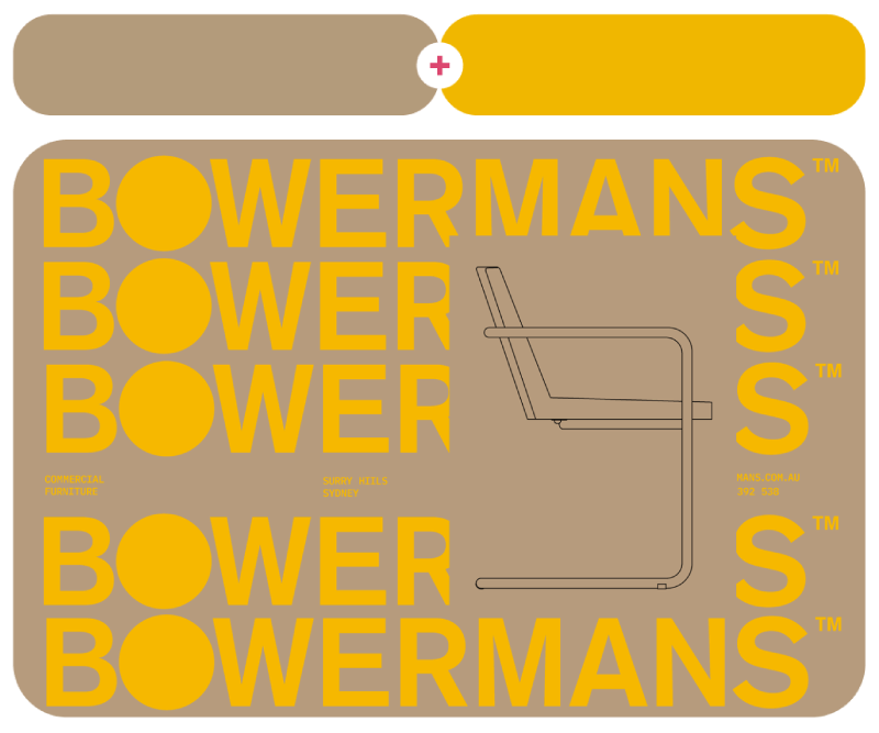
Bowermans is a furniture manufacturer for commercial projects in Australia. Nick Barclay designed their new brand identity.
142. Smokey Topaz Mocha + Centaur Brown + Florentine Brown
#A37A5B – #8C6950 – #7A5344

143. Habitat + Ash Grey + Deep Daigi White
#897D6C – #C1B6A9 – #E9E8E6

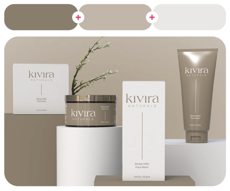
A moodboard by Hida LAB dedicated to Mocha Mousse and Kivira Naturals Skincare branding and packaging design by Gunjan Vaghasiya.
144. Beaver Fur + Aspen Snow
#9D7967 – #F0F0E6

145. Baked Sienna + Pine Grove
#9D7860 – #29433C

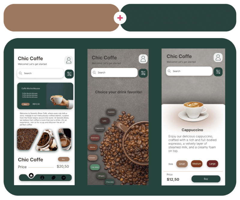
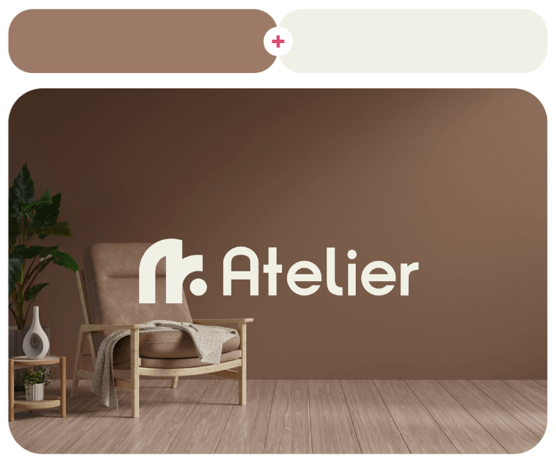
Atelier Interior brand identity design by Amigdala Studio and Chic Coffe UI design by Larissa Araujo.
146. Kurumizome Brown + Orange Liqueur + Pico Ivory
#A07863 – #F0AC7D – #FDF2E7

Next, we have Peach Palm Sunset Collection for fabrics and wallpapers by Annika Lima.
147. Ellen + Kurumizome Brown + Biking Red
#E2C8B7 – #A17864 – #79202B

148. Coco Rum + Sierra Foothills + Nomadic Desert
#9B775A – #A08969 – #C8B09A

The Queen’s Gambit illustrated poster by Ilham Mustaqim and Mocha Mousse wallpaper collection by Daniela di Niro.
149. Centaur + Fun Green + Lilac Purple
#8F6541 – #1B633E – #9F7EC2

150. Peach Purée + Kurumizome Brown + Raw Chocolate
#EECFB5 – #A07862 – #682001

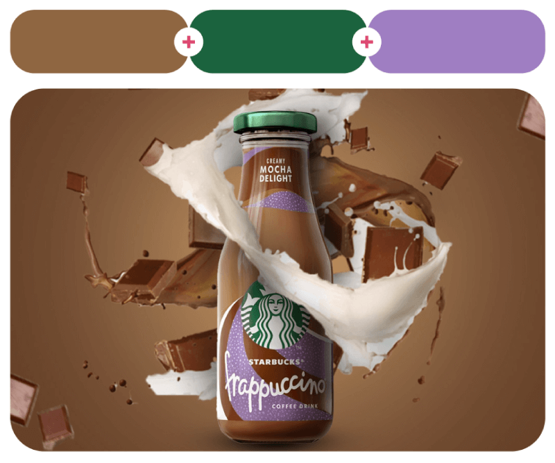
And the last mocha palettes example come from Jna Janoud for a Starbucks social media poster and a cute 3D coffee cat by YU MM.
A free catalog with all the color combos (+hex codes)

As promised, here’s a free PDF catalog with all the color combinations in this article. You can download it and use it to show it to your clients so they can easily make a palette choice, or just use it for yourself for inspiration or to copy the hex codes and try them out.
And there you have it! A full rainbow of color combos that hopefully inspired you and made your color choices a little less stressful. Color is all about fun, so don’t be afraid to experiment!
To get more color combination ideas or learn more about colors in design, continue with some of these articles: