The art of color combinations has been on the minds of creative people and philosophers for centuries. In its essence, a good color combination is considered two, three, or more colors that look pleasing to the eye when put together in design.
Today, we’ll dig deeper into this concept and explain how to identify good color combinations by using the color wheel. Let’s begin.
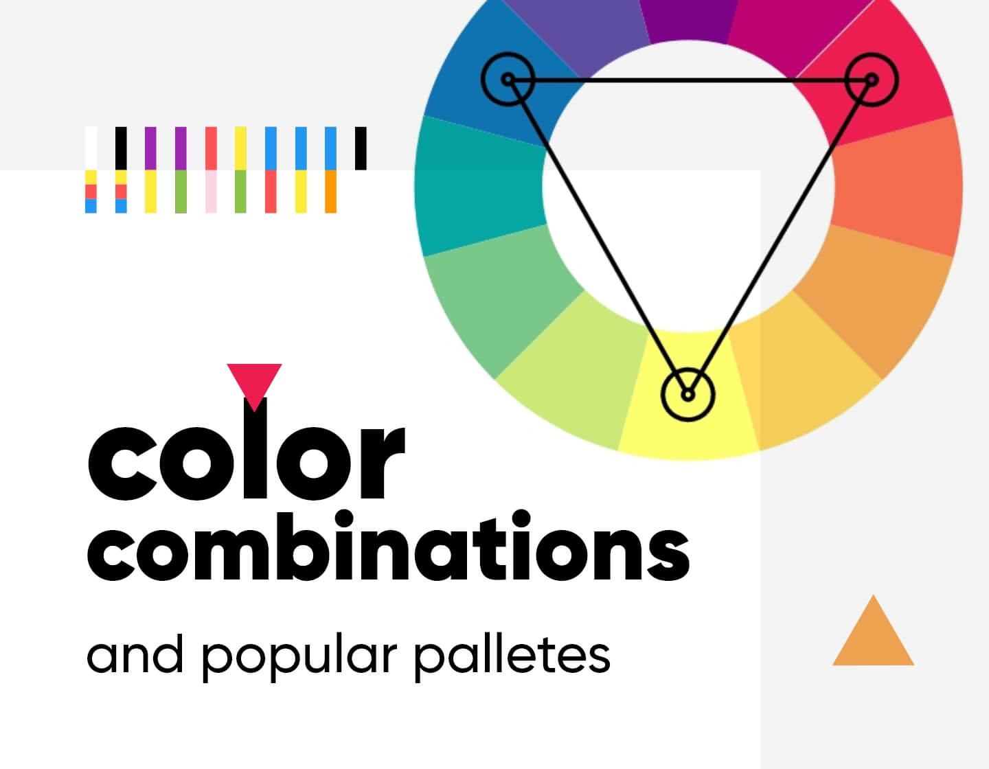
Color wheel
The color wheel that I’ve mentioned visualizes colors and the relationships between them. In its core, it displays primary and secondary colors, sometimes tertiary colors, and goes further. The colors are arranged in a way that depicts the results of color combinations between primary colors, as well as the results between primary and secondary colors.
Colors can be combined in many ways but generally, there are several rules and techniques for perfect aesthetic outcomes. Many designers rely on these rules to create visually appealing color schemes for their designs. Here are the most popular among them:
Analogous color combinations


When you look at the color wheel, you will find out that analogous colors are neighbor ones. They position themselves next to each other and commonly base themselves on one primary color. For example – blue, violet and purple are all based on blue combined with other primary or secondary colors.
Triadic color combinations


You can easily come up with a triadic color scheme by using an equilateral triangle on the color wheel. Triadic colors, as their name suggests, display on three positions on the color wheel at an equal distance between them. They are complementary and create a nice contrast between each other.
Split-complementary colors


These color combinations mix the triadic color scheme and an analogous color scheme. Split-complementary color schemes consist of three colors just like in the triadic color scheme. This time, however, they involve two analogous colors instead of all-contrasting colors. In short, the primary color of the color scheme is combined with the two analogous colors sitting exactly on both sides of the opposite complementary color.
Monochromatic color combinations


Monochromatic color schemes are based on a single color alongside its shades and hues. In fact, this is where the name “mono” comes from. You can easily create a monochromatic color scheme when you add black and/or white to a specific color of your choice and create a difference in its saturation and brightness.
Warm and cool color combinations


The color wheel can be visually divided into two parts. One with warm colors and one with cool colors. The colors on the wheel that fall into the warm category are red, orange, and yellow as well as their combinations. The cool colors refer to the blues and greens primary and violet secondary alongside all tertiary color combinations between them.
To mix warm with cool colors is a popular practice and it creates high contrast between elements and harmony in any design.
Several color palettes that will live forever
Trends come and go and designers often surprise us with new interesting combinations of colors. However, there are color combinations that are absolute evergreen classics. Fortunately, those will keep on pleasing the senses as they will never fall out of use. So, let’s see several popular examples of such color combinations.
Black and white


The classic of the classics. Made of the two neutral colors, black and white is the color duo that goes for any design and will never go out of style. A very safe and classy choice indeed.
Blue and orange


Those two complementary colors create a perfect contrast. The blue is fully cool and the orange is a fully warm color. This is a kind of vibrancy you instantly feel.
Blue and yellow


Combinations of primary colors will always be among the top choices for designers. Blue and yellow look energizing and harmonious together.
Blue and red


Another classic and popular combination that is screaming for attention, and at the same time looks elegant and professional.
Yellow and green


This refreshing combination brings you closer to nature. The primary yellow color goes together with the secondary green both to create an evergreen analogous combination.
Red and baby pink


A very romantic analogous combination. The passionate red combines itself with the sweet baby pink in order to create a dreamy atmosphere.
Purple and green


Although both purple and green are cool colors, they are secondary colors from the two opposites of the cool spectrum. This creates great harmony in any design.
Purple and yellow


These two colors position themselves right opposite from each other on the color wheel. The vibrant yellow gets perfectly complemented by the mysterious purple (a mixture of red and blue).
Black and any primary color


Black is a neutral color that goes with literally any other color on the wheel. However, combinations like black and blue, black and yellow, and black and red are true classics that designers keep choosing for their projects.
White and any primary color


White is the other neutral color that can be successfully combined with every color on the wheel. Its combination with each primary color – white and blue, white and yellow, white and red – creates a great contrast and is considered an undying classic.
Final words
Making successful color combinations is not as hard as people not experienced in design might think. The well-established rules and techniques for combining colors can guide everyone who’s making their first steps in art and design. The more practice you gain, the easier it would be to start experimenting and trying new combinations on your own.
While you’re at it, you could also see other helpful materials on the topic. For example, why not check out the basics of color theory? You could pick up something extra and read about the symbolism of colors.