

Here are 20 common design mistakes in UI/UX and branding that sneak into good-looking websites, and how to fix them before they frustrate real users.
I’ve lost count of how many times I’ve opened a beautifully designed website… only to squint at the text, get ambushed by a modal, or spend way too long trying to figure out if something’s a button. Sound familiar? You’ve probably bumped into the same stuff, sometimes on your own projects (no shame, we’ve all been there).
So, I pulled together 20 common UI and UX design mistakes I keep seeing in the wild, and yep, sometimes even in my own drafts. Think of this as a friendly nudge though, not a scolding. For each one, I added a quick tip to help you dodge the issue before it sneaks into your next design.
If you want your work to feel clean and genuinely helpful to users, this list might just save you some headaches (and maybe a few Slack messages from annoyed clients).
Visual Element Mistakes (How things should NOT look)
These mess with clarity, consistency, and the first impression.
1. Bad color contrast

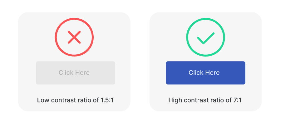
Poor contrast makes content hard to read and access. Stylish isn’t worth it if it’s unreadable.
Light gray text on a white background might look stylish on a designer’s mood board, but in real life, it’s basically invisible. Poor contrast strains the eyes, especially for people with visual impairments.

Pro Tip: Use a contrast checker (there are plenty online) to make sure your text actually stands out. No one should have to squint just to read your menu.
2. Too many fonts
When you mix more than two typefaces, it gets chaotic fast. It’s not expressive, it’s noisy.

Mixing a quirky display font with a cursive script and a tech-style monospaced one… sounds fun, but it usually ends up looking like a ransom note.
Pro Tip: Stick to one font for headings and another for body text. That’s usually more than enough. And if you want variety, play with weights and sizes instead of reaching for a whole new typeface.
3. Inconsistent spacing
Wobbly margins and padding throw the whole layout off. It can make even a great design feel off.

If margins and padding bounce all over the place, even the nicest layout can start to feel off. Uneven spacing creates visual noise. Users might not always know what’s wrong, but they’ll feel that something is.
Pro Tip: Use a spacing scale like 4, 8, 16, 24 pixels and keep it consistent. Many design systems already do this for you, so lean into those built-in rules when possible.
4. No visual hierarchy
When everything screams for attention, nothing gets noticed.

The eye doesn’t know where to go, and users miss what matters. This is why your layout absolutely needs structure.
Pro Tip: Use headings, font sizes, colors, and spacing to create structure. Let your design guide the eye like a visual tour that says, “Start here, then go there”.
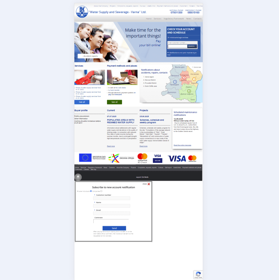
5. No visible labels aside from a placeholder text
Placeholder text disappearing from the input looks clean, but it confuses users if there are no other labels.

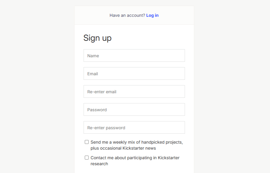
You know those form fields where the label is inside the input box, and it vanishes the moment you start typing? Of course, this is exactly how placeholder text should behave, but what happens when there are no other labels next to the input? Once the placeholder’s gone, there’s no way to double-check what was supposed to go there.
Pro Tip: Always use visible labels outside the input field. Placeholders can still help (like showing the format of a phone number), but don’t use them as the only label. People need a reminder of what they’re filling in.

Common UX Mistakes (How things should NOT feel)
These mistakes frustrate or confuse people while they try to do something.
6. Ignoring mobile users
If it doesn’t work on a phone, it doesn’t work. Period.

Some websites still act like everyone’s browsing on a 27-inch monitor. But more often than not, people are on their phones, scrolling while commuting, watching TV, or pretending to listen in a meeting. If your site doesn’t play nice on smaller screens, it’s going to lose people fast.
Pro Tip: Always check your design on mobile early in the process. Don’t treat it like an afterthought. Even just resizing your browser window while you’re working can help spot problems early.
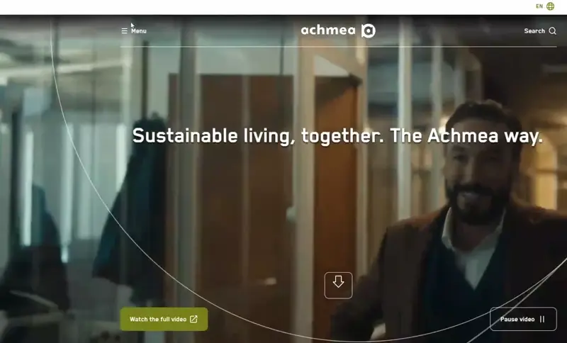
7. Auto-playing audio or video
Uninvited noise makes people bounce fast.
You open a page, and suddenly a video blares at full volume. Panic sets in. Tabs start closing. You question all your life choices. It’s just not a good time.
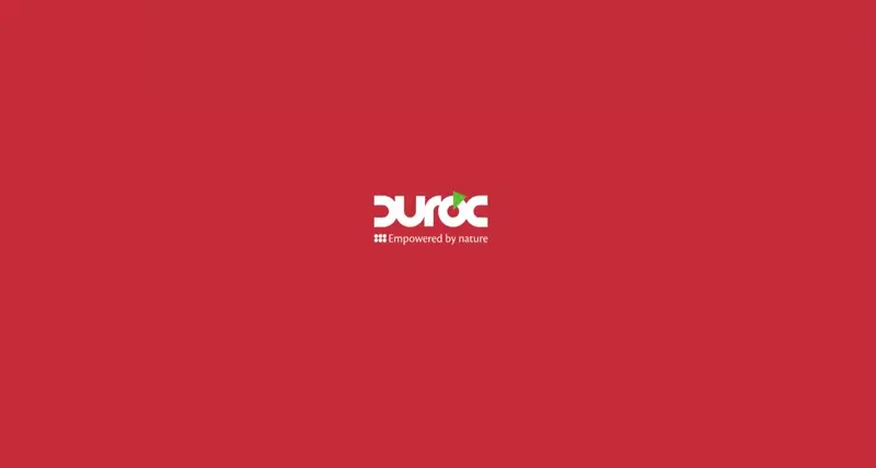
Pro Tip: Let users choose when to play media. If something needs to autoplay, mute it by default. And always make the controls easy to find. In the example above, Duroc did both: when you land on their homepage, the audio is muted by default, and the audio and video controls are visible enough.
8. Scroll hijacking
Hijacking the user’s scroll breaks expectations, and even smooth effects feel rough when forced.

Trying to scroll and having the site take over like it’s got a mind of its own? That’s scroll hijacking. It might look fancy in a designer’s prototype, but it often frustrates real users.
Pro Tip: Let users scroll at their own pace. Smooth animations are great, but don’t mess with basic browser behavior unless you’ve got a really strong reason, and even then, test it with actual users.
9. Pop-ups right away
Interrupting someone before they’ve even settled in is not the best welcome.

You land on a page, and before you even see a headline… bam! Pop-up in your face. “Subscribe to our newsletter!” You don’t even know what the site does yet.
Pro Tip: Give users a little breathing room. Let them scroll or interact before asking for anything. And if you have to use a pop-up, make it easy to close.
10. Form overload
Asking for too much, too soon, pushes people away. Long forms need to earn their keep.

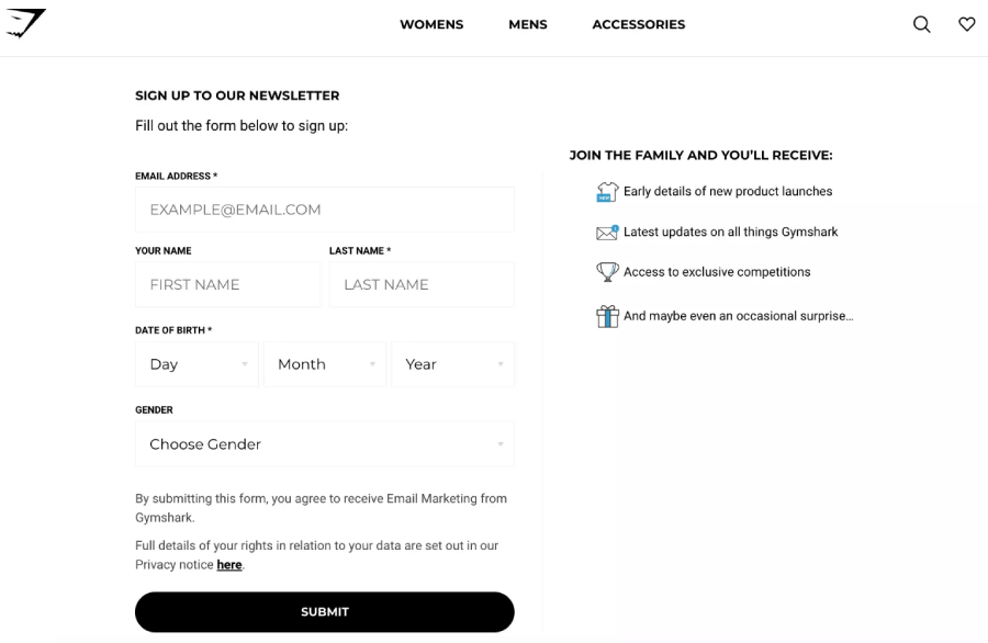
Ever see a sign-up form that feels like applying for a mortgage? Users bail when they’re asked for too much.
Pro Tip: Only ask for the stuff you truly need. And if your form is long, split it into smaller steps with a progress bar. “Almost there” beats “Why are you asking for my shoe size?”
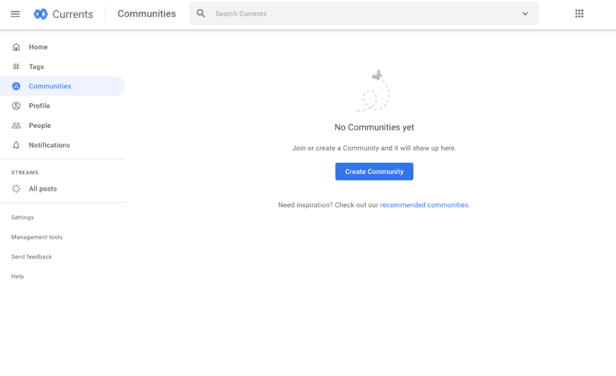
11. Forgetting empty states
Blank dashboards or carts feel broken. These moments need care, too.
Designing for “no content” moments often gets skipped like a cart with nothing in it, or a dashboard before any data appears. These blank slates can feel broken or awkward.
Pro Tip: Treat empty states as part of the experience. Add helpful messages, maybe a bit of personality, and give users a clear next step. Even a friendly “Looks like there’s nothing here yet” goes a long way.

12. Loading states missing
If users click and nothing happens, they assume it didn’t work. Feedback matters.
Click something and… nothing happens. Did it freeze? Did it crash? Am I just impatient? A missing loading indicator leaves people guessing.
Pro Tip: Even a simple spinner or “Loading” message is better than silence. It reassures users that something is happening behind the scenes.
13. Modals that trap you
A pop-up with no exit button is a quick way to frustrate your audience.
See the Pen
Dialog focus trapping with CSS by Kushagra Gour (@chinchang)
on CodePen.
A modal pops up, and there’s no clear way to close it. No X, no cancel, no escape key. Just you and the modal… forever… unless you do what it says.
Pro Tip: Every modal needs a clear exit. Add a close button, let people click outside the modal to dismiss it, and make sure the escape key works too. No one wants to feel stuck.
Common UI Mistakes (How things should NOT work)
These are more about mechanics and interactions, such as buttons, layouts, input fields, etc.
14. Tiny touch targets
If people can’t tap a button without zooming in, it’s too small.

When tapping a button on your site feels like defusing a bomb in a movie (one wrong move and everything blows up), then the button’s too small.
Pro Tip: Make buttons and clickable elements at least 44×44 pixels. And don’t cram them too close together. You want users to tap with confidence, not fear.
15. Overcomplicated navigation
Complex menus make it harder to explore. Users don’t want a treasure map to find your blog.
Navigation should guide users instead of testing their problem-solving skills. Dropdowns inside of dropdowns, cryptic labels, and hidden menus only make things harder.
Pro Tip: Stick with familiar patterns. Keep your main nav simple, your labels clear, and group related items in ways that make sense. If it takes more than a second to find “About Us,” something’s off.
16. Confusing button labels
“Yes” doesn’t mean anything on its own. Clarity beats mystery.
Especially for modals, “Yes” and “No” buttons always require users to go back to the question and read it carefully. For example, if the modal asks “Do you want to save changes?”, try using “No” and ” SAVE” instead.
Pro Tip: Use clear, specific language. Instead of “Submit”, go with “Send Message”, “Place Order”, or “Save Changes”. Tell users exactly what’s going to happen.
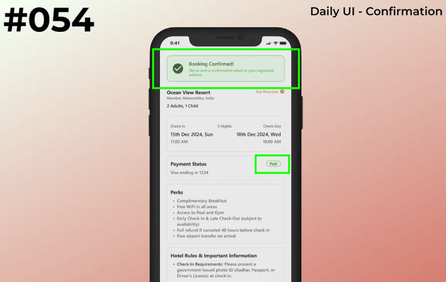
17. No feedback after actions
If clicking doesn’t trigger some response, users are left wondering.
Clicking a button with no response is confusing. Did it work? Did I double-click? Should I reload the page? Silence makes users nervous.
Pro Tip: Always show feedback. A simple spinner, toast notification, or “Success!” message reassures users that the thing they just did worked. In the following example by Adrita Roy, there’s a message “Booking Confirmed!” and it even goes further by instantly adding a green label “paid” next to the payment status. The user immediately feels reassured that they have their booking all set and there’s no need to double-check.

18. Misusing icons
Not every icon is universal. A mystery symbol without context is just decoration.
That star-shaped button might look nice, but does it mean favorite? Featured? Explode? Not everyone interprets icons the same way, especially the more abstract ones.
Pro Tip: Pair icons with labels, at least for anything that’s not super obvious. A trash can means delete, but a magic wand? Could be anything. When in doubt, add text.
Common Branding & Trust Mistakes (How your site should NOT come across)
These issues chip away at credibility and make your brand feel less reliable or thoughtful.
19. Skipping accessibility
Design that shuts people out reflects badly on your brand and misses a huge part of your audience.
If someone using a screen reader or keyboard can’t navigate, they’re out of luck.
Pro Tip: Use semantic HTML, label your form fields, check keyboard navigation, and don’t forget about alt text for images. There are even browser extensions to help spot issues early.
20. Animations that drag
Animations are great, but slow or clunky ones feel unpolished and annoying. Speed = trust.
Yes, animations can look great. But if your loading screen plays out like a movie trailer, or your fade-ins crawl along like a snail, users will lose patience.
Pro Tip: Keep things quick and subtle. Aim for animations under 300 milliseconds. Anything longer needs a really good reason, and even then, it better look amazing.
And there you have it!
These were 20 classic UI/UX facepalms and hopefully a few “oh yeah, I’ve done that” moments along the way. Catching them early (or knowing what to look out for) can seriously clean up your designs from the very beginning.
And if you’re curious about more design tools or need inspiration, we’ve got plenty of other guides worth checking out, just like the following: