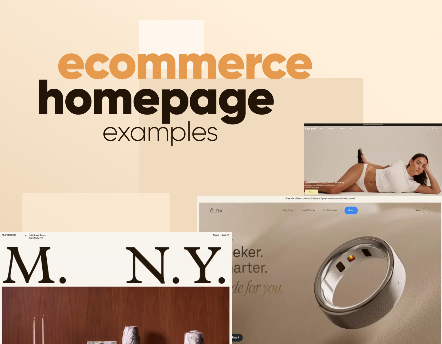
The homepage sets the tone for any online store. It’s the first thing people see, and when it’s done right, it grabs attention, builds trust, and makes you want to stick around (and maybe even hit that “add to cart” button). In this article, I’ve pulled together 10 awesome eCommerce homepage examples from all kinds of industries: fashion, tech, beauty, furniture, you name it. Each one does something a little different, and I’ve broken down what works, what’s clever, and what other brands can borrow.
1. Matthew Fisher
About the store: Matthew Fischer is a NY-based talent who creates sculptural objects from stone with precision, cultural references, and great detail. The site sells some of these pre-made art objects, but Fischer also takes commissions.
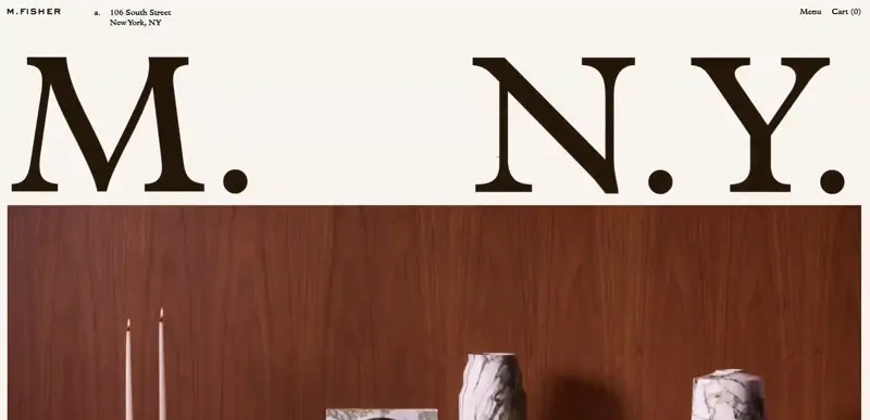
The homepage for his business website, built with NextJS, has a lovely macro design with huge images of his work, oversized typography, and a pretty cool broken-grid layout. It keeps things dynamic but also polished as if you’re browsing an interior design magazine. Above the fold, the homepage starts with a full-screen image of custom items and a huge M. N.Y. title that stands for Matthew New York.
Homepage sections breakdown:
I love how the exact location of his workshop is listed directly in the main navigation, so you won’t need to scroll all the way down to find it. Aside from that, the navigation only has the essential links for the Menu and Cart.
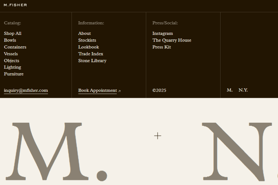
Now, the menu opens an overlay screen with a smooth drop-down animation and reveals the links to Fischer’s catalog. Here you can browse items by categories: Shop All, Bowls, Containers, Vessels, and more. The menu also gives links to galleries and information about the artist, as well as his Socials and quick links to send an Inquiry or book an appointment, powered by Acuity Scheduling.
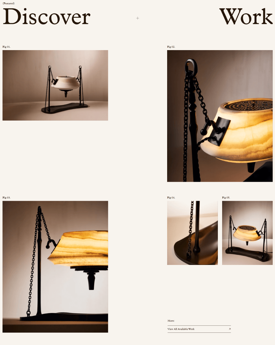
Scrolling down, you’ll get to the “good stuff” pretty quickly as the next section presents a gallery of curated pieces of art to discover. they are arranged tastefully like in a magazine. If the viewer is hooked, the gallery conveniently has a View All Available Work CTA button to visit the shop.
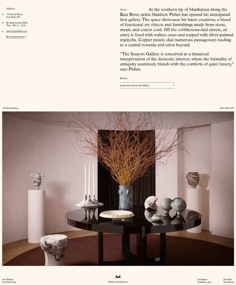
The last section serves to promote an art event where you can visit Matthew Fischer’s gallery and experience his work in person. What I really enjoy about this section is that it has minimal copy. yet, it still shows all the info you need, like opening hours, booking, and address.
This eCommerce website serves as a portfolio with eCommerce functionality rather than a store, so it’s natural for the homepage to also have that same vibe.
2. Tanrevel
About the store: Tanrevel is an award-winning beauty brand for its self-tanning, vegan, and natural skin care products.
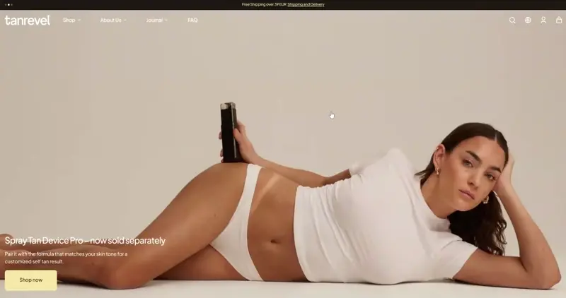
The overall look of the homepage is professional, well-structured, and a pleasure to browse. It manages to pack a lot of data without feeling overwhelming because it mixes layouts pretty smartly. It alternates monoblocks with multi-column layouts within the same grid to separate the different sections and create a dynamic experience.
Homepage sections breakdown:
Since the page is a big one, it’s not overwhelmed by animations or a parallax effect. However, it still has a couple of UI animations like hover effects on the product photos and a motion bar with the name of a promo product. In terms of eCommerce tools, the entire site is built with Shopify Plus and headless Sanity CMS, which is a great configuration when a business uses multiple channels and has a lot of data.
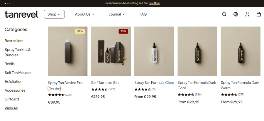
Starting with the navigation, Tanrevel’s homepage has a mega menu with multiple levels, acting like tabs. For example, the Shop option opens a drop-down menu with a side menu of categories and a “screen” for the content for each category to make shopping much easier. When you click on an option, it also has a visible indicator of which option you’ve clicked.
The menu also packs essential inner pages links for About, a blog, and FAQ, alongside the necessary eCommerce icons for search, language, profile, and cart.
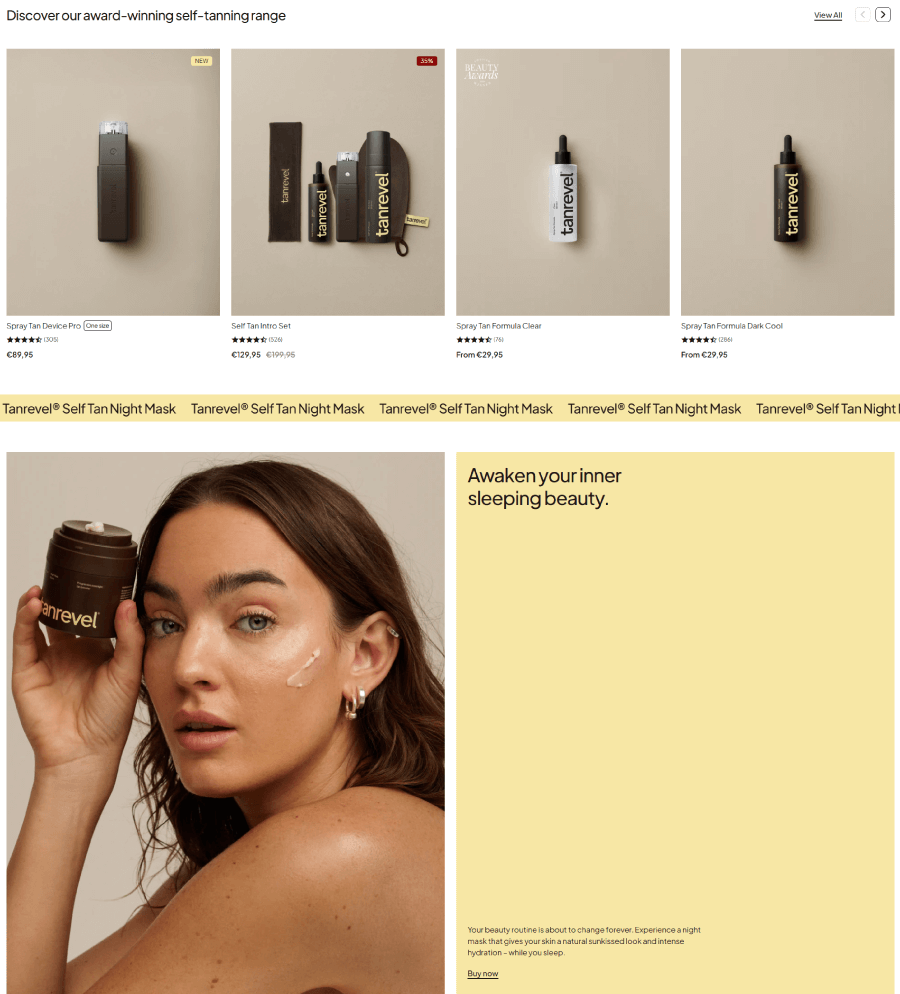
Moving down, the next sections promote popular and new items with ratings and pricing, as well as a very well-designed promo for a new product that takes up an entire section.
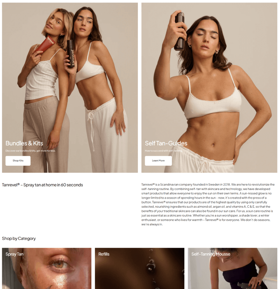
The homepage also promotes bundles and kits for better value with professional images, and self-tan guides for beginners who are just starting to use this type of product.
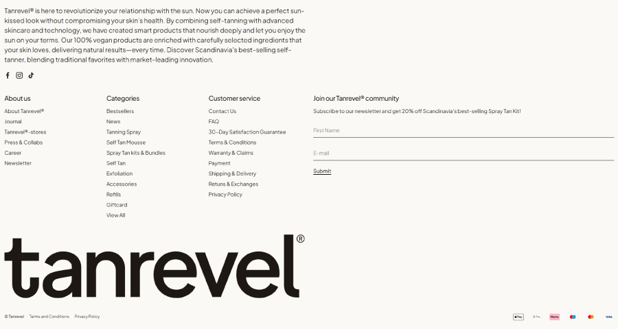
And last, we have a trendy big footer with a short brand message that introduces the company values, socials, and a sitemap. It also has a huge brand logo and a list of icons representing payment options that the site accepts.
In all, this is a typical example of a professional eCommerce homepage for beauty brands that needs to promote as much as possible in a limited space, and does it right.
3. PICKYOU PRO
About the store: PICKYOU PRO is a service for the free market that deals with one-of-a-kind items from influencers across social media, such as models, creators, artists, and actors. These items were used by the mentioned influencers and are put up for sale on this website.
Here we have an awesome Japanese homepage with a unique proposition where users can buy used items from their favourite Japanese influencers. The homepage is clean with a white background and a marcro design, grid layout and motion typography.
Homepage sections breakdown:
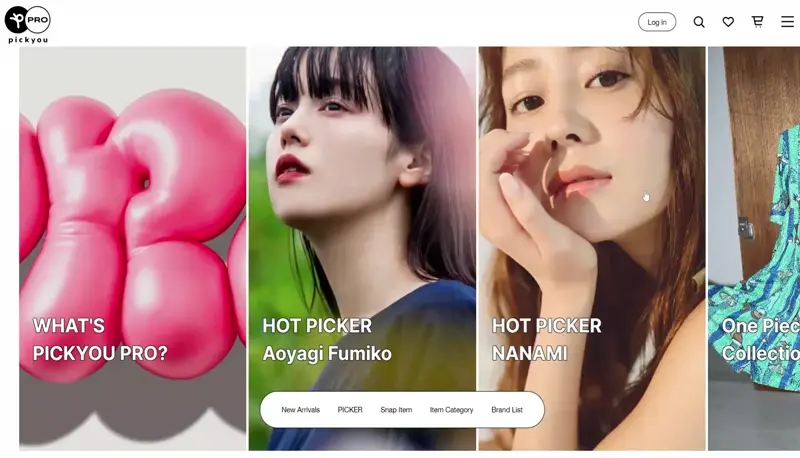
When you first land, you’ll see a sliding hero section with four images, each serving as a portal to different pages. We have What’s PICKYOU PRO for newcomers, the two most popular HOT PICKERS currently on the site, and a one-piece collection.
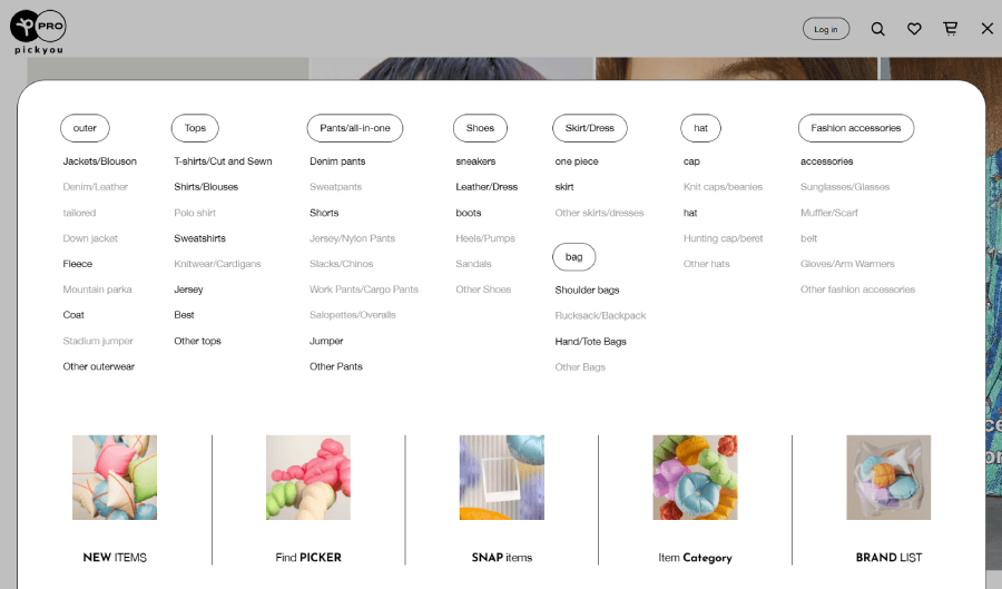
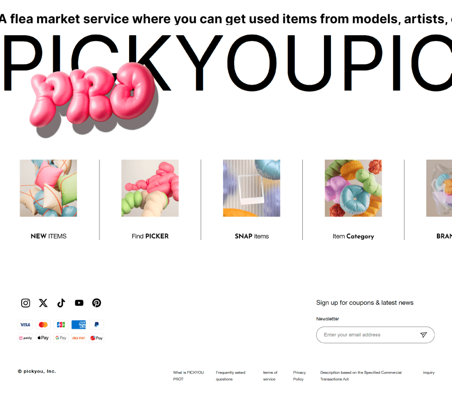
There are two navigations here: one main navigation in the top right corner that holds the Logins, search, favorites, cart, and a drop-down mega menu for all the inner pages in categories. The secondary navigation is in the hero section with overlay buttons for quick links for new arrivals, pickers, snap items, categories, and brand list. You can also see the same quick links in the mega menu from the main navigation, as well as in the first section below the fold.
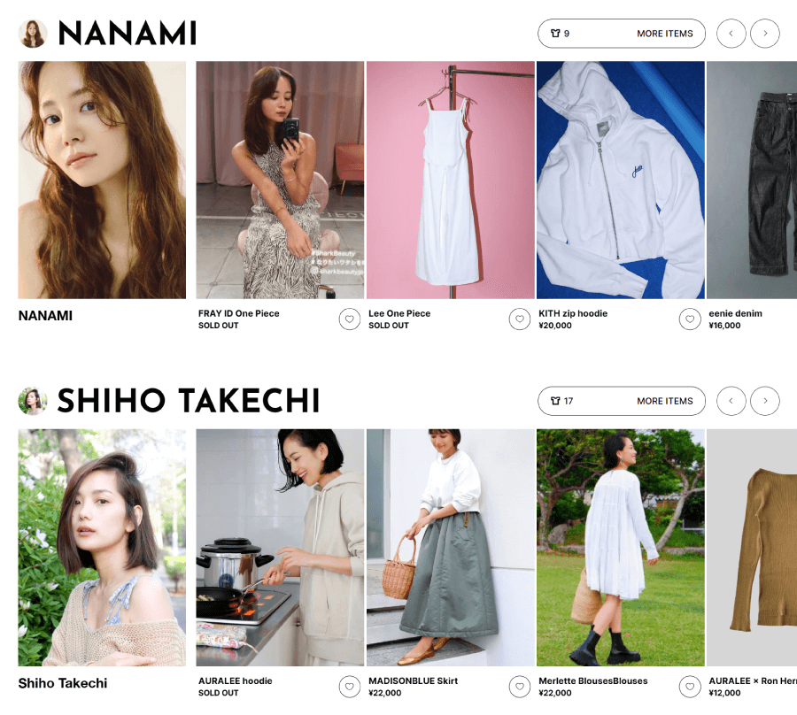
Scrolling down, the homepage basically gives you a lot of sections representing different influencers and their items. They are all packed in nice sliders and an indicator of a number of items available by this particular influencer.
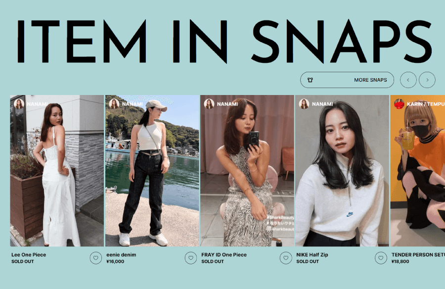
Just like most fashion-related eCommerce homepage examples, this one also shows specific highlights. In this case, right below the influencers, it packs a slider with items from snaps. You can clearly see which ones are still available and which ones have already been sold.
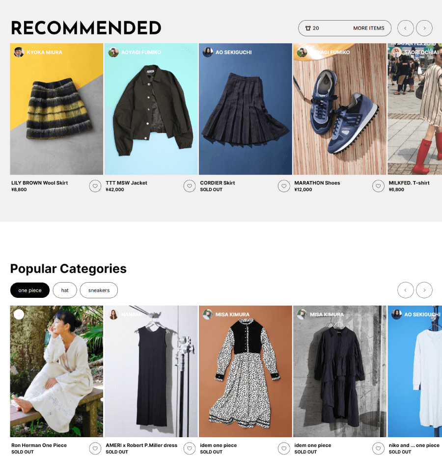
They also have the mandatory Recommended Items section and popular categories to show the best items they have.
It’s very easy to spot which parts of the website PICKYOU PRO are the most important. The quick links I mentioned earlier from two different menus and a section are in the footer as well.
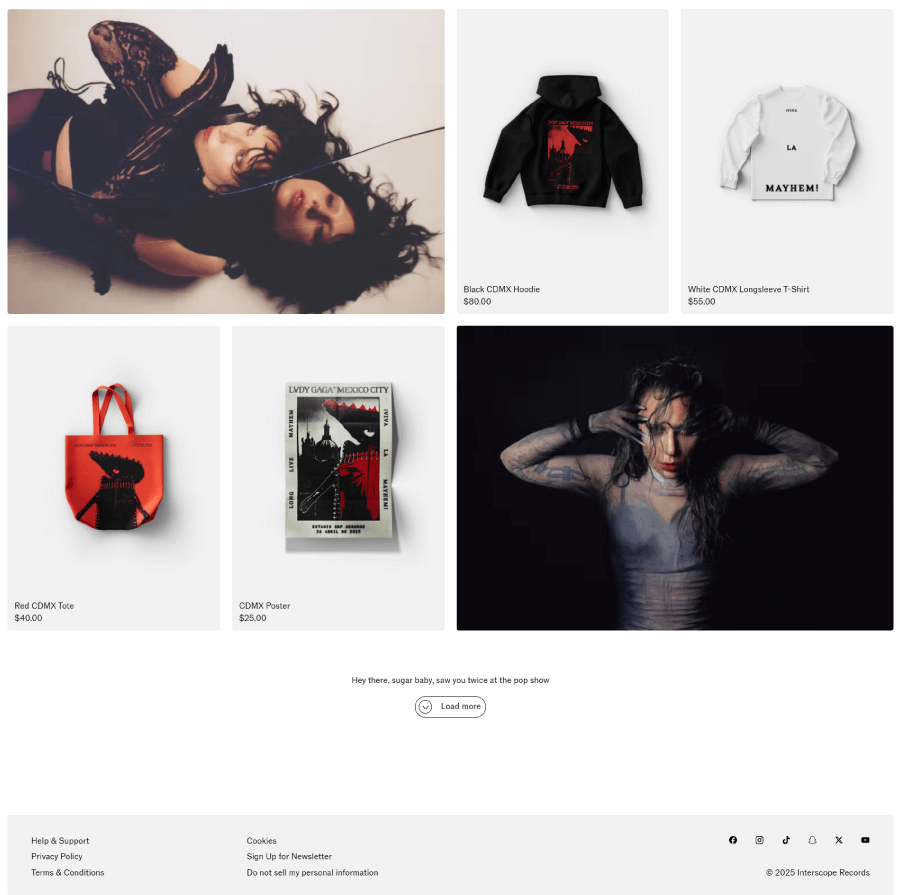
4. Lady Gaga Shop
About the store: This is the official store of Lady Gaga, where fans can buy her merch and albums. It currently promotes the upcoming album Mayhem.
In terms of design, this is an awesome example of a VR website design where the homepage scrolling feels like a realistic walk in Rio or Mexico City, depending on which option you choose. No matter which city you’re exploring, you will see realistic buildings, trees, and floating clickable merch items.
Homepage sections breakdown:
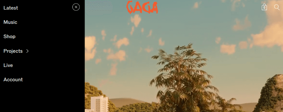
The homepage is basically clean, with a focus on the VR experience. But like any eCommerce site, it also has a navigation to help you find the inner pages, create an account, check your cart, or learn about current and future projects by Gaga.
The VR is only present on the homepage, so if it gets overwhelming, your eyes can rest when you go to the other pages.
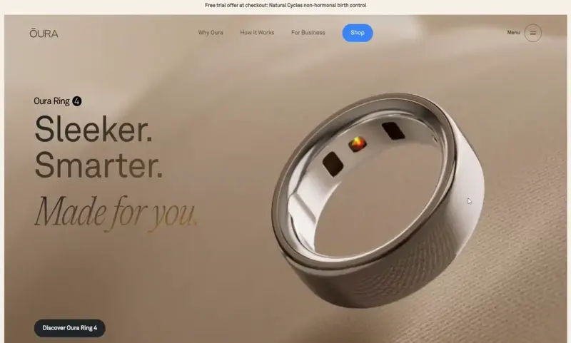
5. Oura Ring
About the store: Oura sells smart rings that can detect movements and provide info about the time of day, calories burnt, steps made, BPM, and heart rate.
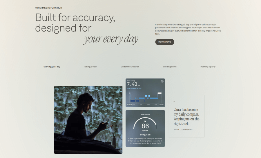
Here you have a great example of a tech eCommerce homepage with a modern, luxurious design and a pretty complex eCommerce configuration of WordPress, HubSpot, and NextJS for the different functionalities. It has a grid layout with big section cards, oversized product images, and lazy scrolling that allows the content to load properly as you scroll.
Homepage sections breakdown:
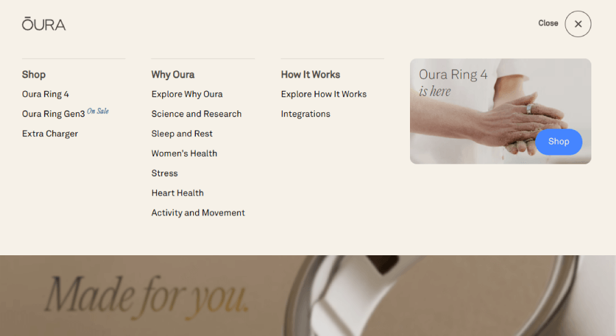
The fixed navigation provides quick links for essentials such as Why Oura, How It Works, and For Business, as well as a drop-down menu with a sitemap.
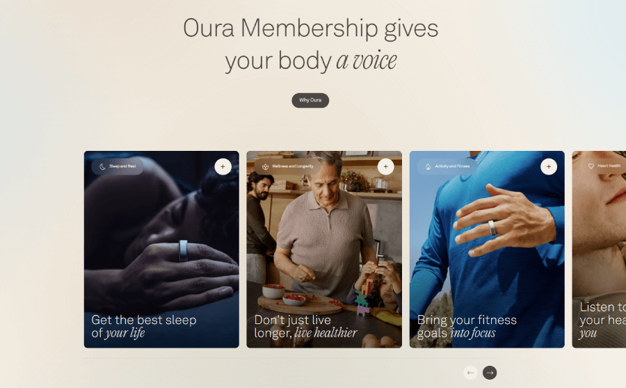
When you scroll down, the elements go off-grid to break the layout consistency and make the design more dynamic. For example, the Oura Membershop section shows a slider with benefits where the cards disappear off-screen before you start sliding.
Things get even more dynamic in the next section, which was very cleverly designed to look broken within the same grid. I’d like to note a very good practice I find here. The page packs the entire process for using the ring in a single small section with tabs for each step, instead of expanding the entire content into scrollable sections. This keeps the page shorter and organized.
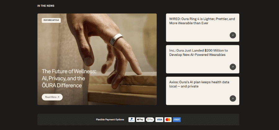
Usually, eCommerce businesses show client testimonials on the homepage as early as possible. But the thing is, any kind of social proof will do. For example, Oura has a section with featured articles that talk about their product in different media.
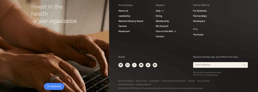
The homepage also has a trendy big footer that takes up almost the entire screen. Aside from the sitemap, socials, and newsletter subscription, it goes split-screen to promote a specific page for businesses, which isn’t something we see often in footers.
6. Glass Abstract Animated Shapes
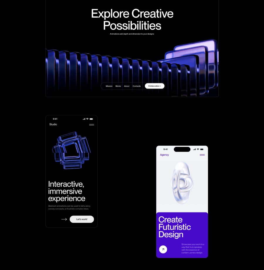
About the store: Glass Abstract sells a package of futuristic glass animations in light and dark mode that users can download and use in their websites, apps, presentations, and other digital products.
Now, let’s enjoy a very futuristic high-tech homepage that looks very different from most eCommerce homepage examples out there.
Homepage sections breakdown:
It’s probably one of the best examples of anything built with Webflow I’ve seen and does its purpose perfectly. I immediately thought if the homepage works that well and the scrolling animations are that smooth and light (my Chrome did not choke), then most likely, so will the product they sell.
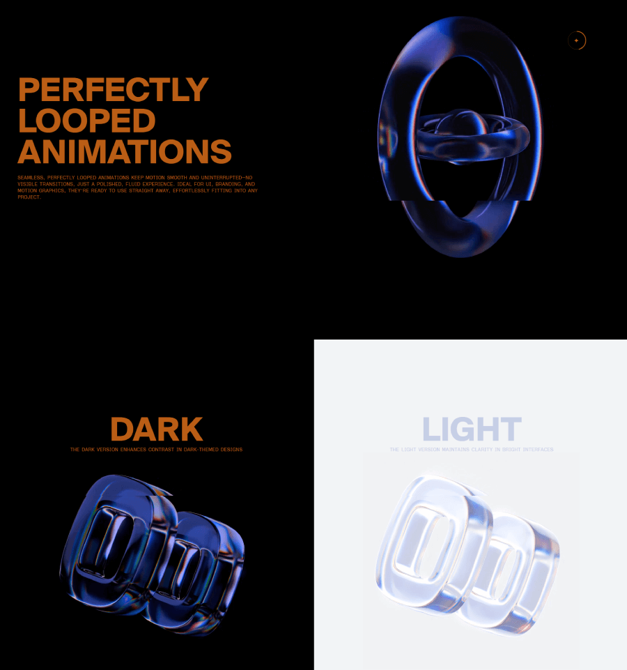
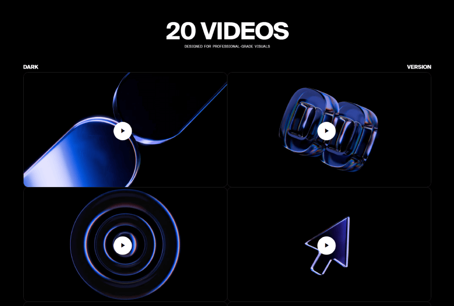
The next sections basically showcase the animations in the pack, starting from how they look in dark or in light mode in a split-screen section.
You can also see a very nicely done animated section that stacks the items one over the other when you scroll.
The homepage also gives you examples of cases where you can use the animation pack and how it will look.
It ends the presentation with videos for all animations included in the pack in both dark and light versions.
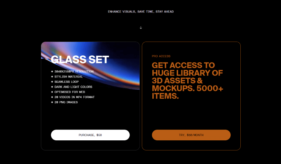
Instead of a footer, the homepage ends up with the purchase options. Here you can choose whether you want to buy the pack and call it a day or subscribe to gain an access to more 3D asses and mockups.
7. Tripletta Pizza
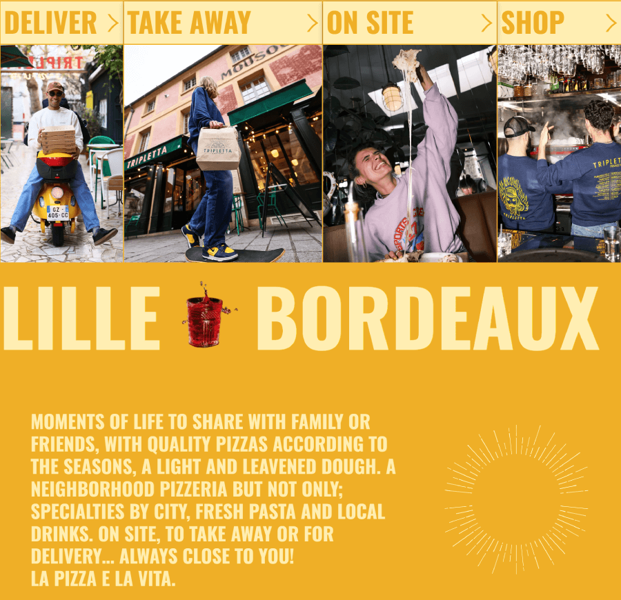
About the store: Tripletta Pizza is a restaurant in several cities that offers delivery options, takeout, reservations on site, and even a merch shop.
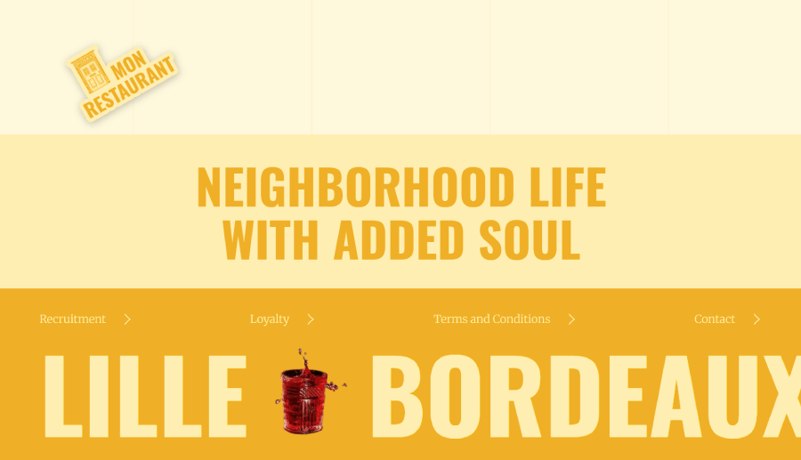
Tripletta has a very fresh and colorful homepage with a mixed layout, lots of animations, and overall great vibes that promote a specific urban lifestyle even more than it promotes the pizza itself.
Homepage sections breakdown:
The homepage opens with a colorful animated preloader that rotates the names of cities Tripletta has a physical location. Once it loads everything properly, it shows you the hero section with an animated hand-drawn illustration and the name of the restaurant. There isn’t much in the hero other than socials, so scrolling down, you’ll get to the links for the inner pages.
This doesn’t look like a traditional navigation. This immediately tells you that this isn’t your everyday pizzeria. The main links go into a card section with labels and images below the hero.
Speaking of promoting the lifestyle, the next section has a broken grid gallery Wall of Love, aiming to show the vibes and sell emotions and subculture.
The footer continues this with a strong motto, Neighbourhood Life with Added Soul, and an animated banner with the cities.
8. Collider
About the store: Collider is a brand that sells mood-boosting non-alcoholic beer.
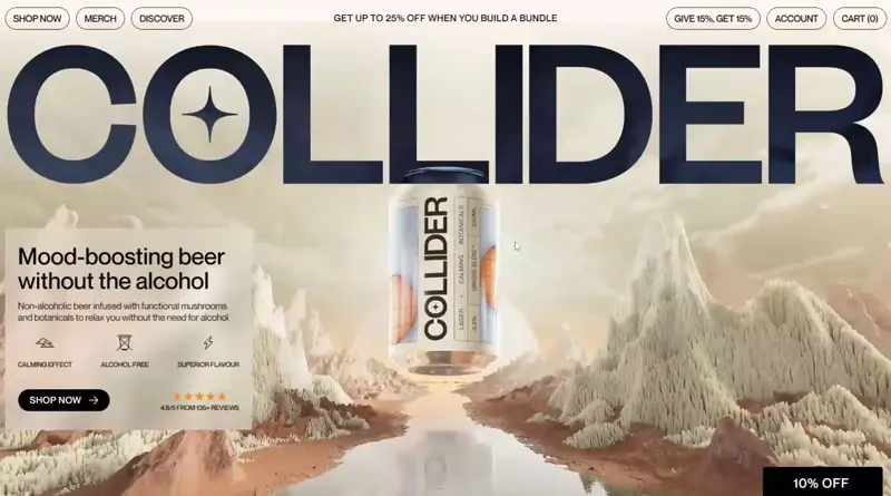
This is a Shopify store with a trendy template that has visible lines and borders that separate the content perfectly without the need to use lots of white space. The homepage is a short scroll, but it has all the info you need to get familiar with the product.
Homepage sections breakdown:
Unlike most of the other examples, the design doesn’t use a lot of animations or parallax. However, it has UI animations such as hover effects and a zoom-out logo that sticks to the navigation the moment you start scrolling.
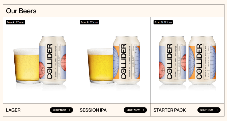
The beer selection shows Collider’s products with cool hover effects and a button to go to the shop page. Since it has only three types of beer, this is a huge plus for users, as there aren’t many choices that may overwhelm you.
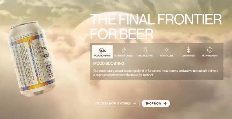
In a typical homepage fashion, Collider also has a presentation section that showcases the benefits of their product. This one uses tabs to keep the content packed and short.
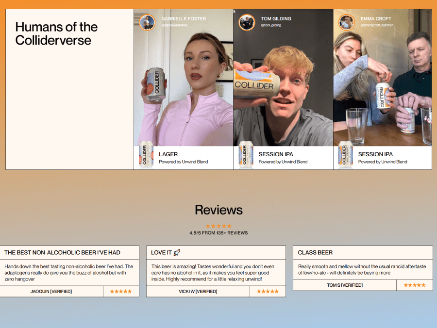
The social proof section shows Instagram reels of clients and curated client testimonials. If you wish to read all the reviews and not just the selected ones by the company, you can do so on the product pages.
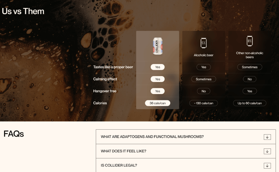
Us vs Them is another great section to have. It shows a clear comparison between the promoted beer brand against alcoholic beers and other brands of non-alcoholic beer.
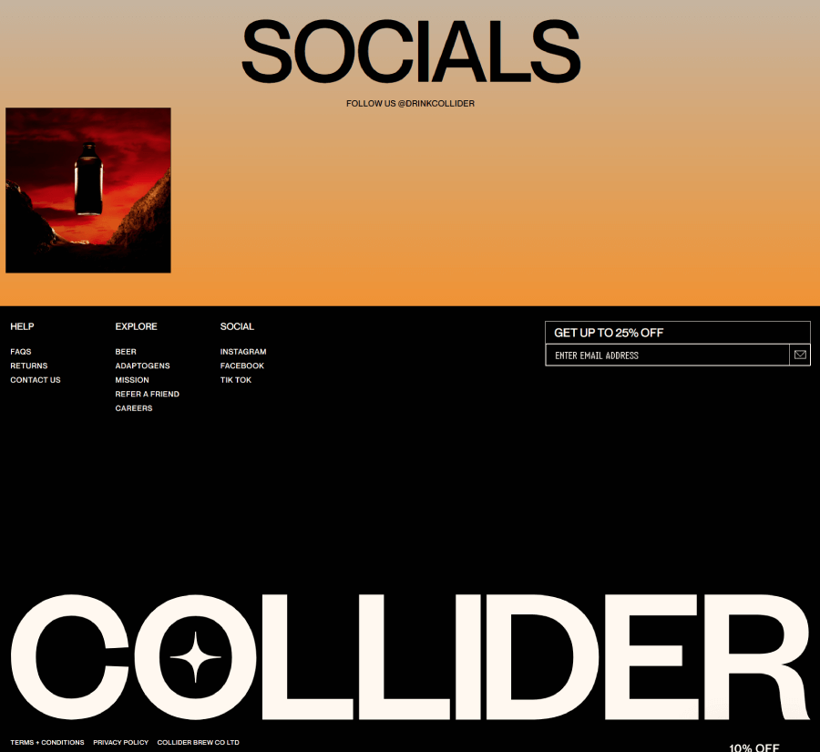
And last, the huge full-screen footer serves more as an aesthetic than a site map. It does have the links to all inner pages, but most of it is white space and the logo.
9. Beardbrand
About the store: Beardbrand sells luxury beard, hair, and body products for men online and in physical locations across the US.
I selected this homepage because of how short and minimal it is. It features a hero section, featured products, product categories, selected blog articles, and a footer. That’s all. On the other hand, it’s structured so well that it actually has more content than it initially seems.
Homepage sections breakdown:
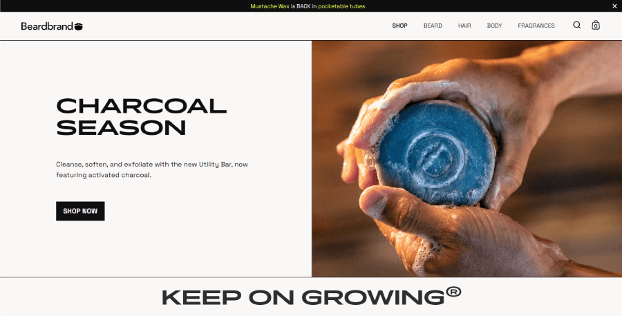
Starting off, the hero here is a classic block section that serves to promote a specific new product.
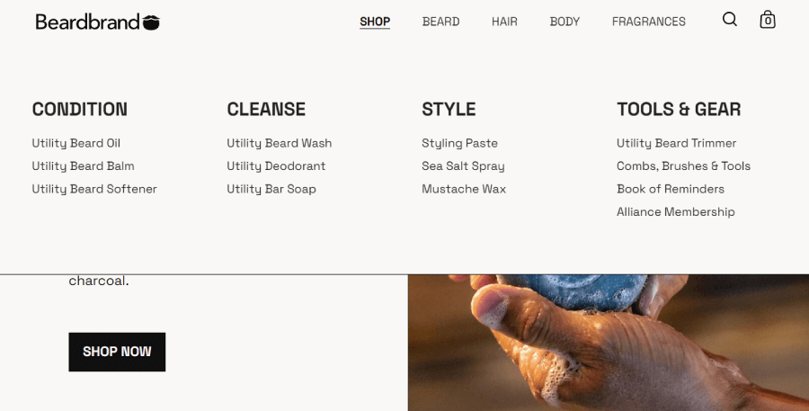
The navigation packs a drop-down menu for the product categories based on purpose. These are followed by the main categories based on type of product, a search, and a cart.
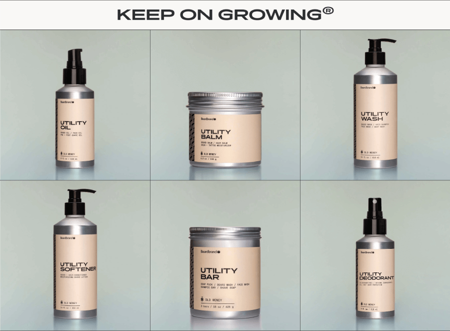
Next, you have a minimal module grid layout section with recommended products that show images only. If you hover over a product, it will immediately reveal its title, pricing, and type.
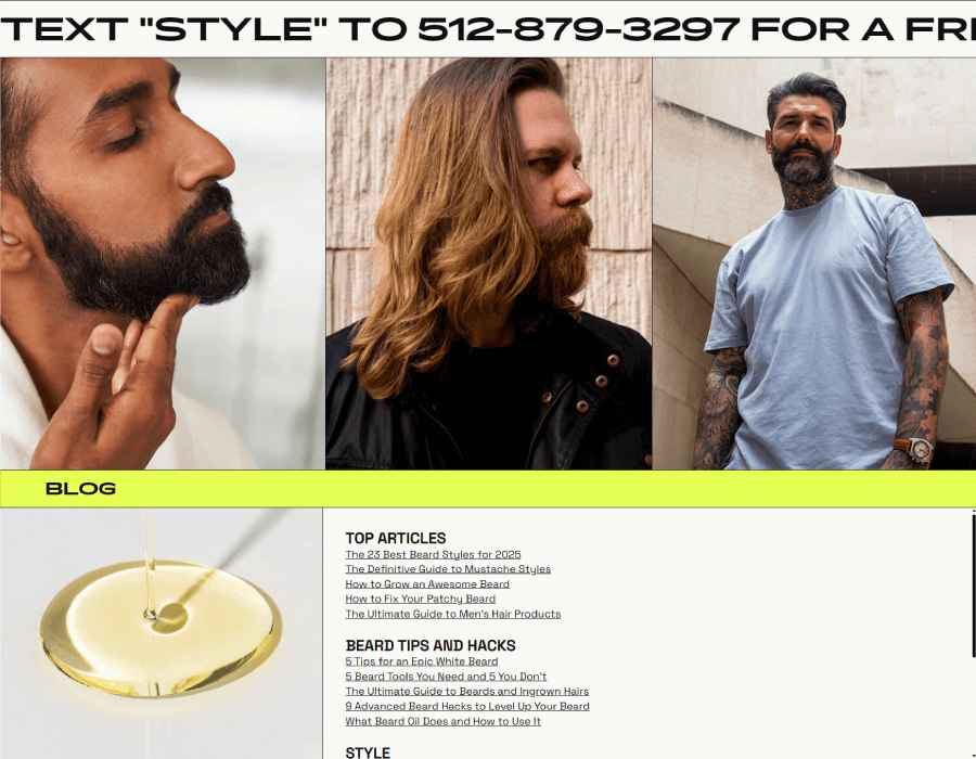
Scrolling down, the homepage has a banner with motion text that promotes a text code for users to get a free consultation. This gives a good value for first-time shoppers. Next, the page features three model images for the three product categories: bear, hair, and body, which is as minimal as it gets.
To showcase expertise, Beardbrand also has a blog with beard tips and hacks, and doesn’t shy from listing some of the articles on the homepage for users to explore.
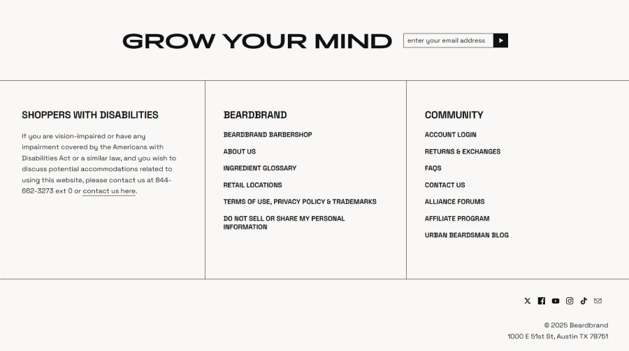
As usual, the homepage ends with the footer. This one packs three columns for accessibility, sitemap, and community.
10. Tiny Organics
About the store: Tiny Organics is a brand that offers prep meals for babies and toddlers.
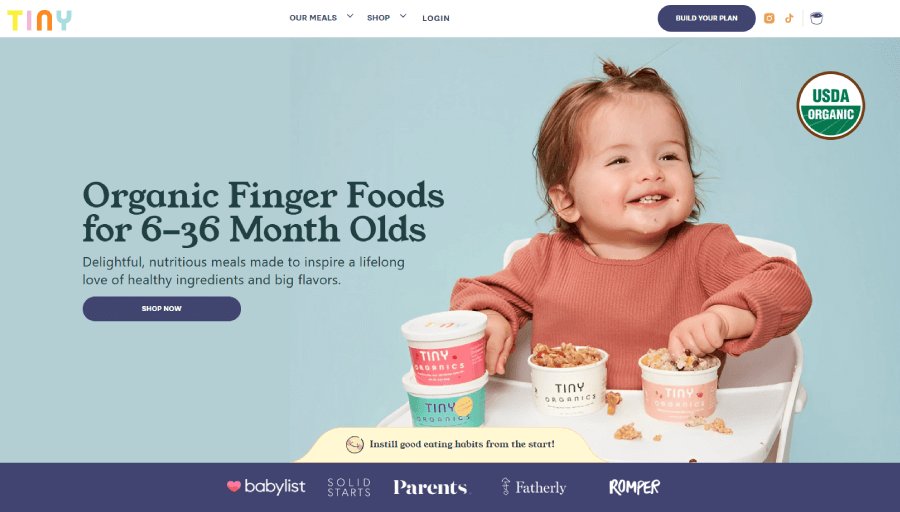
Let’s end this list with an adorable eCommerce homepage for babies’ and toddlers’ meals. It is filled with nutrient information, social proof, and cute images, just as intended.
Homepage sections breakdown:
Starting with the hero, here you have a typical block section with a background image, title, description, and CTA. It serves as a portal to the shopping page with all the meals.
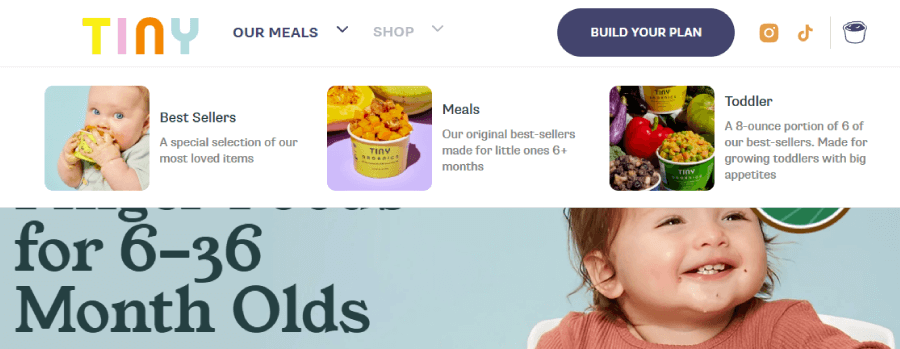
The navigation has everything you need. There are two drop-down menus for Meals and Shop.; A button link to build your own meal, where you can choose the specific number of packs and delivery schedule.; Social icons, and a cart with a cute toddler meal bowl icon.
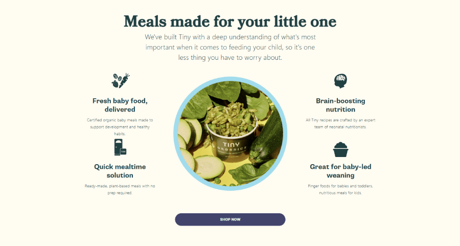
A must for a homepage that promotes baby food, the next section offers a cute infographic that lists all the nutritional benefits of the product. It uses the opportunity to add another shop link CTA.
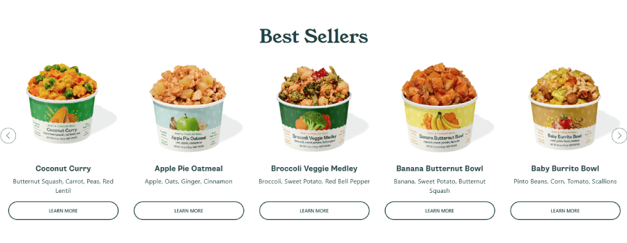
The homepage, of course, features recommendations. In this case, a Best Sellers slider with professionally made photos of the meals, with names, ingredients, and CTA buttons to learn more.
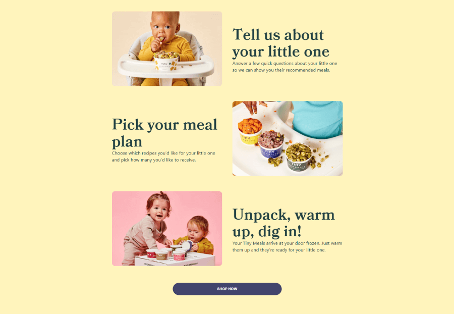
Scrolling down to the next section, it explains the process of building a meal plan. Parents need to take a quick quiz for the site to recommend suitable meals and he’s them create the perfect plan for their kids.
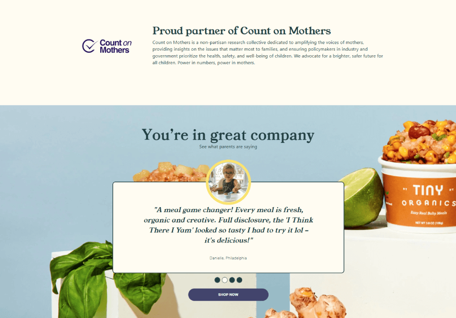
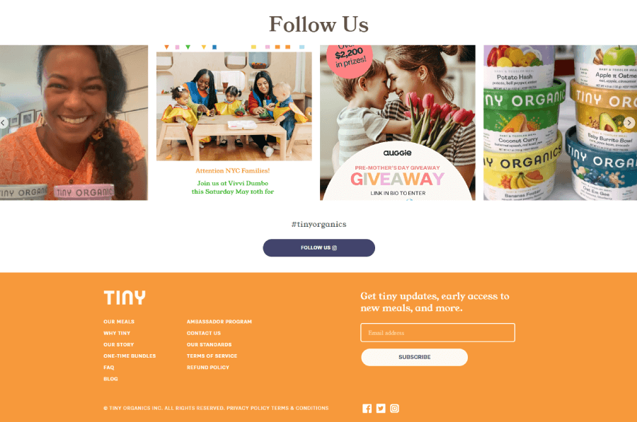
Tiny Organics ends with a slider of selected client reviews and an integrated Instagram feed with posts containing the brand hashtag “tinyorganics”.
Unlike the other examples, the footer is small, packed, and includes the essentials only: sitemap, policies, newsletter subscription, and socials.
And there you have it.
These are 10 awesome eCommerce homepage examples that actually make you want to shop. Each one shows how good design, sharp content, and a bit of personality can go a long way. Some lead with bold visuals, some keep it super clean, and a few just feel fun to scroll through.
Take what fits your style, leave what doesn’t, and maybe don’t let your homepage be the digital version of a cluttered garage. Unless, of course, you’re selling garage stuff. In that case, carry on.


