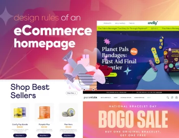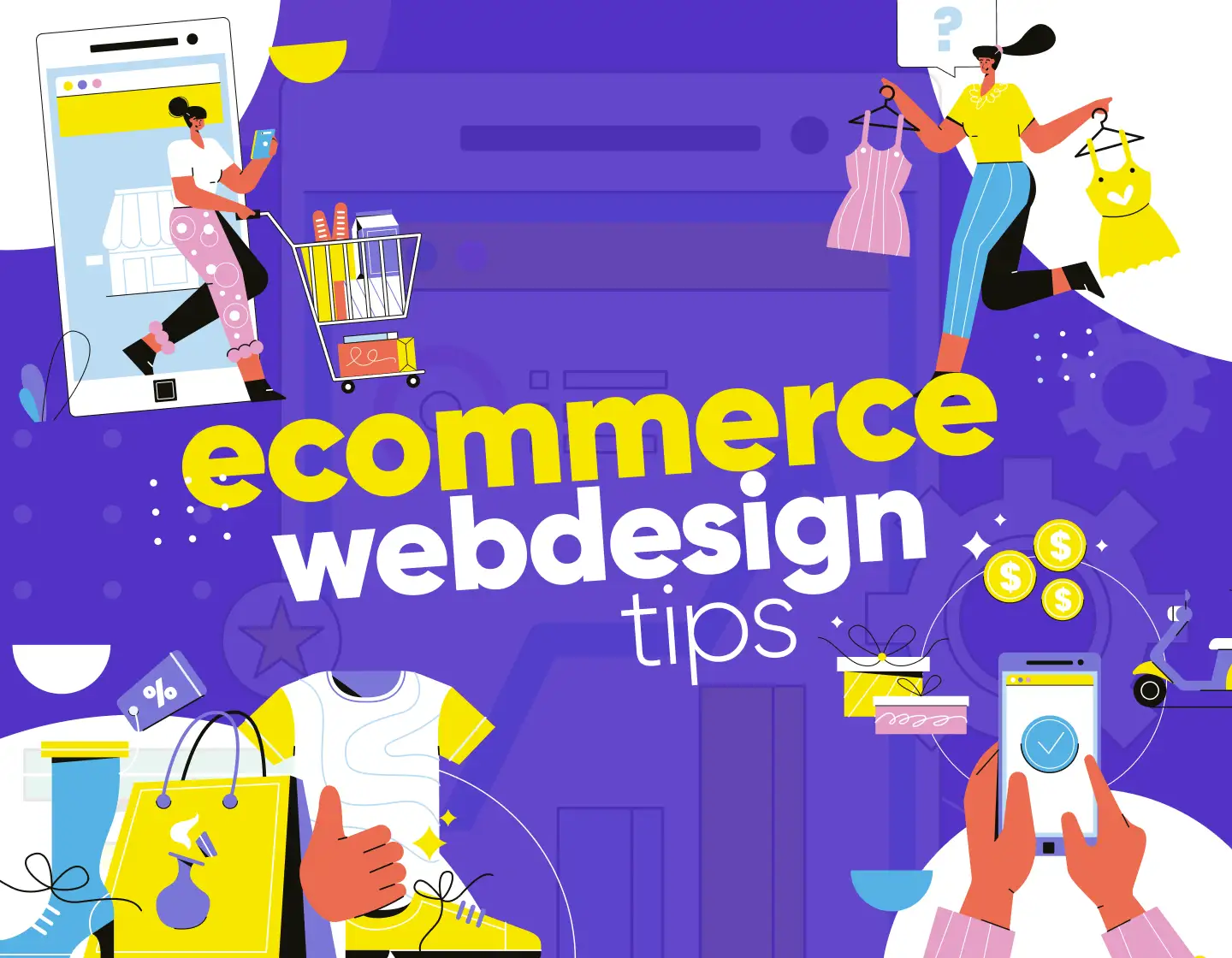
A pocket guide with 15 eCommerce website design tips that can help you build a store that looks great, works well, and makes shopping feel easy.
Sometimes you put tons of work into a site, but somehow things don’t quite click with visitors the way you hoped. As a web or UX designer, you want your designs to look great and actually help people find what they need and feel good doing it.
Well, look no further because I packed some pretty helpful, actionable design tips specifically for eCommerce websites into a little guide with real-life examples. Stuff you can use if you’re building a client’s site or tweaking your own project.
1. Help people find stuff without getting lost
A beautiful product grid means nothing if your visitors can’t figure out where they are or how to get to what they want. As a UX or web designer, you would want to guide them through the shop.
Start with clear product categories
Forget trying to be clever. Stick to short, obvious labels for your product categories like “Shoes“, “Hoodies“, “Accessories“, etc. No one has time to guess what “The Essentials” or “Core Drops” actually mean. The moment someone lands on your homepage, they should get the gist of what you sell and how to browse it.
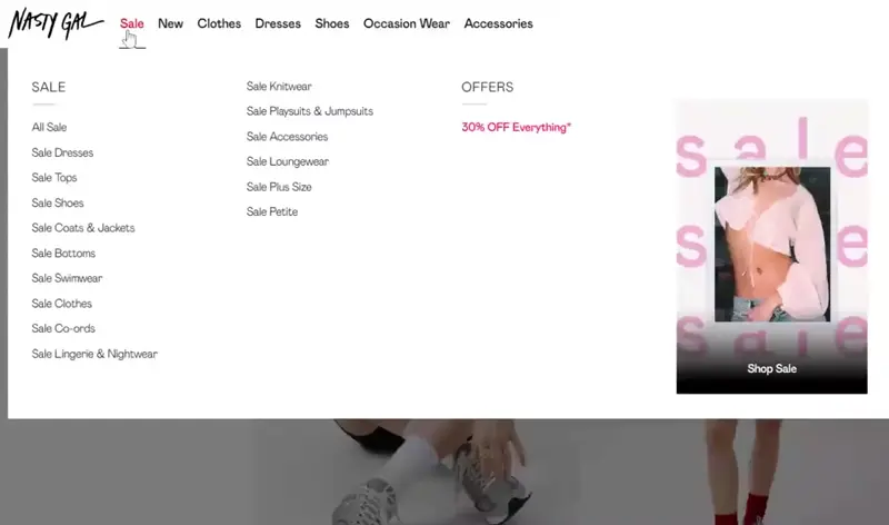
If you’re working with a brand that sells dozens or hundreds of items, consider breaking things into a multi-level mega menu. Think “Men > Shoes> Sneakers“ or “Kitchen > Appliances> Coffee Makers“. It helps people scan faster and cuts down on misclicks.
Keep the search front and center
People love shortcuts and a functional search bar is the shortcut they expect. This is why it’s best to place it top right or somewhere sticky on mobile.
Bonus points for:
- Auto-complete. If someone types “bla”, show them “black hoodie”, not a blank screen.
- Misspelling forgiveness. People type fast and wrong, so build a little grace into the system.
- Search examples. Show a faint “Search: sneakers, red backpack, size 9” inside the field. It’s small UX magic.
Filters that actually filter
Here’s the trick with filters: they should cut the noise, not add to it. Size, color, brand, price range, ratings, are the basics. Designers often overcomplicate filters with toggles and sliders that look fancy but frustrate users. This is why it’s better to keep it clean, and always show how many products are left after applying a filter.
2. Let your design sound like the brand
Every eCommerce site has products. What sets yours apart is the personality behind it. That’s where branding comes in and for designers, this is where the fun begins.
First, know the brand voice
You can’t design around a brand that hasn’t figured itself out. If you’re working with a client and they say, “We want it clean and modern”, ask more questions. What does clean actually mean to them? Is the tone fun and cheeky, or serious and calm? What colors feel like them?

Ask things like:
- If the brand were a person, what kind of shoes would it wear?
- What’s a phrase this brand would never say?
- What makes it stand out from a competitor selling similar products?
- Make the site feel like them
In the meantime, you can check out Really Good Design’s free branding design questionnaire template in interactive PDF format that your clients can easily fill in and check off multiple-choice answers.
Once you have a vibe, bake it into everything. That includes the color scheme, button copy, product photography style, and even hover states.
- A playful eco-brand. Soft edges, hand-drawn icons, and a chill tone in the product descriptions.
- A high-end watch brand. Crisp, monochrome, and let the typography do the talking.
- A brand that sells plant-based protein bars. Earthy tones, textured backgrounds, and conversational text.
Avoid the “template store” look
Nothing screams “dropshipper” like a generic-looking site with zero personality. Scammers copy cookie-cutter designs, so when a site feels unique and consistent, it instantly builds trust.

Example: Let’s say you’re designing for a boutique candle shop with scents inspired by travel. Instead of slapping on a basic Shopify theme and calling it a day, you play with location-inspired colors like amber for Morocco, icy blue for Iceland, and write descriptions that read more like tiny stories. Suddenly, the site feels human. And that connection sells more candles.
3. Keep the flow going with quick product peeks
When someone’s scrolling through a product gallery, they shouldn’t feel like they’re opening new tabs just to learn the basics about a T-shirt. A quick product preview will keep the pace and experience less clicky.
Add a “peek” that doesn’t break the scroll
A small modal or pop-up with the main info like product name, price, quick description, size options, maybe even a few alternate images, gets the job done. Think of it like letting someone hold the product for a second without walking away from the shelf.
Keep it simple but useful
You don’t need to cram every bit of detail in there, of course. Just the basics plus two solid buttons:
- Add to Cart (obvious and close to the thumbnail)
- Save for Later (great for people who browse in batches)

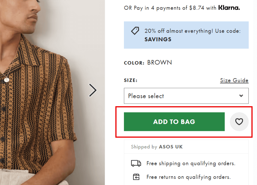
If you go this route, make sure your modal doesn’t block navigation or feel like a pop-up ad. As usual, it should feel like a helpful shortcut, not a detour.
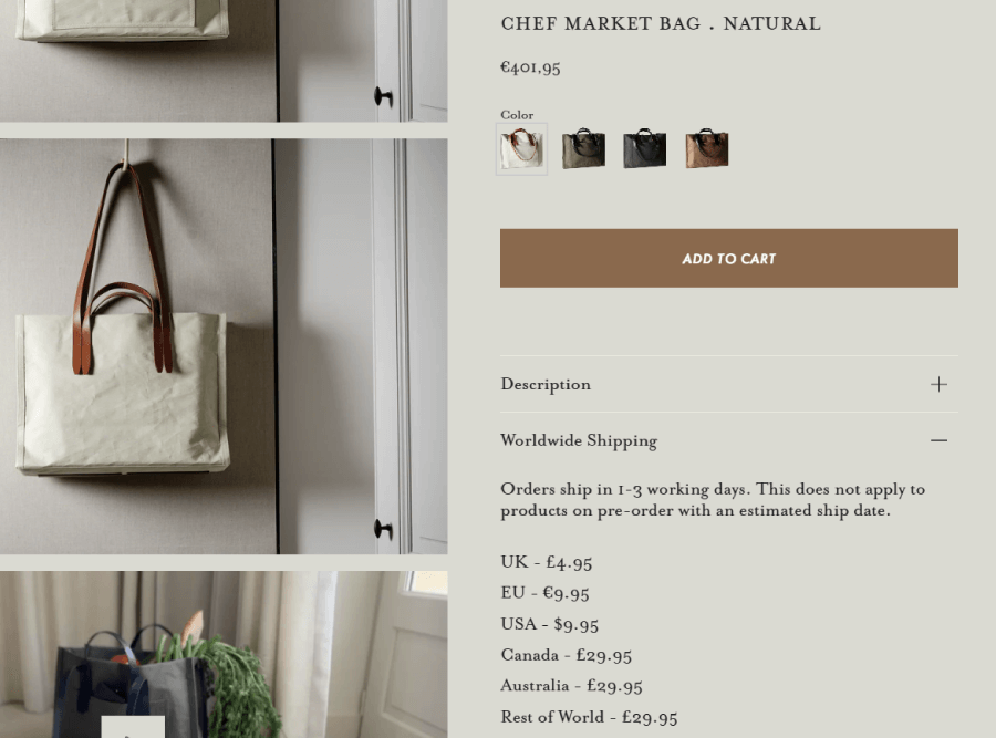
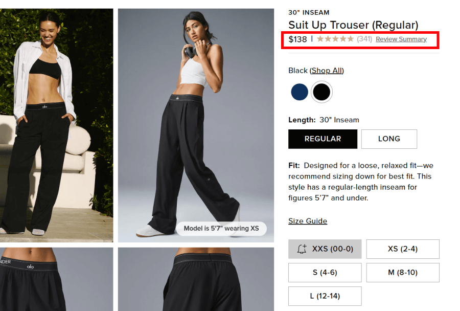
4. Say the price loud and clear
Shoppers can forgive a lot, but hiding prices isn’t one of them. If your user has to hunt for a price tag or gets slapped with a surprise fee at checkout, they’ll probably just bounce.
Put the full cost front and center
Show the price right next to the product name. Don’t bury it. If there are any extras, like taxes, add-ons, or customization fees, mention them early. Ideally, even before someone adds it to their cart.
Example: You’re designing a product page for handmade leather bags. Don’t just show “Starting at $120” with no explanation. Instead, break down the prices:
- $120 for standard size
- +$20 for custom strap
- Free shipping over $150
That kind of clarity helps people make quick decisions and reduces friction at checkout.
Don’t hide shipping until it’s too late
Shipping surprises are one of the biggest reasons for abandoned carts. Even if you can’t show the exact shipping fee early on, at least offer a shipping calculator or estimate on the product page. Sites like Etsy do this well and buyers know what to expect from the start.

If you’re offering flat-rate or free shipping, make it loud, because most people may not notice the tiny note in the footer.
5. Let color do some heavy lifting
Color does more than make a site look nice. It quietly nudges people toward what you want them to notice so if you use it strategically, it will help visitors understand what’s important, what’s clickable, and what kind of vibe your brand gives off.
Make CTAs impossible to miss
If your “Add to Cart” button looks just like the rest of your site, it’ll get lost. A bold color that stands out but still fits your palette can make a huge difference. For example, most sites use bright red or orange because it works well for action buttons. Either way, context matters so don’t just go loud for the sake of it.

Ever notice how Amazon uses yellow for its CTA buttons? It pops without screaming, and it’s consistent across the board.
Tap into how color feels
Color sets the pace, tells people where to look, and adds personality without saying a word. It carries meaning, even if people aren’t consciously thinking about it. That’s why a health brand might lean into clean whites and soft greens, while a luxury watch shop goes all-in on deep blacks and metallic golds.
Here’s a quick cheat sheet for emotional cues:
- Blue. Calm, trustworthy (used often in finance and healthcare)
- Red. Urgent, energetic, high-impact (great for sales, CTAs and the food industry)
- Green. Balance, freshness (popular with eco-conscious brands)
- Black + Gold. Very premium, luxurious, exclusive, bold

Match the mood to the message
Let’s say you’re designing a site for vintage-style sunglasses. You might use warm, retro colors like burnt orange, mustard yellow, or dusty pink to set the tone. On the other hand, a site for sleek tech gear might go for icy blues and crisp whites.
6. Show off your stars first
No one likes digging for gold. If something sells well or gets great reviews, make sure it’s right where people can see it, on the homepage, in banners, or in the first row of product listings.
Use data, not gut feeling
Your best product isn’t always the one with the highest sales. Maybe it’s new and already gaining traction. Maybe it’s the most reviewed. Or maybe it’s the one people keep adding to wishlists. This is why it’s important to check the numbers and go with what your users actually like.

Example: Brands like Glossier and Nike push their newest drops or most hyped items to the top of the homepage carousel. It works. People want to see what’s hot, and they’ll trust you to show it.
Highlight with design tweaks
Some subtle shifts can draw attention without looking pushy, such as a slightly larger thumbnail, a badge that says “Best Seller” or “Back in Stock“, or a colored border.
Also, don’t forget the power of a solid customer review count. A simple “4.9 (300+ reviews)” under the product name builds trust faster than any marketing line.

Let filters help too
Make it easy for users to sort by “Most Popular” or “Top Rated”. If your site hides that behind layers of menus, you’re making people work too hard. The same goes for search: if someone types in “hoodie”, let your best hoodie show up first.
7. Test the shop like a real person would
It’s easy to get tunnel vision when you’ve been buried in mockups and dev handoffs for weeks. You know the structure, the flows, the logic. But your users don’t. That’s why it helps to step back and use the site like it’s your first visit.
Start from the homepage and go shopping
Try finding a specific item as if you had no background knowledge. Can you get there quickly? Is the search working the way you’d expect? Does the menu feel intuitive? If you find yourself pausing or guessing, your users definitely will too.
Example: Say you’re designing a site for a sneaker store. You land on the homepage and try to find “men’s waterproof trail runners”. If that takes more than two clicks or a confusing filter combo, something needs adjusting.
Go through the full checkout experience
Add an item to your cart and actually try checking out. How many steps does it take? Are there weird jumps between pages? Is the form annoying on mobile? If it feels like a chore, you’ve got room to smooth things out.
Bonus tip: Ask someone outside your team (or even better, outside your industry) to try using the site. Watch them fumble. That’s where your best UX fixes will come from.
Look at it with fresh eyes on different devices
Something that feels fine on a laptop might be painful on a phone. Scroll, tap, pinch, and type your way through the site across a few screen sizes. Most people are browsing from their phones while doing five other things. If the experience can’t keep up, they’re gone.
8. Make it feel like the shop knows them
A great eCommerce site usually feels like it gets you because it’s paying attention and making things easier the next time they visit. That’s where personalization comes in.
Keep track of what they’ve seen
Let returning visitors pick up where they left off. A “recently viewed” section can be all it takes to jog someone’s memory and bring them back into a buying mindset.
Example: ASOS shows a row of items you browsed last time, right under the hero banner.
Recommend smart, not random
Product suggestions should make sense and pull from browsing history, past purchases, or even what’s trending in their region. Avoid the trap of pushing whatever’s in stock because irrelevant suggestions just feel like noise and make the entire “recommended” section pointless.
Bonus tip: Why not create shortlists like “Top Picks for Runners” or “Popular Gifts Under $30“? Keep it relevant and timely.
Let people make the experience their own
Wishlists, saved sizes, and color preferences are all small features that make returning easier and faster. And for users who are just window shopping today, a wishlist gives them a reason to come back later.
Add friendly nudges, not nagging pop-ups
Personalization doesn’t need to be high-tech. Even a “Welcome back, Sam” on the homepage or a reminder about an item left in the cart can feel human without crossing into creepy territory.
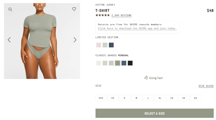
9. Skip the stock. Show the real stuff.
You’ve seen those bland, glossy stock images of smiling people in headsets or perfectly lit laptops. They look polished, but also fake and if you can spot a stock photo, so will shoppers.
Show what people are actually buying
If the site is selling physical products, nothing builds confidence like clear, high-resolution photos from multiple angles. Bonus points for showing the item in context, how it looks in a living room, worn by a person, or used in real life.
Don’t skimp on the variations
If your product comes in five colors or two sizes, show each one. People don’t want to guess what “forest green” looks like or how “petite” compares to “regular“.

When you need people in photos, keep it real
Instead of stock models, use actual customers, your team, or user-generated content (with permission). These kinds of photos feel more relatable, and they make your store feel like it’s run by humans.
Example: If you’re designing a site for a local apparel brand, consider building a “Styled by You” section where shoppers upload pics of themselves wearing your clothes. It makes the site more lively and helps future buyers imagine themselves wearing the products.
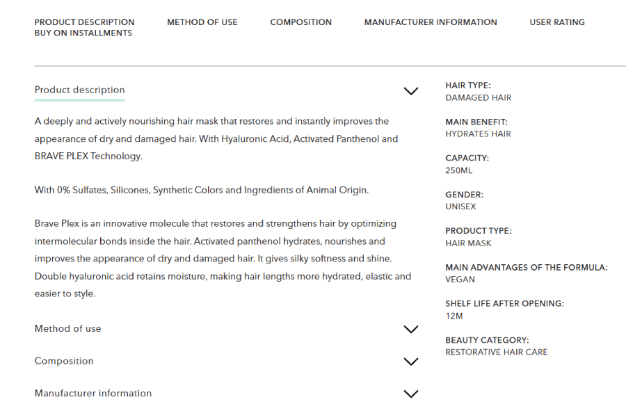
10. Tell people what they actually want to know
People usually don’t want to dig through walls of text just to find out if something comes in medium or ships internationally. At the same time, they won’t buy if they’re left guessing, either. Here’s how to balance this:
Focus on the right details
Start with the stuff people care about most. What’s included? What does it cost? Will it fit? Is there more than one color? Does it come with a warranty? That kind of clarity makes the decision easier.
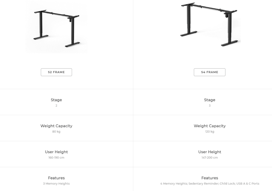
Example: If you’re designing a site that sells adjustable standing desks, highlight the max/min height range, weight capacity, desktop size, and motor noise level right near the product title instead of burying it in a spec sheet.

Keep it skimmable
Use short paragraphs, bullet points, and collapsible sections for extra info. This way, the person who just wants to know if it’s “machine washable” can find that fast, while the one who wants every detail still gets it.
You can also structure the info FAQ-style within the product description. For example:
- Material: 100% organic cotton
- Care: Machine wash cold, tumble dry low
- Fit: True to size (model wears size M)
Use real language
Skip the marketing fluff. Instead of “crafted with excellence“, say “Made with durable stainless steel that won’t rust” because facts wight more than slogans.
11. Add extra info where it actually helps
Some shoppers need a little more reassurance before they commit and a little context goes a long way.
Include things like size charts, how-to guides, ingredient lists, compatibility notes, or even delivery timelines if they matter.
Example: On a skincare site, you could add a quick skin type guide next to each product, so someone with oily skin knows which formula is better for them.

Make the layout work for you
As a design principle, use visual hierarchy to guide attention. Start with the most important info, then make deeper details optional. Use bold labels, clean spacing, and font size changes to lead the eye. If you need to include a lot of detail, try tabs or accordions to keep things tidy.
Example: Say you’re designing for a small appliance store. You might stack key points (dimensions, power rating, warranty) up top, then place in-depth features like “how it handles frozen fruit” or “cleaning instructions” in a collapsible panel below.
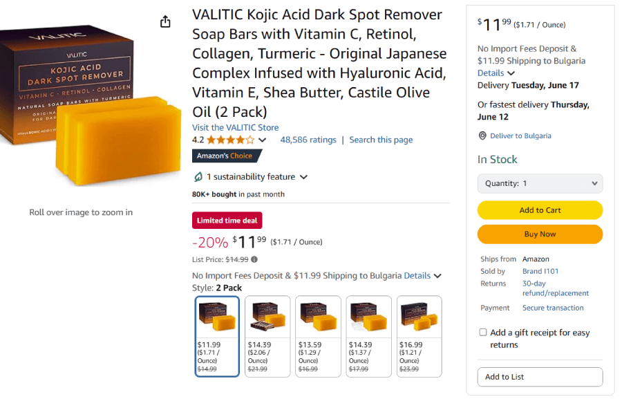
12. Let happy customers do the talking
Real feedback from real people builds trust faster than any clever headline ever will, because no one believes a website that says “we’re the best” without some backup.
Show what others are saying
If you’re designing a product page for a coffee grinder, let the five-star ratings sit just under the product name. Below that, pull in two or three short, helpful reviews that mention things like build quality or ease of use. Another very important thing to keep in mind is to never remove negative reviews. An item that has 4.7-star reviews feels much more real and genuine than 5 stars, which often feels fabricated.

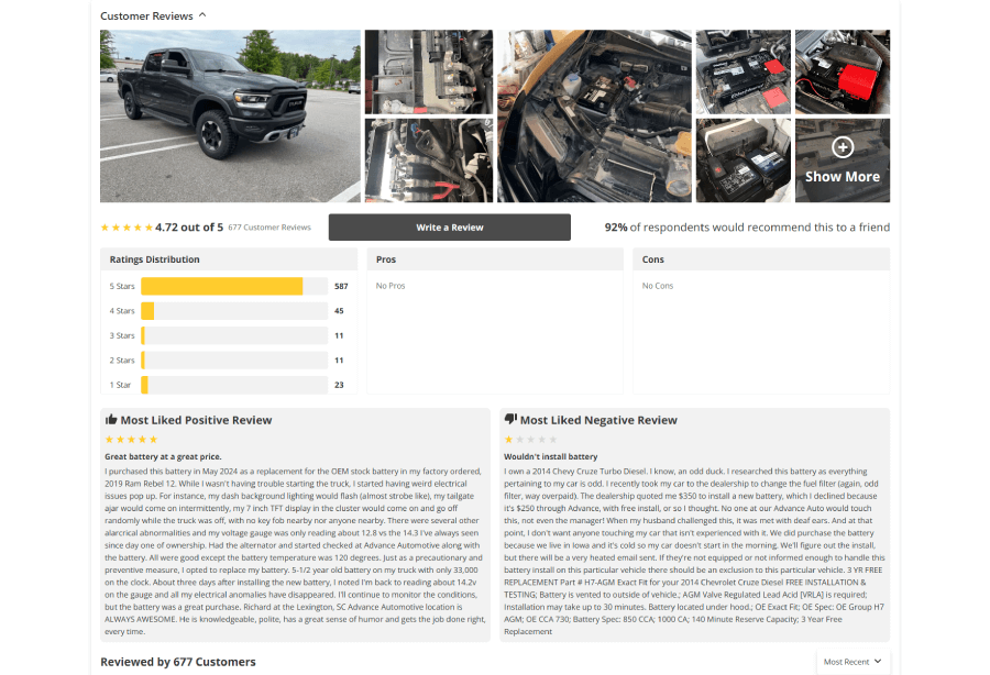
Bonus: Add filters for review topics (like taste, shipping, customer support) so shoppers can quickly find what matters to them.
Let the visuals speak too
User-generated photos or videos make things feel more real. They’re especially handy for fashion, home decor, or anything visual.
Example: On a clothing store’s product page, include a “Worn by Customers” carousel featuring selfies from buyers who tagged the brand on Instagram. It’s casual and shows how things look outside of studio lighting.
Add a bit of name-dropping
If you’ve worked with brands, won any awards, or have good media coverage, show it off.
Example: Include a small “Trusted by” section in your site footer with logos of recognizable companies you’ve worked with, or a short list of publications that have mentioned your work.
Make trust visible
Don’t hide your trust badges and security icons because these signals matter when someone’s about to type in their credit card details.
Example: Use clean, familiar icons like SSL security, “Verified by Visa“, or “30-day returns” near the checkout button where people are most likely to hesitate.
13. Make checkout feel like a no-brainer
People often bail because the checkout experience gets annoying with long forms, surprise fees, or unclear steps.
Example: If you’re designing a checkout form for a boutique shoe store, remove any non-required fields (fax number? nope). You can use smart defaults and auto-detect where you can, like filling in the city when someone enters their ZIP code.
Let them check out their way

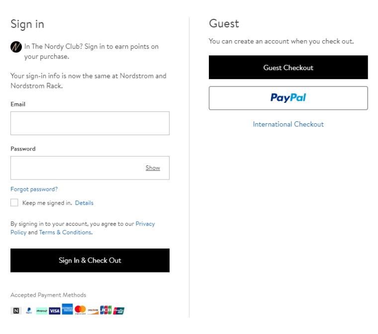
People have preferences. Let them choose what works for them.
- Guest checkout. Offer a one-time checkout option.
- Payment options. Accept cards, PayPal, Apple Pay, Klarna, or whatever makes sense for your audience.
- Third-party logins. For those who don’t want accounts, let them sign in with Google or Facebook to skip the password mess.
Make the cart easy to review
Shoppers need a clear summary of what they’re buying and what it costs.
Example: You can add thumbnail images, brief product titles, size/quantity details, and editable fields directly in the cart preview. This gives people a last-minute chance to double-check or make changes without starting over.
Build confidence, not confusion
Shoppers should also know their info is safe and what to expect if something goes wrong.
To let them stay confident in their purchase, you can:
- Add a link to your return policy near the final “Place Order” button
- Show delivery timeframes clearly
- Add a progress bar so users see how close they are to the finish line
14. Make the last click count
Once someone buys something, signs up, or sends a message, the next screen they see matters more than you might think. A thoughtful Thank You page can make people feel good about your site and give them a reason to come back.
Confirm what just happened
The bare minimum is to let users know their action went through. This might be an order confirmation, a newsletter subscription, or a booking.

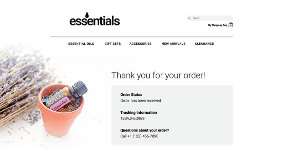
Example: “Thanks for your order! You’ll get a confirmation email shortly.” It’s even better if you add the order number, expected delivery date, and support info, just in case.
Say thanks like you mean it
Instead of a robotic “Your form has been submitted“, why not give it a little personality with something like”We really appreciate your support! Can’t wait for you to try this out.“? Even better if you use a dynamic code to generate the user’s name.
Offer something useful
This is a nice chance to point people toward something they might like next.
- Recent blog posts
- A discount code for their next purchase
- Links to share their experience on social media
- A how-to guide or video tutorial if they bought a product that needs setup
And there you have it!
Give these tips a spin on your next project and you might be surprised how tiny tweaks can make a big splash.
If you found this guide helpful and want to get more insight or inspiration, check out what else we have in our blog or jump straight into some of these articles, I think you’ll find interesting: