Farm logos can make the most significant difference when defining the identity of agricultural businesses. A successful design makes the farm distinctive, memorable, and trustworthy, so clients can easily recognize it and rely on the quality of its products. The most effective logos also represent the beauty of farming and living such a life, underlining the significance of being connected to the soil, nature, and Earth itself.
Whether for a small family farm or a large brand the right logo can set a farm apart from its competitors. So, let’s browse the special selection of 20 impressive farm logos we have prepared for you in today’s article, and see what makes them special! Let’s start!
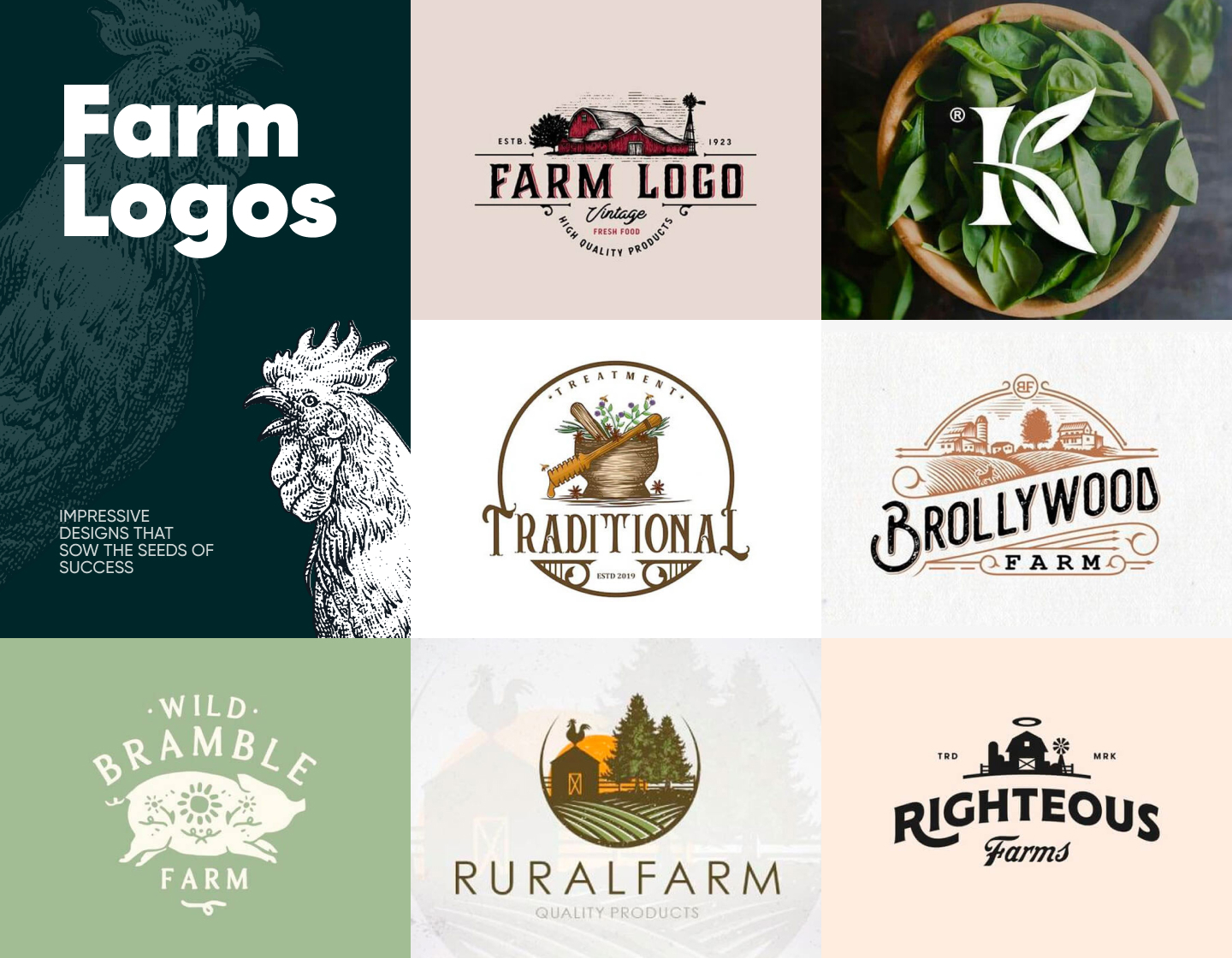
1. Brollywood Farm Hand-drawn Logo
Every element in this elegant, delightful design is thoughtfully chosen and combined with the others. The hand-drawn-like illustration looks rustic and depicts the Brollywood Farm as a happy place. The color palette exudes traditions and a vintage feel with the brown color also connecting to the land. The diagonally positioned text complemented by its beautiful typeface instantly grabs the attention, also giving clarity to the concept.
2. Keho Lake Farms Agriculture Logo Design
This logo has achieved a badge-like appearance thanks to its split encircled design putting the image in the upper half and the text in the lower. The chosen typeface as well as the logo’s simple style give balance, clarity, and beauty to the concept. With the use of colors and the depiction of flourishing open fields lit by the sun, the emblem instantly connects with the nature theme and sustainable food production.
3. Righteous Farms Simple Logo
The visual identity of Righteous Farms is executed in all-black with the only color being the peachy background. It features a minimalistic depiction of a farm’s silhouette, but the greatest impression comes from the playful side of the logo with the added halo above the barn reflecting the farm’s name. The fonts – one bold, large, and direct, and the other looking more classic, are aesthetically pleasing and add to the brand’s credibility.
4. Rural Farm Logo with Barn
This example is so visually appealing with its depiction of a rural paradise! The encircled illustration looks like it has come out of a book with the sun rising over its plowed fields, the coniferous trees, and the cockerel on top of the barn. The color palette instantly connects the logo with the idea of nature and quality products, while the uppercase lettering being straightforward and clean, makes the brand seem honest and trustworthy.
5. Traditional Treatment Illustration Farm Logo
This beautiful logo exudes tradition with every detail in it – from the wrought-iron-like circle framing and typeface to the hand-drawn-like image. Also, depicting a mortar with herbs and honey illustrates the company’s orientation toward conventional medicine. The overall design shines with classical elegance strengthening the brand’s position as credible and immaculate.
6. Creative Farm Logo With Letter
This logo example is so impressive! Even though it is composed of only a single-letter monogram, it is depicted in such a beautiful and creative way. It uses the character’s ascender as the stem of a basil plant, while the letter’s arm and leg are portrayed like the herb’s leaves. The finishing touch comes from the background image featuring a bowl full of vivid green basil.
7. Retro Farm Logo Design Example
The ink-like illustration of this logo shows a vintage-looking farm with its red barns and windmill water pump. All design elements of the concept give it a rustic and authentic look. Meanwhile, the charmingly accentuated texts communicate plainly and instantly to the potential customers the farm’s mission to provide fresh food and high-quality products.
8. Grand Agro Minimalist Farming Logo Example
Grand Agro adopts a more contemporary design for its logo. Its icon is modern and abstract, but still straightforwardly communicates its idea by depicting a growing sprout. In addition, the green color builds an instant connection with nature and clean produce. And, the bold, simple, uppercase typeface emphasizes further the brand’s stability and reliability.
9. Kinwood Farm Logo with Cow
This touching logo example shows a beautifully illustrated idyllic picture of a little girl giving flowers to a cow, embodying the farm’s slogan “Rooted in love”. The classically designed concept, highlighted by the feature of a neat, but friendly serif typeface, exudes the farm’s generations-old traditions and represents its mission to improve people’s lives.
10. Meyer Farms Rustic Logo
This emblem is an example that utilizes the circular shape nicely while placing an accent by breaking its border with the angular bow-like text frame. The monochrome color scheme complements the name’s bold font, exuding stability and power. The tractor depicted next to the cornfield gives the logo more value, also helping the design look strong and adding reliability and professionalism to the company’s image.
11. LiveStock Chicken Farm Logo
The example here shows a stylized logo grabbing the attention with its clean lines and impressive simplicity. The featured image depicts the silhouette of a cockerel perched on a country fence and singing in front of the rising sun. With a plain, modern typeface, the design represents the company’s contemporary approach to offering vintage products.
12. Rockledge Goat Farm Logo Example
This example has a retro-looking design resembling an old wrought-iron sign. The logo depicts a harmonious rural picture of fresh-looking vegetables and animals, that shows the farm’s natural products and makes the company seem friendly and approachable. In addition, the bold, strong typography adds credibility and professionalism to the brand’s image.
13. Opportunity Acres Classic Farm Logo
Stating that they offer an opportunity for good, the Opportunity Acres farm shows a pretty idyllic image of rural life. The picture successfully builds credibility in the quality of the organic dairy products offered. The logo’s label-like look, complemented by the effect from the nicely combined texts’ fonts gives a touch of tradition and trustworthiness to the farm’s image.
14. Sunny Agriculture Logo Design
In this logo example, the chosen color palette gives an instant association with nature, warmth, and light. Representing the livestock farm the design depicts the happy image of animals on green pastures experiencing the harmony of beautiful sunny days. And, the simple yet effective serif typeface looks classic and professional, straightforwardly communicating the farm’s business.
15. The Barn Elegant Farm Logo Example
This example is so elegant, resembling even a classic book’s cover. The classy, decorative typeface instantly grabs the attention and adds sophistication and tradition to the brand’s image. In addition, the charming illustration arouses curiosity sparking interest, and deeply connects with the nature theme, thanks to its muted hues of blue and green.
16. Wild Bramble Pig Farm Branding Logo
This eye-catching logo example uses a lovely olive green hue, evoking calmness and harmony while resonating with the nature theme. The design integrates a pig with sun and floral motifs in a rustic-style illustration. The pig, depicted in motion, running happily, symbolizes the joy and energy as well as the high quality and principles of the Wild Bramble’s farm life.
17. Monochrome Green Farm Logo Example
The Greenfarm’s logo concept makes the most out of using the color of nature. Decided in all green, this emblem design conveys the idea of ecologic, fresh products, and determination for quality and professionalism. The classic, western-like, cowboy font gives rancho associations hinting at traditions in farming and free-range, pasture-raised animals.
18. Uncle Phil Farmer Logo Example
Here’s Uncle Phil welcoming us to his organic farm. Or, at least this is the impression that comes at first when seeing this logo. Using a person’s image to represent a brand is a quick trust-builder and immediately shortens the distance from the viewer. With its bold lines, the design looks strong while also carrying a retro vibe in its text’ fonts and the overall style of the concept.
19. Willow Creek Vintage Farming Logo
Following again the wrought-iron sign theme, the logo for Willow Creek has a very stylish and vintage look. With its brown, ink-like design executed on a grainy-textured paper-like background, it depicts the harmonious life of a country farm. The farm’s name, written with its overlapping letters, adds a feel of tradition and credibility, further improving the classic design’s style.
20. Forever Heart Farm Cartoon Logo Example
Forever Heart’s logo looks like an award banner, and with all its details, works perfectly in achieving the look of a credible and professional company with quality farm products. And, depicting the idyllic pastures in the upper half, and the heart with utensils in the lower one is not only aesthetically pleasing but also a representation of their mission to offer “farm-to-table produce”.
Tips on crafting creative farm logos
- The first thing you need to make sure of is to understand the farm’s brand identity. That is to say, consider its ideas, mission, and values, and align your design with them and the target audience.
- Don’t get lost in a too complicated design, for the most effective logos are often simple and, as a result, easily recognizable.
- When choosing what to include in the imagery, go for a concept representing the company and its products. Make sure to incorporate relevant details that align with the farm’s essence. For example, common elements include fields, crops, animals, barns, and rural landscapes.
- Always be thoughtful of the impact your color choice has. Earthy tones like green, brown, and yellow are popular for farm logos as they are associated with nature and agriculture.
- And, lastly, don’t underestimate the importance of typography in your logo. The texts should be legible and complement the overall design. Also, keep in mind the different ways the fonts communicate their messages. For example, if you’re going for a sense of tradition and authenticity it is better to choose a rustic, hand-drawn one.
Final Words
The well-designed farm logos are the ones building trust and recognition, thus attracting new customers and keeping the regulars. Creating an effective logo concept requires a thoughtful approach that reflects the essence of the agricultural company. This important part of the brand identity is not just a symbol, it is the face of the business, and it should be inviting and memorable.
So, we hope you’ve enjoyed this article and are ready to start sculpting the face of your farm’s identity!
If you need more inspiration to get started, you may try our other selections of amazing logo examples: