

I break down how Fitts’ Law works in UI/UX design, what it is, and how to actually use it to design better.
If you’ve ever clicked a button that felt weirdly far away or missed a tiny “X” five times in a row, then congratulations, you’ve already met Fitts’ Law in action. You just didn’t know it yet.
This law is one of those design principles that sounds technical on paper but feels super obvious once you get it. The idea of it all is how fast people can move their cursor (or finger) to a target and trust me, once you start thinking about it, you’ll notice it everywhere.
For this pocket guide, I’ll break down the Fitts’ Law in plain English, show you how it applies to web and app design, and share a few examples and tips that’ll actually help you make better design calls.
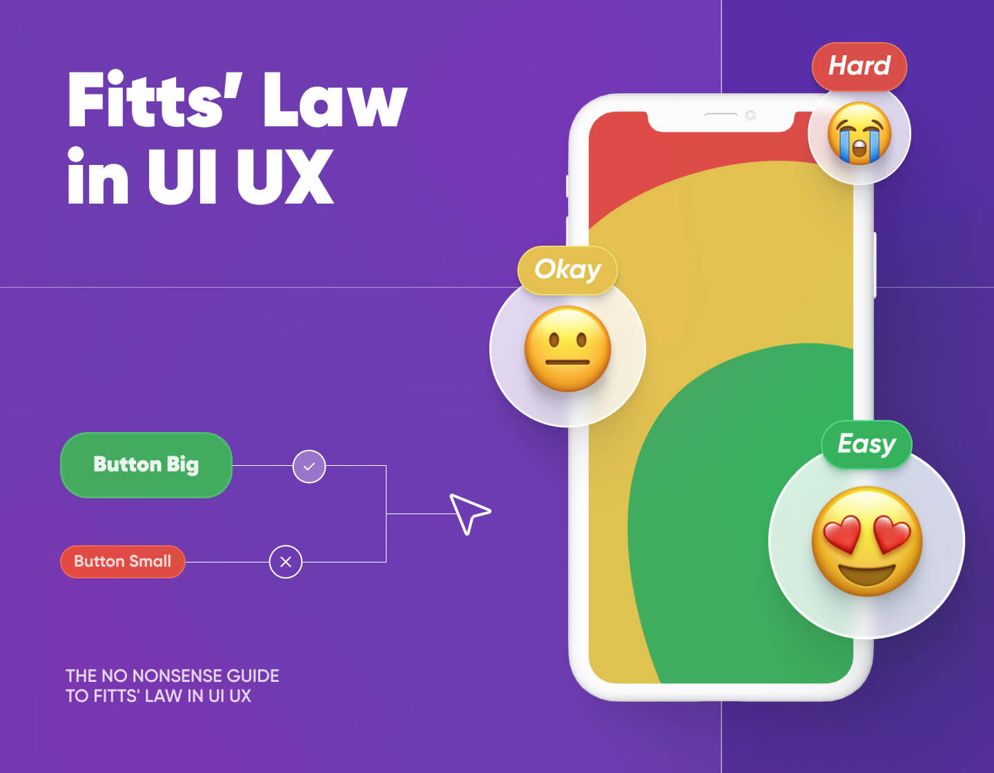
What is the Fitts Law?
Let’s start with the guy behind it. Paul Fitts wasn’t a designer, but he cared a lot about how humans interact with things, especially machines. During World War II, he studied airplane cockpits and noticed something interesting (and honestly, pretty alarming): pilots were being blamed for crashes when, in reality, the controls were just badly designed. So, Fitts shifted the blame from people to design. That’s a big deal.
In the 1950s, he got curious about movement. Specifically, how fast people can move to hit a target, like tapping a button or clicking something on a screen. He borrowed ideas from information theory (think: how many messages can be sent over a wire), but instead of messages, he focused on how quickly we can move and act.
That’s how Fitts’ Law came about.
Now, don’t worry, I’m not throwing a math formula at you. The law basically says this:
The farther away something is, the longer it takes to reach it.
The smaller the target, the harder it is to hit.
Sounds simple, right? But it’s surprisingly useful when you’re building digital interfaces. Fitts’ Law is a go-to principle in UI and UX because it helps explain why some buttons are just easier to click than others.
One more thing: the law doesn’t work in a perfectly straight line. It uses a logarithmic scale, which is a fancy way of saying that doubling the distance won’t necessarily double the time. You’ll speed up at first and slow down as you zero in on the target.
Now, if you want to get more technical and study the exact mathematical formula, you can check out this video as well:
- TLDR: If something’s close and big, you can hit it faster. If it’s small and far away, your finger or mouse is going to need a bit more time and precision.
How does Fitts’ Law apply in UI/UX?
Fitts’ Law is simple math: the farther away and the smaller the target, the slower and harder it is to click. The closer and bigger it is, the faster and easier. This matters specifically in UI and UX, because every interaction is a target hunt.
You can now immediately think of scenarios where the Fitts’ Law shows up in real product interfaces:
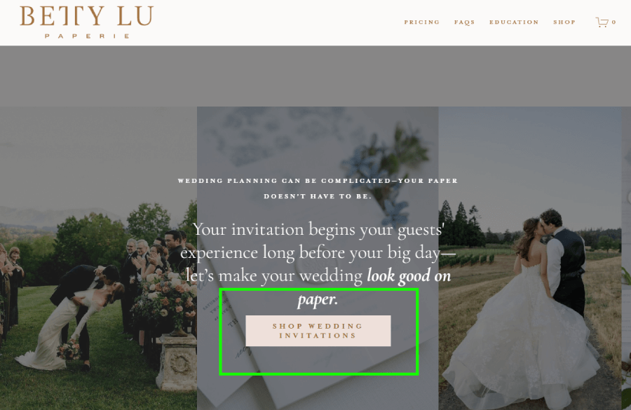
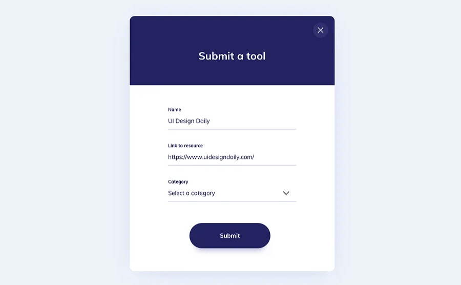
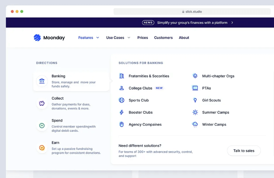
1. Make important buttons big enough to hit without thinking
What it means:
The bigger the target, the easier it is to click or tap. That applies to buttons, links, icons, and basically anything users interact with.
Real-world examples:
Primary buttons (like “Buy Now” or “Submit”) should be large enough to hit quickly, without hovering like a sniper. Here are some real examples where the buttons sit right in the user’s natural flow, sized just right to avoid misclicks or hesitation.


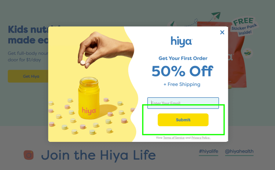
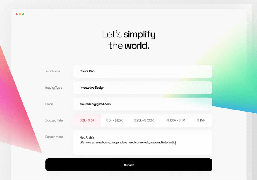
2. Don’t hide buttons in hard-to-reach spots
What it means:
Target distance matters. If a user has to move their mouse or finger across the screen just to click something important, that slows everything down.
Real-world examples:
On mobile, putting the Submit button at the top of a form breaks the user’s rhythm. The logical place is at the bottom, right where they finish entering info. Forms that follow this pattern feel faster, even if the user isn’t in a rush.


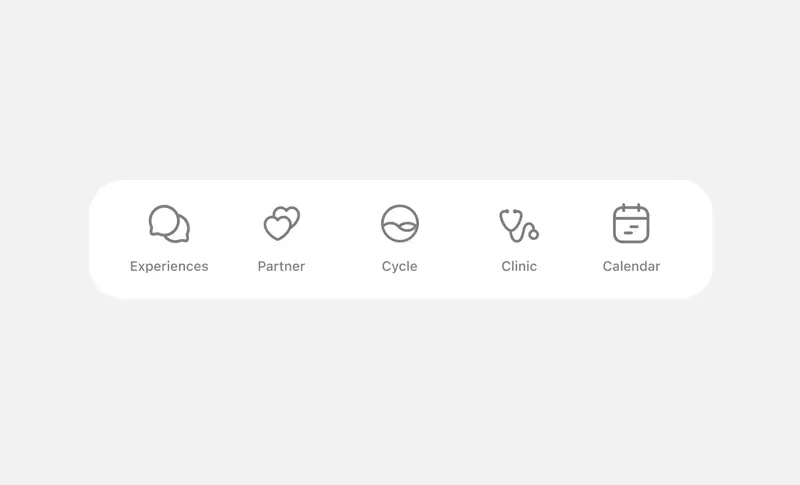
3. Use labels with icons to expand the clickable area
What it means:
An icon with a label is a bigger target. Users don’t have to aim so precisely. It’s easier to hit, which makes for faster interaction.
Real-world examples:
Navigation bars that combine icons and labels are quicker to use than icons alone. Just make sure the entire block is clickable, not just the graphic.
4. Take advantage of screen edges
What it means:
Screen edges act like natural walls. You can’t overshoot them with a cursor, which means it takes less effort to aim.
Real-world examples:
MacOS, for example, places the main menu bar at the top edge of the screen. You can fling your mouse up there at full speed without worrying about precision.

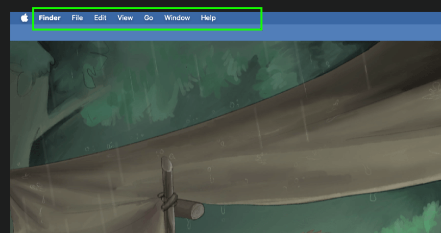
Finder Menu Bar
On older versions of Windows, the Start button lived in the bottom-left corner for the same reason: easy to hit, no slowing down.

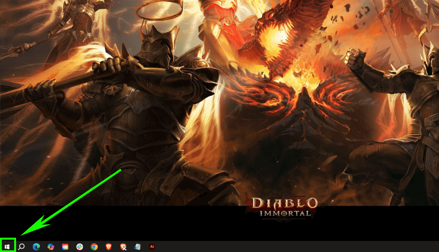
Win 10 Start Menu

5. Avoid crowding clickable elements
What it means:
When buttons or icons sit too close together, you are more likely to tap the wrong one. Even if they’re the right size, they need breathing room.
Real-world examples:
Tiny close buttons on popups next to ads are a recipe for misclicks. Users either miss the close target or accidentally click the ad, which is kinda frustrating and sloppy.

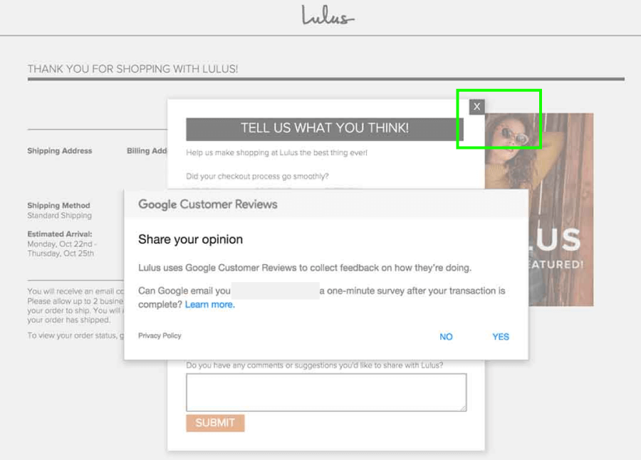
The close button is too close to the clickable ad (though it’s the least of the design problems, considering the stacked popups)
6. Don’t count on padding alone
What it means:
Invisible padding helps increase hit area, but users don’t always realize it’s there. So they may still slow down, because they’re unsure where to click exactly.
Real-world examples:
A ghost button with a padded hit area might technically be “easy” to click, but if it doesn’t look big enough, users won’t treat it like it is. Visual cues matter just as much as functional ones.
7. Menu layout affects movement time
What it means:
Menus can speed things up or slow things down, depending on how they’re arranged. Compact layouts reduce pointer travel.
Real-world examples:
Mega menus (like those on eCommerce sites) allow users to see everything without scrolling or clicking around. You can also consider pie menus (though less common), because they let users pick from equidistant options in a circle, reducing movement even more.


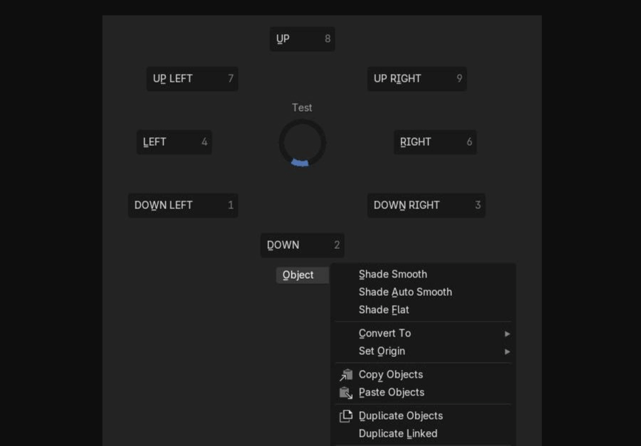
Blender Pie Menu
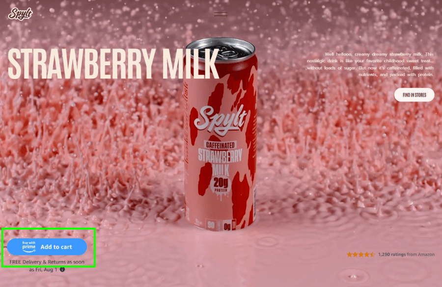
8. Group related actions close together
What it means:
If people tend to click things in a certain order, those things should sit near each other, just not so close that they cause misclicks.
Real-world examples:
In a product page’s cart section, the “Add to Cart” and “Buy Now” buttons should live side by side. If “Buy Now” floats in the header while “Add to Cart” stays below the product, users waste time jumping around.

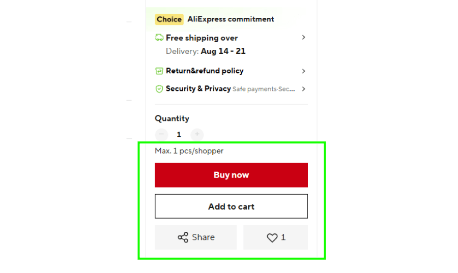
AliExpress Product Page group of action buttons
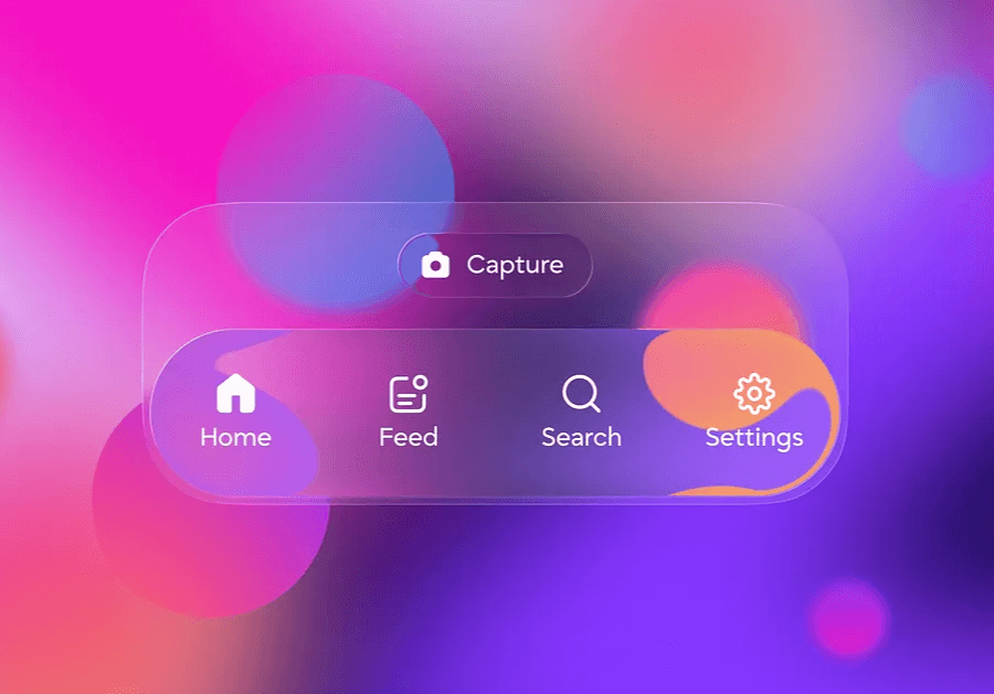
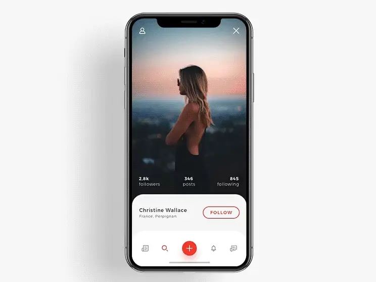
9. Design for thumbs on touchscreens
What it means:
Thumbs are the main pointer on phones and tablets. Keep key interactions close to the natural thumb zone, which is usually the bottom third of the screen.
Real-world example:
Navigation bars on mobile apps sit at the bottom, where thumbs naturally rest. You don’t need to stretch or adjust your grip just to tap a tab.
10. Use visual hierarchy to guide clicks
What it means:
I already mentioned that bigger targets are easier to hit in sync with the Fitts’ Law, but they also draw the eye, which helps users decide where to go next without much thought.
Real-world examples:
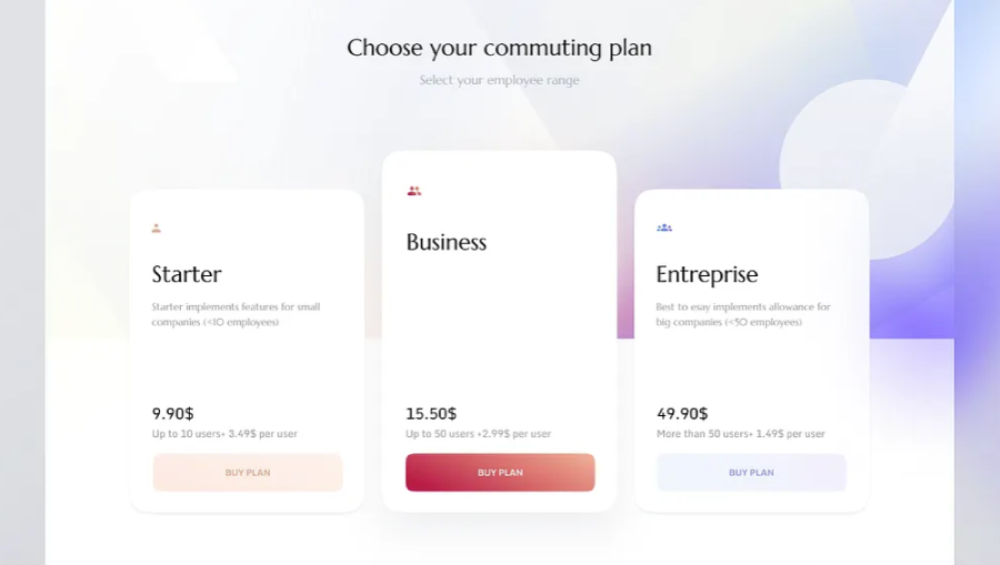
In a pricing table, the most popular plan usually gets a larger “Choose Plan” button and/or one with a different, more vivid color. This makes it faster to spot and easier to select.

And there you have it!
To sum up the entire guide, when you think about target size and placement, your design starts working with the user instead of against them.
If you’re curious about more ways to make your designs smarter (or just better looking), I’ve rounded up a few articles from the blog you might like.