

The short guide to Gestalt principles and how they apply in the everyday work of a UI/UX designer, with real examples.
You know a website has a good design when everything makes sense, as if your eyes know exactly where to land, what is clickable, which elements are related, or how the sections are connected. That’s not luck, but also probably isn’t fully intentional either, because that’s Gestalt principles doing quiet work in the background. If you’ve been designing for a while, chances are you’re already using some of these without even thinking about it. That’s what happens when you’ve got good instincts (and solid design sense).
For this guide, I gathered the 13 Gestalt principles, broke them down so you can actually name what you’ve been doing all along, and included real examples for how these principles apply in UI/UX.
What are Gestalt principles, and why do they matter in UI/UX?
Gestalt principles come from psychology, but don’t worry, this isn’t a textbook. The idea is pretty simple: our brains prefer order. Instead of looking at separate shapes or bits of content, we naturally group things into patterns that make sense. We want the whole picture to come together before getting caught up in the details.
When you’re designing an interface or layout, you (intentionally or not) lean on these principles to help things feel intuitive. Do you place a button near the action it triggers? That’s proximity. Do you make sure all your nav links look the same? That’s similarity.
That’s why Gestalt principles matter so much in UI/UX. They help you design layouts that feel right to users. And once you understand how these principles work, you’ll start spotting them everywhere. Or even better, using them with intention.
1. Proximity
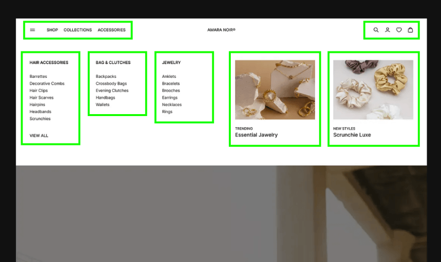
We tend to group things that are physically close together. Your brain assumes that items near each other must be related.
In UI/UX: When you place a label close to its input field or group related buttons in a row, people get it without thinking. But if similar elements are spaced too far apart, users may struggle to connect the dots.
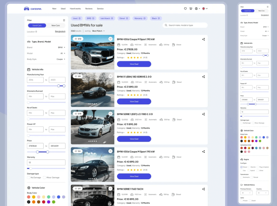
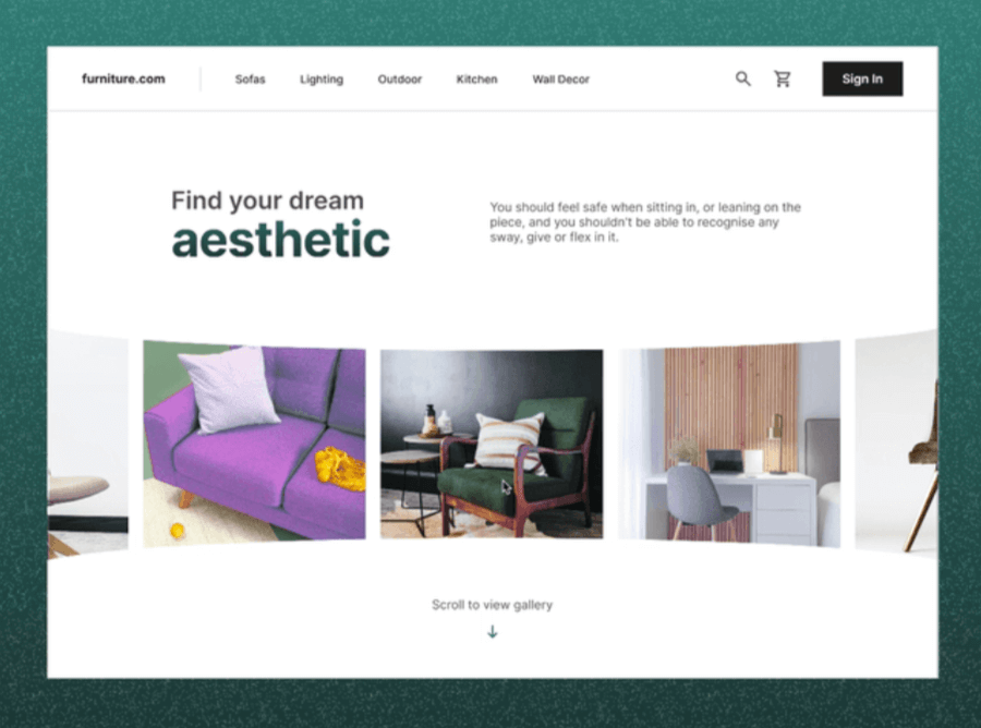
Example: Proximity allows you to visually separate content by sections. You can immediately notice this in navigation menus that use categories to separate products. The items of each category are grouped with much less space between the labels compared to the space between categories.


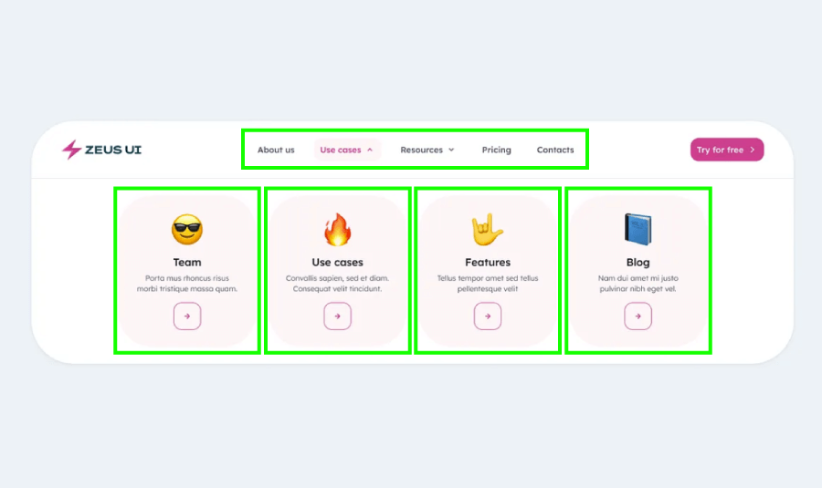

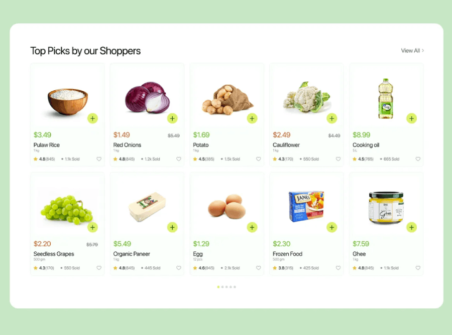
2. Similarity
We see things that look alike (same shape, color, size, or font) as being part of the same group.
In UI/UX: You can help users instantly recognize related elements by styling them consistently. It’s why all your primary buttons usually look the same.
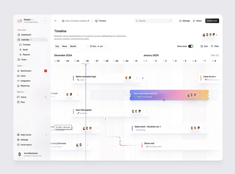
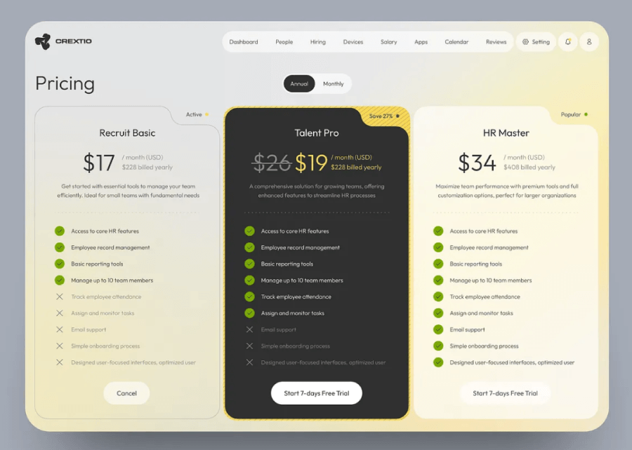
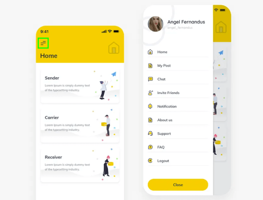
Example: Here’s a quick look at how the law of similarity shows up in real design. The UI uses a bunch of Gestalt principles, but let’s zero in on the cards/task and list items. At first glance, they’ve all got the same shape, which instantly tells you they work the same way and you don’t need to stop and read the fine print first.

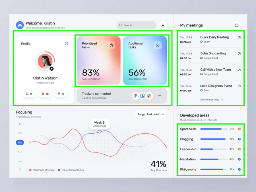
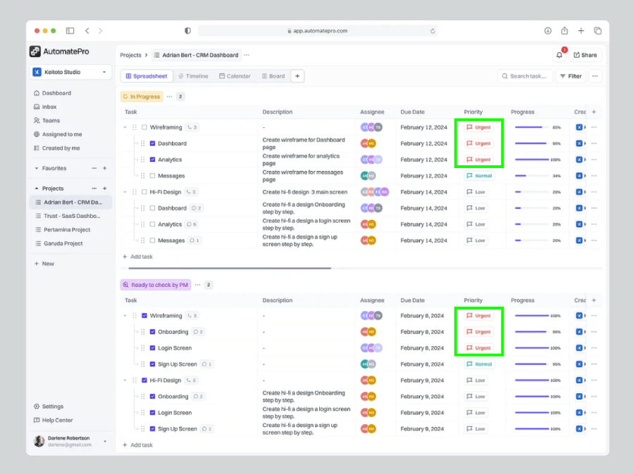
When you mix in a bit of color psychology, Gestalt tricks can make your design feel a lot more intuitive. Take the example below, the red labels visually differentiate tasks by urgency just by the rule of similarity.

Another way to use similarity to help users visually make sense of your designs is through shapes.

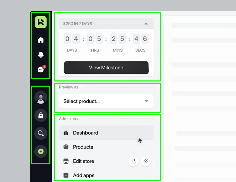
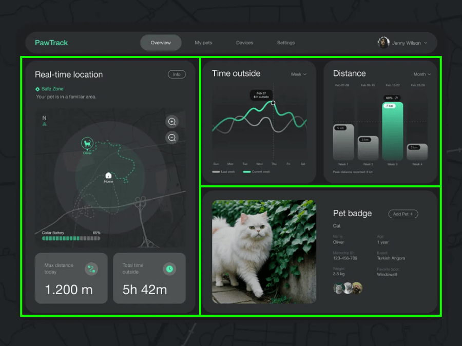
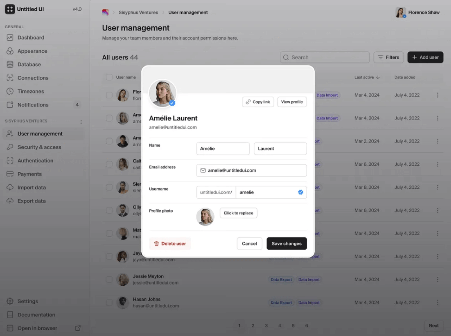
3. Common Region
When elements sit inside a clearly defined area (like a box or a shaded background), we assume they belong together.
In UI/UX: This is why cards work so well. Even if items inside aren’t tightly spaced, the container ties them together visually.
Example: Cards, navigation menus, data tables, forms, and anything that groups elements by strategically placing them on the same background so they are perceived as related. Just like this:


4. Connectedness
When elements are visually linked (usually by lines or shapes), we treat them as related, even if they’re far apart.
In UI/UX: Lines between steps in a process, arrows pointing from labels to sections, or connectors in flowcharts all use this principle to guide the user’s understanding.
Example: A multi-step checkout process where a progress bar links each step helps people understand where they are and what’s coming next.

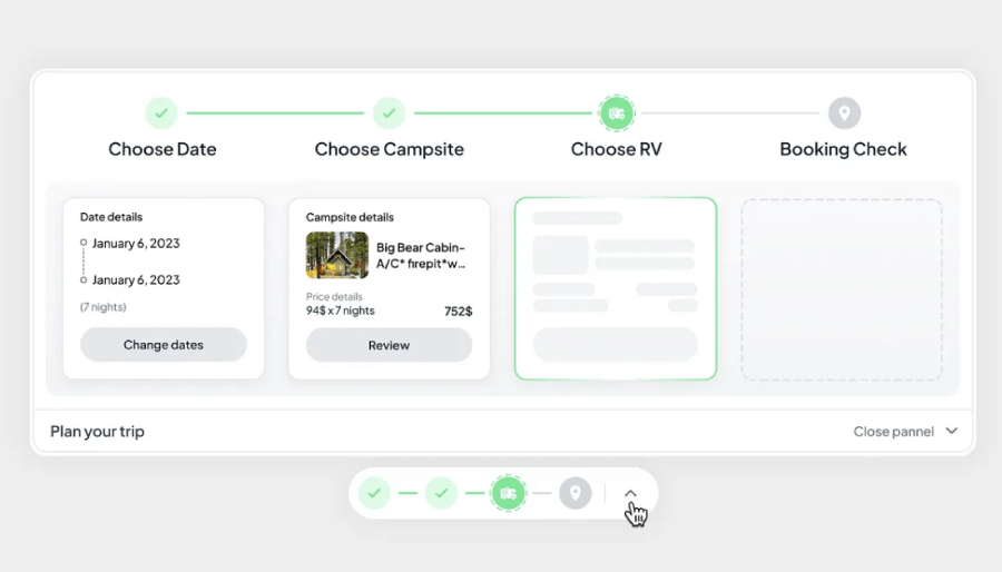
Connectedness is also applied when elements are grouped with a common shape or background, like in calendars or product cars.


5. Common Fate
If multiple objects move in the same direction (or feel like they’re about to), your brain groups them together.
In UI/UX: This shows up in animations. When several items animate together, they feel connected, even if they aren’t close or similar in appearance.
Example: Hovering over a card and watching the icon, text, and button all shift slightly or fade in at once gives the feeling that they’re acting as one unit. Or in Google Drive, when you pick several files, a soft overlay shows they’re part of the same group. Move one, and the others come along too; that’s the Law of Common Fate doing its thing.
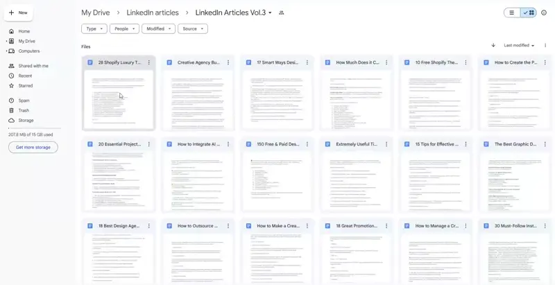
Common Fate Drive Multi-Select and Dragging
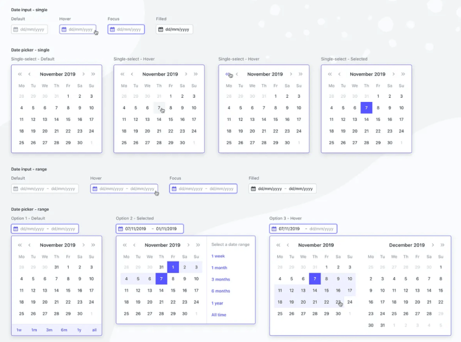
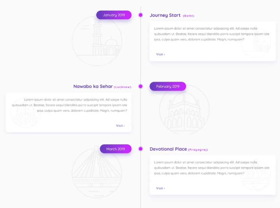
6. Continuity (or Continuation)
We tend to follow lines, curves, or patterns. Our eyes naturally keep going along the smoothest path. Now, you may ask ” Isn’t that Connectedness?” and you are absolutely right.
Connectedness and continuity are both ways our brains sort out visual info, but they do it in different ways. Connectedness happens when elements are clearly linked (our eyes group them together right away). Continuity is more about flow—we naturally follow lines or shapes that seem to move in the same direction, even if there’s a gap in between.
Multi-step checkouts on eCommerce sites, for example, show how connectedness and continuity work together. You’ll usually see related form fields grouped into neat sections (connectedness doing its thing). Then there’s the step-by-step flow, often shown with breadcrumbs or progress bars, which helps guide people through the process smoothly (continuity).

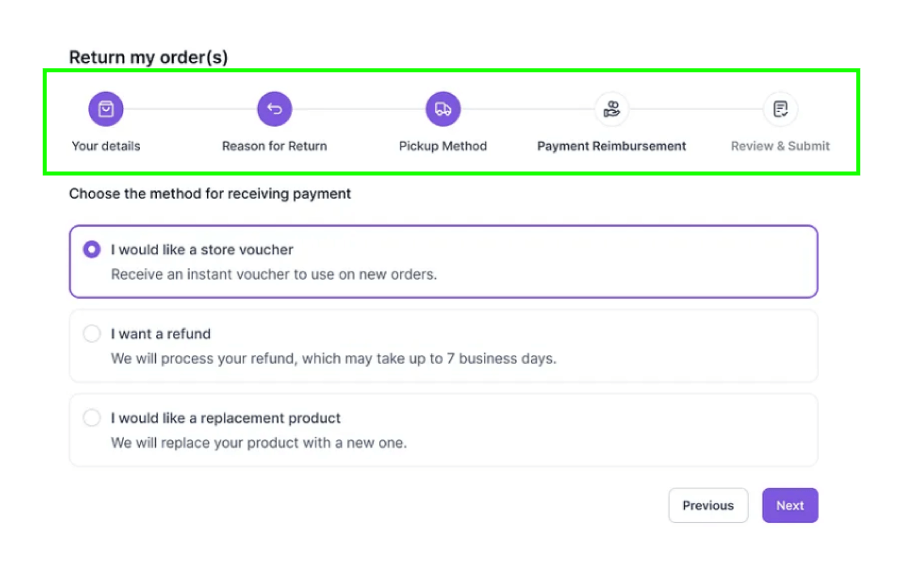
In UI/UX: Designers use this to guide your eye through the layout, from headlines to buttons to next sections, without jarring jumps.
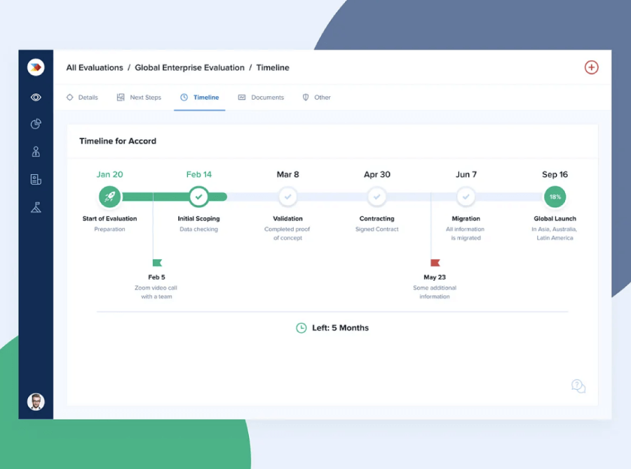
Example: A timeline page that pulls your eye smoothly from one event to the next, thanks to a clean vertical line or curve.


7. Closure
Even if a shape isn’t fully outlined, your brain fills in the blanks and sees the complete form.
In UI/UX: This allows for clever, minimal visuals. You don’t need to draw every detail for users to recognize what something is.
Example: An icon that suggests a shopping cart using just a few lines, no need to draw every wheel or wireframe. People will get it.
Another example would be a carousel where the images on the edges of the visible area are cut. You can’t see the entire image, but you immediately get what it is, and you also understand that you need to swipe to view more, which uses the principle of closure to suggest there’s continuation.

8. Figure-Ground
We automatically separate what’s in the foreground (what we should focus on) from the background.
In UI/UX: Good contrast, layering, and shadows help people know where to look first. This is huge for usability and accessibility.
Example: A modal with a dark overlay behind it helps users focus on the content inside the modal, everything else fades into the background.

The figure-ground principle plays a big role in navigation menus as well. When the menu stands out clearly from the rest of the content, like bold buttons on a muted background, it’s easier to spot and use without thinking twice.

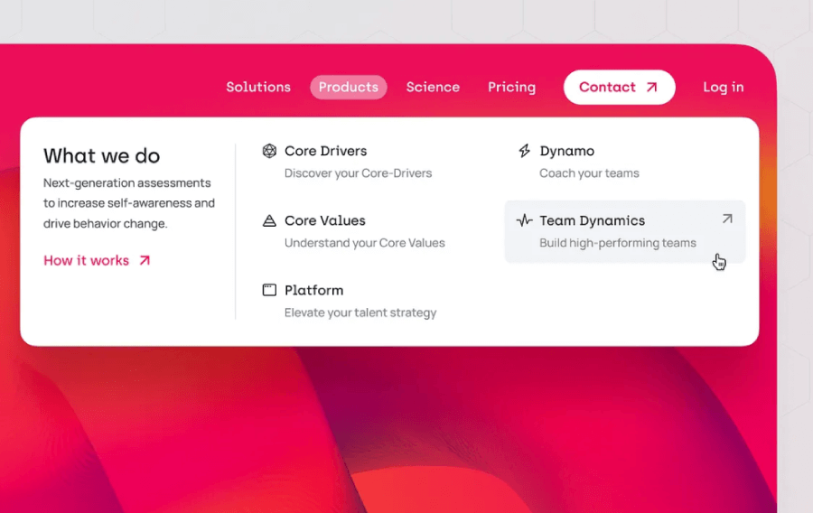
Icons and buttons lean on the figure-ground idea, too. An icon pops out from its background so you can instantly tell what it’s for. It gives you visual information that the element is clickable.
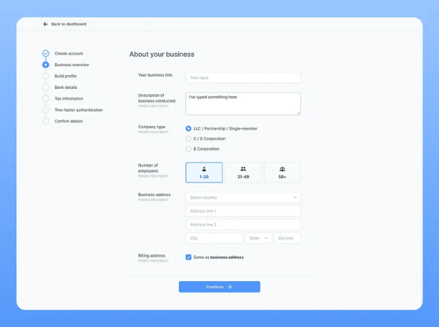
9. Symmetry and Order
We like balance. When things are symmetrical and neatly aligned, they feel calm, stable, and easier to process.
In UI/UX: Grids, even spacing, and tidy alignment all help users scan a page without effort.
Example: A pricing page where all the plan cards are the same width, height, and spacing helps users compare without distractions.

10. Prägnanz (Simplicity)
Our brains prefer simple, clean shapes over messy, complicated ones. We try to reduce what we see to the most basic version.
In UI/UX: You want your designs to feel clear and straightforward, not busy or overwhelming. Less noise, better focus.
Example: Simple icons, clean layout, and minimal colors make a dashboard easier to scan and understand in seconds.
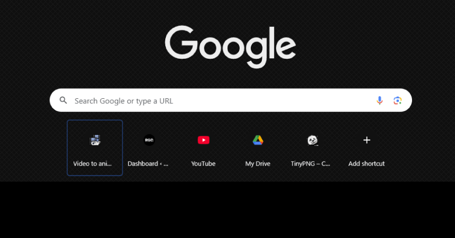
Google’s search page is a solid example of the law of Pragnanz in action. The clean layout and big, centered search bar keep things simple, so your brain knows exactly what to do. There’s not much else on the screen, it’s just you and the search box.

11. Emergence
We often understand the whole of something before noticing its individual parts. The big picture comes first.
In UI/UX: A good interface gives users a sense of structure and purpose before they dig into specific features or details.
Example: When you land on a homepage and instantly understand where the nav is, where the main message sits, and where to click, even before reading anything closely.
Interactive elements like buttons, icons, and form fields might seem basic on their own, but once you start interacting, they work together.
Data visualizations do something similar. A single data point doesn’t say much, but when you line them up in a chart or graph, patterns start to show up. That’s when the bigger picture clicks into place, and you start spotting trends without digging through rows of numbers.

12. Invariance
We still recognize objects even when they’re rotated, scaled, flipped, or distorted (like in CAPTCHAs, for example) . Familiar things stay familiar.
In UI/UX: This principle is useful when designing icons, logos, or layouts that adapt to different screens or states.
Example: That hamburger icon might shrink or move depending on screen size, but your users will still recognize it instantly.


13. Multistability
Some images or visuals can be interpreted in more than one way, but not at the same time. Your perception switches back and forth.
In UI/UX: This one’s used sparingly. It’s more of a design trick than a standard practice, used to catch attention or create clever visuals.
Example: A logo that forms both a letter and a symbol depending on how you look at it. Fun in branding, but not something to use in navigation or core UI.
Tour de France logo (and the hidden shape of a cyclist)


And there you have it!
Once you start noticing Gestalt principles in design, you can’t unsee them. They’re baked into almost every interface that feels logical, or just plain satisfying to use. And you don’t need a psychology degree to put them to work.
And if you’re curious about more design tools or need inspiration, we’ve got plenty of other guides worth checking out, just like the following: