


Check out 10 graphic designs that broke the rules and still worked. Broken grids, bold moves, weird layouts, and color chaos can lead to unforgettable visuals.
You’ve probably heard it a hundred times: “Follow the rules! Use grids. Keep your type readable. Less is more! Respect white space!!!”. And yes, most of the time, sticking to those basics will keep your designs sharp, functional, and in order, but every now and then, someone breaks the rules so confidently it actually works better than if they hadn’t.
That’s exactly what I’ve rounded up here: ten graphic designs that went off-script in the best possible way. These designs break hierarchy, ignore balance, mess with color, ditch grids, or just toss all logic out completely, and somehow, it all clicks.
Of course, I’m not saying you should go rogue every time you open up Figma or Photoshop. But seeing how these rule-breakers pulled it off might just open up a new way of thinking next time you’re stuck in a layout that feels too clean.
Now, I present to you… some sweet, beautiful chaos.
1. Bango – That’s a Bundle VS The Rule of Readability and Contrast

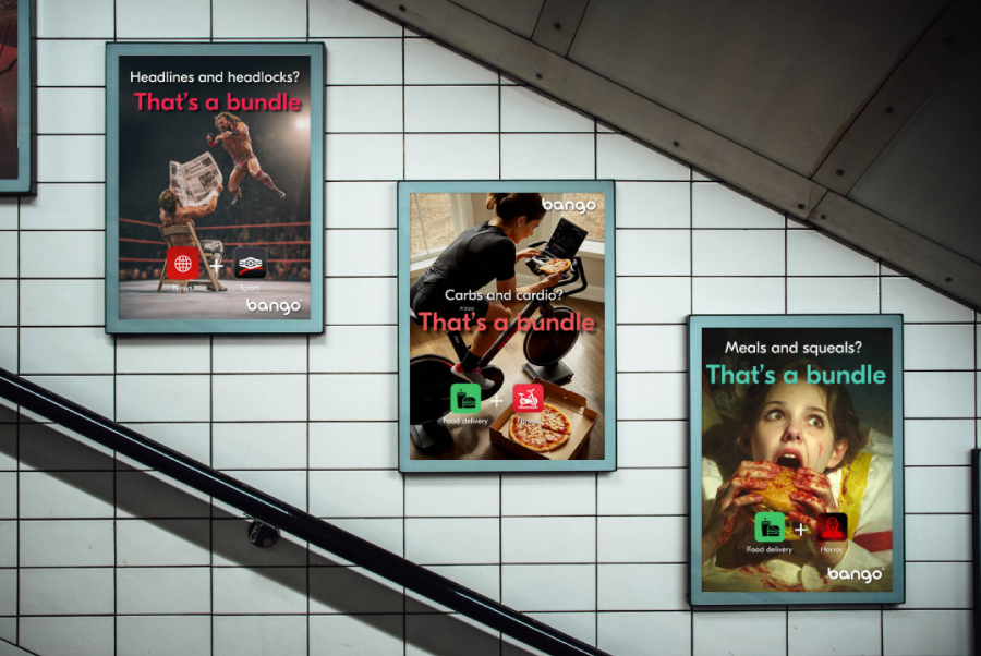
Category: Video ad design; poster design
Broken rules: Contrast between front layer and background. Openly uses AI to generate the ads.

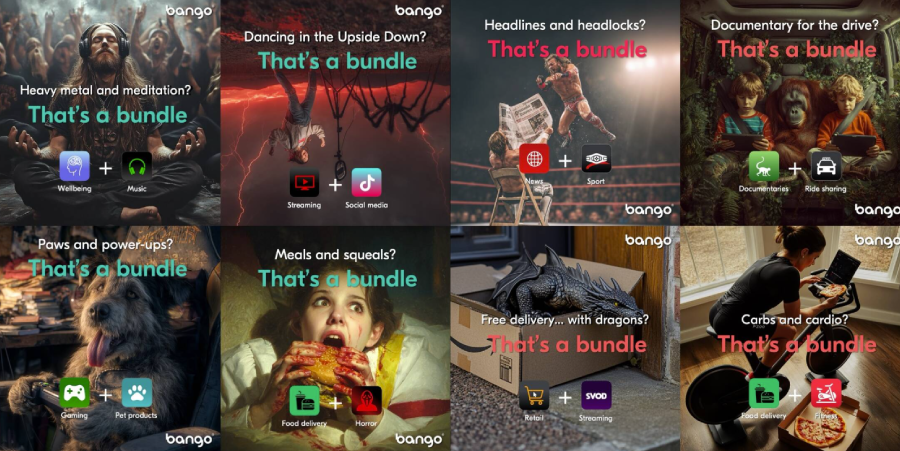
This campaign from Bango throws subtlety out the window. It’s built around the idea of personalized subscription bundles and leans heavily into over-the-top visuals and AI-generated everything (visuals, texts, and voiceovers). The videos run loud and wild, bursting with neon colors, layered textures, and movement that doesn’t exactly help readability.
And that’s exactly what “makes it pop”. The goal here is to show just how messy and varied personal bundles can be with the help of graphics that are loud, confident, and designed to get noticed in the split-second scroll of a digital feed.

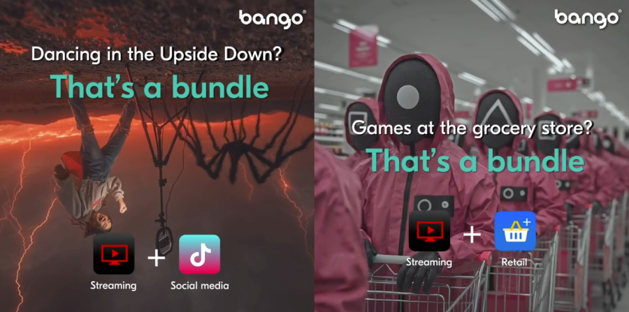
From a graphic design angle, this campaign completely ignores the usual rule about contrast and legibility. The background and foreground constantly fight for attention. CTAs and tools icons almost get lost in the visual noise. But that chaos mirrors the bundle concept, and it feels intentional.

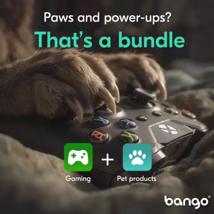
Instead of guiding the eye with clean, focused hierarchy, it overwhelms on purpose, which ends up working for a campaign that’s all about wild combinations and endless options.
2. Bologna- Inspired Facemask VS Skincare Industry Aesthetics

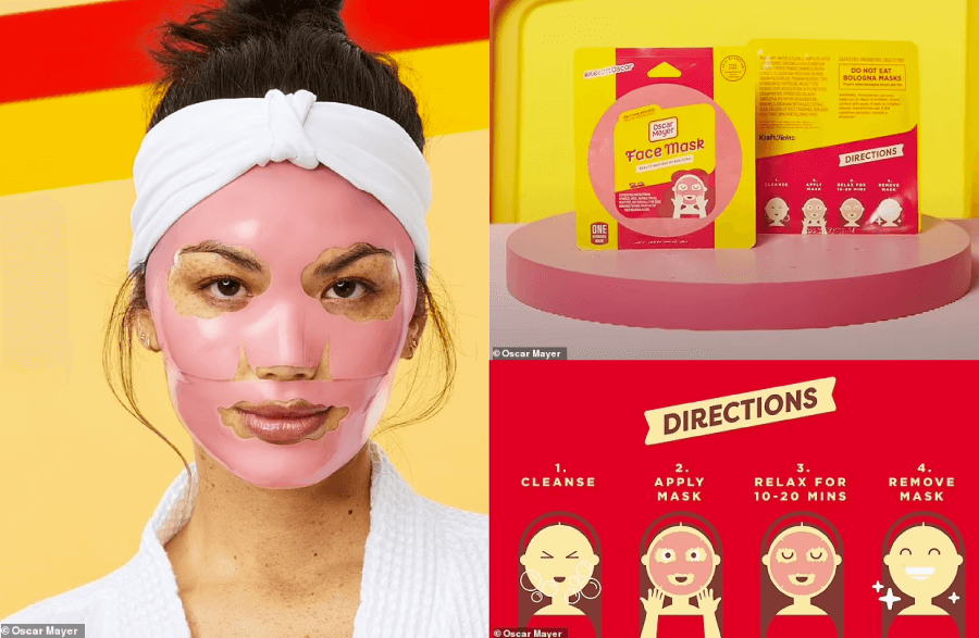
Category: video ad design; branding design; packaging design
Broken rules: Industry-specific rules of aesthetics

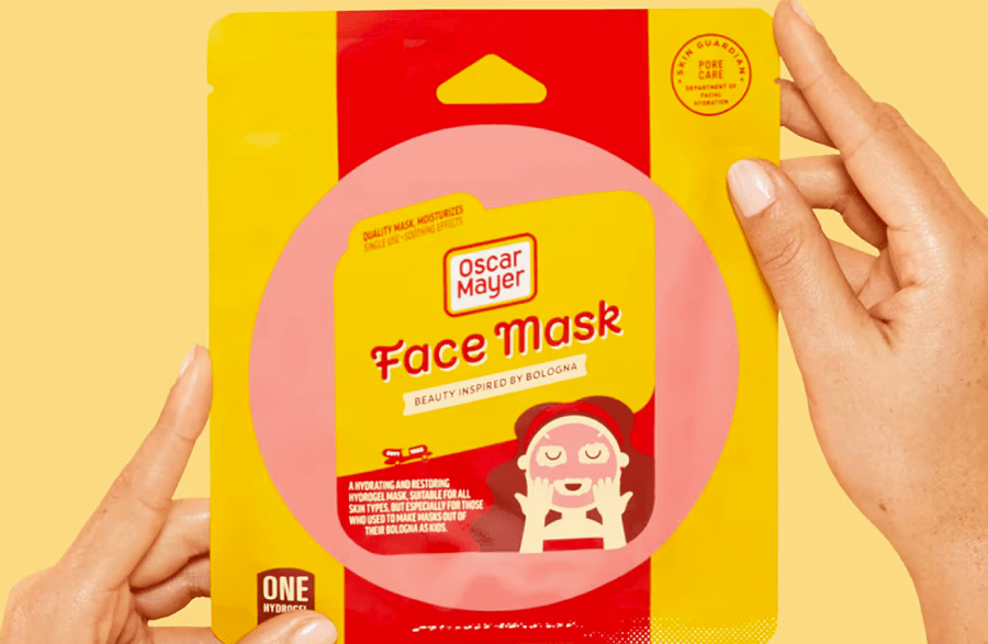
Oscar Mayer went all-in on weird with its bologna-inspired face mask, and it worked. The brand pokes fun at the hyper-serious skincare world with a product that looks like a slice of deli meat but still includes legit hydrating ingredients. It’s meant to trigger nostalgia, not beauty envy.
Think less spa retreat, more lunchbox humor. That throwback vibe speaks directly to millennials, encouraging selfies and social buzz over traditional skincare benefits.
What’s wild here is how hard it breaks the design rules of the beauty industry. Normally, skincare branding screams clean, calm, and polished, lots of soft colors, minimal fonts, and organic textures.
Oscar Mayer, being the rebel he is, flipped the entire playbook and said Bye to elegance and wellness glow. His concept leans into absurdity with a design that feels more like a joke than a product. And you know what, that clash is exactly why it works. It cuts through the sameness and earns attention by refusing to look like skincare at all.
3. Bent Water Brewing VS White Space

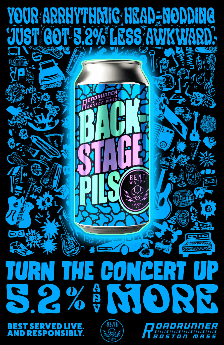
Category: Poster design; package design
Broken rules: Less is more; font readability
Next, you have Bent Water Brewing’s poster and packaging for Backstage Pils. It goes big and bold to channel the energy of live music that is noisy and slightly overwhelming.
The design layers high-contrast patterns behind thick, clunky typography that practically disappears into the background. There’s almost no visual breathing room, but it matches the messy joy of a crowded concert and a cold beer in hand.

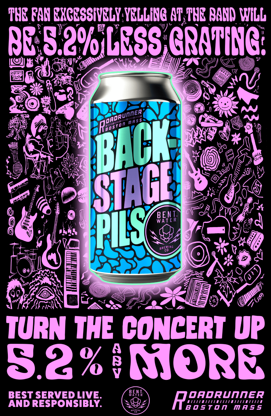

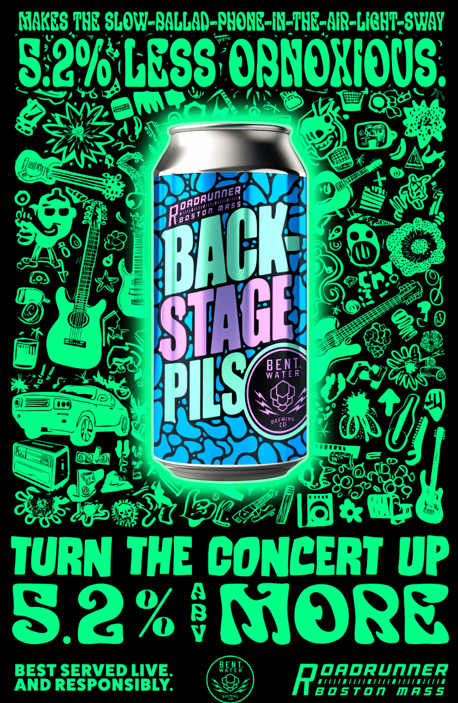
In terms of design rules, this breaks a big one: white space. There isn’t any. Traditional layouts would separate text and background to improve readability, but here, the two blur into each other.
That would usually be a mistake, but it works because the brand isn’t aiming for calm or clarity. The clutter becomes part of the vibe, which is perfect for a beer that’s all about backstage energy.
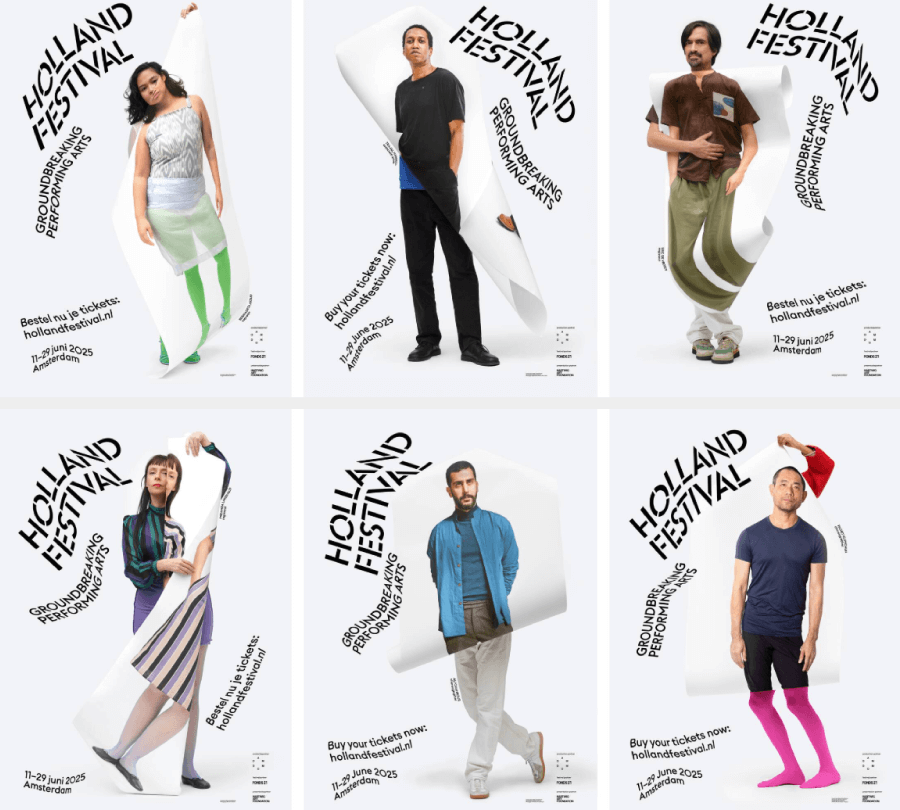
4. Holland Festival 2025 VS Font Readability

Category: Poster Design, brand visual design
Broken rules: Font readability and positioning
The visual identity for Holland Festival 2025 throws out the usual design rulebook in favor of something far more experimental. As one of the oldest international performing arts festivals, it has the freedom to lean into bold ideas.

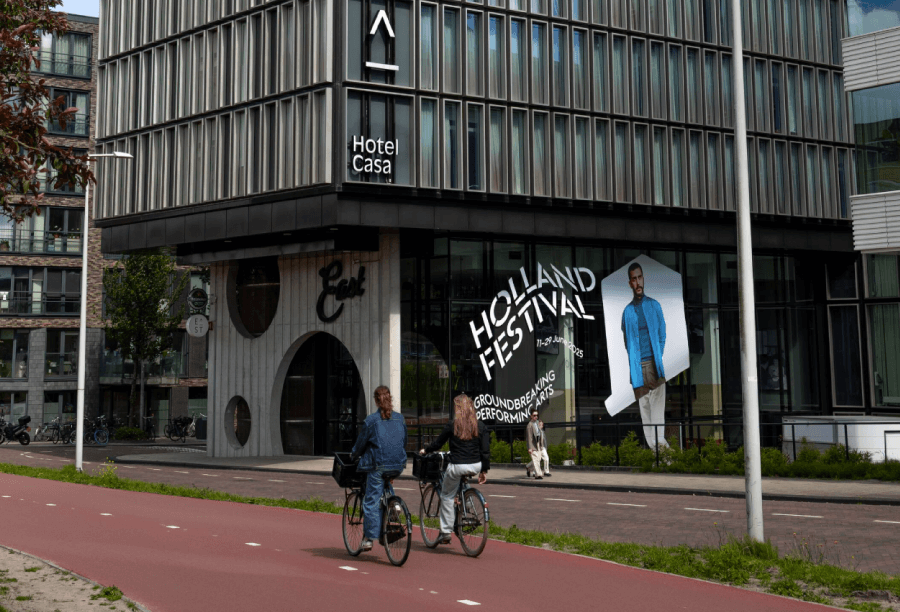
The campaign features surreal, layered portraits of artists like Trajal Harrell, captured through a process that involves photographing life-sized prints of themselves. These offbeat visuals reflect the experimental spirit of the performances they promote: unpolished and ready to challenge comfort zones.
But the real twist comes in the typography. Fonts bend, stretch, curve, and twist into shapes that would normally send graphic design teachers into a panic. Readability takes a back seat to attitude.
And somehow, it works. The audience isn’t here for clear-cut answers, but for art that makes them feel something. The design mirrors the unpredictability of the performances and it’s unapologetically strange.
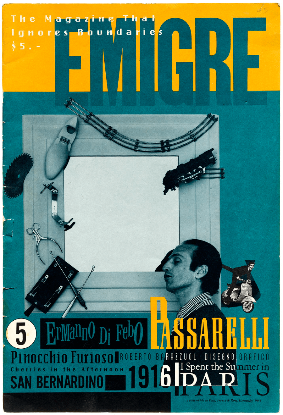
5. Emigre Magazine VS Visual Hierarchy

Category: Editorial design
Broken Rules: Visual hierarchy, text hierarchy
Emigre Magazine never cared much about playing it safe. As one of the first design magazines to go fully digital back in the ’80s, it stood out by looking completely different from everything else on the shelves.

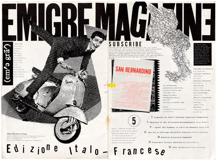
Art director Rudy VanderLans and type designer Zuzana Licko filled its pages with layered type, weird column structures, and fonts that were born straight out of the early Macintosh era. The layouts don’t whisper, but shout, and somehow, that messy, over-the-top style became iconic.

The rule that Emigre broke on purpose is visual hierarchy. Usually, good editorial design guides your eye with clear titles, subtitles, and body text. Emigre said no thanks. Headlines don’t always look like headlines, and sometimes the body text feels more like a design element than readable content.
But in the context of a magazine about design, that chaos makes sense. Readers expected to be visually challenged, and the unconventional approach turned each spread into a playground for typography nerds. Well, that isn’t practical at all, but it was never meant to be.
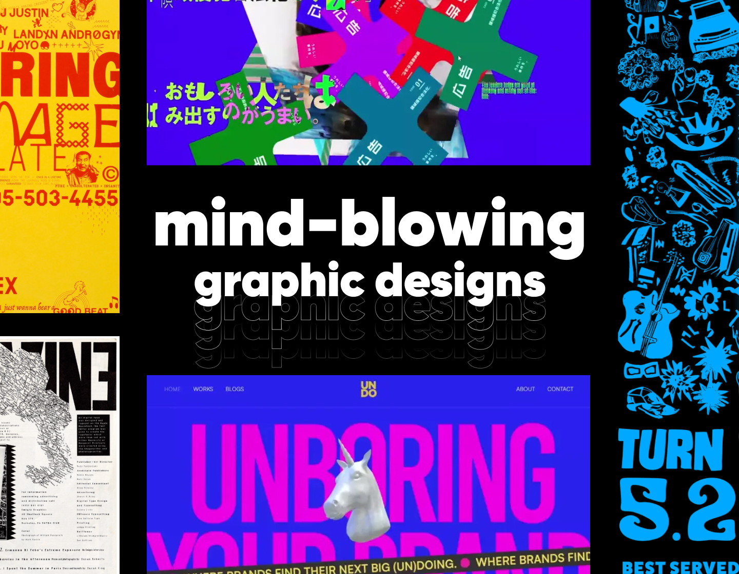
6. UNDO Agency VS Harmonious Colors
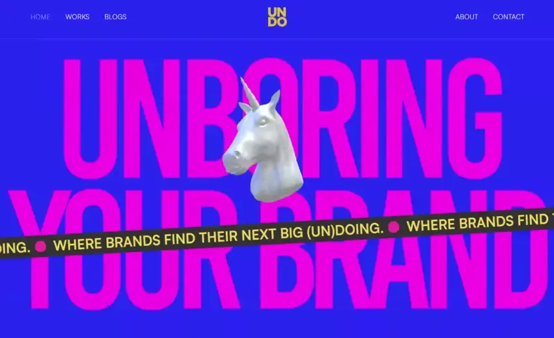
Category: Web design
Broken rules: Harmonious color palettes (color theory)
Here you have a website that hits you like a splash of pop art and neon posters from a parallel internet universe. The design goes hard on attitude, starting with a homepage that throws bright magenta and searing yellow together like it’s daring your screen to keep up.
This branding agency doesn’t tiptoe around first impressions and comes out swinging with electric visuals that feel part retro, part futuristic, and all loud. Safe to say, you won’t scroll past without noticing.

So what is the rule that goes out the window? Color harmony. According to color theory, blue and neon pink or magenta and yellow (especially in their most saturated forms) don’t play nice together. These aren’t happy color families but high-voltage arguments on your screen.
And that’s the point. The discomfort adds energy. The tension draws you in. It works because the visuals reflect the agency’s bold, unfiltered personality.
7. Crumpton Oaks Happy Applecore VS White Space and Color Balance

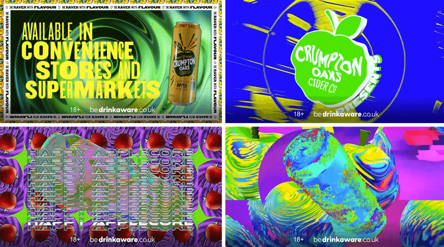
Category: Motion design; branding design, video ad design
Broken rules: white space, color balance, rhythm
This campaign doesn’t try to be calm or collected because Crumpton Oaks leans all the way into 90s nostalgia with bold colors and eye-popping neon graphics. The cider brand teamed up with DJ Hixxy and MC Whizzkid to create a rave-inspired celebration of chaotic joy, from fly posters to projection.
These are all mapped outdoor displays, and the whole thing feels wild. And that’s the point, because the brand doesn’t try to look like a premium craft cider. It’s proud to be brash.
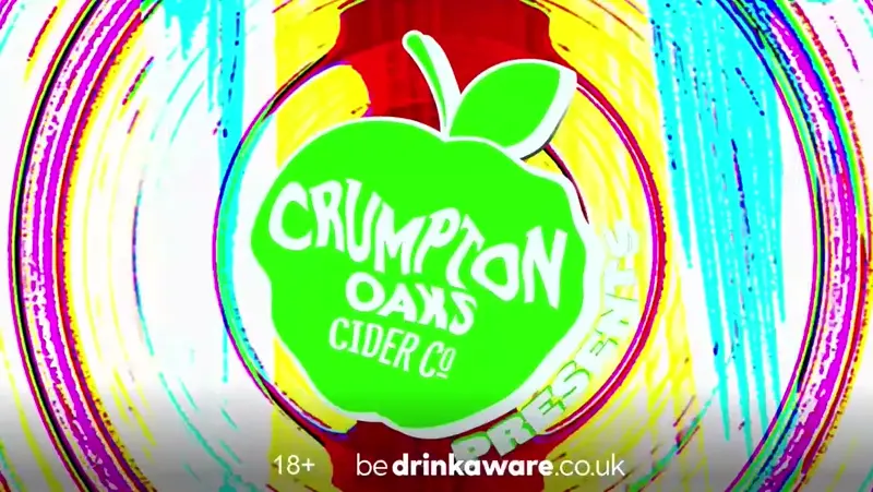
The design flips white space and color balance upside down. There’s no resting point for your eyes. Everything glows or moves or competes for attention. It also throws off rhythm intentionally, refusing to settle into a predictable visual beat.
That kind of overload wouldn’t usually fly in most campaigns, but here it works because the brand wants to feel overstimulating. In short, the sensory chaos becomes part of the appeal.
8. Greenpeace Brazil: What Planet is This VS Grids
Category: Motion typography design
Broken rules: Grid
Now, a very powerful campaign from Greenpeace Brazil. I specifically love this one because it doesn’t shy away from harsh truths and manages to show them with raw aerial footage of climate-ravaged parts of the Amazon and beyond. It paints a picture that’s both otherworldly and uncomfortably real. T
he visuals look like they were taken on Mars, but they show real places in Brazil such as burned forests, cracked riverbeds, and communities running out of time. The tone is heavy, the photography is stunning, and the message is clear: this isn’t just a distant issue, because it’s already happening.
But what is the broken rule here? Instead of relying on clean grids or organized layouts, the campaign lets the typography roam. Text placement feels a bit off and unpredictable, which mirrors the emotional twists in the video. Breaking the grid gives the entire design a sense of disorientation.
In a typical campaign, that could feel messy or unpolished. But here, the choice reinforces the unease and shows the way the climate crisis is throwing everything off balance. Basically, the broken layout of the text becomes part of the message.
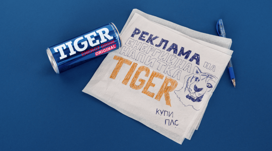
9. Tiger Energy Drink VS Most Branding Design Rules

Category: Brand visuals, ad design, video ad design
Broken rules: Undermining branding. uncontrolled typography, no clear CTA, no hierarchy
Since really good designs can come from anywhere, I will show you something that originates from Eastern Europe. This is the Bulgarian campaign for the Tiger Energy Drink, and what makes it epic is that it absolutely doesn’t care about being pretty. Or polished. Or consistent. In fact, this campaign leans into being as low-effort as possible on purpose. It has graphics drawn on a napkin, a pen left in the shot, and scribbled text that barely fits the frame.
The whole thing feels like it was made in a school cafeteria between classes. And it’s absolutely intentional. The brand runs on brutal honesty, and the message here is something like ” Hey, we’re not pretending to be cooler than we are, but we’re loud, chaotic, and here to wake you up”.
Video transcript: “Hey, bro. Ima be honest with you today. We have a new Tiger Energy Drink campaign. There is also some money for a video… cuz there’s no campaign without a video. And this is why we’re recording it now. This is a video for the Tiger Energy Drink. PLS BUY!”
It breaks basically every rule in the branding book. There’s no visual hierarchy. Typography is messy and unpredictable. Colors clash and overlap. The CTA, “КУПИ ПЛС” (BUY PLS) is tiny and easy to miss.
Most designers would call this layout a disaster, but that’s exactly why it sticks. It plays into the anti-design trend in a smart way against a wall of carefully curated ads, so it looks like a mistake you can’t ignore. That level of raw, messy energy fits a product that promises a jolt. Brilliant!
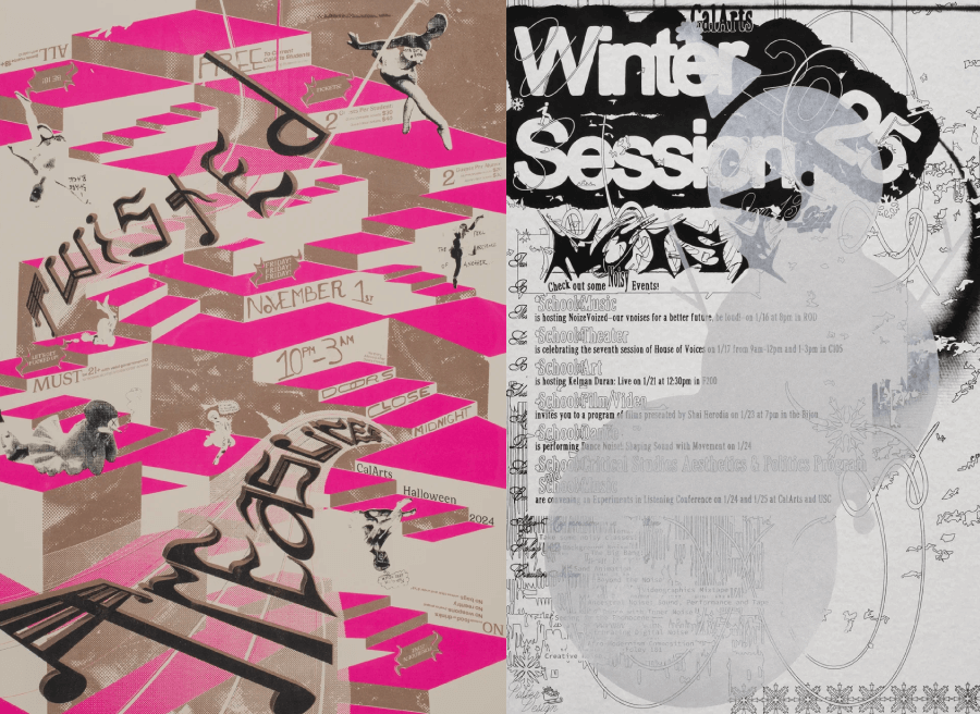
10. CalArts Poster Archive VS Hierarchy, Balance and Readability

Category: Event poster design
Broken rules: Balance, white space, hierarchy, color harmony, font readability, focus
The California Institute of the Arts has never really played by the rules to begin with, and their poster archive is a perfect case in point. This massive visual collection celebrates decades of student-made posters for campus events.

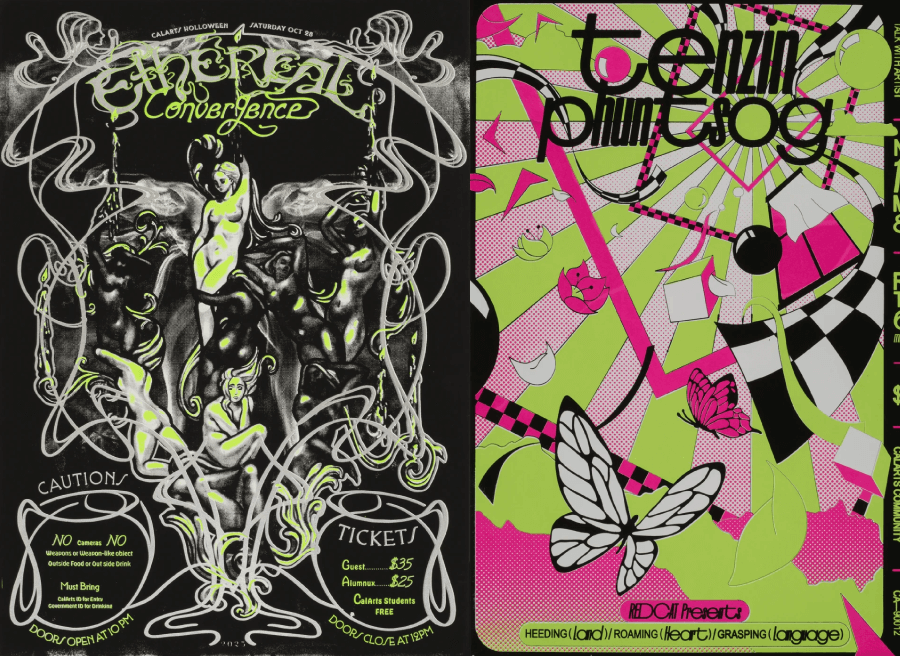
This is the stuff that was once stapled to bulletin boards is now on display like museum pieces. The posters live inside REDCAT gallery now, where they’re organized along the walls and even suspended in mid-air from what they describe as “trees”, “bushes”, and a “cloud”.
So what design rules do they break? Honestly, almost all of them. There’s no consistent hierarchy, color balance is all over the place, and some fonts barely qualify as readable. But that’s exactly what makes them sing.

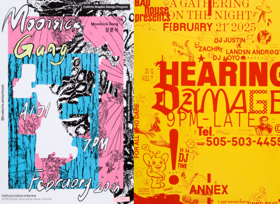
These posters thrive on disruption. CalArts students used posters as test grounds to push ideas and challenge viewers, and as a result, the work feels truly experimental. In this case, “breaking the rules” wasn’t the exception, but the whole point.
Bonus: How about breaking every single rule of graphic design…
11. Kohkoku Magazine VS Everything
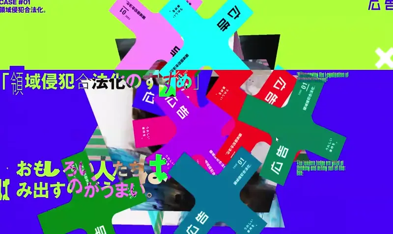
Category: Branding visuals, web design
Broken rules: grid, balance, white space, readability, color harmony, contrast
For the “honourable mention” category, I present to you a design that managed to break everything it could think of. This is the microsite for Kohkoku Magazine’s special issue with the theme “Legalization of Territorial Invasion”. The concept’s pretty intense, and the design doesn’t try to soften it one bit.
What you land on is a site that feels like a graphic collision. Layout? What layout? Text blocks clash with imagery, color choices aren’t exactly harmonious, and you’re not going to find a tidy reading experience. It’s not even off-grid because the grid never existed in the first place.
Every classic rule of design gets thrown out here: balance, contrast, white space, clarity, you name it. But here’s the thing: it absolutely works because the chaos mirrors the message. Of course, a polished, restrained site would’ve killed that vibe. Instead, it makes you sit in discomfort, and in this case, that discomfort is doing exactly what it’s supposed to do.
So yeah, rules are there for a reason, but breaking them? That’s where things get interesting. The designs you just saw didn’t play it safe, and that’s exactly why they stick in your brain.
And there you have it!
Next time you’re staring at a perfectly balanced layout and it feels a little… flat, maybe try flipping the script. Who knows—you might end up creating something totally unforgettable.
And if you’re curious about more design tools or need inspiration, we’ve got plenty of other guides worth checking out, just like the following: