A practical guide to human-centered design that speaks directly to UX designers who care about building stuff people actually want to use.
I’ve always been drawn to products that feel like they were actually designed for real people, that stuff that makes sense without trying too hard. That’s what led me to write about human-centered design. It’s something we talk about a lot in UX, but I wanted to break it down in a way that feels practical and grounded.
This guide covers the core steps of the process and shares some examples of how brands have used it to create better experiences in tune with how people really live and interact with tech.
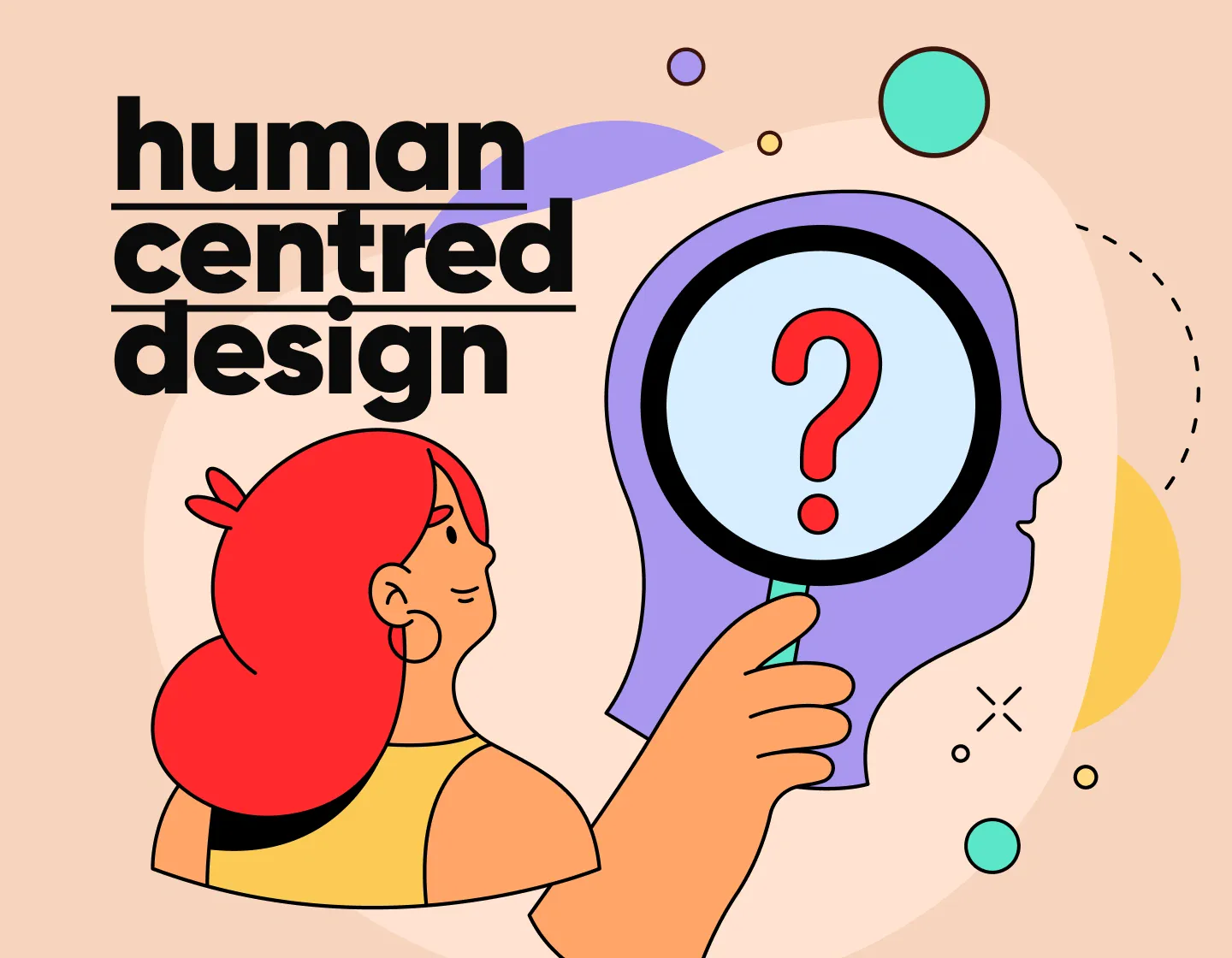
What is human-centered design?
In short, human-centered design means building digital products around the real people who’ll use them. It starts by understanding what users actually need (this is different than what they say they want) and what helps them in the context of their everyday lives.
Designers observe how people interact with things, ask questions, spot patterns, and look for points of friction. Then they use that knowledge to build experiences that actually work and solve real problems.
For example, if users keep dropping off at the checkout stage of an eCommerce app, human-centered design means digging into the why (with testing and observing) and then making changes that remove roadblocks without adding new ones.
Human-centered design vs. design thinking
These two often get used interchangeably, and to be fair, there’s a lot of overlap. Both start with empathy, both involve a lot of prototyping and feedback, and both are iterative by nature.
But here’s where they split!
Design thinking tends to look at the bigger picture, it’s more of a general problem-solving approach that can apply to just about anything, from redesigning a product to rethinking a public service. Human-centered design, on the other hand, stays closer to the user experience and focuses more on creating solutions that not only solve the specific problem, but fit naturally into a user’s life.
So while design thinking might lead a team to invent a new feature, human-centered design makes sure that feature actually helps people and feels intuitive to use.
Here’s an example:
Imagine a team working on a new grocery app. If they use design thinking, they might brainstorm big ideas like adding a feature to suggest recipes based on what’s on sale. It’s a broad problem-solving approach looking to innovate.
But if they opt for human-centered design, they would dig deeper into how shoppers actually use the app and maybe discover that users want quick meal ideas they can prepare in under 30 minutes.
With the second option, instead of just suggesting sales, they will design the feature to offer easy, time-saving recipes that fit into busy lives. The focus here stays on making sure the solution feels natural and useful for real users.
How UX and human-centered design work together
If you’re designing for UX, you’re already working with human-centered design, maybe without even calling it that. The whole process (user research, sketching ideas, building wireframes, testing what works) comes straight from HCD thinking. The difference is, HCD puts people right in the middle from the start and keeps them there through every stage.
Spotify is a great example of how this plays out in practice.

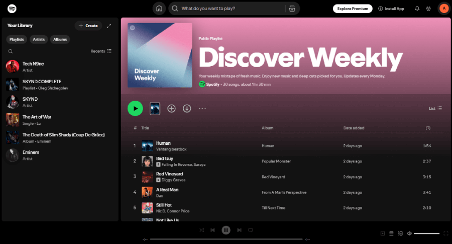
The app actually pays attention to how people use it. Every playlist, from Discover Weekly to Release Radar, comes out of a system that watches what users like, skip, save, and repeat. The UX shifts and improves the more someone interacts with it.
Why human-centered design actually matters
When a product understands what someone needs and responds in a way that feels personal, people notice. That’s where real user engagement comes from. Think of something as simple as how Duolingo cheers you on with goofy animations and streak reminders. It’s a user experience that understands motivation and keeps folks coming back. That kind of connection doesn’t happen by accident. It comes from listening, testing, and staying close to real users throughout the process.
Key ideas behind human-centered design:
The first thing to know is that it’s always about people.
Everything starts with who you’re designing for, what their day looks like, what slows them down, and how your product might fit into that picture.
Then there’s the problem itself.
A lot of the time, the issue users describe isn’t the one that needs fixing but more of a symptom. UX designers often dig a little deeper to uncover the real friction. Fixing the core issue clears the way for everything else to work better.
It also helps to zoom out.
Every piece of the UX (navigation, microcopy, button placement, etc.) plays a part in the whole system. You could design a perfect search feature, but if it leads to confusing results, the bigger experience still breaks.
And finally, small steps matter.
You don’t need to redesign everything at once. Tweak, test, adjust—then repeat. Even tiny UX changes, like shifting the position of a button or rewriting a confusing label, can make a big difference when they’re based on real feedback.
Human-centered design in 5 essential steps
Step 1. Start with the problem.
Not just any problem. It should be the one that real users deal with and that your team can actually help fix. Find out what frustrates people to figure out where your product can step in.
Once you’ve got a clear problem in front of you, move to:
Step 2. Talk to actual users.
Interviews, feedback sessions, usability recordings, whatever gives you a clear view into how people interact with similar products or with yours (if it already exists). The goal is to understand not just what they do, but how they feel while doing it.
After gathering insights, it’s time for:
Step 3. Throw around ideas.
This is where those sticky notes and sketchpads come out. The good ideas usually come from patterns in the research, those little moments that reveal what people wish they could do more easily. At this stage, questions like “Would this actually help someone?” or “Can we pull this off?” help narrow things down.
From there,
Step 4. Move into prototyping.
Don’t overthink it. A clickable Figma mockup is often enough to get quick feedback. Airbnb famously used rough prototypes in the early days to test new features with hosts and guests before putting resources behind them. The rougher the prototype, the easier it is to throw away what doesn’t work.
And finally,
Step 5. Test what you’ve built.
Real feedback from real users beats any internal opinion. You’re not looking for perfection, just watching for what feels clunky, confusing, or just off. Once you find that, tweak it and test again. That loop is where good UX really takes shape.
5 real-life examples of human-centered design
Samsung FreeStyle Bluetooth Projector
Samsung didn’t just throw a product into the market, they designed the FreeStyle projector around what younger users actually want.

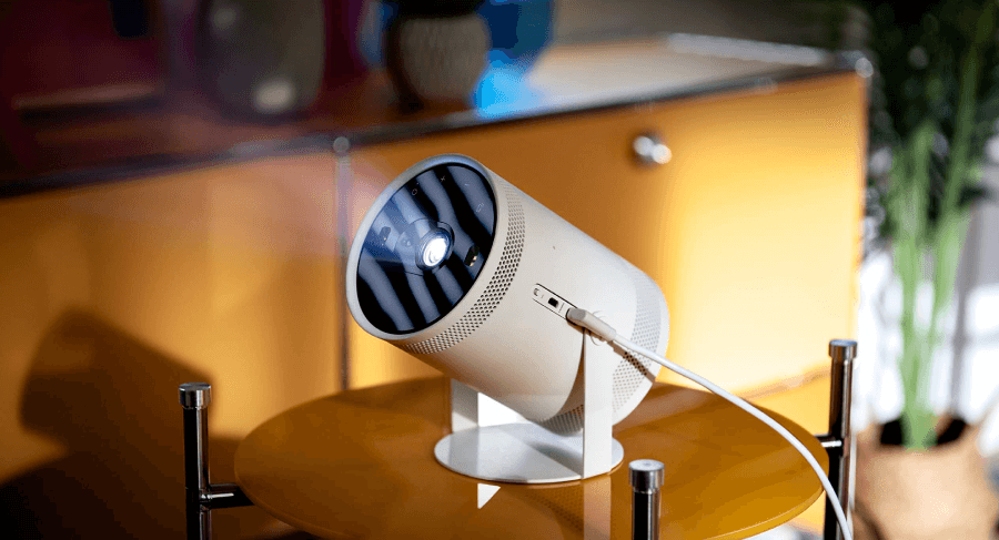
The product is lightweight, portable, and projects on just about any surface, which hits the mark for people who live in small spaces or are always on the move. This projector was made for flexible lifestyles and spontaneous moments such as projecting a movie on a bedroom wall or sharing a slideshow at a friend’s place.
The UX reflects that freedom, as it has simple setup and mobile-friendly controls that match how Gen Z and Millennials already use tech, because Samsung leaned into specific user behaviors instead of chasing a catch-all audience.
HelloFresh
Next, let’s look at what HelloFresh did. They considered how people were eating at home and spotted all the friction points, such as long grocery trips, decision fatigue, and the guilt of throwing out unused ingredients.

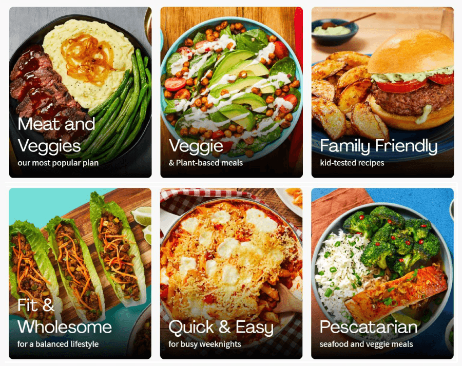
So, they built a service that skips all of that. The experience starts with the user: simple recipes, pre-measured ingredients, and weekly menus that don’t overwhelm. Everything from the unboxing to the cooking instructions gets designed around what real people need after a long day.
Fitbit Stats
Next, Fitbit focuses on how those stats actually matter to each user. These include daily step counts, heart rate trends and more, and the device gives feedback that’s simple to understand and easy to act on.

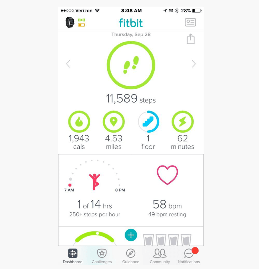
The design supports a range of goals, for example, when someone’s training for a race or just trying to sleep better. It keeps things light and intuitive, with clean visuals and timely nudges that keep users engaged without overwhelming them.
Venmo Social Interface
Venmo didn’t just ask “How can we send money” but instead went for “How do friends want to send money?”. This immediately shift the angle of thinking to making a payment app that feels more like a group chat than a bank transfer.
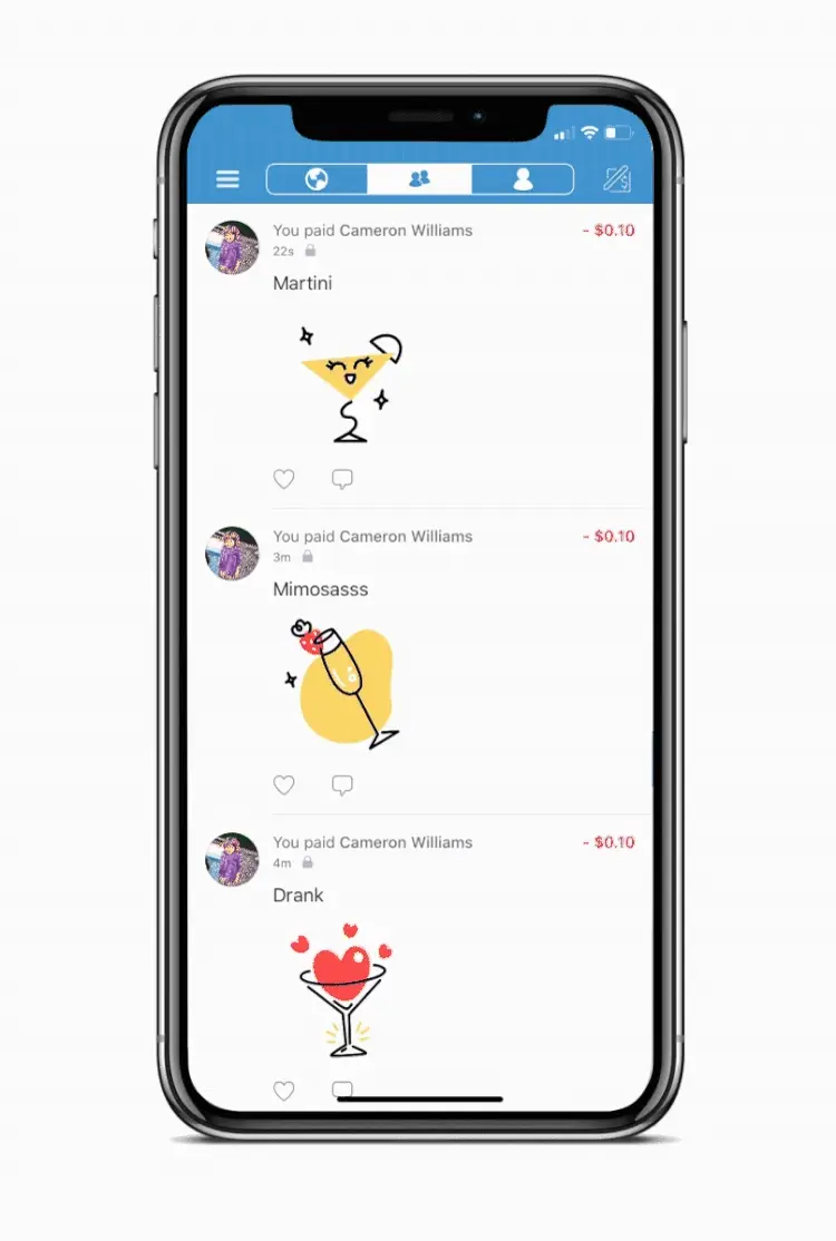
Users can add notes, emojis, and tags when paying someone back, which makes the whole experience feel more social than transactional. The design leans into everyday habits like scrolling a feed, reacting to posts, keeping up with friends, so people feel at home right away. It’s very casual, fast, and made for moments like splitting dinner or paying your roommate for Wi-Fi.
Duolingo Reward System
And last, Duolingo figured out that the real hurdle in learning a language isn’t grammar but sticking with it. So they designed an app that rewards consistency, celebrates progress, and keeps users coming back. Such tweaks include playful sound effects, streak counters and mini goals,whch are all familiar game mechanics that keep things fun.

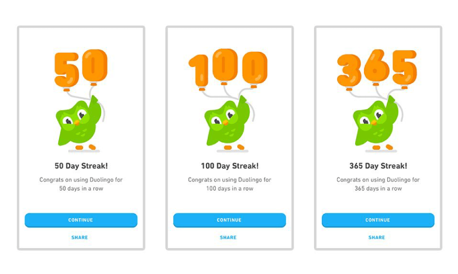
Users can jump into lessons, switch between languages, or take a quick test to find their level. The interface is bright, friendly, and totally stress-free, no matter if you’re brushing up on Spanish or trying Klingon just for fun.
And there you have it!
There’s something satisfying about watching a design come together around real people and their actual needs. Human-centered design is when you pay attention, stay curious, and care enough to test things until they work better. Hopefully, the steps and examples here gave you a few ideas or reminded you why UX is such a weirdly rewarding space to work in. Keep building things that make sense. That’s really the whole point. ❤️
If you’re still in the mood to explore, I’ve got a few more web design and marketing reads you might like: