Last time we collected 40 well-designed and fully-editable infographic resumes for free download that you can adapt to your field and customize to present you in the best way possible. In order to give you inspiration and great ideas on how to style your resume, however, we will proceed with a beautiful collection of 30 infographic resume examples. Hopefully, you’ll gather some great ideas and craft a job-winning resume on your own. So let’s go straight into our hand-picked selection.
If you call failures experiments, you can put them in your resume and claim them as achievements.
Mason Cooley
1. Foldable Resume with Isometric Cartoon Infographic
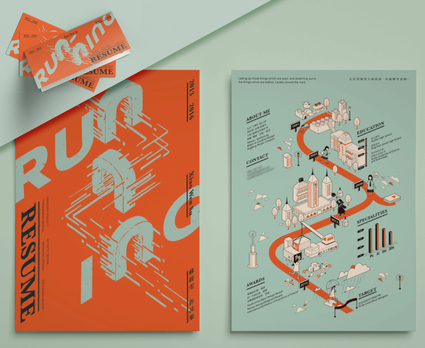
In cases where you present you need to present a physical resume, you can take your creativity further and make a nice brand design on the back of the sheet. In this case, the designer has planned a foldable resume that looks like a card. Its content is also very professionally done with an isometric infographic illustration in brand colors. All sections follow the timeline road logically from the crib towards the designer’s goal. Notice that the illustrations aren’t just decorations, but they feature important details such as the logos of the software the designer uses, a school building representing the education phase in their life, and a construction site where the designer has built their skills.
- Designed by: Sue Su
- Strengths: The entire resume is based on one infographic in a consistent illustration style; original fold idea for a print version.
- Visit Project Page
2. Dashboard Infographic Resume with Timeline Table
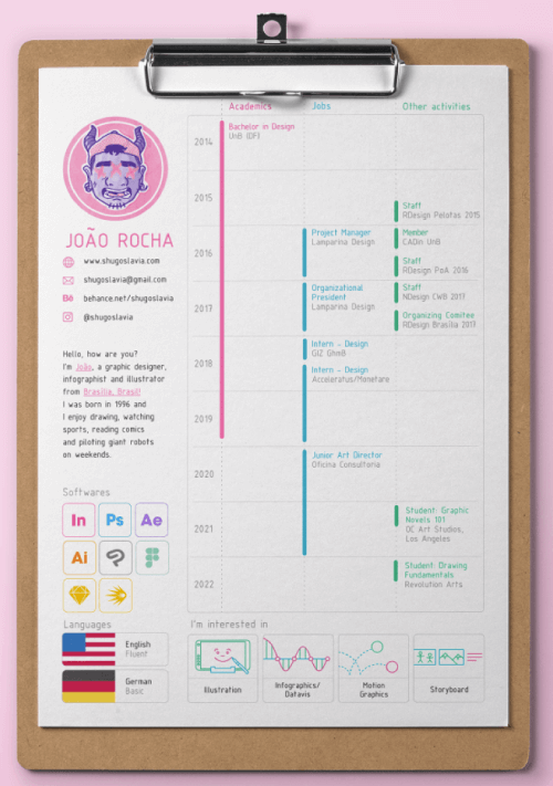
This infographic resume takes inspiration from dashboard design and places the sections as cards in a grid layout. It features a main section with a timeline infographic that follows academics, jobs, and other activities in different accent colors; as well as smaller sections for software tools, languages, and personal interests. The resume also shows good use of icons representing each concept, making it easy to comprehend even without reading the labels.
- Designed by: Joao Rocha
- Strengths: Well-executed dashboard design; use of grid
- Visit Project Page
3. Dark Mode Timeline Resume with Highlights
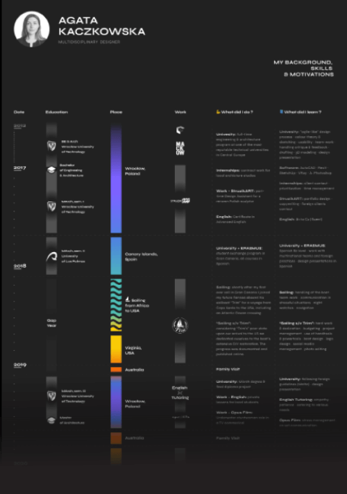
The preview only shows half of the resume, so make sure to check out the original project page. This example offers a version of a professional resume in dark mode, organized around a timeline. What we love about this resume is that the designer has added important highlights of each stage of her education and work experience with sections such as: “What did I do”, and “What did I learn?”. Definitely very important for the employer to focus on.
- Designed by: Agata Kaczkowska
- Strengths: Highlight sections for “What did I do”, and “What did I learn?” next to each stage of the timeline.
- Visit Pr0ject Page
4. Entirely Hand-Drawn Infographic Resume
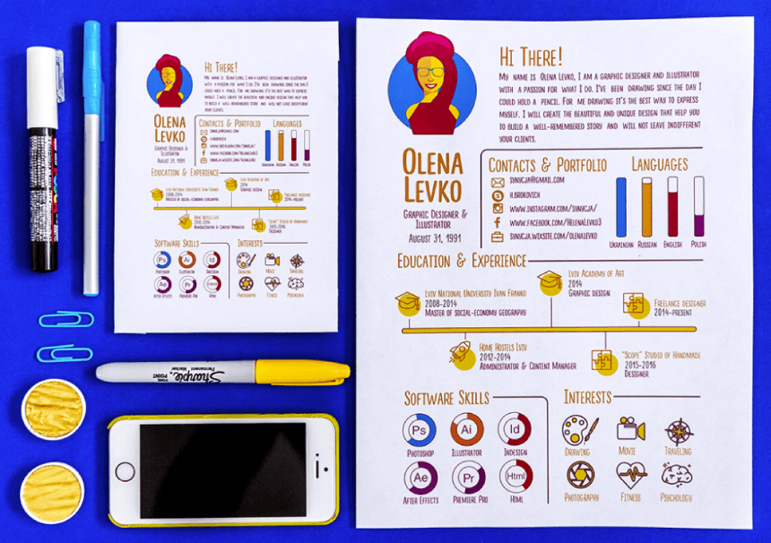
This resume rocks the entirely hand-crafted style from the fonts to the charts and illustrations. Creating something digitally to imitate traditional art is a hard task, however, the designer has managed to do that flawlessly. This is especially a great way to present yourself if you are looking for a job as an illustrator. Such a resume speaks loudly about your skills from the very beginning.
- Designed by: Helen Levko
- Strengths: Entirely hand-drawn and hand-written consistent style.
- Visit Project Page
5. Clean Infographic Resume with Accent Colors
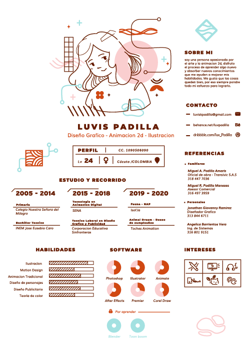
Here we have a more minimalistic approach to a design with personality. It’s very clean with minimum fonts and two colors for the written content, however, it still uses matching clean illustrations and accents with colorful transparent shapes in the background.
- Designed by: Luvis Padilla
- Strengths: Goes minimalistic, but still adds a lot of personality through matching illustrations and accent colors; uses progress bars and donut charts for software expertise.
- Visit Project Page
6. Infographic Resume as a Part of an Illustration
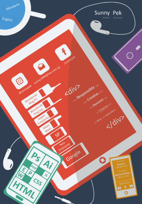
Here we have an entirely different approach to most examples. Designers usually include illustrations in their resumes, however here we have the opposite: a colorful flat-style illustration that accommodates the resume inside of the different elements.
- Designed by: Sunny Pek
- Strengths: The illustration is the main layout while different elements from the composition accommodate sections of the resume; usage of HTML codes around the text.
- Visit Project Page
7. Web Design and OS Style Infographic in Pastel Colors
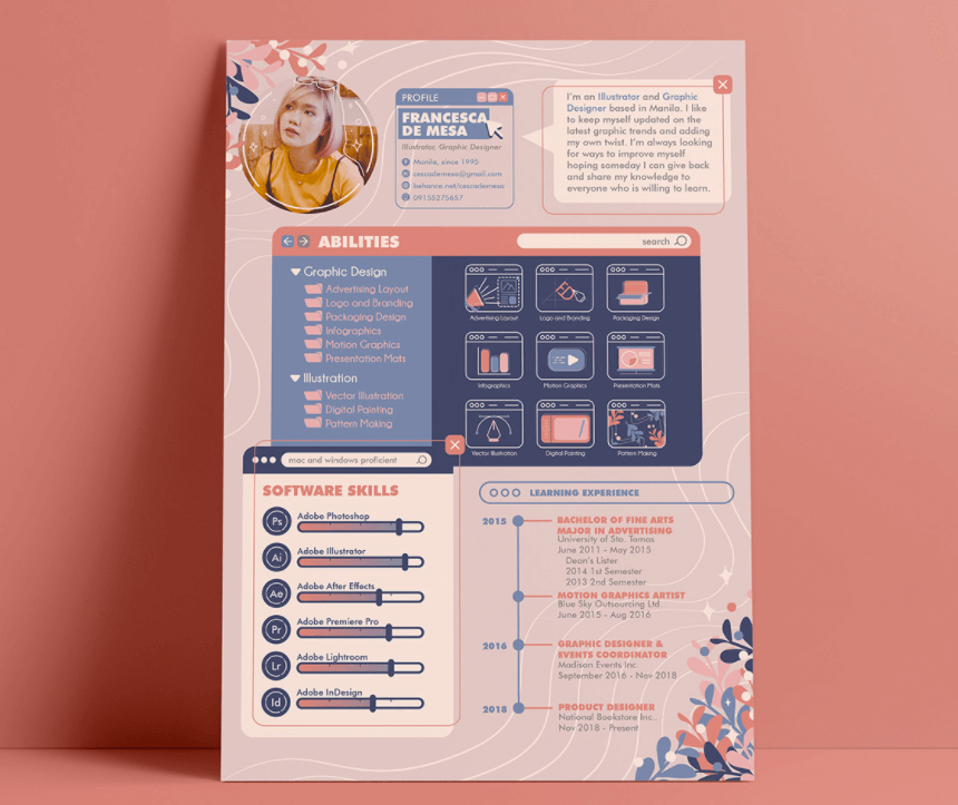
The design of the resume speaks about the designer’s skills. In this case, the resume shows a great balance between visuals and functionality, everything is aesthetically pleasing and very easy to scan and comprehend. The designer has styled their resume as an interface with arranged windows for each section. It uses different tricks to communicate valuable information such as sidebars with tree-view control folders for the Abilities section.
- Designed by: Francesca De Mesa
- Strengths: Arranges sections in interface windows; creative graph chart with tree-view control sidebar
- Visit Project Page
8. Adobe Illustrator Interface Custom Style Infographic Resume
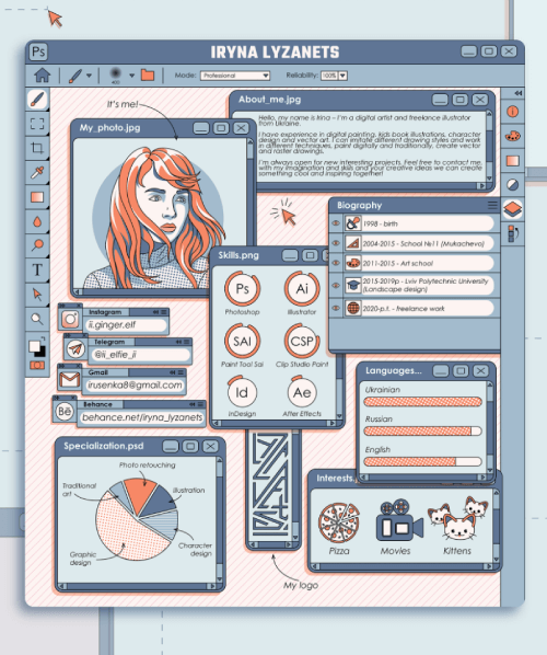
If you’re proficient in a specific software tool, why not take inspiration from its interface for your resume design? In this example, the digital illustrator has designed a custom Adobe Illustrator interface with windows for each section. They showcase their design and drawing skills masterfully with a self-portrait, composition, and personal color scheme. Each section is styled as a tool or project window.
- Designed by: Iryna Lyzanets
- Strengths: Uses the software tool the designer is proficient in as an inspiration for the resume.
- Visit Project Page
9. Colorful Flat Design Resume with Background Shapes
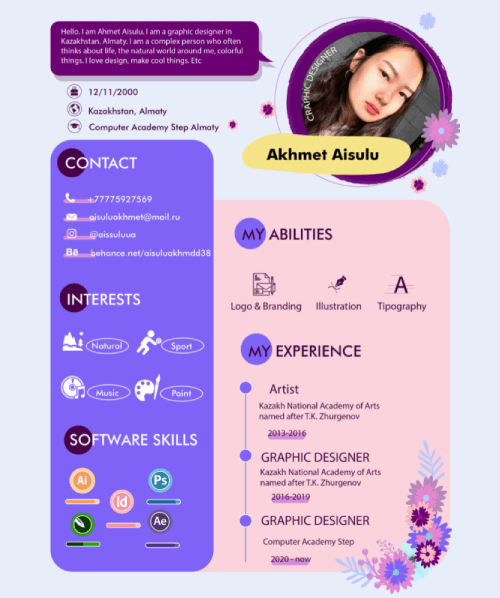
You can also customize your resume to look like a web page or take inspiration from one. In this example, the designer brings the web aesthetics thanks to the flat rounded-corner rectangular background shapes for each data visualization. They are arranged in two columns and are very easy to scan and read. The designer also uses icons and an accent floral illustration to give the design more personality.
- Designed by: Aisulu Akhmet
- Strengths: Styles sections in flat rounded-corner rectangular background shapes; uses simple icons, but also gives an accent with a custom illustration
- Visit Project Page
10. Multiple Pages Clean Infographic Resume Example
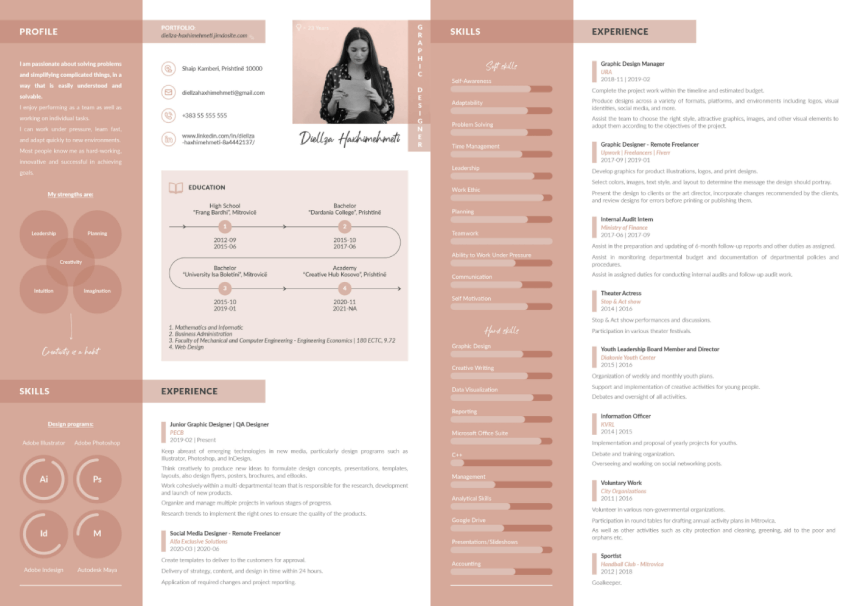
Some professionals need to include a lot of data in their resumes. In such cases, it’s way better to spread it to two or three pages. With quite a lot of information to include, for example, this designer styles the skills in experience into two columns, and two pages and uses visual hierarchy to their advantage.
- Designed by: Diellza Haxhimehmeti
- Strengths: Data-heavy resume looks way more organized and easy to read on multiple pages; a great example of visual hierarchy.
- Visit Project Page
11. Concept Illustration- Based Infographic Resume
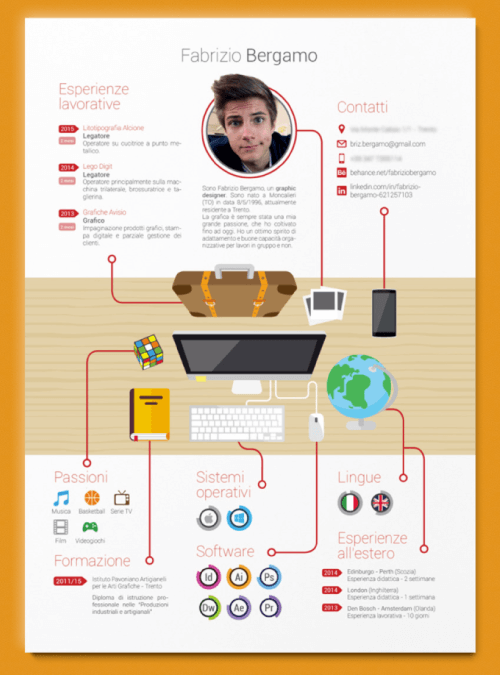
With less data, you can easily arrange your charts and section around a concept illustration in the center. In this case, we have a desk with items; each one of the items has a significant visual connection to a respective section. The Rubik cube links to interests and hobbies, the globe to languages and experience abroad, etc.
- Designed by: Farbrizio Bergamo
- Strengths: Uses a concept illustration in the center, each item visually represents a section.
- Visit Project Page
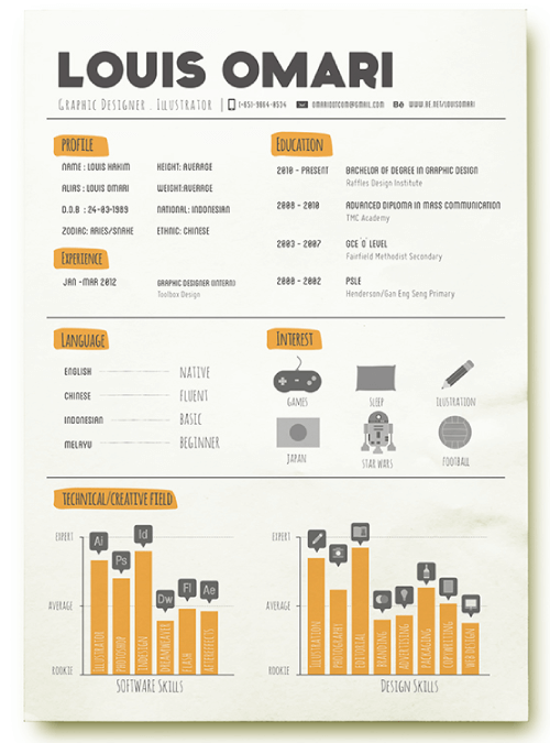
12. Clean Hand-Drawn Style Infographic Resume
This one looks very neat without too many illustrations. It mainly uses icons to represent concepts as well as a very clean color scheme to create a visual hierarchy. The designer styles their creative skills in bar charts to visualize the level of expertise and uses simple silhouette icons to mark each software and skill.
- Designed by: Ragnar Louis
- Strengths: Minimal color scheme, very simple icons, and well-organized.
- Visit Project Page
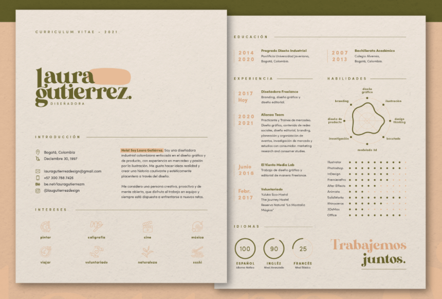
13. Stylish Clean Minimal Infographic Resume
This resume design in 2 pages uses a lot of white space to make it easy to scan and read. In addition, it also has light fonts and thin lines for the charts, making it very stylish, professional, and ready for business. The beautiful color scheme speaks communicates taste and is easy on the eye.
- Designed by: Laura Gutierrez
- Strengths: lots of white space, clean charts, light fonts, viewer-friendly color scheme. You can spread your resume on 2 pages even if you have fewer data sections to include, to benefit from white space and greater scanability.
- Visit Project Page
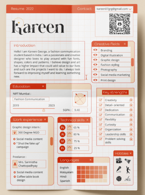
14. Dashboard Interface Infographic Resume
When you decide to include all your infographic sections on 1 page, make it a dashboard. Despite the less white space, using dashboard layout and cards keeps readability and organization neat.
- Designed by: Kareen George
- Strengths: neat card style sections, greatly organized, dashboard layout.
- Visit Project Page
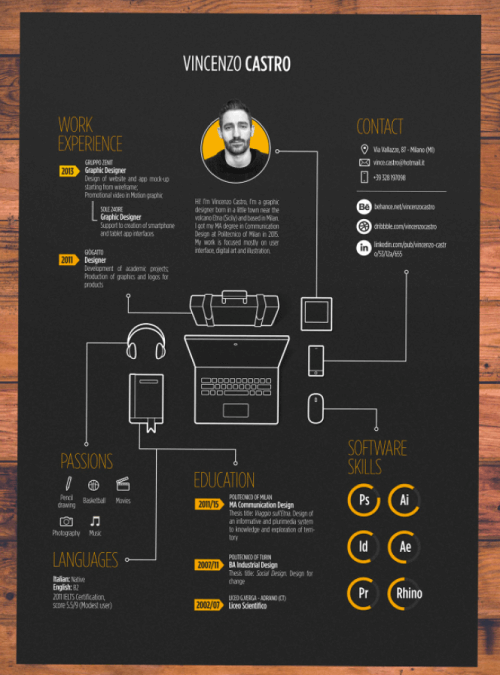
15. Dark Mode Blueprint Style Data Viz Resume
Especially when you can replace a lot of text with icons, you can easily arrange your data on 1 page only and play around with visuals. In this case, the designer features custom illustrations of related items.
- Designed by: Vincenzo Castro
- Strengths: Visuals (icons) replace most of the text; dark mode looks techy.
- Visit Project Page
16. Experience Section Infographic Block Schematic
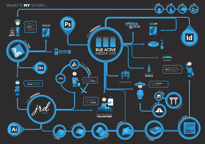
This doesn’t represent the entire resume, but it’s a very interesting example nonetheless, Here we have the experience section of “What’s my story”, visualized into a beautiful comprehensive infographic block schematic with icons, mapping, and labels. Not easy to design, but hopefully gives you some valuable ideas.
- Designed by: James Reid
- Strengths: All sections related to experience wrap up in one comprehensive block schematic.
- Visit Project Page
17. Modern Brutalist Website Style Infographic Resume
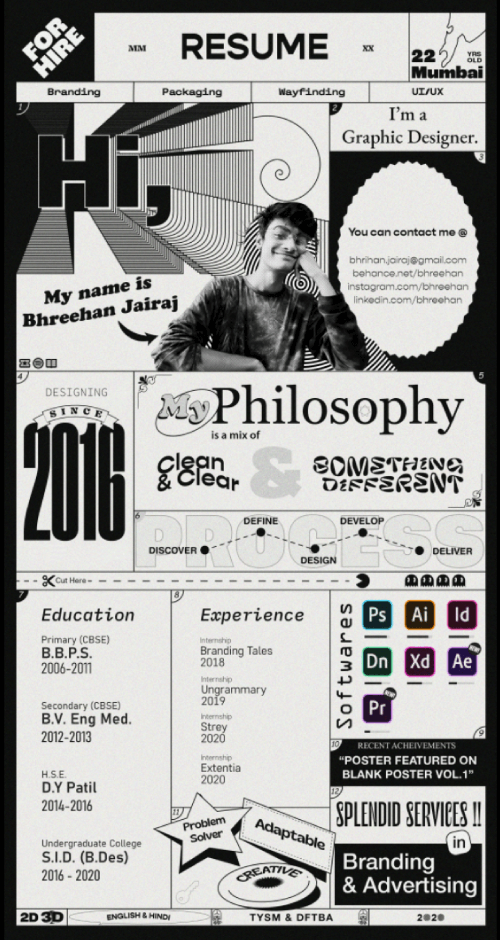
Even before potential employers view your portfolio, you can showcase your web-design skills in your very resume. This is what the web designer who designed this awesome brutalist resume did. With huge fonts, boxes layout, and bold labels, all in black and white, the resume looks incredible.
- Designed by: Bhreehan Jairaj
- Strengths: Showcases web design skills.
- Visit Project Page
18. Adobe Illustrator Interface Infographic Portfolio
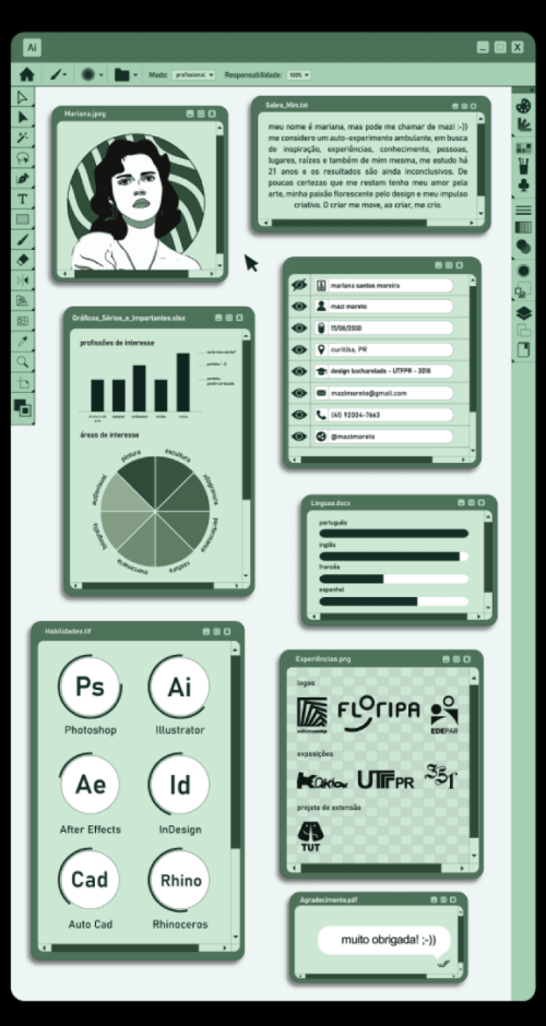
Here we have another take on Illustrator interface-style resume, proving that one single idea can flourish into numerous unique designs. This one has a more limited color scheme, fewer details, and a much cleaner graphic style with lots of white space.
- Designed by: Mazi Moreto
- Strengths: Uses the software tool the designer is proficient in as an inspiration for the resume.
- Visit Project Page
19. Short and Sweet Infographic Resume: Showcases Great Planning Skills
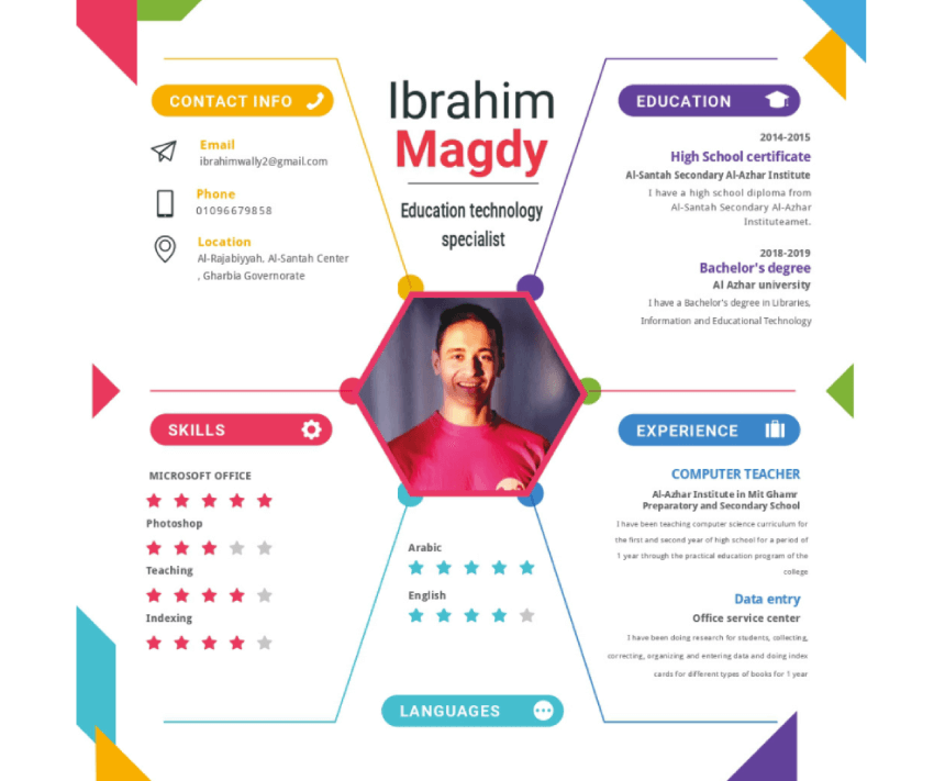
If spreading your data into multiple pages makes your resume pleasant to read, going the opposite direction can also accomplish this. Please keep in mind, that this is much harder to design as there’s the danger of creating a cluttered resume. What the designer here did, was replace a lot of text with icons and use the star system to rate his proficiency. He also included only the absolute most information which allowed him to arrange and organize everything into one small section. This proves that planning and organization skills are as equally as important as design skills. One of our favorite ideas and a must for the creative infographic resume examples collection.
- Designed by: Ibrahim Lotfy
- Strengths: Cleverly arranges everything in just one section with great planning skills, replacing most of the text with icons and using the star system for the proficiencies.
- Visit Project Page
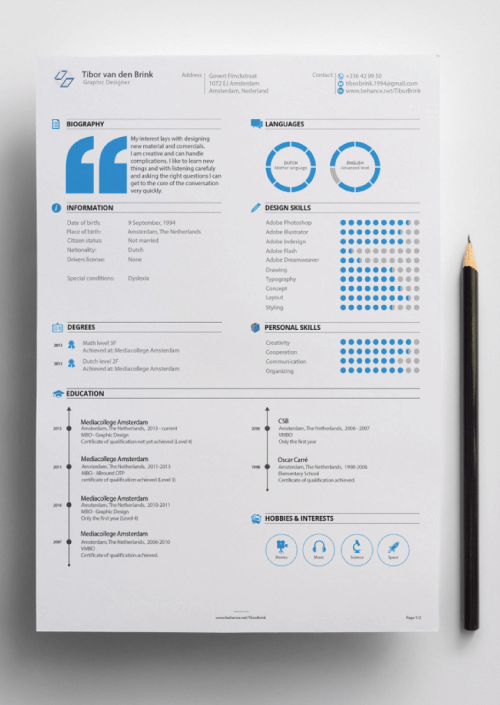
20. Clean Professional Business Infographic Resume
Not everyone applies as a designer so using clever cartoon interfaces doesn’t suit everyone’s needs. In this case, we have a clean, formal business resume, impeccably structured in two columns with professional infographics and a limited color scheme.
- Designed by: Tibor van den Brink
- Strengths: Clean, business, light fonts, and just one accent color. Classic but not boring.
- Visit Project Page
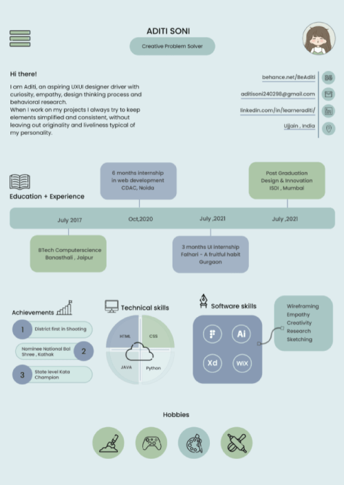
21. Cute Classic Infographic Style Resume
This resume shows the classic style for infographics we see a lot of for the last couple of years with round corner background shapes and small icons in circles. This example capitalizes on that, and also uses a subtle color scheme, lots of white space, and an adorable avatar illustration.
- Designed by: Aditi Soni
- Strengths: Classic Infographic style with round corner rectangular background shapes and lots of simple icons in circles. White space and subtle color scheme.
- Visit Project Page
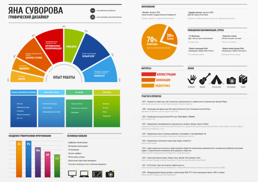
22. Two Page Infographic Resume with Big Charts and Gradients
Spreading the sections into two pages, the designer manages to present big easily-readable infographics with beautiful contrasting gradients.
- Designed by: Aleoo Whiter
- Strengths: Clean design on 2 pages, big readable infographics.
- Visit Project Page
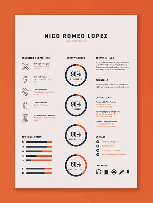
23. Minimalistic Clean Light Font Resume with a Contrasting Color Scheme
Another ideal business resume with clean visuals and great work of fonts and colors.
- Designed by: Nico Romeo Lopez
- Strengths: Clean, great choice of fonts and colors, professional look
- Visit Project Page
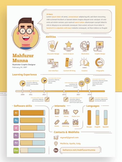
24. Fun and Creative Cartoon Infographic Resume with Custom Illustrations
Colorful cartoon infographic resume with custom illustrations and fun but pleasant colors.
- Designed by: Mahfuzur Munna
- Strengths: Well-organized illustrated sections.
- Visit Project Page
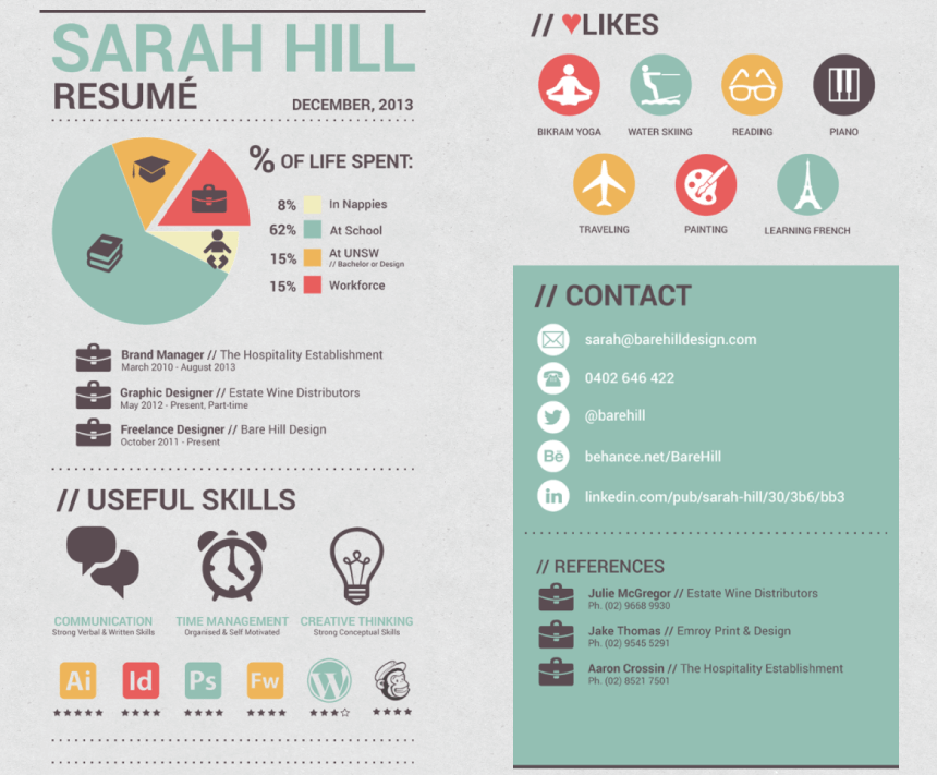
25. Infographic Resume with Icons and Badges
Our next idea from the creative infographic resume examples collection showcases all experience, skills, and likes are presented by icons and badges, while the contact section includes reference contacts.
- Designed by: Sarah Hill
- Strengths: Highly visual, includes reference contacts.
- Visit Project Page
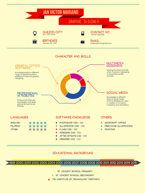
26. Minimal Infographic Resume
The designer sums all skills, languages, knowledge, and other expertise into one comprehensive infographic. They also include educational background timeline infographic, separating institutions by color.
- Designed by: JV Mariano
- Strengths: All skills, languages, knowledge, and other expertise into one comprehensive infographic.
- Visit Project Page
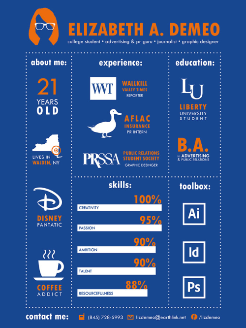
27. Entirely Visual Infographic Resume
Not your typical resume. This one proves that less is more by visualizing everything with minimum text.
- Designed by: Elizabeth McDade
- Strengths: Visualizing everything with minimum text.
- Visit Project Page
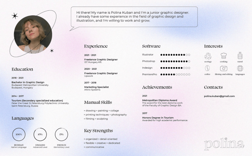
28. Modern Holographic Clean Infographic Resume
This horizontal resume serves as the first page of the designer portfolio and sets the mood for it with beautiful light holo gradients and a great choice of fonts.
- Designed by: Polina Kuban
- Strengths: Trendy, subtle, lots of white space.
- Visit Project Page
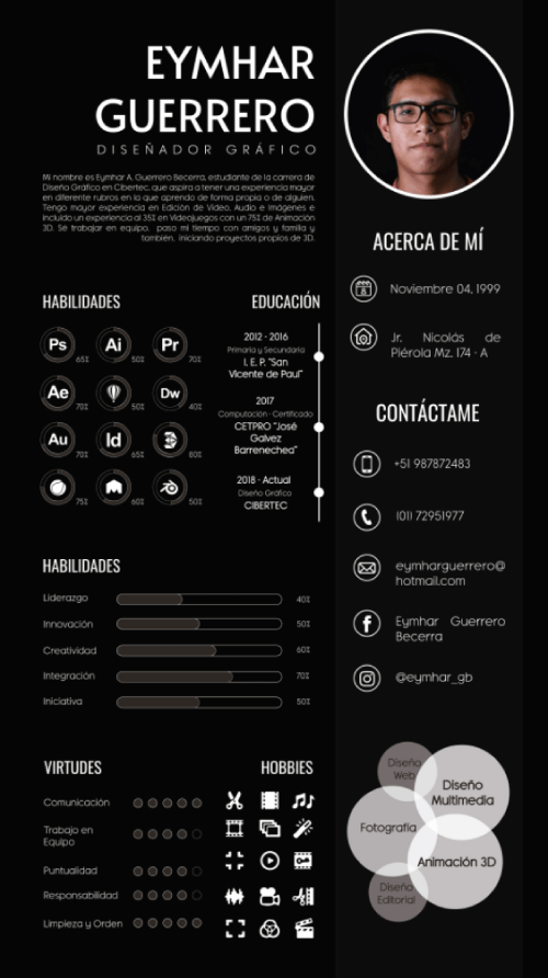
29. Black and White Infographic Resume with Grid Layout
The rule of thirds in action looks great in black and white.
- Designed by: Raty Limache Condori
- Strengths: Grids, layout
- Visit Project Page
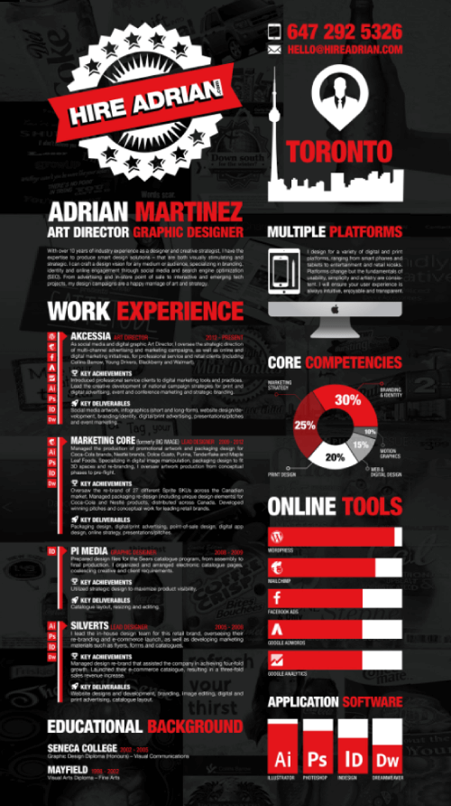
30. More is More with Bold Colors and Background Resume
Our last example in the creative infographic resume examples collection shows something different and much bolder with transparent background images, bold contrasting colors, and a big title “Hire Adrian”.
- Designed by: Adrian Martinez
- Strengths: Balanced by explaining experience in detail in the first column, and ditching text in favor of visuals in the second.
- Visit Project Page
Final Words
In the world of infographic resumes, everything is permitted as long as you make it well-organized and easy to read. Hopefully, this collection of creative infographic resume examples gave you a few interesting approaches to try in order to instantly grab the attention of potential employers and win the job.


