Let’s be real, pricing pages can be tricky. You want to be clear, but not boring. Persuasive, but not pushy. And most importantly, you need to make it easy for potential customers to say, “Yep, this is the right choice!”
I believe that a good pricing page isn’t just about listing numbers. It should guide visitors, remove doubts, and make the decision process a no-brainer. The best ones feel natural, like a friendly nudge rather than a sales pitch.
But what does a high-converting pricing page actually look like? That’s exactly what I’m here to show you. I’ve rounded up 30 amazing pricing page examples that do it right. Along the way, I’ll break down what makes them work so you can steal the best ideas. Without further ado, here is my list of winners.
1. Cisco Webex – Clean and User-Friendly Pricing Page Design

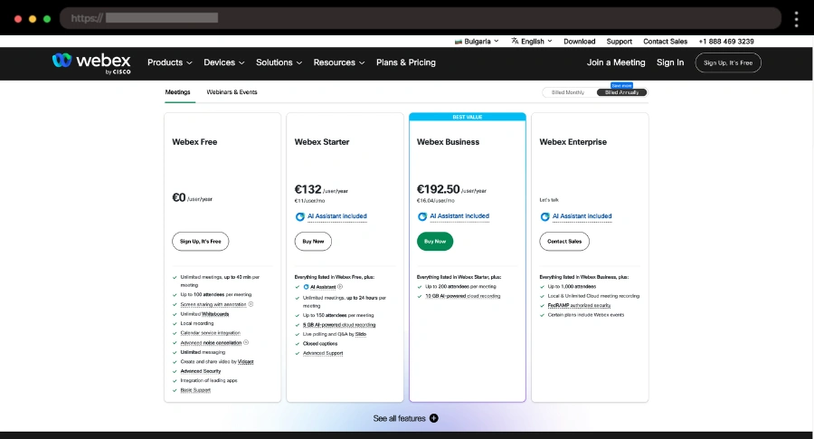
I love how clean and user-friendly Cisco’s pricing page is. It highlights the best deal, keeps everything organized, and even includes an FAQ section to clear up any doubts.
💡 Key Takeaways: Annual/monthly toggle, Best Value tag, Expandable Features, FAQ section
2. Clearscope – Simple Pricing Page with Vibrant CTAs

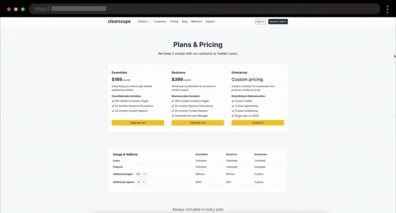
Looking for a pricing page that keeps things simple? Clearscope nails it with their plan names, pricing design, and vibrant yellow Subscribe Now CTAs that instantly grab attention.
💡 Key Takeaways: Simple plan names, Bold pricing, Yellow Subscribe Now CTAs, Social proof, FAQ section
3. Slack – Straightforward Pricing Page Example with Purple Accents

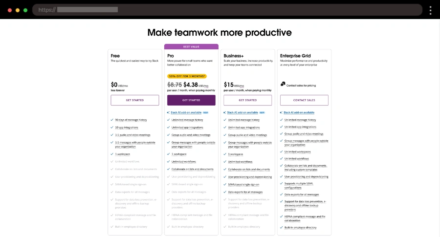
I like how Slack’s pricing page keeps things straightforward. The table layout makes it easy to compare plans, and the “Contact Sales” button for the Enterprise Grid is a smart move to engage high-value leads.
💡 Key Takeaways: Clean table design, Easy feature comparison, “Contact Sales” for Enterprise, Simple user experience
4. Adobe – Tailored Pricing Page for Different Buyer Segments

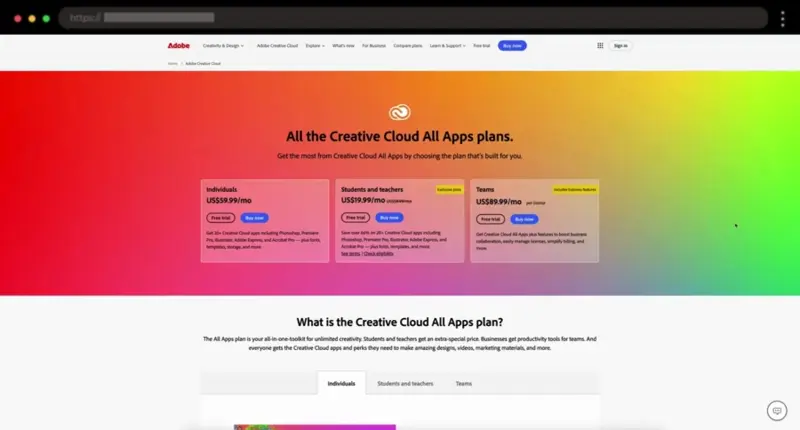
Adobe does an excellent job of tailoring its pricing page for different buyer segments. With clear pricing tiers and a toggle to compare features, it makes choosing the right plan quick and easy.
💡 Key Takeaways: Targeted pricing tiers, Customizable feature toggle, Detailed FAQ, Free trial indication
5. Privy – Interactive and Engaging Pricing Page Design with Calculator

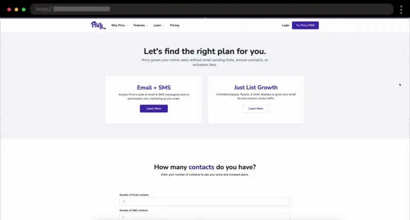
Privy’s pricing page shines with its interactive cost calculator, helping sellers estimate their monthly costs based on email and SMS contacts.
💡 Key Takeaways: Interactive cost calculator, Purposeful simplicity, Thorough FAQ section, Customer reviews slider
6. Wistia – Visually Appealing Pricing Page Example

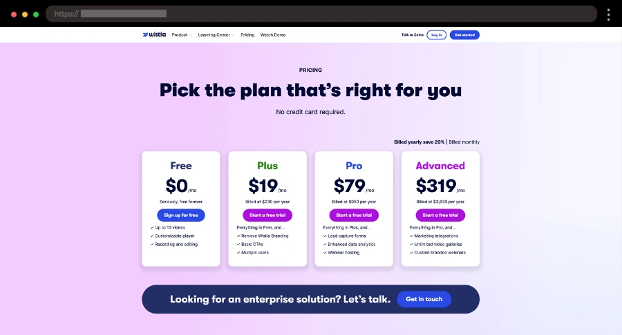
Purple is definitely my color so Wistia’s pricing page stands out to me with its colorful design, making it easy to find the right plan with clear descriptions and a FAQ section.
💡 Key Takeaways: Visually appealing design, Clear plan descriptions, Feature comparison, FAQ section
7. Campaign Monitor – Simple, Interactive Pricing Page Design

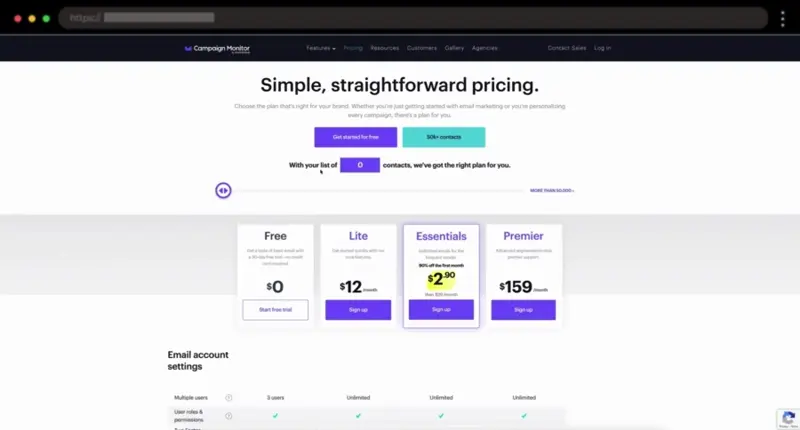
For this example, I like the slider toggle which calculates the price for each plan based on the number of contacts in your list.
💡 Key Takeaways: Simple design, Clear plan features, Hover-over tooltips, Pricing options based on number of contacts, FAQ section
8. Ahrefs – Bold Pricing Page Example with Clear Comparisons

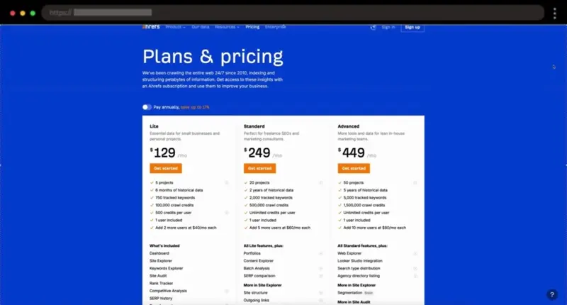
Ahrefs combines a bold blue background with vibrant orange CTAs, making the comprehensive pricing info easy to navigate and choose the best plan.
💡 Key Takeaways: Monthly/annual toggle, Clear plan comparisons, Feature breakdown, Social proof, FAQ section
9. Gusto – Detailed Pricing Page Design

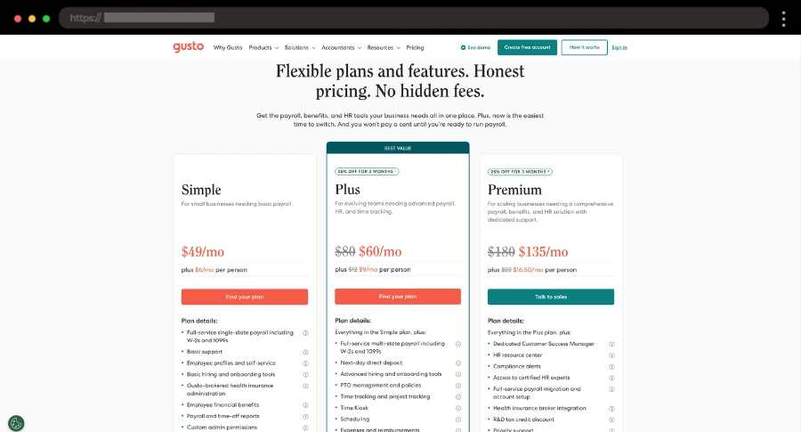
I love how Gusto uses green and orange colors to draw attention, along with a clear “Best Value” tag. Everything is backed by detailed pricing information that makes it easy to choose the right plan.
💡 Key Takeaways: “Best Value” tag, Collapsible features table, FAQ section, Extensive pricing info
10. YNAB – Data-Driven Pricing Page Example

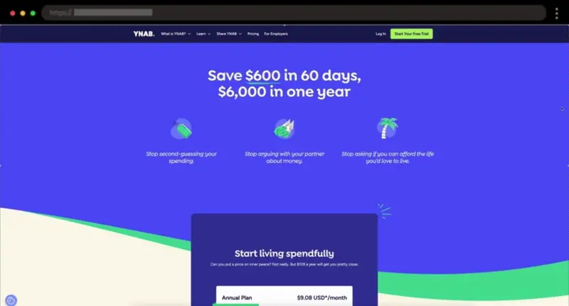
YNAB is one of my favorite budgeting apps! Their pricing page stands out with real customer numbers, which instantly demonstrate the value of their budgeting software and address major pain points for potential customers.
💡 Key Takeaways: Real customer data, Effective testimonials, FAQ section, Highlights user benefits
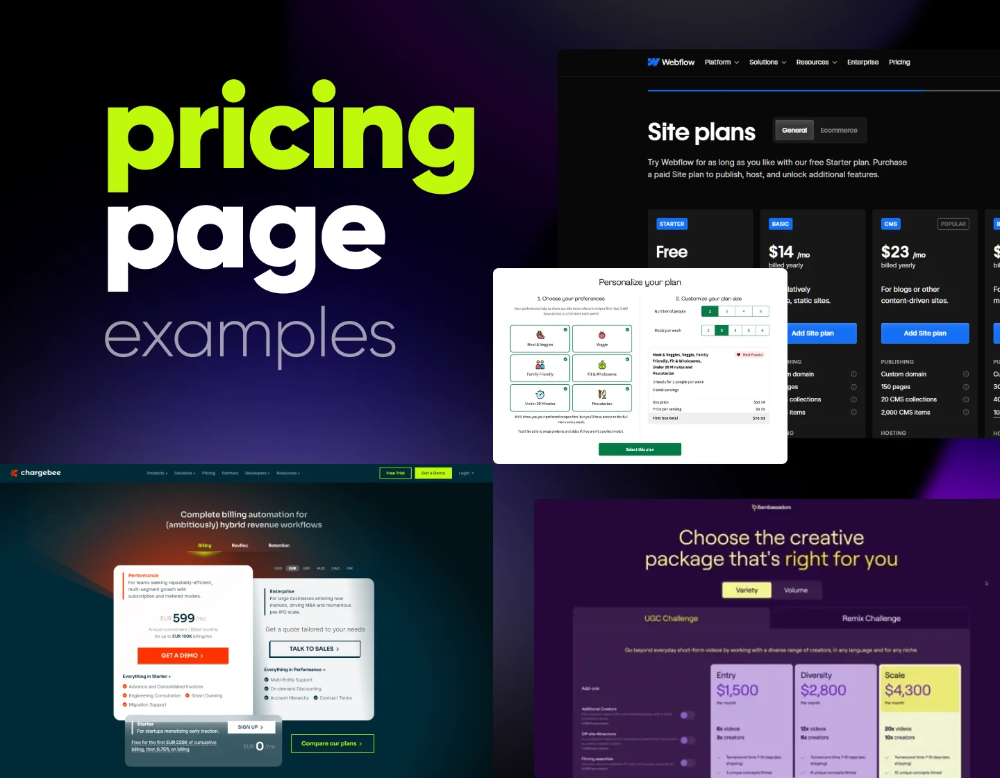
11. ChargeBee – Multi-Currency Friendly Pricing Page Design
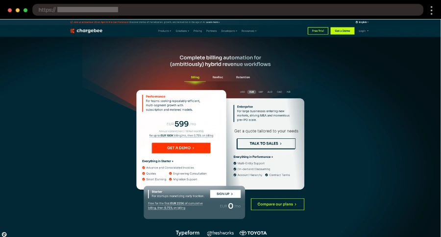
ChargeBee’s pricing page uses differently sized boxes to highlight the paid performance plan, with clear summaries and currency options, which I think is a great idea.
💡 Key Takeaways: Differently sized boxes, Clear plan summaries, 6 currency options, “Compare Plans” pop-up, Social proof, FAQ section
12. HelloFresh – Interactive Pricing Page Example for Meal Plans

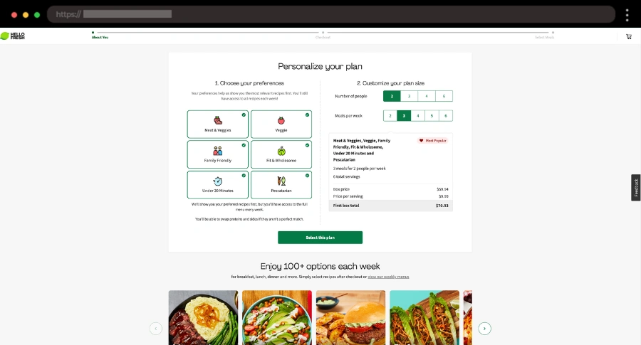
I love how HelloFresh makes pricing feel effortless with its interactive selector—just choose your meals, servings, and frequency, and the price updates instantly!
💡 Key Takeaways: Interactive meal selector, Dynamic pricing, Mouthwatering meal photos, FAQ section
13. Spotify – Customized Music Plan Pricing Page Design

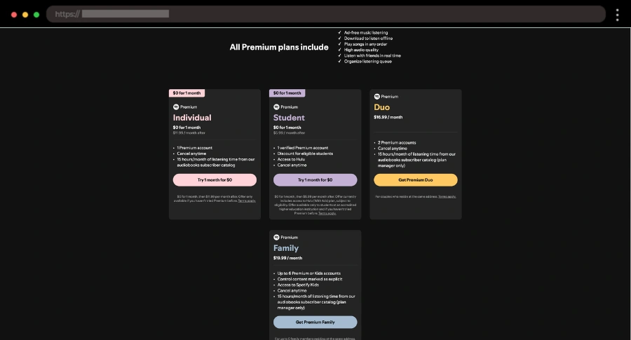
Spotify’s pricing page feels like a playlist—each plan is crafted for different listening needs, making it easy to find the perfect fit.
💡 Key Takeaways: Simple tiered plans, Clear user benefits, Familiar and engaging layout
14. Webflow – Colorful Pricing Page Design with Clear Guidance

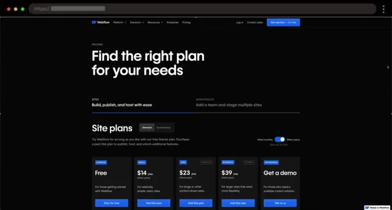
I really like how Webflow grabs attention with bold colors, a smart pricing toggle, and a clear “Most Popular” tag that helps guide choices.
💡 Key Takeaways: Bold visuals, Monthly/annual toggle, “Most Popular” tag, Expandable feature details
15. Squarespace – Clean Pricing Page Example

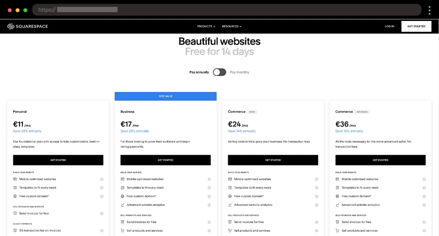
Squarespace keeps things clean and simple, with an easy-to-scan pricing grid, a savings highlight for annual plans, and an FAQ section for any extra details.
💡 Key Takeaways: Minimalist design, Monthly/annual toggle, Cost savings highlight, FAQ section
16. HubSpot – Interactive Pricing Page Design

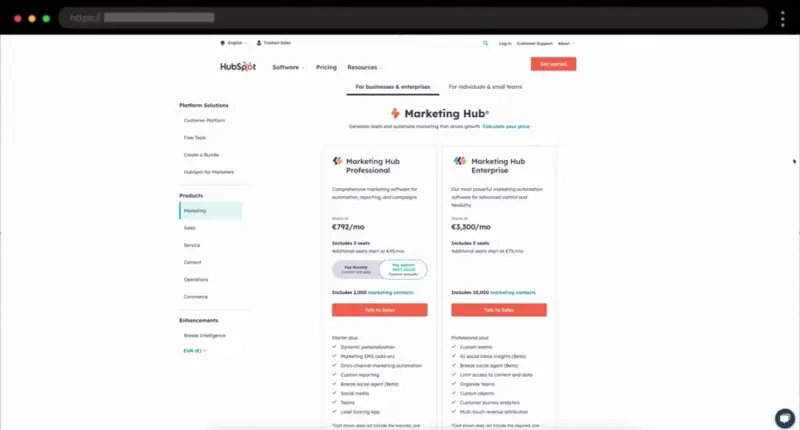
I am a fan of how HubSpot simplifies complex pricing with a clean structure, interactive toggles, and smart CTAs that guide users based on their needs.
💡 Key Takeaways: Intuitive navigation, Interactive pricing toggles, Well-placed CTAs, Extensive FAQ section
17. Asana – Minimalist Pricing Page Example with a Focus on User Needs

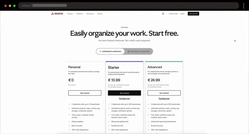
Asana’s pricing page feels as organized as its platform, with a clean-tiered layout, a toggle for different user types, and trust badges for credibility.
💡 Key Takeaways: Minimalist design, Tiered pricing table, User-type toggle, Trust badges, FAQ section
https://asana.com/pricing” data-rel=”nofollow” data-target=”_blank”18. Don’t Board Me – Bright Pricing Page Design

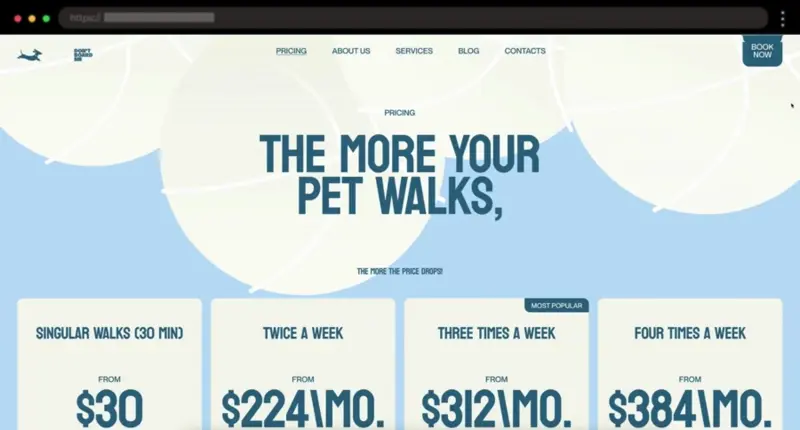
Bright, bold, and easy to scan – this pricing page makes a statement with large fonts and a colorful design. The “Try it” CTAs and “Most Popular” tag guide users toward the best plan effortlessly.
💡 Key Takeaways: Four pricing plans, “Most Popular” tag, Try it CTAs, Additions table, Vibrant design
19. Clay – Modern Pricing Page Example with Orange Accent

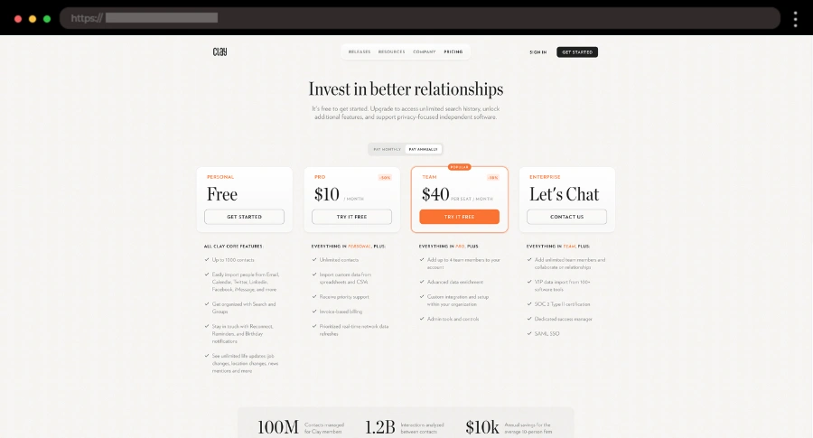
I like how sleek and modern Clay’s pricing page is, with a well-structured layout, that orange accent color, and an inviting free trial option to get users started.
💡 Key Takeaways: Clean design, Monthly/annual toggle, Free trial, Easy plan comparison, FAQ section
20. Repeat – Eye-Catching Pricing Page Design with Engaging CTAs

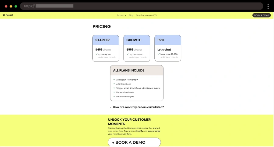
You can’t miss that big “Book a Demo” CTA and the bright, playful colors keeping things simple and eye-catching in this pricing page example.
💡 Key Takeaways: Eye-grabbing “Book a Demo” CTA, Bright colors, Clean and simple design
21. Rawlab – Minimalist Pricing Page Example with Simple Tabs

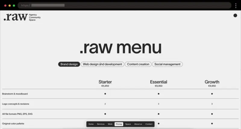
I’m a fan of minimal design, and Rawlab nails it with its black-and-gray look. Choosing the right plan is a no-brainer thanks to the big bold fonts and the comparison table with simple tabs between services.
💡 Key Takeaways: Simple design, Bold fonts, Easy comparison, Services tabs
22. Linktree – Vibrant Pricing Page Design with Easy-to-Scan Plans

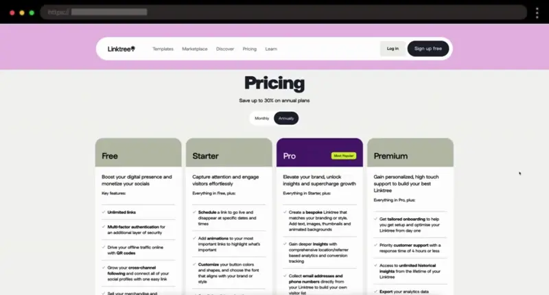
Linktree keeps things visually engaging with a playful, on-brand design. It is easy to scan the pricing cards and the clear “Free Forever” plan sounds inviting for new users.
💡 Key Takeaways: Vibrant design, Slider with clients, Easy-to-scan pricing cards, Clear CTAs, Extensive comparison table and FAQ section
23. RPC Fast – Colorful Pricing Page Example with Brand Logos

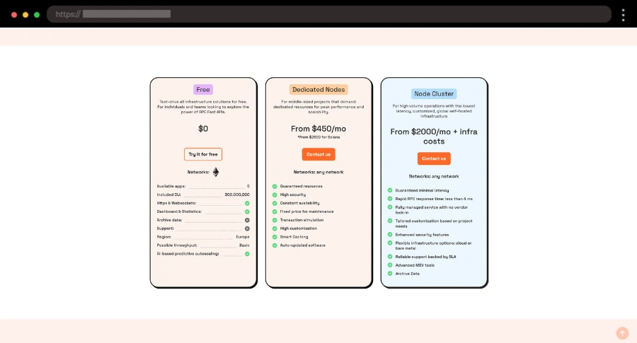
I’m a fan of how this company combines vibrant colors with clear pricing plans, brand logos, and a downloadable case study to make everything informative and well-presented.
💡 Key Takeaways: Bright colors, Clear pricing plans, Brand logos, Case study with PDF
24. HeyOrca – Simple Pricing Page Design for Social Media Management

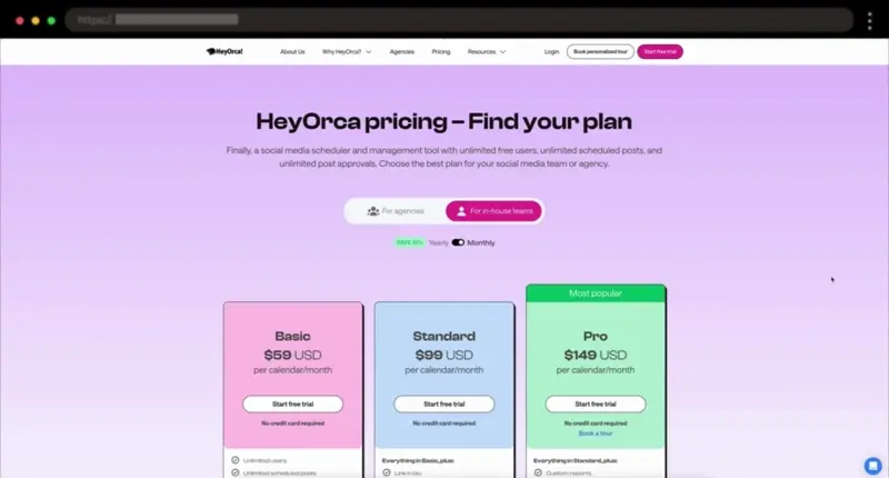
Colors are my thing and this social media management tool pricing page immediately caught my attention. It’s easy on the eyes with pastel pink, blue, and green, and makes comparing plans simple with toggles for agencies and in-house teams.
💡 Key Takeaways: Vibrant design, Extensive comparison table, Client testimonials, 2 toggles (agencies/in-house, monthly/yearly)
25. Artboard Studio – Elegant Pricing Page Example with Modern Features

Artboard Studio’s pricing page impresses ме with its beautiful green tones and modern layout, highlighting its plans and all the awesome features each includes.
💡 Key Takeaways: Monthly/Annually toggle, Ticker with brand logos, FAQ section, Highlighted Professional Plan
26. Bambassadors – Bright Pricing Page Design with Clear Plan Options

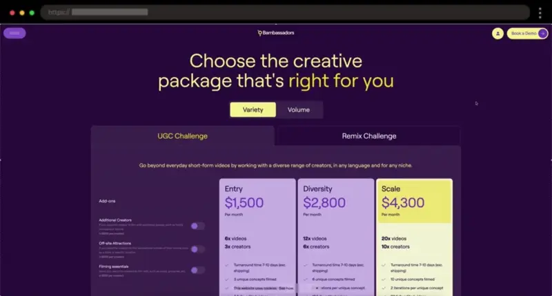
Purple and yellow is such a cool combo, don’t you think? In this example, the toggles give users control, and the highlighted yellow plan really stands out.
💡 Key Takeaways: Well-positioned CTAs, Highlighted plan, Client testimonials, FAQ section
27. Formcarry – Playful Pricing Page Example with Personality

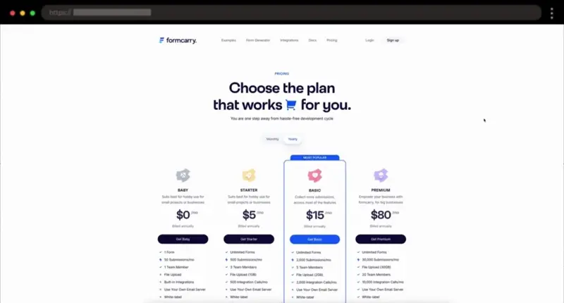
I love the 3D woman character on this page – it adds such a fun personality! Along with playful icons for each plan, the “Most Popular” tag, and blue color highlights, it all creates a fun, approachable vibe.
💡 Key Takeaways: Playful 3D character, “Most Popular” tag, FAQ section
28. Designmodo Postcards – Fun Pricing Page Design with a Popup Feature

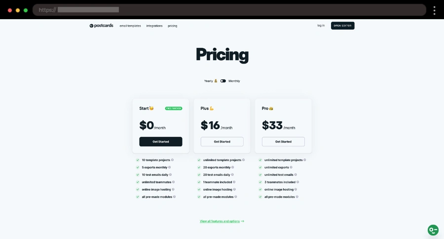
The design in this example is clean, with fun emojis and “Free Forever” tag included. I think that the Pricing Details popup and client testimonials slider are a cool additional touch.
💡 Key Takeaways: Emojis, “Free Forever” tag, Pricing Details popup, Monthly/Annually toggle, Slider with client testimonials, Extensive FAQ section,
29. Kalium – Well-Organized Pricing Page Example with Highlights

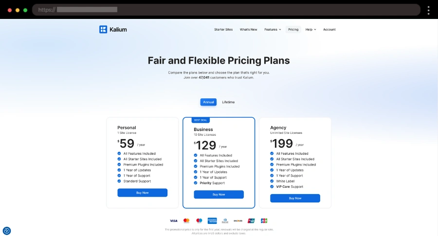
I like the simplicity and the well-organized layout of this page, with clear pricing options, blue highlights, and all the important info right where you need it.
💡 Key Takeaways: Blue highlights, “Best Deal” tag, Annual/Lifetime buttons, Testimonials, FAQ section,
30. FlutterFlow – Stunning Dark Pricing Page Design

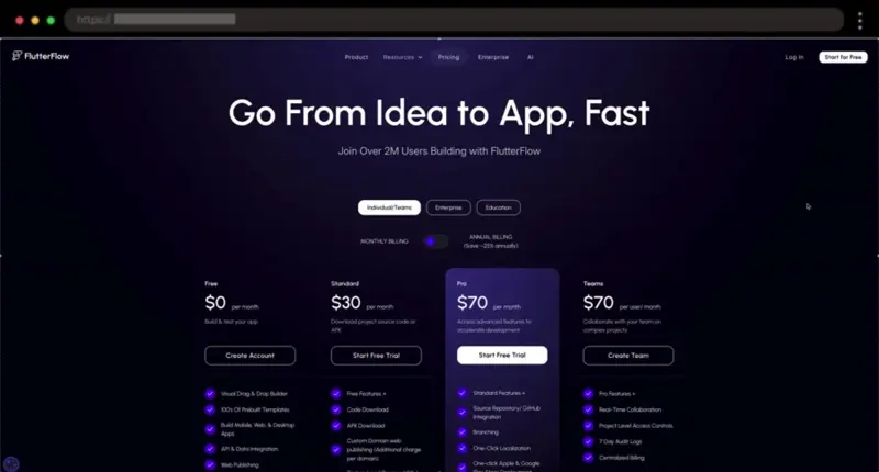
Last but not least, we have a stunning dark design with blue accents that makes this page really stand out while keeping things clean and clutter-free.
💡 Key Takeaways: Highlighted plan, Monthly/Annually toggle, Comparison table, Logo ticker
What Features Make a Pricing Page Stand Out
So, what do all these examples have in common? Let me break it down for you! These pricing pages stand out because they offer clear, user-friendly design with features that make it easy for customers to find exactly what they need. Here’s what I think makes them shine:
- 💡 Simple, Clear Plans: Make it easy for visitors to understand what they get with each plan. Don’t overcomplicate things.
- 🔝 Highlight What Matters: Draw attention to the most popular or best-value plan so users know what to go for.
- 👉 Catchy CTA Buttons: Make your buttons impossible to miss. Think “Get Started”, “Try for Free” or “Book a Demo”.
- 🔄 Payment Toggle: Let users easily switch between monthly/annual or another type of pricing that suits your business to see how much they can save.
- 🗣️ Customer Love: Share some glowing testimonials or reviews to show you’ve got happy customers backing you up.
- ❓ FAQ Section: Answer common questions upfront so visitors don’t have to go searching for info.
And if you need help along the way, our friends at htmlBurger can handle all of this. Get a free quote→
Wrap-up Time
At the end of the day, a great pricing page shouldn’t just list prices – it’s about guiding potential customers through the decision-making process with clarity, ease, and a bit of personality. From what I’ve seen, focusing on simplicity, helpful comparisons, and clear calls to action is the way to go. These examples make it easy for users to understand what they’re getting and why it’s worth it. So, choose some of these awesome examples and create a pricing page that not only looks great but also converts like a pro!
Next steps:
-
Explore these 25 Testimonial Page Examples, or
-
Jump right into our complete WordPress Website Examples Hub.