

A restaurant’s mobile website is often the first impression of your brand, and it needs to grab the visitor’s attention right away. Whether you’re a cozy brunch spot or a fine dining establishment, your mobile-optimized site needs to captivate visitors, showcase your unique personality, and provide a seamless user experience.
To inspire your next design, we’ve rounded up 24 of the best restaurant website designs and their mobile versions. You will notice that some use playful and vibrant layouts while others rely on sleek and sophisticated designs. Yet, all of these examples show how aesthetics and functionality can come together to leave a lasting impression. Without further ado, let’s continue with the winners list.
1. Nobu – High-End Restaurant Group Mobile Website Design

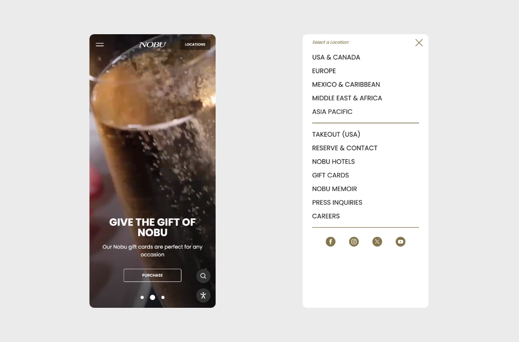
Nobu is renowned for its upscale dining experience and exquisite Japanese-Peruvian fusion cuisine. Their mobile website mirrors this luxurious atmosphere with a sleek, minimalist design. The site features high-quality images of their sophisticated dishes and visually striking locations. We love the video slider in the hero section, especially the one featuring Robert De Niro.
💟 What we like:
- Clean, luxury design.
- High-resolution visuals of the food and locations.
- Interactive video slider in the hero.
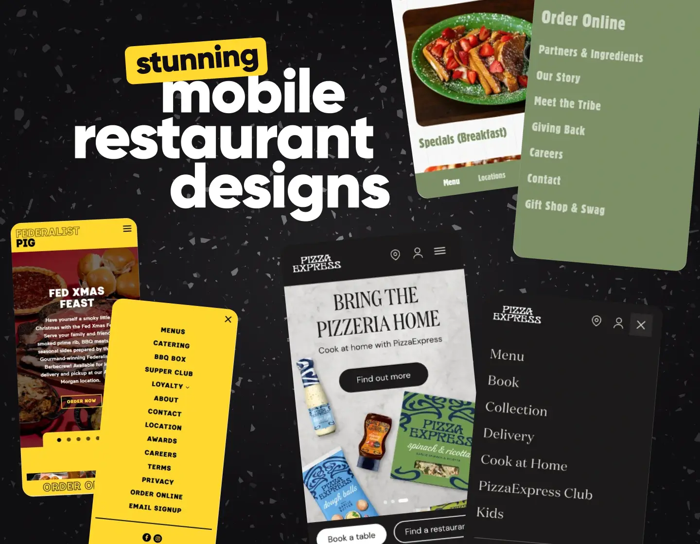
2. PizzaExpress – Fun Mobile Website for a Casual Pizza Chain

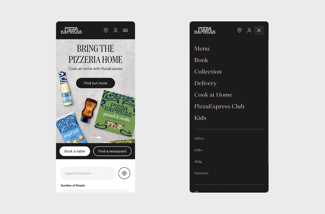
If you crave a fresh, handmade pizza and a laid-back dining experience, PizzaExpress is the place to go. Their mobile website reflects this fun, approachable vibe with cool hand-drawn visuals and an interactive design. Easy-to-use features, such as menu browsing and online ordering, are available for a smooth, engaging experience for their visitors.
💟 What we like:
- All dishes have added images, ingredients, calories, and other important info.
- Interactive features e.g. “Filter by Diet”.
- Quick access to menu, locations, and online ordering.
3. The Fat Duck – Artistic Mobile Website Design for a Michelin-Starred Restaurant

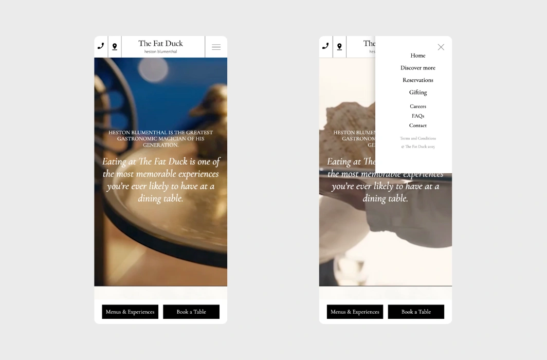
The Fat Duck is a three-Michelin-starred restaurant that offers a one-of-a-kind dining experience. You can sense the same artistry from their mobile website. The used fonts are visually appealing and we love the featured hand-drawn illustrations and intricate details. Visitors can use the tool for reservations and browse the innovative menu with ease.
💟 What we like:
- Immersive design matching the overall vibe.
- Beautiful images and videos throughout the page.
- Sticky bottom bar for reservations and menu.
← Back to WordPress Website Examples Hub
4. Tucker’s – Welcoming Mobile Website for a Comfort Food Chain

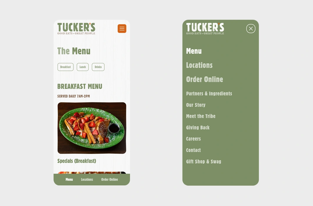
Tucker’s mobile website reflects the cozy vibe of the casual dining and classic American comfort food the restaurant has to offer. Warm color tones, inviting images, and a straightforward layout make it easy for website visitors to find menus, hours, and locations. It’s a perfect match for the restaurant’s friendly, down-to-earth style.
💟 What we like:
- Homey color palette of green and orange.
- Convenient ordering system with an online menu.
- Appetizing food photos.
5. Alinea – Modern Fine Dining Restaurant Mobile Website Design
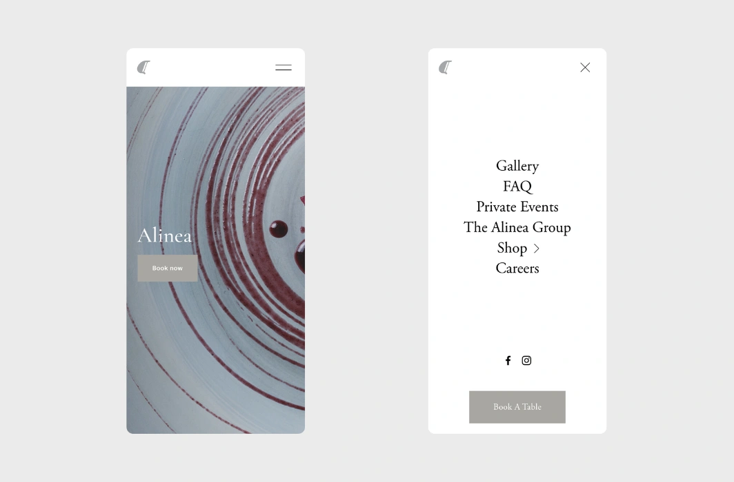
For the fans of fine dining, you will appreciate Alinea, which is an award-winning restaurant. Featuring a bold, contemporary design, the site combines stunning visuals with smooth, interactive elements and matches the restaurant’s innovative spirit. You can host your private event and even purchase items from the online shop.
💟 What we like:
- Contemporary design with an artistic edge.
- Gallery full of gorgeous images.
- Booking tool.
6. Turtle Bay – Colorful Mobile Website Design for a Caribbean Chain

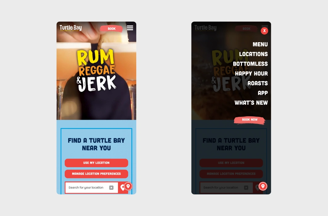
Turtle Bay brings the vibrant flavors of the Caribbean to its guests. The mobile design is full of color, warmth, and energy, perfectly capturing the restaurant’s fun and inviting atmosphere. With clear navigation and easy access to their menu, locations, and online ordering system, it’s a seamless experience for users.
💟 What we like:
- Bold, colorful design with lots of CTAs.
- Easy-to-use booking system and option to purchase gift cards.
- Restaurant location finder.
7. High St. Deli – Retro-Chic Mobile Website Design for a Classic Deli

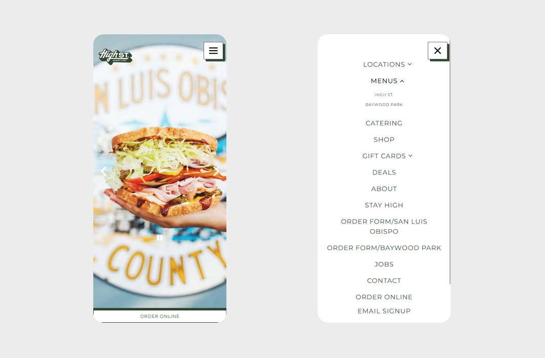
High St. Deli puts a nostalgic spin on deli favorites, and their retro-inspired mobile website captures that old-school charm. Vintage fonts, playful icons, and nostalgic design elements set the tone, while the site’s modern functionality ensures smooth navigation. The easy-to-use layout includes direct links to their menu, online ordering, and even a gift card purchasing option.
💟 What we like:
- Retro fonts and design elements.
- Prominent call-to-action buttons.
- Fun, playful icons.
8. Le Bernardin – Sophisticated Mobile Website Design for a Michelin-Starred Restaurant

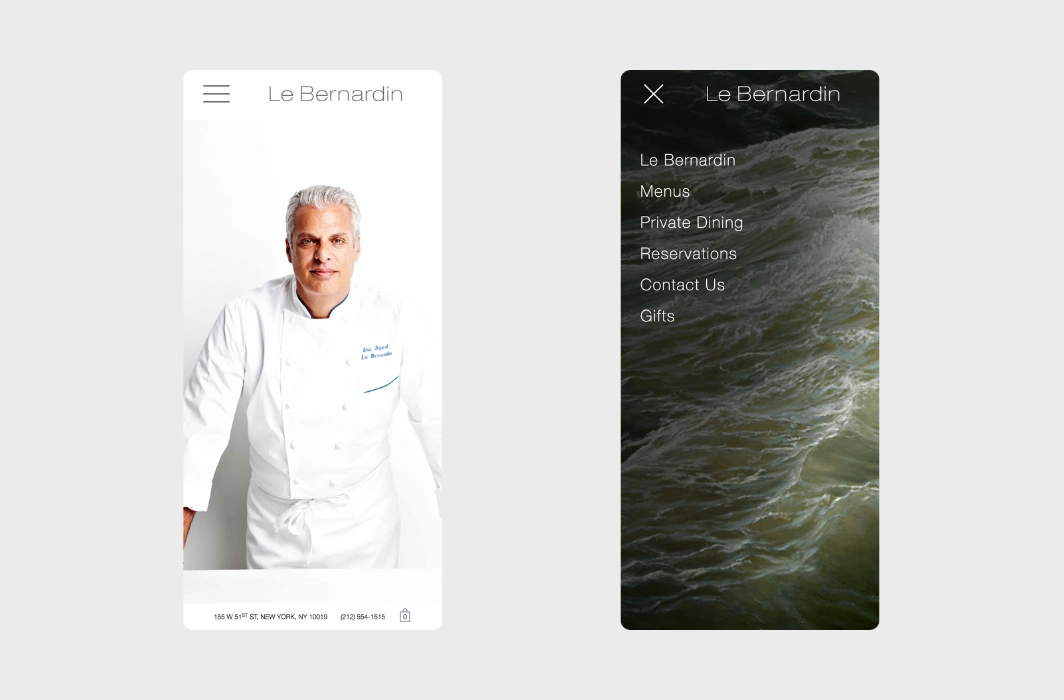
Le Bernardin’s reputation for fine seafood is mirrored in their elegant mobile website. The design is sleek and minimal, focusing on the presentation of their exquisite dishes and the luxurious dining experience. With smooth navigation and an intuitive layout, the mobile version of the website reflects the same sophistication and attention to detail that you’d expect from a Michelin-starred restaurant.
💟 What we like:
- Simple, elegant design.
- High-quality images of exquisite dishes.
- Mobile-friendly layout.
9. Nando’s – Fast Casual Restaurant Chain Mobile Website Design

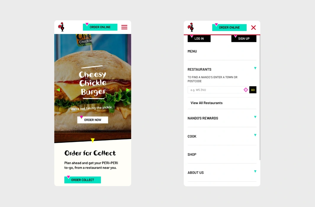
Nando’s has built a loyal following with its signature peri-peri chicken and cheeky energy. Featuring vibrant colors and playful elements, the mobile website design perfectly reflects the restaurant’s fun personality. It’s packed with interactive features, from menu browsing to easy online ordering. We love the fun fonts, small illustrations, and colorful CTAs found throughout the homepage.
💟 What we like:
- Playful lively design.
- Easy-to-use online ordering system.
- Vibrant color palette for an added character.
10. Federalist Pig – Vibrant Barbecue Restaurant Mobile Website Design

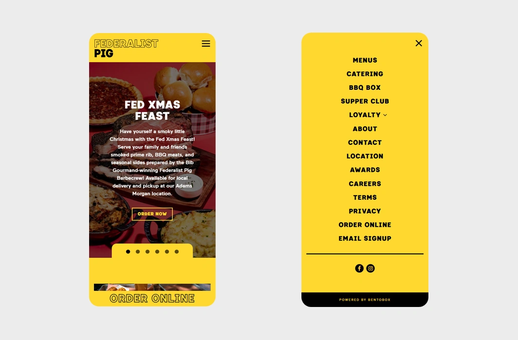
Federalist Pig takes barbecue to the next level with its smoky, flavor-packed menu, and its mobile website matches this bold personality. Featuring edgy typography and vibrant visuals, the design feels both fun and energetic, embodying the restaurant’s lively spirit. Their mobile site is practical too, offering quick links to online ordering, catering services, loyalty programs, and BBQ boxes – all just a tap away.
💟 What we like:
- A simple online ordering experience.
- Bold black-and-yellow theme.
- Well-organized menu.
11. Mugaritz – Minimalist Mobile Website Design for a Spanish World-Renowned Restaurant

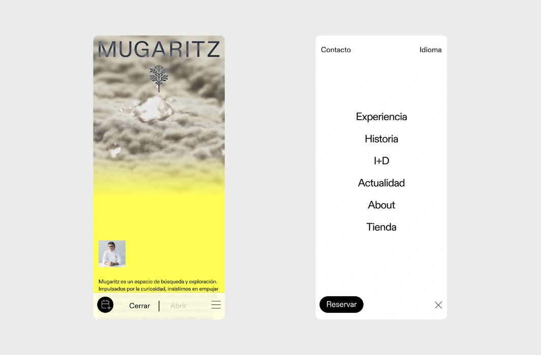
Mugaritz, known for its experimental approach to cuisine, brings that same spirit of innovation to its mobile website. The design is minimal yet striking, using subtle animations and large, high-quality images to showcase the artistry of their food. The slider on the homepage showing two different versions of the page is a unique and interesting feature.
💟 What we like:
- Sleek, minimalist design with added colors.
- Subtle animations without overwhelming.
- Stunning visuals that showcase the innovative cuisine.
12. YO! Sushi – Japanese-Inspired Restaurant Mobile Website Example

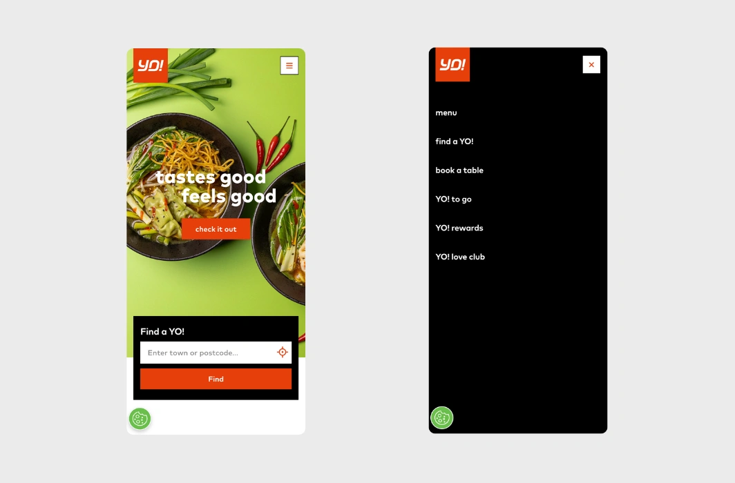
YO! Sushi’s mobile website brings the dynamic energy of their fast-casual sushi chain to life with a playful, colorful design. The site’s interactive elements, like the restaurant locator, visual menu, and easy-to-use ordering system, create a top-notch user experience. With bright colors and vibrant images, it mirrors the fun and modern vibe of their restaurants.
💟 What we like:
- Bright, playful design.
- Interactive menu with great food visuals.
- Online ordering and store locator features.
← Back to WordPress Website Examples Hub
13. Cervejaria Caxarias – Sleek Portuguese Restaurant Mobile Website


Cervejaria Caxarias offers authentic Portuguese cuisine in a cozy vibrant setting. Their mobile website blends modern sophistication with a local touch, featuring engaging animations and a timeless black-and-beige color palette. The design is visually appealing and user-friendly, just like the restaurant vibe.
💟 What we like:
- Lots of stunning restaurant and food images.
- Stylish website layout.
- Language toggle option for Portuguese and English.
14. Pujol – Immersive Mobile Website Design for a World-Class Mexican Restaurant

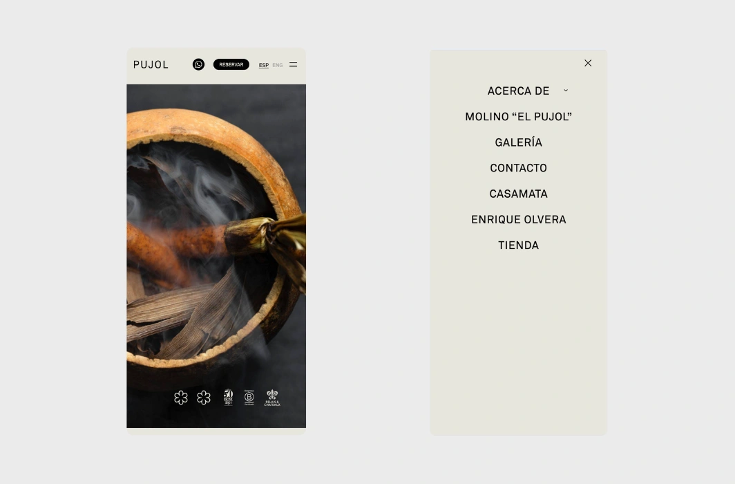
Pujol, one of the best fine-dining experiences in Mexico City, brings its innovative cuisine and artistic flair to its mobile website. The design is elegant, combining high-quality visuals with smooth animations. It’s a perfect reflection of the creativity and passion that defines Pujol’s cuisine.
💟 What we like:
- Artistic design with a classy color scheme.
- Simple subtle animations.
- Language options for Spanish and English.
15. Restaurante Normal en Girona – Minimalist Mobile Design for a Fancy Restaurant

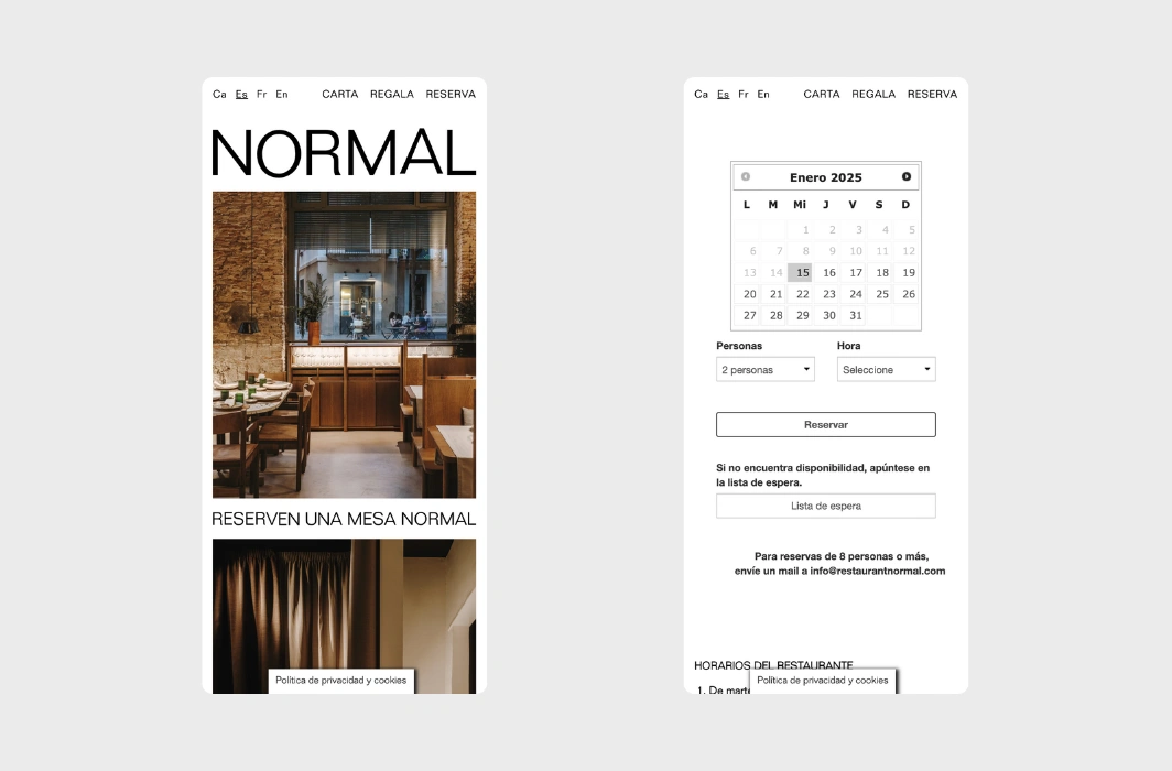
Normal’s minimalist approach to both food and design is perfectly reflected in their mobile website. The clean layout and typography, along with large images allow the food to take center stage. It’s a subtle, sophisticated experience that matches the restaurant’s forward-thinking culinary philosophy.
💟 What we like:
- Elegant, minimalist design.
- Instagram feed with high-quality images.
- 4 website languages available – English, Spanish, French, and Catalan.
16. Galvin – Sophisticated Mobile Website for a British Restaurant Group

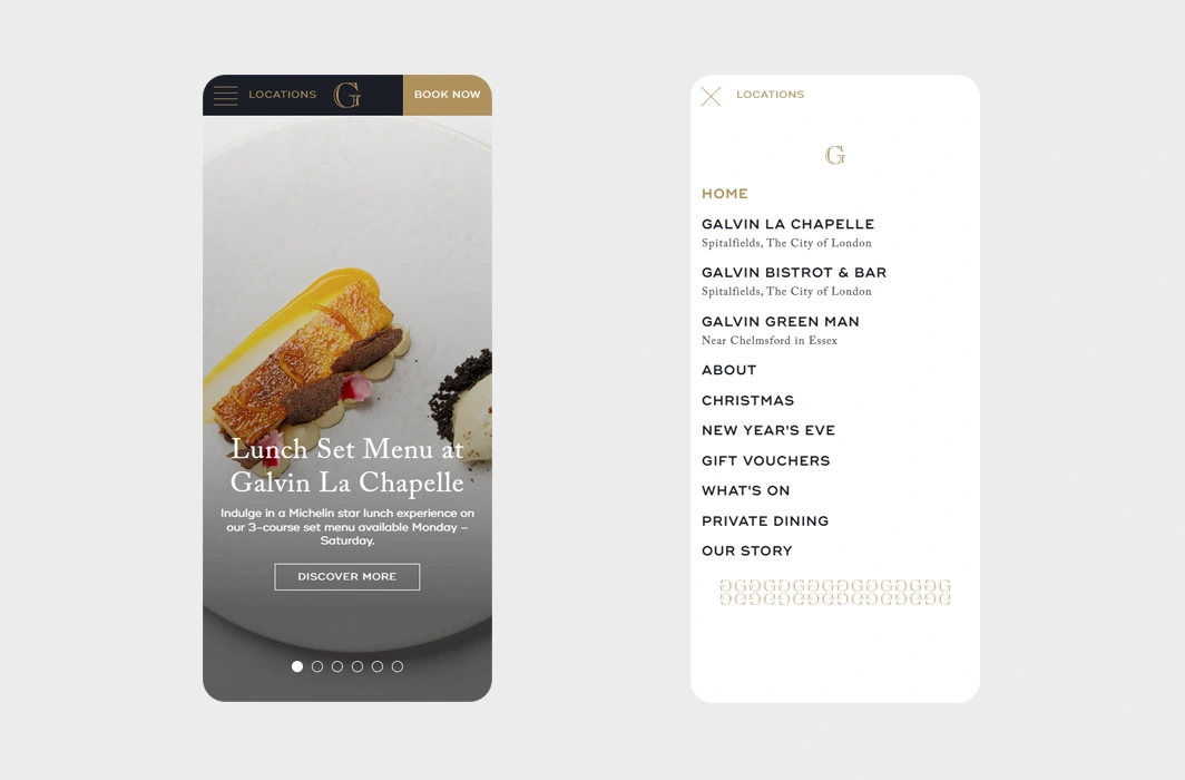
Galvin Restaurants, a celebrated British restaurant group, blends tradition and modernity in their cuisine – and their mobile website mirrors this perfectly. The design conveys sophistication with elegant fonts, rich images, and intuitive navigation. With just a few clicks, guests can easily browse the menu, locate a branch, or book a table.
💟 What we like:
- Luxurious design.
- Stunning images of the food and restaurant’s rich interiors.
- Prominent CTAs for reservations and locations.
← Back to WordPress Website Examples Hub
17. Shake Shack – User-Friendly Modern Burger Chain

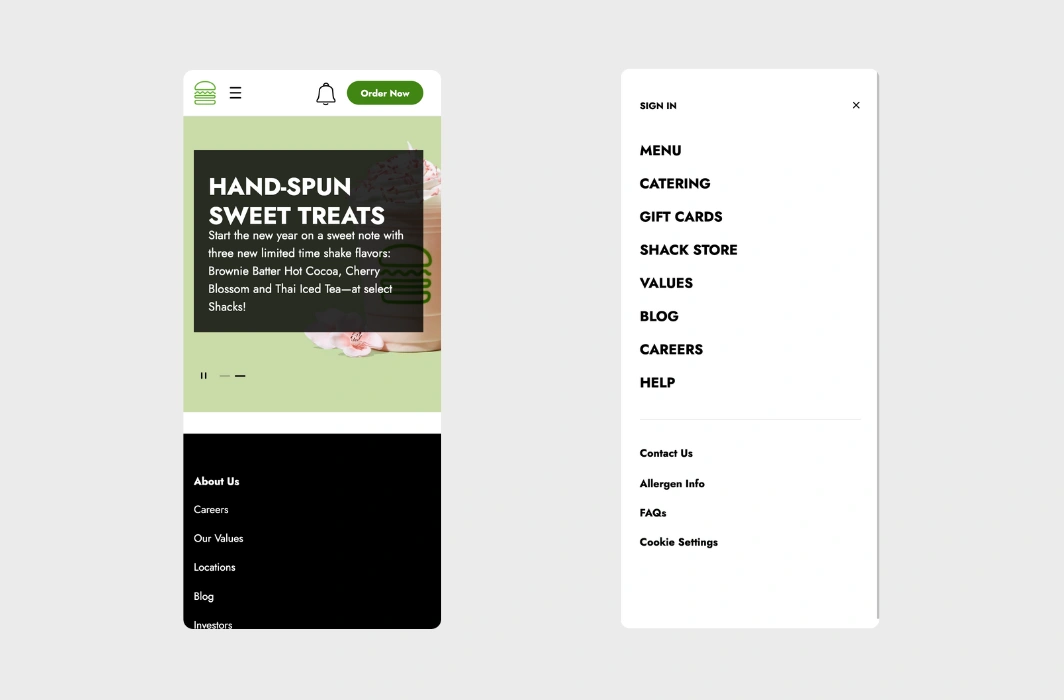
Shake Shack’s mobile website is as fun and approachable as their food. The design is clean and modern, with vibrant visuals and playful elements. It captures the brand’s casual and energetic spirit, while also making it simple for visitors to find what they need – whether it’s the menu, locations, or online ordering.
💟 What we like:
- Fun and playful design.
- Vibrant images of their signature burgers and shakes.
- User-friendly features like online ordering and promotions.
18. Francie – Elegant Fine Dining Mobile Website Example

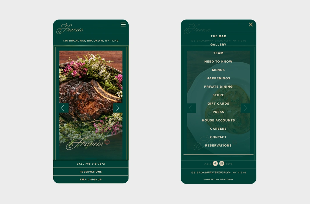
Next on our list is Francie’s, which is a refined fine dining destination in Brooklyn. Their mobile website design expresses sophistication and elegance with clean lines, soft animations, and beautifully-chosen greenish tones. The layout allows for a spacious presentation, putting their exquisite food photography front and center while keeping things simple and classy.
💟 What we like:
- Elegant typography and a subtle color scheme.
- Smooth animations.
- Sticky bottom bar.
19. Hakkasan – Fancy Chinese Website Mobile Version

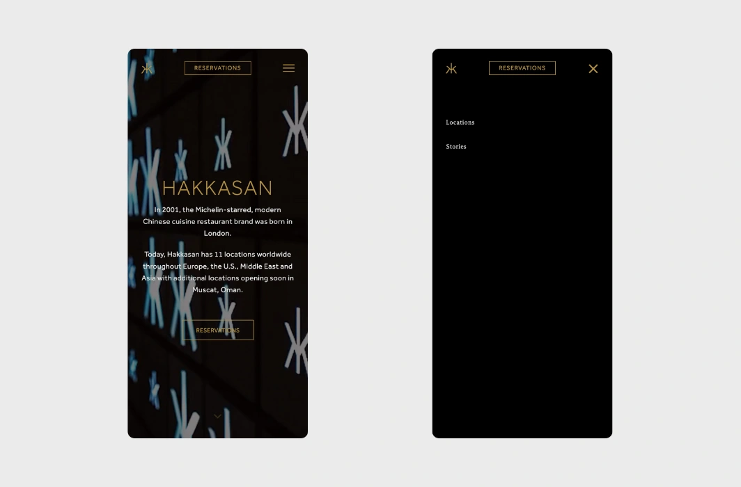
Hakkasan’s mobile website is as refined as its Michelin-starred dining experience. The design is sleek and modern, with a focus on luxury and elegance. High-quality visuals of their exquisite dishes are paired with easy navigation, making it effortless for visitors to access information like menus and reservations while enjoying the stunning aesthetics.
💟 What we like:
- Sophisticated luxurious design.
- High-resolution images of their dishes and interiors.
- Black-and-gold color theme.
20. Wagamama – Vibrant Design for an Asian-Inspired Restaurant

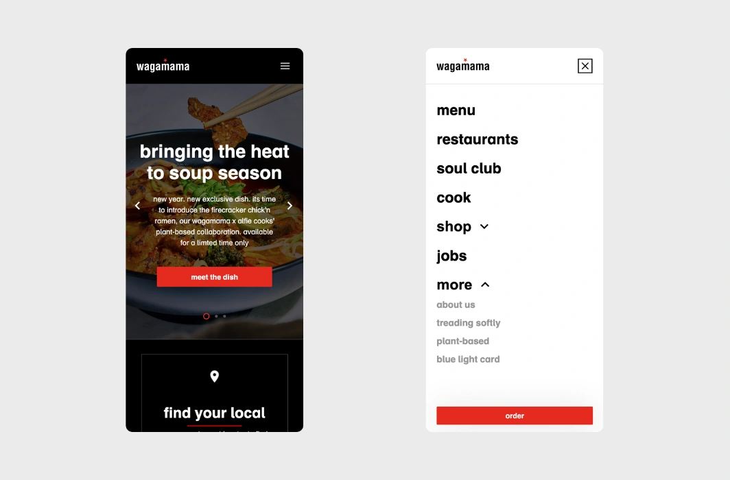
If you’re a fan of Asian food, Wagamama could easily become your favorite spot. Its mobile website is vibrant and engaging, reflecting the restaurant’s fun, energetic personality. The design is colorful and dynamic, with an interactive menu and easy access to online ordering. Whether browsing for menu items, exploring their locations, or checking out special offers, the website experience won’t let you down, for sure.
💟 What we like:
- Bright, vibrant design with black-and-red color scheme.
- Interactive features like the easy-to-use menu and order system.
- Fun, modern visuals of the dishes.
21. Osteria Francescana – Elegant Three-Star Michelin Restaurant Mobile Example

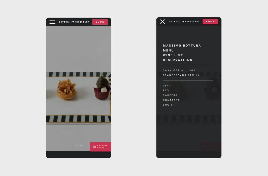
Osteria Francescana, one of the world’s best and popular restaurants, keeps it simple and stylish with a clean mobile design that focuses on big, great-looking images of their dishes. The text is easy to read, and the layout is spacious, so you can easily scroll through the menu, book a table, or check out more details with ease. Smooth animations give it a modern touch, keeping the sophistication of the place.
💟 What we like:
- Large gorgeous images.
- Great use of colors.
- Quick access to the menu, reservations, and contact details.
22. In-N-Out – Fast-Food Chain with User-Friendly Mobile Design

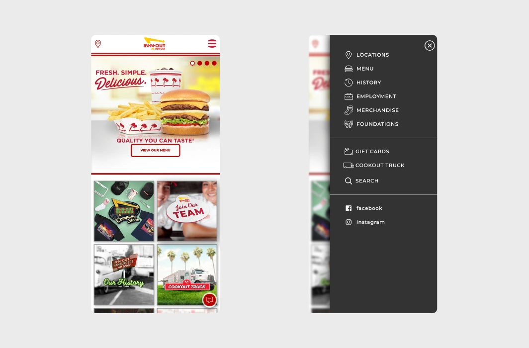
In-N-Out is known for its no-frills, delicious burgers, and their mobile website follows suit with a simple, straightforward design and layout. It is easy to find the menu, locations, and other important details with the integrated search functionality. The focus is on providing a smooth, hassle-free experience for visitors while maintaining the brand’s approachable personality.
💟 What we like:
- Cool hero slider with links to different parts of the website.
- The menu button is in the shape of a burger.
- History page with a timeline of the main chain events.
23. Sunday in Brooklyn – Artistic Mobile Website Design for a Brunch Haven

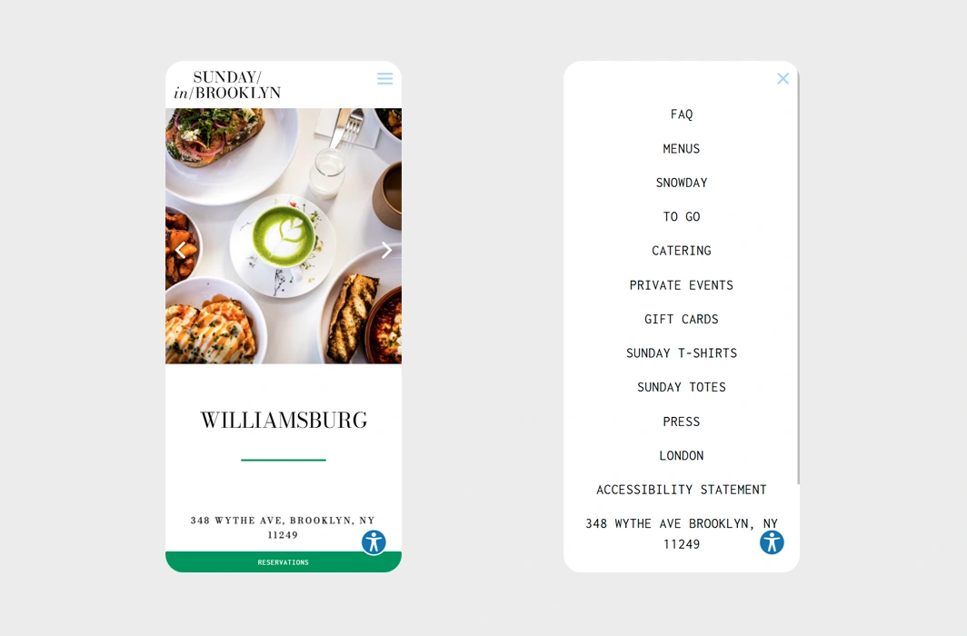
Sunday in Brooklyn is a brunch hotspot with a laid-back vibe. Their mobile website reflects this spirit with a playful, artistic design and bold use of colors. Users can quickly find menus, make reservations, or access contact details. The use of fun illustrations, e.g. for the social media icons, adds a touch of creativity and personality.
💟 What we like:
- Easy access to reservations, location, and contact details.
- Hand-drawn illustrations.
- Vibrant color scheme.
24. Vapiano – Modern and Colorful Austrian Restaurant Chain Mobile Example

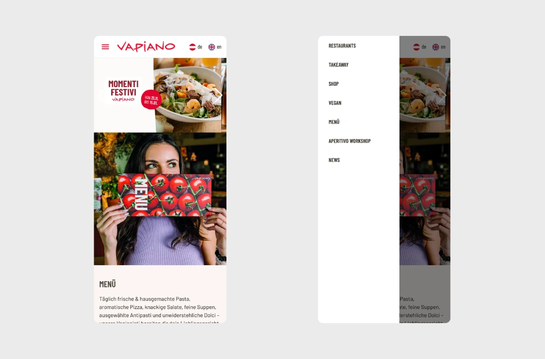
Staying true to their lively and contemporary brand, the Austrian restaurant chain Vapiano is the spot for fresh pasta, pizza, and more of our favorite dishes. The inviting design features large, high-quality images, minimalist illustrations, and clean fonts. When you enter the mobile version, in the burger menu you will notice an easy-to-navigate menu page, access to the shop, and quick location information.
💟 What we like:
- Colorful design with minimalist illustrations.
- Clean typography and large images.
- Interactive menu page and easy access to the online shop.
← Back to WordPress Website Examples Hub
Restaurant Mobile Website Trends for 2025
Mobile restaurant websites are stepping up their game in 2025, making things easier, faster, and more fun for users. Let’s review what are the key trends defining mobile website design for restaurants:
1. Mobile-First Design as the Standard ✅
Designers are building for mobile first, so everything works perfectly on a small screen. Think fast-loading pages, simple menus, and buttons that are easy to tap – even with one hand.
2. Integrated Mobile Ordering Systems ✅
Online ordering is smoother than ever. Mobile sites now let you tweak your order, see what’s in stock, and pay with just a tap using Apple Pay, Google Pay, or whatever works for you.
3. Swipe and Scroll Navigation ✅
No more tiny menus or hard-to-click links. Sites are packed with swipeable image galleries, scroll-friendly layouts, and touch-friendly designs that feel effortless to navigate.
4. Quick Videos Everywhere ✅
Short, snappy videos are everywhere – a chef plating your favorite dish or a quick look at the restaurant vibe. They load fast and keep you hooked.
5. Awesome Menus ✅
Mobile menus are becoming more visual, with dish photos, fun icons, and clear sections that make browsing feel less like work and more like window shopping for your taste buds.
6. Dark Mode ✅
Dark mode isn’t used just in a mobile app – many websites now offer it as a feature, providing a stylish, easy-on-the-eyes option for users browsing at night.
7. QR Codes Are Still Going Strong ✅
Don’t forget about QR codes – whether it’s to check out the menu, make a reservation, or even pay your bill right from your phone. Simple and convenient.
8. Accessible for Everyone ✅
More restaurants are making their sites user-friendly for everyone, with bigger fonts, easy-to-read text, and options for people with disabilities.
Want a top-notch restaurant responsive mobile website like these? Get a free quote → with our friends at htmlBurger.
Final Words
A great restaurant mobile website design goes beyond being visually appealing. It’s about creating a smooth, intuitive experience that keeps visitors engaged. Some with a fun, quirky design, and others choosing sophisticated, sleek layouts to match their vibe, these 24 examples show how a thoughtfully designed site can enhance your brand and bring customers back time and time again.
Planning to create a new website for your restaurant or redesign your current one? Draw inspiration from these incredible examples to craft something that leaves a lasting impression on your guests.
For more inspiring design examples, you can:
-
Check out these 24 Extremely Good Restaurant Websites Making Us Crave To Eat There, or
-
Head back to our WordPress Website Examples Hub.