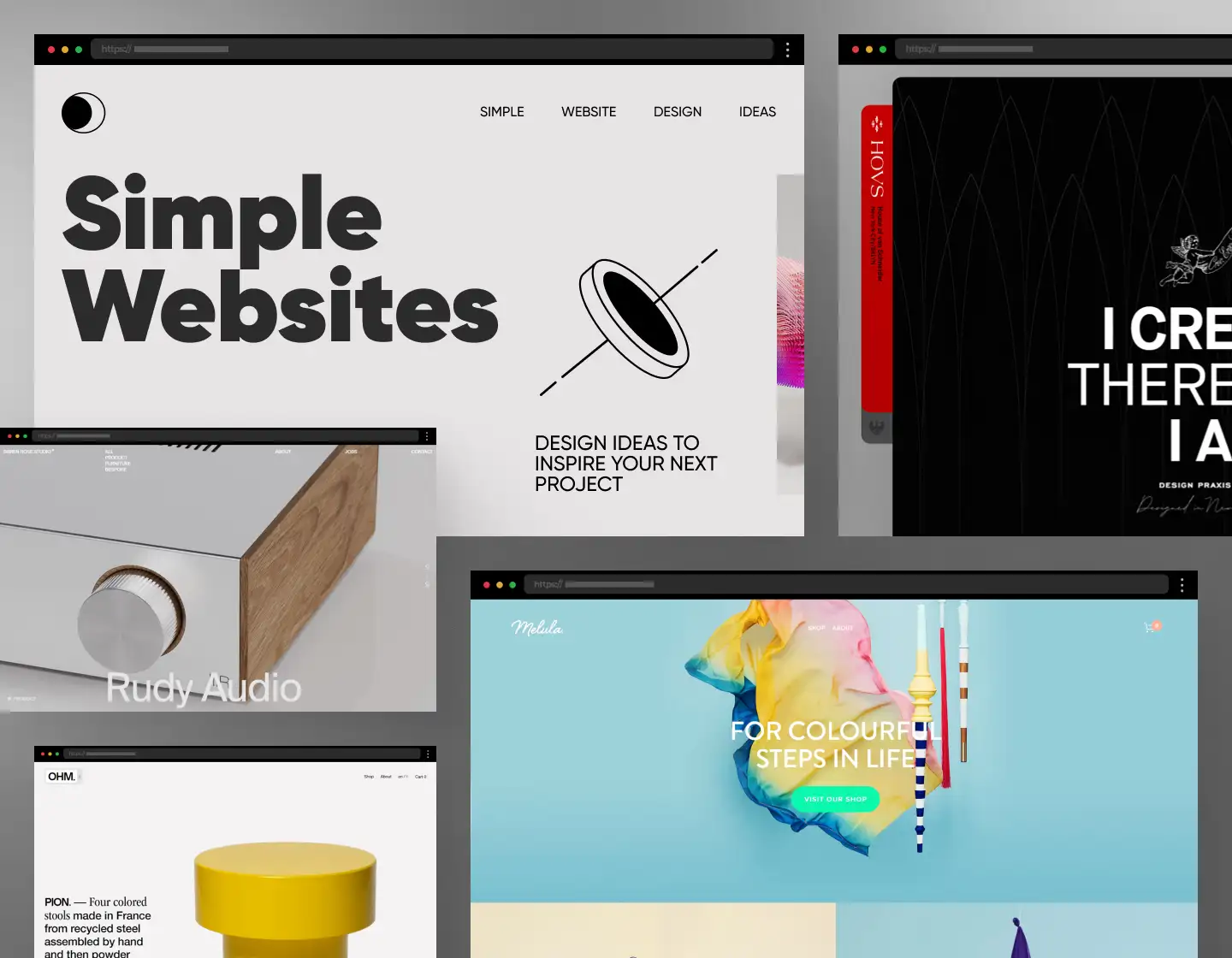
Simplicity can be a powerful tool if used correctly. There is a whole movement in design defined by the famous Mies van der Rohe’s principle that “Less is more”. It is based on the idea that removing obtrusive elements from a design enhances the clarity of the overall concept. Simplicity also greatly emphasizes functionality and aesthetics. Now, if you want to craft a simple website design then you’re in the right place for we have prepared for you a set of examples to gather ideas. Simplicity can speak volumes, so why not use its voice?
In today’s article, we will explore 24 website examples that embody the essence of simple design and provide ideas for a user-friendly interface, straightforward yet creative content presentation, and smooth user experience.
1. Anakin

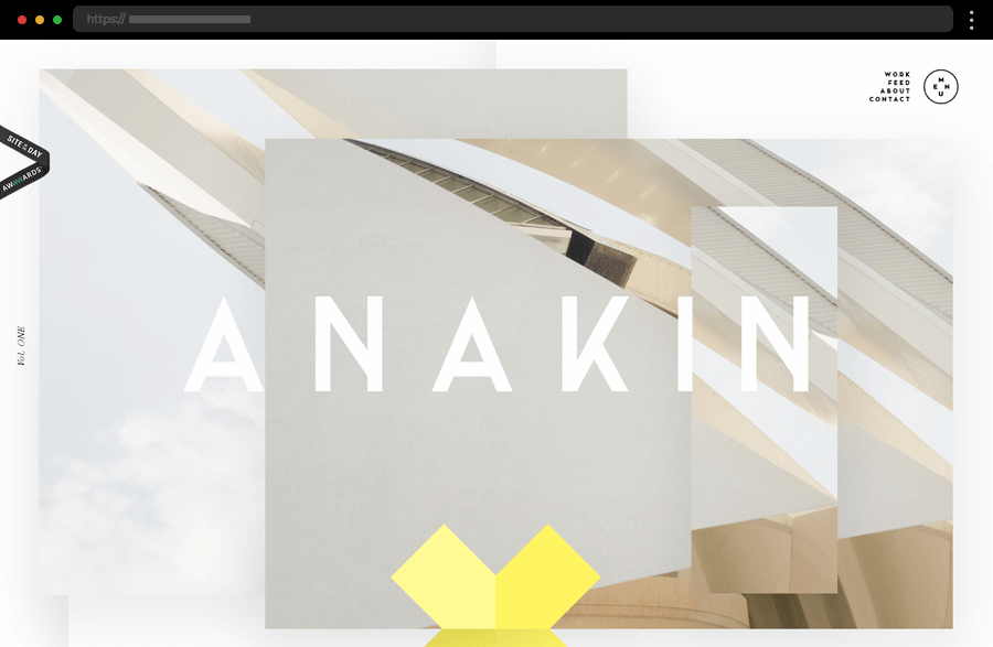
Anakin, a German branding and design studio, boasts a website that captures the attention with a striking, large-scale visual on its homepage. The website has a bold yet simple design with vibrant colors, an attractive layout, and engaging visual elements and animations, providing ideas on how to add a dynamic element without compromising simplicity. The site is a treat to the eye which combined with its intuitive navigation results in a seamless and pleasant user experience.
2. Flow Computing

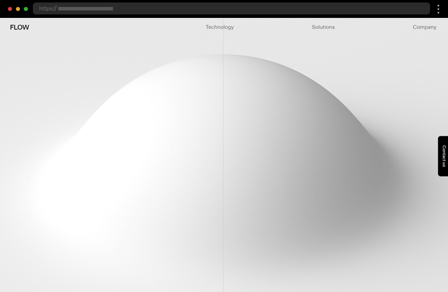
Flow Computing’s website exemplifies simplicity with its clean, white background and straightforward typography. The site’s color palette consists of light colors thus accentuating the showcased photos and content. Even the featured images are presented in muted colors to align with the overall concept. As a result, Flow Computing has beautifully communicated the essence of its complex technologies by effectively executing its idea of a website with a simple design.
3. Ollivere

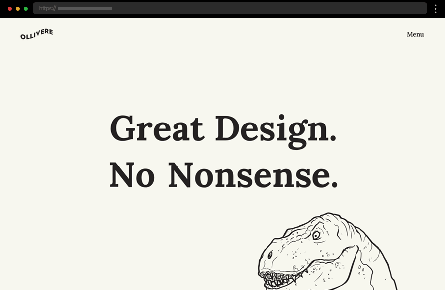
Martin Ollivere, a creative branding and design expert, comes to impress us with his amazing simple website design idea. The engaging and fun design has some of the best scroll-based animations we have seen and with his portfolio presentation, the included testimonials, and concise messaging it manages to build a reliable and impactful brand image. Ollivere’s single-page site, a product of his own work, is also another showcase of the digital creator’s skills, beautifully emphasizing his passion for great and nonsense-free design.
4. Stewart & Partners

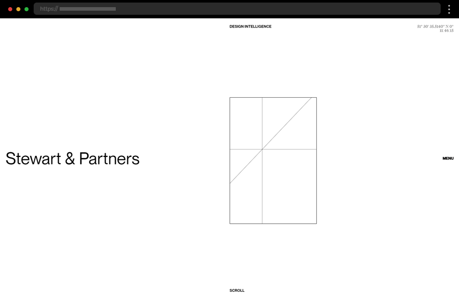
Stewart & Partners, a South African architecture studio, sports a website featuring a sophisticated and sleek design, with elegant fonts, subtle animations, and a monochrome color scheme. The clean layout and strategic use of images focus on showcasing their portfolio achieving a professional and modern overall aesthetic, making it ideal for creative studios and agencies. The simplicity here certainly enhances the studio’s impressive portfolio, the site’s functionality, and user engagement.
5. Olha Uzhykova

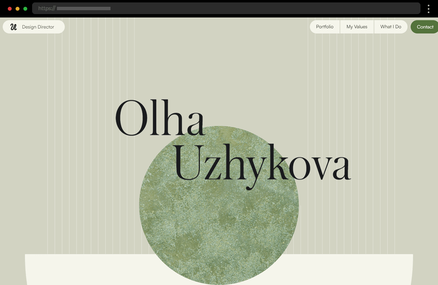
Olha Uzhykova’s simple yet stylish website presents the designer, her portfolio, values, and ideas with an engaging online journey. The single-page site is easily navigated with the help of the anchored menu at the top. In addition, hover effects and scroll-activated animations keep the user’s interest aroused throughout the whole web journey. Though featuring a lot of content and many helpful resources, the site doesn’t lack clarity, achieving a highly informative, elegant, and memorable design.
6. KOBU

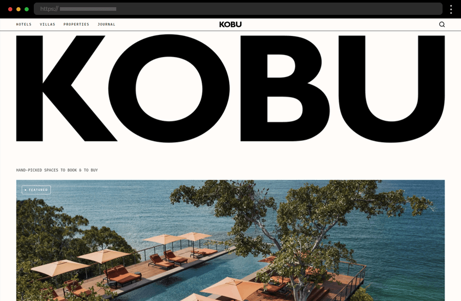
KOBU is a hotel and rental properties platform with a website sporting an online magazine look. The homepage stands out with its hero section’s huge, bold typography, impressive imagery, and clean, structured layout. In addition, using strategically placed concise messaging and a minimal color palette adds to the site’s striking visual impact. Easy navigation and well-organized content enhance the user experience. This design approach is particularly effective for creative agencies wanting to make a memorable impression.
7. Minimalissimo

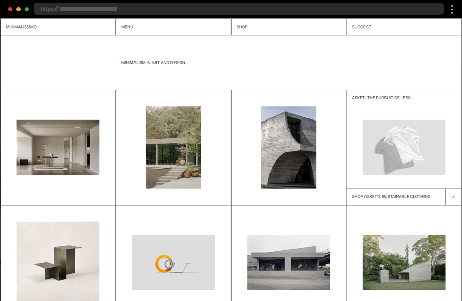
Minimalissimo, an independent print and digital magazine, embraces clarity and minimalism as the pillars of its simple website design. Beautifully organizing the content in a subtle grid depicts the brand’s focus on design and its love for simplicity and minimalism. A notable feature is the switch between a dark and a light mode of the website enhancing the user experience further. Thus, Minimalissimo cements its place as an amazing source of ideas for your simple website design.
8. Seth Hampton

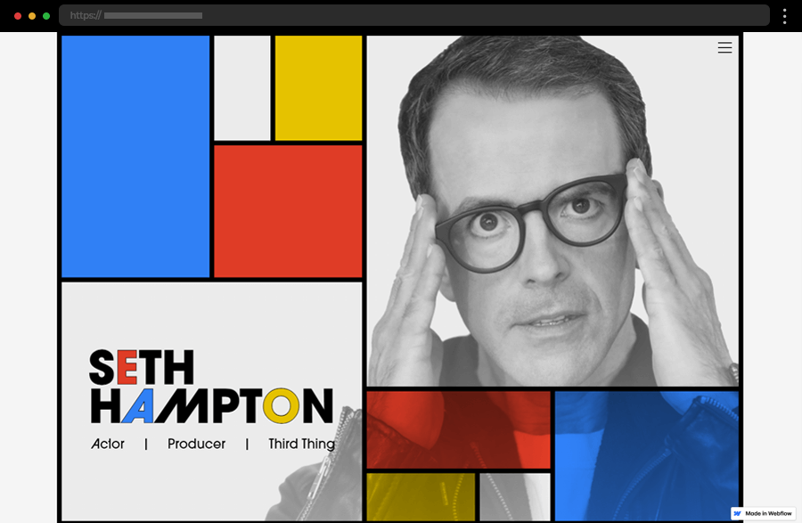
Seth Hampton, a multi-talented actor and producer, provides our next example with his single-page portfolio site boasting a Mondrian-inspired design. The site’s simple, centralized layout, complemented by the intuitive navigation, ensures that the content is easily accessible and comprehended. The overall concept, emphasizing at the same time, creativity, straightforwardness, clarity, and professionalism beautifully executes the idea of a personal portfolio with a simple website design.
9. Studio Iro

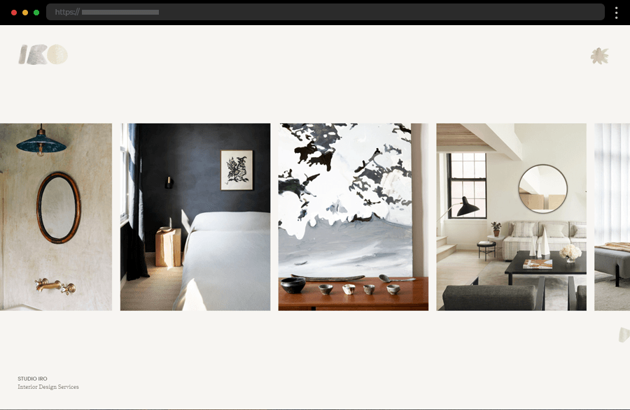
The Interior Design Studio Iro’s website embraces a modern, minimalist design idea with a strong emphasis on simple visual storytelling. Large, high-quality images dominate the homepage, providing an immersive experience in the studio’s portfolio. The minimal text, clear, concise layout, and balanced, stylish color scheme ensure that the visual content takes center stage. Altogether, this design is perfect for visual artists and studios looking to highlight their work effectively.
10. House of van Schneider

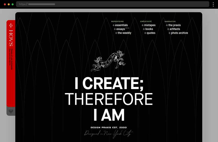
Tobias van Schneider is a branding expert and product designer with a pretty creative online presence. His portfolio site has a clean and well-organized layout with smartly used ample space adding a sense of elegance to it. The site covers the broad spectrum of van Schneider’s studio work and also his personal interests and endeavors, all easily accessed through easy navigation enhancing the user experience. This website design is an ideal example of personal branding and professional portfolios, highlighting the power of simplicity.
11. Soren Rose Studio

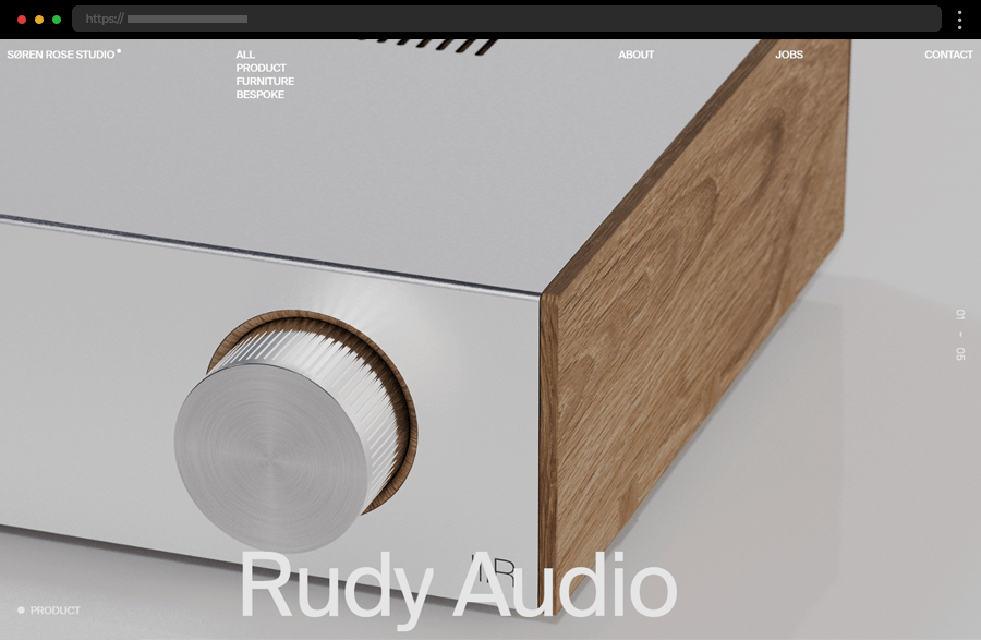
Soren Rose Studio greets us with a stylish, minimal web design with striking full-size, high-quality backdrop imagery complemented by clean typography. The site’s easy-to-follow layout, intuitive navigation, and facilitated menu enhance the user experience, allowing visitors to focus on the designer’s portfolio. Exuding elegance and professionalism, this simple design perfectly exemplifies the idea of creating a sophisticated and engaging website with minimal elements.
12. OHM Studio

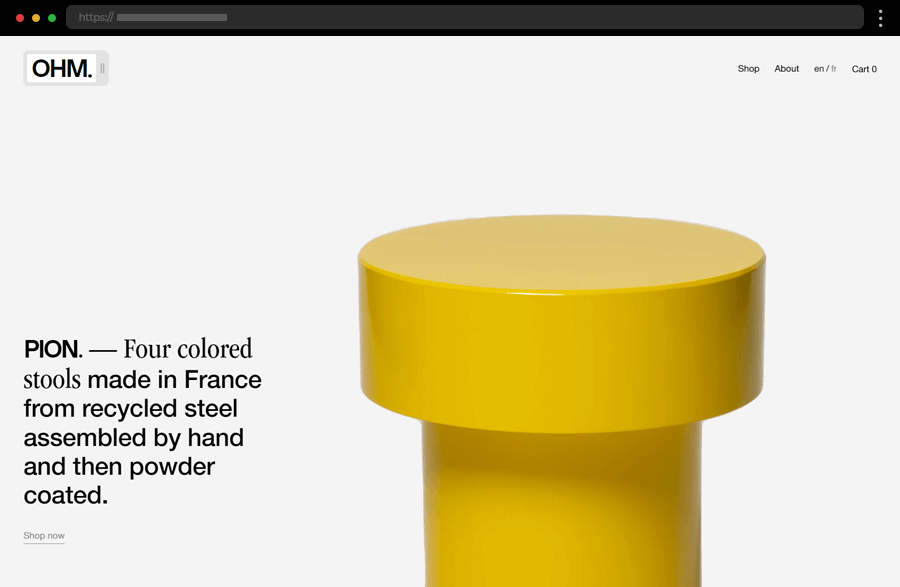
OHM’s website features a clean, straightforward design with a focus on visual content to present the studio’s artisanal products. The use of large images and well-thought-out, concise text creates an immersive experience in OHM’s world of furniture craftsmanship. The simple navigation and clear layout ensure that the users’ attention remains on the content and subtly guides them to the online shop. As a result, this example is another good source of ideas on how to craft an impressive online shop with a simple website design.
13. Melula

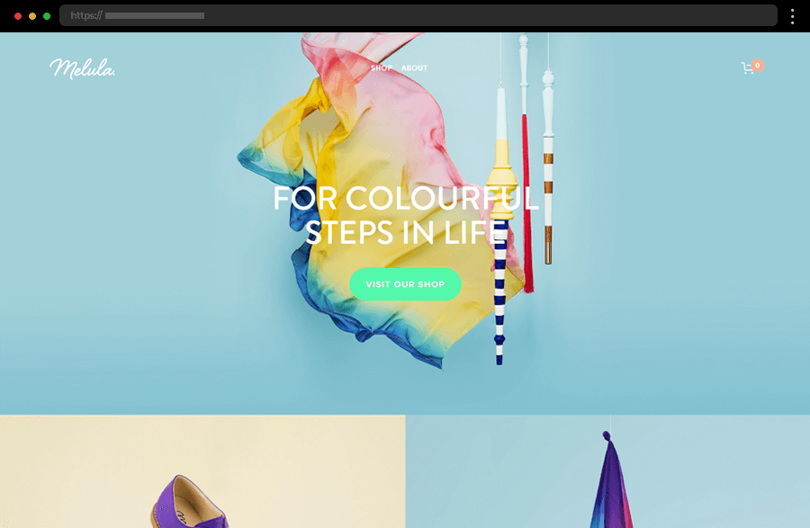
Stylish and energetic, Melula’s website welcomes us into the colorful world of children’s shoe design. The site provides a seamless user journey by embracing clarity and simplicity within its straightforward layout and easy navigation. The impressive product images not only make Melula’s online presence visually appealing but also lead visitors to the shopping page. This design is a perfect example of a business website looking to present its products clearly and professionally and provide a satisfying shopping experience.
14. Two Designers

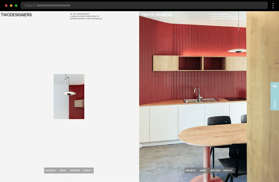
Two Designers, a creative design studio, has a website that quickly immerses users in its engaging design. The homepage welcomes us with a split screen whose sides both feature a navigation menu at the bottom and visitors can have some fun with the mirrored actions of the mouse cursor. The design utilizes clarity and simplicity on each of its pages featuring impressive visuals, concise text, and interactive features to accentuate the studio’s portfolio and services.
15. Heid

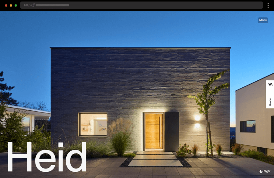
Heid is a website designed to showcase the amazing architecture of a contemporary house. The modern one-page website grabs and retains visitors’ attention by alternating impressive, high-quality images with concise, non-obtrusive descriptions. It also successfully immerses users into the house’s web tour by featuring parallax effects and a switch to toggle the day and night mode of the hero image. With its sticky menu button, easy-to-follow layout, and overall concept, this example provides amazing ideas for a simple website design.
16. Hello Monday

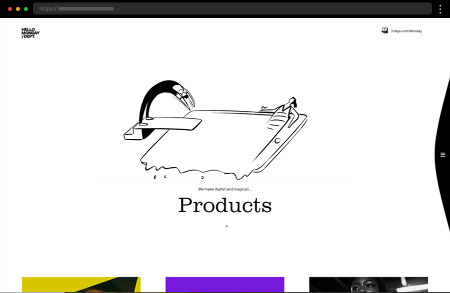
Hello Monday, a creative studio, has a website that combines creativity with simplicity, featuring a clean layout and playful animations. The dynamic homepage highlights the studio’s work with engaging, interactive features like the distortion of the featured images’ edges when moving the cursor around them. With its plain navigation and engaging visuals, this simple website design idea stands out without overwhelming the user and demonstrates how to balance fun and functionality effectively.
17. ETQ

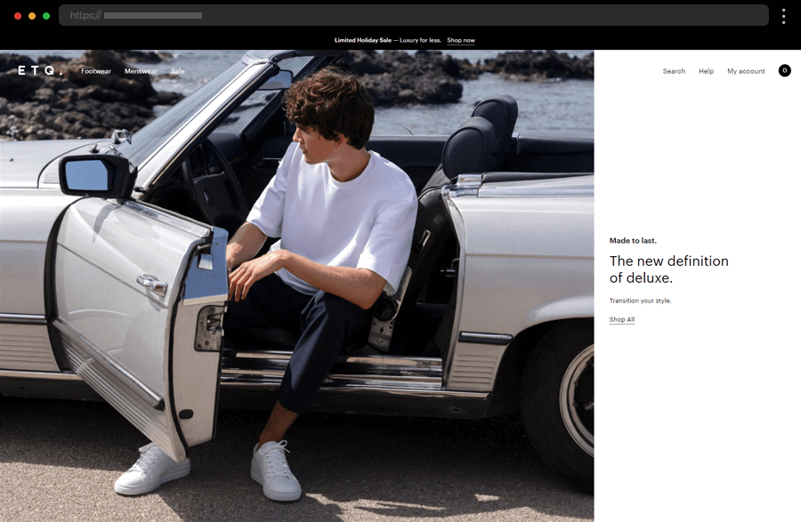
ETQ’s website, an online shop for menswear and footwear, exemplifies simplicity with its clean layout and monochromatic color scheme. Its homepage sets the tone for the site’s sophisticated aesthetic and encaptures visitors with impressive images and clear CTAs, guiding users to the shopping pages. Also, the site is easily navigated through the re-appearing menu at the top and the sticky item filter options. Overall, this design is a great example, providing ideas for brands looking to offer their products on an elegant and simple website.
18. Monograph

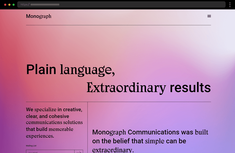
Monograph Communications’ website uses a clean, clearly-structured minimalistic design with a strong focus on typography and ample space. The site’s well-thought-out copy highlights the company’s services effectively while the straightforward layout and navigation ensure a seamless user experience. With its pages’ different, colorful backdrops and clear messaging, this design perfectly projects a modern and professional brand image.
19. Casa Hope

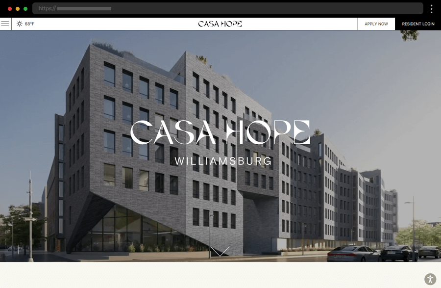
Casa Hope’s site features a minimalist design with a focus on high-quality visuals and clean typography, whose effect is enhanced by the stylish color scheme. The smart use of negative space also creates a sense of elegance and adds clarity to the overall concept. In addition, the simple layout, clear CTAs, and intuitive navigation ensure that the content is easily accessible to users, thus achieving an even better user experience.
20. Our Revolution

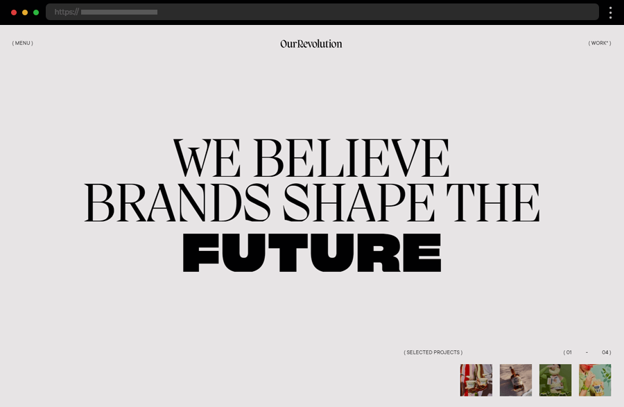
Our Revolution’s website embraces simplicity with a clean, structured layout and monochromatic color scheme. Using high-quality images and simple typography creates a sophisticated aesthetic. Meanwhile, interactive features, for example, the images popping out from the mouse cursor movement, keep user engagement and interest. In addition, the easy navigation and clear calls to action enhance the user experience, making this simple website design ideal for businesses looking to present their services clearly.
21. Wendy Ju

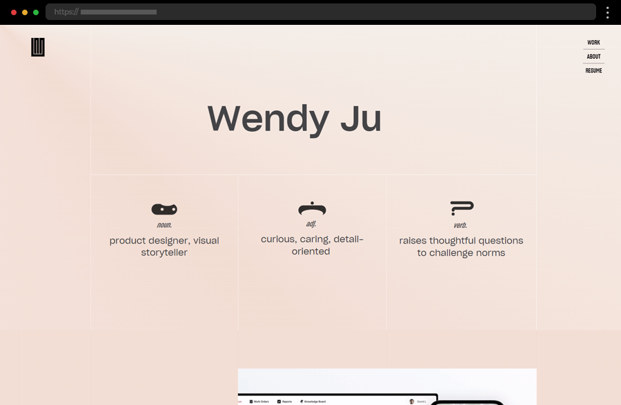
Wendy Ju’s site focuses on presenting the creative professional’s portfolio with a minimalist design. Its homepage features highlights of the designer’s work with large images and concise text, while the dedicated project pages list comprehensively all details about them. In addition, the site uses a clean layout and simplified navigation ensuring the visitors’ attention stays on the content. Thus, this example effectively creates a virtual showcase of Wendy Ju’s portfolio.
22. Carbonmade

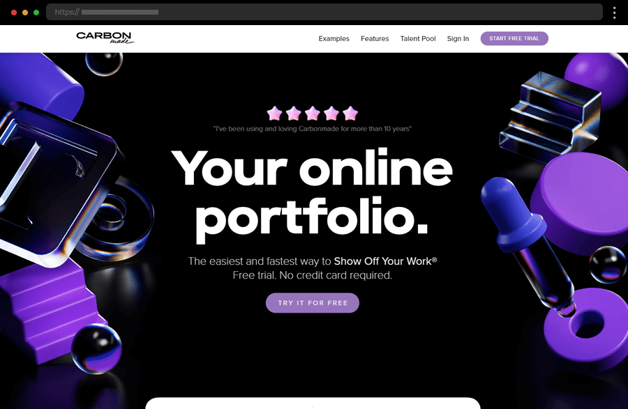
Next comes Carbonmade, a portfolio-building platform, with a site using a simple, modern, and vibrant design. The hero section grabs visitors’ attention with its bold typography, strong colors, and testimonials urging them to start a free trial with its distinct CTAs. In addition, the easy-to-follow layout and facilitated navigation enhance the overall user experience while the subtle animations and attractive color scheme add a modern touch to this user-friendly and visually appealing example.
23. Women Tell Women

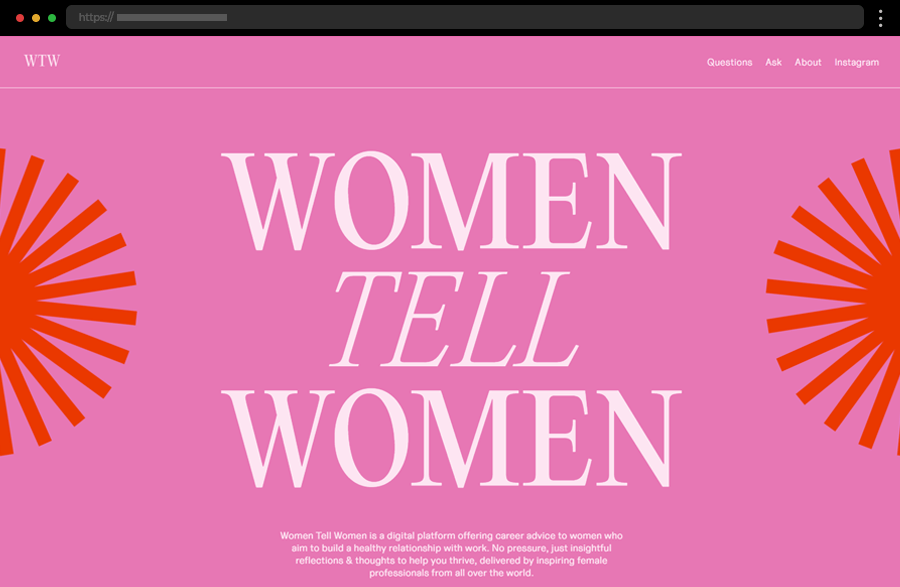
Women Tell Women, a platform offering career advice and ideas to women, has a website with a simple, vibrant design. Offering only textual content, the site’s minimalist concept strongly emphasizes storytelling. It does so by using only a few graphics and animations, a clear, straightforward navigation, and a clean layout. All this, combined with the site’s various colored pages effectively succeeds in presenting the content with clarity while making a strong visual impact.
24. Edward Barber & Jay Osgerby

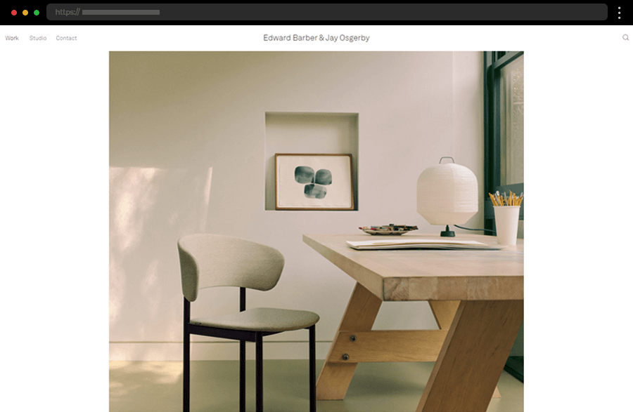
Edward Barber & Jay Osgerby’s architectural studio’s website embraces a minimalist design to leave the focus on the high-quality visuals presenting the studio’s work straight from the homepage. With its straightforward layout and simple menu, enhanced by a search box, the site ensures a smooth user experience. Also, by utilizing clean, non-obtrusive typography and creative use of ample white space, this elegant example evokes clarity and professionalism, building a strong and credible brand image.
Tips and ideas for crafting a simple website design
- Focus on user experience and ensure your website is easy to navigate with clear calls to action. For example, you can choose a user-friendly interface that enhances accessibility and provides a seamless browsing experience.
- Embrace negative space to create a clean, uncluttered look. This will also help to focus user attention on the key elements and will improve readability.
- Incorporate high-quality images and graphics to grab the visitors’ interest but be careful not to clutter the design. Oh, also, ensure that the visuals are optimized for fast loading times to maintain site performance.
- When choosing typography, select clean, readable fonts that complement the overall design. It’s better to avoid using too many different fonts.
- Use a minimal color palette to create a stylish and harmonious look. Monochromatic schemes or two to three complementary colors work well to maintain simplicity and elegance.
- You can also use subtle animations and interactive elements to enhance user engagement. But make sure that these elements add value and don’t overwhelm the design.
- Ensure that your website is responsive and looks great on all devices. Mobile optimization is essential for providing a good user experience and improving search engine rankings.
Final words
Incorporating simple website design ideas can transform how users interact with your site, enhancing both aesthetics and functionality. By focusing on user experience, taking advantage of negative space, and maintaining a clean, minimalist approach, you can create websites that are both beautiful and effective. Whether you’re a web designer or a business owner, we hope our set of examples has helped you gather inspiration and ideas for your new projects. So, embrace simplicity and let your content shine online!