Wondering what kinds of testimonials can really boost your testimonial page? I like to think about a few solid options:
🤳 Social media shoutouts – add a fresh, casual touch with positive reviews shared out in the wild.
💬 Short quotes – work great for quick highlights that show how your product or service hits the mark.
🧾 Case studies – tell a full story about how you’ve helped solve problems and make a difference.
🎓 Authority testimonials – from experts or influencers can give your brand a nice credibility boost.
🎙️ Customer interviews – dig deeper, letting you hear detailed experiences firsthand.
✍️ Blog posts – can double as testimonials, with customers sharing their wins and how your offerings changed the game.
Now, I am about to share with you some great real-life examples of testimonials in action with notes on what makes each one work. I won’t waste your time with unnecessary paragraphs and explanations, so let’s dive in!
1. BlackFish
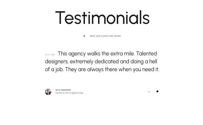
BlackFish keeps things clean and visually sharp. Their homepage includes a testimonial slider that fits right into the minimal layout, nothing flashy, just smooth transitions and clear client quotes that don’t get lost in the design. There’s also a video testimonial tucked behind a “What Our Clients Are Saying” button.
It opens in a pop-up overlay, adding a bit of personality without breaking the visual rhythm. It feels like part of the portfolio rather than an afterthought, which makes it more convincing.
2. Basecamp

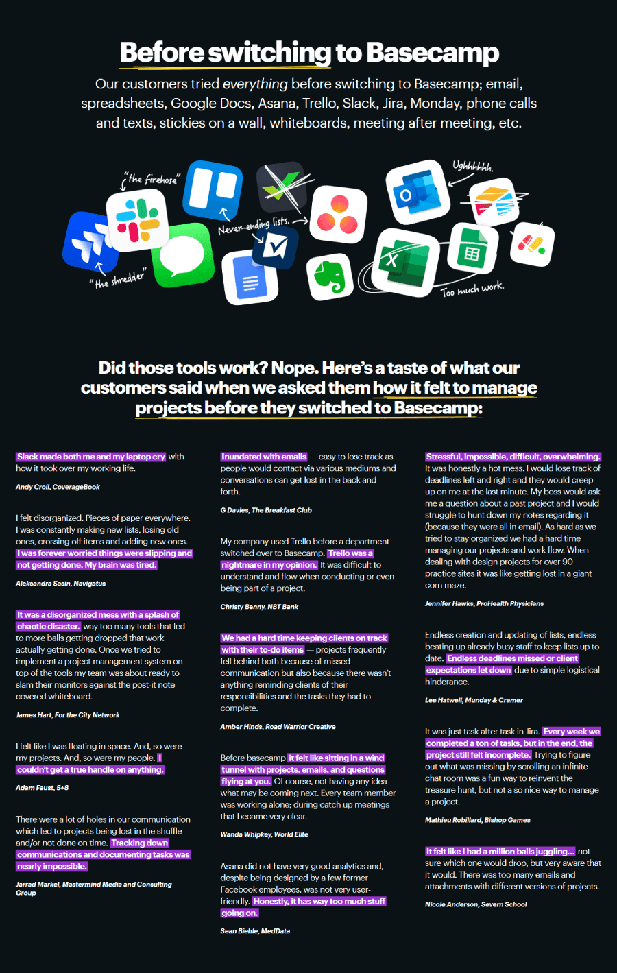

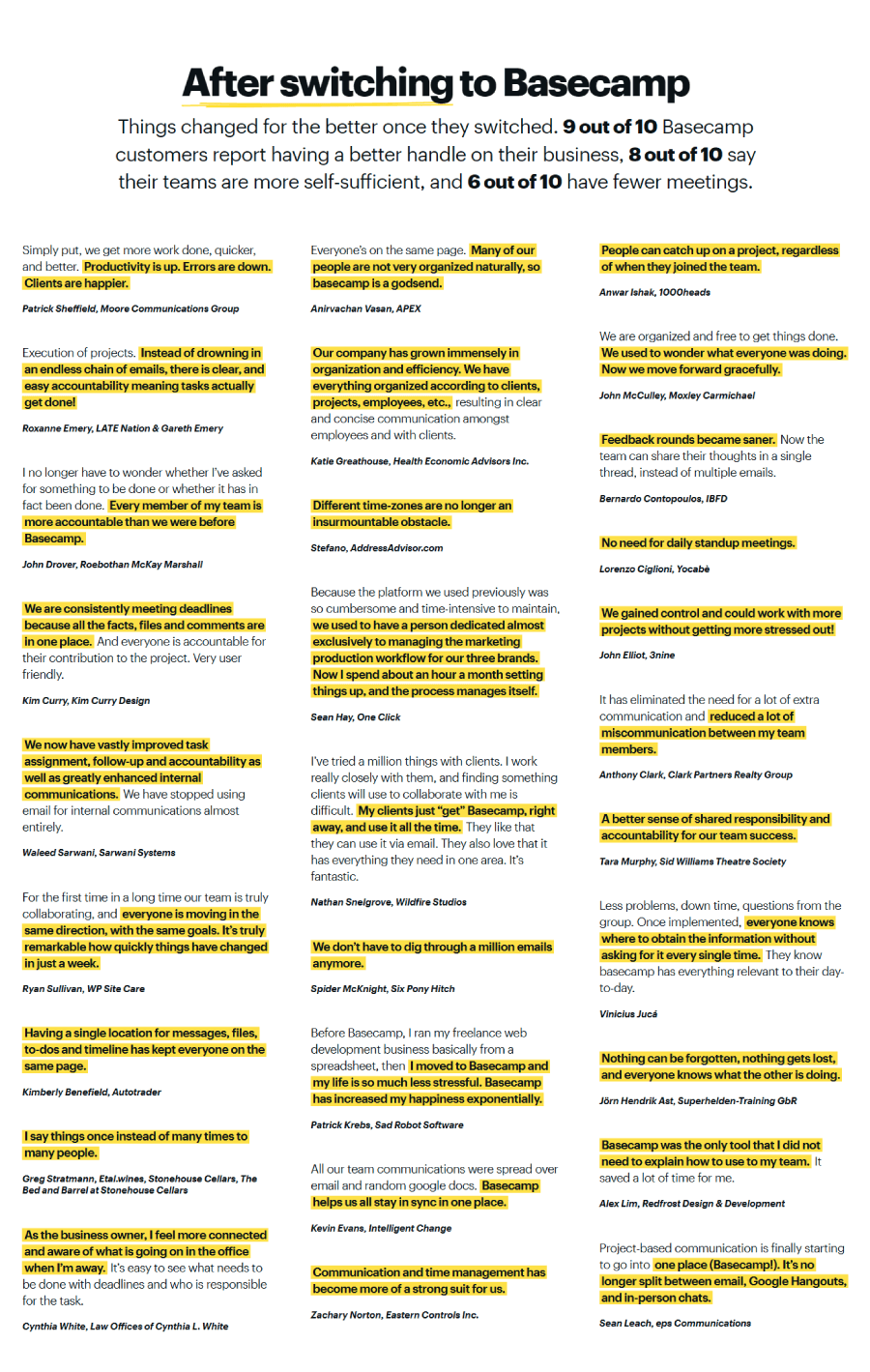
Basecamp treats its testimonials almost like case study snapshots. Instead of dropping in random praise, they frame each story with a before-and-after angle of what life was like before Basecamp, and what changed after. They even split the design visually: the “before” quote appears in dark mode, the “after” in light. It’s a small touch, but it gives the stories more shape and makes the page feel intentional, not just a feedback dump.
3. Bizzabo

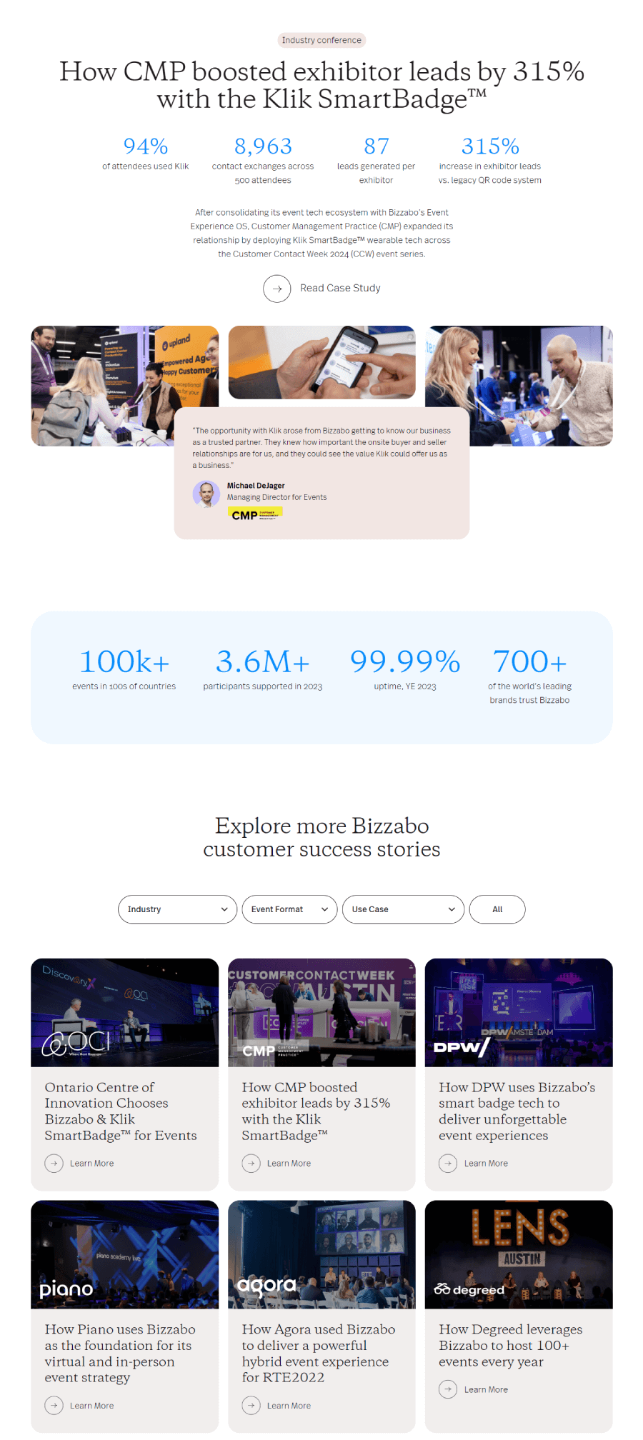

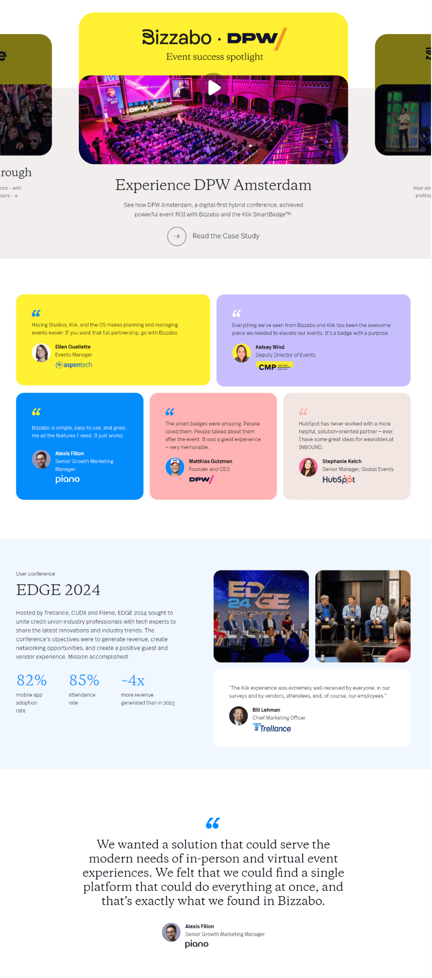
Bizzabo mixes portfolio vibes with storytelling. Their testimonial page includes short client quotes, full case study previews, and a bunch of real event success stories. Visitors can skim or dive deep, depending on how curious they are. The case studies give enough detail to paint a full picture with background, challenges, how Bizzabo stepped in, and what happened after.
4. Bluebeam

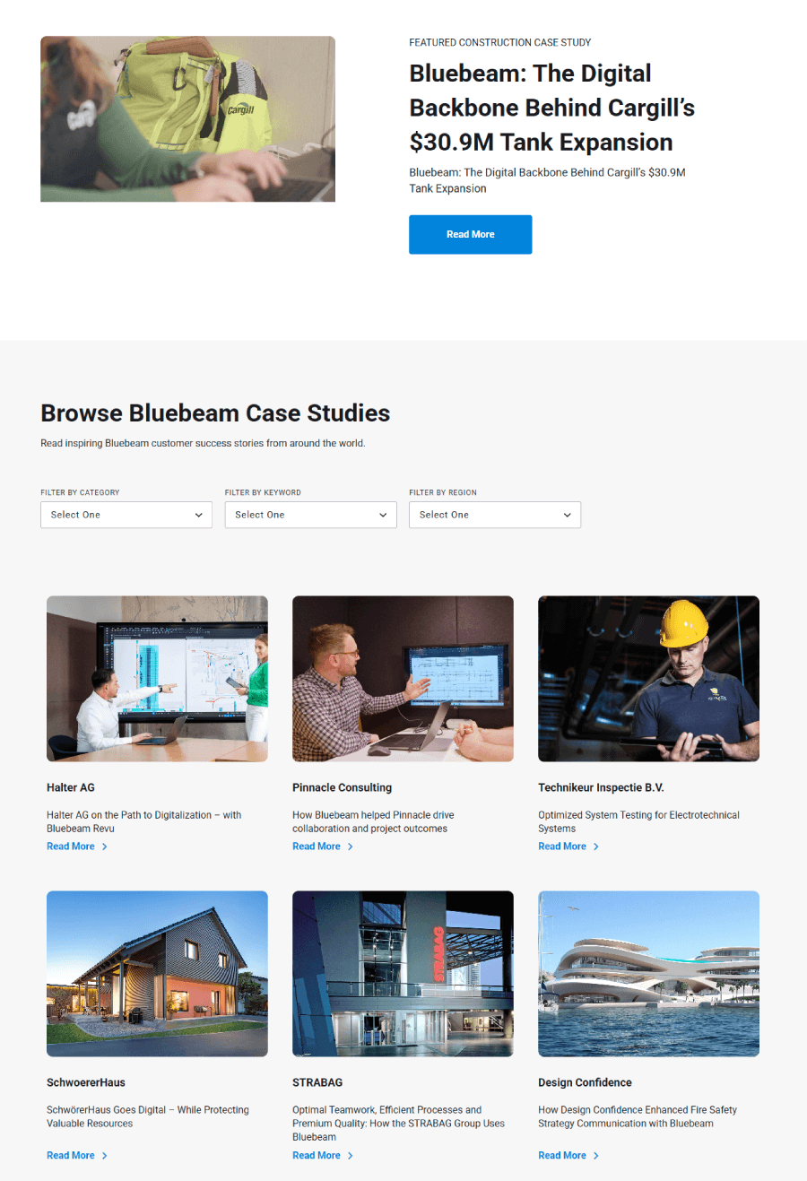
Bluebeam’s testimonial page leans into a more visual portfolio style, using a mix of videos and client panels instead of just quotes on a page. It kicks off with stories from companies in architecture, engineering, and construction, fields where visuals and details matter. These feel like snapshots of real projects, with clients walking through what they needed and how Bluebeam helped make it happen.
5. Bonsai

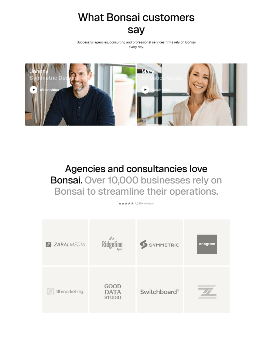

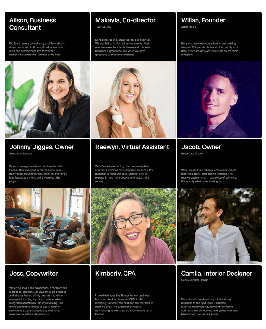
Bonsai keeps it bold and tidy. Their testimonial section stacks real feedback from freelancers and small teams inside dark, oversized cards. The design leans into a modular grid, sitting right below the logos of the agencies they’ve worked with. It feels like a mini portfolio wall, showing not just who they’ve helped but also what kind of creative crowd they attract. The black cards pop without trying too hard, and the whole thing feels thoughtfully structured, like part of the brand’s design DNA.
6. Buy Me a Coffee

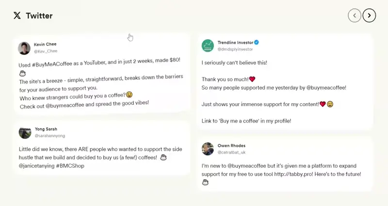
Buy Me a Coffee’s testimonial page takes a more casual, creator-first angle. Instead of polished quotes, they pull in real posts from Twitter and TikTok, actual creators sharing how they’ve used the platform in their own words.

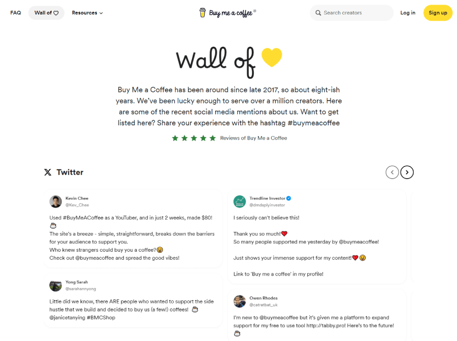

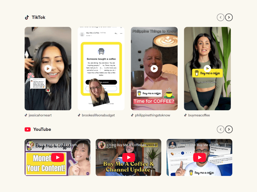
The page opens with a quick backstory, then shifts into user-generated content that feels honest and unscripted. You get a sense of how the platform fits into people’s workflows just by scrolling through the voices of folks who’ve actually used it.
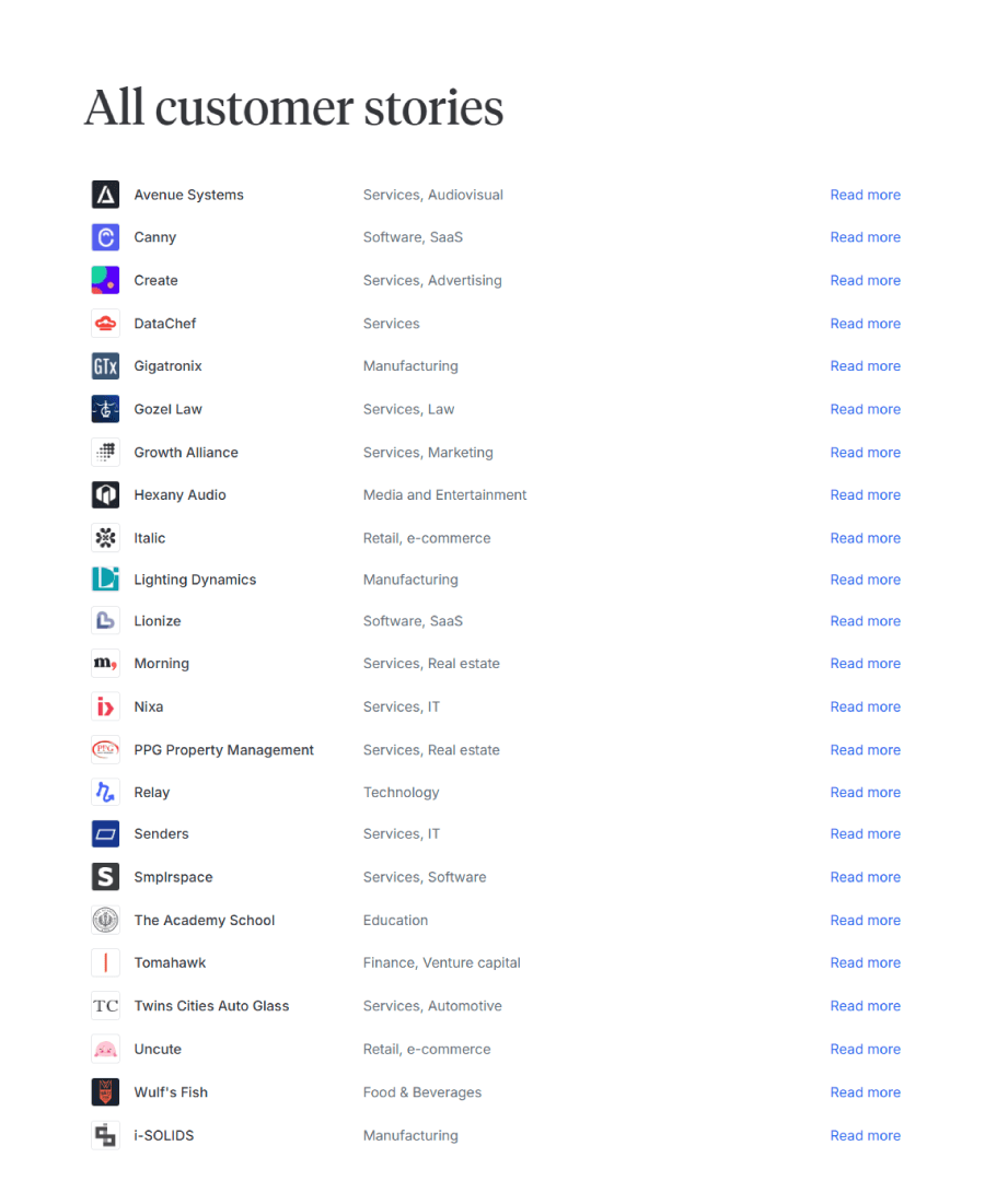
7. Canny

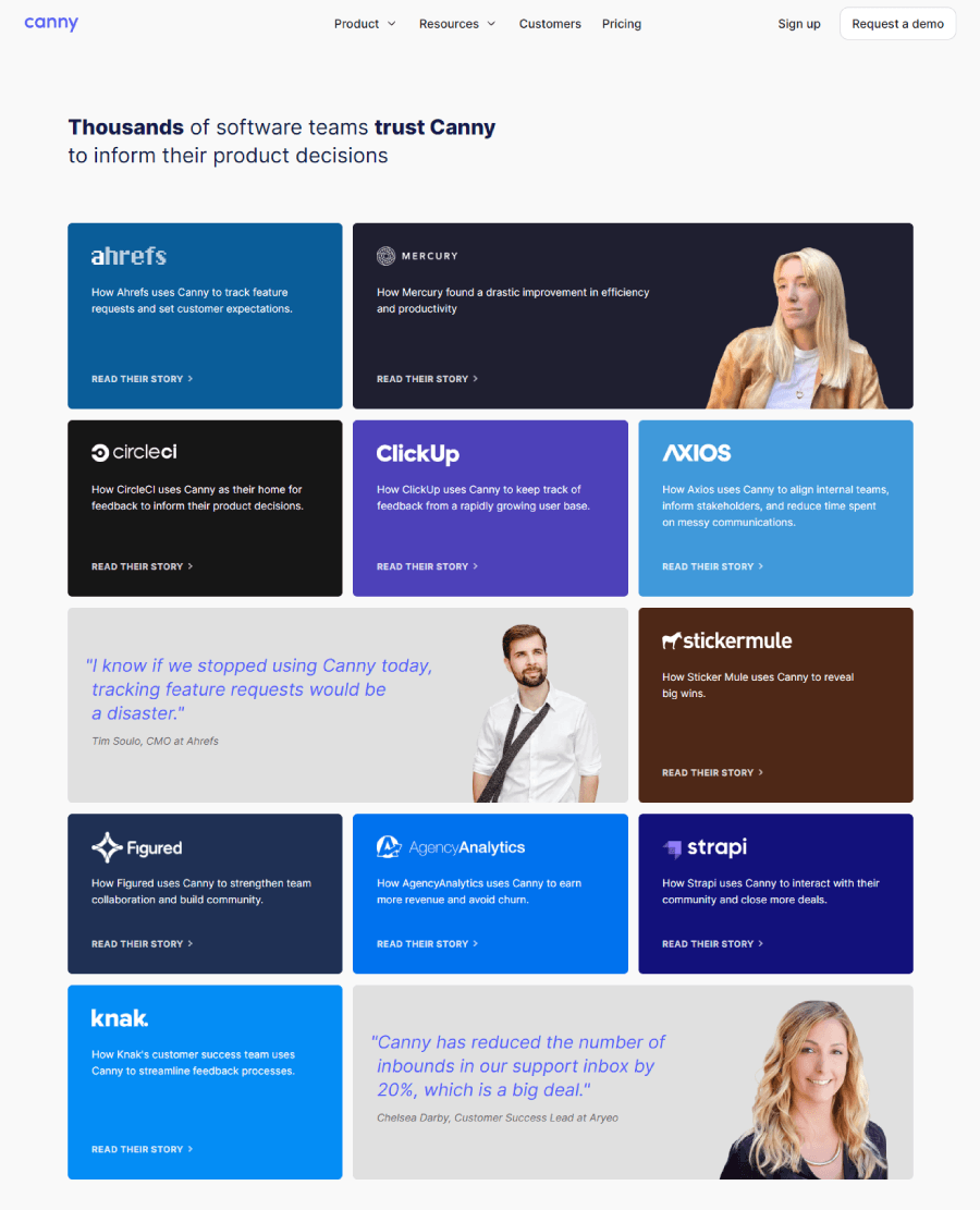
Canny turns its testimonials page into something closer to a visual case study gallery. Each story sits in a colorful modular grid, where company names and a short preview give just enough context to draw you in. Instead of tossing around praise, the layout invites you to explore how different software teams actually use Canny to gather feedback and improve their product.
8. Code Academy

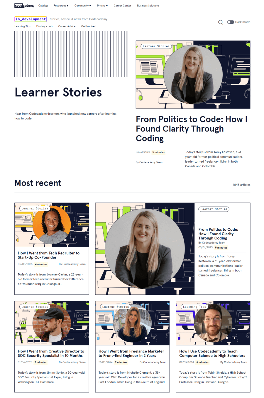
Codecademy puts a personal spin on its testimonial section, calling it “Codecademy Stories”. Each story includes a photo, name, and location, along with a quote and a link to a longer feature. The format is easy to scroll through and has a social feel that keeps things from getting too formal. You’ll find stories from people with all kinds of backgrounds, which helps the section land as more inclusive and genuine.
9. Cognito

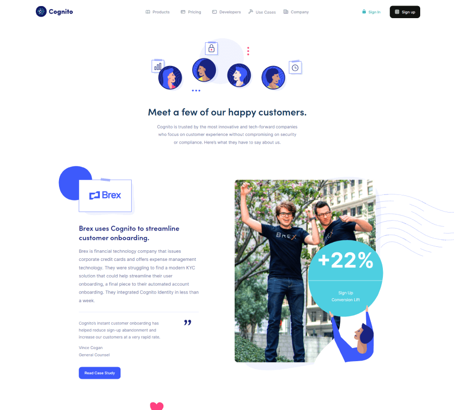
Cognito’s testimonial section focuses on how actual companies put the product to work. The page lays out a bunch of quick case studies that explain how clients are using Cognito for things like customer onboarding and KYC compliance. Each one highlights a specific use case, so it reads more like a working portfolio than a wall of compliments.
10. Dribbble

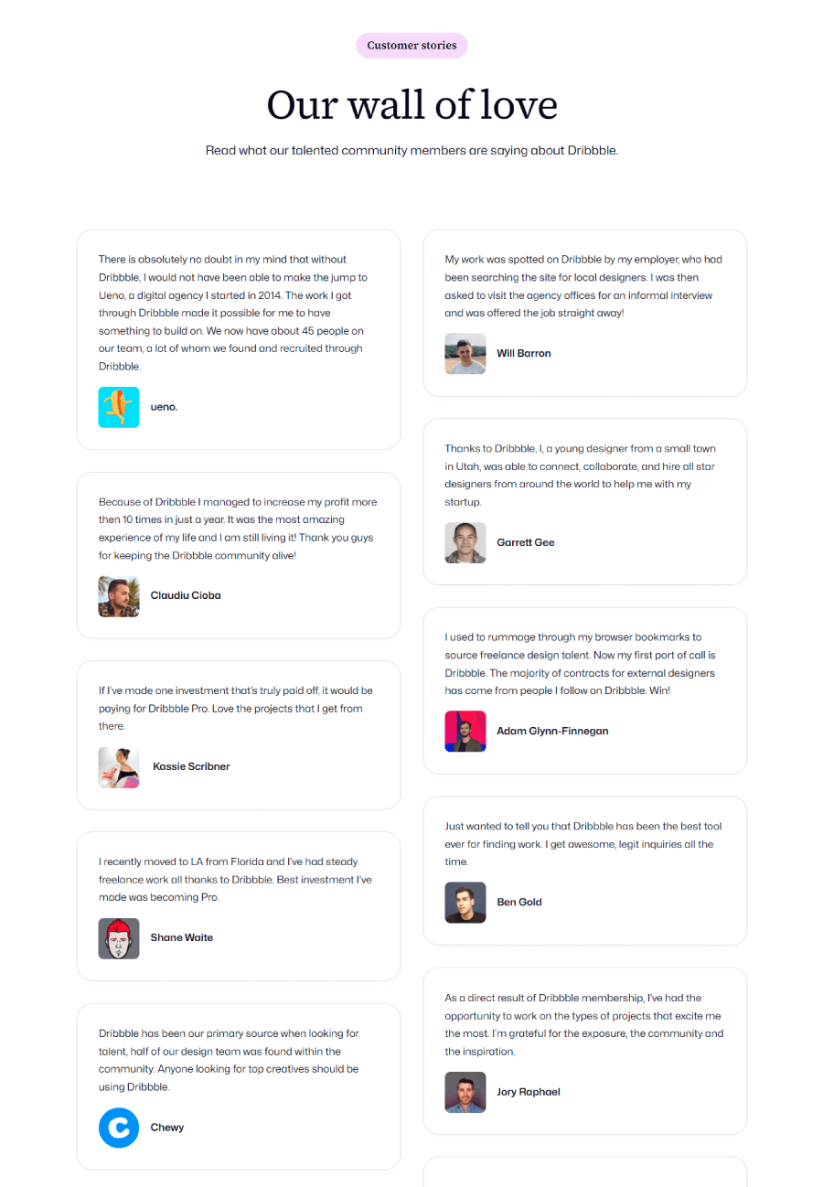
The spotlight here is on designers who’ve used the platform to grow their visibility and land client work. You’ll see just direct quotes from people who treat Dribbble as their creative home base, making it feel more like a living portfolio of success stories than a sales pitch.
11. Focus Lab

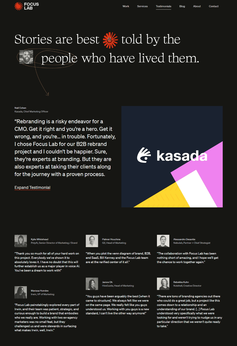

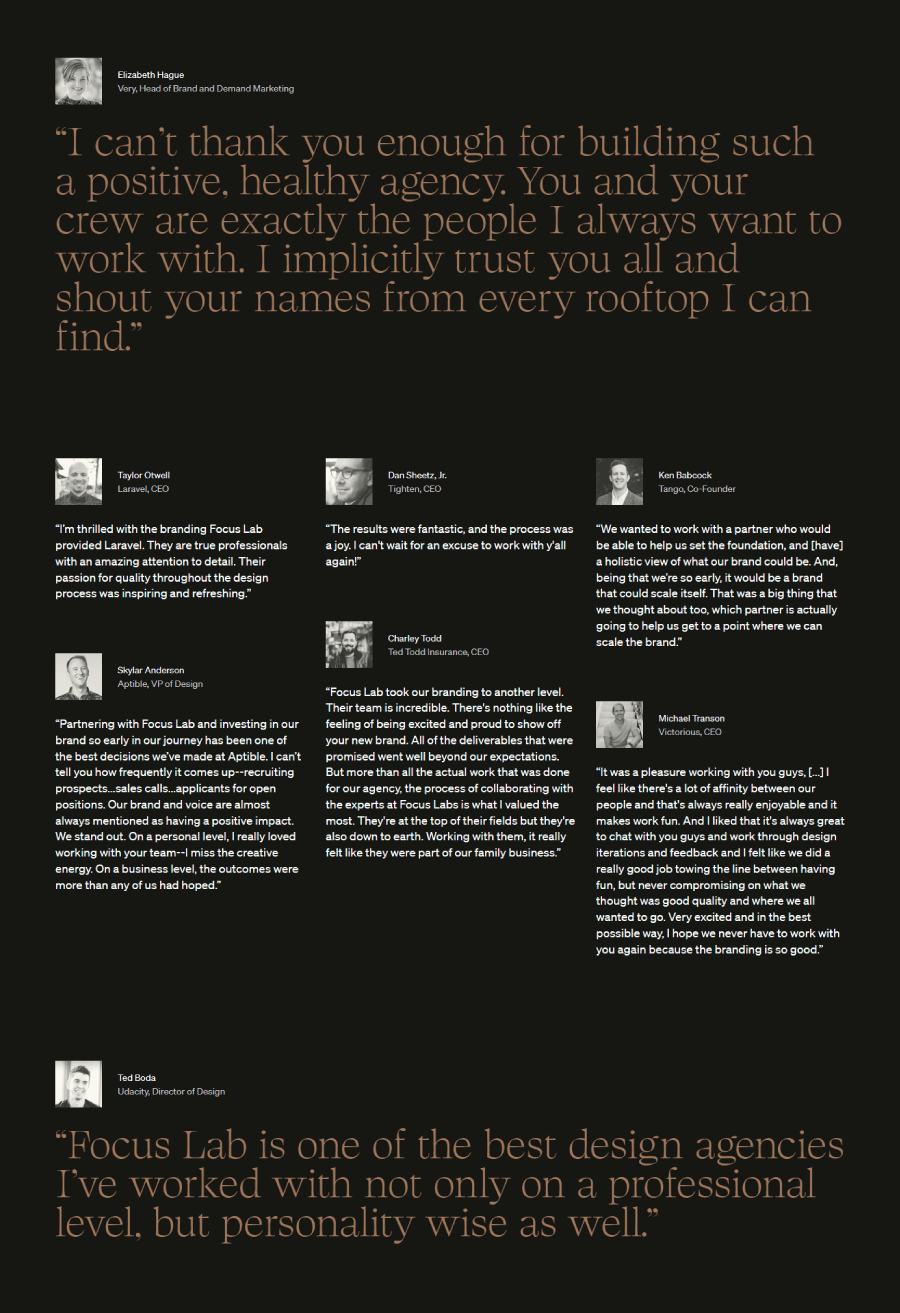
Focus Lab treats its testimonials like a design project. The layout uses typography and visual hierarchy like tools in a kit, turning each quote into something that feels custom-built. Client feedback is tucked into a bold visual grid, and hovering over each one adds a little motion that keeps the page feeling alive.
12. Frame IO

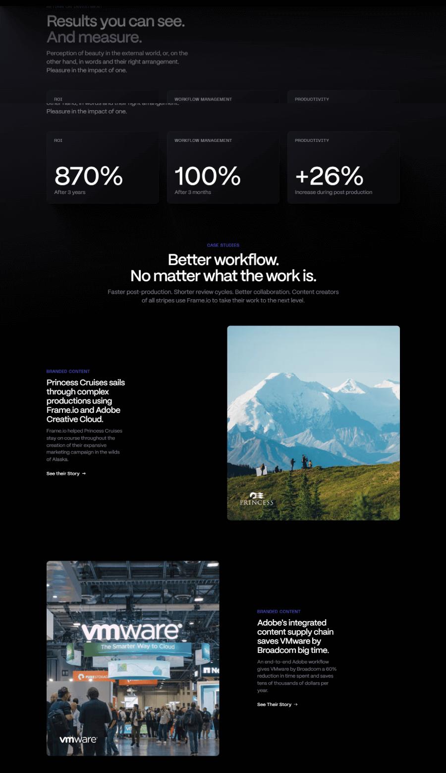

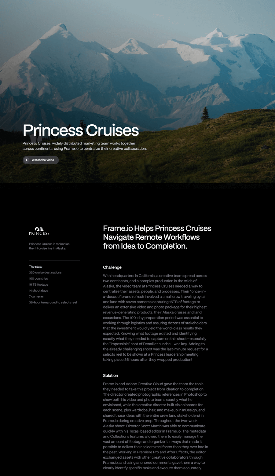
Frame.io opens its testimonial section with a wall of customer portraits that instantly feels human and creative. Scroll past that, and you’ll find stories from major companies using the platform to work on video projects together. It reads less like curated praise and more like a behind-the-scenes peek at how different teams use Frame.io in real production settings.
13. Kalium

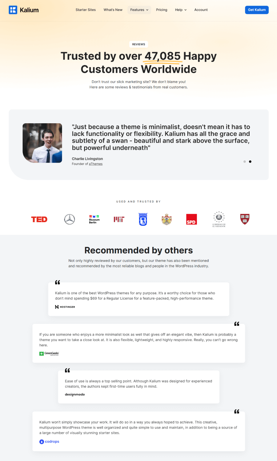

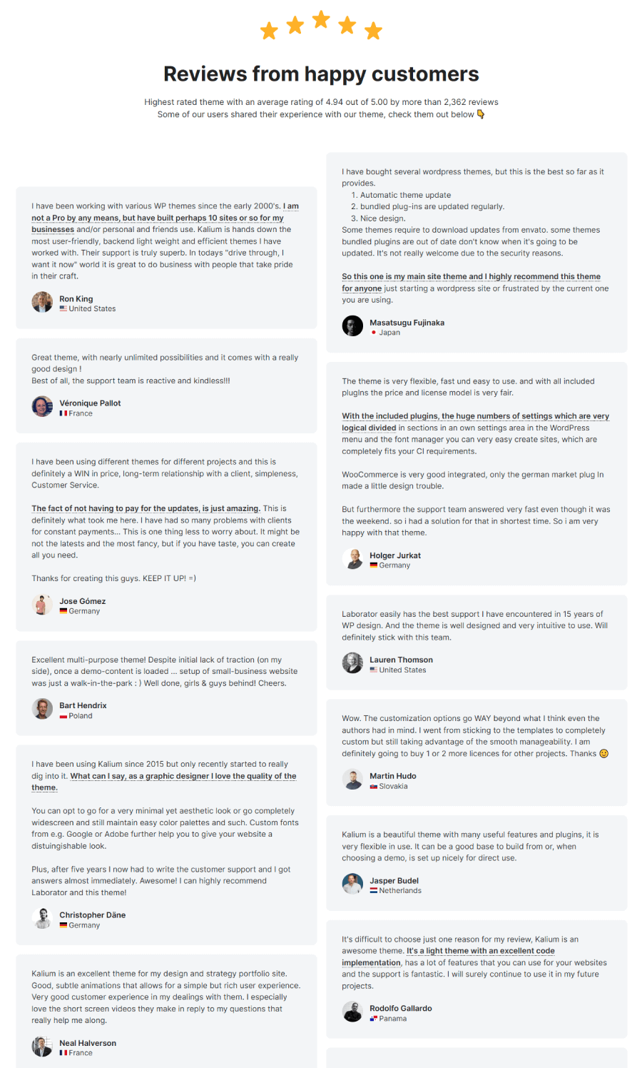
Next, we have Kalium, where right from the start, it plays with transparency, opening with a cheeky line that calls out marketing fluff and steers you straight to real customer opinions. The page includes quotes from people who’ve built actual businesses using the Kalium theme, some of them are founders or team leads who share how the theme helped them shape their websites. It also pulls in nods from respected voices in the WordPress community.
14. Missive App

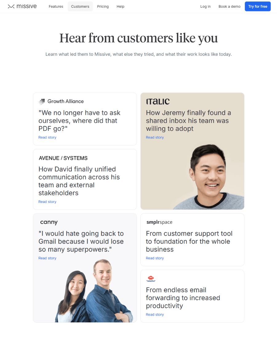

Missive gives a lineup of case studies from teams using the app to sort out internal communication and make things run smoother with their customers. Each story shows how the tool fits into real workflows.
15. PandaPay

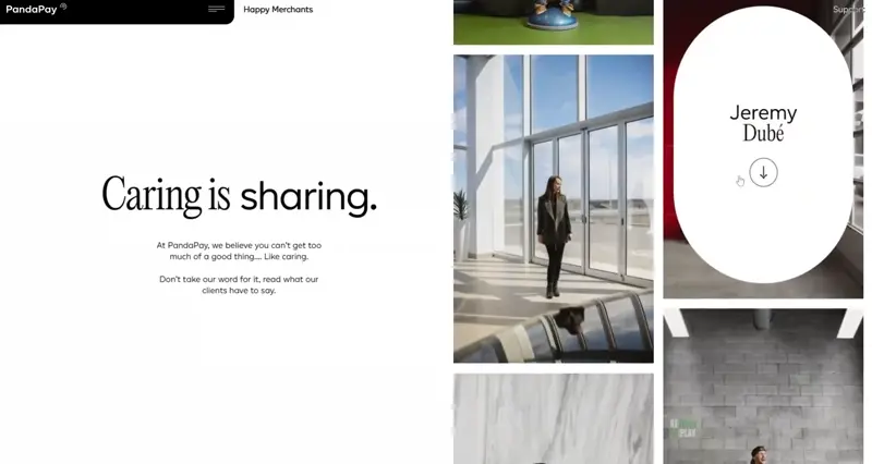
PandaPay calls its testimonial page “Happy Merchants” and the tone matches the title. Real names, faces, and job titles fill the page, so it reads more like a community wall than a pitch.

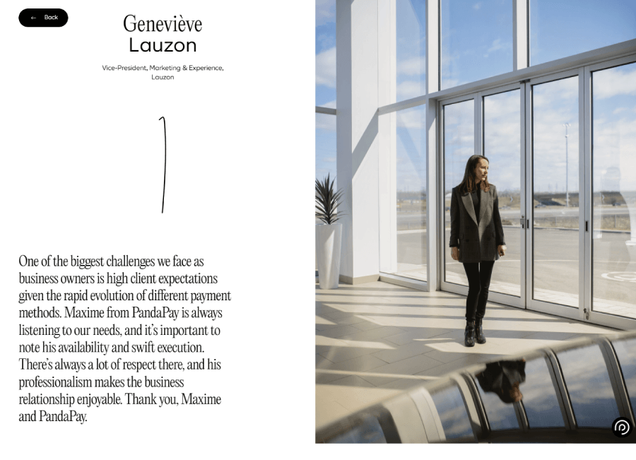
There’s a fun touch with moving photo thumbnails that keep things lively without overdoing it. The overall vibe feels grounded with honest feedback from people running shops and services, all in one place.
16. Postcards

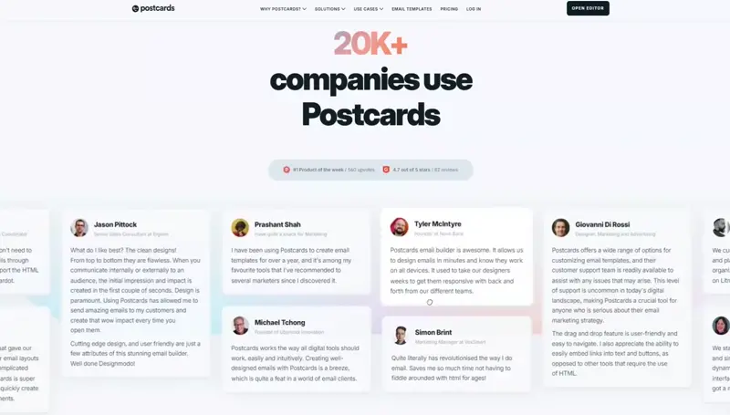
Next, Postcards keeps has an animated slider full of real feedback from users. The design’s got movement and color without going overboard, and the testimonial cards feel more like part of the interface than something bolted on. It’s an easy way to see who’s using the tool and what they actually think.
17. Purplethumb

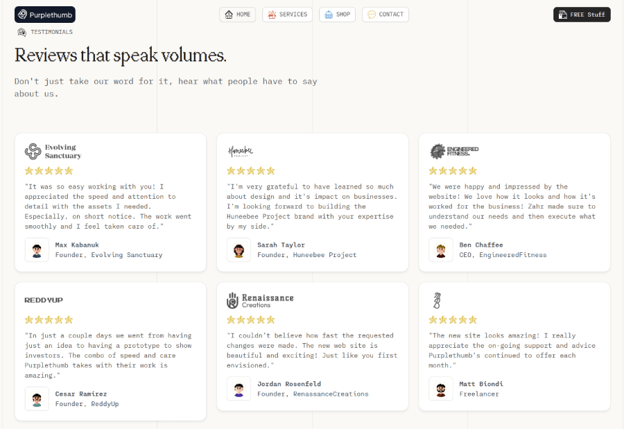
Purplethumb lines up its client quotes in neat, swipeable cards that each come with a company logo, a short review, and a quick star rating. It’s clean and gives you just enough context, such as name, role, business, without crowding the space.
18. Seattle Sports Institute

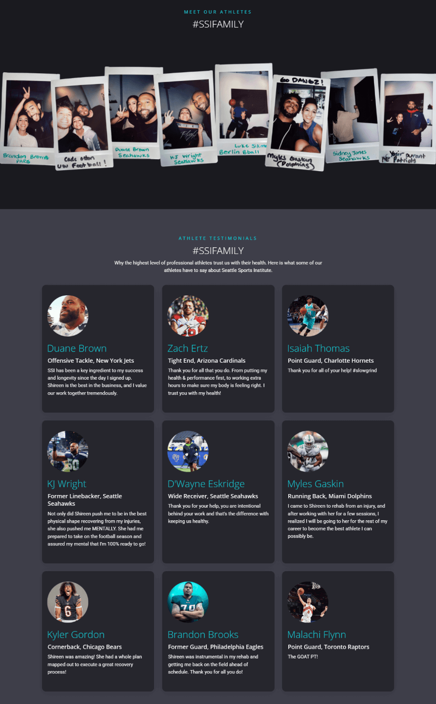
Here we have endorsements from pro athletes, which immediately sets the tone for the kind of clients they work with. The quotes are mixed with a social tag #SSIFAMILY that leads people to find even more reviews on Twitter.
19. Hoops Capital Academy
Instead of the usual testimonial page, Hoops Capital Academy puts their spotlight on YouTube. That’s where they share stories and feedback from young players and families, all captured on video. These clips don’t just show smiles, they show kids in action, the energy of training sessions, and what it feels like to be part of their community. The focus is clearly on the journey of these young athletes and what the program helps them build, both on and off the court.
20. SeedLegals

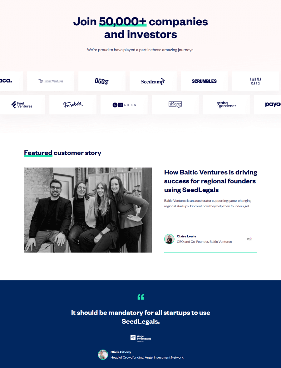

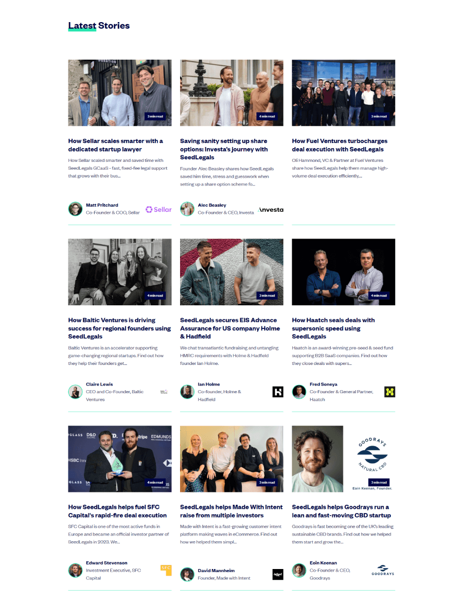
SeedLegals keeps it simple with a page full of client stories told through short videos and quotes. There’s a nice variety of founders and companies featured, and each story ties back to how SeedLegals helped them move things forward. It works more like a living portfolio than a static wall of praise, showing a spread of real people behind the brands.
21. Shopify

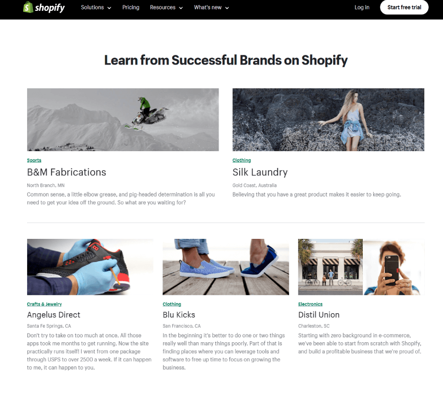

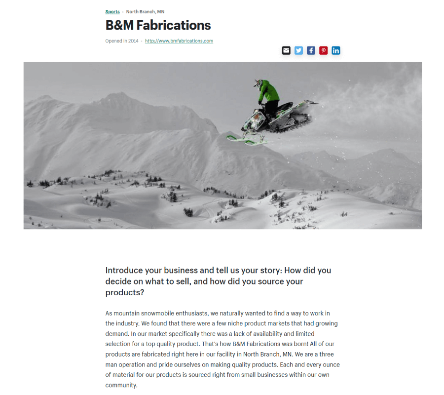
Shopify’s “Success Stories” page reads more like a running blog of client wins. The range is wide—there’s everything from garage startups to fast-growing online stores. Visitors can filter by industry to find stories that feel familiar, which makes the content way more useful than just scrolling. While the page features some recognizable names, the real charm comes from the smaller brands talking about how they made things work with Shopify’s tools.
22. Spendflo

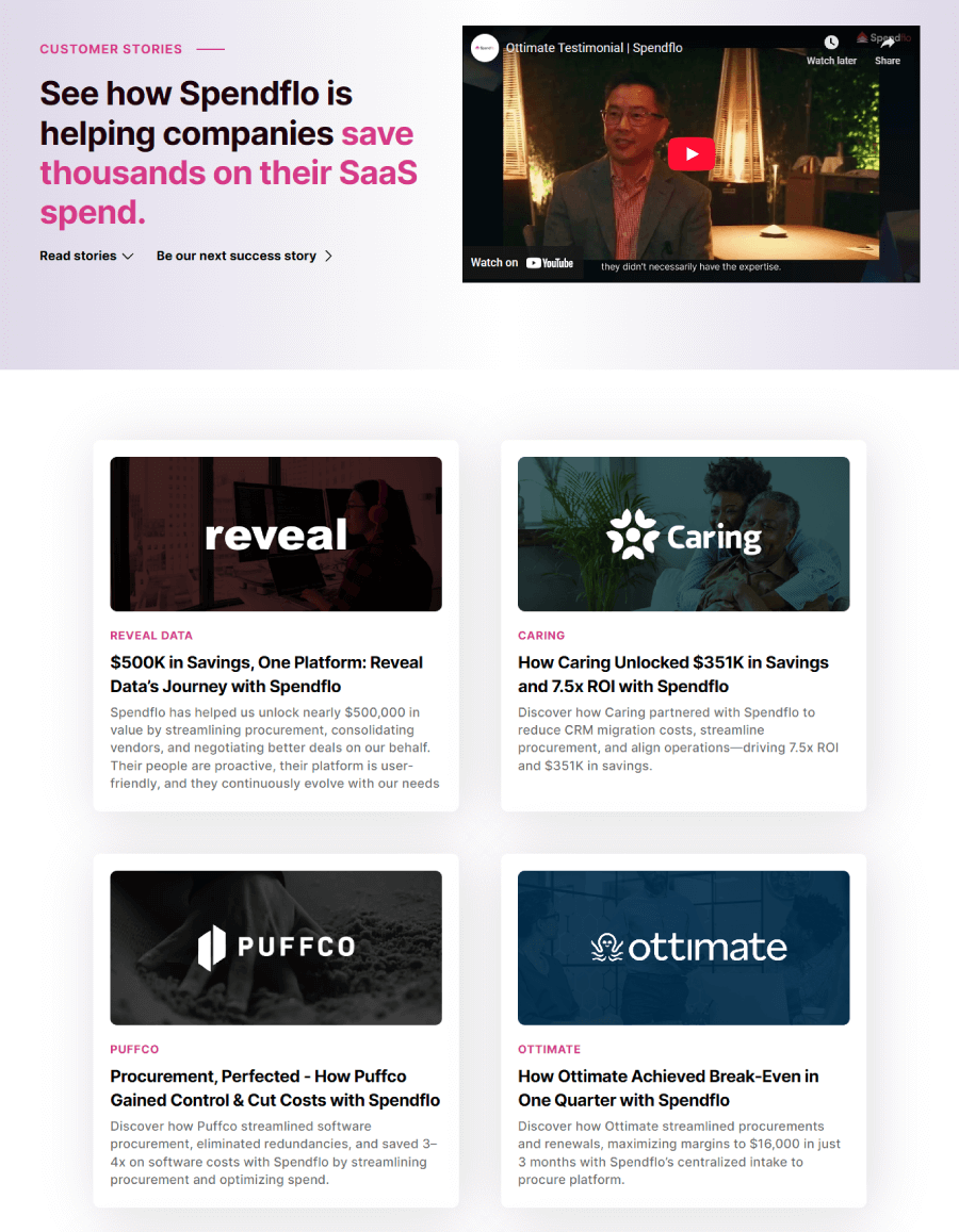
Spendflo shows how teams sped up their entire SaaS buying process by cutting back on wasted time and money.
The quotes read like quick case studies, each one offering a peek into how different companies improved the way they manage software deals through Spendflo.
23. Stio

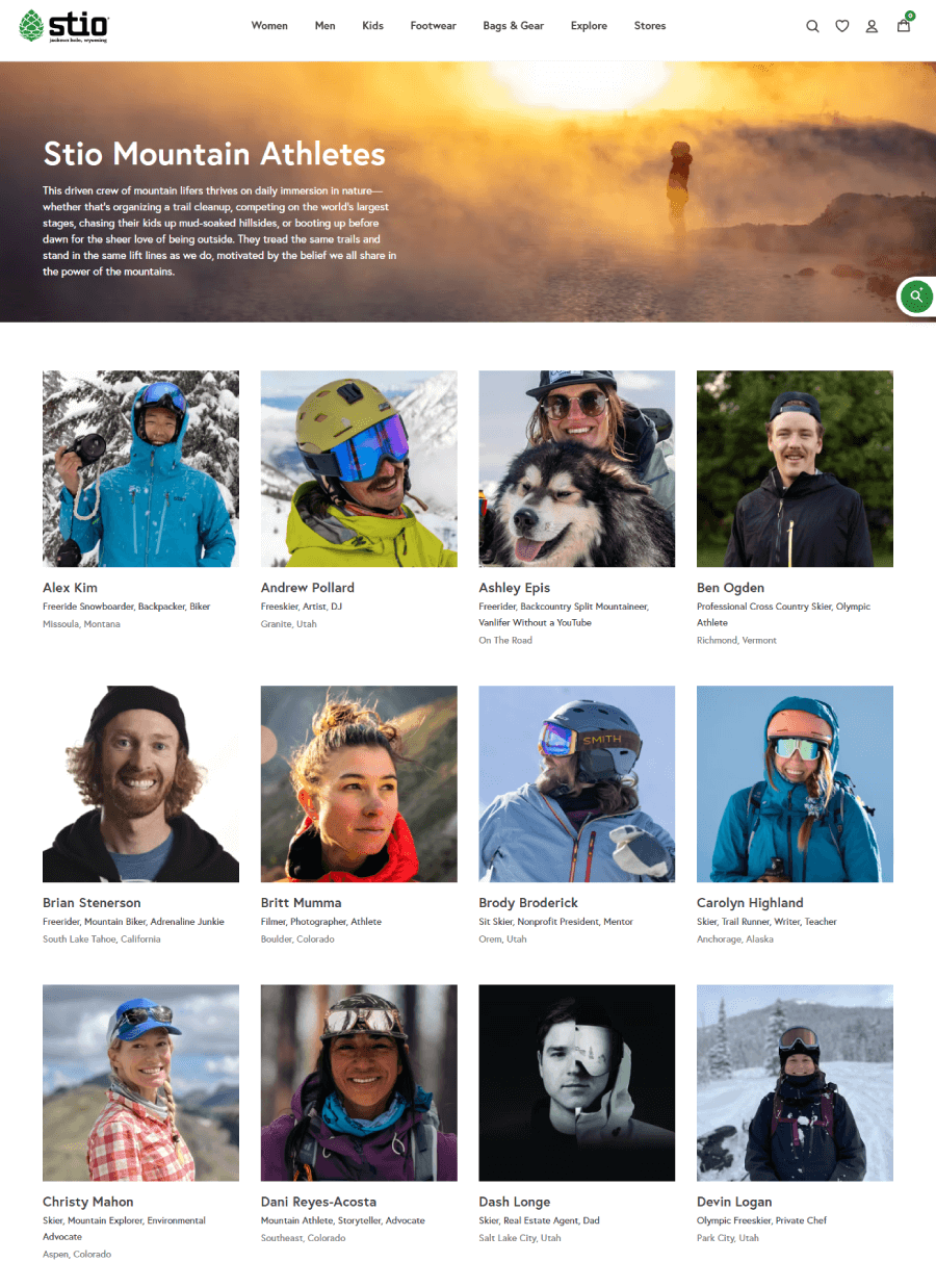
Instead of blurbs or ratings, Stio shares stories from their brand ambassadors, people who live for the outdoors and wear Stio gear while doing what they love. One story features freeskier Andrew Pollard, and it’s part interview, part behind-the-scenes look at life in motion. These stories bring out the personality of the brand and show how their gear holds up in wild, real-world settings.
24. Stripe

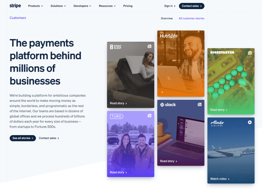

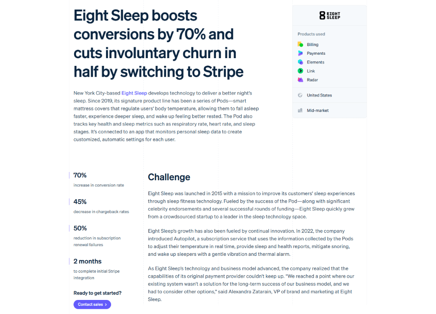
Stripe’s testimonial page mixes customer stories, quick quotes, and video walk-throughs. Some pieces dig into how Stripe helped solve specific issues with payments or growth, while others keep it high-level. Either way, it’s a page full of examples that show what Stripe’s tools look like in actual businesses.
25. Upwork

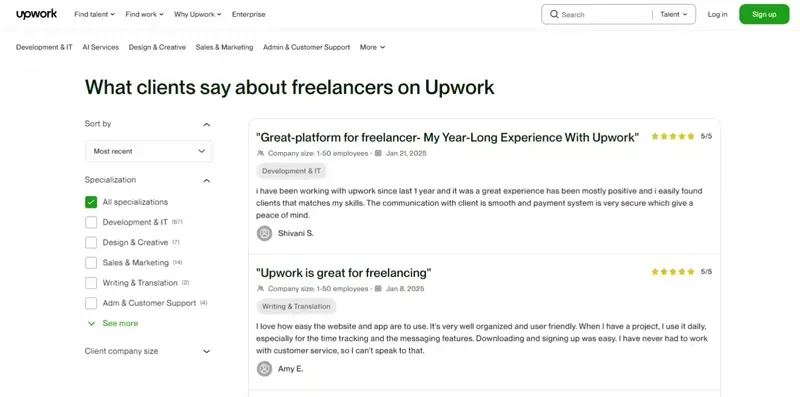
And last, you have Upwork’s testimonial section with an intro at the top to set the tone, then a lineup of stories from businesses and freelancers. Each one gives a quick snapshot of what the project was, who was involved, and how it worked out. It reads more like a working portfolio than a highlight reel.
And there you have it!
When done right, testimonial pages (or sections) can tell better stories than any headline or CTA ever could. It doesn’t really matter what the design is, clean and minimal or all in with quotes, videos, and sliders, the best ones find a way to sound human and build trust without trying too hard.
Hopefully, these 25 testimonial page examples gave you some ideas to play with. If your current testimonial page feels a little flat, now’s a good time to tighten up the messaging and let your happy customers do the talking.
Next steps:
-
Explore these 30 Pricing Page Examples I Love (With Key Takeaways), or
-
Jump right into our complete WordPress Website Examples Hub.