In my previous article, we talked about the basics of fonts theory. We reviewed the difference between typefaces, fonts, and families, as well as their classification and the very structure of a glyph. Today we’ll go through the most popular types of fonts with some examples. So buckle up.
Serif Fonts
Serif fonts are a classic type of fonts with an easily distinguishable feature. They have ornamental details in the form of small strokes that finalize the main strokes of the character. These details are called serifs and this is where the name of the font type comes from.
Serif fonts are usually common in print and publishing design. When it comes to online use, however, we usually see them only on headlines and subheadlines. The reason is simple – the serifs make them harder to read in big paragraphs of text.
Serif fonts convey elegance, sophistication, and high class and are used in designs that communicate the same characteristics.
Here are a few must-have serif fonts you’d love to have in your library.
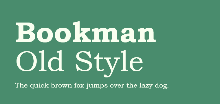
Bookman Old Style
This is a classic serif font that simply makes a statement. Bookman Old Style is a strong typeface with a hint of geometry. It comes in 20 different styles sorted into several families.
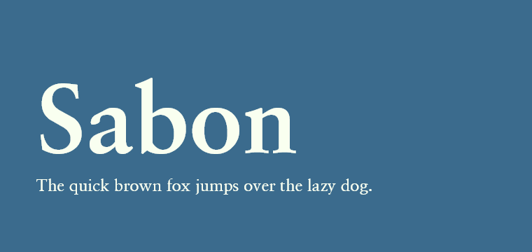
Sabon
Sabon has vague and elegant serif details. This typeface includes 4 different font styles perfect to achieve an elegant look in digital and print designs.
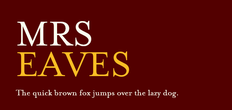
Mrs. Eaves
With strong serifs that make a statement, Mrs. Eaves is a font that won’t go unnoticed in your designs. The typeface comes in 9 different font styles including small caps, as well.
Sans Serif Fonts
Sans serif fonts are probably the most popular type of fonts in the modern-day. Literally translated, sans serif means without serif. You will recognize this font type by the missing serif elements.
Sans serif fonts are created with the main strokes only which makes them look more clean and minimalist. This feature allows them to be used in big paragraphs of text. They maintain perfect readability.
Here are some popular sans serif fonts to try:
Proxima Nova
An elegant sans serif typeface with a geometric appearance and a modern vibe. Proxima Nova is a popular typeface available in a huge diversity of styles and weights forming a total of 48 different fonts.
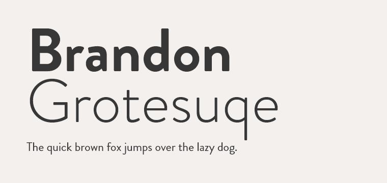
Brandon Grotesque
This one is made in a geometric style and has a warm feel. Brandon Grotesque is a very clean and legible typeface that has expanded to 48 attractive fonts in different styles, including a Condensed family, a Print family, and more.
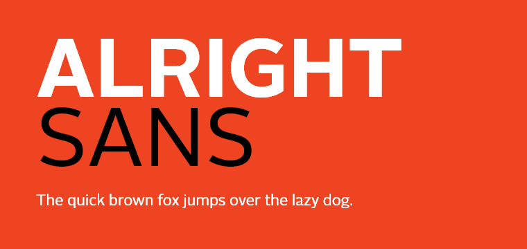
Alright Sans v2
A multipurpose sans serif font that is a mixture of a humanist sans and a neo-grotesque sans. Alright Sans v2. is a 2019 updated version of the original Alright Sans. It comes with a big diversity of font styles and weights.
Script Font Types
Script fonts are very easy to recognize – they are based on handwriting. Since handwriting has changed throughout the centuries, script fonts fall into two categories: classic and modern. Classic script fonts are inspired by the handwriting style in the 17th and 18th centuries, while modern script fonts look more casual and resemble the usual handwriting in the modern days.
As a rule, script fonts are used for short copy such as headlines, slogans, etc. Classic script fonts convey elegance while modern can look quite playful. In large paragraphs of text, script fonts get harder to read which is why it’s best to avoid them for such use.
A few great script fonts to try:
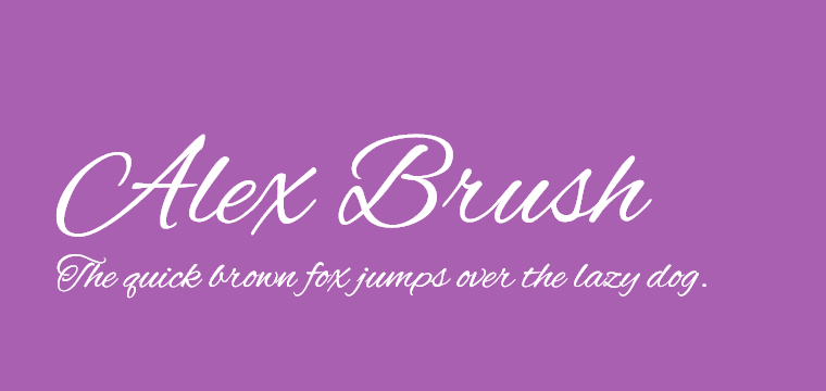
Alex Brush
A very elegant script font with short ascenders and descenders which increases its readability. The font is flowing and perfectly imitates beautiful handwriting. It comes in one style only.
Kaushan Script
This modern calligraphic script with a casual but still beautiful look. The script font comes in one style and is great for headlines and slogans. Not suitable for large body text though.
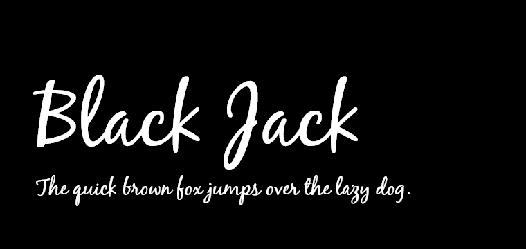
BlackJack
A casual script font imitating brush handwriting. BlackJack comes with a bit of a retro vibe but still looking very modern and unpretentious. Advisable for display use only – headlines and subheadlines.
Display Font Types
Display fonts are usually heavy fonts purposed for use in 20px and larger. These fonts are never used for body text. Their best use is in headlines and slogans where their potential to catch the attention unveils fully.
Display fonts are the type of fonts that suggests the largest creativity – their purpose is to display a visual theme. They can provoke a large array of emotions and convey different messages.
Here are a few great-looking popular script fonts to try out:
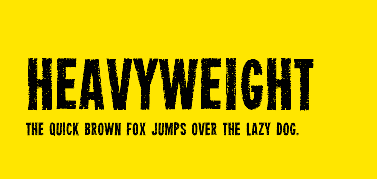
Heavyweight
Perfect for vintage-inspired designs, this display font comes in capital letters only and certainly makes an impression. The typeface looks heavy and grunge and creates an effect of poor ink coverage.
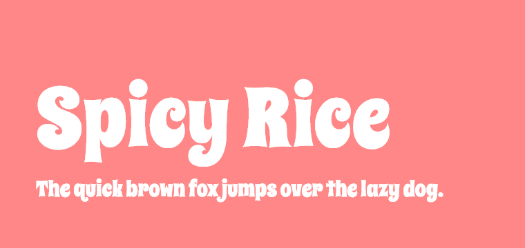
Spicy Rice
A playful and cute display font that presents a quite big x-height relative to the caps-height. The font has chubby and curly shapes which makes it look a little bit retro and very cheerful.
Arbutus
A display font that also falls in the category of slab serif fonts. With its faceted appearance, Arbutus font is suitable for headlines and slogans. However, the big spacing still allows its use in small sizes, as well.
Final Words
Choosing the right fonts for your projects requires a lot of experience and learning, especially with all those types of fonts on the market. However, the huge diversity of fonts allows designers to harmonize the appearance of the lettering with its actual meaning and thus, make stronger designs.


