

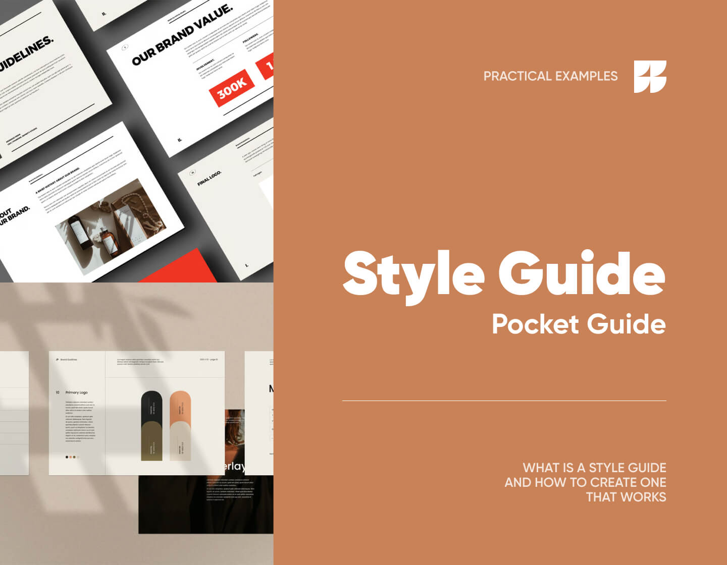
The pocket guide that explains what is a style guide is, why you need one, and how to create your own, with practical examples.
If you’ve ever designed something for your brand and thought, “Wait… what font do we use again?” or “Is this the right logo file?”, you already know why a style guide matters. With a good style guide, you don’t have to guess, hunt through old files, or rely on memory, because you just open it up, follow the rules, and know you’re staying true to your brand when you’re creating a landing page, an Instagram Story, a product label, or your next big campaign.
If you’re not sure where to start, you can just start here. I’ve written a small pocket guide that explains what is a style guide, why you need one, and how to create your own, with practical examples.
What is a style guide exactly?
This is the brand’s instruction manual or the reference you (and anyone else working with your brand) can turn to when you want to make sure everything looks, sounds, and feels the way it should. Inside a style guide, you’ll find all the brand essentials such as its logo variations, color palette, fonts, typography rules, imagery guidelines, and even the kind of language your brand uses in emails, ads, or social posts.
You’d use a style guide any time you create something for your brand (a new landing page, a pitch deck, product packaging, or even a quick Instagram Story), because it will outline your tone of voice, how formal (or casual) you sound, and the little quirks that make your brand feel unique.
For example, if your style guide says your brand always uses bold, high-contrast colors and speaks with a playful, witty tone, you’re not going to send out a beige, corporate-sounding newsletter. Your guide keeps you consistent, so your audience instantly recognizes you no matter where they see you.
Here’s why to have one
When you’ve got a style guide, everyone on your team (designers, copywriters, marketers, video editors, etc) knows exactly how the brand should look and sound. That means any websites, social posts, ads, app, email campaigns, and even YouTube thumbnails related to that brand will feel like they came from the same place.
It also speeds up the whole process. Instead of digging through old files or chasing someone down for the “latest logo”, you’ve got everything in one spot. Of course, any good style guide is organized, easy to skim, and usually has a table of contents so you can jump straight to what you need.
Not all style guides look the same, though. Either way, yours will usually cover these areas:
Brand story
This is where you explain why your brand exists and what you stand for. You might talk about how your coffee shop started because you wanted a space where locals could actually slow down and connect, or how your app was built to help freelancers finally get paid on time. When you keep it authentic and straightforward, it helps your audience feel like they know you. Speaking of the audience…
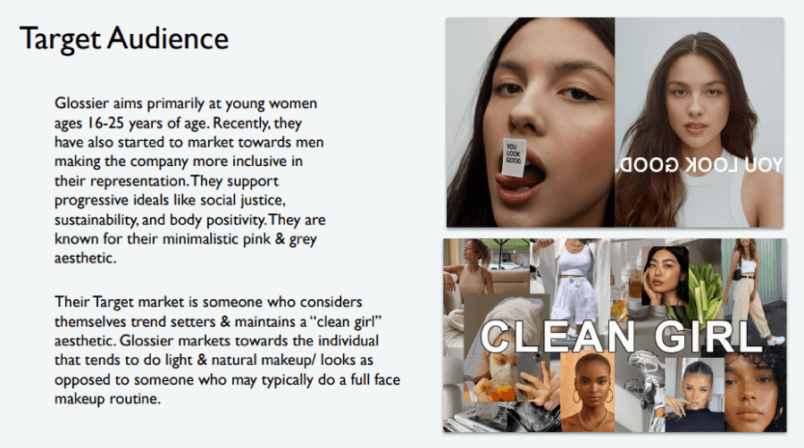
Target audience
Of course, you’ll need to know who you’re talking to for your message to land. You will outline exactly who your customers are and what they care about, in your guide. For example, you may be designing for busy parents who need quick solutions, or for design-savvy twenty-somethings who scroll Instagram more than they check email. You can even include audience personas with details like goals, challenges, and favorite platforms, so everyone on your team knows who they’re speaking to.

Visual identity
This is the part most people think of first. It includes the brand colors, fonts, logos, and imagery that makes the brand recognizable, in all their specifics. You might also include how to use icons, which photography styles are on-brand, and which ones to avoid. This makes it almost impossible for someone to create an off-brand slide deck or Instagram ad.
Brand voice
Your voice is how your brand “talks”, and it’s just as important as how it looks. You could be friendly and cheeky (think Innocent Drinks), bold and no-nonsense (like Harley-Davidson), or warm and trustworthy (like a favorite local bookstore). Your style guide should describe your voice in a few adjectives, and note how it shifts depending on the channel; maybe you’re casual on Instagram, but more professional in proposals.
Writing guidelines
This section keeps your content consistent, even if you’ve got multiple people writing for your brand. You might set a reading level (say, 8th grade for approachable language), define how you handle punctuation (hello, Oxford comma), and list words you always use or never use. For example, maybe you always write “customers” instead of “clients”, or you avoid technical jargon like the plague unless you’re speaking to industry pros.
How to build a brand style guide step by step
For the sake of doing this in practice, let’s say you need to create a style guide for Golden Leaf Tea Co., which is an imaginary boutique tea brand that blends premium loose-leaf teas. The brand focuses on slow living, natural wellness, and aesthetics, so it needs a beautiful presentation. You want your style guide to capture that calm, refined energy.
Step 1. Build the outline
First, figure out the main sections you need so your guide is easy to follow. For Golden Leaf Tea Co., your table of contents might have chapters like “Our Brand Story”, “Who We Serve”, “The Golden Look”, “Our Voice”, and “Writing Do’s & Don’ts”. This way, your packaging designer knows exactly where to find logo rules, and your content writer knows where to check tone guidelines, etc.
Table of Contents:
Brand Story
Target Audience
Visual Identity
3.1 Logo Usage
3.2 Color Palette
3.3 Typography
Brand Voice
Writing Guidelines
Step 2. Write the style guide
Next, document your core story, visuals, and voice. For Golden Leaf Tea Co., your mission might read: “Craft tea experiences that inspire moments of calm and connection”. Your values might be purity, sustainability, and craftsmanship, which will set the tone for how your brand looks, sounds, and feels.
A short example style guide excerpt:
🎯 Mission Statement.Craft tea experiences that inspire moments of calm and connection.
🎨 Color Palette.
Primary: Golden Amber #D4A648; Deep Forest #2B3A2F
Accent: Cream White #F8F5F0; Soft Sage #C7D2C0
Contrast: Use Deep Forest text on Cream White backgrounds for body copy. Avoid gold text on white backgrounds.
🇦 Typography.
Headers: Playfair Display Bold. For tea names, packaging titles, and featured quotes.
Body Text: Lora Regular. For web content, product descriptions, and printed menus.
Sizes: H1: 34px; H2: 26px; Body: 16px.
Text Rules: Title case for product names, sentence case for descriptions. No ALL CAPS unless used for small decorative labels.
📷 Photography Guidelines.
Use natural light with soft shadows.
Include textures like tea leaves, wooden trays, and ceramic teacups.
Feature steam rising from tea, where possible, to create a sense of warmth.
Avoid overly bright colors; stick to muted, earthy tones.
📣 Tone of Voice.
Calm, inviting, and knowledgeable.
Instagram captions: Share short, poetic phrases about tea rituals. Example: “A gentle pour, a quiet moment, a golden sip”.
Packaging copy: Keep it concise but sensory. Example: “Bright citrus notes meet soft jasmine petals”.
Blog articles: Be informative and warm, blend storytelling with expert brewing tips.
Step 3. Gather feedback and revise
Before you finalize the guide, you can run the draft past the client team and your internal project crew. Here, you will usually aim for one short review round that focuses on real use cases for print, package, web, and retail. Send targeted notes so each reviewer knows what to check. For example, the printer checks finishes and stock, the marketing lead checks tone and campaign examples, the developer checks color tokens and CSS variables, etc.
Example excerpt (print + finish notes)
File format: Vector logo in AI or SVG at 1:1 scale. Raster logo files show artifact risk.
Example feedback log (short)
Step 4. Prepare it for delivery
After client sign-off, now you need to deliver a tidy handoff package and run a short walkthrough with the client team. The package contains the master design file, exported assets, token lists, and a one-page quick reference for freelancers. Record the walkthrough for future hires and add a clear version note inside the guide.
Example handoff checklist (what the guide lists)
Logos: /logos/SVG, /logos/PNG, /logos/print/AI
Color tokens: HEX / RGB / CMYK / Pantone
Typography: Font stack, sizes, line-height
Export settings: Web PNG 72 dpi; Print PDF 300 dpi, 3mm bleed
Quick reference PDF: One page with logo lockups and color swatches
Contact: Brand lead email; Design lead email
Version note: Last update: 2025-08-12. Next review window: 6–12 months.
Example style guide excerpt for sharing section:
Digital PDF: [Link to Golden Leaf Tea Co. Brand Guide] Quick-Reference Cards: Small printed cards with the color palette and typography rules, kept at blending stations and design desks.
Asset Library: Logos, photography, and packaging templates available in the shared Dropbox folder.
And there you have it!
A style guide only works if people actually use it, so don’t just tell people what to do. Show them. Real-life dos and don’ts make it so much easier for anyone to keep things on-brand.
Now, if you want to go even deeper, check the full guide on How to Build a Strong Brand & Visual Identity from Scratch, or relax with some of these recommended (and related) articles: