
You have probably heard that “Less is more” and simple logos are here to solidify this idea. The quote became famous thanks to architect Mies van der Rohe who popularized this principle in architecture and design. Simplicity is universal, adaptable, and makes things easier, no matter where it is practiced. In terms of branding design, utilizing a minimal concept adds to the simple logo’s impactful, versatile, and timeless look.
That’s why, in today’s article, we will explore 21 inspiring simple logo examples that effectively utilize plainness to achieve an ingenious design. Distinct, direct, and memorable, simple logos are dressed to impress. So, wait no more, let’s begin!
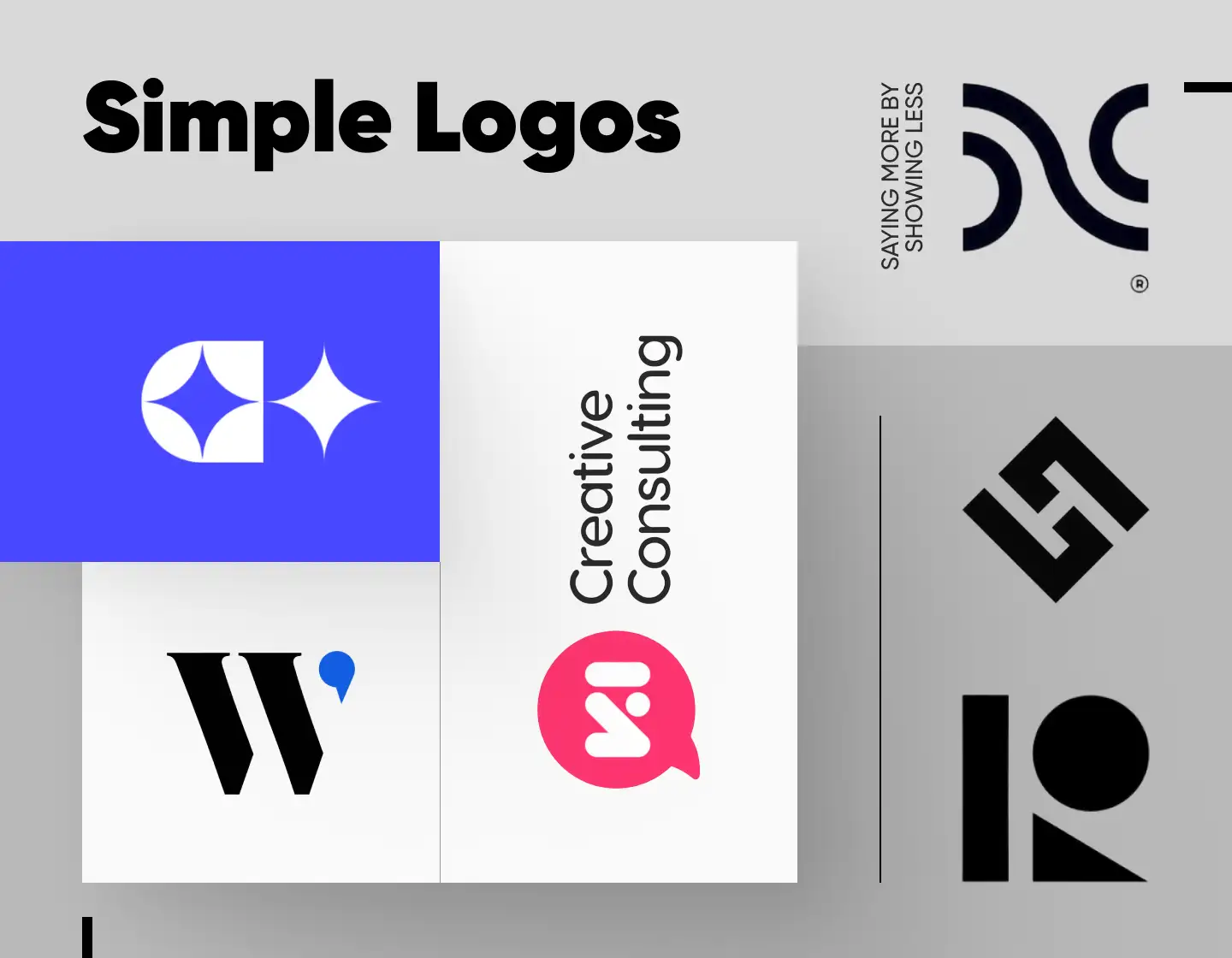
1. Simple Wavy Monogram Logo
This logo looks so sleek with its elegant wavy curve. In addition, when perceived as a whole the graphic elements form an abstract letter “N” with the little arcs also resembling “C” characters. This makes the design a creatively displayed monogram with a classy appeal, reinforced by its color scheme. The concept’s subtlety is further strengthened by keeping symmetry, achieving, as a result, an amazing, recognizable, easily remembered, and timeless look.
2. Creative Negative Space Logo
This concept is created as a simple and clever logo supposed to represent a film director and producer Sarah Hickey. The design smartly combines the name initials in its beautiful design. Looking like a tilted “S”, the emblem smartly uses the negative space to form the “H” character, thus resulting in a truly inspiring and classy simple logo example that will stand the test of time.
3. Simple and Dynamic Bike Logo
The next example – the logo created for the Ribble Bikes rebranding, is all about movement. Its design’s dynamic perspective resembles a bike track or traces, and even the marks of a tire. In addition, its black-and-white color scheme ensures it is versatile and can be adapted to any of the bike manufacturer’s needs, while also keeping a highly recognizable and memorable image.
4. Solid and Simple Logo Example
Is there anything more to be expected from a steel product business branding? The logo icon looks solid and exudes stability as it strongly resembles a twisted steel bar while straightforwardly standing as a streamlined letter “B”. In addition, the concept’s typeface exudes high performance with its sans-serif capitalized lettering. As a result, the design creates a professional, reliable, and trustworthy brand image.
5. Simple Rounded Wordmark Design

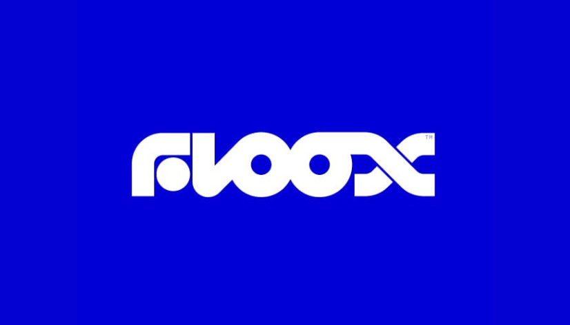
Floox, an electrical products manufacturer, has a logo consisting of only a wordmark yet exuding energy, movement, and overall dynamics. It sports a certainly modern and futuristic design resembling the company’s innovative and modern approach to their business. The solid characters symbolize the powerful electric chargers as the flow between the letters is supposed to resemble the flow of electricity that comes through them.
6. Stylish Simple Logo Design
With its elegant balance and overall stylish look, this logo instantly catches the eye. It also sports a monochrome look reinforcing its sleek appearance. The icon certainly grabs and keeps the attention thanks to the clever use of negative space resulting in a neat, rectangular design incorporating the letters “D” and “C”. To finish the concept, the classic, sans-serif lettering adds reliability and professionalism to the brand’s image.
7. Simple Chat Bubble Logo
With a straightforward design, this logo example represents KI Creative Consulting. Its icon, featuring a chat bubble and the brand’s initials executed in a modern style, plainly describes its identity and consulting services. In addition, the logotype’s simple lettering looks both professional and friendly, reflecting the company’s approachability and expertise.
8. Transport Company Dynamic Symbol
This one is a logo example coming from Denmark’s largest transport company and it has an icon that exudes movement through its every detail. Dynamics and flexibility are what it suggests as it represents the transportation company’s services. With the additional help of its customized typeface, exuding proficiency and approachability, this certainly is one simple, yet powerful concept.
9. Modern Simple Monogram Logo
The next example comes as another strong proof of how impressive simplicity can be! With its rotated letters’ smooth design with an integrated wave in it, the sleek monogram is the epitome of luxurious simplicity. As a result, it exudes excellence and innovation, balance, and professionalism, both with its spectacular design and its color of choice.
10. News Logo Simple Design
From the very first look, this logo exudes professionalism, trust, and seriousness. Its icon smartly incorporates in its modern design the letter “N” and an abstract depiction of an open newspaper, thus resonating with the brand’s essence and name. Meanwhile, the all-lowercase straightforward lettering adds approachability and reliability to the company’s image.
11. Creative Simple Emblem Concept
Our next example is a sleek and modern monogram combining the letters “N” and “U” in its super impressive design. The design’s fluidity, balance, and simplicity are what make it so effective, also ensuring its high versatility. In addition, the logo’s black-and-white color palette further reinforces its stylish, timeless, and memorable look.
12. Abstract Letter Simple Design

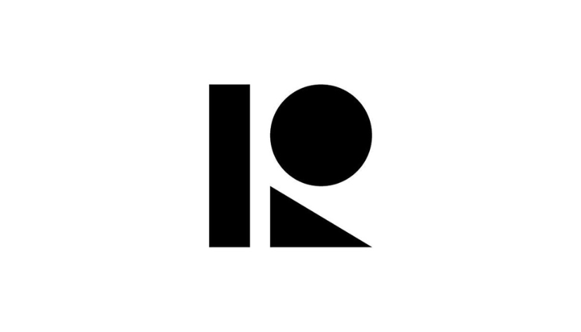
By utilizing three geometrical shapes, this design is a simple and abstract representation of the letter “R”. The rectangle, circle, and triangle, all executed in black, are the only components of the logo, embracing creativity and plainness to achieve its look. The concept’s straightforward and plain approach is what ensures its adaptability and recognizability among the brand’s competitors.
13. Simple Modern Lightning Logo
Simple and unique, this modern lightning logo has a professional and solid look with a touch of luxury. Though depicting an object characterized with sharpness the design seems smooth, flexible, and soft. In addition, the color combination creates a striking contrast that enhances the concept’s message of stability and power even more.
14. Cool Single Letter Logo Design
The next example also uses the benefits of the black and yellow contrast to enhance its design’s effect. The black monogram instantly catches the eye thanks to its color combination and overall simplicity. It features the letter “S” depicted abstractly through simple shapes – two circles and two semicircles. In general, the logo is effective and adaptable, arranged in balance to create beauty.
15. Amazing Simple Logo Concept
The creatively depicted “E” in this logo can easily stand for “elegance”. Utilizing a monochrome color palette, it creates a classy and somewhat feminine look with its ribbon-like design. And, by featuring also the letter “O” in its negative space the logo can be categorized as a monogram, too. As a result, the design achieves a versatile, highly effective, and adaptable look.
16. Simple Logo Idea With Stars
Created for a VR courses platform, the next example embraces a blue and white color scheme. This adds trust and strength to the plain design from the moment we see it. Also, combined with the star shapes, the blue color makes the brand appear successful and trustworthy. The emblem’s design looks modern and futuristic resonating with the company’s business nature.
17. Elegant Name Logo Simple Style
With its sleek, sharp lettering this amazing logo appears so elegant and classy! The emblem’s unfinished lettering style makes it appear mysterious as it leaves the viewer’s imagination to define the concept’s message. It also utilizes a sleek monochrome color palette and, as a result, we see a subtle, trendy, visually appealing design, made to impress and engage.
18. Modern Park Logo Simple Design
This logo, created for a group hosting events along the Mississippi River, has such a modern and impactful look. The minimalistic design uses an abstract approach to display a solid “M” character through various-sized waves. The color palette instantly connects with the brand’s nature-oriented business, also adding to the logo’s recognizable, memorable, and highly attractive appearance.
19. Cool Logo Simple Style
This clean emblem is created for a tech consultancy firm and the simple design certainly adds to the company’s approachability and reliability. These characteristics are also reinforced by the concept’s color choice, exuding optimism and friendliness. The logo’s icon looks dynamic and effective despite its plainness, embodying in itself also the brand’s name, and resulting in a memorable brand image.
20. Creative Single Letter Design

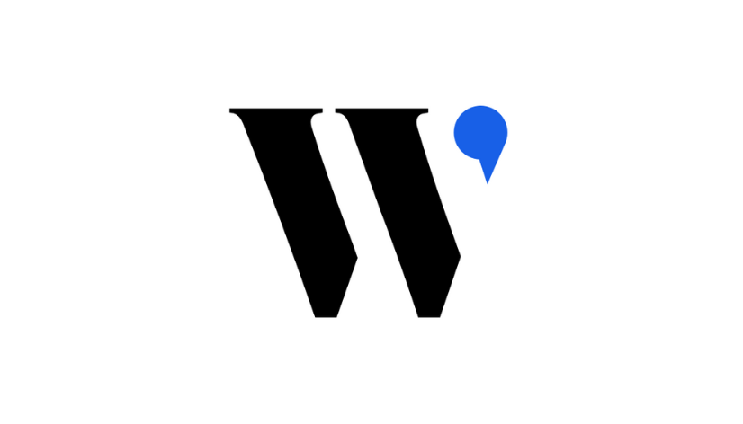
Created for the jobs website WorkinStartups, this logo example utilizes an effective single-letter monogram to create its memorable look. The solid “W” character, using a quotation mark as its third arm, creates a relevant and dependable brand image that builds trust in the company’s business. As a result, the logo can be easily remembered, achieving a recognizable look.
21. Club Logo Cool Design
Our last example for today’s article is created for the Hunt nightclub branding. The design manages to convey the essence of the electronic music scene with its solid, techno-vibe lettering. In addition, the monochrome logo also conveys senses of movement, space, and dynamics, resonating with the idea of partying. With its balance and simplicity, the concept achieves a recognizable and memorable look, perfect for a nightclub logo.
Tips for crafting impressive simple logos
- The essence of simple logos is, well, simplicity, so try to focus on one central, strong visual element. Depending on your idea this could be a shape, icon, or letter. Simplifying the design to one focal point helps in creating a logo that is easily recognizable and memorable.
- Limit your color palette, for too many colors can make a logo look cluttered. Stick to two or three colors that represent your brand’s personality and ensure they work well together.
- If your logo includes text, go for a clean, legible typeface, for the decorative ones can be hard to read. Sans-serif fonts often work best for simple logos due to their clean lines and modern look.
- As you have seen in many examples here negative space can be a powerful tool. You can try incorporating it into your design to add depth and meaning to it. This can certainly make a simple logo more interesting.
- Ensure your logo is adaptable to any use and looks good in any size. Test its scalability and versatility on various backgrounds and for different purposes to ensure its effectiveness.
Final words
In conclusion, we can say that in the overflowing sea of design simple logos stand out as powerful symbols of identity. They are memorable, versatile, and timeless, making them a favorite choice for businesses and brands. Creating simple logos requires a blend of creativity, clarity, and the ability to bring forward the power of minimized elements. Remember, simple logos are often the most iconic designs, that beautifully stand the test of time.
If you enjoyed this article and found it helpful, you may also find our other inspirational logo collections interesting: