In the world of branding, simplicity is often preferred. Black and white logos embody this tendency perfectly, utilizing minimalism to make a bold statement. Whether designed for a brand, product, place, or service, these greyscale emblems hold the key to creating a lasting impression.
So, let’s enjoy the art of monochromatic designs and explore our collection of 19 amazing black-and-white logos!
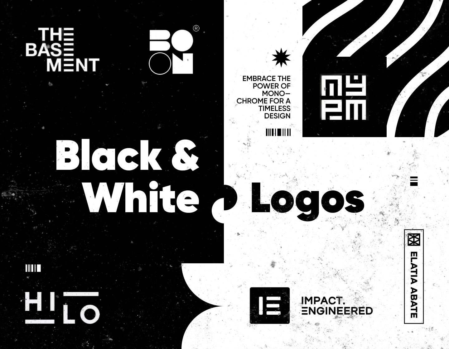
1. Retro Black And White Logo Design
This black and white logo is so chic and vintage! Designed to resemble a tag, it features a beautiful monogram with letters of the business’ name – Odyssey ClayWorks. Meanwhile, with the help of the rays around it, the monogram itself reminds of the all-seeing eye, that watches over the workers of mankind.
2. Modern Black & White Logo Design
The logo for The Basement teaches a lesson of creativity on how to communicate with only letters in your design effectively. The alignment and design of the Es form a stairway, thus associating with the name of the online community and leading the way to the basement.
3. Clever Black and White Logo Example
This clever black-and-white logo example features one truly well-done monogram with an underground vibe style. The letters are interlocked beautifully, and at the same time, the design remains legible and understandable.
4. Cool Black And White Logo Example
Created for an art gallery the Boon logo is such a cool modern example! It consists only of beautifully stylized lettering, but if you use your artistic imagination you may see how the letters on the right resemble a person looking at an exhibit.
5. Circular Black and White Logo Example
Made for Dignity Tech Limited, a company specializing in artificial neural networks, this logo is a stylish and trendy example. The emblem it features resembles a part of a neuron link and meanwhile represents stylized stag horns, a symbol of dignity. At the same time, the lowercase lettering brings balance and makes the brand seem accessible.
6. Cartoon Black and White Logo Example
This cartoon black and white logo example radiates cuteness everywhere. It features a sleeping dragon in assonance with the logotype, and jointly both hint at something magical. In addition, the dragon and the little star situated next to it also resemble a moon with a star.
7. Monogram Logo Design in Black & White
This monogram logo features a clever design of two overlapping letters “M”. Both letters have one shorter and one longer shoulder, thus creating the illusion of the forming of a narrower inside “M” and a wider outside one.
8. Creative Black & White Logo Example
Impact.Engineered is a conference celebrating the engineering profession and the impact it has. The icon, created by combining the “I” and “E” letters embodies clarity, approachability, and modernity. This logo shows how to take advantage of contrast in a great way, using it to make a strong impression.
9. Country Black & White Logo Example
Presenting the Country Cured Charcuterie, this logo straightforwardly uses a barn as its symbol. Its detailed image, the fonts used, and the added wrought-iron-like decorative elements effectively instill a sense of vintage, hinting at the company’s years-old recipes.
10. Geometry Logo Design in B&W
In this stylish example, putting the icon and name in a frame makes the logo look complete and puts focus on the information. The design embraces a geometrical approach using all uppercase sans-serif lettering and a sharp-edged icon. The square symbol itself is formed by overlapping the letters “EA” and their mirrored versions, thus smartly presenting the brand.
11. Black and White Bird Logo Example
This example is made for Crane Talent Group – an executive recruitment service. The stylized image of a crane, a symbol of good fortune and peace, shines with elegance and brings harmony to the logo. And, overall, the design is neatly structured, with the logotype and the icon completing each other’s balance.
12. Black and White Logotype Example


See how the HI is raised high on a platform, while the LO is positioned low – underneath one? This example shows how in a creative way we can literally transfer the meaning of the brand name to its graphic representation. Bold and straightforward, this design is also clever, modern, and elegant.
13. Timeless Logo Black & White Design
This is the logo of a Korean menswear line that effectively represents the brand’s hip-hop style. It also resonates with their designs full of overall patterns and black and white tones. And, if you clear out the logotype from all the little unconnected elements, you will see the brand’s name clearly – Nasty Palm.
14. Minimalist Black & White Logo Example
This minimalist black and white logo is a stylish example of a personal logo. It features a sleek, sharp-edged monogram created from the merging letters “A” and “S”, which obviously represent the name of Antanas Sinica.
15. Bold Geometric B&W Logo Design
Created to represent the personal trainer James Blanchard, this is another monogram that takes the maximum from the combination of black and white. The sportsman’s initials are masterfully joined in a bold and strong geometric design, thus creating a logo that instills trust and reliability in James’ services.
16. Serif Black & White Logo Design
Another amazing example of a monogram logo! Here we can clearly see the serif symbols “W&C” and how they are intertwined in order to achieve this beautiful logo. As a result, the whole design acquires a timeless and elegant look.
17. Great Negative Space Logo Example
This HE logo shows the mastery of using negative space for creative design solutions. The example demonstrates simplicity and how the right shadows, along with just one letter and two rectangles can force the brain and eyes to see non-existing elements.
18. Number Logo Example in Black & White
This example shows a logo that demonstrates how numbers can be equally impactful elements as letters. The design is created by merging and modeling the two figures 8 and 3, while observing the proportions in order to keep symmetry.
19. Linear Black And White Logo Design
This linear design logo features a “shining” cityscape sketch and the name – Metropolis. The skyscraper reference conveys a message of professionalism and quality, while the logotype presentation makes the brand seem approachable.
Tips to guide you when creating black-and-white logos:
1. Simplify your design by focusing on clear shapes and forms. Avoid small details that may get lost in monochrome, and go instead for bold, easily recognizable elements.
2. While simplicity is fundamental, don’t sacrifice your brand’s identity for minimalism. Just smartly use the elements that reflect your brand’s personality, even in a monochromatic palette.
3. Ensure your logo uses strong contrast to enhance visibility and legibility. Experiment with different shades of black and white to find the perfect balance.
4. Select clean and legible fonts that complement the overall design, when incorporating text into your logo.
5. Always test your design in different sizes and contexts, from digital screens to print materials, to ensure its effectiveness everywhere.
Final words
In the flooded design world, black and white logos stand out for their elegance and their timeless look. By following good practices and keeping simplicity, designers can create amazing logos that leave a lasting impression. Because no matter what type of design you choose, one thing will always be true – the power of black-and-white logos lies in their ability to communicate effectively across diverse audiences.
So, embrace the simplicity and the contrast, and let your black-and-white logo speak for you!
Still, if you find yourself in need of more inspiration, you may try looking for it here: