In our modern world, where two-thirds of the world’s population has access to the internet, having a memorable online presence is more than important. It is even mandatory for most businesses. So, it comes naturally that any restaurant wishing to please its customers must have a good website. A good restaurant website design provides options to explore the venue and its menu, make a reservation or order online, and get to know the business’ story. Strengthening the bond with their clients and improving the customer experience, the restaurant websites are an irreplaceable part of their marketing strategies.
In today’s article, we will explore 24 examples of good restaurant websites, that instantly whet our appetite and make us crave going to eat there. So, get ready to get hungry!
1. Dim T

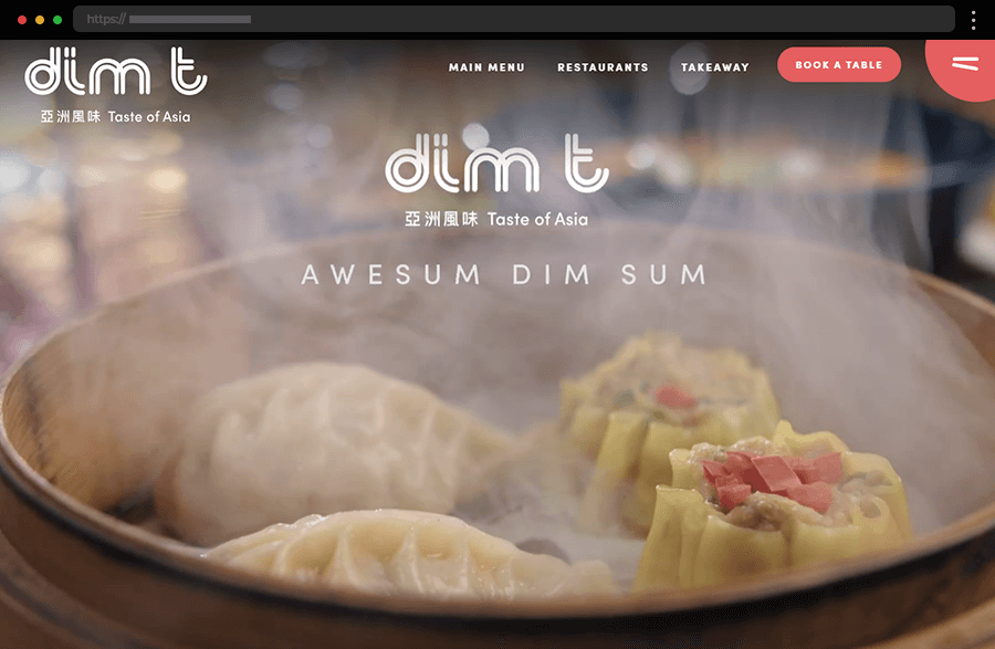
This website certainly makes us crave their “awesum dim sum” by showing impressive close-up footage of Dim T restaurant specialties’ preparation. Its amazing web design perfectly embodies the essence of Asian culture. It beautifully keeps consistency throughout the pages and exudes harmony, balance, and beauty. In addition to being quite eye-pleasing, the site is also packed with anything a client might need. There’s nothing redundant either in the site’s design or in its content. And, the navigation menu icon depicting chopsticks certainly makes a sweet impression.
2. Banana Blossom

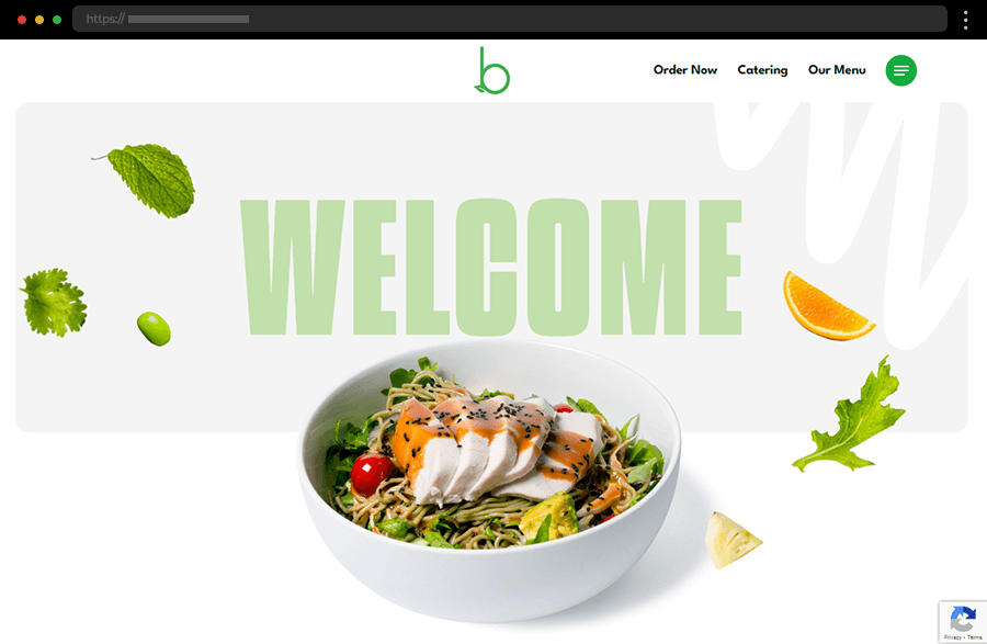
The website of Banana Blossom is an impressive example of how to convey freshness. It does so with a bright, clean design accentuated by the use of intense green color and high-quality imagery. Featuring on the homepage quick access to the restaurant’s menu and bestsellers greatly facilitates customers with their food choices. Also, with the easy-to-use straightforward navigation and all the site’s options, this restaurant website example provides a pleasurable and memorable user experience.
3. Baobab Restaurant

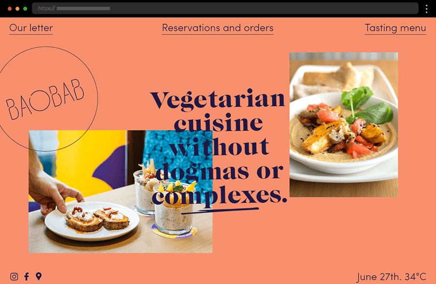
This example certainly impresses us with its ingenious combination of simplicity and creativity. Its homepage unobtrusively but still quite visibly incorporates three CTAs and social media links. And, it even displays a calendar with an outside temperature indicator. Featuring scroll-triggered animations, playful illustrations, and a sticky menu at the bottom, the website of Baobab Restaurant successfully keeps the visitor’s interest while providing every functionality that a good restaurant website needs.
4. LÜKS Kebab

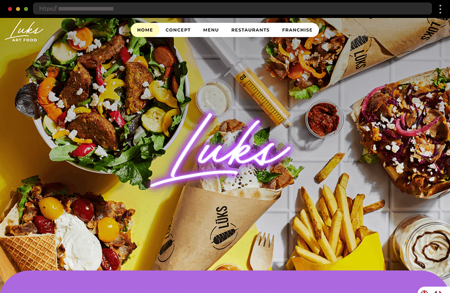
With its design color palette, playful fonts, and attractive imagery the website of LUKS Kebab exudes fun and the promise of a time well spent with food well cooked. The bilingual site’s layout and ease of use add to its groovy appeal, thus making it especially alluring to the younger audience. By featuring every important information on the homepage and listing all the rest in the quickly accessible top navigation, this example ensures a smooth, unburdened, and delightful user experience.
5. Loro

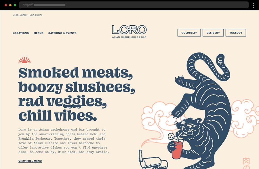
Building an easily recognizable brand image, with its custom graphics, scroll-triggered animated illustrations, and easy-to-follow layout, the Loro Restaurant website keeps the interest with its effective appearance. In addition, the distinct call-to-action and navigation buttons ensure engagement from the start and facilitate users with their web journey. With all the essential details included and its entertaining presentation, this certainly is a good restaurant website example.
6. A Fianco

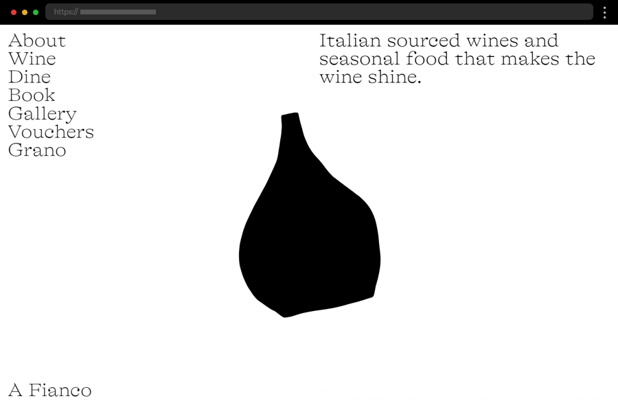
A Fianco Restaurant’s monochrome website looks like a celebration of minimalism. Based on a white background all the homepage features is a simplistic, traditional lettering and an engaging animation of a big transforming black dot. Keeping the design elements to a minimum produces a great effect of arousing interest and instilling a sense of mystery. In addition, the website provides every important detail and creates a memorable impression in the user’s mind.
7. La Torre Del Saracino

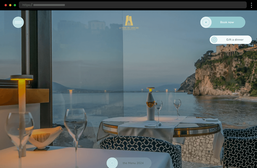
On the website of La Torre del Saracino, magnificent photos of the restaurant’s delicacies and the venue itself win over the site’s visitors, also effectively spiking interest. Sticky buttons consisting of calls-to-action, navigation, and the food menu for the current year facilitate users in their web journey. Meanwhile, the extensive information on the site offers a peek into the two Michelin-star restaurant’s exciting history, team, and kitchen. Overall, La Torre del Saracino’s website depicts a credible, professional, and elegant brand image.
8. Andreucci

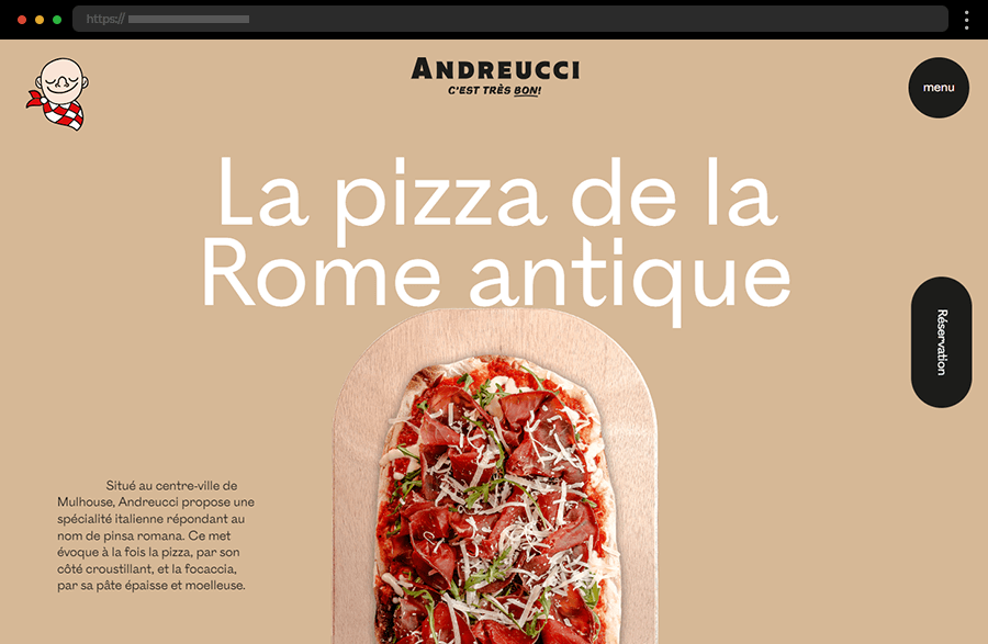
The homepage of Andreucci’s restaurant whets the appetite from the first moment with the slideshow of its deliciously looking pizzas. The engaging design’s layout with interactive scroll-triggered elements also reveals more details about the place, its traditions, and its cuisine. In addition, two sticky CTAs ensure quick reservations and easy navigation throughout the whole web experience.
9. Quay

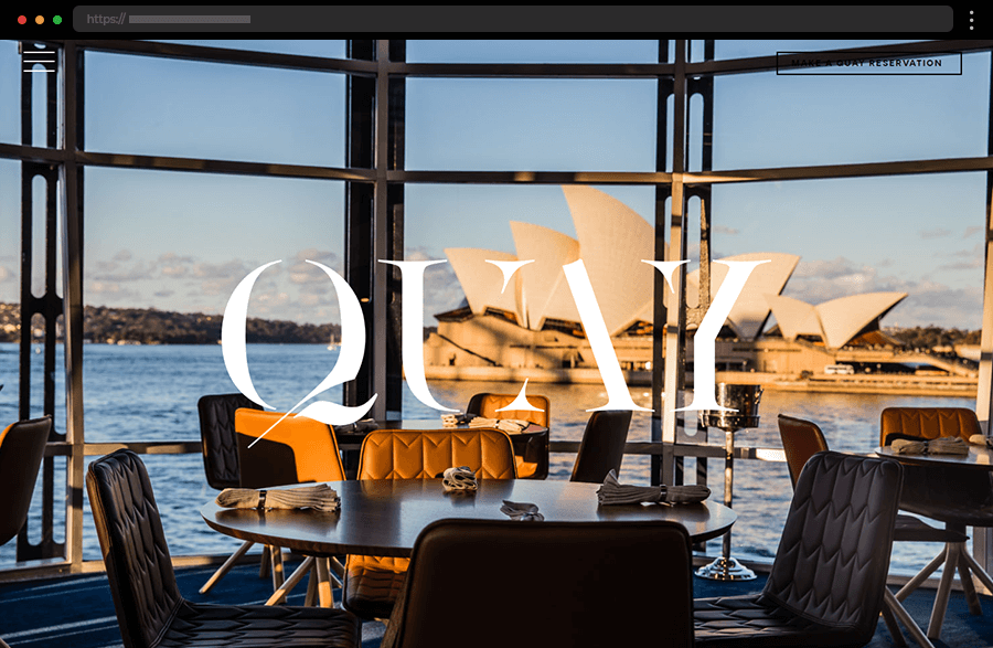
When seeing the Quay Restaurant’s website, one cannot help but feel the luxury it exudes. With a reservation button and navigation icon leading to an extensive menu, the hero section ensures users can quickly get what they want without further searching. Meanwhile, scrolling the page reveals impressive images with brief descriptions and quick links to the site’s pages. Every detail of this example’s design is well-thought-out and chosen to convey professionalism and exclusivity.
10. Fifty Nine Republic

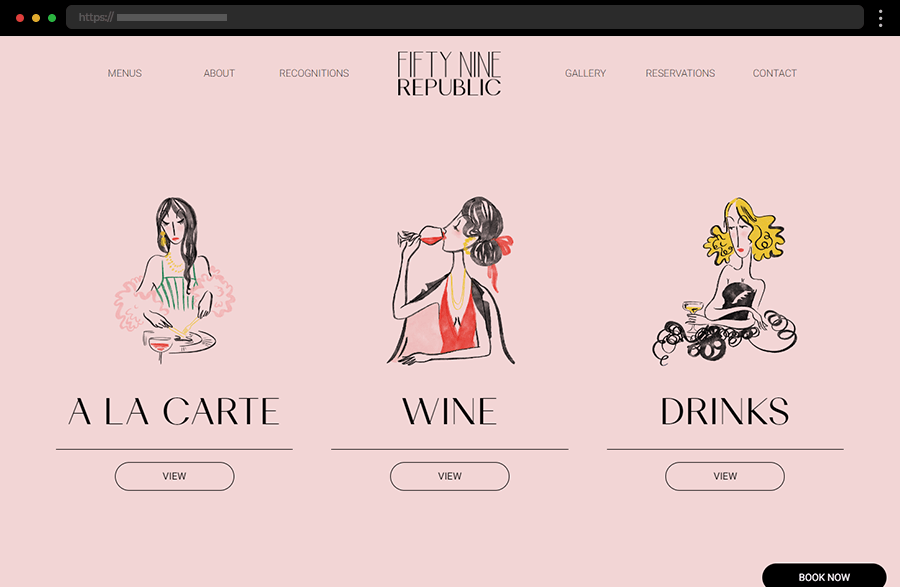
With its subtle elegance, the web design of Fifty Nine Republic exudes luxury vibes while also maintaining an approachable image. The website ensures user satisfaction by featuring the restaurant’s menu, sharing the story behind the business, and also offering an integrated reservation form. The smart sectioning successfully keeps the interest of the user while also providing important information and interesting details.
11. Canlis

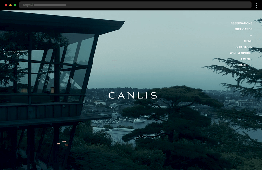
From the very first second, the website of Canlis Restaurant conveys exclusivity. The stunning background video showing the restaurant’s location and the view from it convinces the website users to visit it. Also, the discreet navigation incorporated subtly on the right side keeps in line with the stylish web design. Overall, the simple layout, the elegant design, and the unobtrusively presented information effectively embody the restaurant’s nature and style, managing also to arouse the potential client’s interest.
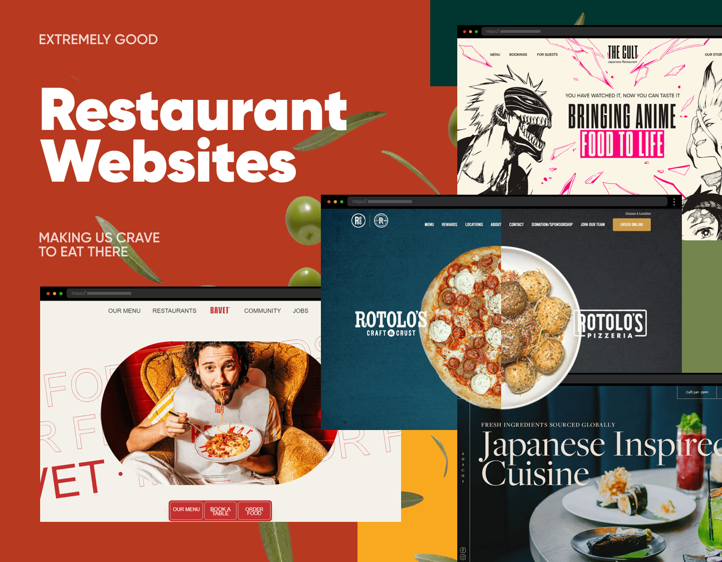
12. Bavet

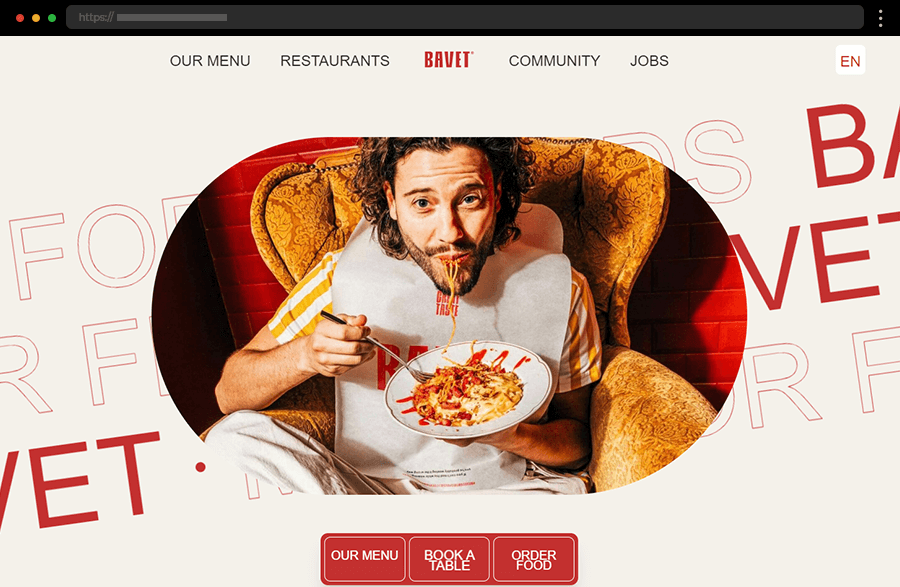
With its color scheme, funny photos, and scroll-triggered animations the website of Bavet successfully exudes the passion with which the restaurant is operated. Interactive elements engage the user while also focusing his attention on the food, thus increasing his appetite and interest. In addition, the full menu and restaurant details along with the three sticky CTA buttons at the bottom of the screen greatly facilitate the user experience.
13. Genesis

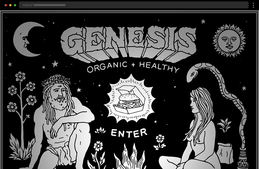
This single-page example instantly catches the eye with its custom animated illustrations, turning the user journey into a work-of-art browsing experience. The flashlight-like cursor gives visitors the sense of exploring, thus engaging them even further. The creative and unconventional design makes a great and lasting impression while also creating a memorable and recognizable brand image.
14. Catch Fish & Chips

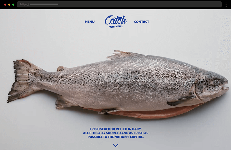
Catch Fish & Chips Restaurant offers its website visitors a quite different experience. The interactive homepage grabs users’ attention with its scroll-triggered animation. It introduces us to the restaurant’s process of preparing fish while also sharing facts and details about the eatery. The highly minimalist website is designed to focus on the engaging fish-cooking experience, accentuating the restaurant’s dedication to fresh seafood.
15. Smith & Wollensky

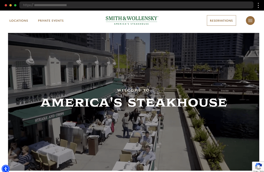
The website of Smith & Wollensky has a design that effectively conveys the restaurant’s traditions and passion for quality food, service, and hospitality. Nice illustrations supplement the site’s menu while it offers extensive information about the eatery. Overall, Smith & Wollensky Steakhouse has a website that clearly communicates its specialization in classic meat recipes and provides a user-friendly, informative, and engaging web experience.
16. Pastaria

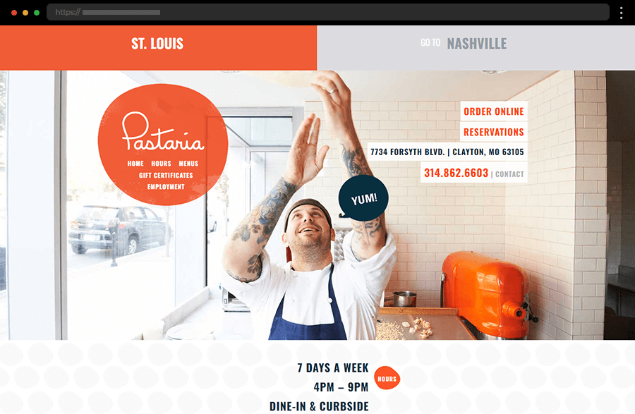
Pastaria’s website focuses on user convenience by giving them the option to choose between the restaurant’s two locations and respectively their different menus. The site’s navigation is cleverly displayed in a sticky red bubble ensuring visitors always find their way around. By also featuring its food menu and just the right amount of information on the homepage, this example cements its place as a straightforward, user-friendly, and easy-to-navigate website.
17. Rotolo’s

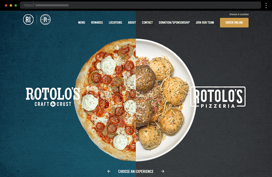
The Rotolo’s homepage is so appealing with its split-screen depicting two halves of signature dishes of the restaurant’s different menus. Choosing one of the specialties leads the user to the corresponding menu comprehensively listing all it has to offer. In addition, with an easy-to-use top navigation and a convenient CTA for online orders, Rotolo’s website is a breeze to use and explore.
18. Sarma

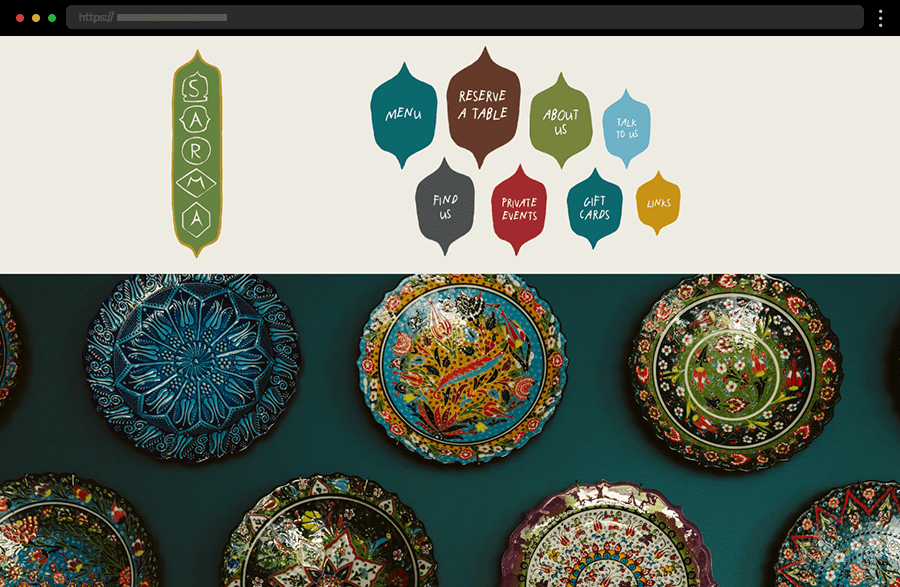
With its distinctive shapes and color palette, the header of Sarma’s website certainly succeeds in communicating the restaurant’s oriental essence. It also provides quick links to the most important points of interest, such as reservations, details about the business, and the restaurant’s menu. With every element it features, the web design of Sarma’s site works towards reinforcing its image as a friendly yet professional brand.
19. L’Enclume

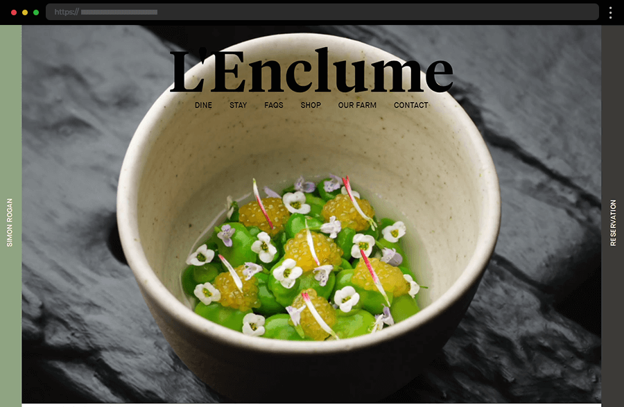
A full-sized video with impressive footage from the kitchen instantly engages web visitors as they visit L’Enclume’s website. High-quality imagery from the restaurant’s farm and kitchen strengthens its credibility and position as a place dedicated to taste and exclusivity. In addition, the peripherally located navigation leaves the user’s attention on the effectively presented information while providing also ease of use.
20. The Cult

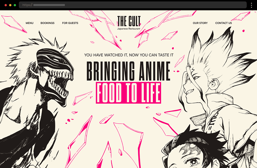
The next example is quick to win the hearts of anime fans. With its engaging graphics and animated illustrations, the design successfully embodies the restaurant’s nature while keeping the user’s interest. Equipped with brief texts, smartly incorporated CTAs, highlights, and quick links to the most notable dishes, the homepage can easily satisfy any user’s needs. Still, the top menu options provide any further details that may come in need.
21. Ministry Of Crab

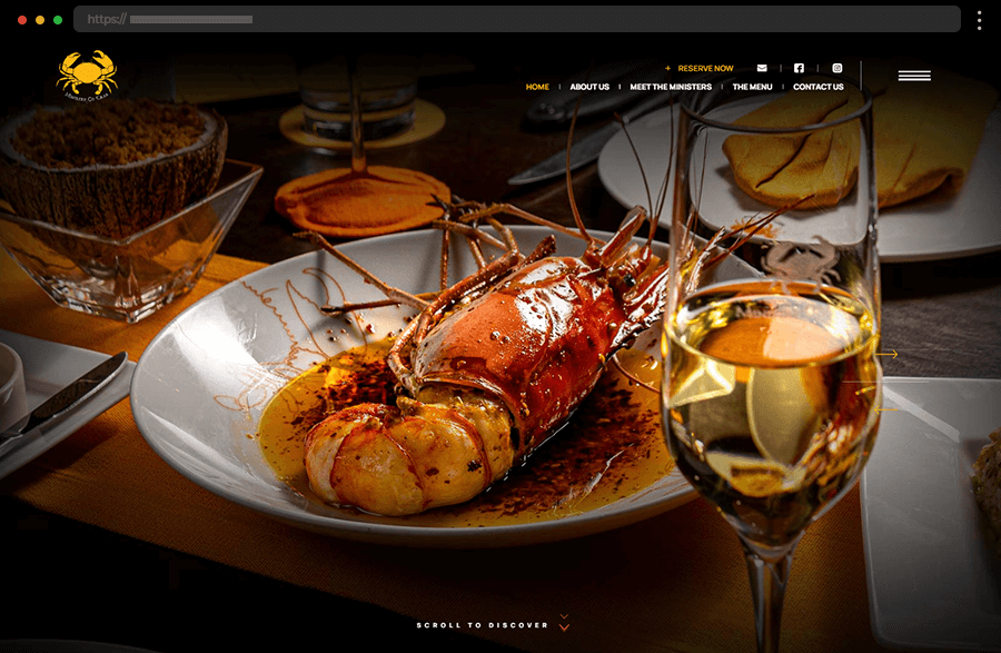
With its video and imagery, highlights of the restaurant’s story and menu, the homepage of the Ministry of Crab’s website certainly grabs the visitor’s attention. In addition, the sticky header provides a quick and easy way to the broad menu options that the site offers. This approach greatly facilitates users to get to know the restaurant and its founders, find out every other information that may interest them, or simply act towards visiting the restaurant.
22. Barra

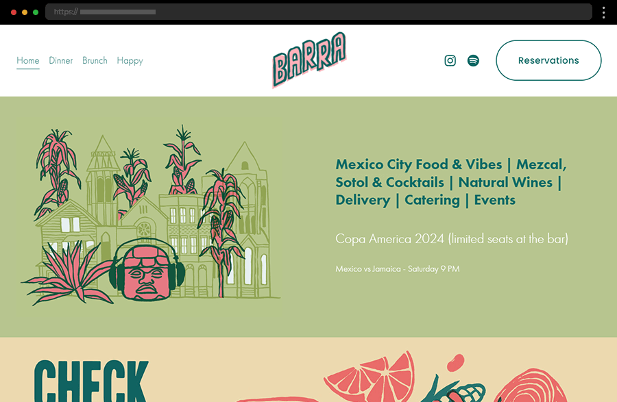
Simplicity is the key feature of Barra Restaurant’s web design. With its straightforward layout, fresh color scheme, and impactful illustrations the site is visually appealing and also functional. Keeping the menu and overall user decisions to a minimum leaves a sense of ease and hints at fun and relaxing experiences. Exactly what a laid-back restaurant would want to be associated with.
23. Adachi

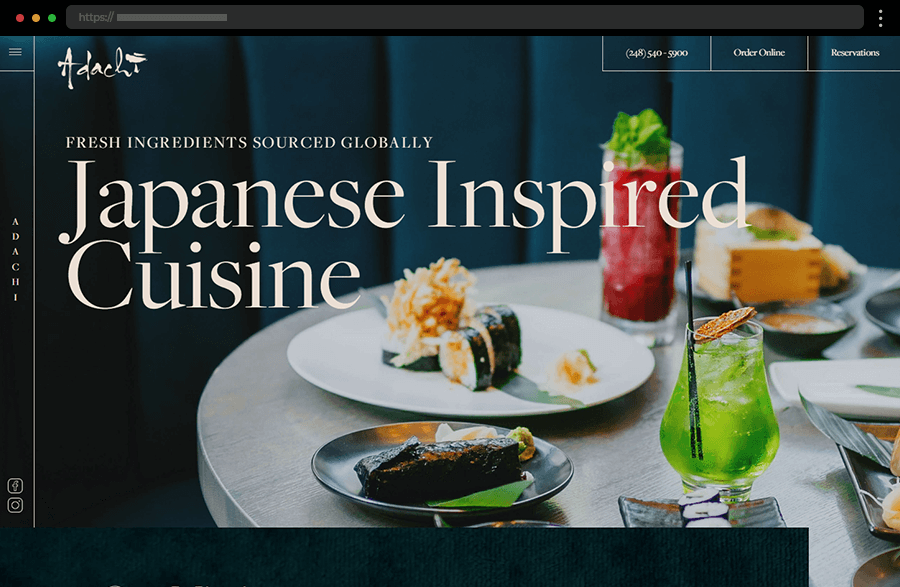
Designed with a modern touch, the website of the Japanese restaurant Adachi combines eye-catching high-quality imagery with contemporary design to create a satisfying user experience. Also, by segregating its menu into various sections it provides an example of how to facilitate users in making their choice. And, in the meantime, the sticky navigation and call-to-action buttons assist the website visitors in taking the last step towards visiting the restaurant or ordering a delivery.
24. Fat Choy

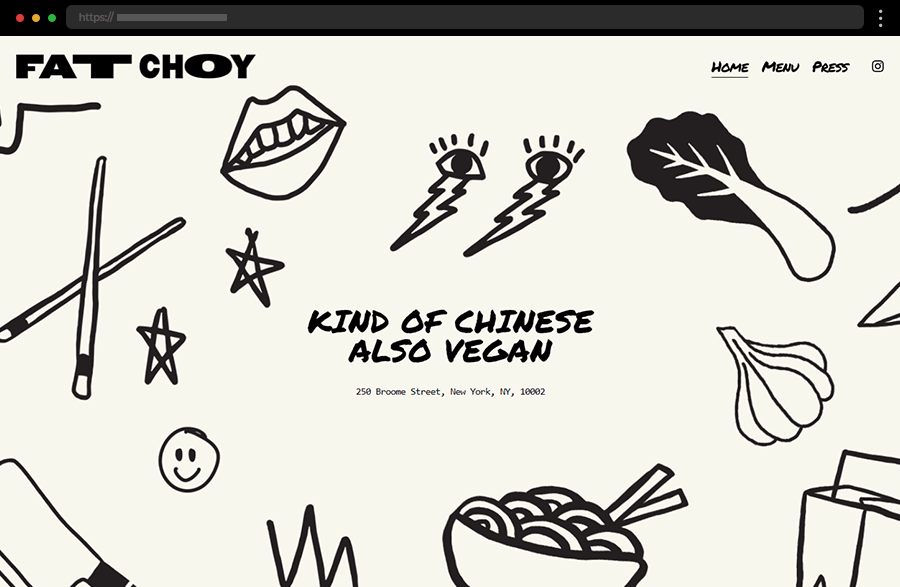
By featuring custom catchy illustrations, the menu, and photos of its specialties Fat Choy’s website lures its potential clients straight from its homepage. The web design’s style adds approachability and fun to the restaurant’s image, while it also exudes easiness with its convenient and straightforward navigation. In addition, the featured press publications and social media links increase the brand’s credibility and strengthen its online presence.
Tips for crafting good restaurant websites
- Try keeping your design simple and clean in terms of layout and navigation menu. This way visitors can easily find the information they need.
- Use professional photos of your food, restaurant interior, the team, or any unique features the restaurant has. High-quality images always grab the attention and make anything look more visually appealing.
- Organize your site so that visitors can quickly find menus, locations, contact information, and online reservation options. A straightforward navigation menu enhances user experience and increases the number of clients.
- Keep your website updated with current menus, special offers, events, and operating hours. Also, think about integrating online reservation and ordering systems to facilitate and attract more customers.
- Make sure to include positive reviews and testimonials from satisfied customers. This way you increase the credibility of your restaurant and encourage new customers to try it.
- Incorporate social media links to your restaurant’s profile on your website. This will allow users to follow your brand and engage with it on multiple platforms, increasing your reach and visibility.
- Many users will access your site from their phones and that’s why a mobile-friendly design is essential. So, to avoid customer frustration ensure your website is responsive and looks great on all devices.
Final words
A good restaurant website not only attracts potential customers but also provides essential information and a seamless user experience. By combining aesthetics with functionality and up-to-date information the site can serve as a powerful tool to overcome the high competition in the industry. So, gather some good inspiration, follow the best practices, and start crafting the restaurant website that will help you stand out and succeed.
If you enjoyed this article and found it helpful you may also like our other inspiring sets of examples: