Minimalist design has become a popular fresh approach in web design. Minimalism, however, isn’t just a trend – it’s a powerful approach that focuses on simplicity and clarity. By removing unnecessary elements, minimalist websites let content take center stage, offering visitors an intuitive, distraction-free experience.
In this article, we’ve gathered 30 of the best minimalist website examples that beautifully showcase the potential of clean layouts, streamlined navigation, and striking visuals. Whether you’re a web designer looking for inspiration or just someone curious about effective design, we believe we will spark your imagination with these design examples. Each of them is a perfect example of how simplicity can lead to functional and visually appealing websites.
Want even more inspiration? Jump to our →WordPress Website Examples Hub.
1. La Petite Jumelle – Refined Packaging Business Minimalist Design

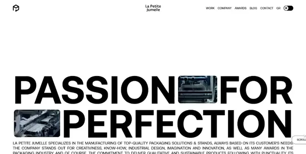
First, we have La Petite Jumelle’s website which specializes in crafting high-quality packaging solutions tailored to customer needs. Their website reflects their innovative approach with a minimalist design that feels fresh and professional. The soft, muted palette combined with sleek layouts emphasizes their creativity while allowing their impressive portfolio to shine.
👌 What we like:
- Elegant, muted color scheme.
- Clean, spacious layouts.
- Professional sans serif fonts.
- High-quality visuals showcasing their projects.
2. Ira June – Minimalist Design for Creative Photography Work

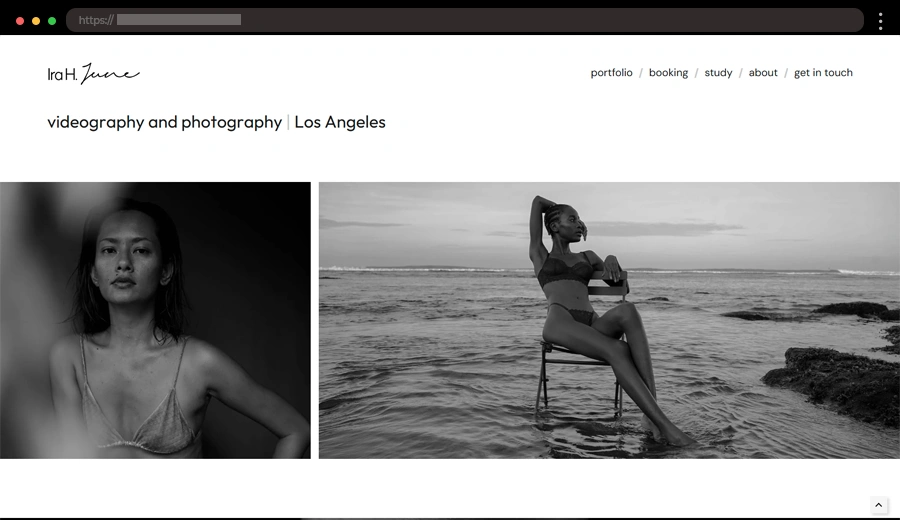
Ira June’s website serves as a portfolio for a talented designer, showcasing a blend of creative work with a minimalist approach. The site emphasizes clean layouts, bold visuals, and simple navigation. The design allows each project to shine, with ample white space and easy-to-read typography. Ira’s work is the main focus, creating a seamless browsing experience. The minimalist design choices highlight the creativity behind each project while ensuring the site is modern and sleek.
👌 What we like:
- Gorgeous large photographs of her work.
- Simple, intuitive navigation.
- Effective use of white space.
3. Mercuryo – Modern Financial Service Minimal Web Design

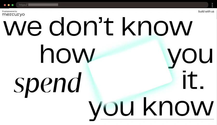
Mercuryo Spend offers a minimalist approach to digital finance, with a clean and simple website design. The site uses large minimal text and links, making navigation easy. The design is sleek, with modern fonts, effective use of space, and an intuitive interface, allowing users to focus on what matters most -managing their finances.
👌 What we like:
- Modern, sleek design.
- Ample use of white space for a tidy look.
- Cool subtle scrolling animations.
Want even more inspiration? Jump to our →WordPress Website Examples Hub.
4. Scott Snyder Photography – Minimalist Portfolio for Photographer of Objects

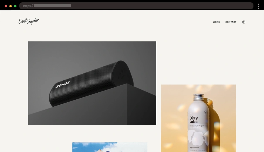
Scott Snyder’s photography website is a perfect example of minimalist design in action. The site uses large, full-screen images to showcase his stunning photography, with a simple menu. The focus is entirely on the images, with a smooth, easy-to-navigate layout. The minimalist design highlights the photographs, allowing each one to make a strong impression while maintaining a modern and elegant feel.
👌 What we like:
- Large high-quality images as the focal point.
- Simple clean navigation.
- Minimal text, letting the work shine.
5. You Must Create – Minimalist Website for a Fashion Company

Next, we have a contemporary fashion label offering bold yet timeless designs. Their website channels the brand’s aesthetic with an artistic approach. Oversized visuals of their clothing make a striking first impression, while a neutral palette and clean layout spotlight simplicity. The design radiates sophistication and creativity, ensuring the focus stays on the products.
👌 What we like:
- Large, impactful product images.
- Minimal stylish layout.
- Balanced use of negative space.
6. Mogutable – Modern Everyday Life Products with Minimalist Principles

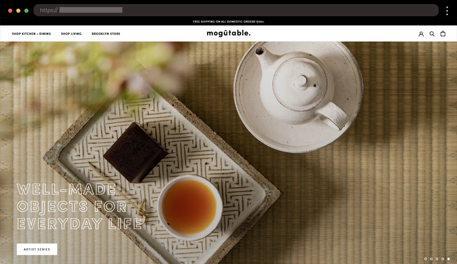
Mogutable is a Williamsburg-based store for everyday life objects. From teapots and ceramics to incense and candles, their ever-evolving selection ensures a unique experience with every visit. Their website reflects their aesthetic, using a monochrome color palette, sleek sans serif fonts, and beautiful product photography.
What we like:
- Timeless monochrome palette.
- Beautiful, high-quality product images.
- A focus on everyday objects like cutlery, cups, mugs, etc.
7. Sala Art Jove – Art Project with Simple, Elegant Design

Next from our minimal website design examples list is Salad Art Jove’s website. It is a minimalist showcase for their art project and with a simple design, the website lets the art speak for itself. The minimalist approach makes the website easy to navigate and focuses on the art’s impact.
👌 What we like:
- Simple layout that doesn’t distract from the artwork.
- Bold, large typography.
- Focused use of images with minimal text.
8. Halo – Minimalist Design for Apparel Website

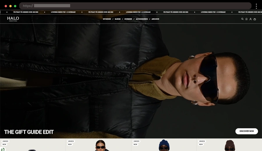
Halo is a Danish clothing brand with a website that’s as sleek as its styles. The site grabs your attention right away with a bold hero video and keeps things simple with big, clean images and just the right amount of text. Navigating feels natural, so you can focus on what matters – shopping. Plus, the checkout page is so clean and easy, it makes buying your new favorite outfit a breeze.
What we like:
- Stunning hero video.
- Large, high-quality images showcasing the apparel.
- Clean and simple checkout experience.
9. Club of the Waves – Surfer-Inspired Art & Photography Minimalist Web Design

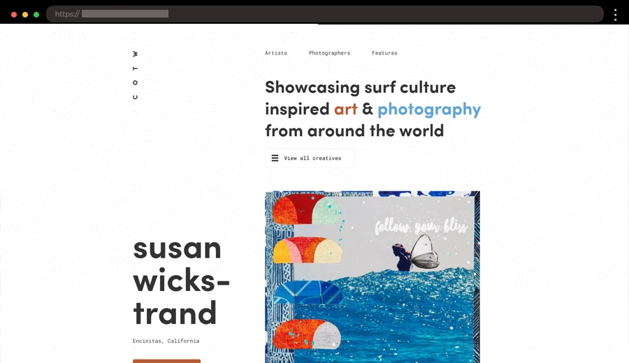
Club of the Waves combines minimalist design principles with the spirit of surfing culture. The website features a clean layout with large, high-quality images showing the beauty of surfing while offering a smooth and easy-to-navigate experience. The minimalistic design allows the stunning visuals to take center stage. The site’s focus is on clear storytelling with minimal distractions, which perfectly reflects the lifestyle it promotes.
👌 What we like:
- Large, impactful images that tell each artst’s story.
- Clean, easy-to-use layout.
- Bold, yet minimal color palette.
10. Monolith – Bold Minimalist Website Design for Furniture

Monolith creates unique furniture and collectible objects, and their website reflects that creativity with a minimalist design. The site uses bold, high-impact product visuals, crisp lines, and a black-and-white color scheme to keep things modern and stylish and showcase their innovative pieces. With simple navigation and standout typography, the design lets the products take center stage.
👌 What we like:
- Intuitive navigation with minimal menus.
- High-resolution images of furniture pieces.
- Artistic and modern design elements.
11. Léopold Manguette – Minimalist Website for Creative Developer
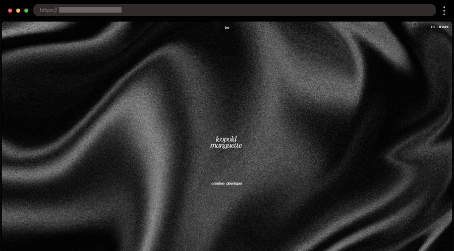
Léopold Manguette’s website perfectly captures his creative flair as a frontend developer. With a black background and white text, the design feels sleek and modern. The large hero image draws you in, and the cool hover effects on his projects make browsing super interactive. Plus, a little description at the bottom and his social links add a personal touch, all while keeping things simple and clean.
What we like:
- Bold black-and-white color scheme.
- Large impactful hero image.
- Cool hover effects on projects.
- Personal touch with social links.
12. Casa Mami – Earthy Elegant Residence Minimalist Web Design
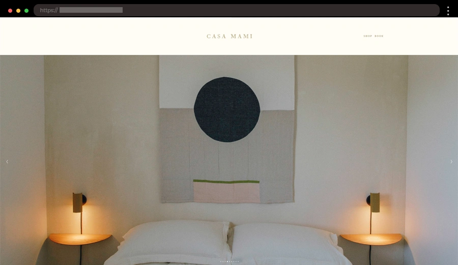
Casa Mami is an eco-friendly vacation rental that blends earthy aesthetics with modern simplicity. The website mirrors this philosophy, using a natural color palette, clean lines, and large, inviting images. The minimal design ensures a relaxing browsing experience, much like the property itself. Casa Mami’s attention to detail in both their property and web design sets them apart.
👌 What we like:
- Earth-toned color scheme for a natural vibe.
- Large, inviting images showcasing the property.
- Modern, eco-friendly design elements.
13. Riad Mammadov – Artistic Pianist and Composer Minimalist Website

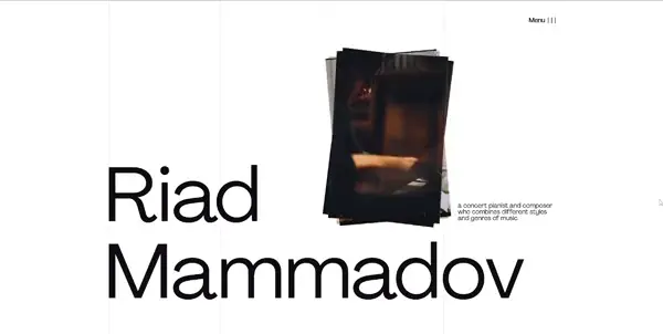
Riad Mammadov’s website perfectly captures his artistic identity as a pianist and composer. The design uses large, clean typography and ample white space to put the spotlight on his music and performances. Minimal text and impactful visuals create a harmonious balance that reflects his creativity and talent.
👌 What we like:
- Engaging horizontal and vertical scrolling animations.
- Large, impactful visuals of performances.
- Minimalistic style that complements his artistry.
14. YSL – Elegant and Timeless Brand Minimalist Website

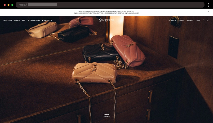
Yves Saint Laurent’s website is a stunning blend of luxury and simplicity. YSL is one of the world’s most iconic fashion brands, known for its high-end clothing, accessories, and fragrances. The website focuses on showcasing their collections with an understated elegance. The use of ample white space, crisp images, and a monochromatic color palette puts the products front and center, creating a luxurious shopping experience.
👌 What we like:
- Monochromatic palette with elegant typography.
- Minimal yet sophisticated aesthetic.
- High-quality, large product images and videos.
15. Elena Smirnova – Stylish Digital Designer Portfolio with Minimalist Design

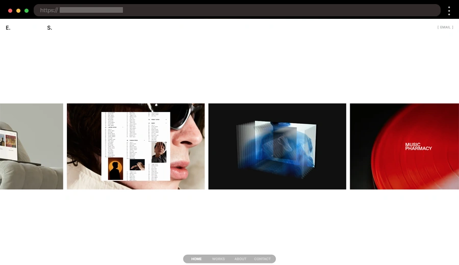
Elena Smirnova’s portfolio website is a chic, minimalist masterpiece that lets her creative work grab our attention immediately. With clean layouts, a monochrome palette, and sleek typography, the site is both stylish and functional.
👌 What we like:
- Modern black-and-white color scheme.
- Infinite horizontal scrolling experience.
- Simple sticky navigation, positioned at the bottom of the page.
16. Karlie Kloss – Modern Supermodel Minimalist Website

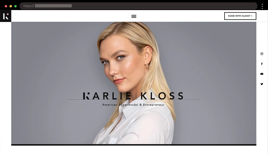
Karlie Kloss’s website is a great mix of simplicity and style. As a supermodel, tech advocate, and philanthropist, the site highlights her many projects, like Kode with Klossy, through large, striking visuals and easy navigation. The clean design, bold typography, and minimal colors keep the focus on her work and impact. The whole layout flows effortlessly, reflecting her modern, polished brand identity while keeping things easy to browse and visually engaging.
👌 What we like:
- Crisp black-and-white colors with a white background.
- Large, impactful visuals.
- Balanced use of negative space.
17. Polène – Elegant Minimalist Web Design for Luxury Goods

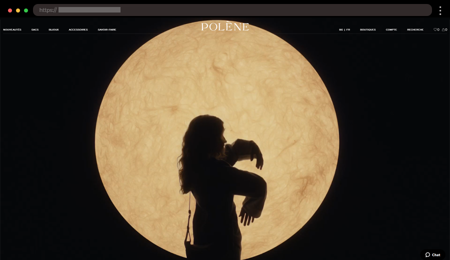
Polène’s website highlights its luxury leather goods through large high-quality images and a clean layout. The design is simple yet elegant, with neutral tones and a refined aesthetic that lets the products shine. It reflects the brand’s sophisticated identity, offering site visitors a luxurious journey.
👌 What we like:
- Refined, neutral color palette.
- High-quality images showcasing products.
- Sophisticated design that complements the brand.
18. Zimik Studio – Artistic Website for Handcrafted Candles

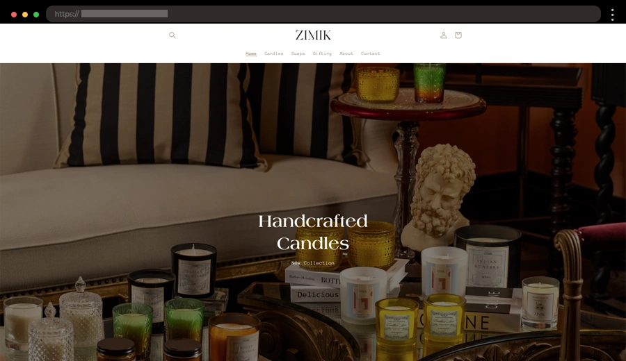
Zimik Studio’s website brings an artisan vibe with its handcrafted candles and soaps. The design blends black, white, and brown tones, keeping things simple and sleek. You’ll find a clean layout, a search bar, and gorgeous product shots that really make the candles pop. There’s also a bit about the creator, adding a personal touch. It’s a relaxed yet stylish experience that lets the beautiful products speak for themselves.
👌 What we like:
- Simple layout with a cozy, inviting feel.
- Earthy color palette of black, white, and brown.
- Personal touch with information about the creator.
- Easy-to-use search bar and minimal navigation.
19. Stereotropism – Dynamic Minimalist Website for A Digital Agency

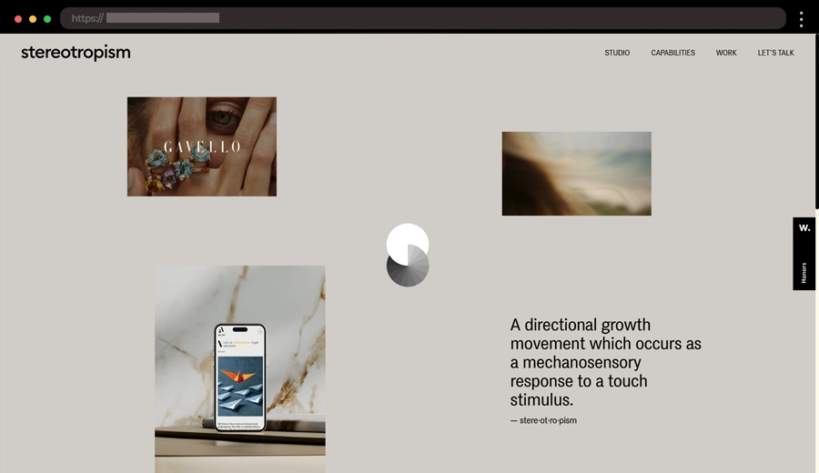
Stereotropism is an experimental platform that features bold, unique visual projects. The website’s minimalist design uses large, eye-catching graphics paired with simple typography, allowing the artwork to take center stage. With minimal distractions on each page, the focus remains on the innovative designs, creating a striking contrast between visual intensity and clean layout.
👌 What we like:
- Bold visuals and contrasting design elements.
- Minimalist creative layout.
- Smooth scrolling and engaging transitions.
20. Lettuce & Co – Whimsical Event Planner Minimalist Website

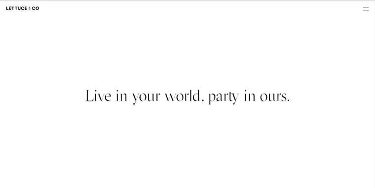
Lettuce & Co specializes in creating memorable events with a touch of magic. Their website blends whimsy and minimalism, featuring clean sections and playful black-and-white tones with pops of red. The design style reflects their creative energy while ensuring a professional, user-friendly interface.
👌 What we like:
- Black-and-white color scheme with pops of red.
- Large images of their event setups.
- A fun yet sophisticated aesthetic.
21. Mirko Romanelli – Modern Product Designer Portfolio with Minimalist Design

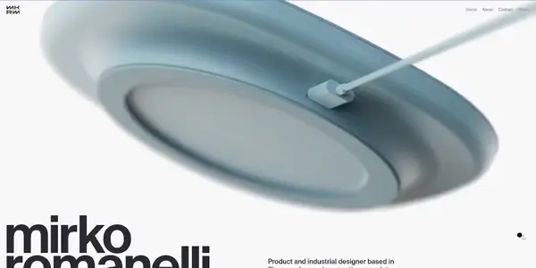
Mirko Romanelli is a product designer whose website expresses modernity and minimalism. Using sans serif fonts and neutral tones, the website creates an elegant platform to showcase his projects. The clean design ensures his portfolio remains the focal point.
👌 What we like:
- Smooth scrolling and seamless navigation.
- Subtle design elements.
- Effective use of negative space.
22. Duten – Clean Washroom Accessories Minimalist Website

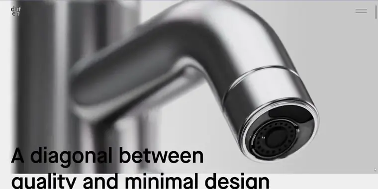
Duten’s website is a masterclass in minimalism with a sleek black-and-white color scheme and bold typography. It features impressive 3D product visuals and animations that bring washroom accessories to life. The interface is simple yet sophisticated, with a burger menu offering fullscreen options like social links, language settings, and search functionality. Additionally, subtle animations add a polished touch to the overall look.
👌 What we like:
- Eye-catching 3D product visuals and animations.
- Clean navigation with functional and stylish menus.
- Polished, subtle animation effects.
23. Gregory Lalle – Creative Developer Minimalist Example

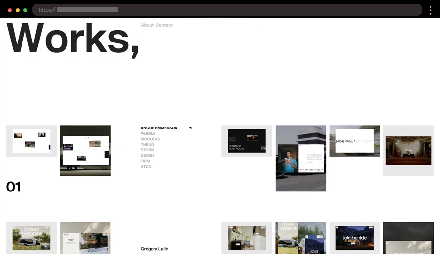
Gregory Lalle is a designer whose portfolio website is a testament to minimalist design principles. The homepage features a clean white background with sans serif fonts and striking project visuals. This site uses only a few elements to ensure the focus remains on his work, reflecting his commitment to clarity and simplicity.
👌 What we like:
- Minimal layout highlighting portfolio pieces.
- Use of white space for an uncluttered look.
- Subtle transitions for added polish.
24. Sav Media – Vibrant Automotive Photographer Minimalist Web Design

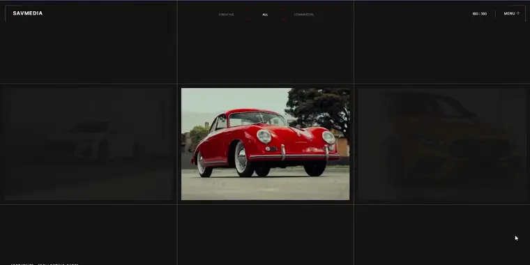
Sav Media’s website perfectly captures the energy of automotive photography. With a sleek black background and crisp white text, the design highlights stunning car images that feel like works of art. The site’s standout feature is its infinite horizontal scroll, which mirrors the dynamism of camera settings and motion. This innovative layout keeps the user engaged while emphasizing the artistry of each photo.
👌 What we like:
- Bold and stylish black-and-white color palette.
- Striking, high-quality automotive photography.
- Unique infinite horizontal scroll layout.
25. Grege Intérieurs – Sophisticated Interior Design Minimalist Site

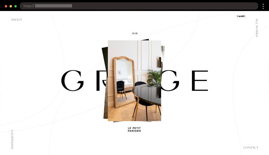
Grege Intérieurs specializes in refined interior design solutions, and their website reflects this ethos. With a monochromatic color scheme and understated visuals, the design style perfectly complements their luxurious yet minimal vibe.
👌 What we like:
- Elegant monochromatic palette.
- Ample white space for a refined look.
- Stunning luxury project images.
26. Public Library – Artsy Brand Agency Minimalist Web Design

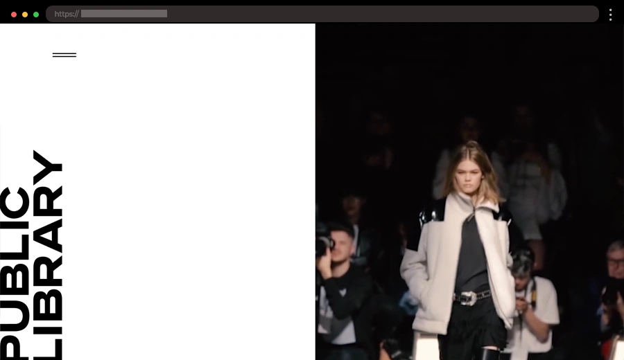
Public Library is a brand management agency offering services in PR, events, content creation, and social media. They work with brands across fashion, design, FMCG, and lifestyle industries. Their website includes an unconventional layout and design choices which create a visually stunning experience. The site employs visual hierarchy cleverly to draw the eye where it matters most.
👌 What we like:
- Unique and artsy layout.
- Minimalist aesthetic with a modern twist.
- Full-screen images and menu.
27. Rebecca Atwood – Elegant Handmade Patterns Minimalist Website

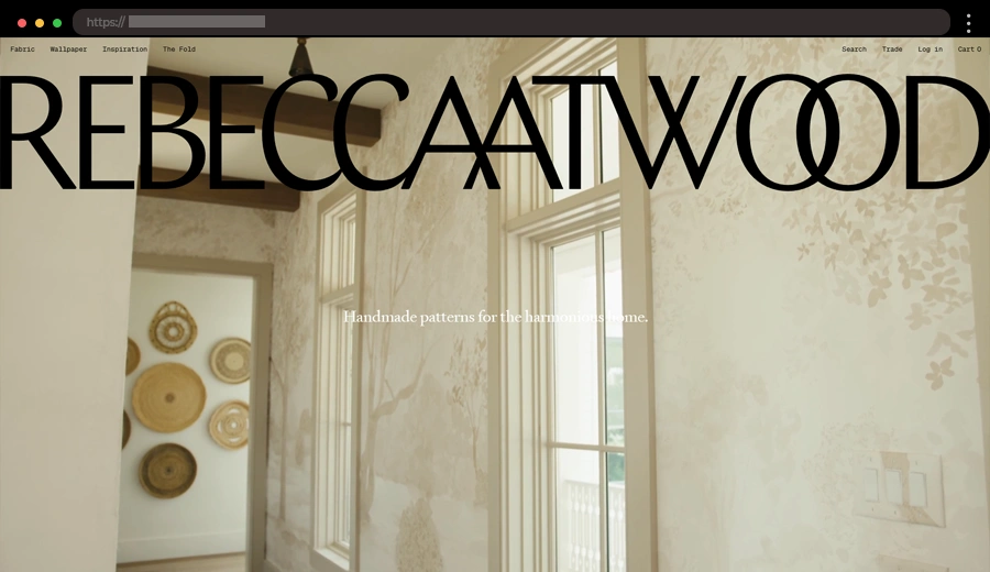
Rebecca Atwood’s website showcases her home décor and textiles in a serene, minimalist design. With soft tones and carefully placed product images, the site creates a relaxing shopping experience that mirrors the brand’s cozy aesthetic.
👌 What we like:
- Soft color palette reflecting the brand.
- Balanced use of images and negative space.
- Elegant typography aligning with the brand.
28. Limesharp – Functional Minimalist Design For Digital Commerce Agency

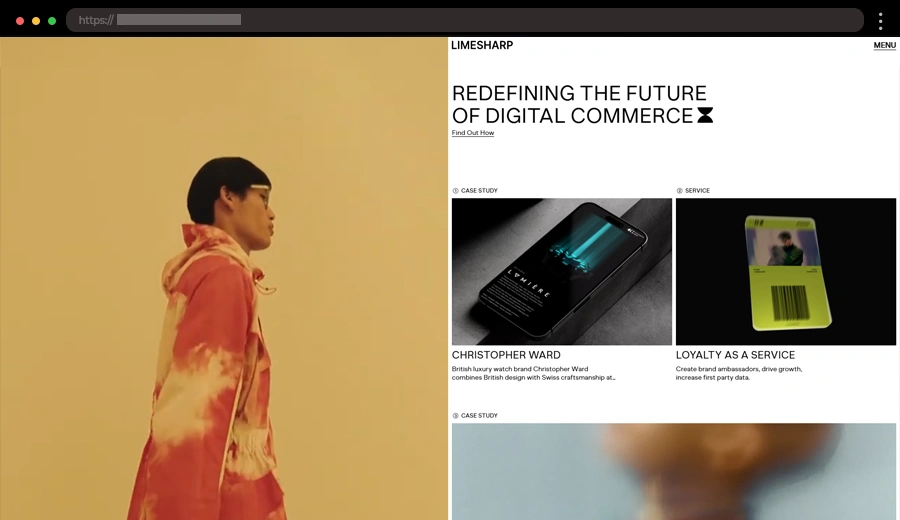
Limesharp specializes in creating bespoke eCommerce solutions, and their website is a shining example of a sleek, functional minimalist approach. The design balances clean typography with sharp visuals, delivering a professional and seamless experience.
👌 What we like:
- Clean and sharp visuals.
- Simple right-aligned menu.
- Bold typography paired with minimal elements.
29. Gavril – Dynamic Minimalist Designer Portfolio

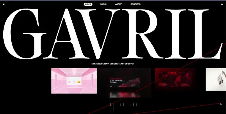
Gavril Design showcases a creative portfolio with a modern minimalist touch. Featuring a dynamic interface with strong visuals, the website keeps things clean yet engaging, letting the work speak for itself.
👌 What we like:
- Bold typography for a modern aesthetic.
- Simple intuitive navigation.
- Horizontal scroll of the projects.
- Cool red mouse cursor effect.
30. Monoceros – Clean Trading Firm Minimalist Web Design

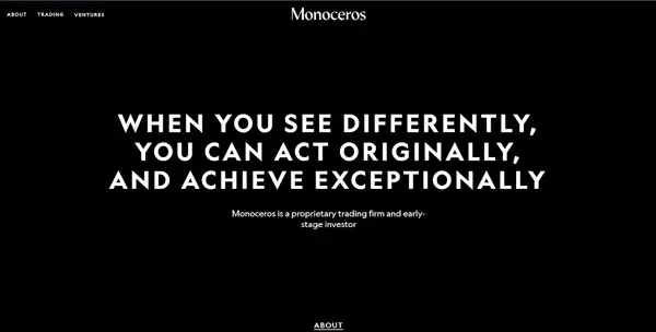
Monoceros is a proprietary trading firm and early-stage investor. Their website embodies professionalism with a minimalist design that uses sharp monochrome visuals and clean layouts. Notice the smooth transitions and subtle animations which create an engaging experience. Their bold messaging is presented clearly through modern typography.
👌 What we like:
- Polished black-and-white color scheme.
- Spacious, professional layouts.
- Subtle animations enhancing the browsing experience.
Key Features of Minimalist Website Design
Minimalist web design focuses on clarity and simplicity, ensuring that content stands out and the user experience remains smooth and intuitive. Here’s what makes minimalist websites effective and visually compelling:
- Clean Layouts ✨: Minimalist designs prioritize simplicity, using structured grids and clear sections to keep the interface tidy and visually appealing.
- Ample White Space ✨ : Negative space around elements emphasizes content, reduces visual noise, and provides a calm, uncluttered feel to the site.
- Limited Color Palette ✨ : Minimalist websites often use neutral tones or monochromatic schemes with occasional pops of color to draw attention to key elements.
- Simple Typography ✨ : Sans-serif fonts are commonly used for their clean and modern look. Typography is often included as a design element, with bold sizes or distinct styles.
- Focus on Content ✨ : The minimalist approach ensures that text, images, or videos stand out by eliminating distracting elements.
- Streamlined Navigation ✨ : Menus are simple and easy to find, often featuring just a few links or collapsible elements like burger menus to maintain a tidy appearance.
- High-Quality Visuals ✨ : Images and videos are central to minimalist designs. Large, crisp visuals are used to tell the story or showcase products.
- Subtle Animations ✨ : Smooth animations, like hover effects or subtle transitions, add a modern touch without overpowering the site’s simplicity.
- Responsive Design ✨ : Minimalist sites prioritize adaptability, ensuring they look great and function well across all devices.
- Fast Loading Speeds ✨ : With fewer elements and optimized visuals, minimalist websites load quickly, improving the user experience and boosting SEO performance.
Final Words
Minimalist web design is all about making the most of less. These 30 minimalist website design examples showcase how clean, simple layouts can create powerful and effective user experiences. By focusing on just the essentials, these sites offer easy navigation, striking visuals, and clear messaging. Minimalism doesn’t mean boring- it means efficient and beautiful. Hopefully, you can take inspiration from these examples and think about how you can apply the principles of simplicity to your own projects.
Next steps:
-
Check out these 22 Minimalist Portfolio Website Examples, or
-
Jump right into our complete WordPress Website Examples Hub.