Think of a website footer as the quiet overachiever of web design – it may not be flashy but it is a perfect example of an element that can pack a serious punch when done right. For site visitors, a well-crafted footer provides direction and delivers key information. For website owners, it’s an opportunity to drive engagement, establish credibility, and create a polished user experience.
So, that’s why for today’s post, we’ve gathered 30 standout website footer examples that prove just how powerful this space can be. From clever navigation tools to branding elements that pop, these designs show that the end of a webpage is just the beginning of possibilities. Let’s explore what makes these footers not only functional but downright inspiring – because a great footer can truly leave a lasting mark! Let’s move to our list of inspiring website footer examples:
1. Kota – Modern Website with Sleek and Professional Footer
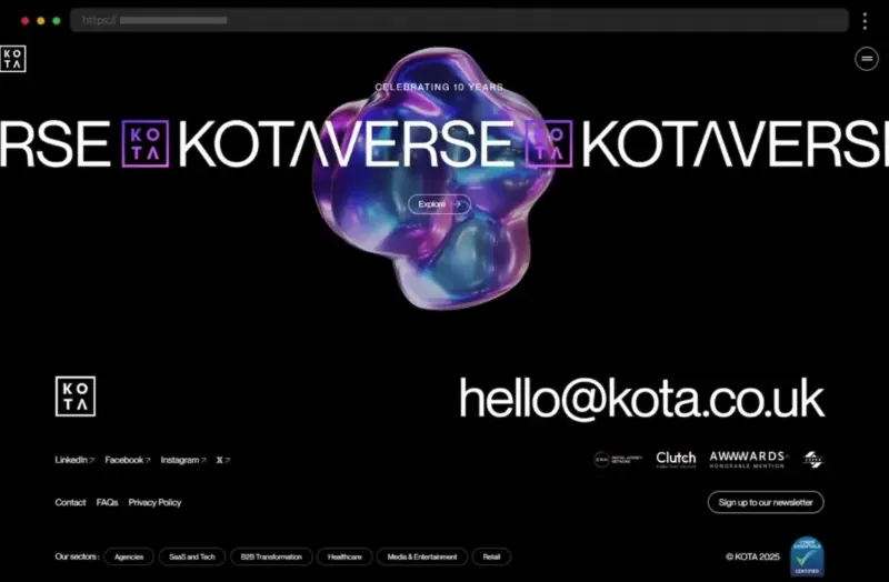
Kota’s footer is sleek and professional, seamlessly extending the design language of their main site. The dark background enhances contrast and allows the immersive animation to pop up, while the typography is modern and easy to read. The footer includes concise navigation, social media links, and also a CTA to sign up for a newsletter, all organized neatly. Thus, it reflects the design agency’s flair for minimalist functionality.
What we like:
- Eye-catching minimal design
- Clean design that doesn’t overwhelm site visitors
- Prominent CTA button to encourage communication
2. Petra Garmon – Concise and Elegant Website Footer Example
Further on our list stands this elegant footer that effortlessly complements the brand’s refined aesthetic, utilizing soft tones and sophisticated typography. The footer delivers super concise navigation, a subscription box, and an understated social media section, perfect for maintaining a professional image. In addition, the signature kiss of the brand and the hover effects of the contact details and social links encourage visitors to engage and enhance the user experience.
What we like:
- Elegant design that mirrors the brand’s identity
- Compact layout with well-organized sections
- Subtle use of whitespace to avoid overwhelming
3. Décor Systems – Subtle Website Footer Design Example
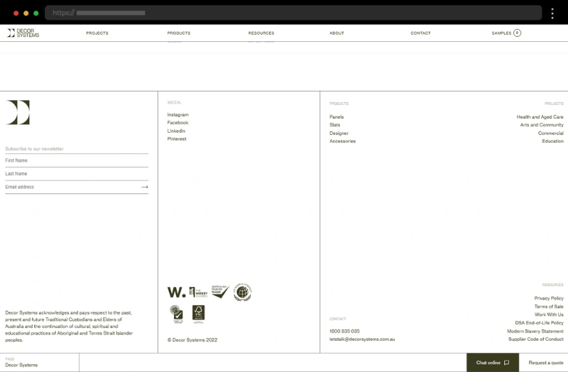
Décor Systems’ website footer design is clean, practical, and professional, with an emphasis on usability. The design employs a neutral palette and a straightforward layout and also includes links to product pages, projects, social media profiles, and important resources. Moreover, the footer features a prominently displayed “Chat Online” button and a phone number, encouraging site visitors to initiate contact. The fine typography and overall subtle design beautifully resonate with the brand’s polished aesthetic.
What we like:
- Professional design that ensures links are easy to locate
- Neatly organized layout with clear navigation
- Inclusion of fine print and a comprehensive copyright notice
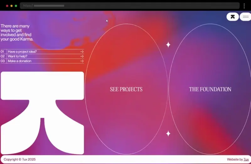
4. TUX Karma – Innovative Example of a Website Footer
The TUX Karma footer goes bold, incorporating vivid colors and a dynamic layout that certainly grabs attention. It balances functionality with a creative twist, combining useful links with striking visuals. The bold design also impresses with the pop-up forms showing up once users click the “Have a project idea?” or “Want to help?” buttons. Thus, TUX Karma provides us with an example of one modern and innovative footer website.
What we like:
- Bold use of vibrant colors
- A unique, eye-catching layout that draws the eye
- Modern and innovative design
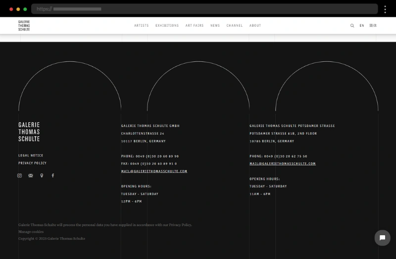
5. Galerie Thomas Schulte – Creative Gallery Website Footer Example
This creative footer is as sleek and contemporary as the artwork that Galerie Thomas Schulte represents. The footer design prioritizes space and uses clean lines, neutral tones, and a spacious layout to create a polished, gallery-inspired look. Essential links, contact information, business hours, and social media icons are neatly arranged, allowing website visitors to explore without distractions, thus making the footer design feel like an extension of the gallery’s serene and modern aesthetic.
What we like:
- Elegant, minimalist aesthetic for a modern, artistic feel
- The copyright notice ensures compliance with general rules
- Social media links are displayed with stylish icons
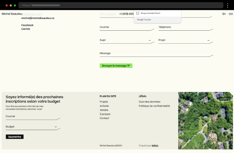
6. Michel Beaulieu – Narrow Footer Example for a Real Estate Broker Website
The next example is Michel Beaulieu’s website which has a footer that exudes professionalism. It wears a minimal vibe with clean lines and a neutral color palette while the added Google maps snippet makes it perfect for a real estate broker portfolio site. The website footer is simple yet effective, with a sitemap, legal links, and also a subscription field with all the elements aligned neatly.
What we like:
- Minimalist approach
- Clean design that feels modern and also professional
- Optimized sitemap and legal information
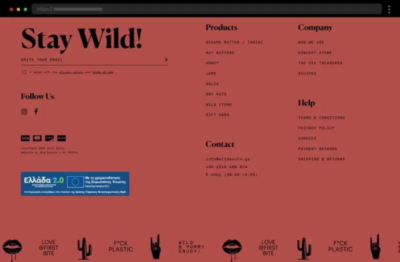
7. Wild Souls – Food Company Website Footer Example
Wild Souls’ website footer design captures the essence of its natural, eco-friendly branding and certainly makes a great impression. Using earthy tones, impactful typography, and also an engaging carousel of graphics in the sub-footer the design feels inviting and aligned with the company’s mission. Footer links connect to product categories, a blog with recipes, and the company’s story and initiatives. Social media icons encourage users to explore the brand’s online presence while the displayed payment methods facilitate users with shopping.
What we like:
- An impactful design that reflects the brand’s mission
- Clear and accessible navigation for a seamless browsing experience
- Prominently displayed key links and icons
8. htmlBurger – Great Website Footer Example with Professional Design
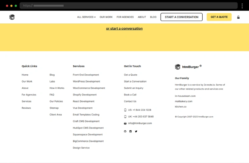
htmlBurger’s website footer is practical and well-organized, reflecting the site’s professional tone. It prioritizes usability without sacrificing style and focuses on delivering information in a clear and accessible manner, reflecting, as a result, the professional tone of the site. The fat footer includes a FAQ section, contact information, social media icons, quick links, and internal links to the company’s services and contact page, thus making it a valuable resource for site visitors.
What we like:
- Professional, no-frills design that’s easy to navigate
- FAQ section in the footer – a rare but helpful touch
- Clear contact details for immediate accessibility
9. Runway – Modern Website Footer Design Example
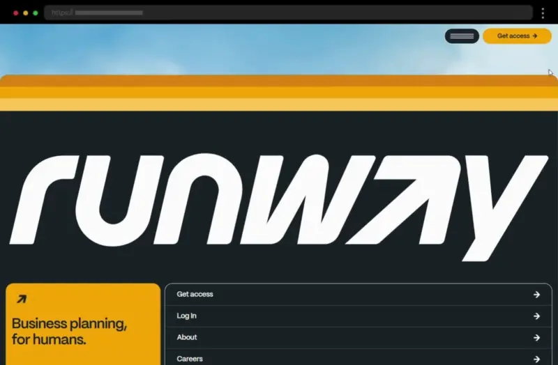
Runway’s website footer follows a clean and minimal design, blending warm colors with a dark-colored background and bold typography to create a contemporary and user-friendly experience. Light and airy, as the airplane theme of the site, the footer acts as a natural extension of its sleek interface, offering essential navigation and helpful information. Combining legal links with such for the company’s social media accounts, the footer also leads to essential web pages, resulting in another good footer design example.
What we like:
- Modern, clean layout with warm pastel tones
- Subtle branding that feels cohesive with the overall web design
10. Hapchot – Footer Example of a Website with Retro Design
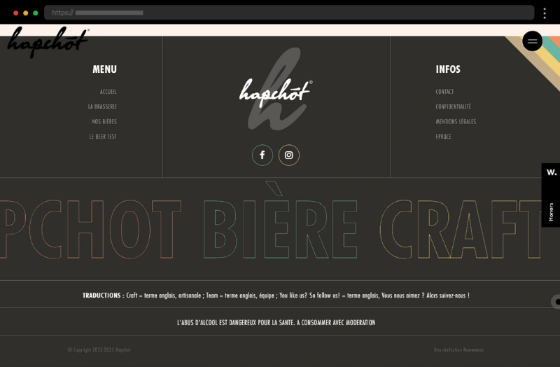
Further on our list comes the website of Hapchot Craft Beer, with a footer that opts for simplicity in its design. Still, it manages to make a pretty nice impression with the retro-colored palette of its branding, organized layout, and short copy adding personality to it. Overall, it emphasizes usability over ornamentation. In addition, the footer includes a simple menu along with contact and legal links.
What we like:
- Focused and purposeful, catering to its intended audience
- Simple but impactful design
- Prominent essential links
11. Chirpley – Vibrant Website Footer with Playful Design
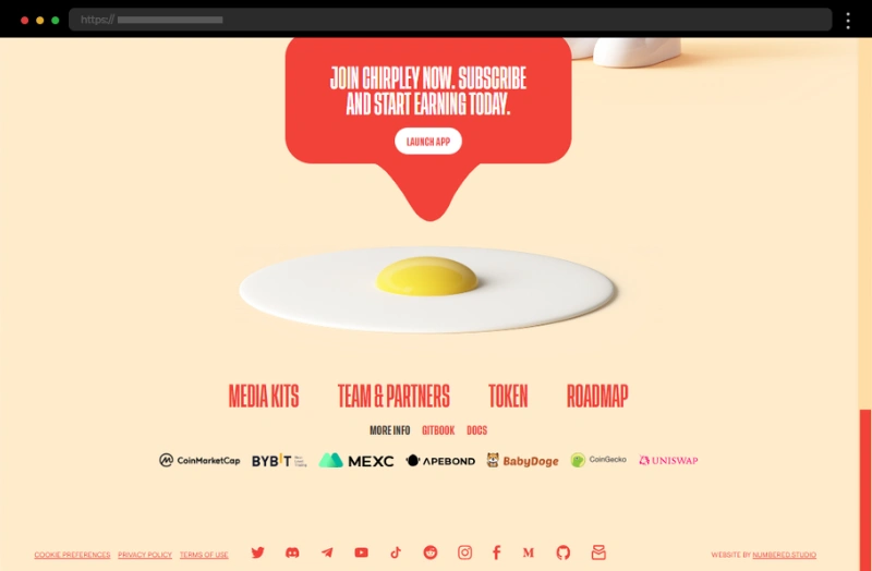
Our next example, Chirpley’s website footer, is undoubtedly attention-grabbing with its playful and vibrant design, combining bold typography and engaging visuals. The footer reflects the brand’s innovative personality and accommodates a strong call-to-action inviting users to launch their app, social icons that are creatively styled to match the website’s branding, and also the usual footer links to essential information.
What we like:
- Playful but functional design that aligns with the brand’s image
- Eye-catching CTA and social media icons for greater engagement
- A layout that ensures easy navigation
12. Art4Web – Cool Website Footer with Minimalistic Design
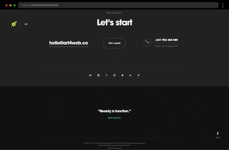
Further, we have Art4Web’s footer design, which is an impressive showcase of minimalistic creativity. The footer accommodates an inviting copy with a clear call-to-action button that opens a contact form for getting a quote. There is also an e-mail and a phone number, all displayed in a bold font and followed by seamlessly integrated social media icons. A nice touch is the added sub-footer with a quote, adding a personal touch to it, and the fine print with the copyright notice and legal details.
What we like:
- Seamless integration of call-to-action button and social media icons
- A unique layout that keeps users engaged while remaining practical
- A balanced design that serves both style and function
13. Fold7 – Bold and Innovative Website Footer Example
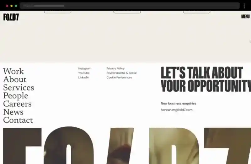
Our next example, Fold7’s website footer, mirrors the brand’s edgy, innovative aesthetic with bold design choices and a high-contrast color palette. It includes navigation that mirrors the site’s hamburger menu, links to the brand’s social media pages, and important links to legal and also contact information, all presented with a flair.
What we like:
- Edgy design that aligns with the brand’s creativity
- Strong emphasis on engagement via a sub-footer video
- A high-contrast palette for a dramatic visual impact
14. Discovered Foods – Warm and Inviting Website Footer Design Example
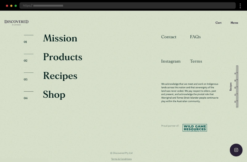
With elegant design and a warm palette, this website footer feels inviting and fresh, matching the company’s focus on wholesome, flavorful products. The footer integrates a navigation mimicking the one in the hamburger menu and accommodates all mandatory footer elements without feeling cluttered. It also adds personality with the small bursts of color of the custom cursor and a playful font.
What we like:
- Friendly, welcoming concept that resonates with food lovers
- Subtle design reinforcing the consistent branding
15. RocketAir – Design and Strategy Company Website Footer Example
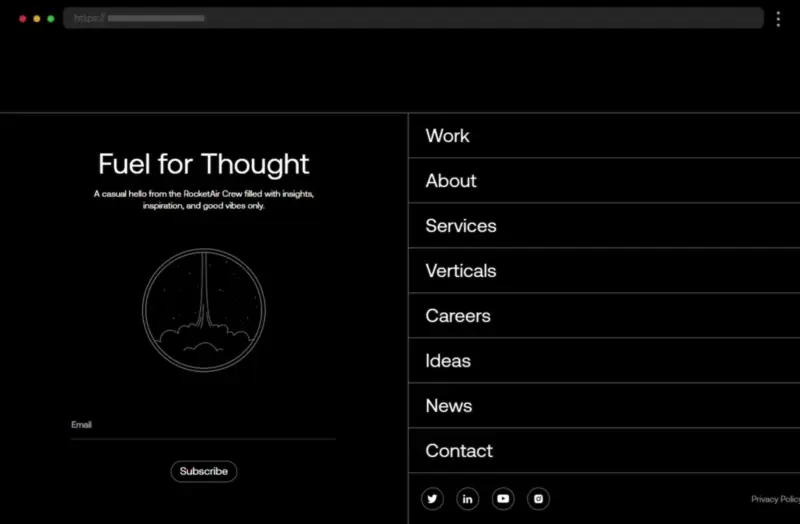
RocketAir’s website footer is sleek and modern, split into two distinct sections – one for navigation links and the other for a subscription form. The design makes excellent use of white space and a monochrome color scheme, keeping the content both functional and visually impactful. In addition, the list of links leading to the website’s most important pages is neatly organized in a no-nonsense manner ensuring easy access and a satisfying user experience.
What we like:
- Clean, spacious design that feels professional
- Clear CTA encouraging newsletter subscriptions
- A well-structured split-screen design
16. Spline – CTA Website Footer Example with Minimal Design
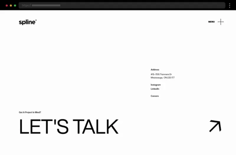
Spline’s website footer is highly minimal consisting of only a strong call-to-action with huge lettering, social and career links, and the physical address of the company. The design sticks to a black-and-white color scheme, thus creating a sleek, modern look and offering a polished experience for site visitors. The generous use of ample space and the subtle branding ensures it feels professional and approachable, creating, as a result, one truly good footer design.
What we like:
- Sleek, minimalistic call-to-action-focused design
- Subtle branding that reinforces professionalism but without overwhelming
- Responsive design that ensures usability on mobile devices
17. Philip Mould – Elegant Website Footer Design Example
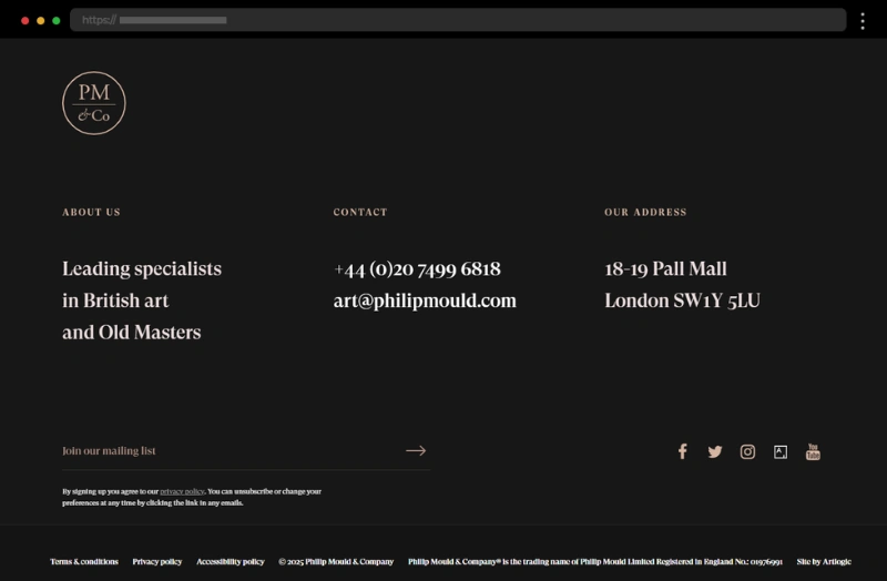
Further on our list of examples comes Philip Mould with a website footer that exudes timeless elegance, mirroring the refined nature of the art showcased on the site. The muted color palette, paired with well-organized footer content, highlights essential information such as contact details and important links. The simple layout ensures the fine print and copyright notice remain easy to find while the mobile-friendly design guarantees seamless usability on mobile devices.
What we like:
- Elegant design that appeals to art enthusiasts
- Copyright symbol and legal info at the very bottom for easy reference
- Thoughtful inclusion of social icons to boost engagement
18. Will Ventures – Sleek and Confident Website Footer Design
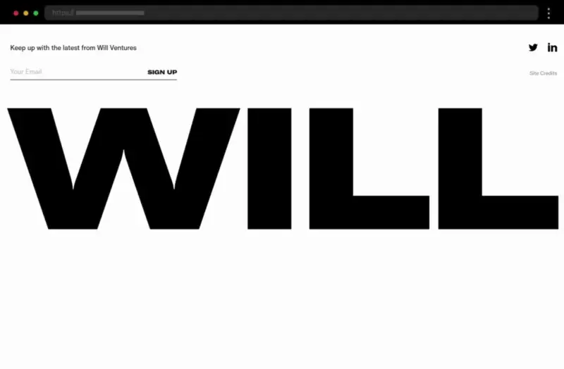
Further on our list, the footer for Will Ventures is bold and impactful, much like the venture capital firm itself. The website footer design is a modern and sleek example, utilizing both strong typography and a high-contrast palette to make a lasting impression. Moreover, animated lettering reinforces the company’s branding and professional image. Featuring only a newsletter sign-up form and social media icons, the footer appears bold and straightforward while exuding confidence and professionalism.
What we like:
- Sleek and confident website footer design
- Branding that reinforces the firm’s professional image
- Prominent social media icons for easy accessibility
19. L’Étude – Footer Design of a Creative Studio Website
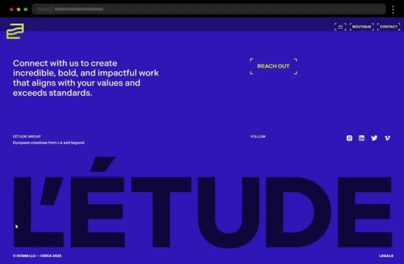
Our next example, L’Étude’s website footer has a bold and impactful design that instantly grabs site visitors’ attention. Both the footer’s copy and colors exude professionalism and invite users to connect with the company. In addition, the animated lettering at the bottom and the integrated social icons and a contact form promote engagement and interaction, enhancing the footer design’s effect even more.
What we like:
- Bold and impactful design with a strong statement
- Thoughtful placement of CTAs and social media icons
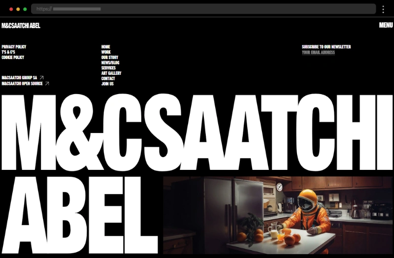
20. M&C Saatchi Abel – Edgy Website Footer with Creative Design
The footer design for M&C Saatchi Abel perfectly reflects its innovative and bold brand personality. Featuring eye-catching typography and creative imagery, this footer grabs attention while remaining highly functional. The strong contrast between the fine print of all footer links and the huge lettering of the brand’s name is undoubtedly impactful and leaves a lasting impression. Overall, it’s designed to encourage action and inspire creativity, making the website footer design as functional as it is visually appealing.
What we like:
- Links to social media are cleverly integrated
- Striking imagery that aligns with the brand’s image
- Clear navigation and intuitive footer links
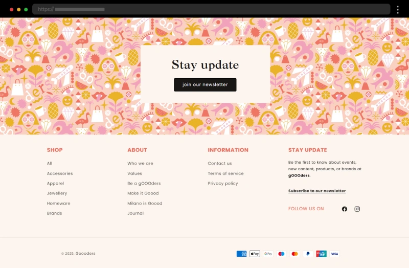
21. Goooders – Website Footer with Fresh and Playful Design
Goooders’ website footer design is cheerful and inviting, a vibrant and playful extension of their brand, emphasizing their focus on ethical, sustainable products. The design feels fresh and lively, with bold fonts and cheerful colors that engage users. The footer integrates quick links to shop categories, social icons, and a bold call-to-action that undoubtedly draws attention to the newsletter form. Overall, it is designed to encourage interaction while staying true to the brand’s personality and mission, making it stand out from other online stores.
What we like:
- Fresh, playful design that reflects the brand’s values
- Well-placed newsletter signup to boost engagement
- Cheerful colors and typography that create a welcoming vibe
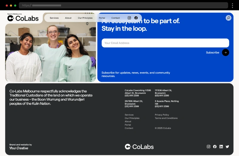
22. Colabs – Sleek Website Footer Design with Sections
The footer design for Colabs’ website has a modern layout with bold typography, sleek navigation, and subtle brand accents that resonate with site visitors. The footer is divided into distinct sections, ensuring, as a result, each important element is easily accessible. It features prominent social media icons that connect users to external platforms, thus reinforcing engagement. In addition, organized footer links help visitors find valuable information effortlessly.
What we like:
- Clean structure with distinct sections
- Intuitive design that ensures links function properly
- Features also a team photo that adds a personal touch
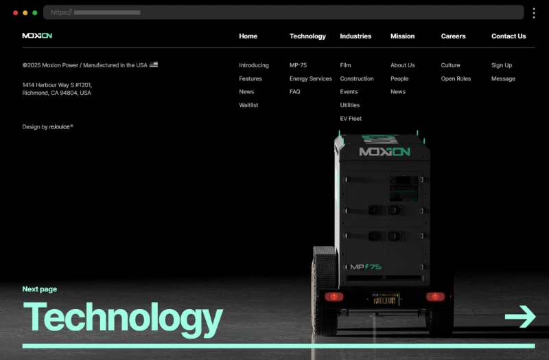
23. Moxion – Energy Company Website Footer Example
Moxion here provides one really good footer example which embraces functionality with a minimalist approach, focusing on utility for site visitors. It includes neatly organized links and a compact design and follows the color scheme of the entire website. The website footer also shares the company’s physical address, and provides site links to all important pages while staying neat and clean, making it stand out among the many websites out there.
What we like:
- Straightforward navigation that’s easy to scan
- Consistent branding across the footer
- Effective use of spacing for a clean look
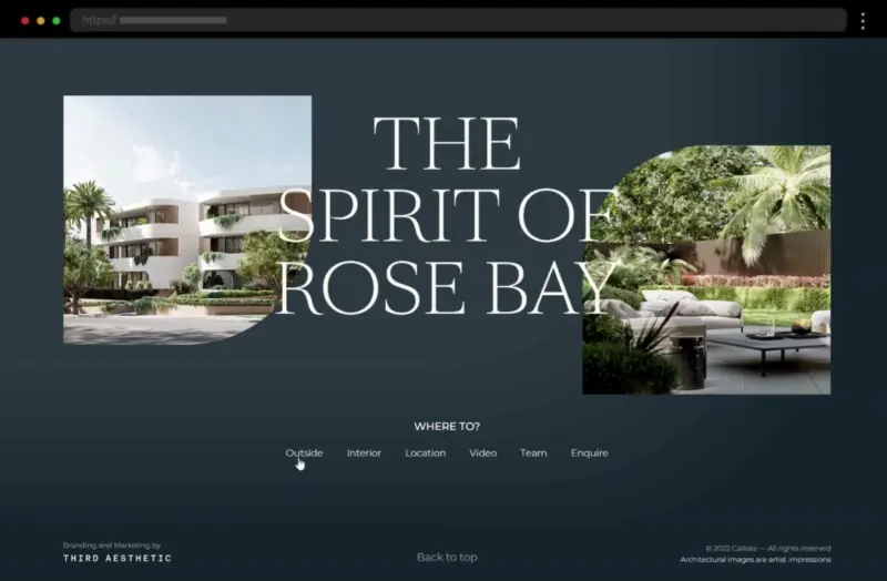
24. Callista Rose Bay – Clean Website Footer with Responsive Design
Callista Rose Bay’s website footer exudes coastal elegance, combining a serene color palette with a structured layout. The design, in general, reflects the luxurious and relaxing vibe of the brand, making it inviting for site visitors. The footer content consists of impactful imagery, links to key pages, a contact form, and also a copyright notice at the very bottom. In addition, the clean, responsive layout ensures it functions properly on both desktop and mobile devices.
What we like:
- Soothing color scheme and typography that align with the brand’s style
- Intuitive navigation with well-placed links to internal pages
- Effective use of ample space to display information with clarity
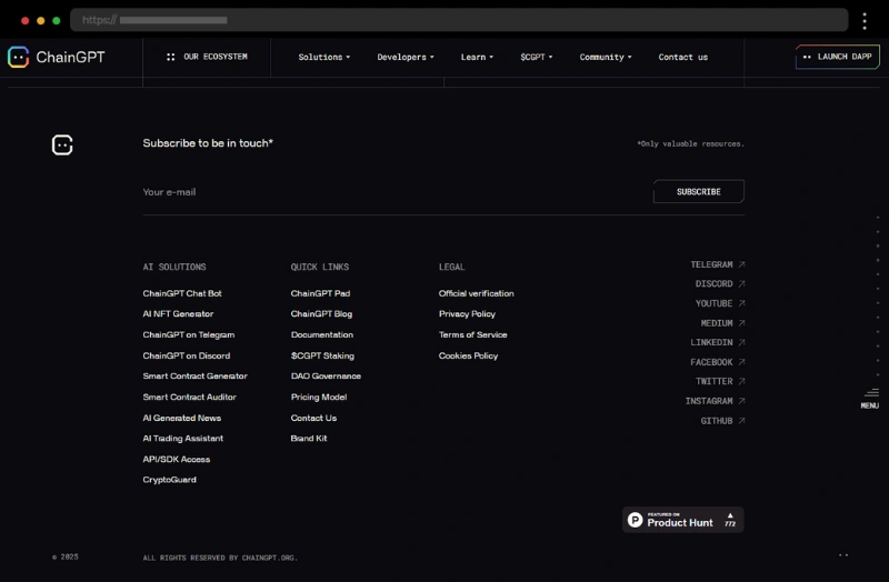
25. ChainGPT – Dark and Futuristic Website Footer Example
ChainGPT’s footer feels futuristic, matching the tech-forward theme of the site with both its dark design and structured layouts. Keeping a straightforward, unadorned concept, the fat footer accommodates important quick links, links to the company’s AI solutions, links to all its social media accounts, and also a newsletter subscription box. Thus, ChainGPT shows us one comprehensive and helpful website footer.
What we like:
- Futuristic footer design that aligns with the brand
- An organized layout that doesn’t overwhelm the user
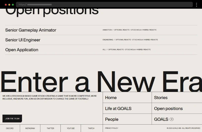
26. Playgoals Studio – Game Studio Website Footer Example
With its bold typography and segmented layout, Playgoals Studio’s website footer is an extension of the studio’s imaginative branding and serves as a memorable conclusion to its site. The creative footer features important links, social media icons, and internal links to important web pages, and still its balance between practicality and artistry is expertly maintained.
What we like:
- A balanced mix of creativity and practicality
- Smooth navigation links for enhanced usability
- Eye-catching typography that adds personality
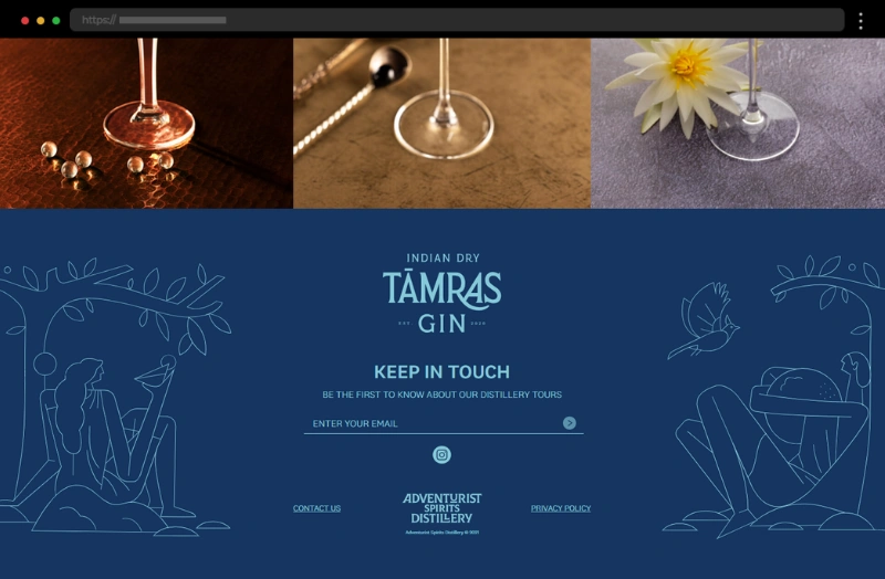
27. Adventurist Spirits – Adventurous Design of a Website Footer Example
The footer design for Adventurist Spirits’ website is a bold and adventurous example, just like the brand itself. Muted blue tones paired with modern fonts create a sleek, contemporary aesthetic while the artsy graphics add a friendly and welcoming vibe. The footer centers around a newsletter form and an icon for the brand’s social media so it can keep customers engaged. In addition, the fine print with the copyright owner notice is easy to locate at the bottom along with a contact option and link to the privacy policy page.
What we like:
- Modern, adventurous design that reflects the brand’s identity
- Muted blue tones that create a welcoming atmosphere
- Strong call-to-action with a prominent newsletter form
28. Hape – Narrow Website Footer Example with Bold Design
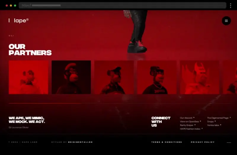
What we have here is the website footer design for Hape – a futuristic and sleek example, that is perfectly in line with its cutting-edge digital brand. Vibrant accents against a dark background create a striking visual impact and so draw users’ attention to the content in the footer. Bold links to essential pages ensure smooth navigation while social media links enhance engagement and help users connect with the brand.
What we like:
- Modern design with high visual contrast
- Bold typography that makes a statement
- A links structure that guides visitors to key pages
29. OTHR – Bold and Modern Website Footer Example
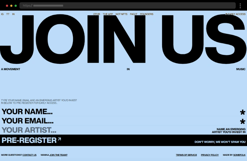
Further on our examples list is OTHR’s website footer with a design that is clean and modern, featuring striking bold fonts and a visually appealing light blue and black color palette. The footer content is extremely focused on the featured fill-out box, which aims to attract more enthusiasts to the brand’s cause. Additionally, the footer accommodates legal and contact information, ensuring users can turn to it for useful resources.
What we like:
- Striking modern design with bold fonts
- Strong focus on the featured lead generation form
30. Fitsole – eCommerce Website Narrow Footer Example with Clean Design
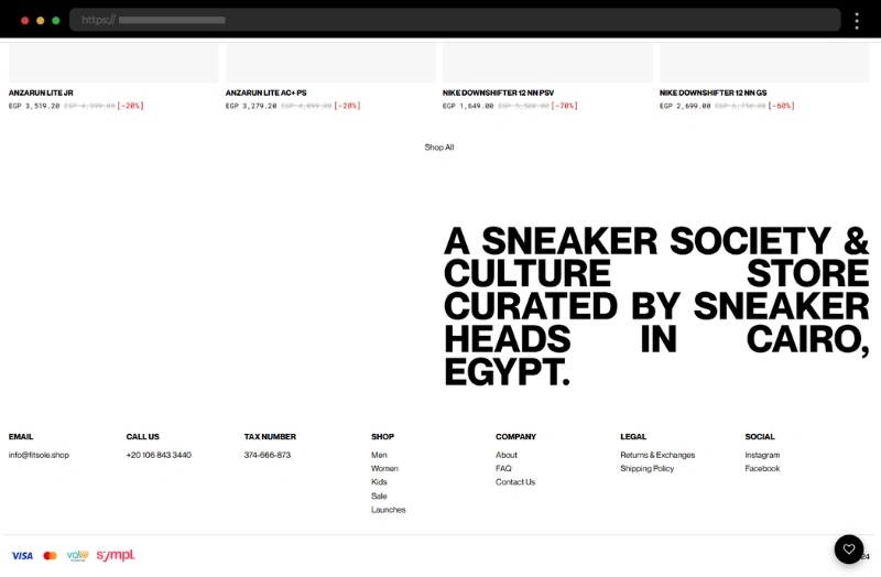
Fitsole’s website footer is clean and straightforward, much like their brand, and sports a black-and-white color scheme and bold fonts. The narrow footer smartly accommodates all essential links, such as contact information, navigation links, legal info, and social profile links. It also displays the possible payment methods for the online shop, making it a useful place for potential customers to look for information.
What we like:
- Clean and straightforward website footer design
- User-friendly navigation with quick access to key areas
Best Practices for Creating Effective Website Footers
Crafting an effective footer design requires a balance between aesthetics and functionality. Here are some best practices to ensure your footer serves its purpose:
1. Aim for simplicity and avoid overloading the content of the footer with excessive information. Also, use clear headings and logical groupings for links and resources.
2. Align the footer design with your brand’s color scheme, typography, and overall style so you can make it visually cohesive.
3. Focus on providing easy navigation – include important links to frequently visited pages and resources and also ensure that links work properly and guide users to the intended destination.
4. Optimize your footer for engagement – highlight call-to-action buttons, such as “Subscribe to Our Newsletter” or “Contact Us.”, and position social media icons or links to encourage interaction.
5. Use legible fonts and high-contrast colors to improve readability, include alternative text for icons, and follow the general rules for accessible design so you can provide accessibility and improve your ranking in search engines.
6. Include policies and legal pages, such as “Privacy Policy” or “Terms of Use,” in the fine print section, and add a copyright notice to ensure compliance with intellectual property laws.
7. Don’t forget to test your footer to verify that links, call-to-actions, and all interactive elements work seamlessly while ensuring your footer design is fully responsive across all devices.
Essential Elements of a Website Footer
Must-Haves
- A copyright notice is a must-have for any website, including the copyright symbol, year of publication, and name of the copyright owner.
- Terms of service should be included in the footer, referring to general rules and guidelines for using the website.
- Contact information, including phone number, and physical and email address.
- Social media icons can be placed in the footer to encourage users to engage further.
Additional Elements
- A sitemap and links can be included in the footer to help users navigate the website.
- A simple hierarchy can be used so links can be organized and the footer – easy to browse.
- A footer can also include a description of the company or organization to provide more context.
- A newsletter subscription option can be included in the footer to further engage with visitors.
Final words
A thoughtfully designed footer is more than just a section at the bottom of a website page – it’s a helpful tool where every detail contributes to making your footer design both functional and visually compelling. And it can certainly help you elevate your site’s usability, engage site visitors, and leave a lasting impression. Remember, the footer of a website might be the last thing your visitors see, but it’s also the element that ties everything together. So make it count, and your site will stand out for all the right reasons. Now, it’s time to get creative and turn your footer into a functional masterpiece!
Check out our other awesome articles for more design ideas and inspiration:


