

We are living in the apogee of ecommerce business, and the tendency for it is to keep evolving and rising in popularity. So, it’s natural that product page design has been receiving lots of attention. And it should. Beautiful and functional product page design is key to converting users into real customers.
While product pages should offer a familiar, intuitive flow in order to make the customer feel safe, designers still have to make sure each product page design corresponds to the feel and look of the brand itself.
But product page designs should undoubtedly contain mandatory elements that provide all needed information around this last stage of conversion. The lack or misfunction of any such element would make or break the sale, no matter the design. Such must-haves are features and specifications, delivery and shipping, probably reviews, and so on.
In today’s post, we’ve picked 26 examples of super effective product page designs that convert the user with ease and finesse. Let’s begin!
1. Bahama Buck’s

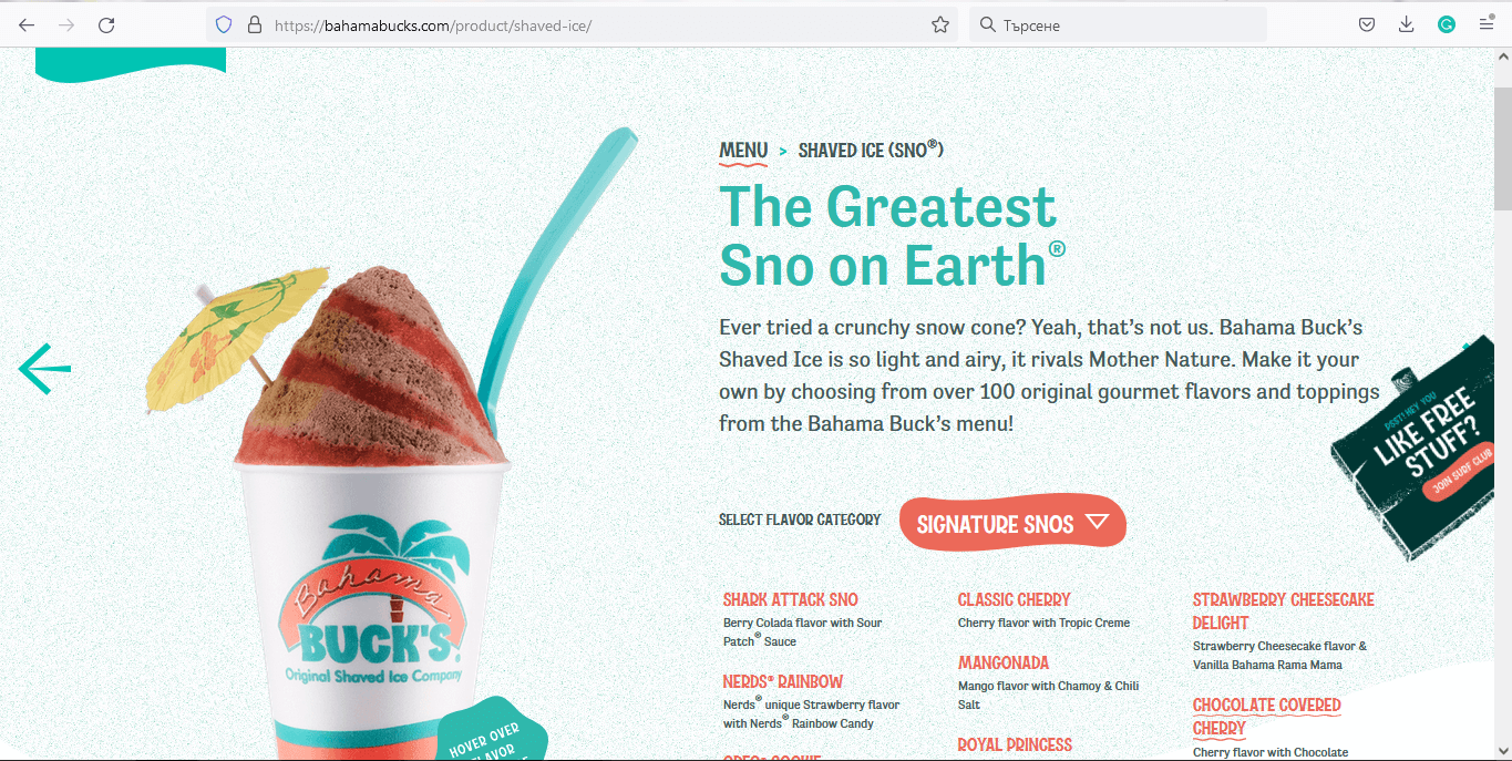
The snow cones look super delicious and enticing, changing their appearance every time you hover over a specific flavor. These visuals can literally make you drool! Once you click on a chosen product, you can see a lot of information about it, such as indigents, nutrition, and allergens – valuable information that may be critical for a customer to go ahead and buy.
2. ZARA

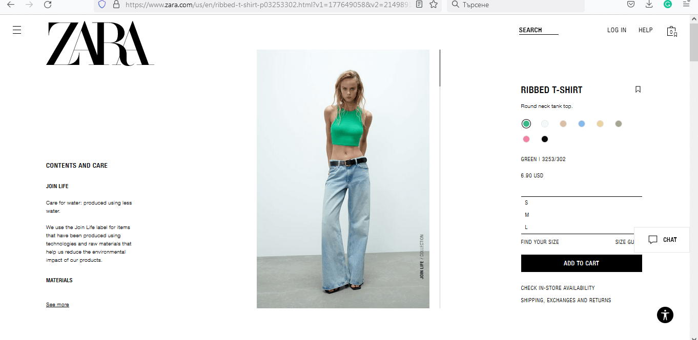
Simple, yet classic and sophisticated, the design perfectly grasps the spirit of the brand. It focuses on the product with all the necessary information around it. Nice, smooth hover animations boost the user experience. And their iconic serif font logo standing proudly on the side is in perfect harmony with the sans serif font type of the body text.
3. Sandy Gray Whisky

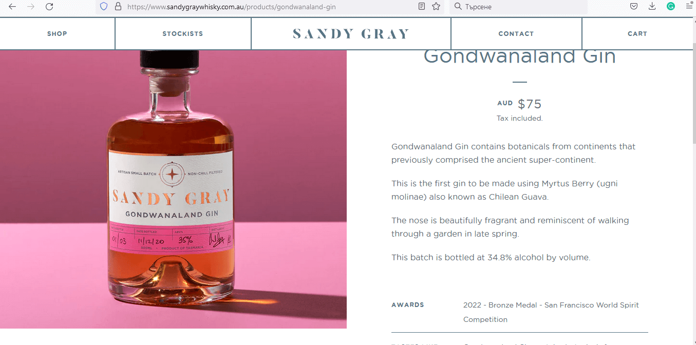
Secondly, the description just adds up to the picture. It highlights the product’s uniqueness and provides proof of quality (awards). Moreover, it naturally boosts the user’s desire to taste the beverage by comparing the gin’s fragrance to a dreamy “walk a garden in late spring.” Who wouldn’t want to have such an experience with just a sip?
4. Bang & Olufsen

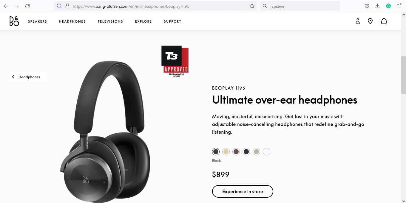
Sleek, modern, and interactive, with great product images, this product page design is intuitive and easy to use. The “Experience in-store” button takes you to locations of physical stores in case you want to test out the product in person.
5. Under Armour

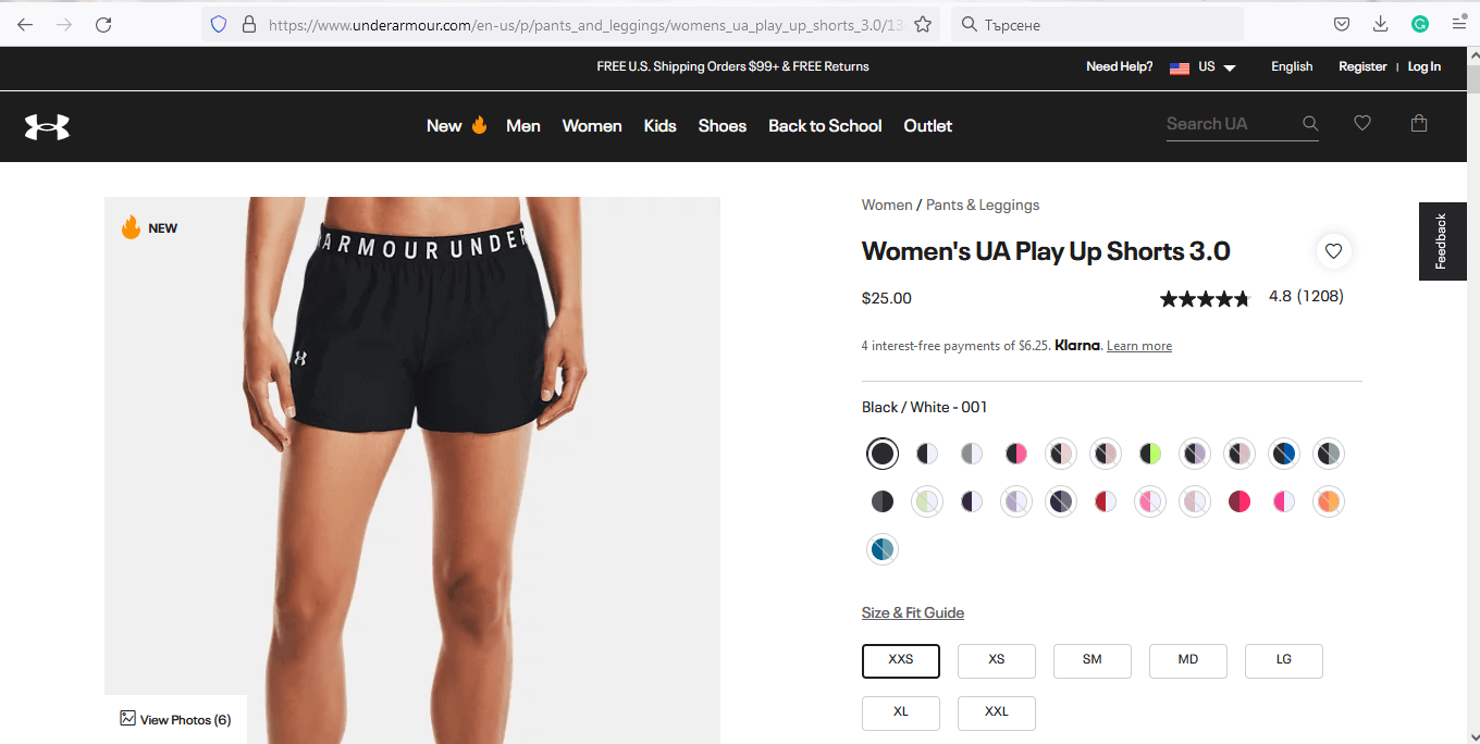
Clean, straightforward, and highlighting the product’s benefits from all angles. Literally. The extra thought and care Under Armour put into creating each product, shows to the smallest detail. They listen to their customers and realize. They put the client first.
The big Reviews section, followed by the Q&A section really adds up to the trust which Under Armour aims to build. The product page design conveys reliability, friendliness, and approachability.
6. Kershaw

7. Vitra

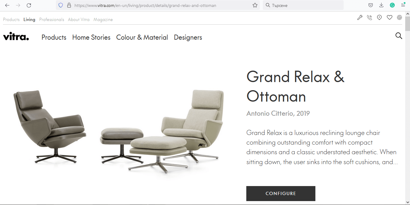
Vitra knows how to win clients and it shows. First of all, we were impressed with the product tagging feature and the option to “Shop the look” of the interior setup. But what impressed us the most, was the amazing 3D visualization of how you can customize (and personalize) your product. You can customize everything – from the materials’ types to colors.
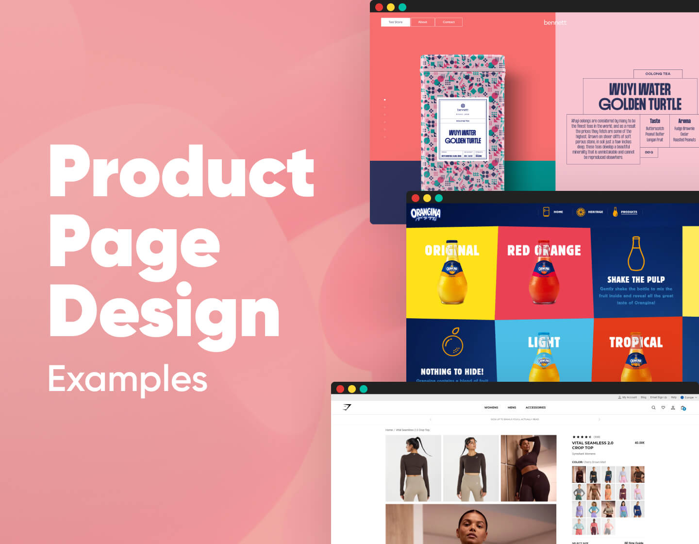
8. Bennett tea

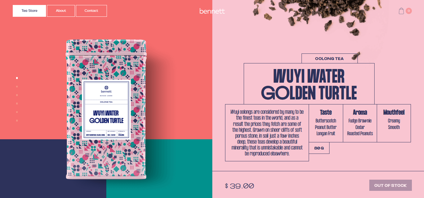
How fancy a tea website can be? Well, check out this one! A super unique, fancy, and innovative product page design that will make you keep scrolling to see the entire product line.
Smooth animations and absolutely enchanting pastel colors. The product design itself is quite impressive, embracing the essence of the Memphis design movement.
9. Vredestein

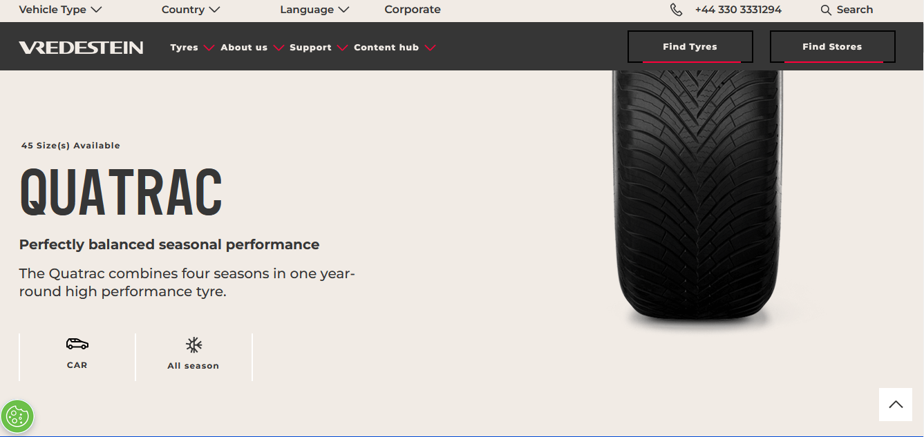
This product page design certainly has it all to make you choose their tires over the competitors’. Completely focusing on the product’s safety, durability, and great performance in all weather conditions, this brand convinces you that you are about to make the right decision here.
The nice little interaction with the displayed tire makes your experience on the page even more fun. Try grabbing the tire with your cursor and moving it left and right.
To make it even easier for you to make a purchasing decision, you’ve got vendors’ location search console, competitive features of the model, and a list of specifications of each product variant.
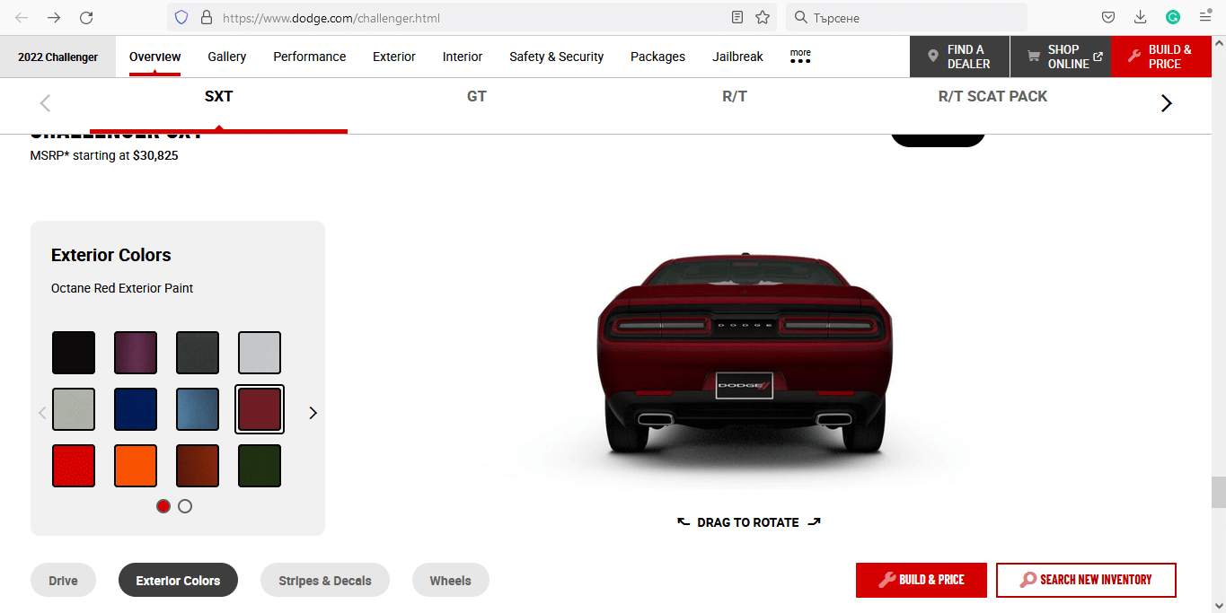
10. Dodge

11. Polly Kole

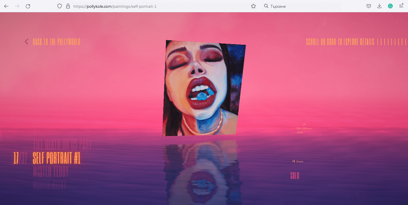
Oh, wow, where do we begin? This site sweeps you away from the very beginning. The landing page and the way it leads you to the product page are like you are exploring a new fantasy world. It really keeps your interest on the deepest level, and the background music really adds up to the feeling of entering an exciting, fantasy world.
12. DDNA

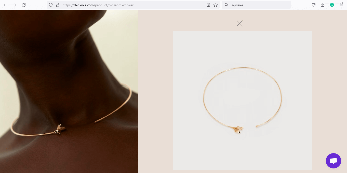
A clean and minimalist product page design that focuses on the product while conveying sophistication. The simple menu design on the right resembles a classic spreadsheet design, and the soft rose color of the background awakes associations of rose gold.
If you browse the rest of the site, you’ll find a horizontal scroll and even animated 3D elements. This site is definitely a mix of modern UX design with retro classic design choices.
13. Miista

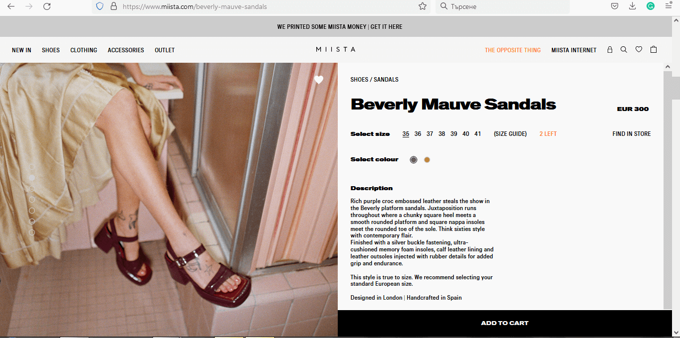
A black-and-white menu is nothing new really. But what catches the eye is the extraordinary decision not to leave margins between design sections. The “Add to cart” button takes up almost half of the bottom of the page, and the wide heavy font makes the product page design feel rebellious and out-of-the-norm. Of course, for such a brand, models with tattoos and noisy images go perfectly in line with the vibe.
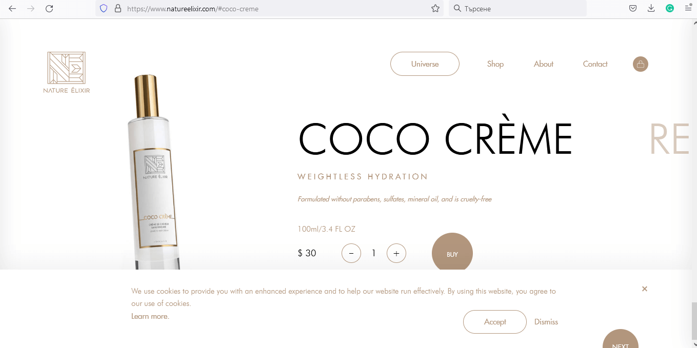
14. Nature Elixir

15. Rent The Runway

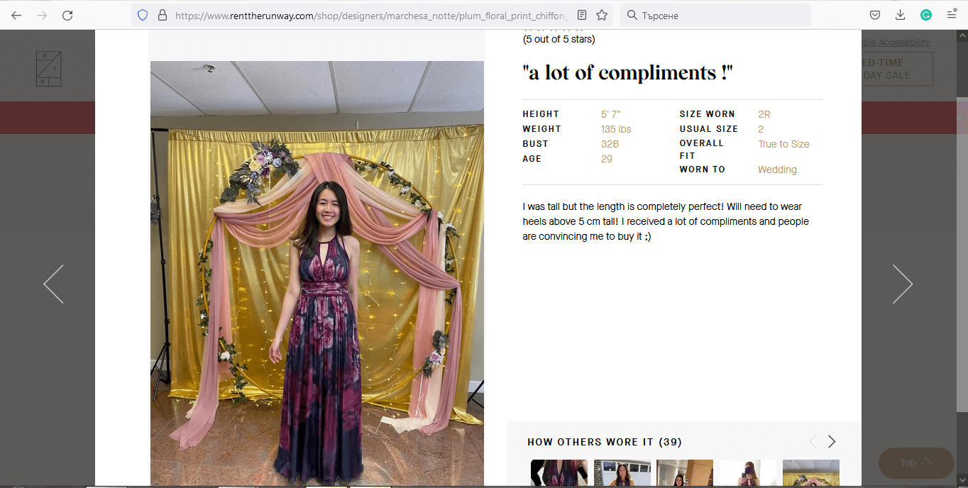
A product page design with an ingenious concept. Instead of putting photos of professional models wearing the garment, they put a section of “How others wore it”. The idea is, customers can rent these garments and leave real photos of the dress wearing it, providing valuable information for other potential customers that want to rent this garment.
This smart tactic may eliminate the fear of purchasing clothes online, as people can see real photos posted not from the seller, but from real customers.
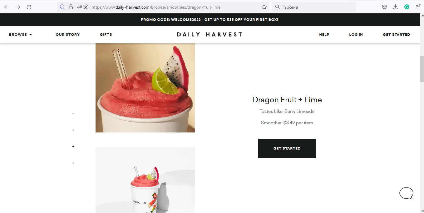
16. Daily Harvest

17. Orangina

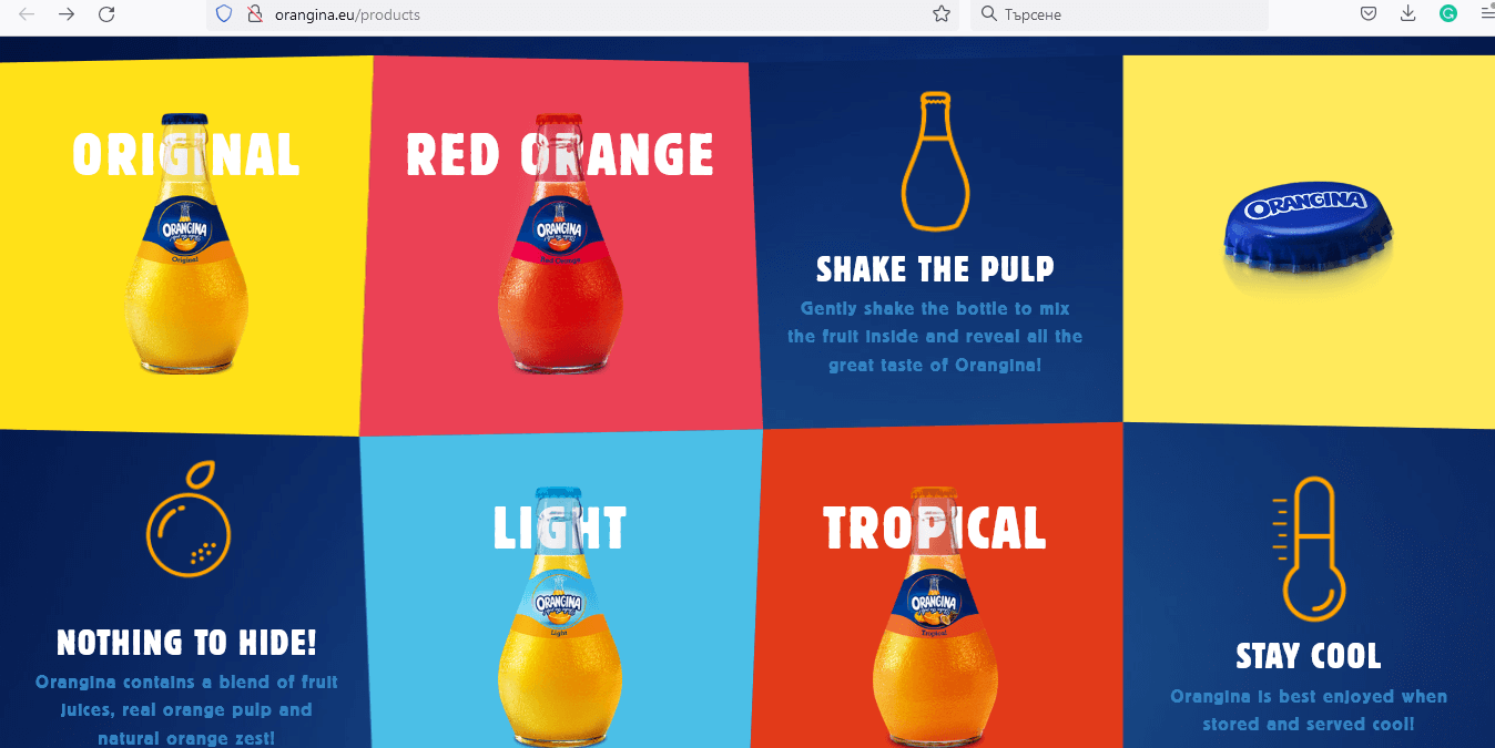
Colorful, playful, and catchy, Orangina will surprise you with a lot of interesting information about the history of the juices. When it comes to their individual product page designs, expect to see combinations of bold, lovely colors, cute simple illustrations, and playful icon animations.
18. Gymshark

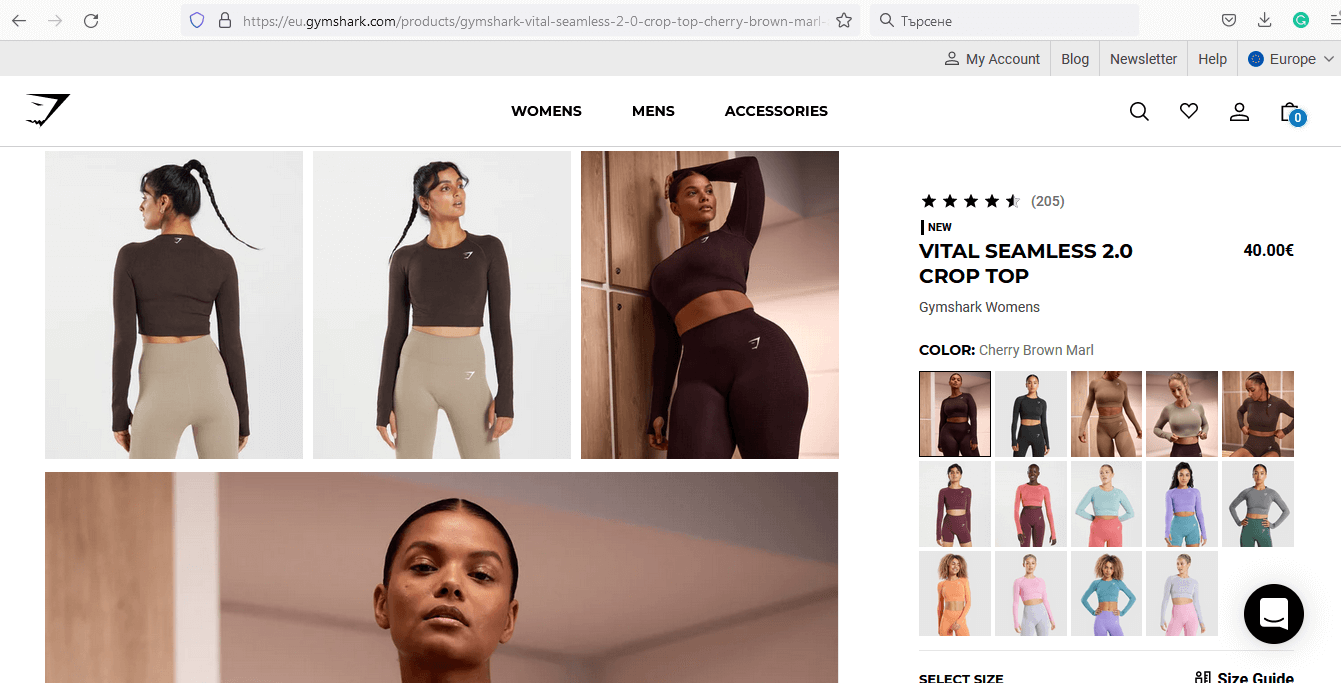
This product page design is quite straightforward but it does surprise us with an interesting grid of photos. Plus, the color menu on the right shows real pictures of people wearing that garment in other colors rather than putting just circles of colors. Super convenient to get an idea of other garment variants without having to click through all the options.
19. Apple

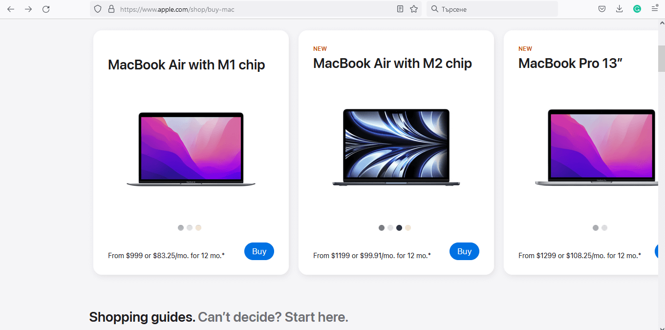
Apple’s product page design is inspired by material design, presenting each product in a different block. Once you click on a product, you stay on the same page and get a popup with all product details. The CTA buttons are on every block and every popup, kindly prompting you to buy.
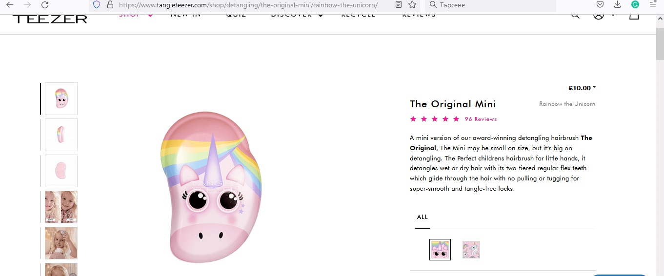
20. Tangle Teezer

21. Nudie Jeans

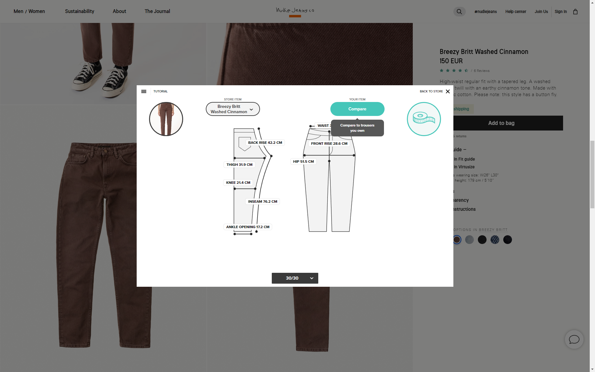
Nothing really new about the design itself but this product page does have a couple of functionalities that really stand out. The Virtusize guide lets you compare this model to your own model of jeans, and the Fit guide allows you to compare the cut and feel of two different models on the site. Both features provide an awesome user experience for customers who are never really sure if the model will fit.
22. Leesa

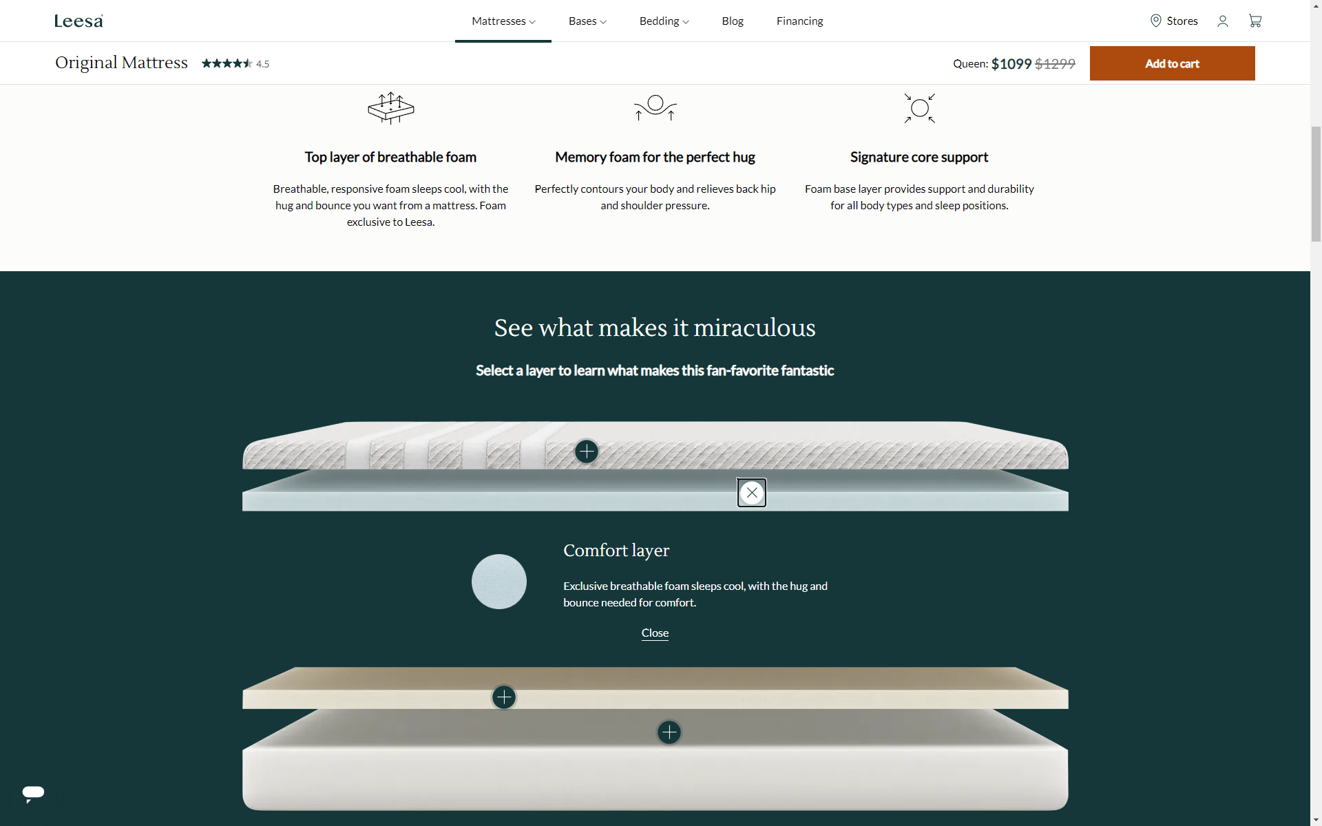
A modern, simple, and stylish product page design that also offers an interactive experience. And it presents the advantages of the product in a very attractive way. You can literally see the layers of which the mattress is made, and read more information about each. The call-to-action button stays prominent on the top, so once you decide to purchase, you won’t have to scroll back.
23. Boohoo

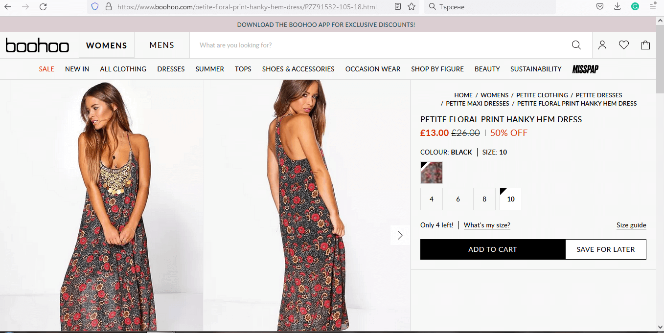
A straightforward product page design with a lovely hover effect on the pictures with zooming. Just hover over the photos to see a zoomed version in a popup that appears. Another element that caught our eye is the energy-saving feature on the right. Once you turn it on, you know that this website will consume less energy. Definitely a win for every eco activist!
24. Mac cosmetics

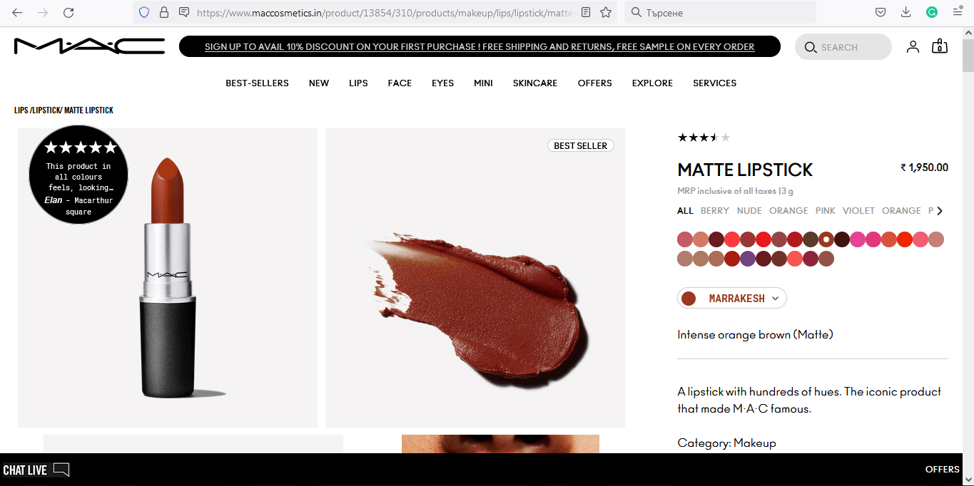
Mac’s product page design presents photos in a grid with a zoom hover effect. Well, of course – when you are choosing makeup, even the smallest details matter. You’ve got a “best seller” tag, and a 5-star product review, both of which elements speak of a high-quality product.
What impressed us the most, however, is the feature to “try it on”. Being curious about it, we clicked to find out that you can use your camera or upload your photo in order to test out different nuances of color. Brilliant!
25. Garnier

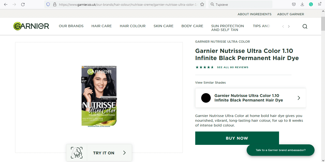
It seems that the “try it on” feature works amazingly for conversions since Garnier also went in that direction. Very often, women want to change their hair color but hesitate if they are making the right choice. Well, Garnier’s product page design offers a virtual try-it-on for hair dye. You simply upload a photo and find out what nuance fits you the best.
26. Jack Daniels

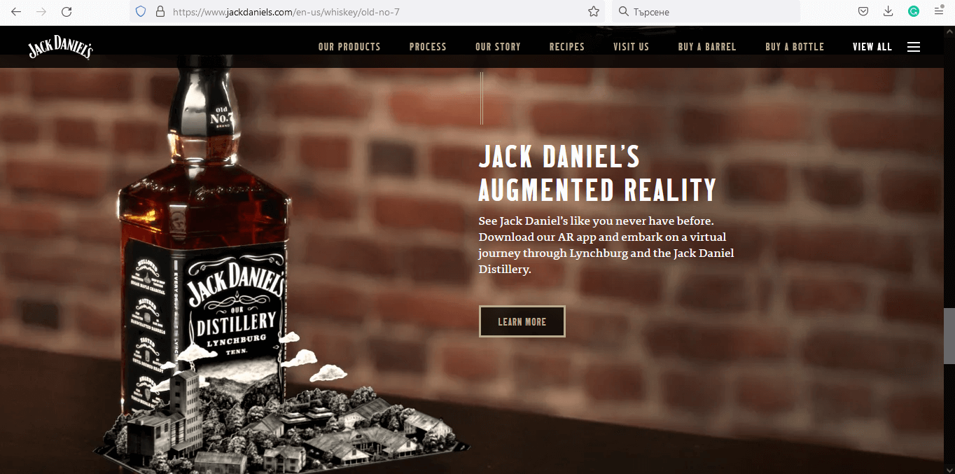
Dimmed, cozy, sophisticated. The product page design of Jack Daniels makes you immerse in an atmosphere exactly like the one you want to be in when consuming high-class whiskey. The whole presentation of the product is like storytelling and kind of makes you bond with the beverage. Even the call-to-action prompts you to “Bring home a bottle…”.
Conclusion
There are as many product page designs as the stars in the sky. Although most follow the same pattern, some can provide you with unique ideas of how to improve your own product page design and boost your conversions. We hope you liked this article and found it helpful!
In the meantime, why not take a look at the related articles to get some more inspiration or grab a couple of freebies: