


Sometimes it feels like every site looks the same, won’t you agree? Yeah, I feel that. Especially when you’re working on ecommerce designs in Squarespace. Clean grid, minimal fonts, muted colors, a couple hover effects… it’s all starting to blur together, right? And when a client’s expecting something fresh and unique, that sea of sameness? Not super helpful.
That’s why I pulled together this list. These Squarespace ecommerce sites actually stand out. I’m talking smart layouts, great branding choices, and the kind of details that make you pause and think, “Okay, that’s cool.”
So, is Squarespace a solid choice for ecommerce? I’d say absolutely – if you know how to use it well. Here are 26 Squarespace ecommerce sites every creative should see 👀
1. Jars of Dust – Warm Ceramics Brand Squarespace Ecommerce Site

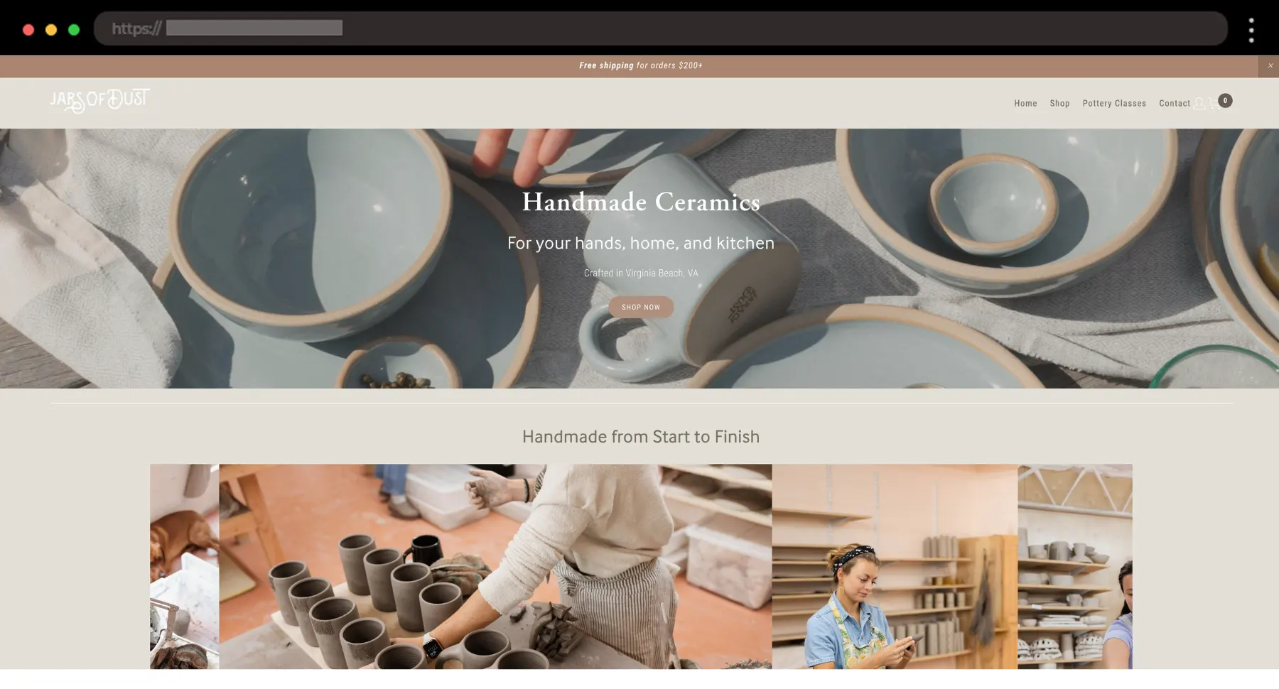
I love ceramics, and Jars of Dust makes me want everything from it! Both handcrafted and high-end, this example pairs beautifully soft photography with a warm layout.
What I like:
- Natural tones and materials vibe
- Pottery class calendar feature
- Beautiful product styling
2. Muff & Co – Cozy Squarespace Ecommerce Website for Gourmet Baking Mixes

With its beautiful homey photography, this site makes me want to bake something immediately! It’s proof that comfort food brands can still look modern and fresh.
What I like:
- Testimonials section
- Warm cozy tones
- Clear structure with product highlights and categories
3. Betty Lu Paperie – Romantic Squarespace Ecommerce Website for Wedding Stationery

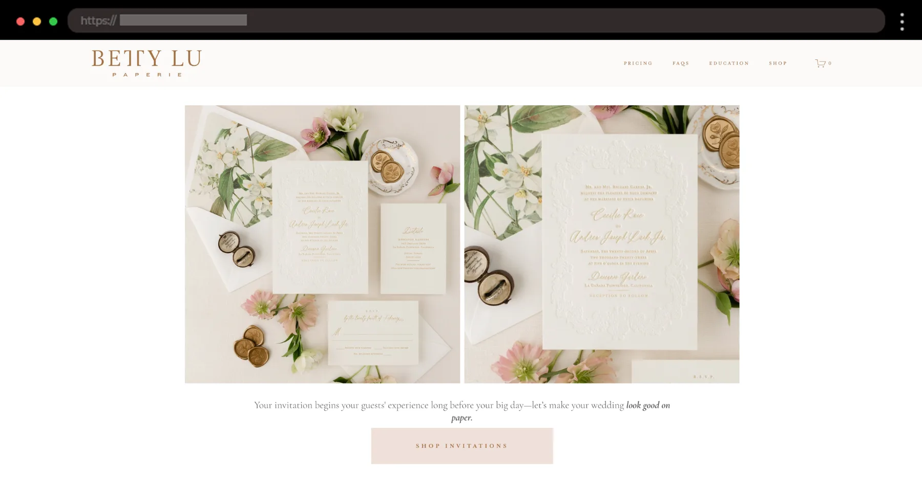
This one’s such a soft, elegant experience. I personally think the homepage copy is some of the best I’ve seen – smooth and intentional.
What I like:
- Beautiful serif fonts with a feminine touch
- Warm, romantic images
- Spacious and airy layout
4. Carolyn’s Krisps – Snack Brand Squarespace Ecommerce Website

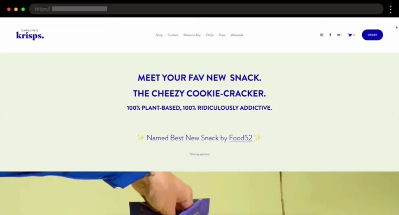
Carolyn’s Krisps feels like the cool snack brand at a weekend market with playful visuals and that homemade energy. I like the blue accent color, for me, it adds some sophistication.
What I like:
- Cheerful color palette
- Simple shop layout with cozy product photos
- Warm, casual copy
5. Afhra – Modern Squarespace Ecommerce Jewelry Brand

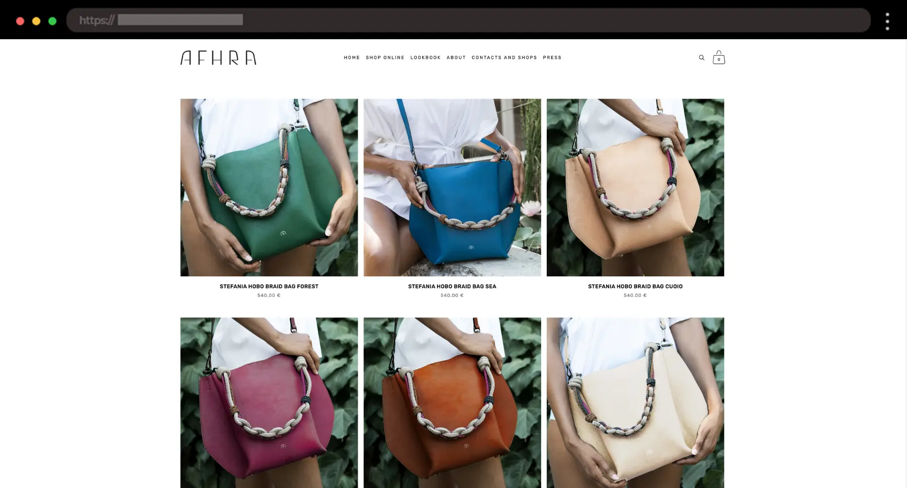
Afhra creates bold, artful jewelry, and it shows. The whole site feels like an extension of the pieces: minimal, striking, and super intentional.
What I like:
- Sharp, editorial photography
- Bold use of negative space
- Monochrome color palette
6. Clare Nicolson – Whimsical Squarespace Ecommerce Website for Handmade Decor

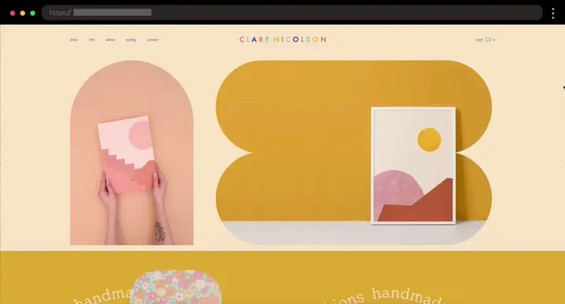
I genuinely love how fun this site feels! It’s playful without being messy, and the products it offers totally match her artistic style.
What I like:
- Unique layout blocks that break the usual grid
- Fun shapes and colors
- Nicely organized shop page
7. Sunday State – Clean Ethical Lifestyle Goods Squarespace Design

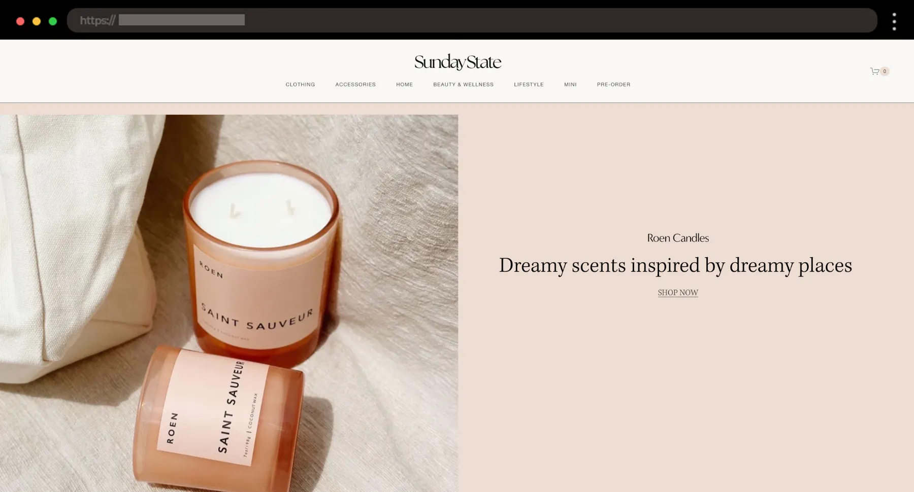
Sunday State feels like a breath of fresh air. The way they mix simplicity with strong intent is something I’m always trying to pull off in my own work.
What I like:
- Ultra-clear homepage structure with easy navigation
- Soft neutral tones that let the products shine
- Consistent photo styling across categories
8. Supernatural – Playful Squarespace Website for Colorful Springles

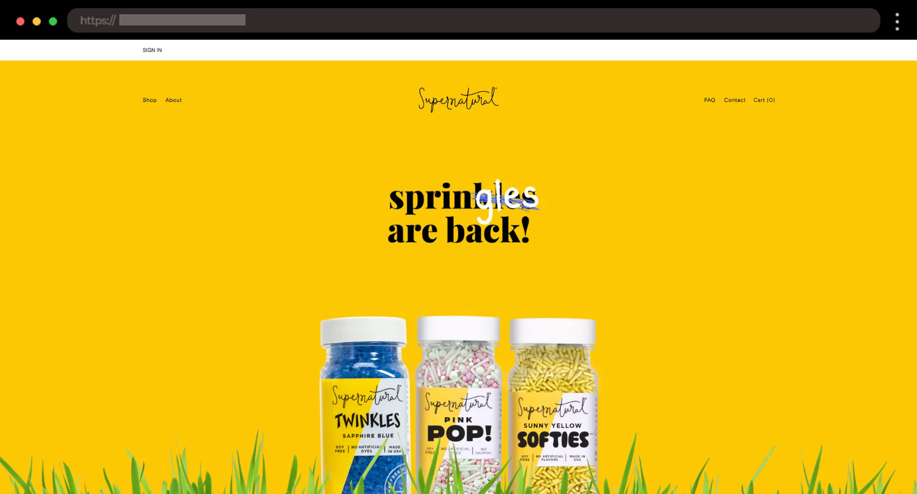
Supernatural’s site pops with energy. The bold yellow theme and the “springles are back” text in the hero section instantly set the tone – fun, bright, and a little rebellious.
What I like:
- Full-width hero section with strong visual focus
- Product images change on hover
- Consistent color palette across site, socials, and packaging
9. Soilboy – Grounded Plant Lovers Squarespace Example


Soilboy leans into minimalism with earthy tones and generous spacing. It’s a great example of selling vibe just as much as the product.
What I like:
- Neutral palette with soft contrast
- Strong product visuals
- Instagram feed integration in the homepage
10. Shhhowercap – Bold Squarespace Ecommerce Website for Showercaps

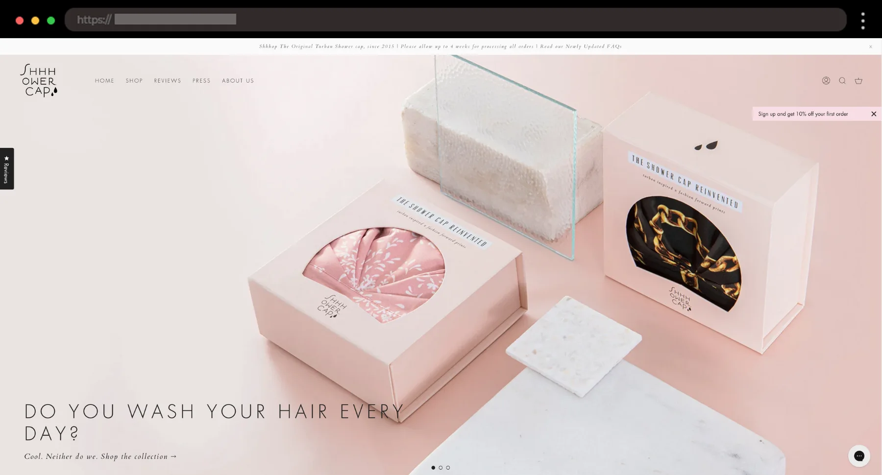
What is this website for you might ask? You guessed it – showercaps! The copy on Shhhowercap is awesome. It grabs your attention instantly, and the visuals keep you scrolling without even realizing it.
What I like:
- Strong, witty copy
- Sharp product photos
- Tons of product images and client reviews
11. Kipferl – Cozy Squarespace Ecommerce Website for Austrian Eats

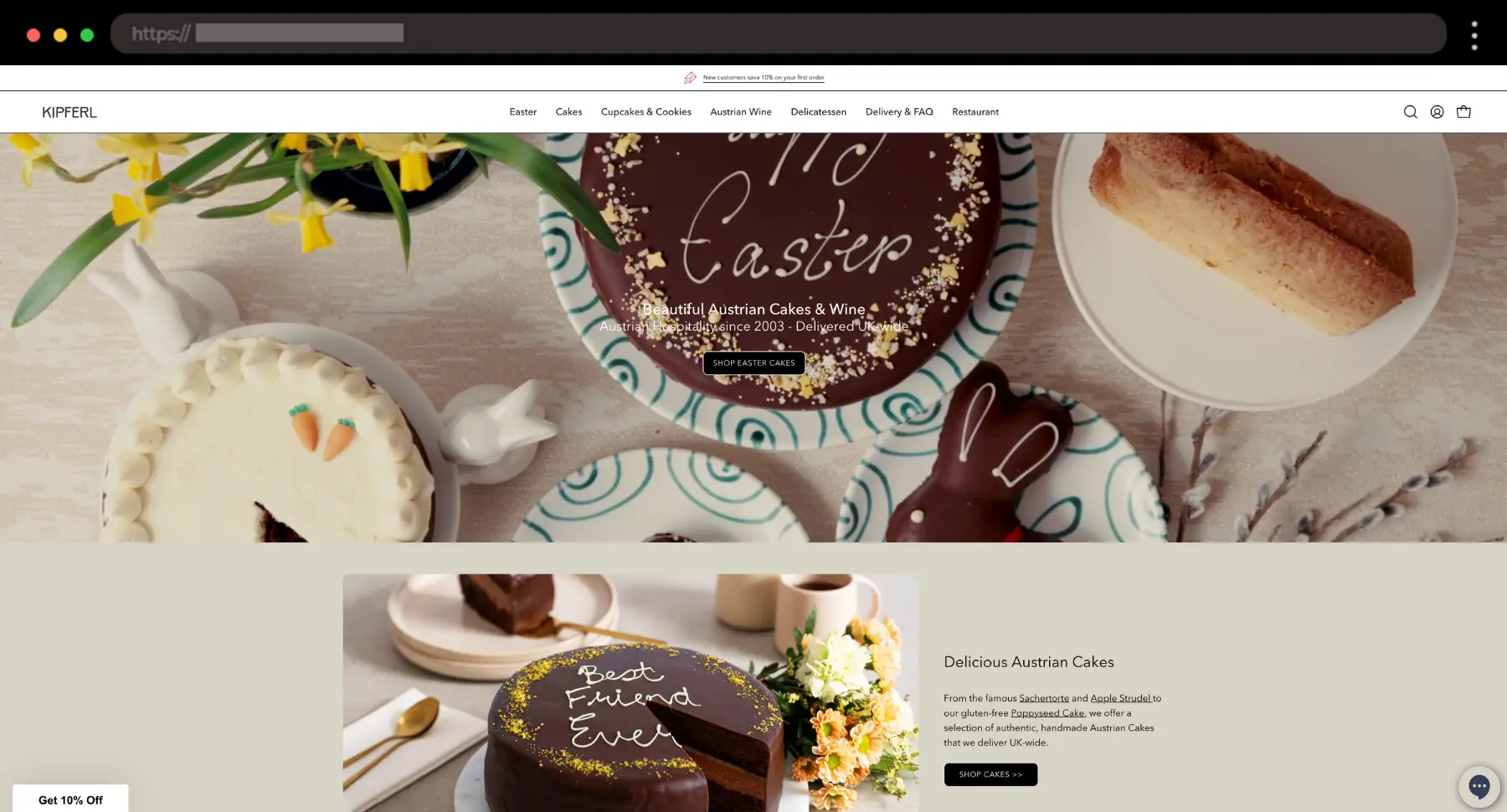
Kipferl’s site feels like sitting down in a warm café. The layout is simple but full of personality, from its earthy tones to vintage-style images.
What I like:
- Tasteful use of serif fonts
- Customer feedback section
- Soft, natural color palette for a cozy atmosphere
12. Bodha – Meditative Scents Squarespace Brand

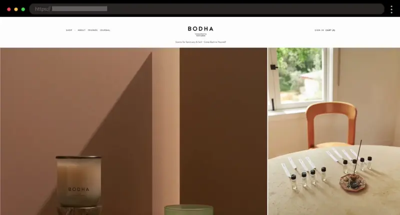
Bodha’s site is so serene and calm. They sell incense and wellness goods, and the site’s design totally reflects that minimal, meditative mood.
What I like:
- Soft color palette
- High-end editorial styling
- Large product images
13. Mingua Beef Jerky – Rugged Squarespace Ecommerce Website with Strong Identity


This example speaks to its audience loud and clear. The bold visuals and overall branding tell you exactly what this brand is about – good old beef jerky.
What I like:
- Bold typography and colors to match the product
- Photography of rugged, outdoor lifestyle
- Clear voice and tone throughout the site
14. Ocelot Chocolate – Stylish Artisan Chocolate Squarespace Website

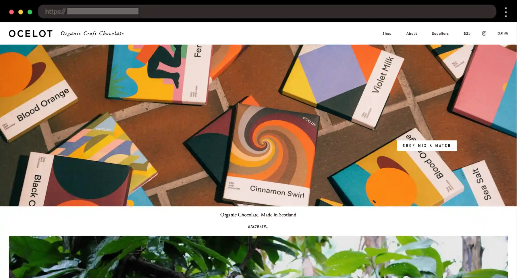
Like most people, I love chocolate, so for me, Ocelot’s site is sharp, structured, and confident. The uniform grid and muted tones keep everything feeling luxe and editorial.
What I like:
- Grid layout that flows like a mini portfolio
- Large product images
- Instagram feed emphasys
15. HappyRose – Squarespace Ecommerce Example for Aromatherapy Brand


HappyRose sells preserved flower gifts and I’m really into how soft this site feels. I think that the layout is just as delicate and considered as the products.
What I like:
- Soft color palette and gentle visuals
- Spaced-out layout with room to breathe
- Subtle animations throughout the site
16. Visual Jams – Minimal Squarespace Ecommerce Website for Art Prints

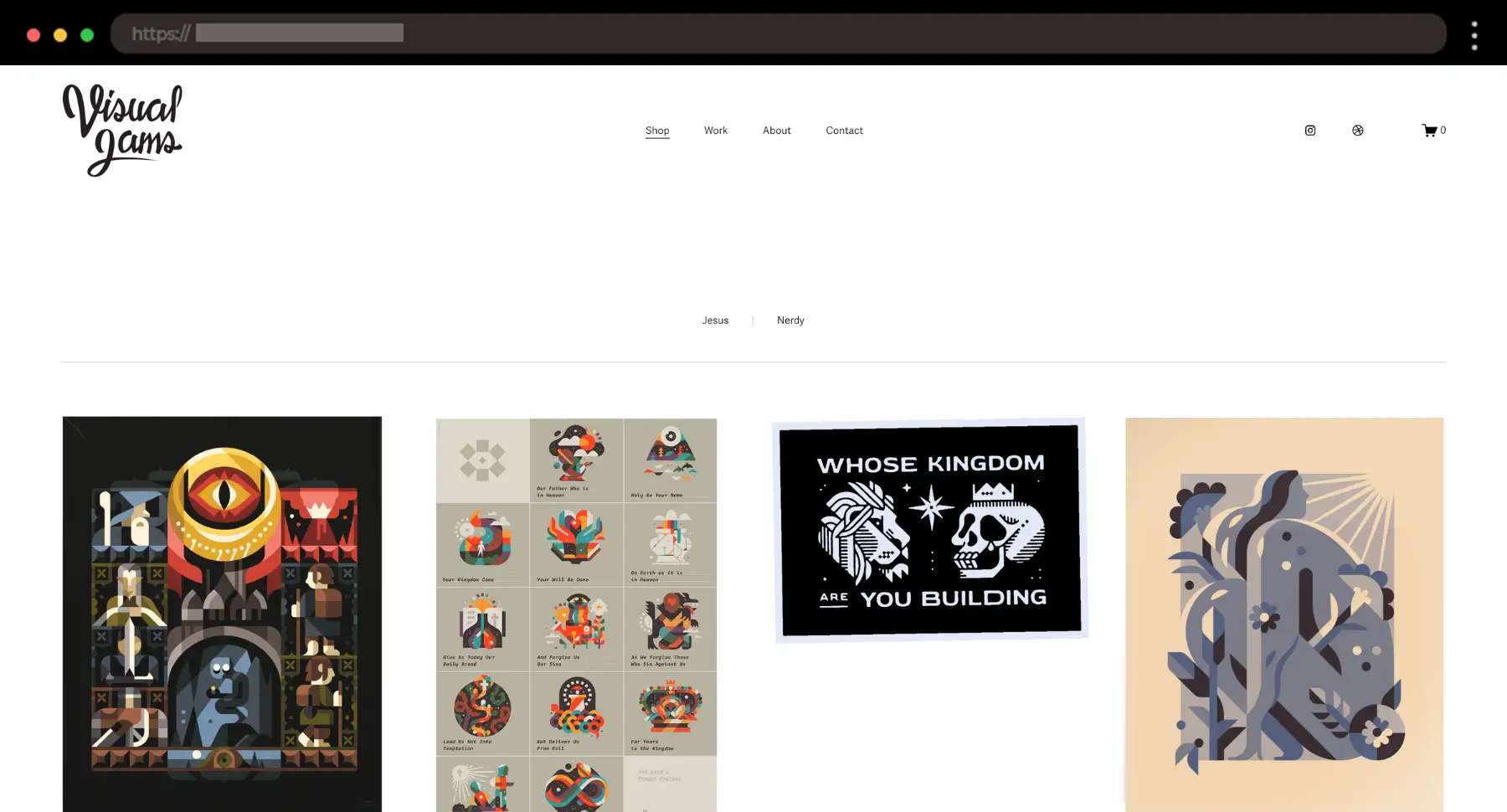
I like how simple this one is, and it doesn’t try too hard. A basic grid of prints lets the artwork speak for itself.
What I like:
- Evenly spaced grid layout
- Subtle hover effects
- Quick and intuitive checkout
17. SIP’ER – Polished Squarespace Ecommerce Website for Beverages
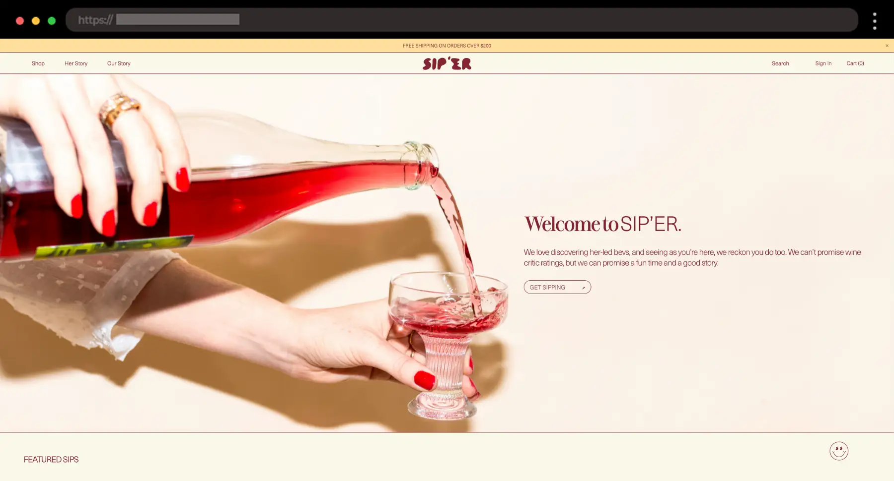
SIP’ER’s site feels sleek with the hero image and “Welcome to SIP’ER” message. I like how everything, from the photography to the color palette, feels crisp and intentional.
What I like:
- Fun message and tone towards visitors
- Editorial-style product photography
- Use of brand color for emphasis
18. Detach – Squarespace Webpage for Fasting Product

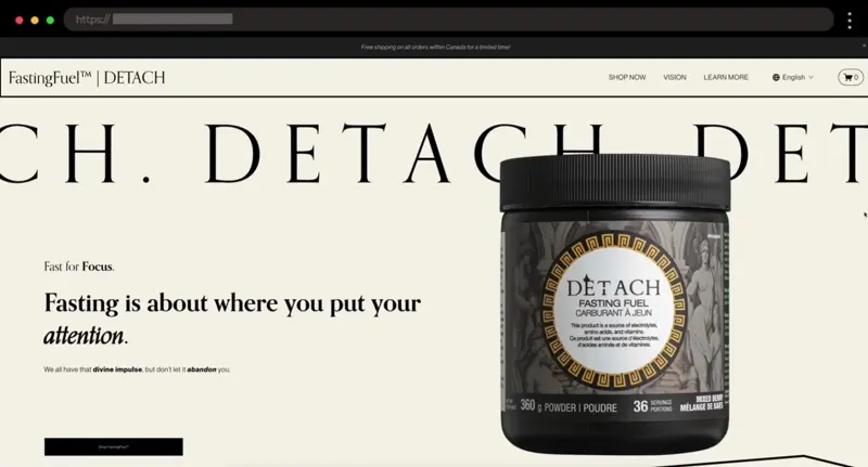
If your brand is about slowing down, take a peek at Detach. They sell fasting powders, and their site feels like a deep breath – soft, light, and easy.
What I like:
- Soft, muted gradients
- Fluid scroll interactions
- Lots of important product info
19. Vool – Smart EV Charging Ecommerce Brand Site

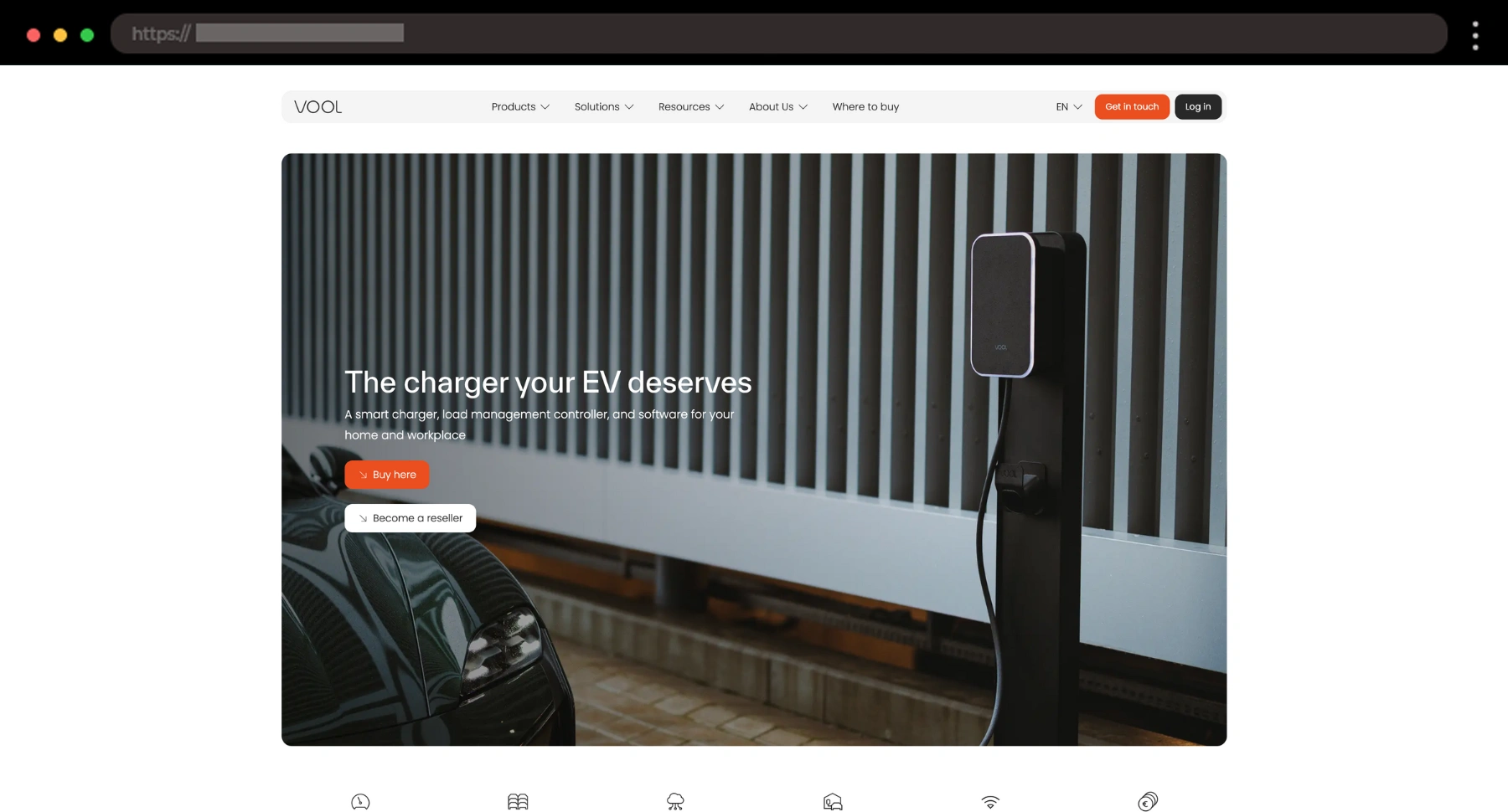
I’m a sucker for clean design and VOOL nails it. They sell EV chargers, and the site feels as sharp and intelligent as the product itself.
What I like:
- High-contrast monochrome palette
- Tight, grid-based layout
- Strong hero section with bold product display
20. TYST – Simple Decor Brand Squarespace Ecommerce Website

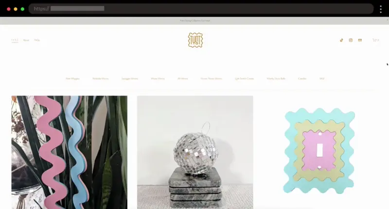
TYST is a modern brand selling decor items from candles to mirrors, and I personally love how the site embraces quiet confidence. Nothing flashy, just smart, minimal design.
What I like:
- Large product visuals
- Neutral color palette
- Simple page structure – home, about, faqs
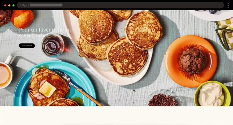
21. Nature’s Own – Fresh Squarespace Ecommerce Website for Bread Brand

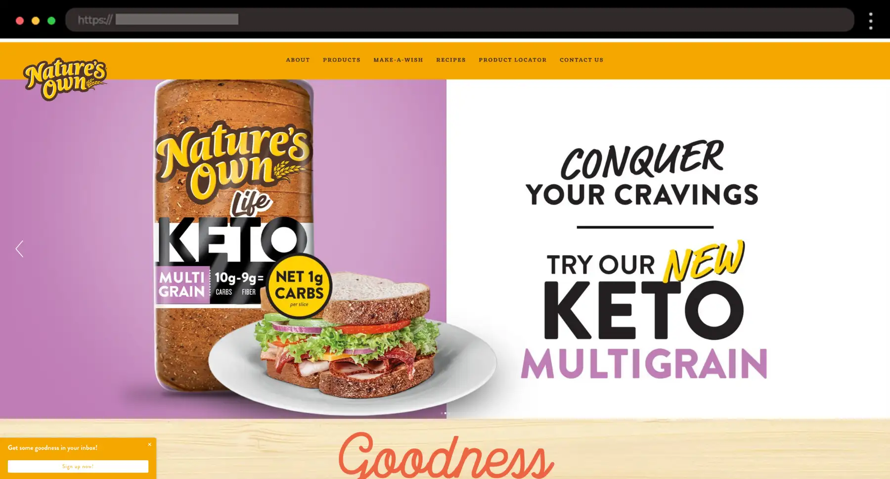
I like bread (who doesn’t?), and this brand makes it look really good! For bread fans or food brands, Nature’s Own is a great example of how fun and friendly a site can feel.
What I like:
- Warm color accents
- Bold fun typography
- Clean product presentation
22. 1790 Coffee – Coffee Brand Squarespace Ecommerce Website with a Bold Look

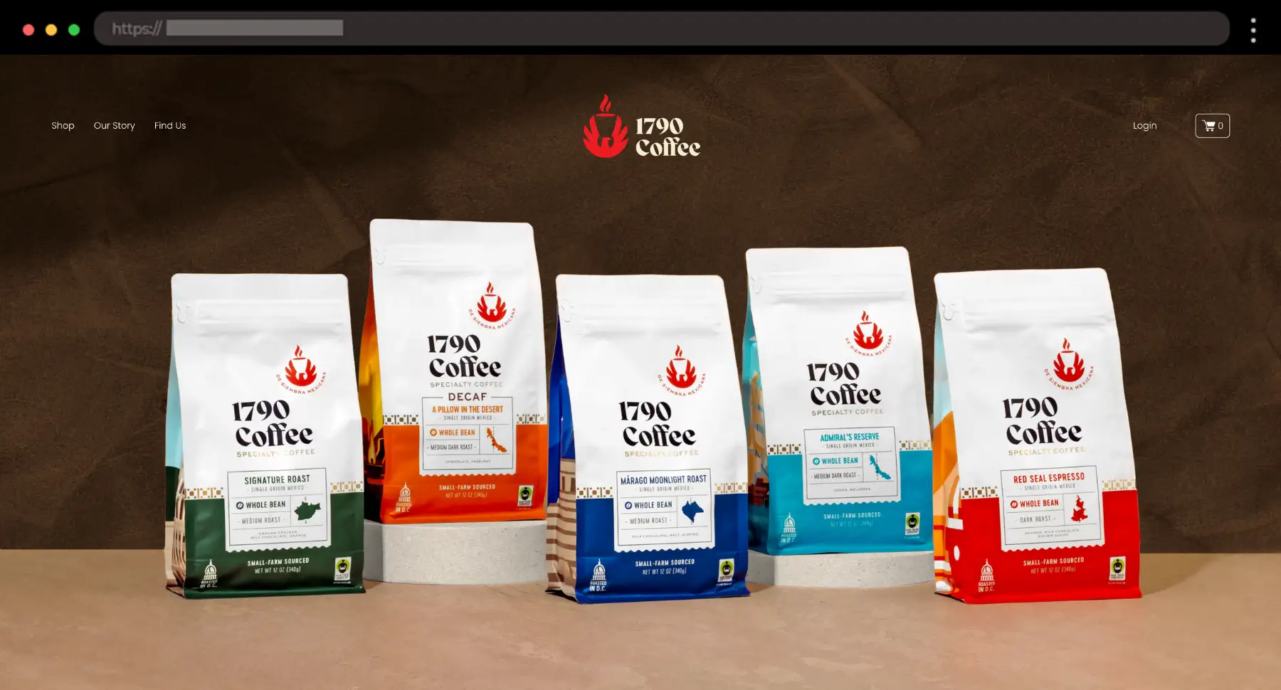
I love a coffee brand with a bit of attitude. 1790 Coffee keeps it bold and modern, with strong type and a super confident design.
What I like:
- Strong typography
- High-contrast layout with dark tones
- Product images with personality
23. Tapatío – Hot Sauce Brand Squarespace Ecommerce Website with Classic Energy

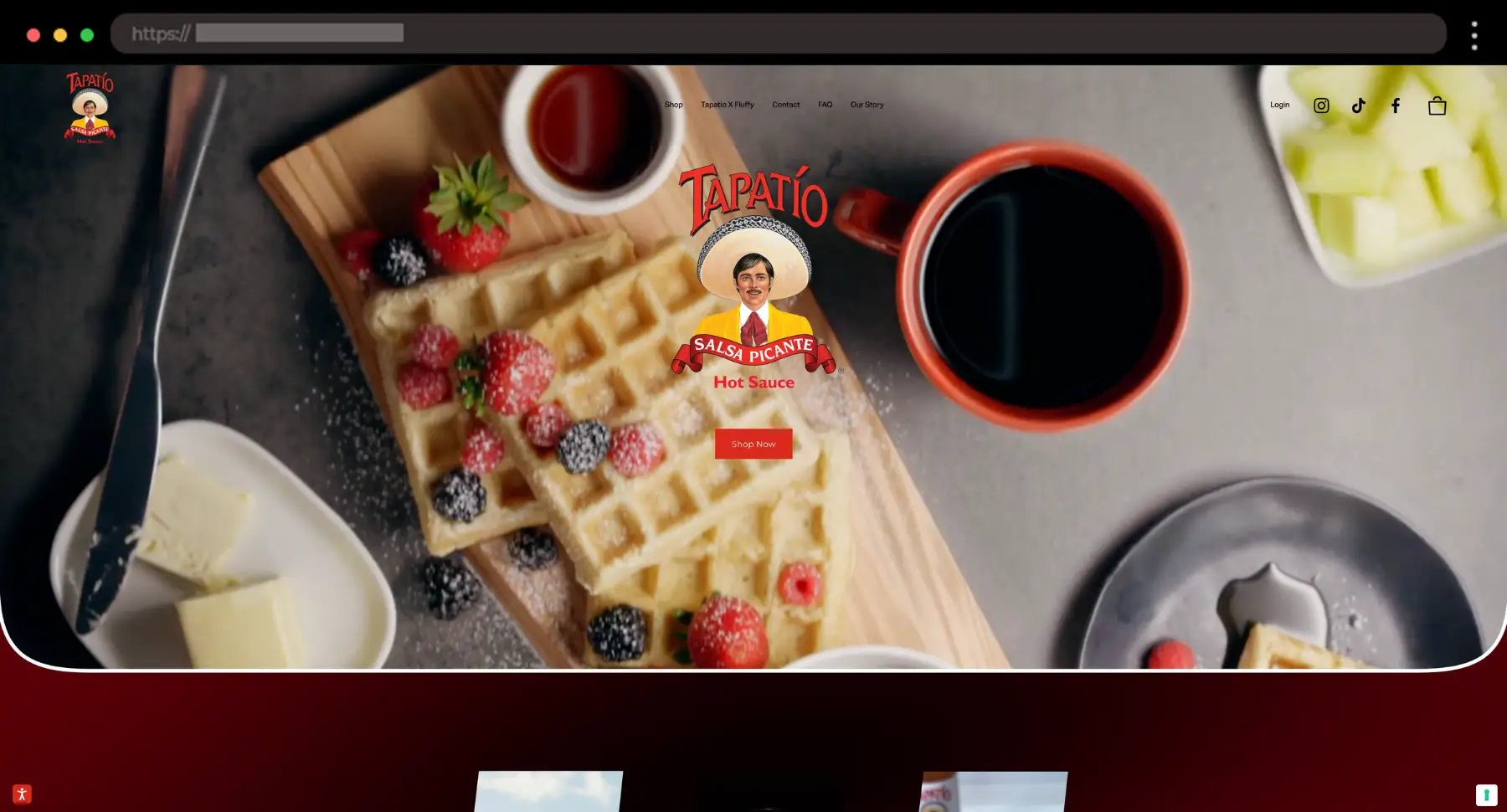
You probably already know the bottle, but I love how Tapatío translated its iconic branding into a bold, scrollable shop. It’s loud, proud, and full of flavor, just like the sauce.
What I like:
- Signature red color throughout
- Retro fonts and brand personality
- Simple store with spicy product focus
24. Grn Goods – Fresh Wellness Squarespace Ecommerce Website

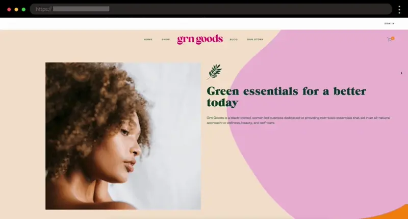
GRN Goods is a women-led business offering non-toxic essentials and I really like that their site reflects that same care and creativity through playful colors and thoughtful design.
What I like:
- Fun color palette
- Lots of playful geometric shapes
- Bright, inviting product photography
25. Bites Bakery – Clean Baked Goods Squarespace Ecommerce Website

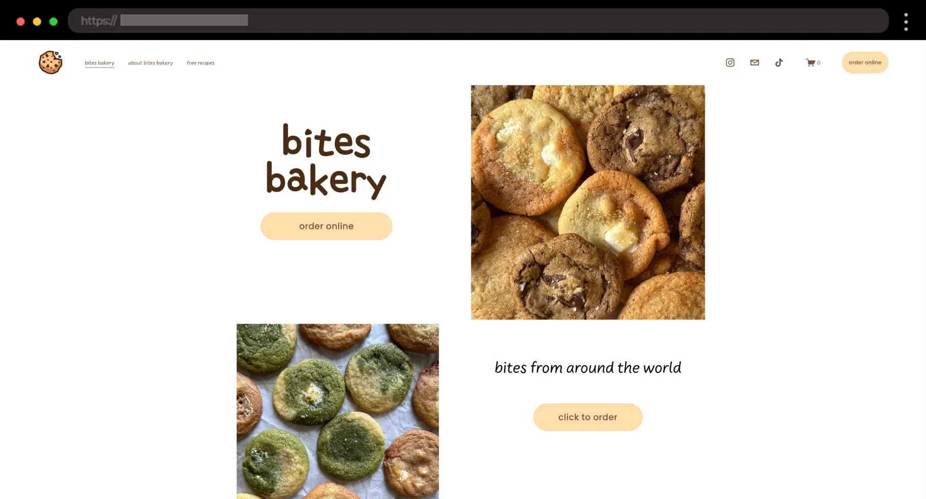
For bakery brands, this one’s a treat. I love how Bites Bakery uses soft color, clean grids, and just enough personality to make the site feel friendly.
What I like:
- Simple order page
- Tight photo styling for every treat
- Organized product collections
26. B-TD – Product Design Website with Sleek Monochrome Style

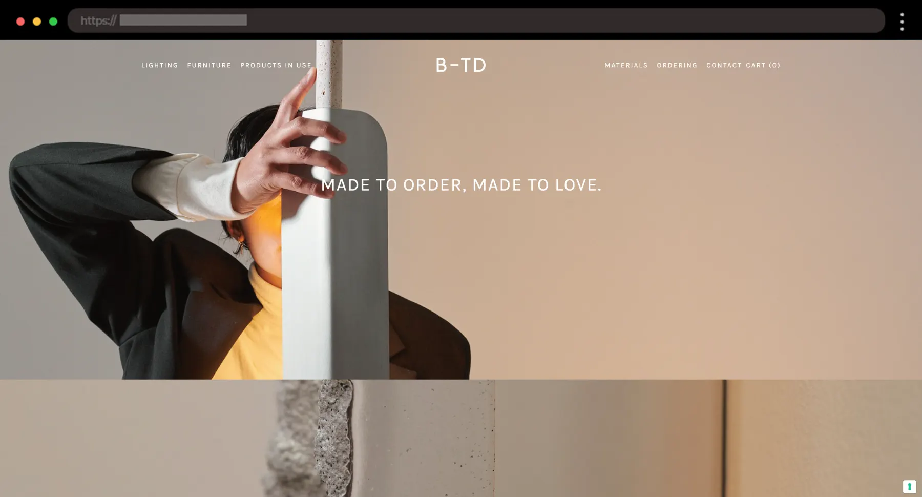
Lastly, B-TD wraps things up with serious style. They design lighting, objects, and furniture for modern interiors, and their black-and-white site nails that clean, architectural vibe I really admire.
What I like:
- Minimal, modern typefaces
- Product-first layout with lots of images
- Integrated Instagram feed for visual balance
So, why Squarespace?
I get asked this a lot – why do so many small brands and indie creatives choose Squarespace? Honestly, it’s the balance. You get a clean, modern canvas that’s easy to shape without diving into code, and you can still bring in custom touches when you need them.
Honestly, it’s great how quickly you can go from idea to polished site, especially for ecommerce. For designers, it’s one of those tools that just lets you focus on the visual which is probably why so many of the sites in this roundup feel effortlessly stylish.
So, what makes a great Squarespace ecommerce site? Here’s what I always look for:
- Clear Navigation – Simple, easy-to-follow menus that guide visitors to exactly what they’re looking for.
- Stunning Product Photography – High-quality images that make each product shine.
- Whitespace Balance – The right amount of space between elements to keep things feeling clean and organized.
- Visual Hierarchy – A layout where your eyes naturally follow the flow, from key info to calls-to-action.
- Interactive Elements – Little animations or hover effects that bring the site to life without overwhelming it.
Final Words
Every now and then, I catch myself thinking every site starts to look the same, but clearly, there are still plenty of Squarespace gems out there breaking the mold and these 26 examples prove it. I’m sure some of them sparked a few fresh ideas for your next project. Personally, I’ve bookmarked a handful of these for whenever I need a little design boost, and I hope you do, too!