Wondering how to design your eCommerce home page? Don’t worry, we’ve gathered 13 excellent eCommerce home page examples that do it right and will inspire you for your next eCommerce home page project.
All of the pages we’ve listed follow the best practices and use them to create a stunning design that drives sales.
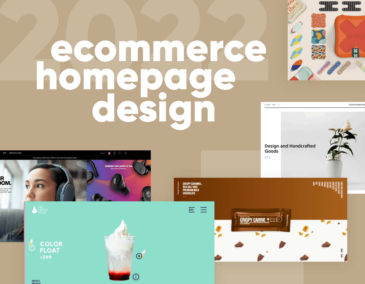
13 eCommerce home page examples that will inspire you!
- Nova Smart Home
- Bouguessa
- Welly
- Premium Teas
- Bite Toothpaste Bits
- Simply Chocolate
- Protest
- Northernism
- Smokehaus
- Boxhill
- Vegan Essentials
- Dainty Jewell’s
- Skullcandy
1. Nova Smart Home

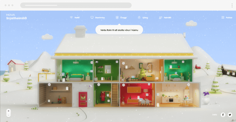
Nova Smart home is a one-of-a-kind microsite dedicated to its smart home devices. Their eCommerce home page uses an animated 3D house model, that becomes an interactive product demonstration website for Nova’s products.
This eCommerce home page example does a great job of showcasing what is possible when you mix design and technology. The highly stylized design of the page mixes user interactivity to create a one-of-a-kind shopping experience.
While the website is designed to be viewed on desktop screens, the eCommerce home translates well to mobile devices. The top navigation bar transforms into a handy hamburger menu, and the buttons remain visible.
2. Bouguessa

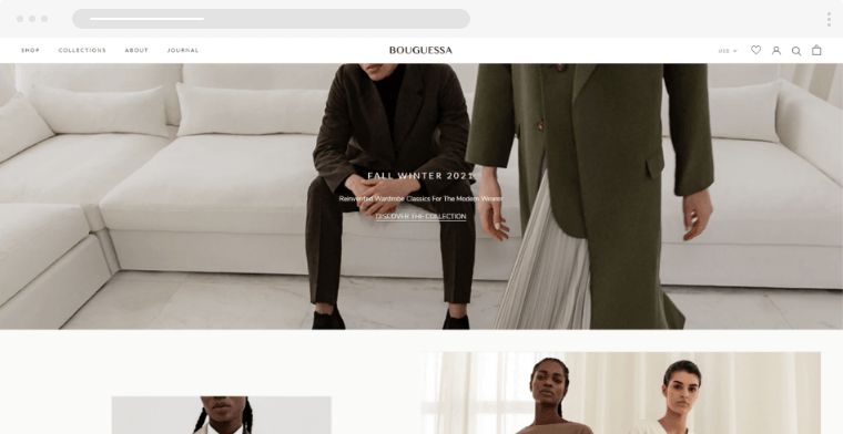
Bouguessa’s eCommerce homepage design is a great example of giving the customer a luxurious feel as soon as you arrive on the website. The images take center stage. The black and white theme also enables bright-colored apparel to stand out.
3. Welly

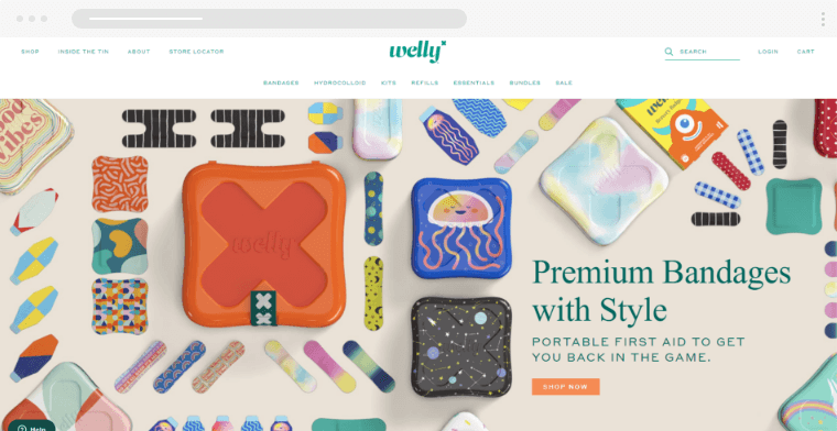
If you want to make a minimalistic eCommerce home page, consider Welly for your inspiration. Welly is a US-based first aid brand with a modern eCommerce website design, putting its products first and foremost.
The interface makes great use of white space. Welly’s eCommerce home page also features a great example typographic hierarchy that improves the website’s readability, making it easy for customers to understand what the business is about.
You should also take inspiration from the color palette – the website primarily uses white for the background and green for text, while orange serves as the CTA color.
This color combination helps direct the users’ to essential elements like buy buttons.
4. Premium Teas

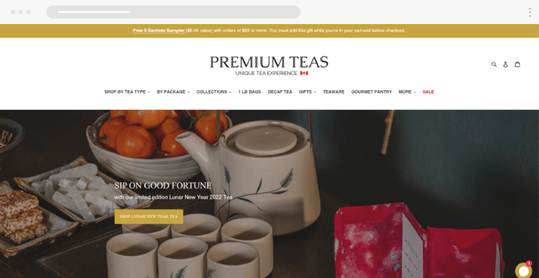
This eCommerce home page is a great example of a clean, modern, and sophisticated design. The products are arranged in a way that makes it easier for visitors to scroll through and select their items. The page relies on visual representation rather than being covered in the text.
Click on any product and you will be taken to the product page that has a detailed description. This is a great example of an eCommerce home page that gets the users buying as soon as possible.
5. Bite Toothpaste Bits

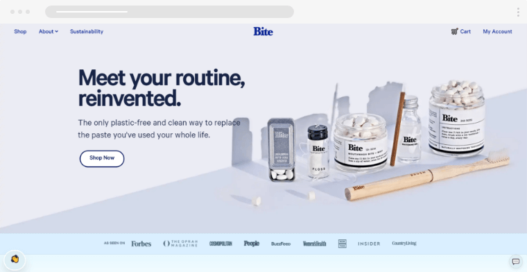
The homepage grabs the visitors’ attention and perfectly communicates why their toothpaste is worth the investment. The page also gives essential information about the product, such as its benefits and tips on how to use it. Take note of the several hero shots for demonstration.
All of these elements contribute to a great customer journey. As a result, visitors shouldn’t have any doubts about making a purchase decision.
6. Simply Chocolate

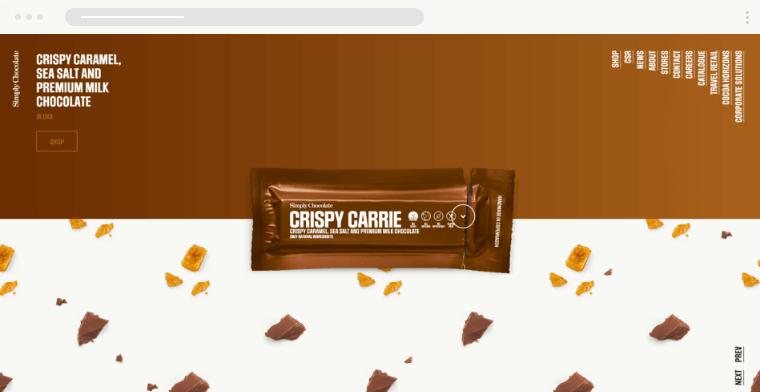
Simply Chocolates’ home page design is a great example of how you should give every product enough space to stand on its own.
Scroll down a little and a new chocolate bar comes up. As that happens the background color and theme change. This is how you implement vision and motion to let your product take center stage.
If you want to get inspiration on how to combine motion and graphics on a home page look no further.
7. Protest


Sleek, modern, and easy to navigate are the 3 words we would use to describe this eCommerce home page. Every clothing shop can take inspiration from Protest.
The home page uses the typical white background to allow for products with vibrant colors to pop and stand out. This contributes to an immersive shopping experience.
8. Northernism

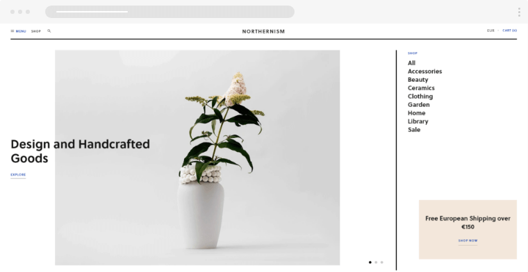
Grid design is one of the latest trends in eCommerce homepage design. Northernism is a great example of why most online stores are looking to implement this type of website design. It looks modern clean and neatly organized. Overall a great example of an eCommerce homepage flat design.
9. Smokehaus

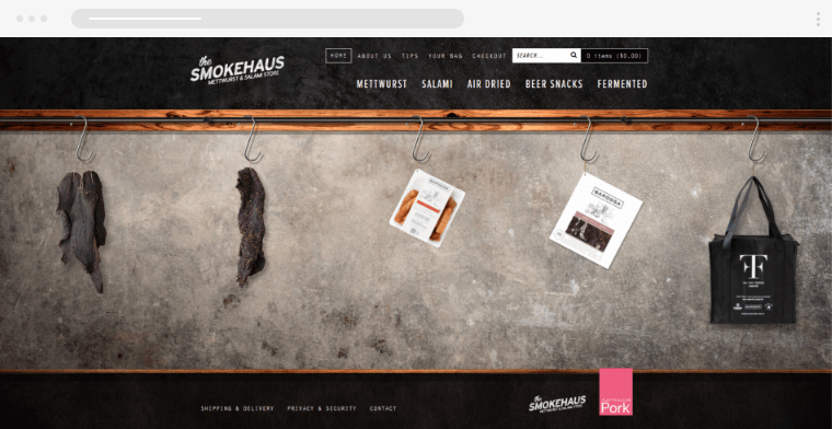
Smokehaus is an Australian food provider. Their eCommerce home page design is a great example of laser focus. The home page has only one goal to get the user to see the products. That’s it
Instead of using a grid to present the products, the website opts for a draggable slider to imitate the look of a butcher’s shop. The welcome message gives pointers to visitors on how to navigate the store as well.
Unlike most eCommerce home page designs, Smokehaus doesn’t use any other elements on its home page. Some of you may say that their site is pretty bare-bones, we think that it’s an interesting concept that’s worth exploring.
Also, there is a little detail we noticed. Every time you add an item to the shopping cart, a notification appears with a short message like “Good choice!” or “Yum! We love that one.” That’s a level of attention that every eCommerce home page should draw inspiration from.
10. Boxhill

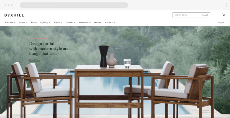
This beautifully designed eCommerce store has a theme with a lot of white space, which helps present the items more prominently. It has a very neat and clean design, making the website look very professional and sophisticated.
Boxhill is a company that produces garden furniture and accessories for your garden. The focus of simplicity is seen both in the product design of their product and their website. White space is used in a way that allows their items to stand out.
11. Vegan Essentials

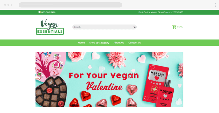
Vegan Essentials’ website is an excellent example to follow if you have a wide range of products. The clear categorization and tagging system allows users to find desired items easily.
One feature worth mentioning is the filtering option. Since this eCommerce store caters to people with specific diets, it has a special filter that lets customers find products based on their ingredients.
If your store offers a wide range of products feel free to draw inspiration from the eCommerce home page of Vegan Essentials. This website is designed using the traditional home page formula of a header, product category, and most bought products.
We even covered this type of design in-depth in our guide on eCommerce home page design.
12. Dainty Jewell’s

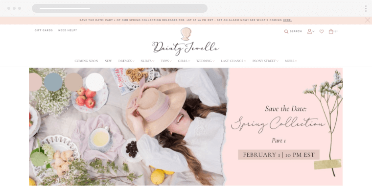
What colors come to mind when thinking about weddings? White, pink, soft colors in general? That’s correct! That is exactly the design philosophy that Dainty Jewell’s followed for the design of their eCommerce home page.
They’ve combined this color scheme with a design that looks both modern and vintage. You have a modern layout and simplicity and vintage elements and fonts. If you are looking for an example of modern and vintage eCommerce home page design look no further.
13. Skullcandy

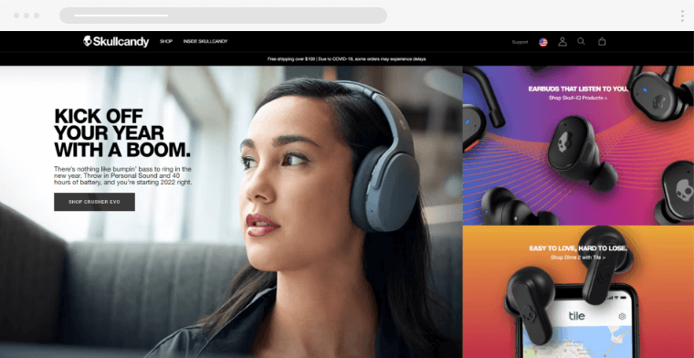
Skullcandy has always been a brand that pays as much attention to the performance of its products as its visual look. Their eCommerce homepage is an example of pushing a design first methodology without sacrificing functionality.
The final result is a visually pleasing website that has a bold design but doesn’t overwhelm the customer and makes it easy for anyone to discover and buy their products.
Conclusion
All of these eCommerce home pages should serve as a great inspiration for your next designs. All of them do a great job of being functional and aesthetically pleasing to the user but most importantly they help users get on their buying journey. This is the big takeaway and the rule you should remember.
And since you already know what makes a great eCommerce home page. Check out our guide on how to design a great eCommerce product page. Or you could also get more design inspiration from the following articles: