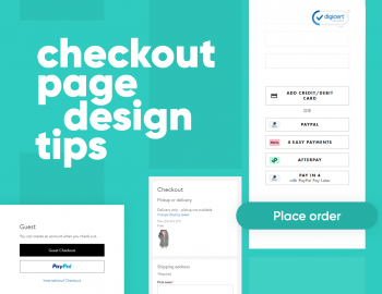
![Successful Checkout Page Design Playbook [Stats, Tips & Best Practices]](https://reallygooddesigns.com/wp-content/uploads/2025/06/checkout_page_design_playbook_stats_tips_best_practices.webp)
The pocket guide to checkout page design with useful best practices, practical tips, real examples, and eye-opening stats.
Checkout is where a lot of websites lose people, even if you’ve done the hard work with a great product and solid design, so users click “Add to cart”. So far, so good, but then… Poof!… They’re gone. Maybe the flow was clunky, or they encountered surprise fees, or there were just too many fields.
With this being said, I checked the stats and made this pocket guide to break down what you, as a UX designer, can do to make any checkout experience work. I included real numbers, smart design choices, and practical fixes you can use for your own projects.
Why shoppers bail before buying
In general, people abandon carts a lot. According to Baymard’s report, in 2025, the average online shopping cart abandonment rate sits at 70.19%. That’s not a typo! Most users who add something to their cart don’t follow through with the purchase.
Now, not all of these are UX crimes. A big chunk of shoppers are just browsing, comparing prices, saving items for later, or scouting for gift ideas. In fact, 43% of US online shoppers say they’ve left a cart in the past three months simply because they weren’t ready to buy. No design trick can fully fix that.
But once you filter out the window shoppers, the remaining reasons for abandonment start pointing fingers directly at the checkout experience. Here’s what Baymard’s latest data shows about the main dealbreakers:
21% said delivery times were too slow
19% didn’t trust the site with their credit card
19% bounced because the site forced them to create an account
18% found the checkout process too long or confusing
15% weren’t happy with the returns policy
15% ran into errors or crashes
14% couldn’t see the total cost upfront
10% didn’t find a payment method they liked
8% had their card declined
Basically, when someone starts checkout and then walks away, the reason is usually one of the first five.
The 5 main reasons why people quit the checkout
According to these stats, five of those reasons come up over and over again, and four of them (minus the delivery times, of course) are things UX designers can absolutely do something about.
Let’s break them down:
1. Surprise costs at the finish line
39% of shoppers back out when unexpected fees show up late. That includes shipping, taxes, and random add-ons. People are reacting more to the timing of the final price rather than the price itself. If they expected to pay $50 and the final total says $70, it feels like a bait-and-switch.
A quick fix? Show all the costs earlier in the flow. If that’s impossible to determine for some reason, like the shopper hasn’t specified their location yet, you can still include shipping estimates in the cart to help set better expectations.
2. Delivery feels too slow
21% leave because the delivery time feels like too much of a wait. Obviously, there isn’t much a UX designer can do to make the items ship faster, but there’s a quick fix in phrasing that can help.
Usually, it’s not even about the number of days but how it sounds. “7–14 business days” doesn’t build confidence at all. The shopper will start doing mental math… ok, 14 days is two weeks, but they said “business days”, so it’s basically three weeks… Just don’t give people math problems.
Instead, give them a clear estimated delivery date and then offer faster options (even if they cost extra). This can make a big difference.
3. Checkout feels sketchy
19% stop because they don’t trust the site with their credit card info. And honestly, it doesn’t take much to trip that wire. The obvious suspects here are outdated design, weird URLs, or missing trust signals (like SSL, payment logos, or customer reviews), so a little polish goes a long way here.
4. Forced to make an account

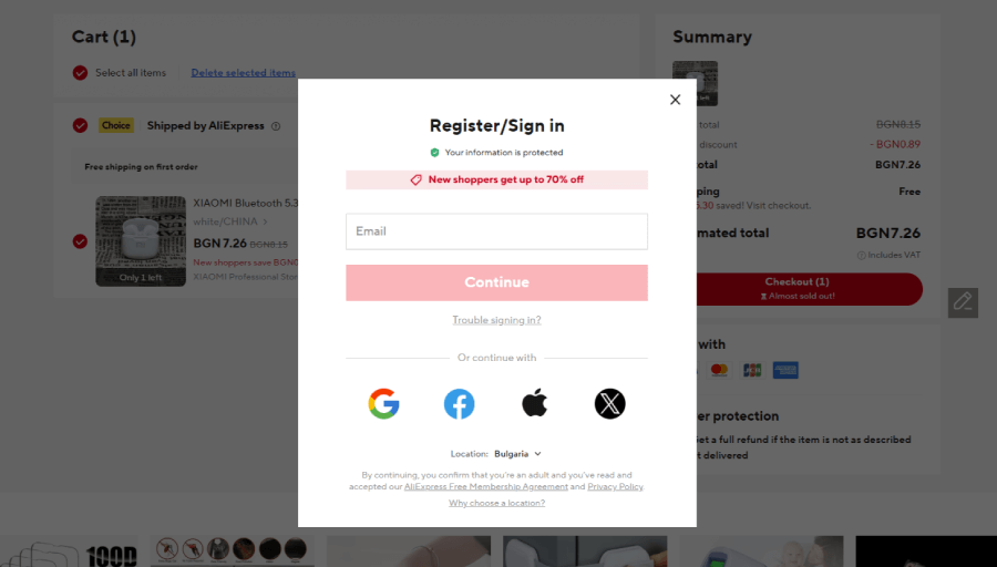
19% bounce when they’re told they have to sign up. For first-time buyers or anyone just trying to get in and out, a forced registration feels like a speed bump, but a guest checkout keeps the flow moving. Some shops let users create an account automatically after checkout with a single checkbox that feels optional.
5. Checkout takes too long
18% quit because the process drags on, there are too many fields and too much friction… and this is more common than it should be. Baymard found that many sites throw over 23 form elements at users during checkout, when a well-optimized flow could cut that down by almost half. Even a few smart changes like combining fields or using address lookup tools can keep people from losing patience.
Now, the good news! According to that same report, fixing these common checkout issues can literally bring back billions. To be more precise, around $260 billion in lost sales across the US and EU. Even the biggest names in eCommerce still miss the mark here, so there’s a huge opportunity for UX teams to step in and do better.
Best UX practices for the checkout page
What great checkout design does is simply clear the path from “Add to Cart” to “Place Order”. The fewer things that feel like work, the better your chances of closing the sale. Here are some practical ways to keep your checkout flow sharp, fast, and user-friendly, while considering the stats I mentioned earlier.
1. Let people check out as guests

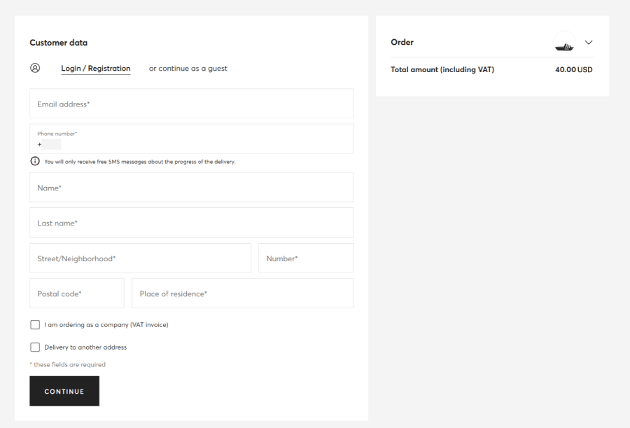
Forcing account creation is a fast way to lose casual buyers. Not everyone’s looking to join a loyalty program, they just want that one hoodie. Let them check out without an account, then offer to save their info after the order’s done. It feels optional, not pushy.
2. Pre-fill where you can
Returning users shouldn’t have to retype their address like it’s Groundhog Day. Autofill basic info (names, emails, saved cards) for logged-in users. Even better: let browsers or mobile wallets do the heavy lifting.
3. Show errors early, not at the end
Ever filled out 15 fields, hit “Pay”, and only then found out you forgot your phone number? Don’t do that to your users. Show inline error messages right when they happen, ideally under the field, in plain language.
4. Be upfront about costs
Nobody likes getting ambushed by a $14 shipping fee after entering their card details. If you can’t offer free shipping, be clear about extra costs as early as the cart. Even a simple “Estimate shipping & tax” link helps.
5. Show the goods

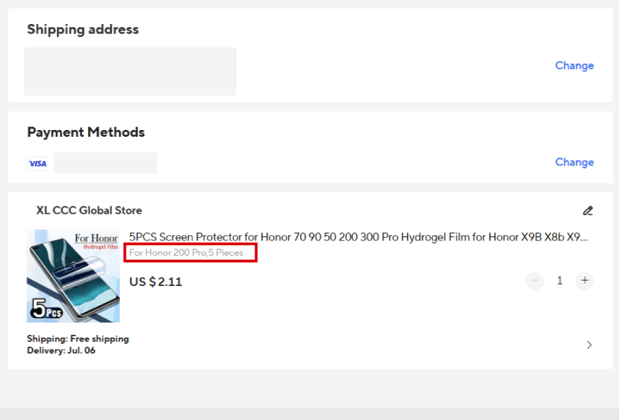
Let users double-check what they’re buying during checkout: color, size, quantity, etc. That little reassurance saves a lot of backtracking.
6. Confirm it’s in stock

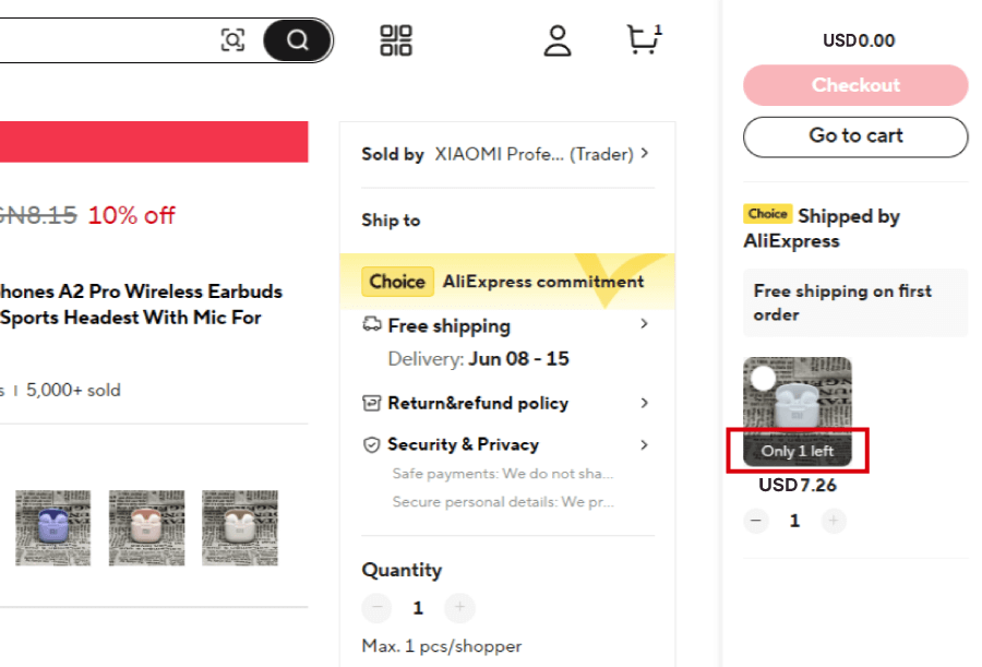
Nothing kills trust faster than reaching the final click, then seeing “Oops, out of stock”. If inventory is tight, reflect that before the checkout process even starts.
7. Multiple ways to pay

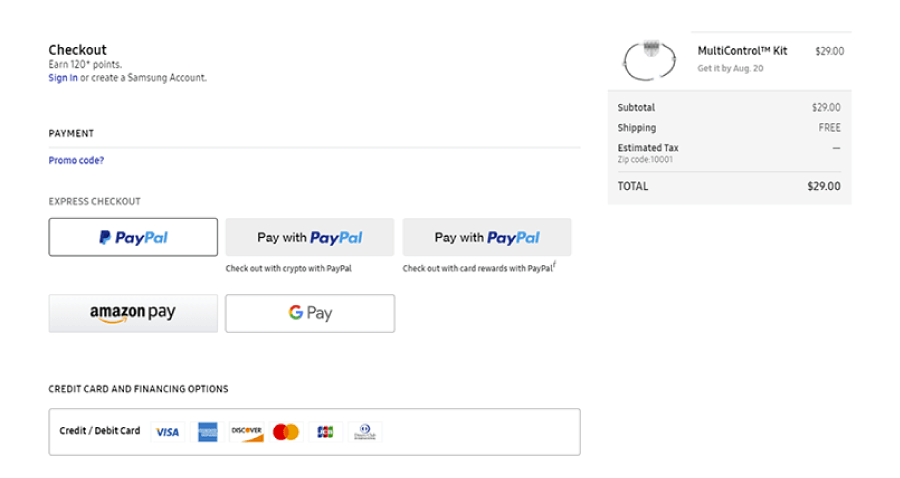
Give people options. Some don’t want to pull out a credit card. PayPal, Apple Pay, Google Pay, because these are fast and familiar (and safe). If you’re international, consider adding local payment options too.
8. Estimate the delivery
A simple “Arrives between June 2- 5” does wonders. People like knowing when to expect things, even if the range is broad. It adds a layer of trust and helps them plan.
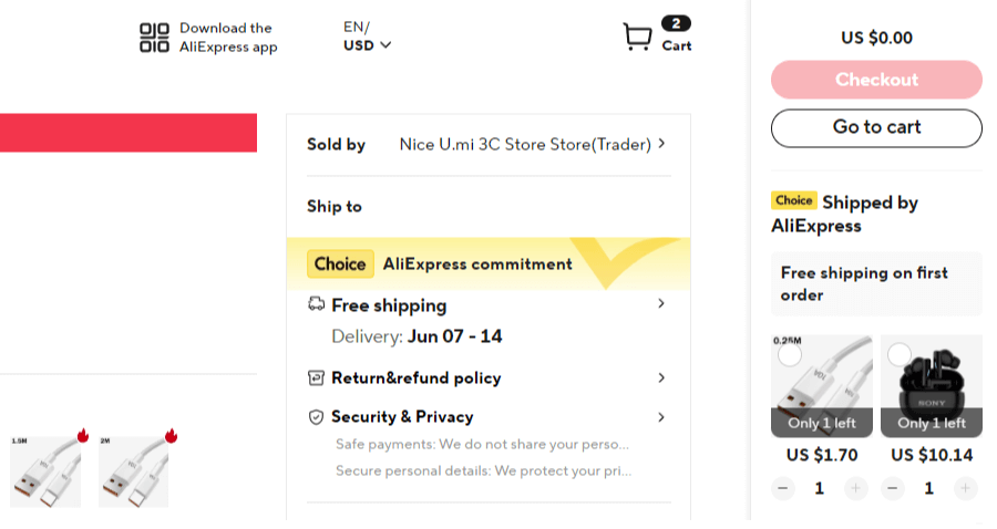
9. Keep the cart close
Instead of redirecting users to a separate cart page, try a slide-out cart or sticky icon that shows key info without breaking the flow. Makes it easier to check totals or edit quantities on the fly.

This is all stuff users might not notice when it’s done right, but they’ll definitely feel it when it’s not. And so will the conversion rate.
Next, with the stats-based practices out of the way, let’s break down some specific practical tips for improving the checkout design in general.
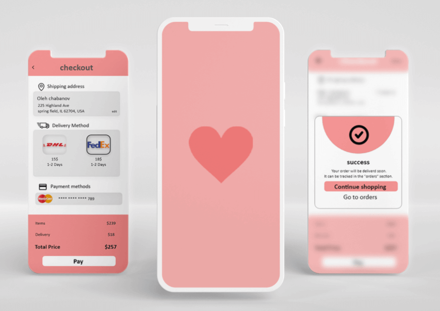
Checkout page design fixes you can implement now
These are the small tweaks you can implement now to cut friction and help people follow through.
Start small and design for mobile-first

Most people shop on their phone, so start by designing the checkout flow specifically for small screens with thumb-friendly buttons, simple forms, and easy-to-read text. Then scale that up for bigger devices. Also, this mobile-first mindset helps you prioritize what actually matters in the flow.
Example: Think about one-handed use. If the “Place Order” button is stuck in the top right corner, you’re asking for thumb gymnastics, so bring it down where thumbs naturally rest.
Strip out the noise

At this point in the funnel, your job is to help people finish, not to show off new arrivals or link them to your blog. Remove the stuff that doesn’t help them check out. That might mean hiding the top navigation, footer links, side banners, or even promo carousels. Fewer distractions = fewer detours.
Example: Ever been about to click “Pay” and then seen a “You May Also Like” section that drags you back into shopping mode? Great for discovery, but terrible for finishing an order. Save that stuff for post-purchase or email follow-ups.
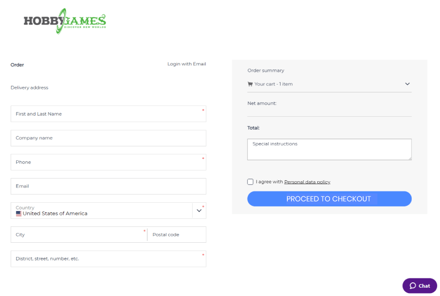
Make it short and sweet
If your form looks like a tax return, people won’t bother. Keep things tight by asking only for what’s absolutely needed to ship the product and process the payment. Combine fields where it makes sense (first + last name, maybe), use dropdowns or auto-detect for country/state, and skip anything that feels like a survey.
You probably don’t need someone’s company name or second phone number (or FAX!) to ship them a hoodie. The fewer fields they see, the faster they’ll finish.
Add visual cues of security

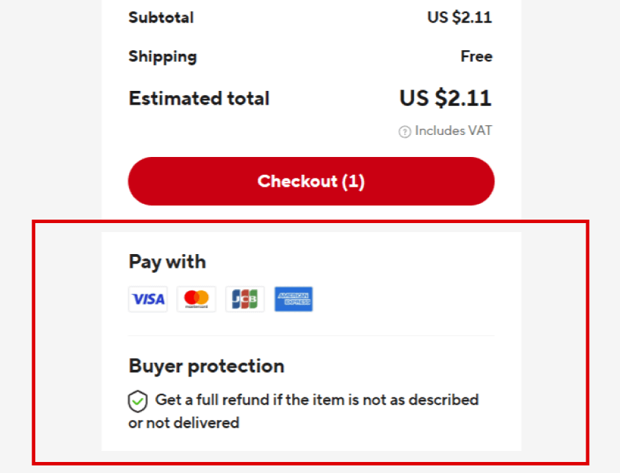
Even if your checkout is technically secure, it’s on you to prove it. Usually, trust badges like SSL seals, payment icons (Visa, MasterCard, PayPal), or “Secure Checkout” labels calm last-minute nerves. You can place them where it counts like near the card entry form or CTA button. Just don’t overdo it. One clean lock icon works better than a wall of badges.
Example: Imagine someone’s about to enter their credit card info on your site for the first time. If all they see is a barebones form with no hint of security, they might hesitate. A small lock icon with “128-bit SSL Encryption” next to the payment field can quietly reassure them.
Use a progress tracker

Nobody likes feeling lost in the middle of checkout. If your flow spans multiple steps like shipping, billing, and confirmation, a simple progress bar or step indicator can help. It shows users where they are and what’s next, so they don’t start wondering if they’re ever going to hit “Place Order”.
Say someone’s on step 2 of 4. A clean progress tracker at the top tells them they’re halfway through, not stuck in a loop.
Add one-click payment options

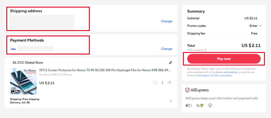
A returning shopper with a saved PayPal account shouldn’t have to hunt for their CVV again. One tap, and they’re out.
Repeat customers and wallet users don’t want to type out their card number again. Let them tap a “Pay with PayPal” button and be done. It’s fast, familiar, and builds trust, especially if they’ve used that method before.
Keep cart edits easy

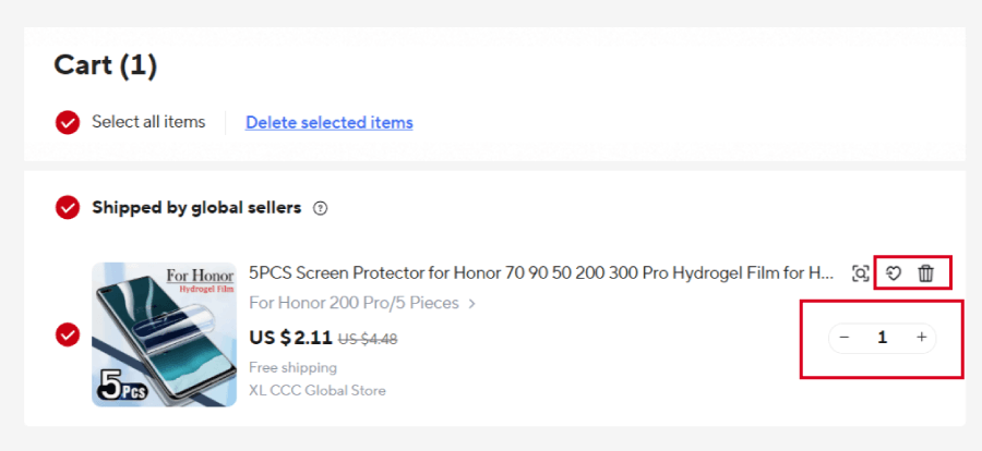
Imagine changing your mind about buying three pairs of socks instead of one. You shouldn’t need to backtrack two pages just to adjust the number.
If someone wants to bump the quantity up or remove an item, let them do it right there without jumping back to the cart page. Tiny “+/-” buttons, a trash icon, or a quick edit link next to each product can save clicks and keep the checkout flow smooth.
And there you have it!
Checkout might sit at the end of the user journey, but for a lot of shoppers, it’s where the real decision happens. Tiny design tweaks, a clearer flow, and fewer surprise fees all add up. And when you look at how many people bail at the last second, it’s clear that this isn’t a small detail; it’s a dealbreaker.
If you found this guide helpful and want to get more insight or inspiration, check out what else we have in our blog or jump straight into some of these articles, I think you’ll find interesting: