

When creating an eCommerce website you will spend a lot of time optimizing the user experience and the design that the user will work with. Alongside your product page and your home page, one of the most important parts of your online shop is the checkout page.
In this article, we will go over what makes a good checkout experience that will enable your customers to quickly start buying.
- What is checkout abandonment and how does it impact your sales?
- Make sure your checkout is mobile-friendly.
- Allow for guest checkout.
- Use a clear design that is free of distractions.
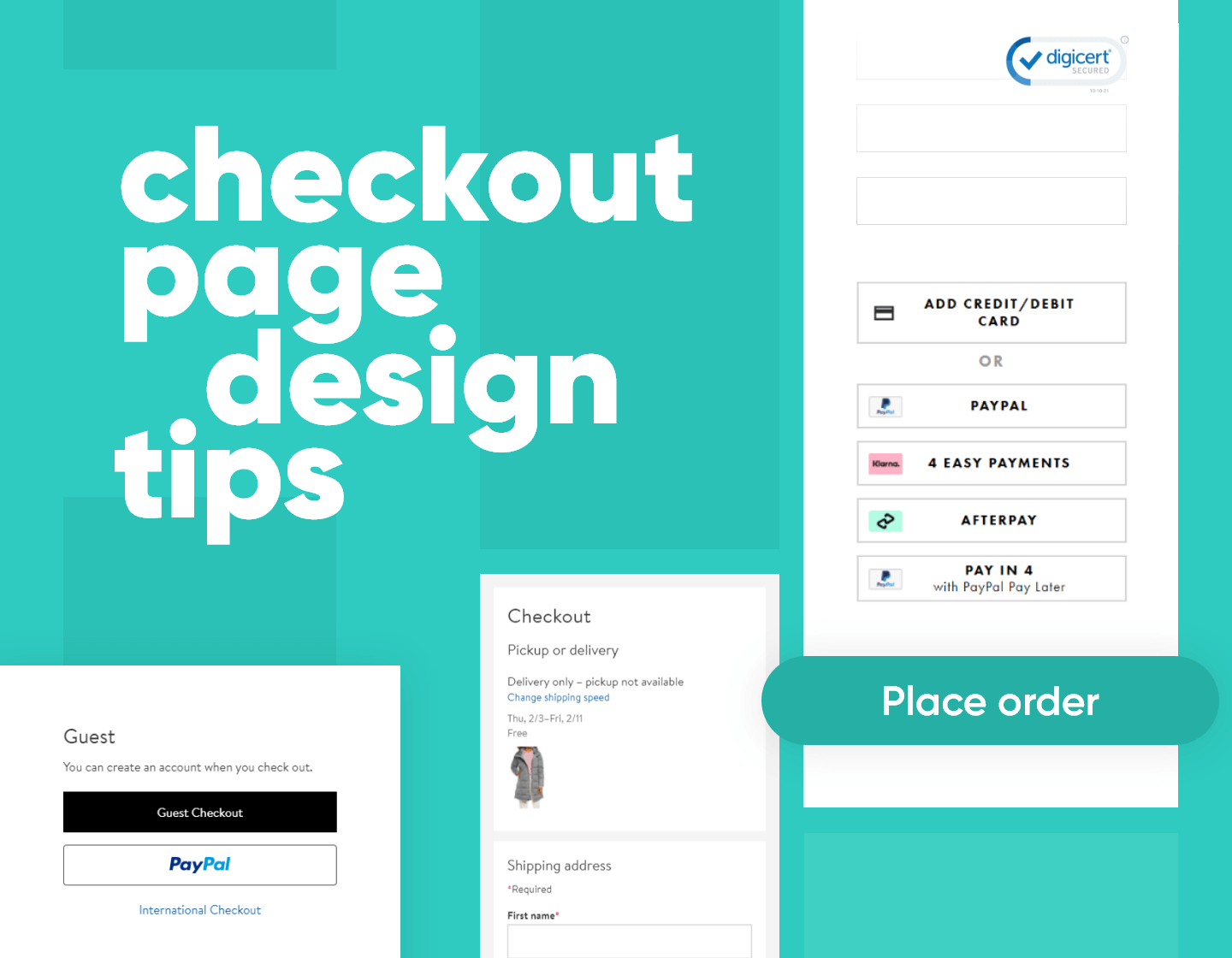
- Display all of the payment methods you support.
- Include security badges to give users peace of mind when shopping from your store.
- Have progress bars during your entire checkout process.
- Don’t include surprise charges at the end of the checkout process.
Remember checkout abandonment is a real concern when creating an eCommerce checkout page. The tips in this article will help you improve the design of your checkout page and reduce the number of customers who abandon a purchase at the last step.
Before we go into how to make sure checkout abandonment doesn’t happen let’s have a quick overview of what checkout abandonment is.
What is checkout abandonment and how does it impact your sales?
When the customer has added one or multiple items from your store and is ready to pay for them he starts the checkout process. The checkout process includes all the steps from the customer going into his cart to filling out payment details and getting to the order confirmation page.
When checkout abandonment happens you will have practically lost all of the money you’ve spent up to that point to get the customer. This includes money spent on ads, retargeting ads, email blasts, and more.
Now that we know the definition of checkout abandonment let’s how you can solve it.
7 steps to get the best checkout process
1. Make sure your checkout is mobile-friendly.

In recent years mobile shopping has completely overtaken all other forms of online shopping. Most of the customers are actively using their phones to browse and purchase from online stores.
Case study: Mobile retail commerce sales as a percentage of retail e-commerce sales worldwide from 2016 to 2021
Naturally, a big part of optimizing and designing your checkout process should be centered around mobile devices.
Make sure that all of the items are big enough to be clickable and visible. Account for the limited width you’ll have and stack items horizontally. Even if you can’t fit your entire checkout form, making the user scroll a little is not a big deal.
2. Allow for guest checkout

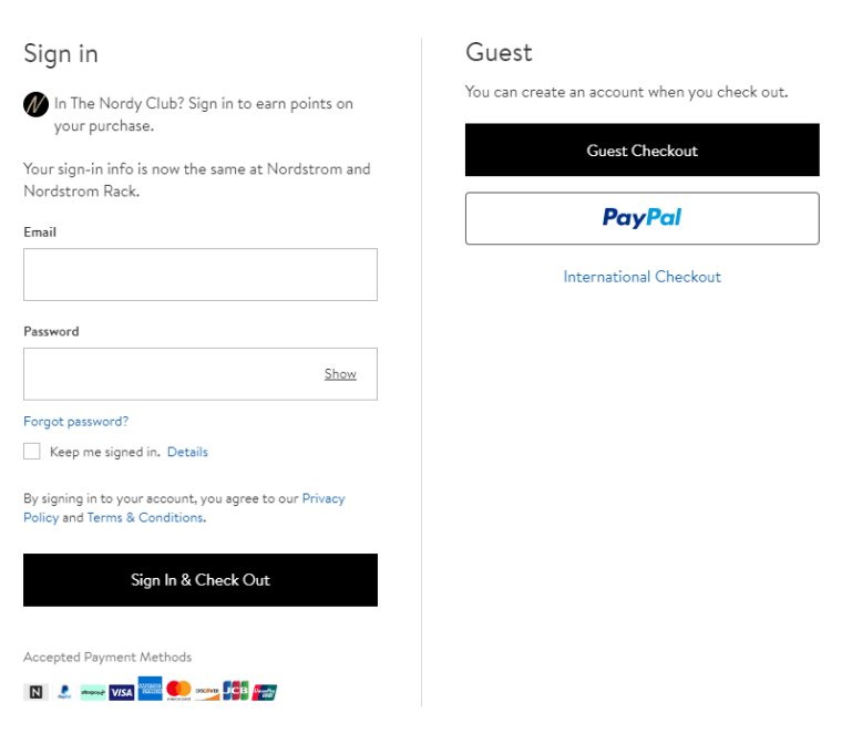
This is as much of a functionality tip as it is a design tip.
From a functionalist perspective, you need to enable customers the choice of whether or not they want to register or not. Forcing your customers to create an account is a bad move since a lot of customers may not be sure if they want to spend the time and register for a website when they are not sure if they’ll ever order again.
From a design perspective, you need to make sure that you highlight the options of different checkouts. Don’t hide your guest checkout and make it hard to find. Remember that one-time purchasers are important and you don’t want to lose them.
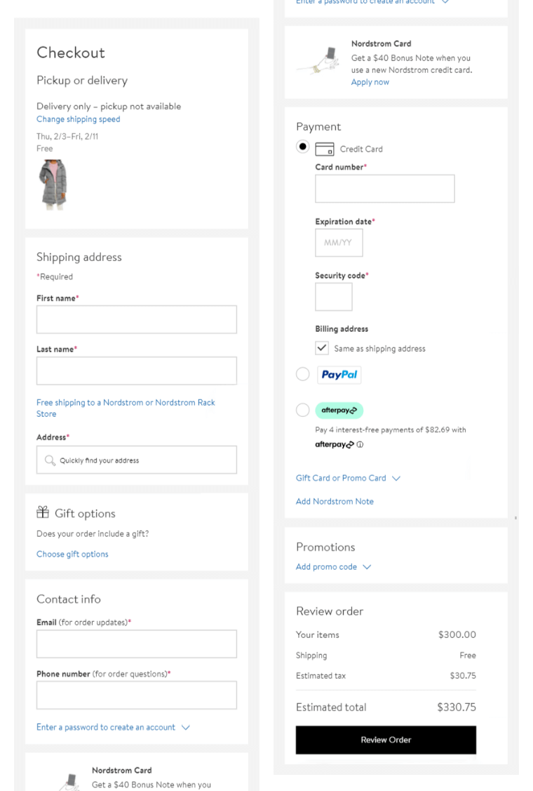
3. Use a clear design that is free of distractions.
Leave all of the interesting designs and graphics for the other pages on your websites. This is where you design bare-bones. Think of an official document that your customer has to fill out. It only features the fields that needed to be filled and a logo of the company at most.
To take things a step further includes a minimal version of your header and your footer this way you will make sure that all of the focus is on the checkout process and nothing else. Simpler designs keep customers focused on progressing through the checkout process.
Some websites try to upsell or cross-sell during the checkout process. We do not advise you to do this. Cross-selling and upselling should be done on the product page. You don’t want your customers starting the decision process again when they are this close to buying.
4. Display all of the payment methods you support.

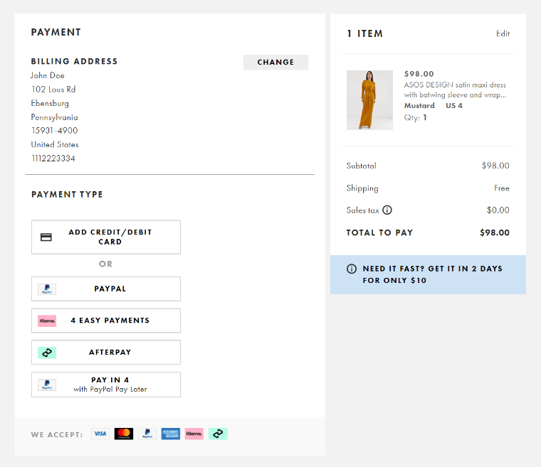
Different people have different preferences when it comes to payment. A good eCommerce checkout page should provide as many payment options as possible. Make sure that you have all of the most popular options and make sure to directly showcase to the user the options to choose from.
It is also a good idea to inform the customer of all the payment options before they initiate the purchasing process meaning that it’s a good idea to place the icons of different payment processing companies on the product page as well as on the checkout page. You don’t want people to go through the entire checkout process only to find out that their preferred payment method is not supported.
5. Include security badges to give users peace of mind when shopping from your store.
Security is a massive concern in 2021. With the rising rates of cybercrime, it’s essential that you inform your customers that your store is a safe place to submit their sensitive data and that their credit card data is handled securely.
So it’s important to include a security badge on your checkout page. This way you will be reassuring your customers that their data will be safe while shopping online.
Fortunately, you don’t have to go out of your way to implement good security measures on your eCommerce checkout page. Most payment processing services, plugins, or eCommerce platforms already have high-security features built-in so you just need to include the corresponding badge on your checkout.
6. Have progress bars during your entire checkout process.


Progress bars are a great quality of life feature you can add to your eCommerce checkout page. Progress bars give your clients a good indication of where they are in the checkout process and how many steps there are left.
As an added benefit you can add hyperlinks to your progress indicators allowing users to go back to a step and review the info they’ve submitted. This is especially convenient when your checkout process includes multiple pages or multiple steps.
With this being said you should remember that it’s always a good idea to keep the checkout process as short as possible.
7. Don’t include surprise charges at the end of the checkout process.
Your customers are almost ready to buy. They’ve gone through every step of the checkout process.
Suddenly at the end, they notice that there are 15$ added to their price? This is a prime example of how not to include additional charges or shipping costs. A lot of retailers will exclude surcharges like shipping or tax from the initial price of the product with the hope of enticing the users as much as possible. However, sooner or later they come up.
No customer enjoys this. If there are any surcharges or additional fees make sure to warn the customer as soon as possible. If possible just include them in the price of the product.
Overview
By implementing all of these in your checkout design you will have a great checkout process that will ensure that every time a customer goes to buy from your e-commerce store has a safe and convenient checkout process.
In the meantime, why not take a look at the related articles to get some more inspiration or grab a couple of freebies: