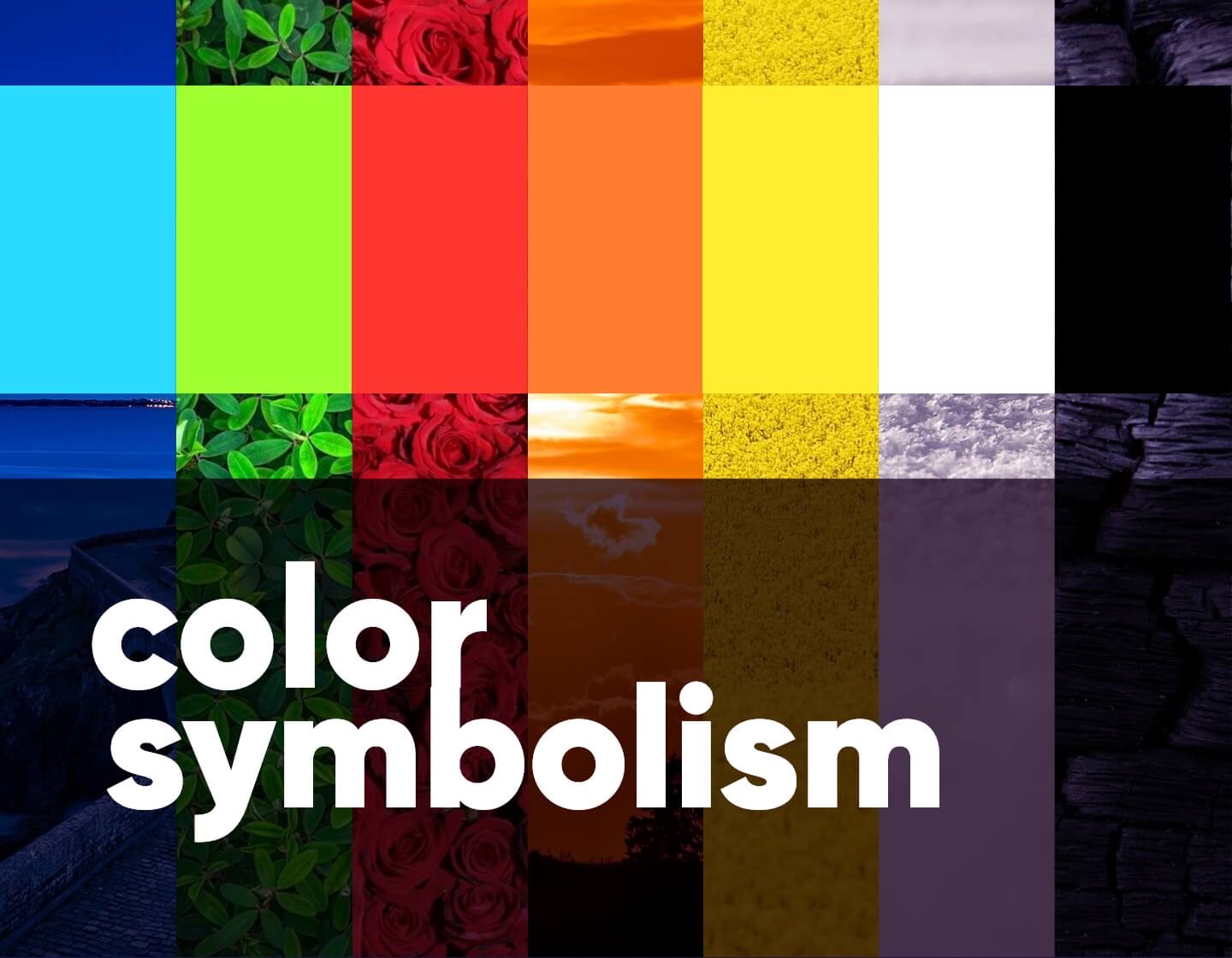
Color symbolism is deeply connected with the way colors can impact the viewer. It’s a subject that is very important for designers and marketers whose goal is to provoke people for action through design.
In this article, we will talk about the power of colors, how they affect people on an emotional level, and how they resonate with the brands’ personalities.
The Color Blue
- Reliability, trust, strength
- Communication
- Authority, professionalism
- Calmness, tranquility, peace
- Sadness, depression
As one of the primary colors and the only color that is 100% cool, blue is very versatile. It’s also the most preferred color in the world, according to statistics.
Blue is the color of the sea and the sky which is why it raises instant associations with tranquility, peace, and even infinity. It is very suitable for projects that aim to convey calmness and relaxation.
Blue is deeply related to reliability, trustworthiness, and authority. This is why this is the most popular color for corporate, business, and finance-related projects. Darker blues are more likely to convey these characteristics while lighter blues convey a more relaxing and refreshing feel.
From an emotional perspective, blue can be easily associated with sadness and depression, as well. This is where the expression “feeling blue” comes from. Moreover, blue also represents cold – the darker the shade, the colder temperature it represents.
The Color Green
- Nature, plants, growth, renewal
- Environment, ecology
- Freshness, health, vitality, youth
- Money, wealth, prestige
- Envy, jealousy
The most refreshing color that marks new beginnings, a fresh start, and growth. Green is a cool color, a combination of cool blue and warm yellow.
This is the color of nature, which is why it is tightly associated with growth, life, vitality, and a fresh beginning. In this train of thought, green is a symbolic color for the ecology and saving the environment.
Green also means healthy, refreshed, and relaxed and is highly suitable for projects that promote a healthy body and mind.
On the other side of the association spectrum, green also associates itself with money and wealth. This association is related to American dollars whose color is also green. Green may carry negative characteristics depending on its use. It is the color that portrays envy and jealousy.
The Color Red
- Energy, power, strength, confidence
- Importance, danger, alert
- Anger, rage, blood, fire
- Passion, love, sexuality, desire, heat
Red is a very energetic color that raises strong associations. As one of the primary colors and the warmest color on the color wheel, red suits projects and brands that want to feel energetic, powerful, and passionate.
Red is definitely the color that evokes the most intense emotions in humans. It’s the color of alert, danger, and importance – it can nail the attention in less than a second. It also represents rage and anger symbolizing the face turning red when triggered by anger.
But red is also an equivalent for passion. This powerful color is the color of sexuality and love which are among the strongest emotion-triggers for humans. This is why romance and passion-related designs almost always incorporate tones of red.
Across different cultures, the color red may have other meanings, as well. For example, in China, red is considered the color of happiness while in South Africa, it’s the color of mourning. Red also stands for communism when speaking in terms of politics.
The color red also provokes the appetite and boosts the metabolism. This is why you will often see red or nuances of red in design materials for the food industry.
The Color Orange
- Creativity
- Change, movement
- Fun, adventure
- Youthfulness, energy, vibrancy
- Friendliness
- Health and vitality
A warm, friendly, and inviting color that emits optimistic energy and vitality. Orange is a secondary color, a mix of red and yellow. It is warm and energizing. In designs, it easily catches attention. However, unlike the aggressive red, we accept orange as more friendly, fun, and even playful.
The color orange often symbolizes creativity, youthfulness, a fresh mind full of ideas. As the color which marks the transition between summer and winter, orange is definitely the color of the new – it symbolizes change and movement.
Orange is inevitably related to natural goods, as well. It raises instant association with oranges, carrots, pumpkins. This is why it also symbolizes health and promotes healthy life choices. Just like red, orange appeals to the appetite.
The Color Yellow
- Energy, sunshine, light
- Happiness, cheerfulness, joy
- Optimism, hope
- Alert, importance, caution
The color of light and the sun is definitely perceived as the most optimistic and energizing color among all on the color wheel. Yellow is a vibrant warm color, one of the primary colors and the one that best transmits optimistic vibes and positive energy.
Usually perceived as cheerful and joyful, the color yellow can easily make people happier and enthusiastic. Therefore, it is perfect for design projects that want to set happiness, playfulness, and a good mood.
Yellow is also the color of alert. It is highly notable even from a distance, which is why it often appears on road signs, alerts, and precautionary measures signs.
The color may have a few different meanings, as well, across different cultures. For example, in Japan, it means courage while in Egypt it symbolizes mourning.
White in Color Symbolism
- Purity, transparency
- Honesty, innocence, goodness
- Simplicity, minimalism
- Healthcare, Medicine
- Winter, snow, calmness
Speaking in terms of color theory, white is not a color but a mixture of all colors. As such, it goes well with any other color of the wheel. In terms of symbolism, white is a color that most strongly conveys purity and simplicity. This is why it is the color of weddings and brides, and the colors of angels. It resembles purity, virtue, goodness, innocence, and cleanliness.
When used in product design, white very well conveys simplicity and straightforwardness. With the rise of minimalism, white has become very popular, communicating simplicity and transparency.
White is also a symbol of sterility. It is widely associated with healthcare and Medicine. It is also the color of winter representing snow and cold but tranquility and calmness, as well.
Across cultures, you may encounter different perceptions of white. In some countries, like India, white is the traditional color of mourning and never worn by brides.
Black in Color Symbolism
- Power, high class, formality
- Elegance, sophistication
- Luxury, exclusivity
- Evil, death, mourning
- Mystery, drama
- Rebelliousness, living on the edge
Regarding the color theory, black is not a color but the absence of color. Its neutrality makes it a perfect match with any other color on the color wheel.
In terms of meaning, black can stand for power and high class. It is the color of formality. Designs that are based on black, can look luxurious and exclusive, elegant, and sophisticated.
Since black is the absence of light, it is deeply connected with mystery, darkness, and death. In most cultures, black is the color of mourning. In terms of design, black definitely appears intriguing and mysterious and is perfect for projects that have to convey these qualities.
Black may also represent a rebellious lifestyle and usually, it is the main color in designs that have to look edgy, alternative, and rebellious.
Final Words for Color Symbolism
In conclusion, color symbolism is essential in design when it comes to conveying a message, tell a story, and invoke feelings. To be successful, a design’s colors should resonate with the message it conveys and the brand personality behind it. The choice of colors can amplify or neutralize the effect and the purpose of the design, so we have to choose wisely.
If you enjoyed this article and wish to know more about design, check out these articles:
- The Best Graphic Design Courses for Beginners in 2025
- 6 Great Design Books That Explain How Design Works
- The 9 Main Principles of Design Everyone Should Know
- The Art To Color Combinations: How to Use the Color Wheel
- Color Theory: Everything You Need to Know About Colors
- 150 Fresh Color Combinations You’ll Want to Steal +Free Resource


