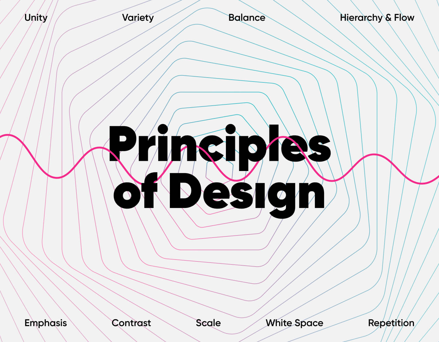
Every design is an aggregate of principles – 9 principles working together to achieve a composition that doesn’t just look harmonious and aesthetic but is also functional. The principles of design make sure the final result communicates just the right message and concept it was meant to. And it does it in a very effective, almost invisible way.
And while one principle cannot be achieved without another, today we’ll go through all principles of design to see what the purpose of each is and how it correlates with the rest. Let’s begin!
- Principle #1: Unity
- Principle #2: Variety
- Principle #3: Balance
- Principle #4: Hierarchy & Flow
- Principle #5: Emphasis
- Principle #6: Contrast
- Principle #7: Scale
- Principle #8: White Space
- Principle #9: Repetition
Principle #1: Unity
Unity is what gives the design the feeling of oneness and consistency. And since we don’t want to sound too abstract here, let’s give an example right away.
Every brand’s visual identity is a great example of unity. Think of all the materials created for this particular brand – a website design, business card design, stationery design, flyers, banners, and other advertising design, packaging design, environmental design, and even more types of design. All designs created for this particular brand are united by the same brand colors, fonts, styles, shapes, etc., so they can share and communicate the same brand message.

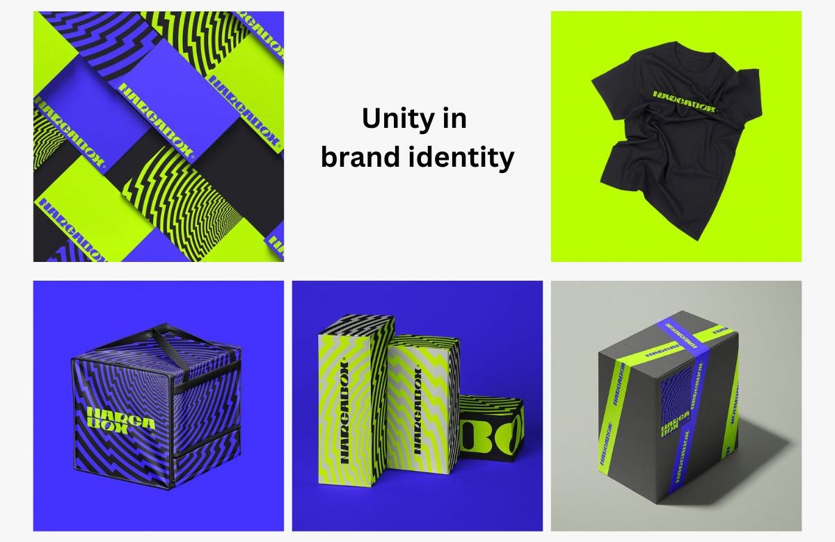
Unity in brand identity. Example by Rafael Silveira
But unity is an important aspect of each individual design, as well. Unity makes sure the design looks harmonious rather than chaotic. Designers achieve unity by making sure all parts work great with each other. Very often, unity is created by repeating elements – for example, using the same color to add emphasis on buttons and text, using the same style of buttons, the same font, and more.


Principles of design – Unity. Example by multiple owners
And in order to unite, you have to diversify first. This leads us to principle #2 – variety.
Principle #2: Variety
The design principle of variety means diversifying elements in terms of shapes, colors, forms, fonts, and more. Using the principle of variety helps to activate other principles of design – hierarchy (visual flow) and emphasis (focal point). Even contrast, in every sense, is achieved by using a variety of color nuances, shapes, and sizing.

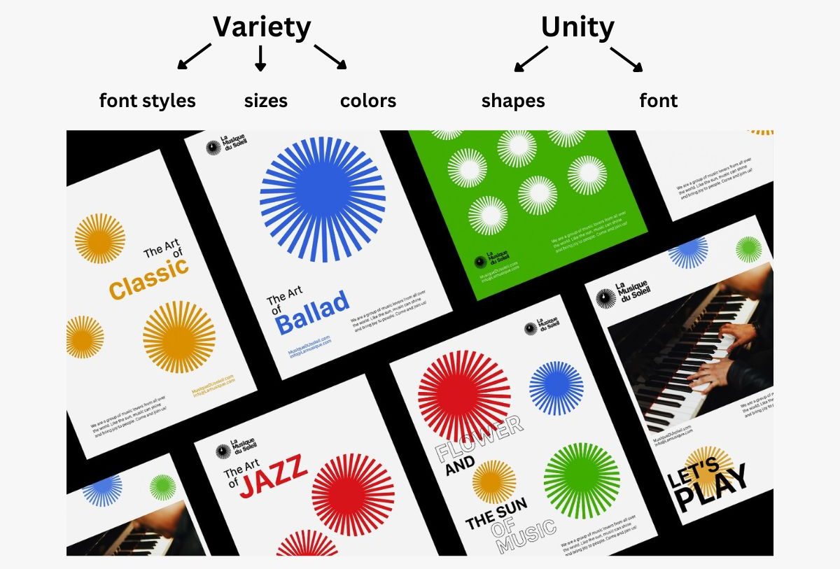
Variety vs Unity in Design. Example by multiple owners
For example, by diversifying the size of text and images, you make larger objects more prominent, and smaller objects – less important. This type of variety creates a hierarchy and helps the viewer scan the content. By using a variety of elements that complement each other, let’s say, an image that clarifies the text, or vice versa – text that empowers an image, you make the composition easier to understand, more appealing, and even functional.
Both unity and variety are essential for the overall balance of the design – principle #3.
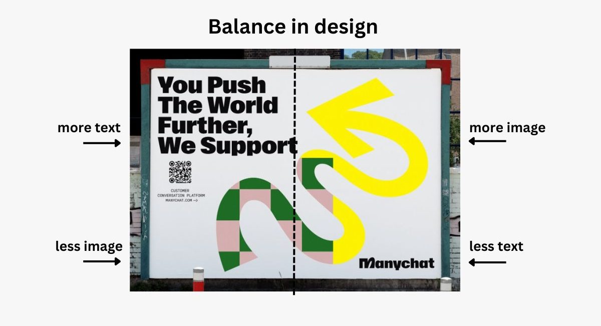
Principle #3: Balance
The principle of balance makes the composition feel stable and firm. And while the balance is something subjective and invisible, if isn’t there, you can easily tell – the design will just feel off.
The principle of balance in design is tightly related and easily determined by the viewer’s perception of how much visual weight each element holds. When you draw an invisible line in the middle of the design, both sides should “weigh” the same.

Principles of design – Balance. Example by multiple owners
Well, how do you determine the exact visual weight of each element? The more prominent = the heavier. Elements with more saturated colors will feel heavier than elements with paler colors. Larger elements will feel heavier than smaller elements.
And while it’s easy to achieve balance in a symmetrical design – you just use the same type and amount of elements on both sides, you can achieve balance in an asymmetrical design, too. In asymmetrical design, the total weight of visual elements on one side should equal the total weight of visual elements on the other. For example, one large element on the right will balance greatly with three small elements on the left.

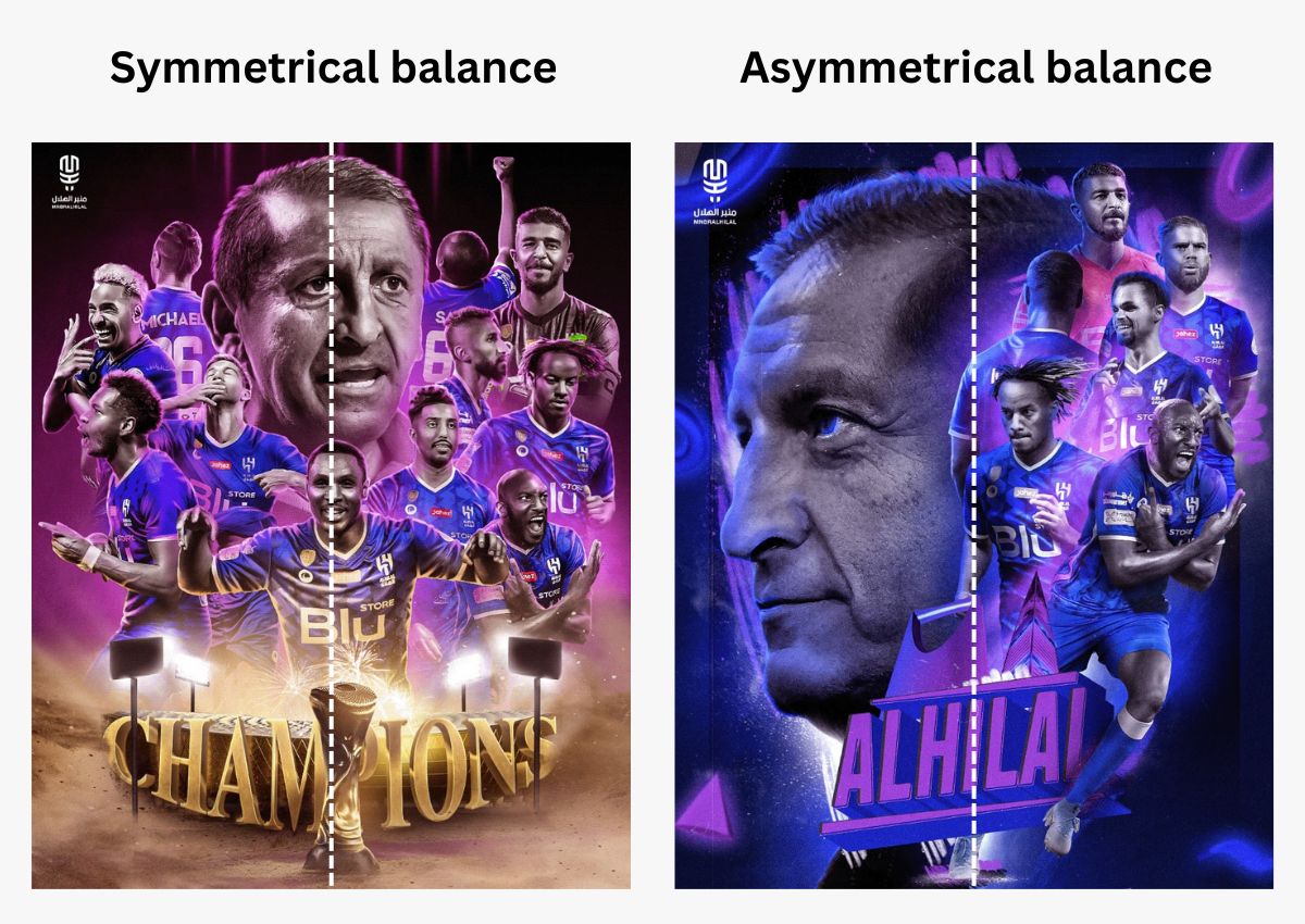
Principles of design – Balance. Examples by 3MooRA
But the sizing of elements doesn’t only help create balance. It is also used to establish hierarchy – principle #4.
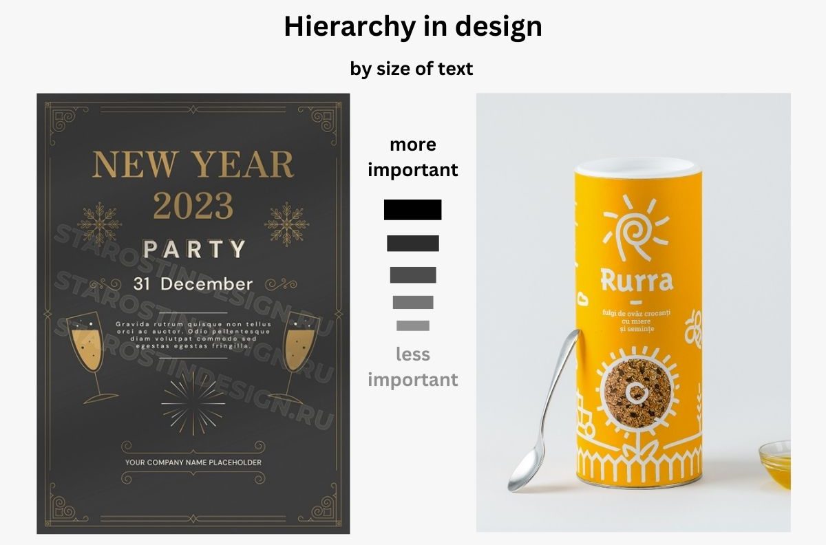
Principle #4: Hierarchy & Flow
The principle of hierarchy is a way to achieve order in a design and a way to arrange elements by importance. Hierarchy makes the design easy to process. Moreover, a well-established hierarchy creates a visual flow that leads the viewer’s eye through the design in the exact same order the designer meant to. A good hierarchy doesn’t require additional cues like arrows to guide the attention.

Principles of Design – Hierarchy. Examples by Sergey Starostin and Ovidiu Pop
Applying the principle of hierarchy also helps to create a familiar pattern. Let’s take this page design, for example. You have navigation on top, a hero image for this blog post, a title with the biggest font size right next to it, headings with medium sizes, and body text with the smallest size. Once you see this design for the first time, you instantly understand the order and know what follows next.
To create hierarchy and flow, designers use the principles of scaling, contrast, white space, repetition, and even more.
Principle #5: Emphasis
What else you will notice when scanning this post, are the bolded parts of the text that naturally draw the attention. This is called creating an emphasis. Well, when it comes to a complex design, an emphasis can be put on a button, on an image, on an object, on a specific word, etc. Creating an emphasis is a way to focus the attention on a specific desired element.
The principle of emphasis is easily created by using the principles of contrast (the brighter – the better), scaling (the bigger – the better), and white space – the more white space around it, the more it stands out.

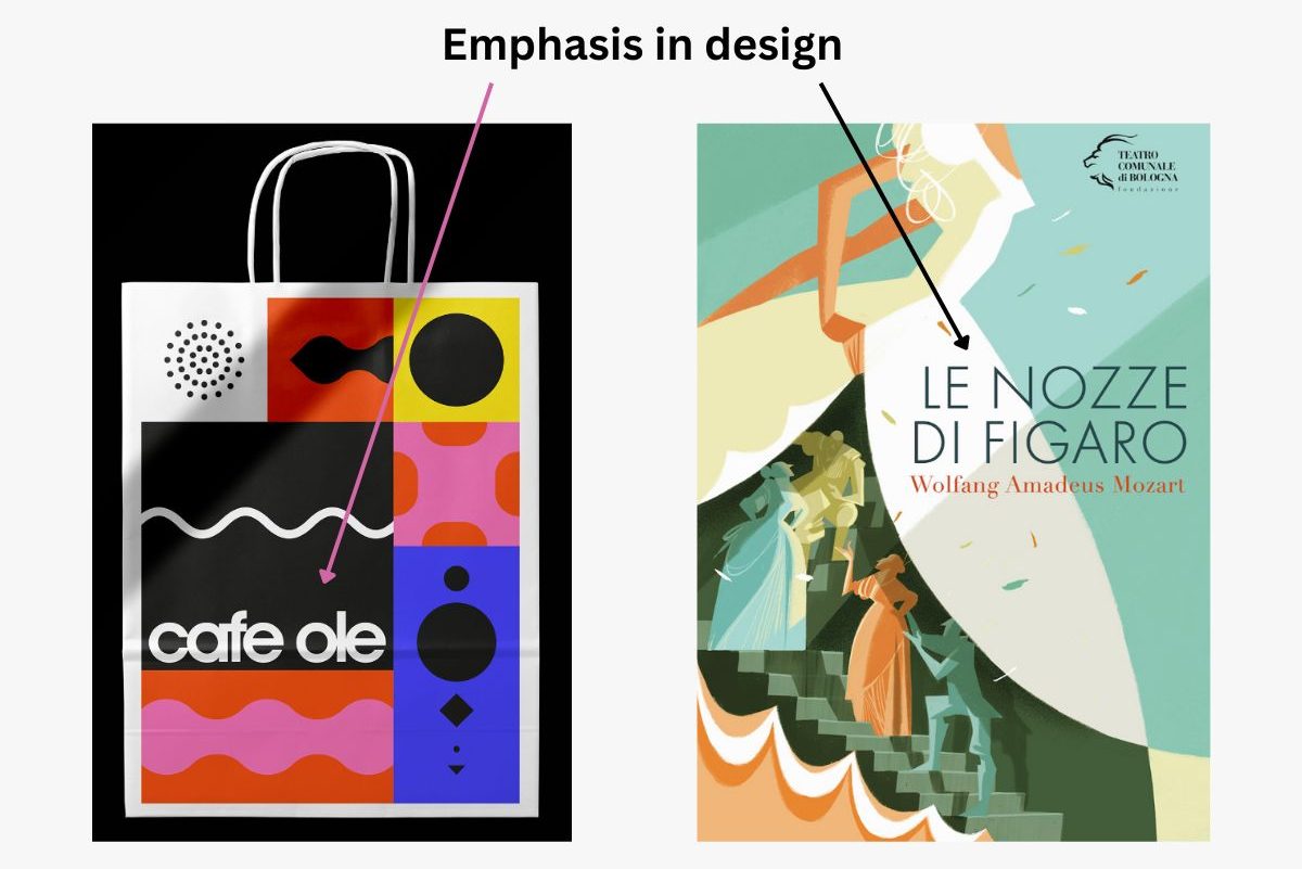
Principles of Design – Emphasis. Examples by multiple owners and Riccardo Guasco
And while it may be tempting to use all these principles on creating one focal point, it’s even more important to keep the principle of balance throughout this process. So, don’t overdo it.
Speaking of effective ways to create an emphasis, let’s move on to principle #6 – contrast.
Principle #6: Contrast
The principle of contrast refers to the difference between objects in a design. Although contrast is usually associated with the intensity of color, the term is broader than that. Contrast can be achieved by shape, e.g. a shape of a star will stand out if placed among circular shapes; by scaling – a bigger object will stand out among smaller ones; by white space – the more white space you leave around an object, the more it nails the attention; and of course contrast made by color.

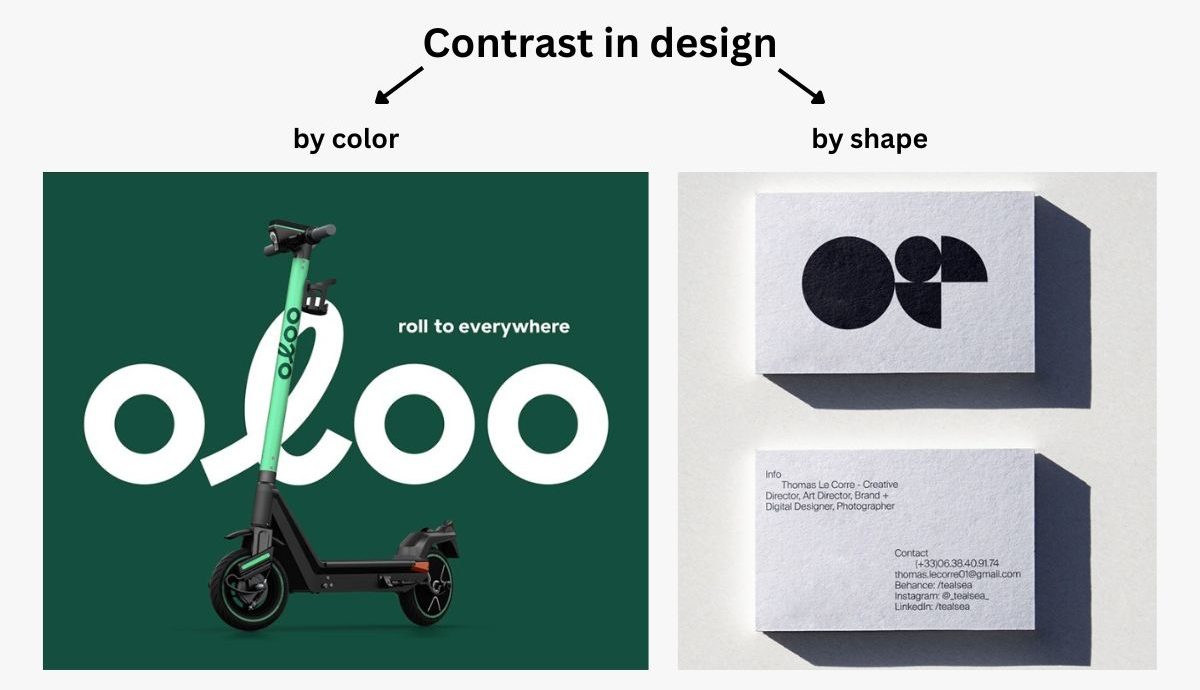
Principles of Design – Contrast. Examples by multiple owners and Thomas Le Corre
Contrast is a highly important principle of design that participates in applying almost all other principles. Contrast is essential in creating an emphasis on the most important parts, but it also helps define hierarchy and visual flow, maintains variety, and helps achieve overall balance.
Principle #7: Scale
Scaling refers to the sizing of objects. It is another important principle of design that is used to accomplish other principles like hierarchy, emphasis, and contrast. Images and text with larger sizes create a bigger contrast with the rest, a focal point (emphasis), and indicate a bigger priority (hierarchy).

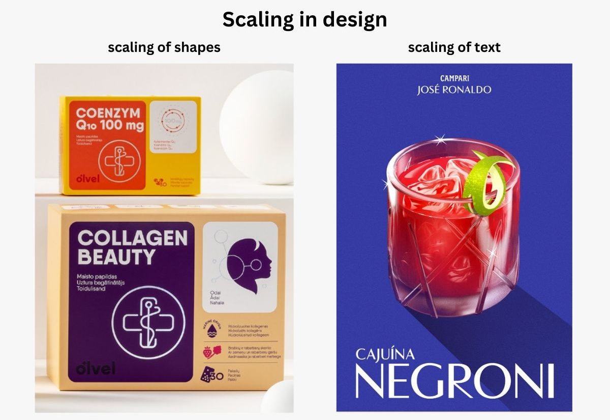
Principles of Design – Scaling. Examples by multiple owners and Black Madre
Scaling is tightly related to proportion, as well. The right sizes of elements create proportions that feel eye-pleasing and aesthetic.
Principle #8: White Space
The skill to use white space correctly can make or break your design. So, it’s no wonder that white space takes its place among the main principles of design. To get into the theory, white space is in fact, the empty space that’s left around elements – text, images, buttons, etc.
When applied correctly, the principle of white space helps make the design eye-pleasing and easy to understand. Moreover, white space can be used to make an emphasis. It works as an invisible border around an object – the bigger the “border”, the more important and noticeable this object feels.

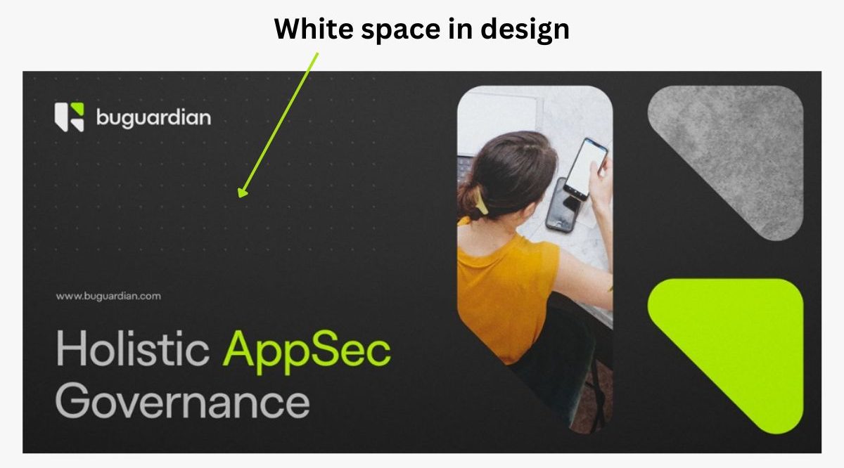
Principles of Design – White Space. Example by multiple owners
The white space is a part of the background, so if the background contains a pattern, this is also considered white space.
Principle #9: Repetition
Repetition is a main principle of design without which you wouldn’t be able to achieve unity and consistency. You repeat elements like colors, shapes, lines, forms, and fonts to make the design familiar and easy to grasp.


Principles of Design – Repetition. Example by MW Branding Agency
Moreover, repetition is the main principle that applies in creating patterns for design. In patterns, a set of elements (shapes, colors, textures, and rarely – text) are repeated in the same order all over again. Patterns are often used on backgrounds to add visual interest, in package design, or in other types of design.

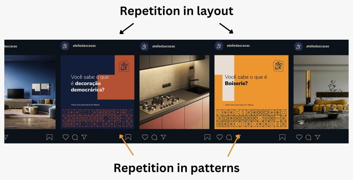
Repetition in Design. Example by multiple owners
Final words
Although design is a creative process, it should abide by certain rules in order to serve its purpose. But principles of design aren’t a thing to be afraid of. They are guidelines that only help you to communicate the idea you want, fast and effectively. And when used intuitively, the principles of design won’t restrict your creativity but rather give you empowerment to create even more influencing designs.
We hope you found this article helpful, along with all examples depicting the 9 principles of design. If you are interested to learn more about design, don’t miss out on the latest trends in graphic design.
Share this article