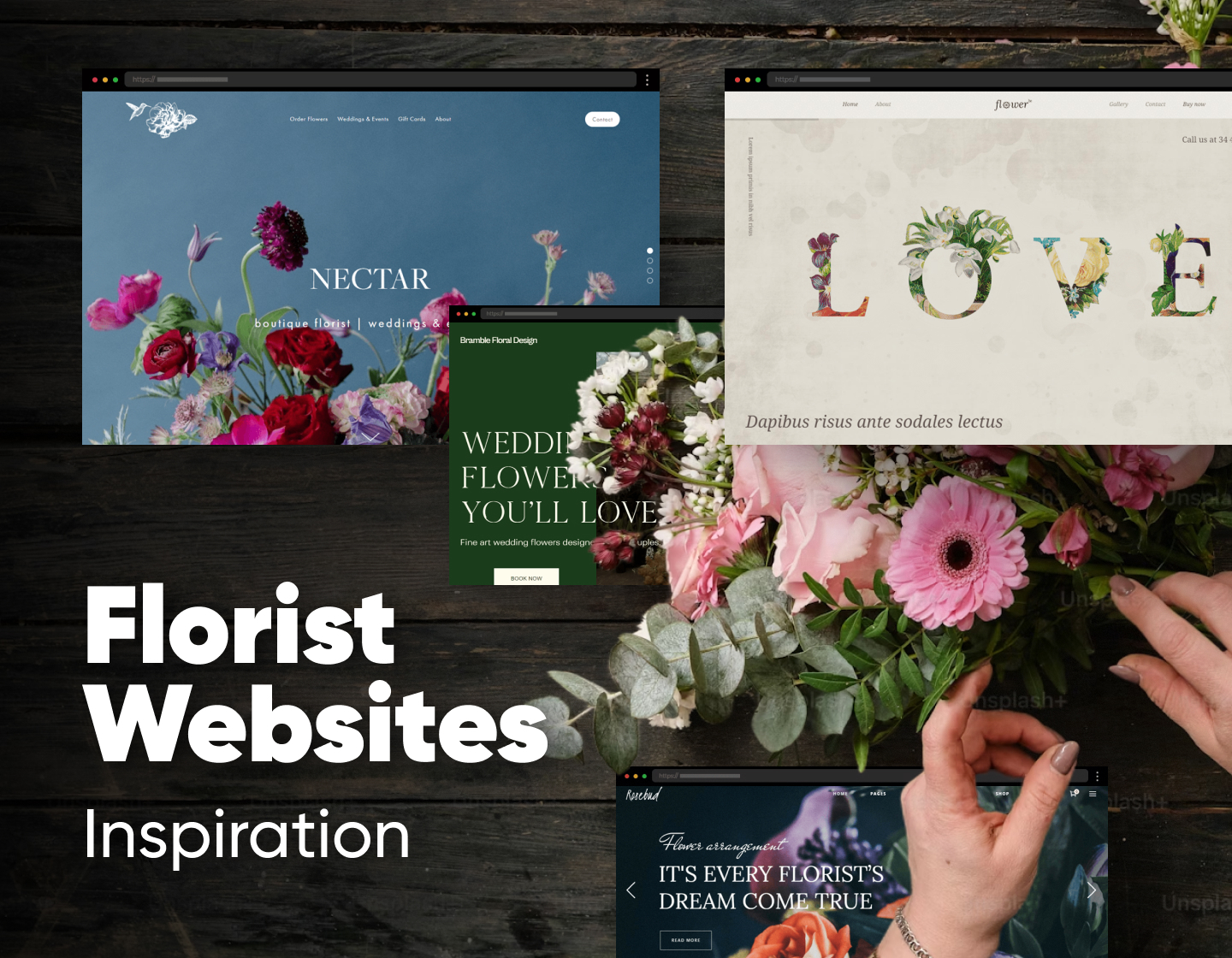
We know why you are here, so we present to you the best florist websites elegantly wielding their flower power. Everyone knows that in our age and time having a strong online presence is an absolute must for any business looking to expand their reach and increase sales. It is especially important for florists since they don’t have a constant assortment of products. Therefore, a well-designed florist website can showcase their beautiful arrangements, attract new customers, and provide a seamless shopping experience.
In today’s article, we will explore 22 of the best florist websites we found, designed to impress and make your inspiration bloom. Enjoy!
1. Gray Harper
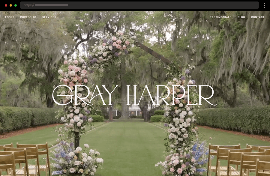
A breathtaking video showing the beautiful floral arrangements of the business steals all the attention on Gray Harper’s website. Its elegant layout ensures ease of browsing and a sophisticated look, while the straightforward navigation and the highlights from the site’s pages make the homepage a pleasure to explore. And, if that wasn’t enough, the included amazing imagery and flattering testimonials add the final touch, winning over the clients.
2. Gosha Flowers
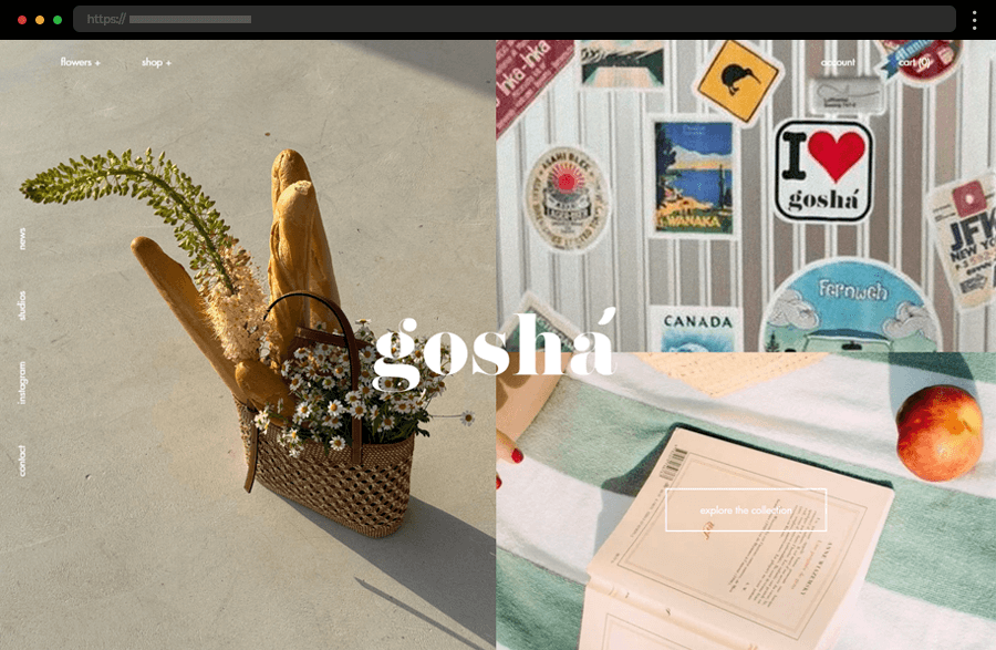
All the elements featured on the homepage of Gosha Flowers’ website follow a modern concept. In addition, the arrangement of the photos, the navigation tabs, and the interactive elements add to the site’s contemporary and friendly look. The result is a beautiful example of how to quickly shorten the distance with potential customers and create a user-friendly and visually appealing florist website experience.
3. Rosebud Florist Website Template
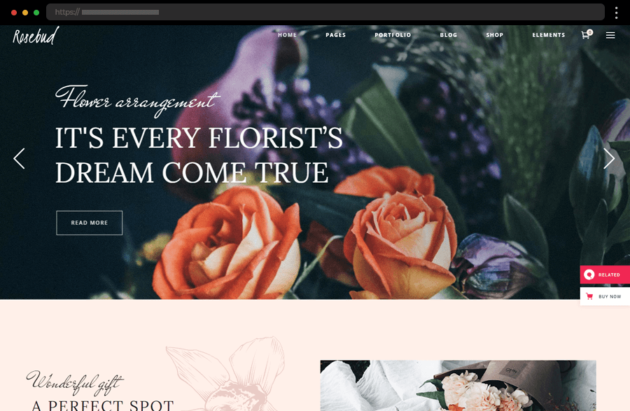
Here, the high-quality photograph in the hero section certainly facilitates the user’s decision to click the convenient CTAs. Meanwhile, the extensive drop-down menu options provide all the information about the flower arrangement services and access to the portfolio. Yet, the homepage is just enough to win the clients over, as it features an easy-to-follow, nicely structured layout with amazing design and sections covering every aspect of the business.
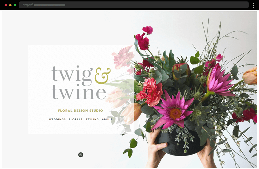
4. Twig & Twine Floral Design Studio
A beautiful, static homepage with a clean design is what captures the attention of Twig & Twine’s website. In addition, the overall minimalist web design and the four-column grid of the portfolio pages are so effective and work nicely for a user-friendly and easily navigated site. Overall, this florist bets on the impressive high-quality imagery to speak for her and sell her services. And, if we dare say, it works – she got us interested!
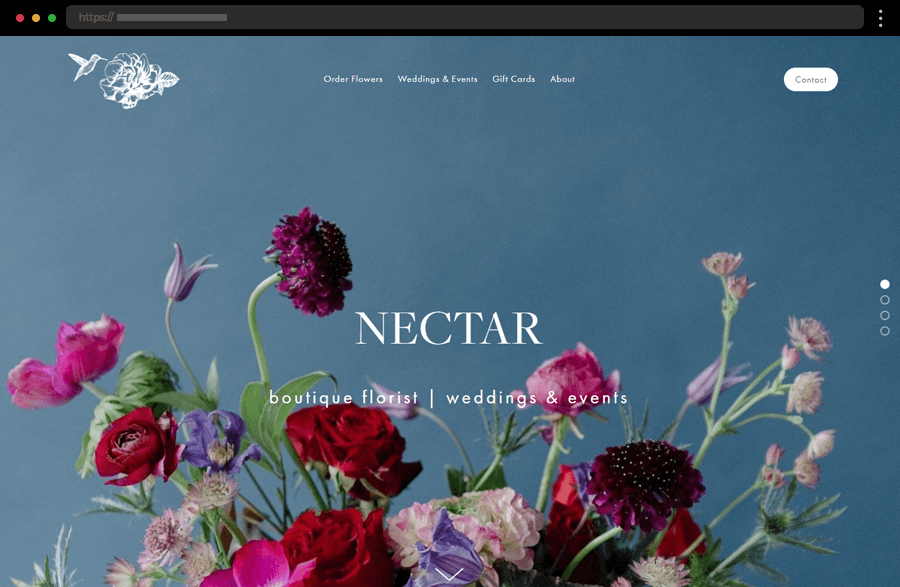
5. Nectar Boutique Florist
Exuding harmony and calmness, the homepage of Nectar Boutique meets us with a beautiful background image. With neat navigation, a clear layout, and distinct CTAs, the website quickly wins its visitors’ interest and trust. Overall, the site is focused on a smooth, pleasant, and productive user experience while maintaining a sophisticated look, thus ensuring its place on the best florist websites list.
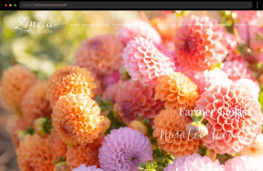
6. Zinnia Floral Designs
The website of Zinnia Floral Designs is another one sporting a modern yet sophisticated look. With a clear structure and smart sectioning, the homepage beautifully highlights all the important details of the florist’s business. The site’s design and navigation embrace clarity and elegance, so the user’s focus can stay on the impressive display of images that quickly win over the customer’s trust.
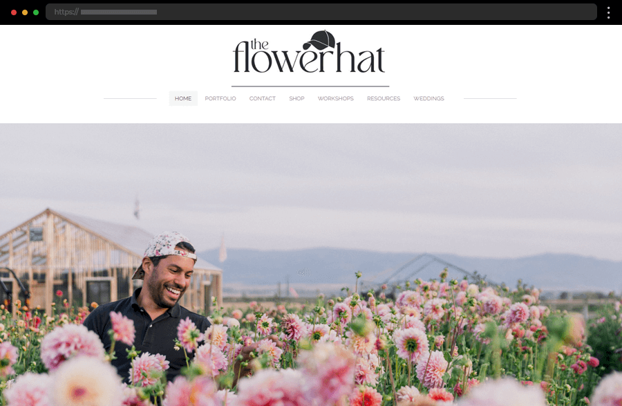
7. The Flower Hat
With its design’s simplicity and accent on the colorful photograph, this homepage certainly accentuates the business owner’s love for flowers. Within the neat and concise navigation, the website offers more than enough information about the floral studio and its services. Providing a delightful user experience, this example is also another one reflecting the florist’s style of work and arrangements, resulting in a worth-to-copy example.
8. Sadie’s Couture Floral
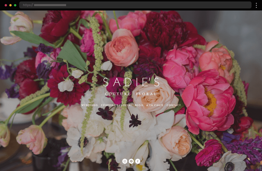
An impressive slideshow of full-sized background images steals the show on Sadie’s Couture Floral’s website, while every page in it exudes subtlety. The site’s centered layout, focused on simplicity and clarity, is the perfect showcase for displaying the floral boutique’s portfolio of vivid pictures. With its top menu and straightforward design, this example conveys a sense of easiness and pleasure, just the right associations for a florist’s services.
9. Bramble & Wild
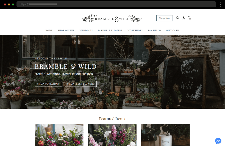
With its subtle design and a modest yet elegant layout, the website of Bramble & Wild quickly wins over the visitor’s trust and admiration. Its homepage shines with smart calls-to-action, a display of featured items, a brief bio, and convenient business details. There’s also a super extensive menu providing everything that may come of interest to the users and potential clients. Beautifully done, this certainly is one of the best florist websites we have seen.
10. Isadia Florist Website
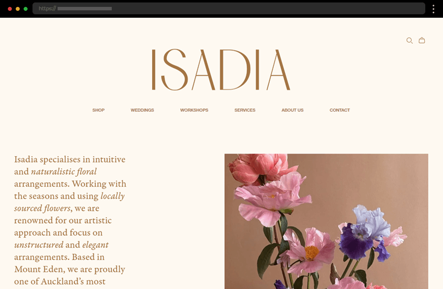
In this example, the website’s style follows the florist’s credo of creating natural and romantic arrangement aesthetics. The minimal and subtle design doesn’t fail to display enough imagery and information about all the services this business provides. With its straightforward navigation, easiness of use, and consistency throughout all of its pages, this florist website is a delightful example of how to build a credible and positive brand image.
11. Floom Florist Website
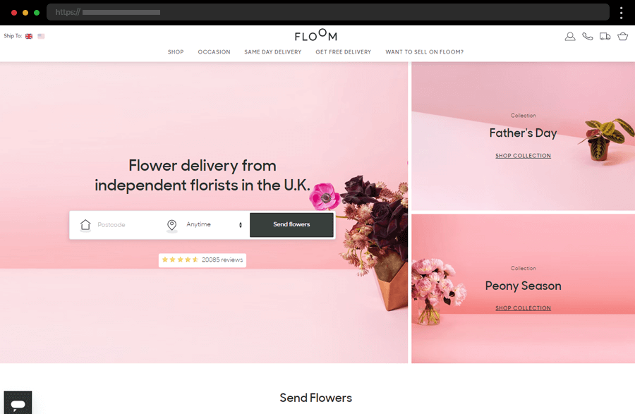
Straightforwardly incorporating on its homepage a flower delivery form and season offers, the Floom website ensures ease of use and accelerates the purchase process. Visually appealing and functional, this example also features comprehensive information about the services and their broad spectrum. Also, with highlights of the best-selling bouquets and relevant articles, the site is engaging, successfully keeping users’ interest.
12. Bleuet Coquelicot Florist Website
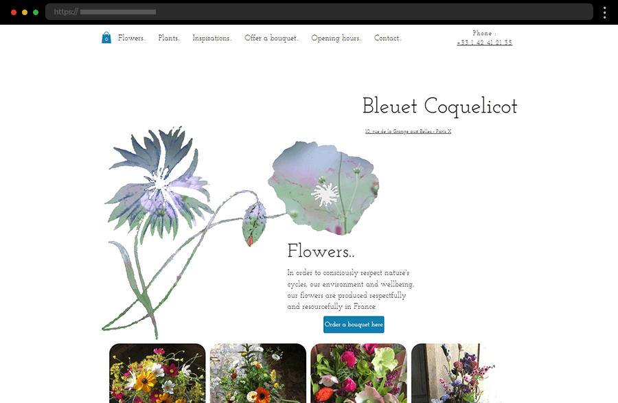
With an engaging animation, minimalistic design, and vibrant imagery, this multilingual website quickly catches the eye. While maintaining its uncluttered appearance, it manages to feature enough details about the store, like its location on Google Maps, for example, and full contact information. And it also offers the option to send flowers directly through its easy-to-use website form.
13. Bloom Flowers
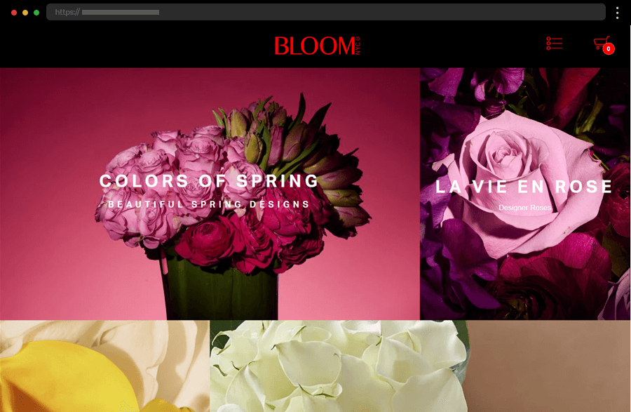
This website example uses the striking contrast between black and bright red within its design to enhance the store’s exclusiveness and its luxury services. Meanwhile, the dark design also helps the intensely colored images to stand out, thus creating a strong impression. The site also gets the most out of internal linking as every photo is leading the way to shopping or exploring all that it is offering.
14. Twig & Arrow Botanical Styling
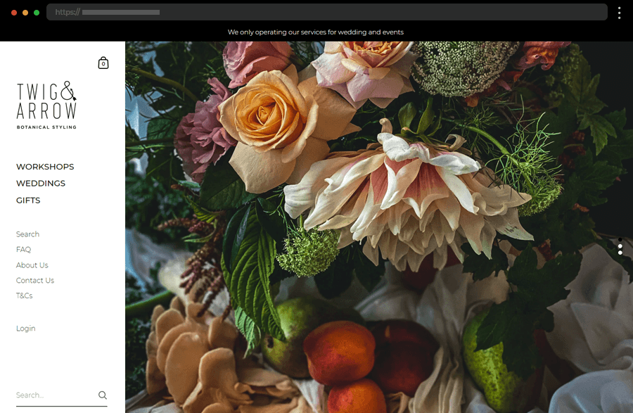
A static menu located in the left sidebar makes navigating this website a breeze while providing broad details about Twig & Arrow’s business. High-quality images impress users throughout the pages while the wedding gallery’s layout makes it an absolute pleasure to browse. As a result, the overall feel this website creates is one of design aimed at providing a smooth and easy user journey.
15. Native Poppy Florist Website
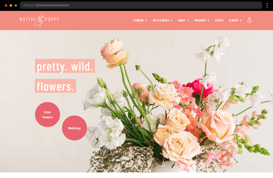
Fresh colors and more playful design work for a friendly and approachable brand image on the Native Poppy Florist website. With comprehensive details, easily noticeable CTAs, custom graphics, and inspiring images, the homepage features everything of interest. Still, anyone wishing to collaborate with the florist or learn more can take advantage of the broad top menu options, that provide all the other information.
16. FLWR Shop
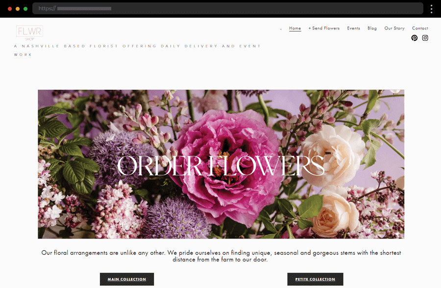
The website of the FLWR Shop utilizes a neat and plain layout that accentuates the featured attractive imagery. With its distinct and convenient CTAs, it certainly facilitates users with their purchases. In addition, the florist’s site has clear and concise copywriting that sufficiently describes the story and essence of the business. Thus, it also convinces users to take advantage of its services.
17. Vintage Florist Website Template
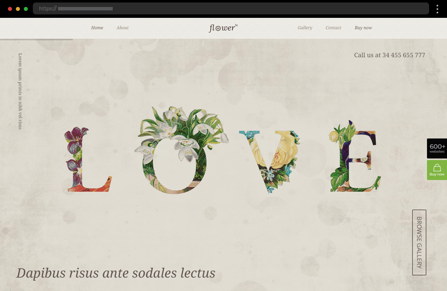
This template’s vintage appeal makes it perfect for florists wishing to convey style and tradition through their online presence. With a hero section featuring a slideshow of images, the homepage also displays sections where bestsellers, testimonials, gallery highlights, and a brief bio are included. Offering also easy navigation and cleverly positioned call-to-action buttons, the florist website template nicely combines an elegant vision with a functional design.
18. KAN Flowers
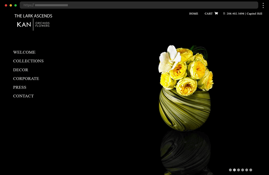
Looking at the black elegance of the KAN website, one can easily perceive the exclusive and luxurious nature of the floral designers’ products. With its left-sided navigation, the site offers ease and clarity of switching between its different pages. Also, incorporating press releases, where the flower shop arrangements are featured, increases the brand’s credibility and reliability.
19. Bloom Generation
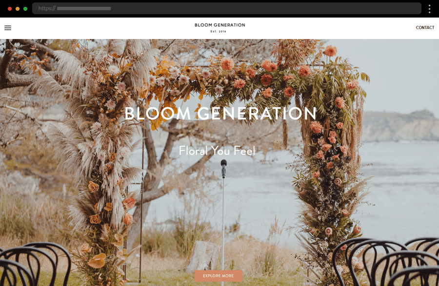
The homepage of Bloom Generation loads with a full-width photo showcasing one of the florist’s wedding arrangements. Alongside it, the users can find a menu icon and contact button, which prove to be very useful when one finally escapes the beautiful image’s enchantment. Featuring event highlights, lots of useful CTAs, and comprehensive information about the florist’s services, this website promises a productive and pleasant user experience.
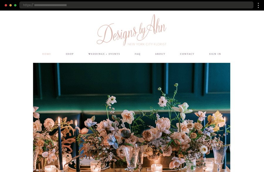
20. Designs By Ahn Florist Website
This New York City florist has chosen to utilize a minimalistic web design. The white background of the pages leaves the visitor’s focus on the displayed images, press publications, and testimonials. Easy-to-use static navigation and detailed information add more value to the website, though the texts could be displayed in larger fonts to improve its readability and effectiveness.
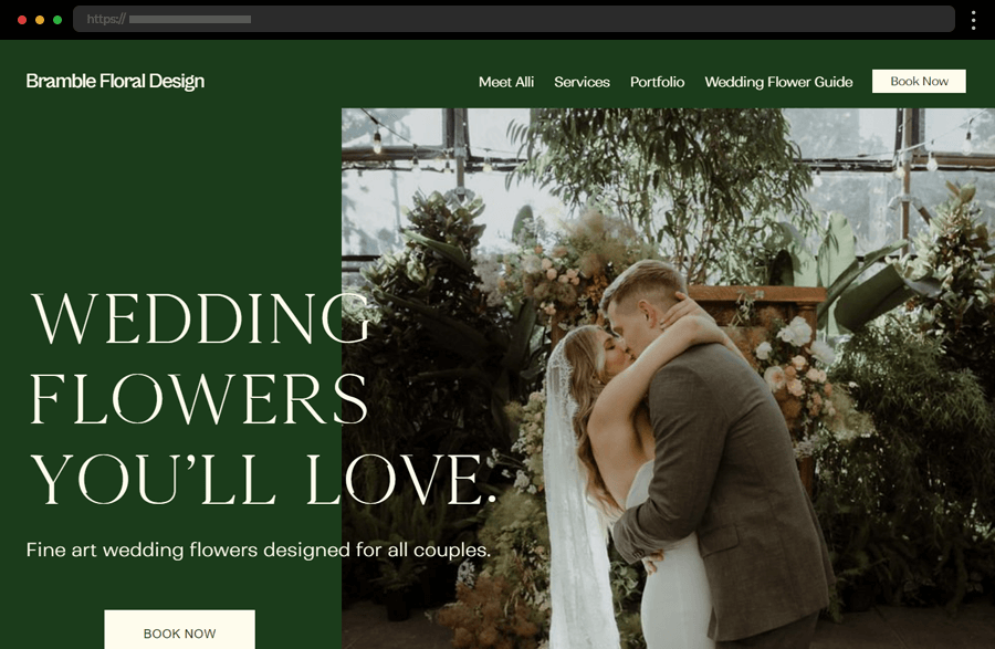
21. Bramble Floral Design
This example is one that follows a slightly different approach to its design. The website’s color palette is chosen to reflect the business owner’s character and nature, thus shortening the distance from potential clients. And, while checking all boxes of necessary features that make a florist website successful, Bramble Floral Design’s site leaves an impression of easiness and reliability, proving to be comprehensive and effective.
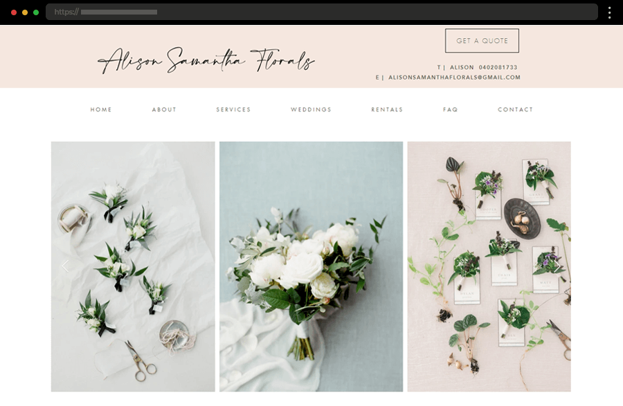
22. Alison Samantha Flowers
With a carousel of images and a pastel-colored header, this florist website’s homepage impresses from the beginning. Also featuring testimonials, a brief bio section, and event highlights, it quickly wins the user’s trust. With visitor’s convenience in mind, the site provides broad information throughout its pages, an inspirational gallery, and easy ways to get in touch through the contact details and forms.
Tips on the best practices to create florist websites
- Go for a user-friendly design to ensure your website is easy to navigate with a clean, uncluttered layout.
- Put the focus on your imagery. Use high-quality images of floral arrangements and clear, descriptive text to help customers make their choices.
- Don’t forget the power of testimonials, for they can be that little something that secures your next client. Displaying customer reviews and testimonials builds trust and enhances the website’s reputation.
- Keep in mind that many customers will browse and shop from their mobile devices. So make sure your site has a responsive design and fast loading times. This way you will avoid frustrating visitors and provide a consistent user experience across all devices.
- Offer customers personalization of their orders. Think about options like custom messages, special details, or specific delivery instructions. This is always a sure way to enhance the user experience.
- Remember to prioritize SEO! Following the best SEO practices boosts your search engine ranking and helps you reach higher numbers of your target audience.
Final words
Crafting a standout florist website starts with knowing your target audience and involves focusing on user experience, showcasing your portfolio, and optimizing your site. You also have to include high-quality, impressive imagery that has the power to turn the viewers into customers. So, now that you have gathered inspiration from the amazing florist website examples in our list, and you know the best practices, we hope you are ready to begin crafting your online presence in the digital floral market.
Still, if you need more inspiration to get started with your design, try finding it here:


