![20 Modern Logos For Memorable Branding [Inspiring & Creative Ideas]](https://reallygooddesigns.com/wp-content/uploads/2024/08/modern-logos-193x150.webp)

A good brand style guide is like a cheat code for looking put-together. It keeps your colors, fonts, tone, and vibe in check so things don’t go off the rails when it’s time to design something new. This is why for this roundup, I hunted down 15 brand style guide examples from different industries that keep it fresh and consistent. Let’s poke around and see what makes each one worth a look.
1. ClickUp Style Guide
The way ClickUp mixes color combinations that match its logo feels like a thoughtful detail—it really helps bring the brand to life. I’ve always liked seeing a variety of colors in brand guides because it adds energy and makes everything feel a bit more human. One thing that stood out was how they gave a separate look and logo to one of their products.

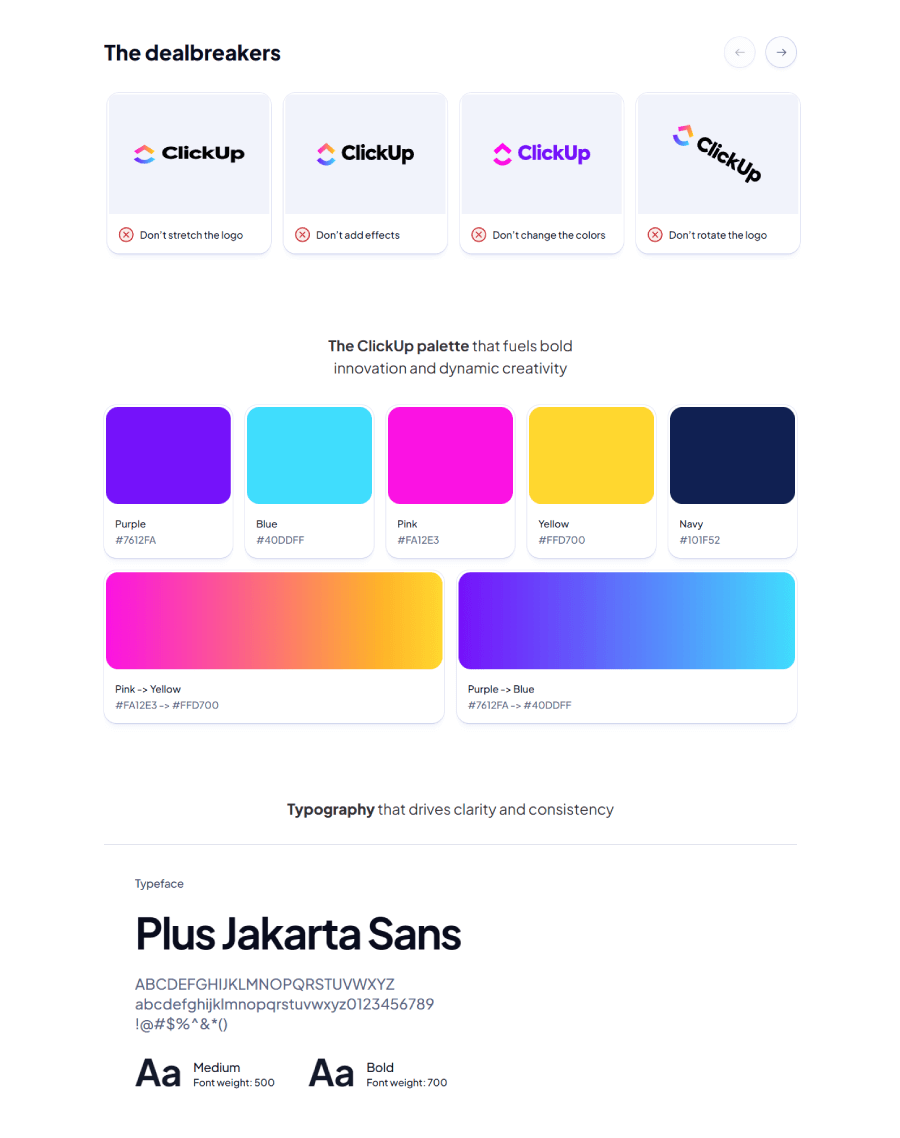
You can even download the logo files in .svg format right from their site, which makes things easier for anyone needing to use them. I’d used ClickUp before checking out its brand guide, and seeing how everything’s laid out made me realize just how helpful clear rules are. It’s especially noticeable for front-end developers, who can translate designs into real interfaces without second-guessing.
They’ve also added a fun touch with a “dealbreakers” section that shows what not to do with the logo, laid out as a little carousel slider. It keeps things light and interactive, but still gets the point across. At the end of the day, brand guidelines like these help everyone stay on the same page, making it easier to keep the brand looking consistent no matter who’s working on it.
2. Tyrell Garden & Nursery Brand

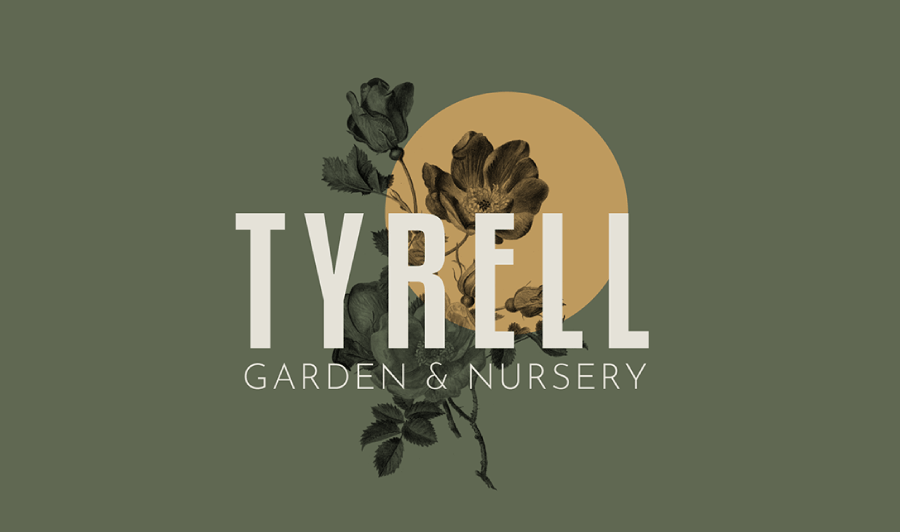
As you probably already guessed, this brand project was based on House Tyrell from the show Game of Thrones. It retains the original house sygils, colors and personality but it’s adapted to a garden and nursery brand.
The project has the entire brand style guide, starting from the primary logo with a golden rose on a green field that looks like a drawing rather than a boring corporate logo. I also love the Iconography section where the designer includes multiple icons that can apply in different cases.

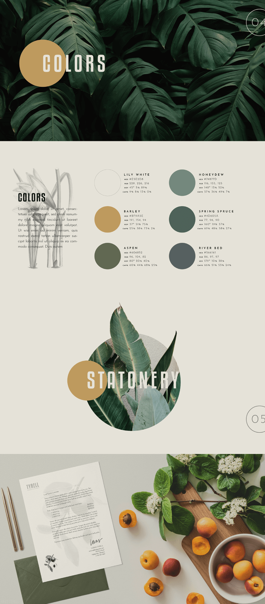
To complete the full visual identity, this guide also features beautiful stationery mockups that show how the logo, colors, typography and custom icons apply on print and packaging.
3. Netflix Logo Guide
Netflix keeps things simple and crystal clear when it comes to how its brand should look in the wild, especially the logo. The brand guide puts a lot of focus on getting the logo just right, laying out specific instructions for how big it should be, how much space should surround it, and where it should sit.

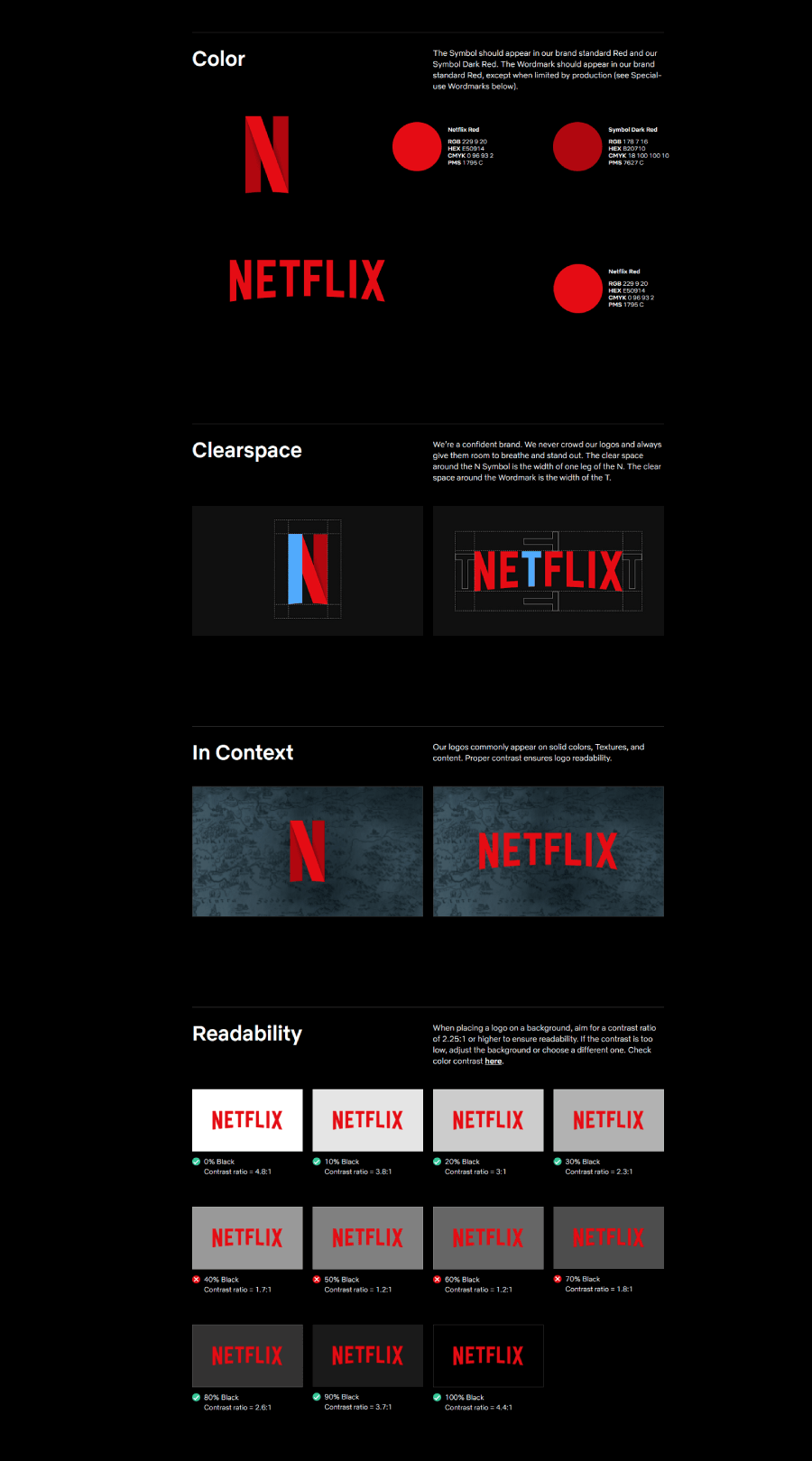

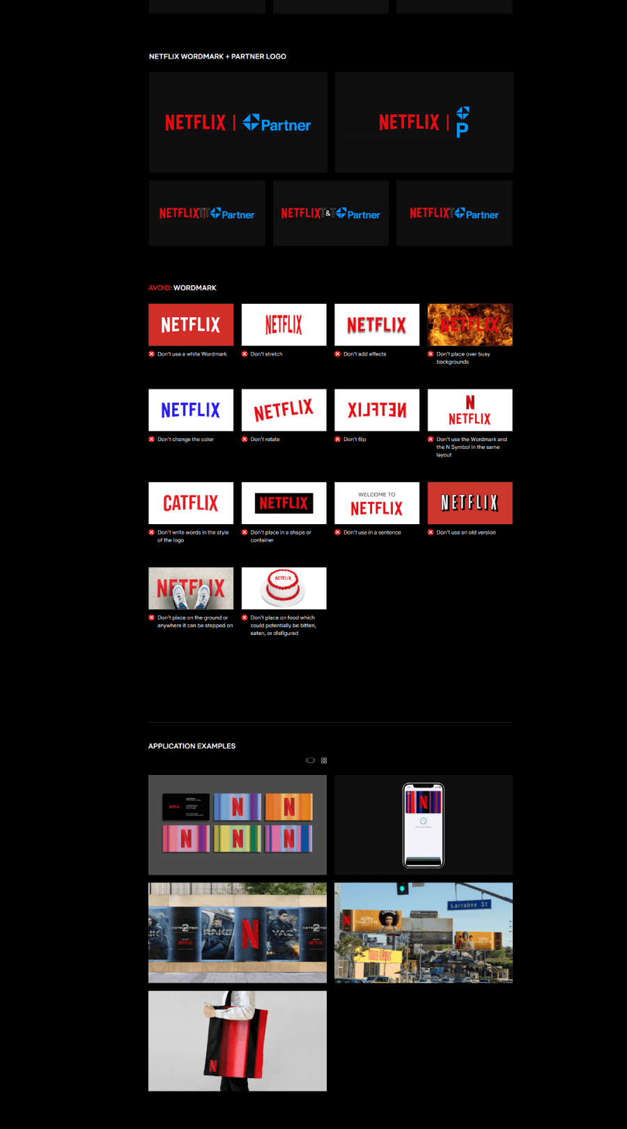
They’ve stuck with their recognizable capitalized typeface and made sure there’s no confusion about the signature red—there’s one official color code, and that’s it. The guide doesn’t go overboard, but it covers exactly what someone needs to keep the Netflix brand looking sharp and consistent wherever it shows up.
4. Cirdia Startup Tech

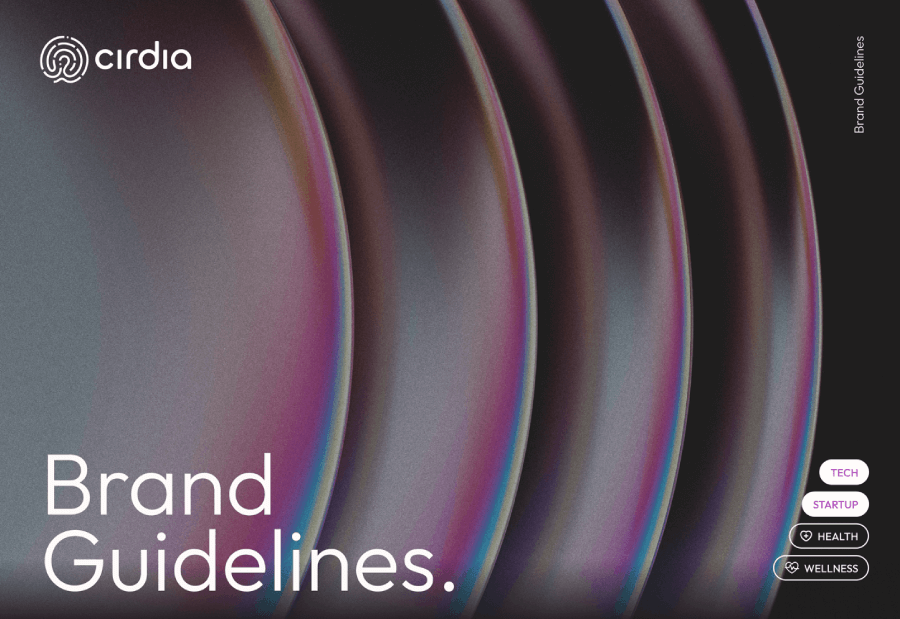
Next, we have a huge branding project with 54 pages and 9 different sections for a tech startup. It’s a full cse study that includes the competitor analisis, brand strategy, values and personality. The actual brand style guide starts from section 4 where it breaks down the art direcion. It includes the logotypes, their variations and uses, colors and imagery.

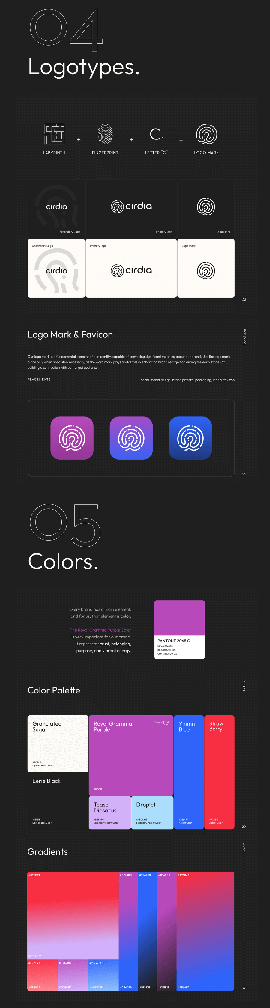

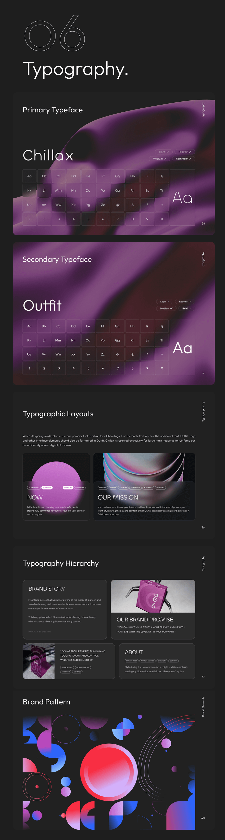
As you can see, this is a very modern high-tech style guide with colorful gradients, frosted glass effects and modern fonts.
5. Mozilla Firefox Brand Style Guide
Mozilla Firefox’s brand guide does a great job of showing who they are, without needing to shout about it. The entire thing feels like it speaks in Firefox’s voice in the colors and visuals, and in the tone of the writing. It explains the brand personality and shows it well. Everything feels connected. The bold color palette includes deep purples, fiery oranges, rich reds, and vibrant pinks; and it backs up the guide’s message about being open, daring, and kind.

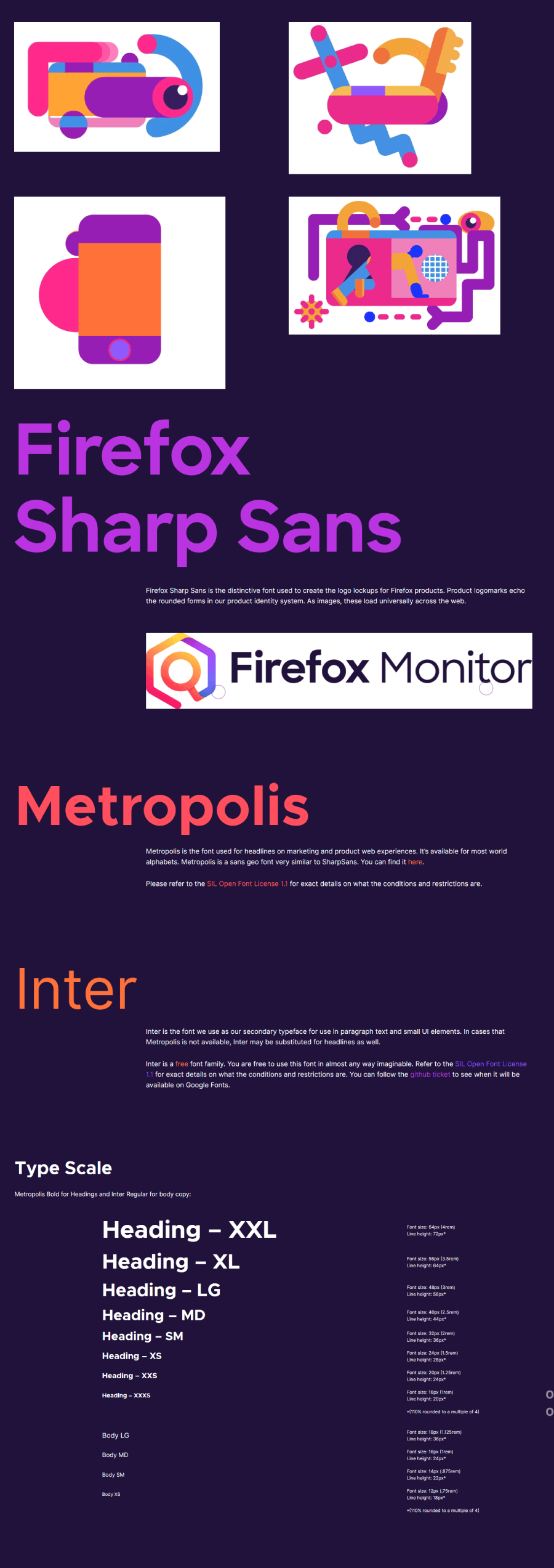
The color choices say a lot on their own. Red grabs your attention, orange adds a sense of creativity and energy, purple gives off a more luxurious, unconventional vibe, and pink adds a softer, more playful touch. These colors match the way Firefox describes itself and help that identity come through clearly.
What really stands out is how well the visuals and the written content work together. The voice section qualifies it with examples that actually match the tone of the design. There’s nothing dry or generic here. The brand personality feels real, consistent, and easy to spot on every page of the guide.
6. Museum of Humanity Brand Visuals

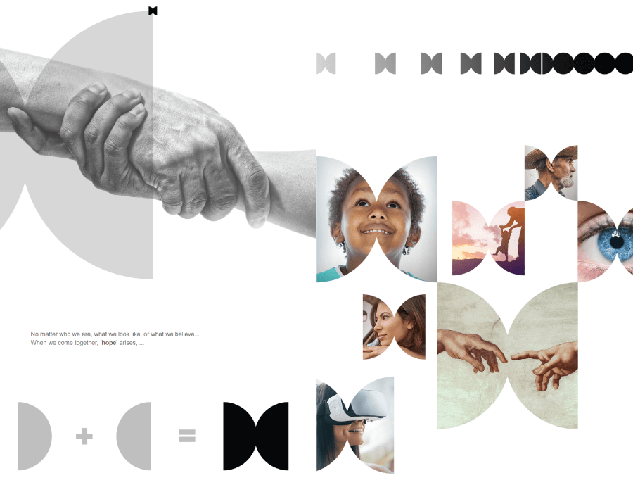
The Museum of Humanity Los Angeles (MOHLA) is a platform that celebrates the best of human achievements across history. It mixes art, culture, science, history, and philosophy to inspire people all over the world. MOHLA’s programs encourage global conversations, pulling from the wisdom of the past and creating excitement for the future.

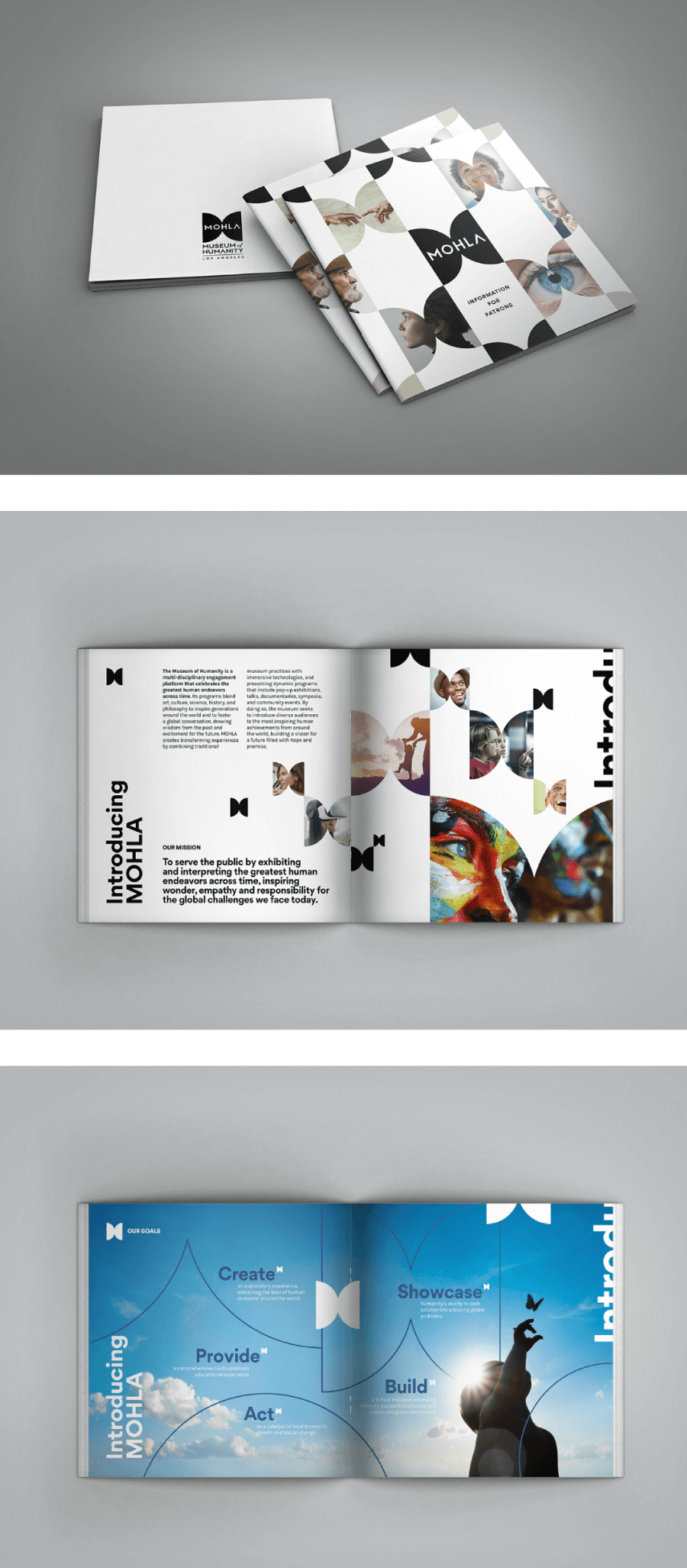
When it comes to their style guide, MOHLA keeps things simple yet striking. The design uses black-and-white images, which really let the logo and brand elements stand out against colorful gradients. This visual style makes everything feel vibrant and energetic. One part of the guide focuses on designing brochures. The challenge there was to take a lot of text and turn it into something visually appealing. Since the museum’s physical space isn’t open yet, the design had to highlight the concept of the museum and its potential while showing off the brand’s sophisticated feel.
7. Wix Design Assets and Guidelines
The Wix brand style guide is super straightforward and simple. It gives you just the essentials without overloading you with info. The color palette is clean and uses a few key shades that help everything feel put together.

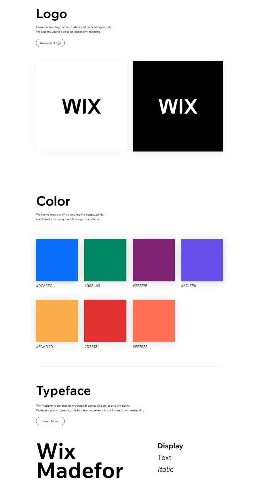
The typeface they use is modern and friendly, which fits the brand perfectly. There are two versions of the logo, so you’ve got options while still keeping everything looking like Wix. And there’s also a fun little pattern that adds some character to the design without being too much.
8. EPA Styleguide Book Logo Colors
The EPA’s 1977 brand guide has a bit of a cult following among graphic designers, and it’s easy to see why. There’s something oddly charming about the way they assigned bold patterns to different programs, like toxic substances, noise, and radiation.

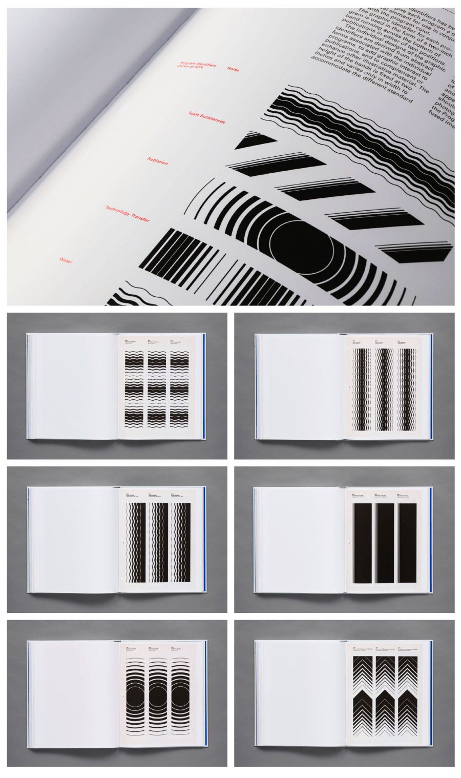
The guide is refreshingly clear, especially when it comes to using the official seal. It spells out exactly when and where the seal should appear, so there’s no second-guessing. One of the standout features has to be the color names. Instead of playing it safe, they went with options like “Radiation Red,” “Pesticides Green,” and the unforgettable “Solid Waste Brown.” It’s quirky, direct, and surprisingly memorable—much like the guide itself.
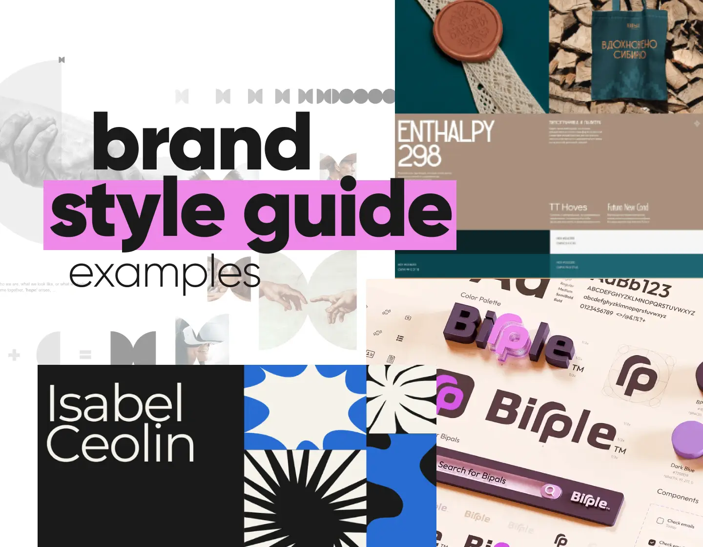
9. Isabel Ceolin Freelance Creative Personal Brand

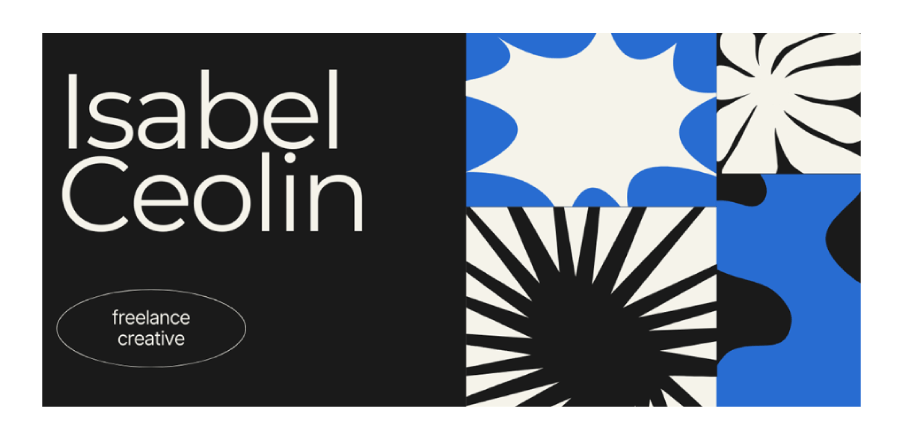
Bel’s personal brand uses moody lighting and spontaneous energy to create visuals that feel both personal and powerful. Her work ranges from editorial photoshoots to behind-the-scenes glimpses and lifestyle vlogs, always carrying that effortless cool factor that draws people in.
Her vibe comes down to being creative, bold, and naturally cool. Through her photography and content, Bel connects with others by capturing the energy of the present moment. She brings creativity, spontaneity, and a bold, authentic style to everything she does, staying true to herself along the way.

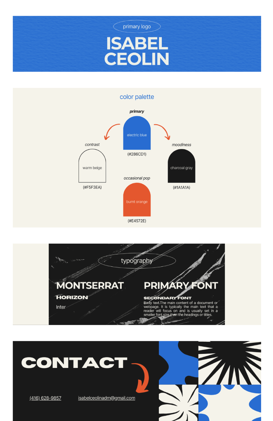
Her brand symbol takes inspiration from an eclipse, with two overlapping circles. This represents duality, transformation, and mystery—much like how Bel’s work evolves and surprises. The clean, wide-spaced letters of her name, “Isabel Ceolin,” add a simple, fresh feel to the brand. It all comes together in a way that’s relaxed, approachable, and uniquely hers.
10. Medium Logo Variations and Colors Style Guide
Medium’s brand style guide keeps things straightforward and easy to follow, which makes a lot of sense for a company built around clear communication. Instead of lengthy explanations, they use direct visual examples to show exactly how things should look, like how to set up headings, body text, and pull quotes. It feels approachable, not overwhelming, and every detail serves a purpose. The guide doesn’t wander off into unnecessary territory, but it still manages to cover everything you need.

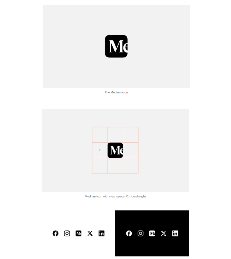
You can tell that Medium put real thought into how their logo and name work together visually. There’s a clean, balanced look to it that fits the overall vibe of the brand. Since Medium started as a space for writers, especially newer voices, it makes sense that their design choices lean into that printed-text feel. The guide mirrors that mission with a clear and minimal layout that’s more practical than flashy. It’s calm, confident, and knows exactly what it’s trying to say.
11. Raven Furniture Brand Style Guide

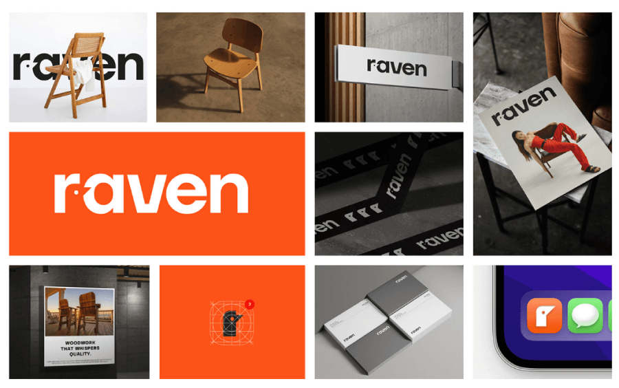
Here you have another concept for a brand, this time for an interior design brand called Raven Furniture. It’s a full case study with brand mission, vision, and personality, focusing on the visual identity. The sections include a full logo section that show the spacing an logomark, as well as where it should be positioned in different elements.

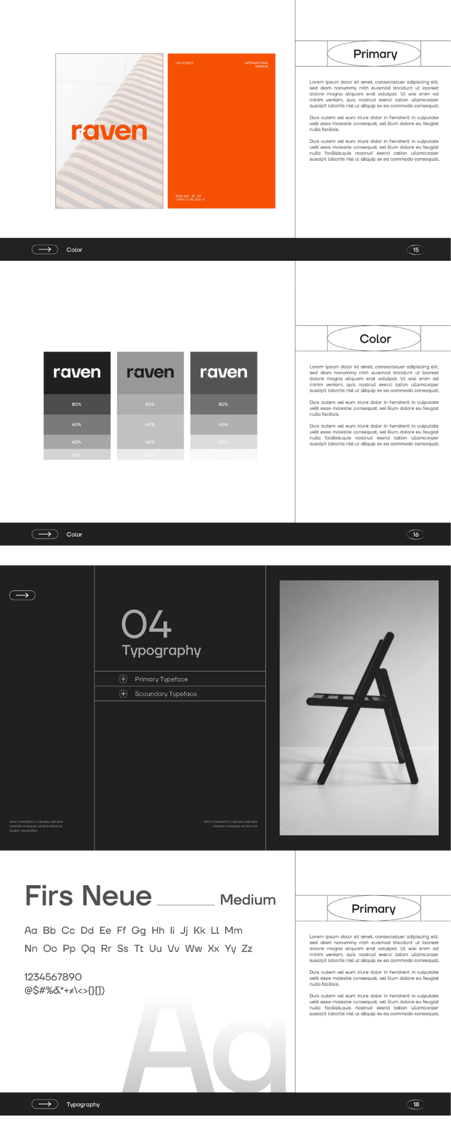
The style guide also shows the primary color scheme and the contrast palette in black-and-white, as well as the primary and secondary font.
12. NASA Style Guide
NASA’s brand guide is one of the most thorough I’ve seen. It goes into a ton of detail about how to place their logo to the colors they use and all the supporting design elements. The guide even has special rules for things like the space shuttles, which is a cool touch. It also covers typography, imagery, and gives specific details about logo placement, making sure everything fits perfectly with NASA’s identity.
The guide shows four different variations of their iconic insignia, which is nice for any situation that calls for them. One thing I really like is how they’ve spelled out the exact background colors to use, leaving no room for guesswork. It’s impressive how the guide covers so many different contexts, like digital uses and even branding on spacecraft and uniforms.
13. VOA Haircare Visual Identity Guide

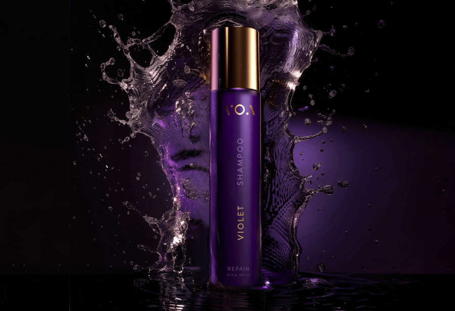
VOA has a calm, confident vibe that feels right at home in the luxury haircare space. The look leans into soft purples, warm golds, and natural textures, which gives it a kind of effortless polish, nothing flashy, just quietly refined.

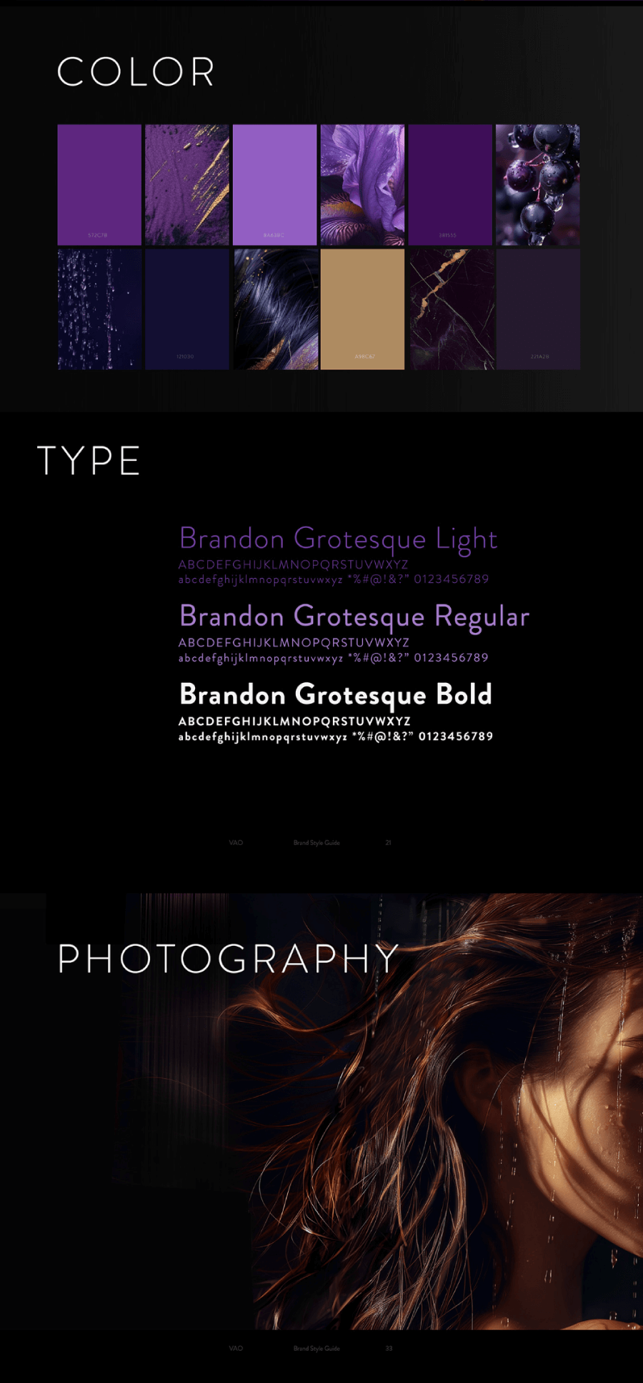
The style guide shows off how those colors and textures work together, and the moodboard pulls it all into focus. It feels grounded and put-together in a way that makes sense for a brand like this. Packaging looks just as considered, and the professional photos help show how the whole brand comes together. The mockups give a peek at how everything holds up across print, desktop, and mobile, keeping things consistent without making it feel too strict.
14. Spotify Brand Style Guide
Spotify’s brand guide lays out a tight color palette with just a few specific shades, which helps keep things looking consistent without overcomplicating anything. It also puts a good amount of attention on how the logo can be used in different settings, along with clear pointers on handling album artwork, something that feels right at home for a music platform.
You can even grab downloadable logo icons straight from the guide, which makes it super easy for partners or creators to use Spotify’s branding the right way. Everything feels thoughtful, simple, and true to Spotify’s vibe.
15. Barynya Siberian Restaurant

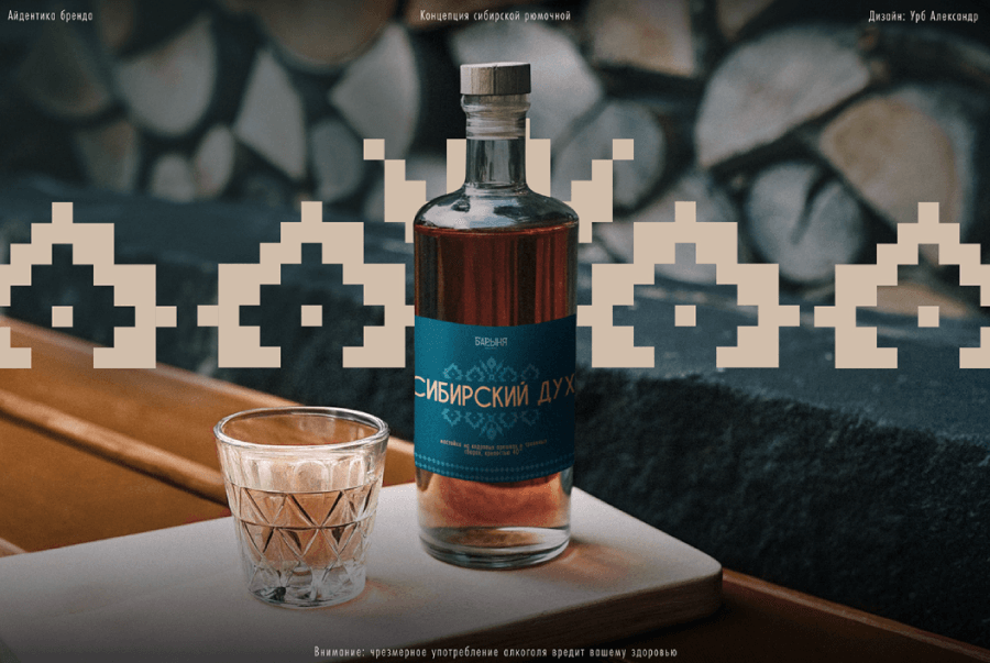
And last, this is the brand style guide and visual identity for Barynya, a cozy restaurant in Irkutsk that offers a wide range of traditional Siberian and Slavic dishes and drinks. The style guide manages to recreate the atmosphere of the place with traditional patterns and motifs.

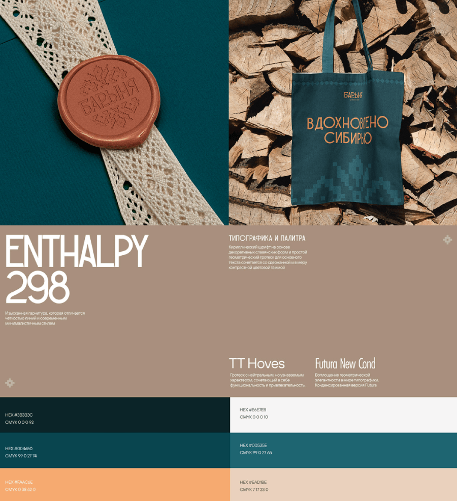

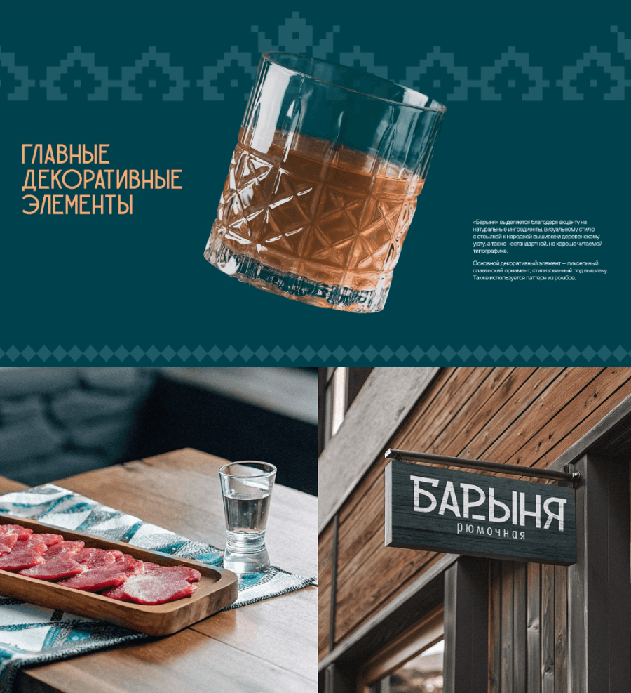
It has a palette of natural, cozy colors, traditional Slavic fonts, and a gallery of aesthetic photos and mockups that translate the vibe perfectly.
Bonus Brand Style Guide Examples
Oh, the list is over, but I wanted to share two more examples that bring something different. The so-called “honourable mentions”.
Bipple Color Palette and Fonts 3D Guide

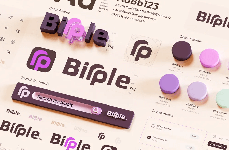
This ne is a very short brand style guide for Bipple, but the presentation is awesome as everything is in 3D and the elements look so real you can touch them.
Rick and Morty Merch Style Guide

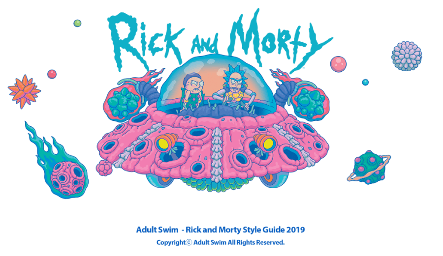
And, the official Rick and Morty merch guide. You have probably seen t-shirts and other apparel sporting these patterns, they were all made by the artist SANGHO BANG from South Korea in a ftting for the franchize psychedelic style.

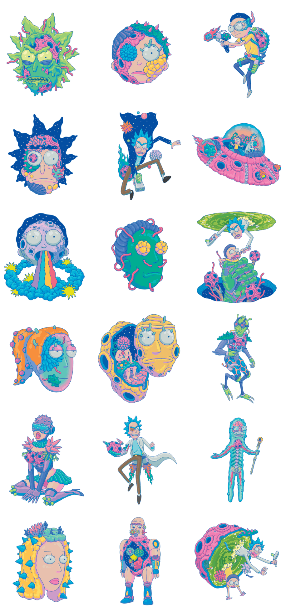

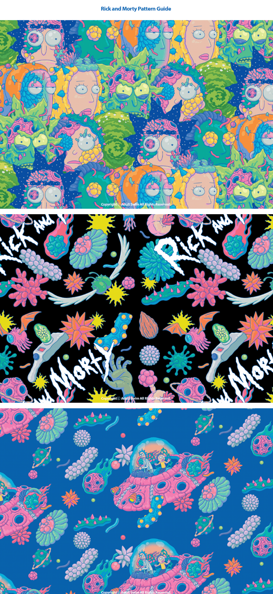
The guide has a simple structure with only two sections: illustrations and patterns. All of them get printed on hoodies, shirts, sneakers, posters and other merchendize for Rick and Morty fans.
And there you have it!
.As you’ve seen, a good guide keeps everything working together, like a well-rehearsed band. It can be loud and colorful or calm and minimal, but the point stays the same: keep your brand feeling like you, everywhere it shows up. Hope this gave you some ideas for your own branding game.
Stick around for more design inspo and tips!