Company website design plays a vital role in how potential customers perceive and interact with your brand. Creating a strong and compelling design is mandatory for businesses aiming to establish a reputable online presence, especially when catering to corporate clients. Crafting a great website for a company goes beyond visual appeal, the design needs to be functional, optimized, and reflective of your value proposition while also helping drive traffic, engage visitors, and convert them into clients. Corporate websites also showcase a company’s brand, services, and expertise, providing web users with first impressions that can significantly influence their perception.
So, in today’s article, we’ll showcase 20 top examples to inspire your next project, and share expert tips on the best practices for crafting corporate websites, so make sure to stay until the end. Let’s dive!
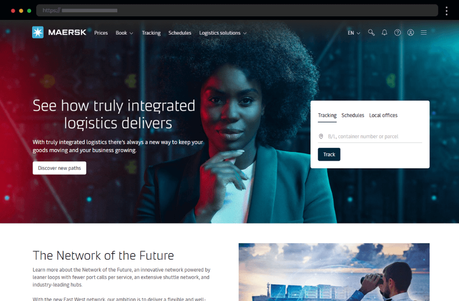
1. Maersk, Transportation and logistics company website design
Maersk’s website features a modern and professional design with a strong visual emphasis on global logistics. High-quality images and videos showcase the company’s expansive reach and innovative solutions in the shipping industry. With clear navigation and a search bar, the site is easy to get around and find services quickly. Meanwhile, the clear, well-designed CTAs guide customers to service details, client resources, insights, and news, building trust with business visitors and reinforcing Maersk’s reputation as an industry leader.
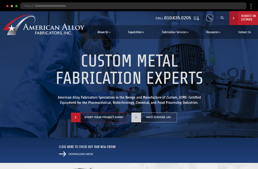
2. American Alloy Fabricators, Manufacturing company website design
American Alloy Fabricators’ corporate website uses a professional design that reflects the brand’s precision engineering in metal fabrication. The homepage displays images of custom-fabricated products and an introduction to the company’s services. Overall, the website focuses on highlighting the company’s expertise, appealing to industries that demand high-quality manufacturing. In addition, the web design conveys a sense of reliability with intuitive navigation that ensures users find information on fabrication options and certifications.
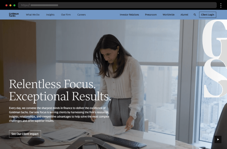
3. Goldman Sachs, Financial services company website design
Goldman Sachs’ website has a sophisticated, corporate aesthetic with bold typography and striking visuals, creating a first impression of authority and professionalism. The site organizes complex financial information with the help of a broad drop-down menu. The design’s muted color palette enhances the brand’s prestigious image, also allowing the content to shine and reflect Goldman Sachs’ focus on quality. Their corporate web design effectively communicates credibility and expertise, smartly utilizing CTA buttons to guide users through the company’s extensive offerings.
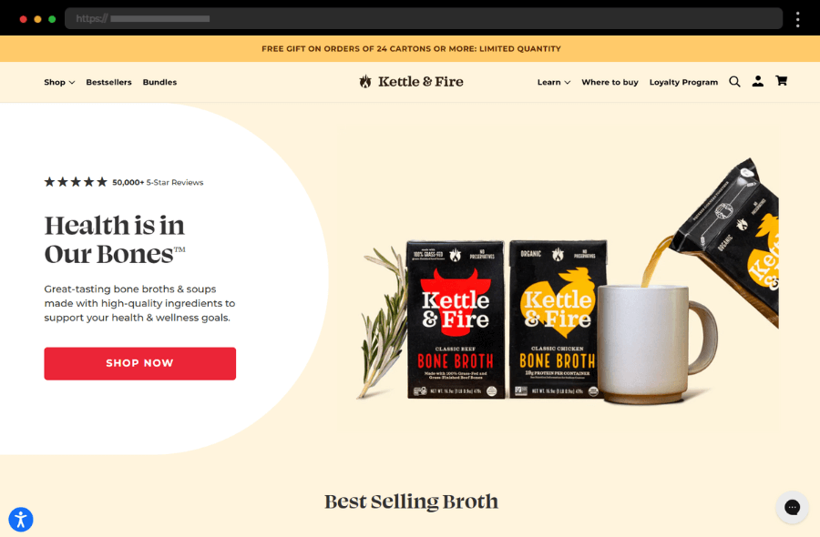
4. Kettle & Fire, Food company website design example
Kettle & Fire’s business website design is vibrant and engaging, appealing directly to health-conscious customers interested in organic and high-quality food products. The homepage uses appetizing images and warm colors to create an inviting feel, while clear call-to-action buttons encourage users to explore products or learn about health benefits. Kettle & Fire’s content is informative and aligns well with its audience’s values, providing recipes, wellness tips, and blog articles that additionally enhance brand trust and engagement.
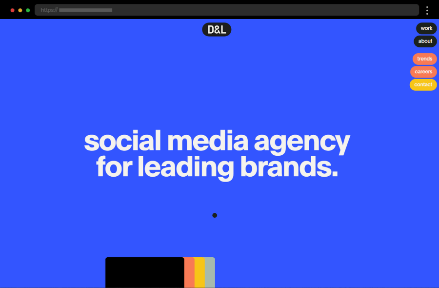
5. Dorst & Lesser, Social media agency website design
Dorst & Lesser’s company website is an outburst of web design creativity with its colorful and engaging concept, full of effects and animations. Simplified, sticky navigation tabs facilitate the user journey while amazing visuals and bold typography keep the user’s attention and never let it go. With impressive project presentations, easily accessed contact information, well-thought-out copy, and overall amazing design Dorst & Lesser elegantly shows how it’s done.
6. Compass, Real estate company website design
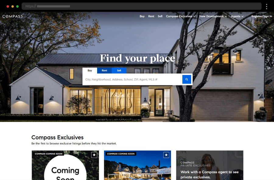
Real estate company Compass uses a sleek and modern website design tailored for property professionals and homebuyers. The homepage prominently features a detailed search tool for properties, directly addressing user needs. Compass uses high-quality images of homes and communities that help potential buyers envision their ideal home, while streamlined navigation and strategically placed CTAs engage users to explore listings further. The site’s structure balances professional elegance with functionality – a fitting approach for a professional, client-centered real estate business.
7. JHL Constructors, Construction company website design
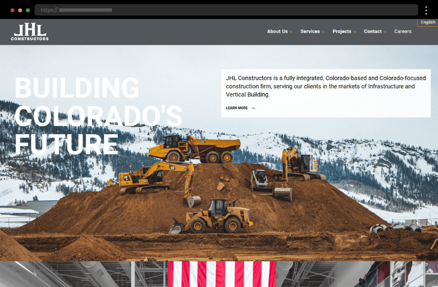
JHL Constructors’ corporate website uses bold design elements that convey strength and expertise in construction. The homepage welcomes visitors with powerful, large visuals of projects, showcasing the company’s impressive portfolio. The website also features sections for different industry services, providing visitors with a clear path to learn more about each specialty. In addition, strong headlines and clean typography reinforce JHL’s commitment to quality and project management excellence.
8. William Rawn Associates, Architecture company website design
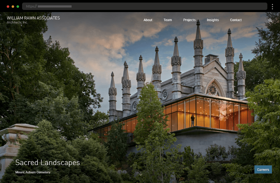
William Rawn Associates’ architecture company website reflects the firm’s dedication to high-end architectural design through minimalist aesthetics and impactful visuals. The homepage does an excellent job of allowing the company’s work to speak for itself by featuring large, striking images of completed projects. With straightforward navigation, great content, and clean typography, this website creates an immersive experience, appealing to potential customers interested in aesthetics and quality. Making things even better, William Rawn’s branding is subtle yet refined, focusing on sophistication and creativity.
9. Deloitte, Financial solutions and consultations company
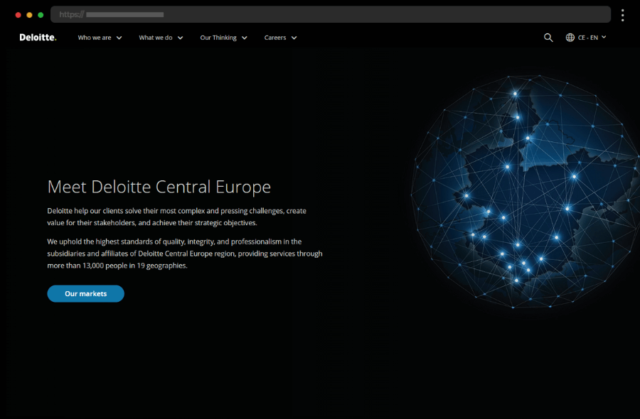
Modern and engaging, Deloitte’s corporate website is elegantly designed with a straightforward layout and compelling copywriting. Homepage visuals with parallax effect and well-structured content, offering insights and blog articles, additionally enhance Deloitte’s strong online presence. In addition, the web design smoothly combines attractive imagery with CTAs in a way that maintains a professional look and guides visitors to go that extra mile and explore Deloitte’s wide range of services.
10. R.D. Offutt Farms, Agriculture company website design
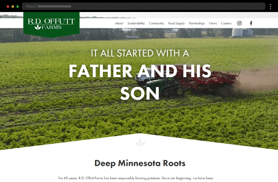
R.D. Offutt Farms’ company website embraces a warm and earthy design that reflects its agricultural roots. Rich visuals of farmland and crops greet visitors on the homepage, creating an inviting atmosphere. The website emphasizes storytelling through sections that describe the company’s heritage, sustainable farming practices, and quality-dedicated services. With its typography and color scheme, the site delivers a sense of trust and connection to the land, aligning perfectly with its brand values.
11. Allianz, Insurance company website design
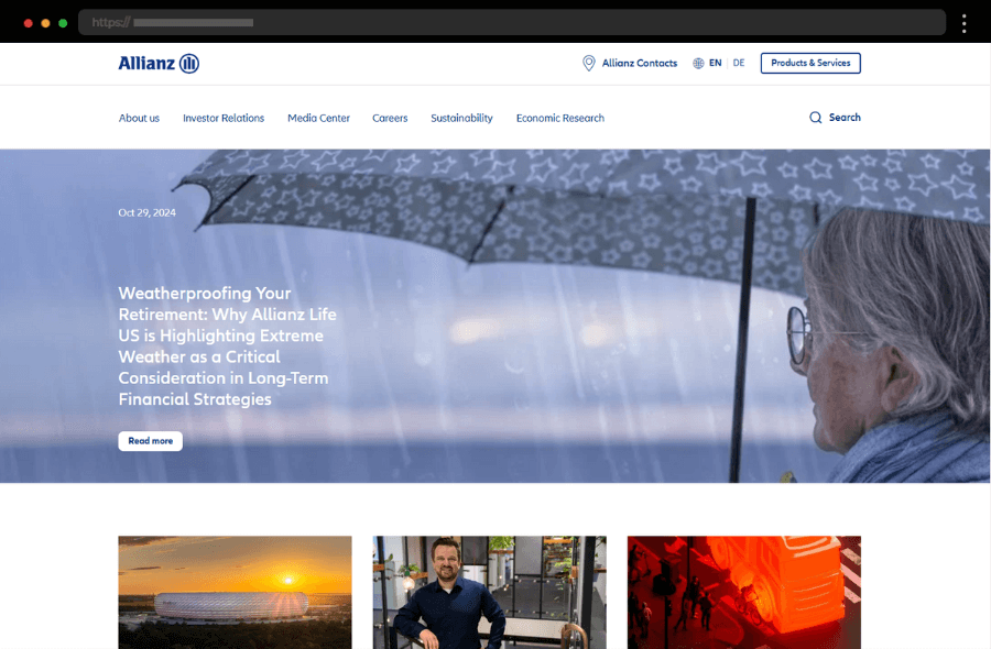
Allianz’s company website captures attention with its sleek design, calming color scheme, and well-curated content with strong messaging. Focusing on user experience, the corporate website features a clear layout, high-quality images, and CTA buttons that direct visitors to services sections efficiently. As a result, the professional look and seamless navigation create a lasting first impression, making it easy for clients to find and explore information relevant to their needs.
12. AAA Auto, car dealer company website design
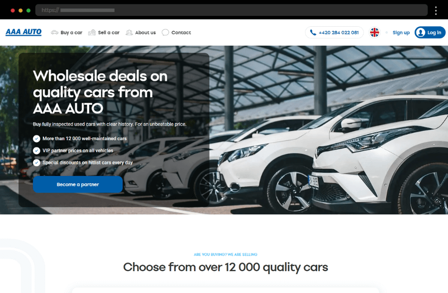
AAA Auto’s corporate website design offers a straightforward user experience aimed at car buyers and sellers across Europe. The homepage highlights the company’s core services and provides an easy-to-navigate search tool, allowing users to browse inventory quickly. Further, the site’s web design is functional, with a focus on practicality, and uses concise copywriting to make information about pricing and car specifications accessible. Thus, AAA Auto’s branding and website design is subtle yet professional, positioning it as a reliable platform for automotive deals.
13. National Car Rental, Car rentals company website design
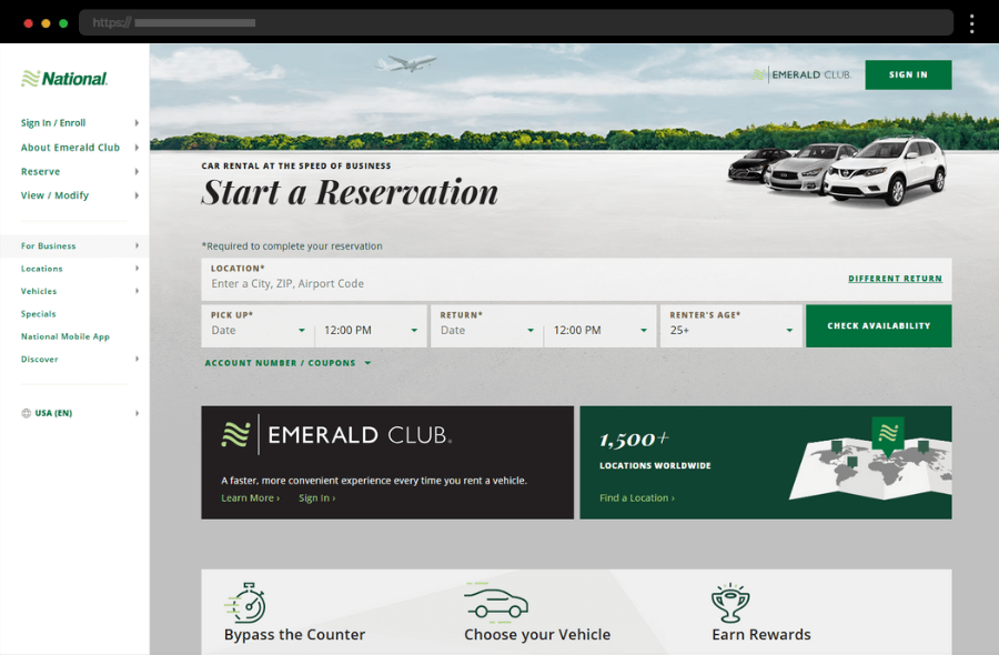
National Car Rental’s website is focused on efficiency and usability, ideal for travelers seeking quick and easy booking options. Its homepage prominently displays a reservation tool, allowing visitors to book a car right from the start. The design is clean and professional, with a green and white color scheme that aligns with the brand’s identity, while the site’s simple, modern layout and sidebar navigation allow customers to access key services and promotions effortlessly. Thus, National Car Rental shows us how to enhance user engagement and satisfaction by seamlessly combining function with brand consistency.
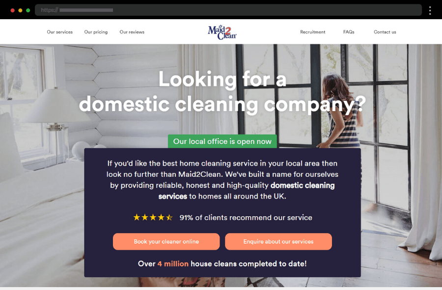
14. Maid 2 Clean, Cleaning company website design example
Maid 2 Clean’s website delivers a welcoming experience, with a clear, service-oriented design that focuses on user convenience. Their homepage showcases CTA buttons to enquire or book a cleaning, thus facilitating users to take action. In addition, the web design uses soft colors and clear typography, contributing to a calm and friendly environment and enhancing the company’s professional appeal. Thus, this website emphasizes simplicity and functionality, ensuring potential clients can quickly find information about services and locations.
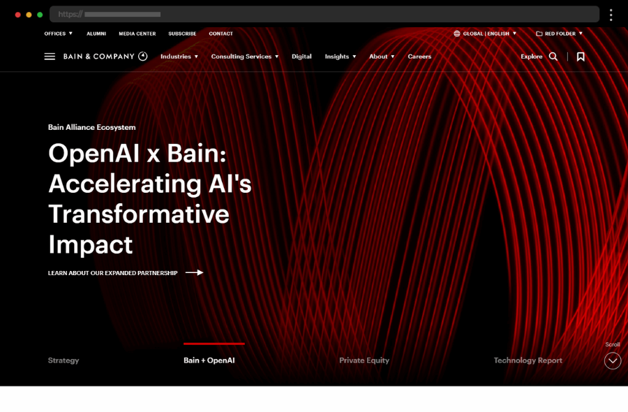
15. Bain & Company, Management consulting firm website design
Bain & Company’s website design stands out for its simplicity and clarity. High-resolution imagery and engaging content reflect Bain’s expertise in management consulting, while straightforward navigation ensures potential clients find relevant information quickly. Thus, this design is one of the top examples of how to create clean, efficient, and highly informative corporate websites.
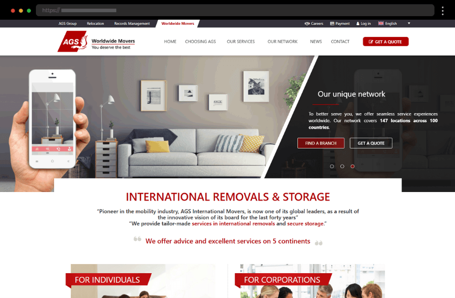
16. AGS Worldwide Movers, Moving company website design
AGS Worldwide Movers’ website provides a user-friendly experience with a welcoming design that reflects its global moving services. Clear CTAs easily guide users whether they want to request quotes or learn more. Further on, with detailed service sections and language options, the site emphasizes its global reach and expertise in relocation. In addition, high-quality images and a straightforward layout enhance the site’s appeal, enriching the user experience for potential clients worldwide.
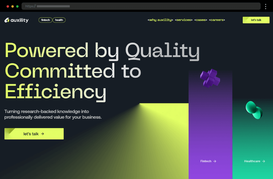
17. Auxility, Software development company website design
Auxility’s bright and welcoming website showcases a bold, modern approach, with a clear focus on innovative design. The site emphasizes clarity and simplicity, with a responsive design and clear CTA buttons that lead to their services, thus creating an accessible experience for any type of user. The bold colors and dynamic imagery make an immediate impression and enhance engagement, thus showing how well-thought-out website design can convey brand strength.
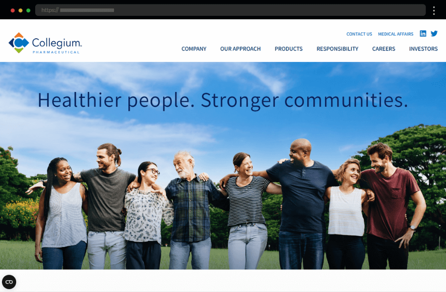
18. Collegium Pharmaceutical, Pharmaceutical company website design
Collegium Pharmaceutical’s website design balances professionalism with clarity, using a muted color palette and clear typography. The home page introduces visitors to the company’s therapies and healthcare services, using structured layouts and minimalistic design. Overall, the site is user-friendly, with clearly defined sections for products, company details, and investor relations, ensuring easy navigation. Collegium’s branding is subtle, emphasizing additionally its focus on innovation and patient-centered solutions.
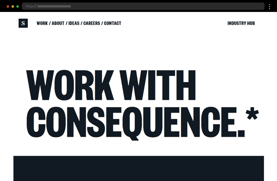
19. Sullivan NYC, Brand management company website design
Sullivan is one of the websites that are an elegant example of how to use striking typography, alternating colors, and beautiful images to draw users in. Their unique storytelling approach enhances the user experience, making it memorable and impactful, especially for an audience seeking brand management agency services. With a focus on creative branding, Sullivan’s site uses bold visuals, many animations, and effects to achieve this highly visual site making it stand out in its industry.
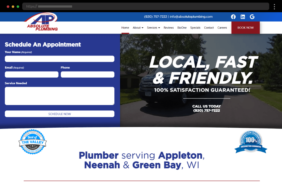
20. Absolute Plumbing, Plumbing company website design
Absolute Plumbing’s corporate website is designed with functionality and ease of use in mind, focusing on delivering critical services to its target audience. The homepage displays prominent CTAs for booking services and contacting the company, thus streamlining the user journey. With a straightforward layout and clear typography, the website effortlessly communicates professionalism and reliability. In addition, testimonials and service overviews build credibility, positioning Absolute Plumbing as a reliable option for plumbing needs.
Tips for creating an outstanding company website design
1. Prioritize Consistent Branding
Your brand image is what sets you apart. Consistent use of colors, typography, and visuals throughout each page will not only maintain a professional look but also strengthen your branding.
2. Focus on Usability and Fast Load Times
A well-designed website should be easy to navigate, with clear page structures and prominent CTA buttons that are easy to spot. Additionally, fast load times keep users engaged and reduce bounce rates.
3. Emphasize Clear and Strategic CTA Buttons
CTA buttons play a key role in converting visitors into leads or clients. They should be strategically placed throughout the website to guide users to desired actions, such as exploring services, booking consultations, or contacting the company directly.
4. Add a Blog Section to Showcase Expertise
A well-maintained blog on a corporate website can be a powerful tool for establishing brand authority. Relevant, quality content can attract potential clients and increase website traffic.
5. Showcase Case Studies or Testimonials
Including case studies, client testimonials, or detailed project descriptions can effectively convey your company’s experience, competence, and trustworthiness to potential clients.
6. Optimize for Mobile and Desktop
A website that is easy to navigate on both mobile and desktop provides a better user experience and exudes professionalism. Optimized web design is not only good for user engagement but also boosts SEO rankings, as mobile-friendly sites rank higher.
7. Invest in High-Quality Visuals
Quality images and videos, paired with clean fonts, can significantly enhance the website’s look and feel, engaging visitors and keeping them on the site longer.
8. Prioritize SEO
A well-optimized corporate website attracts organic traffic, thus building business visibility. So, use target keywords, optimize page titles and descriptions, and keep your content updated and relevant to your industry.
Need help creating your professional company website like this?
We can build it for you→
FAQs
► How can I create a website for my business?
To create a corporate website, begin by defining your business goals, audience, and core message to structure the site effectively. You can hire a professional web design agency, use platforms such as WordPress to do it yourself, or work with freelance designers to bring your vision to life. Regardless of the approach, ensure the design reflects your business and provides value to visitors.
► How much does it cost to design a website for a company?
Shortly, costs vary depending on design complexity, features, and development needs. A simple website can cost a few thousand dollars(usually prices start from around $1,000), while more complex corporate websites can reach higher price points based on custom elements and services. Factors like SEO, custom graphics, and ongoing maintenance also impact costs.
► How do you structure a company website?
A corporate website generally follows a clear structure with key pages: homepage, about, services, blog, contact, and industry-specific pages. Each page should have a clear focus, be easy to navigate, and also include optimized content and images.
And if you need help along the way, our friends at htmlBurger can handle all of this. Get a free quote→
Final words
An effective company website design reflects both the branding and goals of the business, creating first impressions that resonate with potential customers. Whether it’s the design, copywriting, or unique features, a great corporate website connects users with the company’s vision. Taking inspiration from the examples above and keeping in line with the best practices, you can create a website that truly represents your brand, engages visitors, and drives results.
So, we hope you enjoyed our article and found in it the inspiration spark for your next project. But if you’re still looking for that little something to get started, have a look at our other articles full of great design ideas, insights, and tips:
Next steps:
-
Check out these 25 Top Insurance Websites: Cool & Effective Examples Worth Following, or
-
Head over to our complete WordPress Website Examples Hub.


