

As in any other field, for construction businesses, it is essential to make a memorable and lasting first impression. That’s where construction logos come to save the day. They not only represent the brand but also convey professionalism and credibility to clients and give a promise of a high-quality service. In the construction industry winning quickly people’s trust and standing out amongst the competition is crucial. And, the well-designed logo can do just that!
In today’s article, we will explore 24 of the best construction logos, that lay the foundations for brand success. So, let’s start!
1. Blue Ladder Construction
Blue Ladder Construction has come up with a minimalistic but impactful logo. It is based on a black background with the company’s name set in a white straightforward typeface and the lettering arranged in symmetry. The “E” characters are displayed accentuated in blue and without their stems, thus cleverly resembling a blue ladder. With the help of a blue window and a rooftop, the concept looks like a house, hinting at the construction and home repair services offered.
2. Restored Renovations Company
This company, specializing in home restorations and renovations, offers a design right on point. The straightforward concept features the simplistic outlines of a house and the company’s name and tagline. As for the color palette of blue and green, it associates the brand’s image with trust, safety, confidence, and success.
3. Design Build Repeat LTD
This is a logo concept presenting a building construction company. It sports a design guided by symmetry with the lettering aligned in the center, and set in a simple contemporary typeface. The logo’s icon is a creative presentation of a house’s facade, depicted in the style of an architectural sketch. All this combined, makes the overall design look elegant and professional and adds credibility and reliability to the company’s image.
4. Two Brothers Construction Company
This logo example is a personification of elegance. Minimalistic and sophisticated, it instantly catches the eye with its black and gold color combination and the overall design’s impact. The imagery depicts the outlines of two similar roofs with a window each, thus reflecting the company’s name and services. In addition, the simplistic typefaces complete the logo’s clean design, making it a perfect example of a modern construction logo.
5. ABC Construction Company
This logo’s image shows an abstract depiction of a house in a blueprint style, with half of it appearing as in a vertical section with the masonry showing, and the other half looking like a facade silhouette. In addition, the straightforward typeface of the text and the overall combination of blue and grey strengthen the company’s image as solid and trustworthy, offering professional and reliable services.
6. Heights At Cashes Valley – Construction Services
This example is a modern take on construction services presentations. The design’s icon features three triangular shapes, whose outlines form a group of hills, thus resonating with the brand’s name. Moreover, it also resembles the silhouette of three roofs, hinting at the company’s essence of work. The neat, all-capitals, sans-serif logotype adds to the modern look and ensures a versatile and sustainable design.
7. J&T Construction Logo Design
The J&T construction logo sports a very creative icon – it is formed like a double T beam when looked at the front. The symbol is composed of a single element with its mirrored vertically and horizontally copy, thus creating one modern monogram, representing the letters ‘J’ and ‘T’. This practical and clever construction logo is made whole by the customized lettering, finishing the design’s contemporary appearance.
8. Averox Construction Logo
Though it uses as an icon just a single shape with its dropped shadow, this logo creates an instant reference to constructions and building services with its sharp, 3-dimensional look. The text looks neat in a sans-serif typography, one bold and strong, and the other subtle and concise. Designed this way the logotype radiates professionalism, competence, strength, and reliability.
9. SUX Construction Logo Concept
This example features an icon that straightforwardly resembles a part of a masonry wall and looks like a cube in a perspective view. There’s even a deeper idea, as the lines, the masonry joints, form the letters ‘S’ at the cube’s upper part and ‘C’ in its bottom one, thus standing as the company’s name initials. Meanwhile, the logotype adds to the modern look of the brand, as the red color depicts their passion and energy for their work.
10. Dixon Crafted Homes
Presenting a woodworker’s business, this beautiful carpenter services logo is going for a vintage look, one that suits the work’s essence better. The concept elements are centrally aligned, with the detailed drawing-like image of a carpenter being visually balanced by the extra-large font of the company’s name and the secondary texts. All the logo elements being executed in a single color of graphite gray make the whole design look like pencil art.
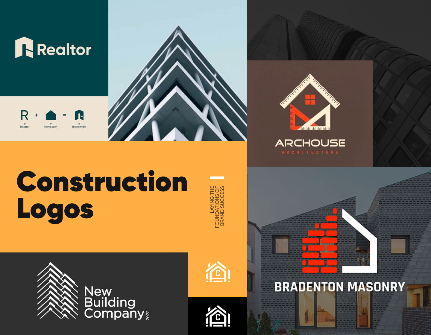
11. Archouse Architecture
This construction logo example has a straightforward yet catchy icon, depicting a house composed of different rulers and a stylized window. While it instantly communicates the company’s field of work, the modern-looking logotype adds even more to the brand’s professional image. The overall design, along with the color scheme, makes the architectural bureau seem credible, original, and enthusiastic.
12. Square Angle Siding & Construction
The Square Angle Siding and Construction company’s logo has an icon abstractly depicting a building by composing its image out of construction and measuring tools. In addition, the solid, bold typeface works towards a professional and credible brand image. And, the finishing touches coming from the color palette evoke optimism, originality, knowledge, and trust.
13. Anderson Pro Builders

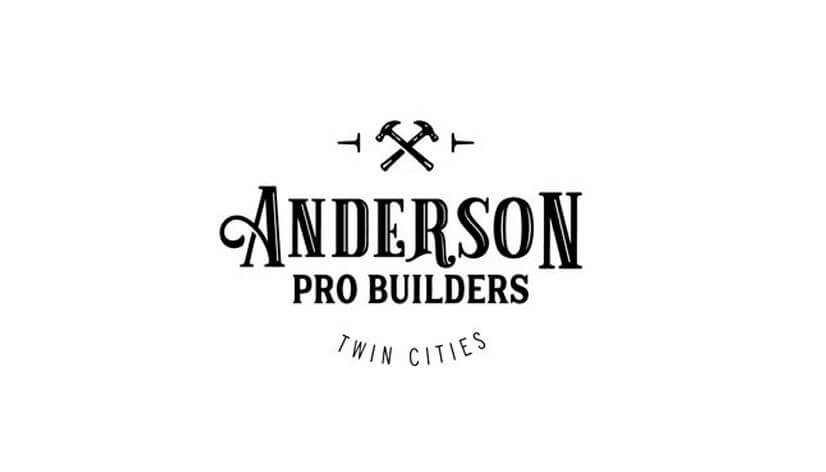
This design looks so classy and vintage! Centered around the beautifully displayed company name, it features also two informative complementing texts with simpler fonts. The logo’s icon is plain yet memorable, depicting two crossed hammers and two nails, and it also serves as an example of the power of simplicity. In general, the concept radiates professionalism and credibility, whilst evoking a sense of tradition and mastery.
14. Realtor Construction Logo
This example represents a company that builds and sells real estate property. The logo has a creatively formed icon, that merges the shapes of a home silhouette and the letter ‘R’, resulting in a memorable brand mark. Choosing this combination of dark peacock blue and beige, adds elegance to the design, while the plain typeface brings approachability and trustworthiness to it.
15. MUUK Building Group
As a company specializing in construction and remodeling projects, MUUK uses a very creative logo. Their icon smartly represents the company’s services and name, being abstractly composed of its first letter and a steel cable structure of a bridge. In addition, the bold and straightforward text along with the other logo elements reinforces the brand’s appearance as confident, strong, and professional.
16. ADHA Construction Logo
The logo idea for ADHA Construction certainly looks elegant and impressive. It features an icon depicting the silhouette of a modern building designed in deconstructivism. The simple, classic, all-uppercase typeface gives an approachable yet professional look, strengthening the brand’s credibility, as the chosen golden gradient adds a touch of luxury, hinting at extraordinary services.
17. Bradenton Masonry Build

The Bradenton Masonry logo smartly depicts a house with its icon design split in two – half the house being displayed with brick-like masonry elements and the other with a thick, solid outline. Also, with the featuring of a sans-serif bold but neat lettering, the design works towards building a contemporary, competent, and trustworthy company image.
18. Chantelle Sells Houses Company
Here we have another example of a creative construction logo symbol. The icon is composed to look like a house’s vertical section blueprint with the brand’s initial inside, but the clever approach to its design is what steals the show. Also, the modern customized font gives the text a contemporary and innovative look, hinting at the company’s adaptability and reliable solutions.
19. Building Services Logo
This building services logo is made to present a house construction and interior design company. The concept is inspired by the Ionic order in Ancient Greece’s architecture and with its shield-like shape it looks like an old-time family crest, achieving a traditional and competent look. By choosing a monochrome black design on a soft background, the idea carries an elegant and luxurious look, adding to the company’s promise of exceptional services.
20. Bell Construction & Design LLC
With its logo design Bell company certainly solidifies the principles of its slogan statement, for the design’s icon follows them just right. Integrating a rooftop and a window in designing the letter ‘B’ results in a stylish symbol, successfully presenting the brand’s initial and the scope of services provided. In addition, the text is set in a plain, sans-serif typeface, looking neat, straightforward, and professional.
21. Haven CMG Construction Logo
This logo idea is so minimalistic and yet so impressive. The icon’s design is centered around the letter ‘H’ depicted with the help of cubic shapes, altogether reminding the form of a construction element. With the deep contrast, the symbol looks bold and strong. And, in general, the overall design stands trustworthy and powerful, evoking feelings of reliability, safety, and confidence.
22. Homely Home Building
The Homely logo follows a pretty straightforward design idea. It features an icon that is the result of combining the shape of a house with the form of the lowercase letter ‘h’. Minimalistic yet effective it presents the brand’s name in a conventional typeface. All this, along with the chosen blue color gradient adds approachability, trust, and professionalism to the brand’s image.
23. Hataka Construction Logo Design

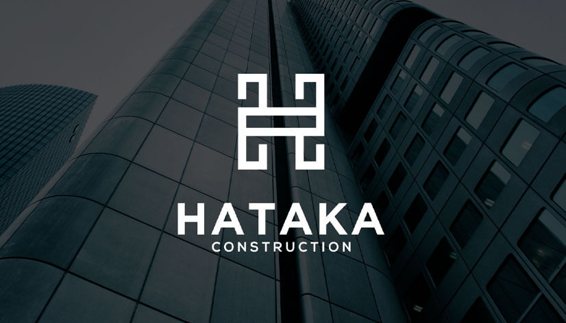
This logo appears bold and authoritative thanks to its white-only design and the bold lines and fonts in which the elements are executed. The logo’s icon, evoking unity and strength, resembles both the letter ‘H’ and a construction element. As a result, the logo is both memorable and professional, projecting an image of quality and reliability.
24. New Building Company
The New Building Company logo perfectly does its job of presenting the brand as professional, credible, and of high quality. The icon consists of lines and shapes composing the sketched image of a high building seen in a perspective view. And, in addition, the straightforward logotype is in synchrony with the overall design adding balance and completing the concept.
Tips on creating impressive construction logos
- Go for a simplistic but memorable design. Your logo should be easily readable and recognizable. Focus on clean lines and basic shapes that convey the essence of the construction industry.
- Never forget that colors play a significant role in logo design. So, when designing construction logos, use colors like blue, black, gray, and yellow to associate with strength, reliability, and safety.
- Incorporate symbols that are directly related to construction, such as house silhouettes, tools, buildings, or structures. These elements instantly communicate the nature of your business.
- The font you choose should reflect the professionalism and solidity of the construction industry. Bold and solid fonts work well to achieve this. Just remember that the text should be legible in various scales.
- Your logo should be versatile and look good in different formats and sizes. That’s why you have to make sure you go for a more stylized design to maintain clarity. You can also test the logo in both color and black-and-white versions to ensure it maintains its impact.
Final Words
In the competitive construction market, a well-crafted logo can certainly enhance your company’s image and contribute to its success. The right design is the one that presents the brand as professional, trustworthy, and knowledgeable. You must find an idea that resonates with your target audience and accurately represents your company. In short, effective construction logos are key to establishing a strong brand identity in this industry.
So, now that you have fueled your inspiration the only thing left is to go build the perfect logo for your brand’s strong foundations!
If you liked this article, you may also enjoy our other inspirational logo collections: