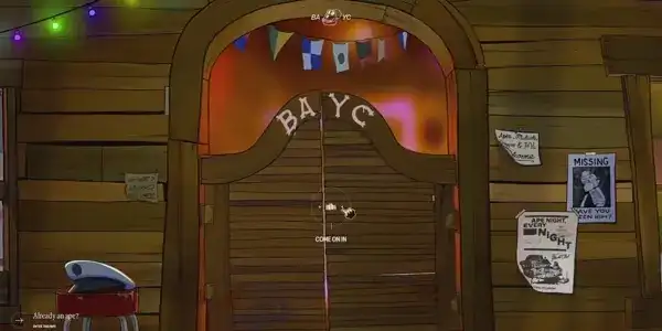
We can all agree that a creative, functional website is key to catching people’s attention and leaving a lasting impression of your brand. With thousands of sites out there competing for clicks, only the boldest and most unique designs truly stand out. From immersive storytelling to sleek, minimalist layouts, these examples are packed with ideas to spark your imagination and take your web design project to the next level.
In this article, we’re diving into 20 creative website designs that push the limits of both style and usability. Without further ado, let’s start!
1. Pebble – Creative Parallax Website Design
Pebble Flow is an all-electric travel trailer that aims to provide an iPhone-like experience for RV enthusiasts.
This web design effectively targets tech-savvy and eco-conscious consumers. Their website features a stylish design that highlights the features of their all-electric trailer including its sleek interior design. The layout is clean, with a good balance of visuals and text, showcasing the product’s innovative aspects such as off-grid capabilities and remote control features. The use of large images and minimalistic design elements creates a sense of adventure and freedom.
2. Dior Rouge – Unique Lipstick Webpage Design
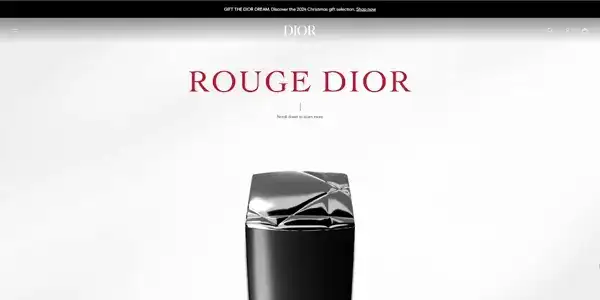
Second on our award-winning list is the site of Dior Rouge UK. This is the iconic line of lipsticks by Dior, known for their rich pigmentation, long-lasting formula, and luxurious packaging.
The website for this fancy lipstick invites visitors to dive into the infamous Rouge Dior collection. It shows off the luxurious colors, textures, and finishes, highlighting how Rouge Dior is all about enhancing natural beauty. The layout is engaging, with a fun visual storytelling vibe that lets users explore the different shades and the artistry behind the products. Plus, it shows the brand’s commitment to quality and sustainability in their makeup lineup.
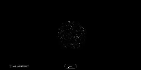
3. What is missing – Unique Ecological Website
The “What is Missing?” project by Maya Lin is an environmental memorial focused on biodiversity loss and ecological conservation. Through interactive storytelling, art, and data, it aims to educate about extinct species, endangered habitats, and possible ways to protect nature.
Check out the website for a reflective and inspiring experience! It has a beautifully thoughtful and calming design, perfectly fitting its mission of remembering lost ecosystems and highlighting ways to protect nature. The earthy tones, soft visuals, and interactive elements draw you in, inviting you to explore stories of environmental changes over time. The layout makes discovering solutions and reflecting on nature’s past and future feel personal and meaningful. Also, it encourages public participation by inviting users to share personal stories and explore conservation actions.
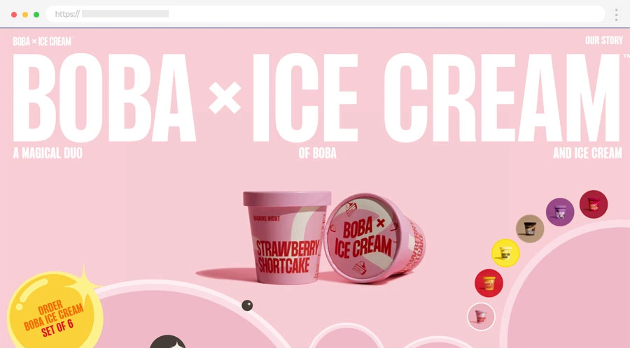
4. Boba x Ice Cream – Cute Sweets Website
Boba x Ice Cream is a brand that creatively combines ice cream with the chewy texture of boba pearls, offering unique, Asian-inspired flavors. Their product range includes enticing options like Strawberry Shortcake and Mango Chamoy, each designed to provide an innovative twist on traditional ice cream.
Check out their website! It boasts a vibrant and engaging design showcasing unique products that combine ice cream with boba. The colorful images display the various ice cream flavors, along with playful and catchy descriptions that emphasize the fusion of boba and ice cream. The user-friendly layout allows for easy navigation to browse flavors, explore ordering options, and access brand information. Overall, the design captures the fun and innovative spirit of the brand, making it appealing to a youthful audience.
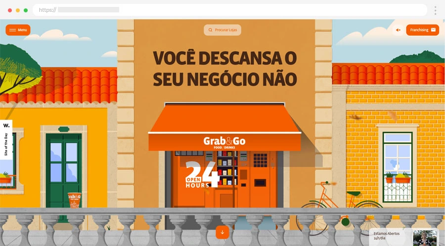
5. Grab & Go – Great Illustrated Website Design
Grab&Go is a Portuguese company offering automated retail stores that operate 24/7, allowing customers to quickly shop for a wide range of products without staff assistance.
This brand presents a perfect example of how an award-winning site should look and feel. It is inviting and easy to navigate, making it a breeze for visitors to explore what they offer. With a fun and clean design, the website showcases their 24/7 service and a wide range of products. The visuals stand out and the layout feels fresh and modern, making you want to check out their automatic stores. Plus, it emphasizes their commitment to convenience and support for franchisees, which is a nice touch. Overall, it’s a vibrant and user-friendly site that perfectly reflects their brand vibe.
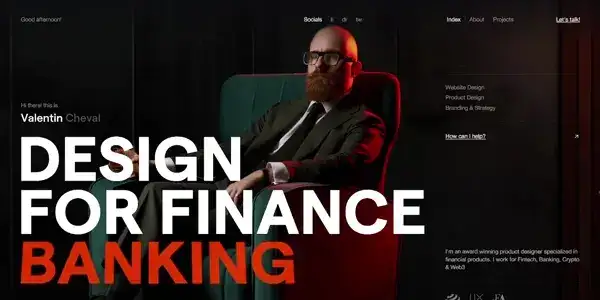
6. Valentin Cheval – 3D Background Website
Another captivating website is the Valentin Cheval’s. He showcases his work as a UX/UI and brand design leader specializing in fintech, crypto, and Web3 projects. His portfolio highlights his expertise in creating intuitive, user-centered designs for financial products, combining design thinking with strategic brand development.
Let’s dive into his website! 🎉 First off, it’s sleek and stylish, and if websites could wear designer outfits, this one would be strutting down the runway! The color scheme is fresh and modern, and the layout is user-friendly, making it feel like a breeze to explore.
We like the way he showcases his work with some cool visuals, making it not just informative but also engaging. Plus, the friendly vibe in his writing really pulls you in. Overall, it’s a fantastic blend of creativity and professionalism!
7. Hoarding Disorder – Awesome Abstract Website
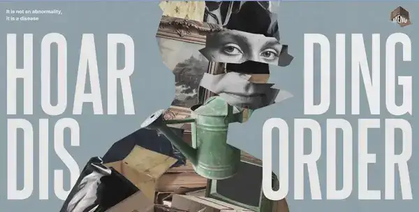
The website “What is Hoarding?” provides an overview of hoarding disorder, explaining its symptoms, underlying causes, and available treatment options. It offers resources for individuals affected by hoarding, as well as guidance for family members on how to support loved ones with the disorder.
The website has a nice, simple design with clear sections that guide you through everything you need to know about the disorder. The used typography is on point – it keeps the focus of the visitor on the important text. We enjoy the visuals which are friendly and make the information more engaging without being too heavy. In general, it strikes a great balance between being informative and approachable, making a serious topic a lot easier to understand.
8. Kriss AI – Interactive 3D Website Design
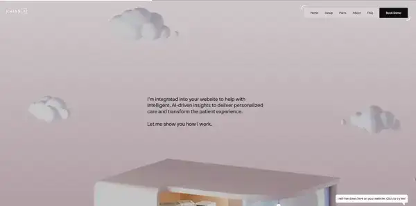
Kriss.ai is an artificial intelligence chatbot platform for doctors, dentists, healthcare professionals, healthcare insurance agents, etc. It integrates into websites to help with intelligent, AI-driven insights to deliver personalized care and transform the patient experience.
Kriss.ai is a fun, user-friendly site that really showcases what they’re all about. It has a really sleek and modern vibe. We like how it uses bold visuals and bright colors to keep things engaging without being overwhelming. The FAQ page is useful for visitors who would like to learn more about the chatbot. The interactive hotspot map with different hospital rooms is very creative and unique. We are impressed with every little detail of it – the feature card for each room is a great addition to the already engaging experience.
9. A(i)astrology – Futuristic Astrology Website
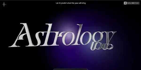
A(i)strology showcases a design project by Jonathan Grindell that uses astrology to predict trends for 2024. This project is intended to inspire other web designers by demonstrating innovative use of themes and layouts.
We have a fantastic website that makes diving into astrology both enjoyable and fun! With captivating visuals and interactive elements, it grabs your attention right from the start. The bright, vibrant design perfectly captures the astrology theme, inviting you to scroll down and explore more. This encourages an engaging experience as you uncover astrological insights, making the whole journey interactive and exciting. Check it out for yourself and see how design enhances your understanding of astrology!
10. Language Inclusion – Google Research Website
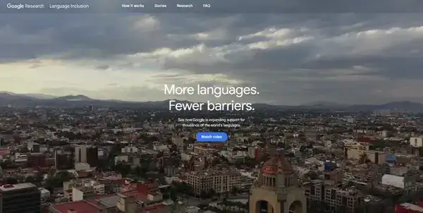
The Language Inclusion website showcases how Google is working to improve support for multiple languages in its products, especially with Gboard, the Google Keyboard. They’re focusing on integrating over 900 different languages and 70 writing systems, making it easier for people to communicate in their preferred languages. This effort highlights Google’s commitment to helping everyone connect, no matter what language they speak.
The Google Languages website is something worth checking out. It has a clean and colorful design that makes learning about language inclusion feel fun and engaging. The layout is user-friendly, so you can easily navigate through the different sections. The information is presented in an accessible way, with eye-catching visuals that draw you in. Overall, it’s a friendly and inviting site that makes exploring the world of languages feel exciting!

11. Mon Top Netflix – Interactive Movie Website
Mon Top Netflix is a great website as it allows users to create and share their personal rankings of Netflix shows and movies. It offers a platform for discovering content through user-generated lists, making it easy to find recommendations based on various genres and themes.
The Mon Top Netflix feels like a community of movie lovers sharing their favorites, making it a great spot to get inspired for your next Netflix night! 🎉 The website has a vibrant and playful design that makes exploring Netflix recommendations fun. The layout is simple and easy to navigate, which is perfect for finding your next binge-watch. We like the bright visuals and catchy titles that pull you in right away.
12. Panelki Nostalgia – Creative History Architecture Website
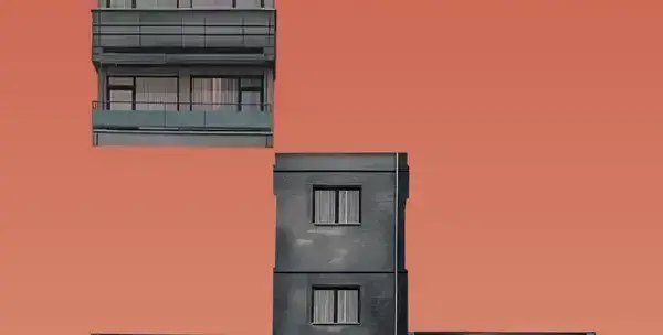
The Panelki Nostalgia website is a fascinating trip down memory lane, celebrating the charm and history of Soviet-era panel buildings. It focuses on the cultural and historical significance of panel buildings, advocating for their preservation rather than demolition. It emphasizes the cost-effectiveness and environmental benefits of remodeling these structures, which are increasingly recognized as architectural monuments in places like Germany.
The website design captures a nostalgic vibe with vintage-inspired visuals and thoughtful content that explores the architectural and cultural significance of these structures. The layout is simple yet effective, encouraging you to dig deeper into the stories behind these iconic buildings. It’s an engaging mix of history, culture, and architecture that makes exploring the world of panel buildings surprisingly fun!
13. Jiddo – Minimalist Tea Brand Website
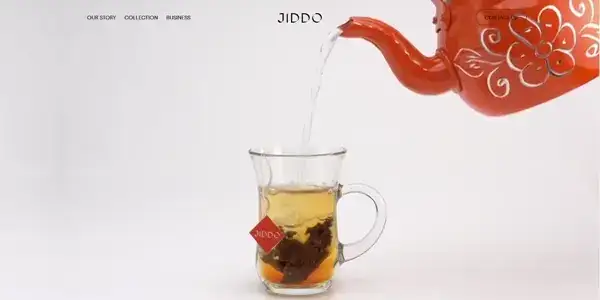
Jiddo is a small business that specializes in a variety of Arabic teas. The brand emphasizes tradition and quality, and its website reflects a focus on community and cultural heritage.
The website has a warm feel that matches the cozy vibe. The design is simple and lets you focus on the beautiful tea blends and their descriptions. We enjoy the scrolling text animations of the features of the tea. The animated image gallery at the bottom of the home page is a nice touch too. It makes you want a cup just scrolling through!
14. THE PROOF – Animated Dry Brush Hair Website
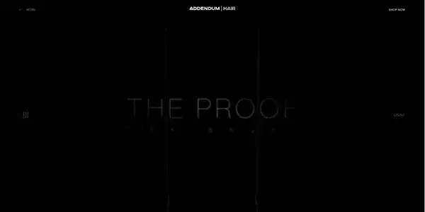
The Proof website promotes a specialized dry brush designed for hair care, combining ethically sourced boar bristles with nylon to enhance hair health. It claims to boost hair growth, improve scalp blood circulation, and evenly distribute natural oils for shinier, stronger hair.
This website is all about luxury and elegance. It has a smooth, minimalistic design that feels high-end, perfect for showcasing their premium hairbrushes. The visuals are polished and inviting, giving you a feel of the quality they promise. Each section is beautifully organized, emphasizing craftsmanship and sustainability with just the right amount of detail. It’s a classy, streamlined site that makes browsing their products a relaxing experience.
15. McDonald’s Collector’s Meal – Fast Food Retro Website
You’ve probably heard of McDonald’s. It’s one of the biggest fast-food chains in the world with over 39,000 restaurants in 100+ different countries.
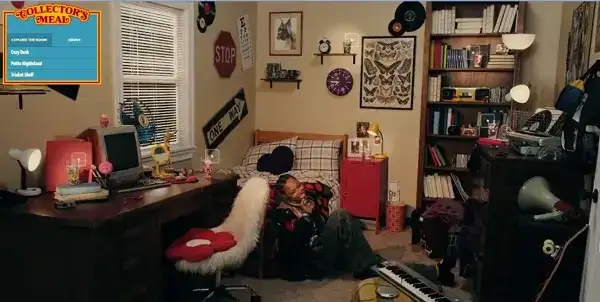
The McDonald’s Collector’s Meal campaign brings a playful twist that makes exploring it a blast. Teaming up with Hypebeast, it uses a cool, unexpected layout that pulls you in to check out the new collector’s edition cups. With interactive VR features, it’s all about making things fun and getting fans excited to hit up the online store for these one-of-a-kind items.
16. Lokal Poster Co. – Animated Art Website
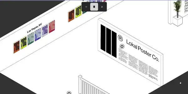
Lokal Poster Co. specializes in creating and selling unique, city-themed posters that celebrate local culture and landmarks. The posters are aimed at those who want to showcase their love for their hometown or celebrate specific locations, combining artistic expression with local pride.
The website features a gallery of art prints, allowing customers to browse and purchase designs that reflect the spirit of their cities. It has a retro, artsy vibe that makes exploring their collection so much fun! The design is clean, with bold visuals and stylish typography that highlight the personality of each city-themed poster. Browsing feels like flipping through an art gallery with pieces that capture a city’s character. It’s simple but packed with charm, perfect for anyone looking to bring a bit of local flair to their walls.
17. HiveTown – Cool Parallax Scroll Website Design
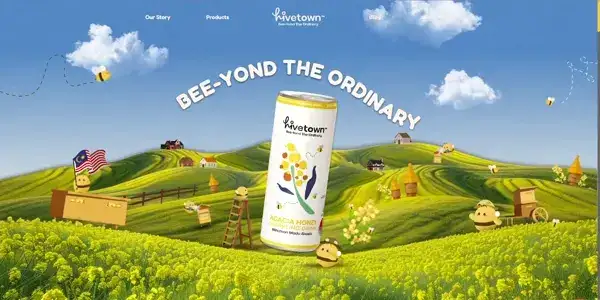
Another award-winning website is of the brand HiveTown. It specializes in crafting beverages made from 100% locally sourced Malaysian honey. Their signature product is a sparkling honey drink, designed to be a healthier alternative to traditional carbonated beverages.
The website has a bright, fresh look that’s all about celebrating natural honey with a modern twist. The design feels like a mix of nature and luxury, with clean sections making it easy to learn about their products. The little bee and honey touches throughout are charming and add a friendly vibe. We enjoy the animated objects showing up when we’re scrolling to the bottom of the home page.
18. Namma Bangalore – Great Cartoon Studio Website
The Liquid Ink Design website showcases the studio’s work in product design, branding, creative direction, and illustration. They focus on creating engaging experiences that blend art and logic, and their portfolio features various projects that highlight their design expertise.
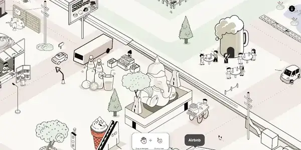
The Namma Bangalore project is an artsy, locally inspired website showcasing an interactive map with illustrations of certain people, iconic eateries, and beautiful places that capture the vibrant spirit of Bangalore. Its modern aesthetics shows the spirit of the city in a fun and engaging way. The design is filled with striking colors, creative fonts, and a local feel that draws you right into the heart of Bangalore.
19. Bowery – Modern Clean Farming Website
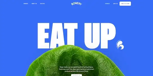
Bowery is an indoor vertical farming company that uses proprietary technology, BoweryOS, to grow fresh produce with minimal resources. Their smart farms operate with 100% renewable energy, use 90% less water than traditional farms, and maximize crop yield through a controlled indoor environment.
Bowery’s dynamic website design is an absolute piece of art. The website is engaging, fun and informative. It highlights its mission to revolutionize farming through indoor vertical agriculture with ease. Key features include an earthy color palette, clean typography, and high-quality visuals showcasing their produce and tech-driven farms.
20. Bored Ape Yacht Club – Illustrated Scene NFT Website
The Bored Ape Yacht Club (BAYC) website serves as the official hub for the popular NFT collection featuring unique digital art of cartoon apes. It provides information about the project, including membership benefits, community events, and upcoming initiatives.
Visitor’s eyes are drawn to the gritty, clubhouse feel with bold graphics and a mysterious edge that fits perfectly with the NFT scene. The design is stylish and to the point, making you feel like you’re entering a members-only world of rare digital art. The layout is simple yet striking, showcasing the apes in a way that’s fun and high-energy, just like the brand itself.
Key Features and Tips For a Great Website Design
An effective, creative website isn’t just visually appealing – it provides visitors with a seamless experience and invites them to explore, engages them in your brand’s story, and builds a lasting connection. Here are some essential elements that define outstanding web design and tips to enhance the customer experience.
☑️ Consistent Branding
Every element of the website – from logo placement and color choices to tone of voice—should reflect your brand’s identity consistently. This cohesion builds credibility and helps reinforce brand recognition for returning visitors.
☑️ Storytelling through Design
The design process is essential as great websites guide users through a narrative, drawing them into the brand’s world. Whether through a parallax scroll that reveals your brand story or strategically placed content blocks that convey a product’s journey, storytelling fosters a more memorable and meaningful connection with users.
☑️ Matching Color Scheme
Choose a color scheme that aligns with your brand and expresses the right emotions to your audience. Blue, for instance, is calming and often associated with trust, while red conveys excitement or urgency. Use tools like Adobe Color or Coolors to experiment with color palettes and ensure that your text is always readable against your chosen background.
☑️ Unique Typography and Captivating Visuals
Visuals and fonts define a brand’s personality. Using distinct, custom typography and high-quality images or illustrations can set your site apart and make it instantly recognizable. Choose visuals and fonts that reflect your brand’s voice and style, ensuring consistency across all pages.
☑️ Interactive Elements
Interactive websites just stand out and go beyond simple visuals. Including features like hover effects, sliders, or animated icons increases user engagement and makes users feel more connected to the site. Just remember to balance; interactions should enhance the experience, not overwhelm or slow down the site.
☑️ User-Centric Navigation
Prioritize intuitive navigation by structuring content so users can easily locate key information. A clear, predictable menu layout with concise labels helps users feel at ease, while breadcrumb trails and dropdown menus make larger sites easier to navigate. Aim for navigation that lets users find precisely what they need within three clicks.
☑️ Clear Call-to-Action Buttons
Use CTAs strategically to guide users towards specific actions—whether that’s signing up, making a purchase, or learning more. Make sure CTAs are easy to spot but not intrusive, and use action-oriented language to drive engagement. A well-placed CTA in a contrasting color can make all the difference in conversions.
☑️ Responsive Design
Responsive design is now a must-have for reaching and retaining a broad audience as mobile browsing continues to grow. Your design must function perfectly across desktops, tablets, and mobile devices. Use scalable images, flexible grid layouts, and touch-friendly elements to adapt content seamlessly across devices.
☑️ Accessible Design
Ensure your site is accessible to all users, including those with disabilities. Use alt text for images, color contrast for readability, and keyboard-friendly navigation to create an inclusive user experience. Accessible design isn’t just a best practice; it widens your audience reach and shows social responsibility.
☑️ Fast Loading Times
Speed is crucial for user experience and SEO. Compress images, reduce HTTP requests, and use optimized code to minimize load times. Users tend to abandon sites that take longer than three seconds to load, so a fast-loading site not only improves user experience but also helps retain visitors and reduce bounce rates.
☑️ Data-Driven Design Choices
Analyze user behavior through tools like Google Analytics or Hotjar to see how visitors interact with your site. Knowing where users spend the most time or where they drop off allows you to make informed design adjustments that optimize user experience over time.
These features and tips are the foundation of an impactful, memorable web design. Incorporate these elements thoughtfully, and you’ll be well on your way to creating a site that not only looks great but also helps providing users with a seamless, engaging user experience.
Frequently Asked Questions
❓ What are the main elements of a creative website?
A creative website often includes an intuitive layout, compelling visuals, digital design elements, and a unique brand voice. These elements work together to engage users, enhance usability, and leave a lasting impression.
❓ How can I make my website stand out without cluttering the design?
Simplicity is key. Use a clean design that includes only essential elements, and focus on high-quality images, easy navigation, and unique features like animations or interactive sections to create visual interest without overwhelming users.
❓ Is it necessary to include animations on a creative website?
While animations can enhance engagement, they aren’t necessary for every website. Focus on your brand’s style and audience needs; sometimes, subtle animations are enough to bring the site to life without distracting from the main content.
❓ How do responsive designs impact user experience?
Responsive designs ensure that your website functions smoothly on various devices. This accessibility improves user experience by allowing people to interact with your site across desktops, tablets, and mobile devices, which is crucial in today’s mobile-driven world.
❓ What is the best way to approach website color schemes?
Choose colors that align with your brand identity and evoke the desired emotional response. As already mentioned, use color tools that can help you experiment with combinations to find a scheme that complements your site’s theme and functionality.
❓ What tools are available for designing my website?
When you’re looking to design a website, there are plenty of great tools to help you out. If you want something easy to use, website builders like Wix and Squarespace let you create a site without needing to code. On the other hand, WordPress is great if you want more flexibility.
For planning and sketching out your ideas, tools like Figma and Adobe XD are fantastic for making wireframes and prototypes. If you need to whip up some visuals, Photoshop and Canva are perfect for creating custom graphics. Plus, using tools like Google Analytics can help you keep track of how your site is doing.
Overall, there’s a mix of tools to fit whatever style and needs you have for your website.
Need help creating your professional website like this?
We can build it for you→
Final Words
A great website design can elevate your brand and provide users with fantastic experiences. However, achieving this requires a balance between creativity, functionality, and user-centric design. Remember, a creative website is more than just a pretty interface; it’s an experience that tells a story and connects with users on a deeper level.
Furthermore, let some of these best examples inspire you to push boundaries and create something unique. With a well-designed website, you’ll be equipped to attract more visitors, engage them meaningfully, and ultimately establish a strong brand presence online. So, feel free to use these award-winning website design examples and design ideas as inspiration for your current site or next project.
Next steps:
-
Browse a gallery of 40 small business website designs, or
-
Jump right into our complete WordPress Website Examples Hub.


