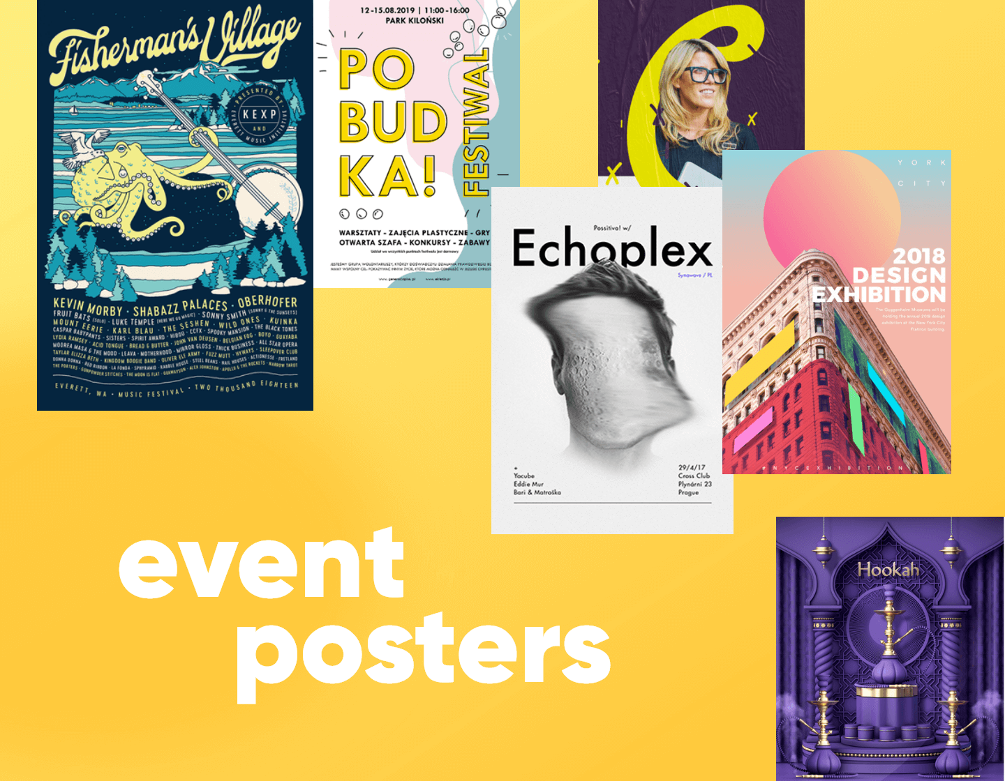
If you want people to know about your event you need to advertise it. Event posters are usually a simple solution. From billboards to Banners, from posters to flyers or invitations. The solution is suitable for everything from a formal business or corporate event to a cool concert or rockin’ party. The trick here is to design the poster in such a way that it will not only attract and inform but more importantly get the right people interested. In today’s gallery guide, I’ve collected the best examples I could find that could help you start 2020 off with a bang of inspiration.
Party Event Posters
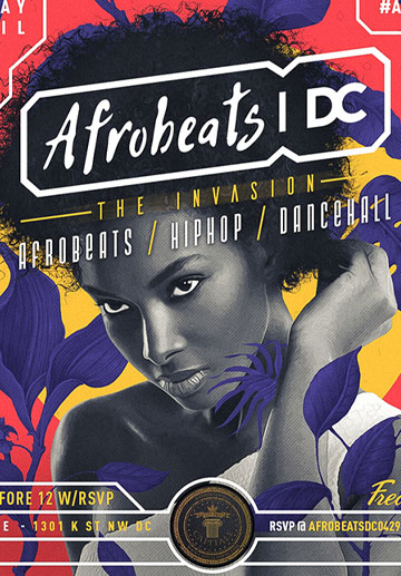
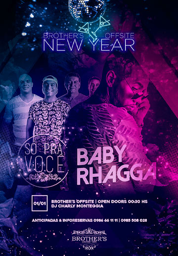
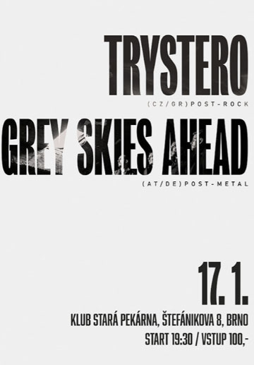
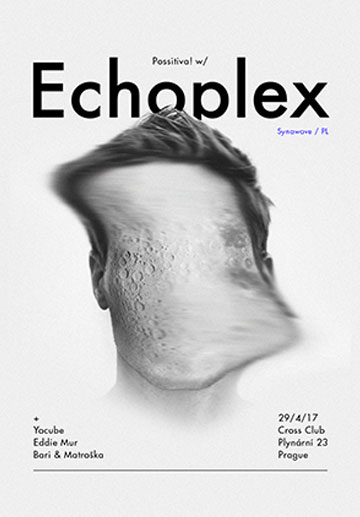
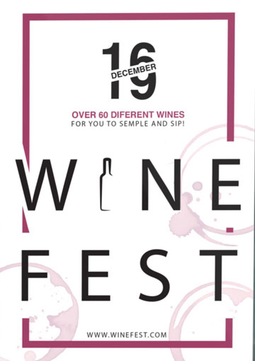
This collection of party posters varies in design, color, and style, same as the parties themselves. However, they all have a certain thing in common when you see them: you know what you are getting and you want to be there! Retro beach party with retro fonts; Fred Events that scream afrobeat through color and imagery, Trystero with minimalistic simplicity – we could go on. You will notice the design doesn’t distract from the key information, it completes it.
Festival, Fair and Concert Posters
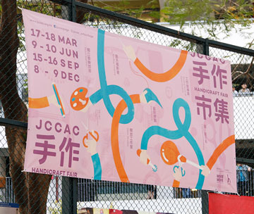
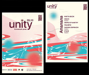
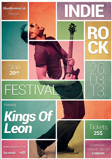
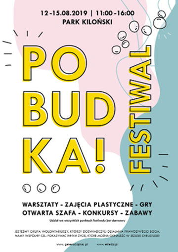
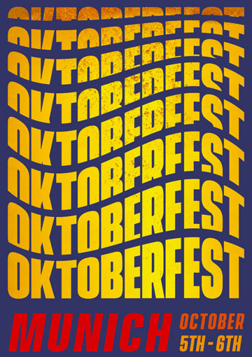
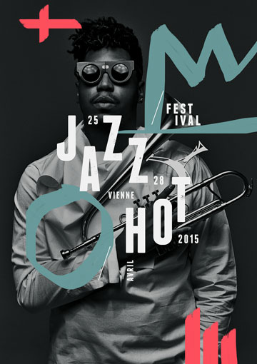
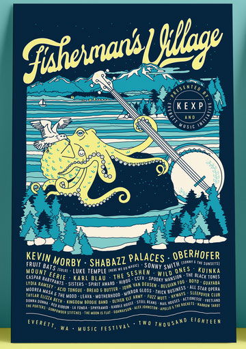
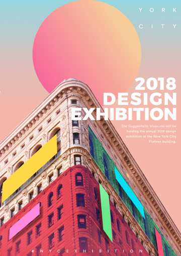
These fine poster examples sell more than an event; they create a brand. The posters are lasting images with great use of color, fonts, design motifs, and photos to stick in your memory and grab your interest. Job done!
Conference Posters
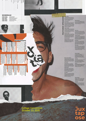
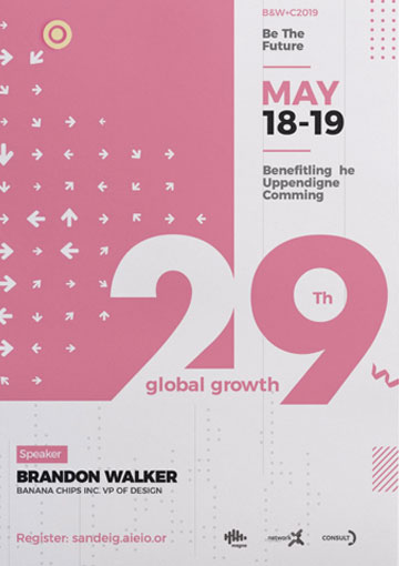
Here are some great examples of how your conference poster can stand out from the pack. They aim to attract people who are familiar with the subject, so let’s fully immerse ourselves in it. If you want to attend a conference about collaging and typography, the first poster shows you we know what we are talking about.
Film Festival Event Posters
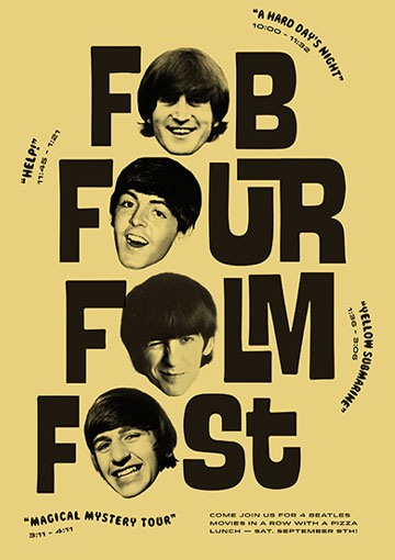
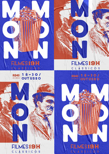
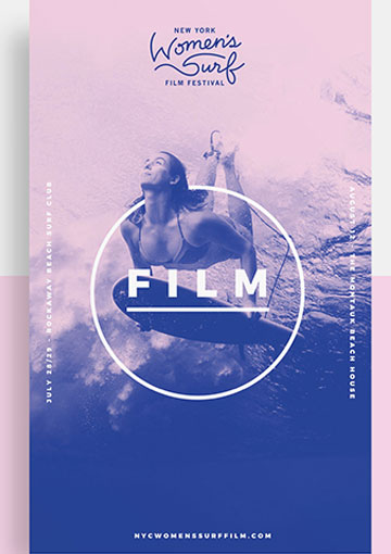
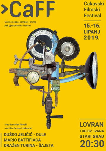
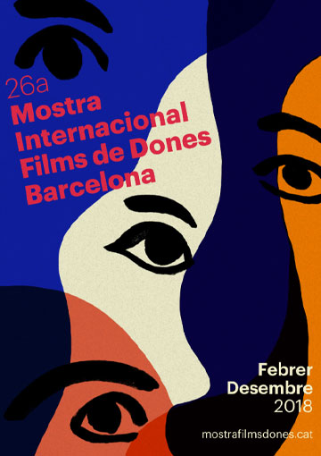
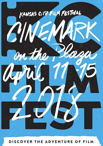
A film festival poster is a chance to get creative and these examples do just that in so many different ways. The purpose again is to attract film lovers, art lovers, culture vultures. The best examples use classic techniques to relate the festival to the audience. Mon’s combines images of popcorn, camera and Chaplin on an eyecatching orange/blue/white theme. Byron Bay centres on a camera graphic icon and uses icon images to set the physical scene of the festival, again with minimal use of colour. Mostra Internacional relates the film to Art by using abstract Picasso like images and colours.
Other Examples of Event Posters
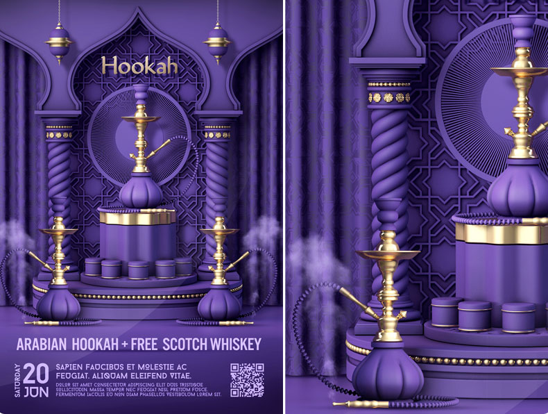
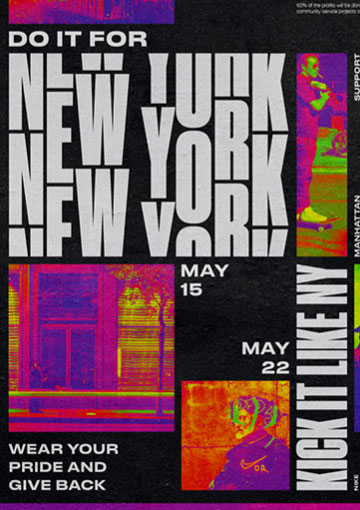
Here’s Nike’s dynamic New York campaign with contrasting minimal monochrome with loud, garish images and demanding attention. Subtle pastels of the Night Market Event leave a feeling of comfort, while the Arabian hookah uses tones of gorgeous purple and gold to create a rich and exotic surprise. Sip-N-Stitch event poster encompasses the hand-made theme with illustrations and hand-written style fonts. Different design for different occasion.
Final Words
In conclusion, event posters are more than adverts. They reflect your image, tone, and concept. Time and effort spent creating something effective and genuinely thoughtful are not time wasted. It reflects the time, effort, and thought put into the event itself. It’s often your first point of contact with your potential audience, so make it count.
While you’re on the topic of advertising events, why not also check out these articles:


