As in every other branding design, fishing logos play an important role in establishing the presence of organizations and businesses related to fishing. Whether crafted for stores selling fishing gear and apparel, or for representing fishing clubs and activities, a well-designed logo can create a memorable visual identity and attract customers, or club members.
So, in today’s article, we will explore 19 fishing logo examples that leave a lasting impression and show how it’s done. Let’s start!
1. Colorful Fishing Logo Example
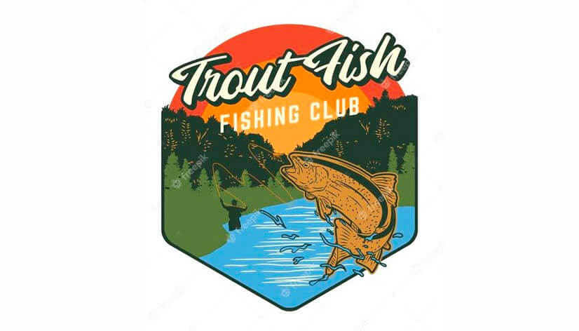
The “Trout Fish Fishing Club” logo features a bold, cursive logotype and a vibrant color scheme. Further, the orange sunset, green trees, and blue water evoke a natural, inviting atmosphere. On focus is a leaping trout caught by a fisherman in the background symbolizing the action and excitement of catching fish. And, in addition, the badge-like frame effectively hints at the club’s traditions in trout fishing and outdoor adventure.
2. Minimal Fish Logo Idea
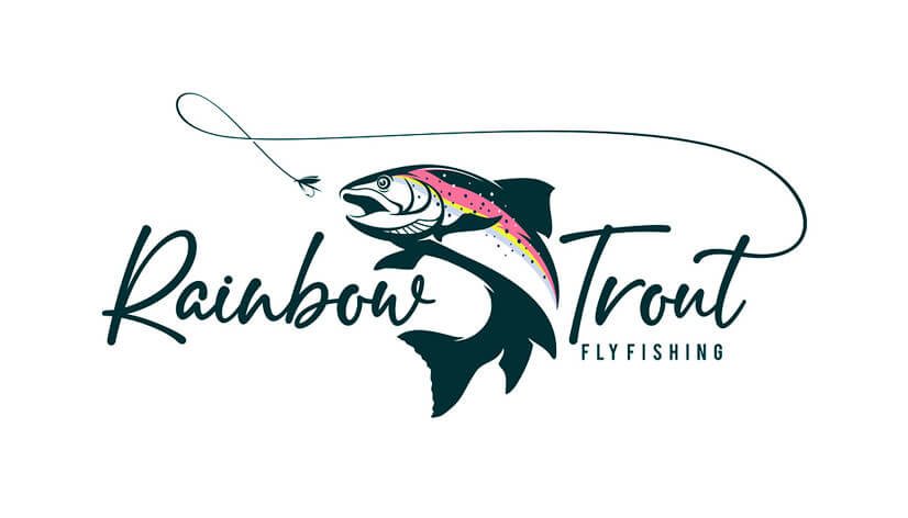
This eye-catching logo features a stylized image of a rainbow trout with a touch of pink, yellow, and purple. It’s shown in motion going for a fishing line starting from one of the letters and elegantly looping around the design. In addition, the typography balances creativity and clarity by combining a cursive font with a more straightforward, sans-serif one. Overall, the logo effectively communicates the adventure of fly fishing.
3. Modern Fishing Logo Design
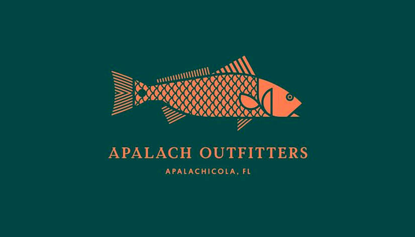
Following the fishing theme, the logo features an orange fish on a dark aquatic green background. The featured text is displayed plainly and prominently, indicating the club’s name and location. The stylized, geometrical portrayal of the fish along with the overall clean and straightforward design suggest professionalism and focus on the outdoor activity.
4. Blue Fishing Logo Example
The next logo speaks right from the start with its deep blue, circle design. Featuring a detailed illustration of a fish and a ship at sea, this logo combines realism with artistic creativity. With the way the fish has jumped in the center, the icon even resembles the Yin and Yang theme, adding balance to the overall feeling. And while it truly works well in emphasizing the brand’s traditions and craftsmanship, the little details might not be as visible in smaller sizes.
5. Black and White Fishing Logo
This monochrome logo example looks so stylish and inviting. It uses a bold, strong typeface, evoking stability and on the other hand the image’s details and dynamic lines suggest motion. The design helps for quick recognition and, in addition, the limited color palette improves its versatility. As a result, the overall logo concept effectively communicates the club’s passion and traditions in fishing.
6. Fishing Logo Illustration Design
This attention-grabbing illustrated logo design for fishing trips is so visually appealing. For instance, the literal interpretation of the business through the illustration of the two people riding a fish, adds fun and playfulness to the design. Positioned in a circle, the image is balanced by the text displayed diagonally in catchy typefaces, even including a hook as one of the letters.
7. Minimalist Fishing Logo Idea
With its elegant color combination and simple yet memorable design, this logo is another great example. The icon it features is of a playful dotted fish in motion with exaggerated features. And, displaying the logotype centered right below it in this well-thought-out combination of typefaces makes it well-composed and easy to read.
8. Clean Simple Fishing Logo
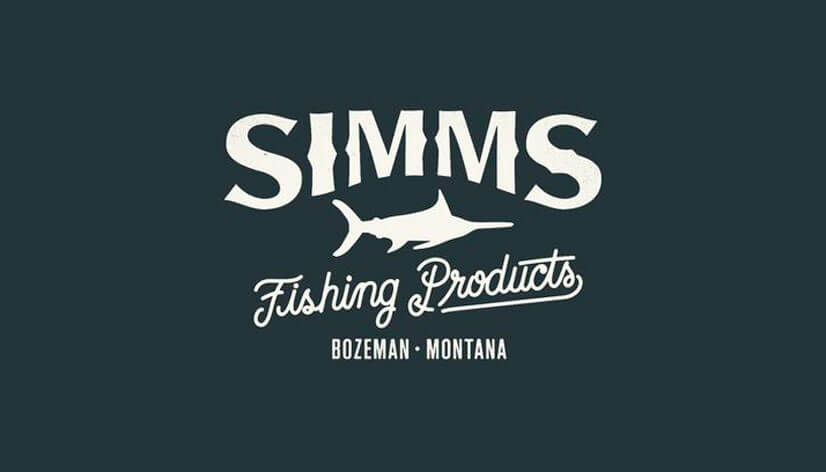
Our next example is a vintage-style logo with a fish silhouette icon. The large, bold typeface used for the company’s name stands strong while being nicely complemented by the smaller descriptive cursive one below. Overall, this logo design concept is suitable for any size and use and also bears a classical feel suitable for brands with traditions.
9. Fishing Logo Circle Example
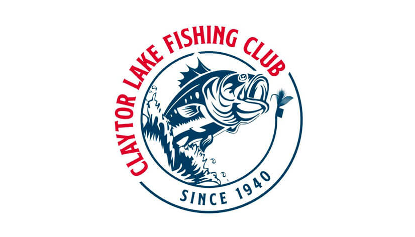
Claytor Lake Fishing Club’s logo quickly and easily communicates the club’s essence, location, and establishment. It features a highly decorative fish icon in motion, which is about to take the bait. The rotating “fishing line” border encircling the image gives it a stamp-like appearance, which along with the visually appealing color combination associates the design with tradition and style.
10. Vintage Fishing Club Logo Example
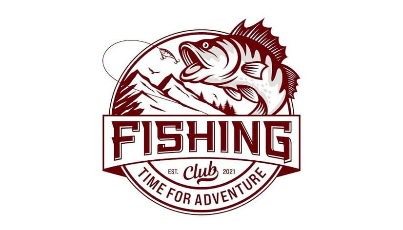
Also embracing a round shape is the next fishing club logo example, which features a leaping fish going for the bait on the hook. The dynamic years-old emblem-like composition perfectly complements the traditional positioning and style of the texts. And, as a result, it certainly draws attention and pleases the eye. The overall design evokes a sense of action and energy highlighting the adventure-loving club.
11. Creative Fishing Logo Idea
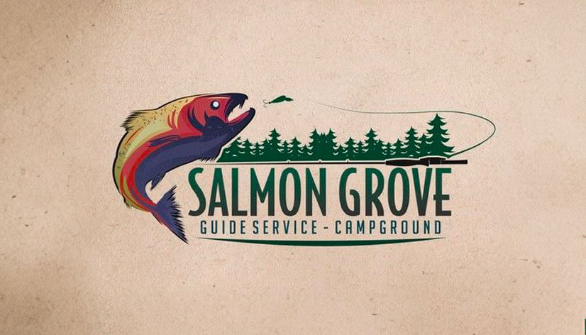
The first thing, grabbing the attention in this logo example, is the detailed depiction of the colorful river salmon. It looks like the fish is going for the bait, coming from the smoothly featured horizontal fishing pole that visually outlines the riverside with the coniferous trees. On the other hand, to balance the decorative design, the logotype is displayed in a sleek slightly elongated typeface with a modern look.
12. Professional Fishing Logo Design
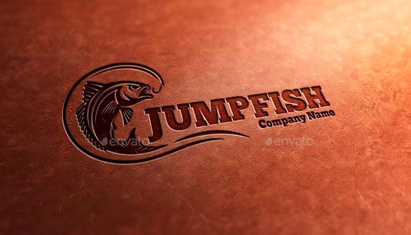
This fishing logo is certainly very well executed, looking modern and stylish. The detailed fish is depicted in motion and with a fierce expression as it will fight the hook and not be caught by it. Further, the fishing line element and the additional curves encircling the fish form a wave, adding dynamic to the design. In addition, the logo’s simplicity ensures it is adaptable to different sizes and uses.
13. Abstract Fishing Logo Example
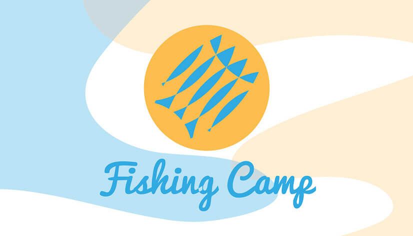
The playful logo you see is created to present a children’s fishing camp and it fits its purpose perfectly. What makes the design so engaging for kids, firstly is the color combination with its bright colors reminding of sun, sand, and water. Further, the flowy shapes and the catchy cursive typeface add a joyful vibe. And lastly, the icon with the abstractly depicted fish completes the promise of fun and good times that this logo carries.
14. Logo Design With Fisherman
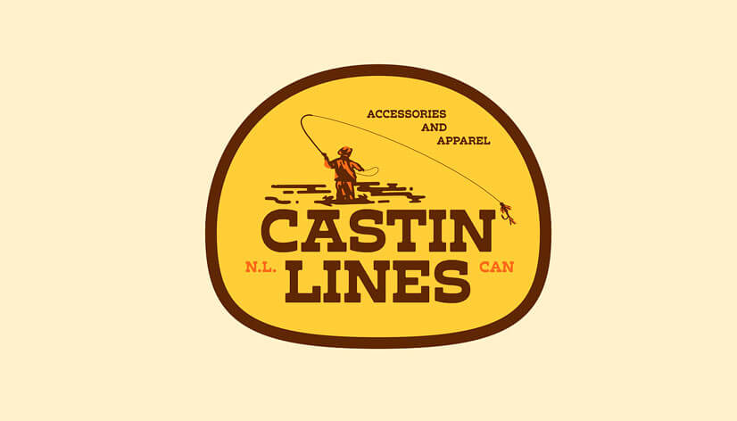
This store logo illustrates a scene of a fisherman casting his fishing rod, perfect for accessories and apparel branding. When looking at the shop’s name, we can see that the word “castin'” is spelled without the “g”, and the fishing hook smartly works as the needed apostrophe. With the Western-like vibe that the chosen typeface and color palette carry, this design is engaging and memorable.
15. Ink Style Fishing Logo Idea
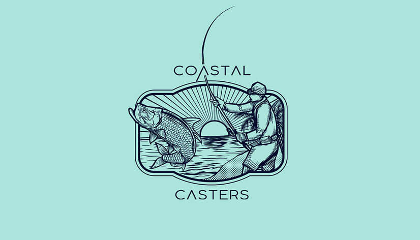
The Coastal Casters’ logo example is executed in a truly visually appealing style like an ink illustration. The extremely detailed depiction of this fishing scene has a vintage look making it seem timeless. Meanwhile, how the fish and the man stick out of the frame adds dynamic and life to the concept. And, in addition, the combination of a classic-looking drawing with modern text creates an impressive and memorable logo.
16. Cartoon Fishing Logo Example
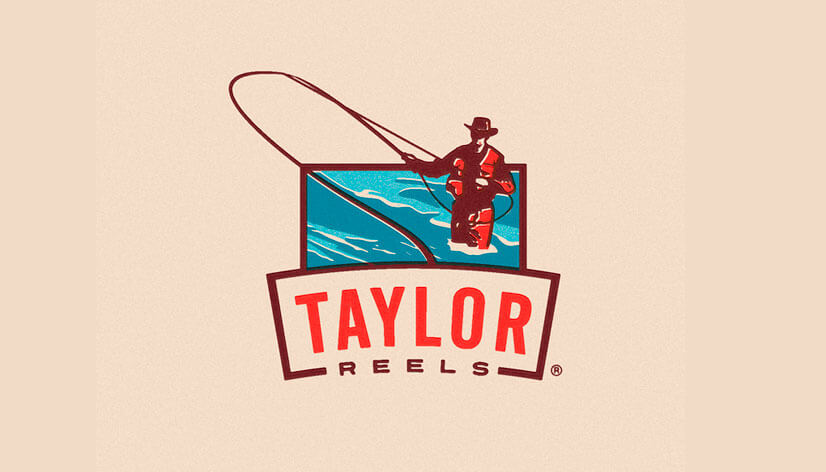
This concept for Taylor Reels is for a modern logo with sleek lines. The moving waters and the fisherman casting a pole add dynamic and excitement to the design. Also, if you look at the framing lines they seem to outline a fishing boat looked at the front. And, adding even more value is the simple non-intrusive text, that only complements the overall design and strengthens the brand’s presence.
17. Geometrical Logo Design Idea
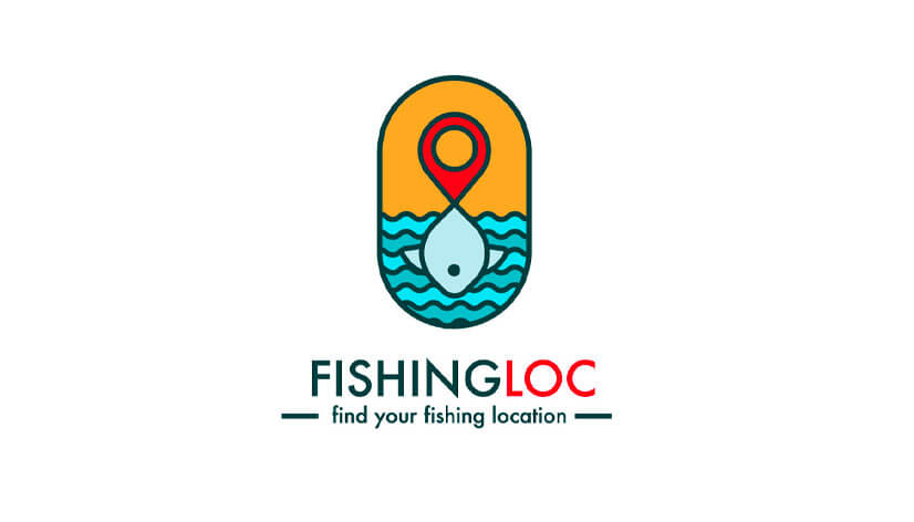
What we see here is the smart logo for a fishing location app. Even without saying this, everything is clear, for the icon creatively combines the location pin symbol with a simple fish-in-the-water illustration. The integration of elements is certainly super clever and functional. As a result, the plain, colorful, clean design speaks directly to the public and ensures versatility and recognizability.
18. Fishing Rentals Logo Example
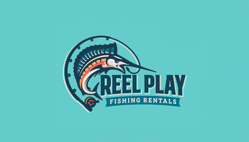
The logo here is for a boat and fishing gear rental company. It features a fish integrated with a curved reel, capturing the brand’s essence. With the additional help of the decisive logotype, the design carries a strong and professional presence. Using bold lines and shapes makes the logo dynamic and visually interesting, ensuring it stands out.
19. Inspirational Fish Logo Idea
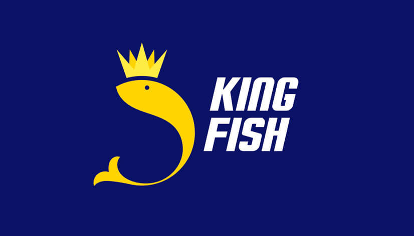
Here, we have a concept for a fishing business logo. It features a regal fish design with a crown, emphasizing the “king” aspect. The color palette of gold and royal blue furthermore emphasizes its luxurious feel. The simple lettering leaves the focus on the fish icon and completes the modern design. As a result, the logo stands bold and authoritative, suitable for premium brands.
Tips on creating cool fishing logos:
- Firstly, make sure to research your target audience. Understand their preferences, expectations, and the type of fishing they engage in.
- Keep your design simple and focus on creating a clean, straightforward logo that is easy to remember and legible in all sizes.
- Use graphic elements directly related to fishing, such as fish, hooks, water, and rods. And, ensure their style complements the overall design.
- Select colors that evoke the natural fishing environment, like blues and greens, which, of course, must also be in synchrony with your brand identity.
- Make sure the logo is scalable, works well in color and monochrome versions, and is suitable for all intended purposes.
Final Words
Analyzing existing logo examples can provide valuable insights and inspiration for your next design. With these guidelines, you can craft memorable and impactful fishing logos that resonate with your audience and effectively represent your company. Remember that logos are a vital part of any business’ visual identity, and if done right can significantly impact your brand’s presence.
Now, the only thing left to do is to start creating the design of your new fishing logo!
If you enjoyed this article, then you may like our other logo example collections, too:


