


Let’s talk about some fonts theory and why is it so important. Fonts are a key part of every design. In fact, they are such an essential element that they can make a mediocre design look great or completely ruin a perfect design. In this article, I’ll shed some light on the basics. What fonts, typefaces, and font families are. What are the types, weights, structure, and styles of typefaces?
Difference Between Fonts, Typefaces, and Families in Fonts Theory
Often confused with each other, these terms form the foundation of the font theory. So let’s jump right into it.
The typeface refers to the design of the lettering. It can feature different variations of that typeface such as thin, light, regular, italic, bold, or black. Each of those variations of a typeface is a font.
Every typeface is a collection of letters, numbers, and symbols that are called glyphs. Naturally, a glyph could be used for characters from different scripts. For example, the Roman uppercase A can be used for the uppercase Cyrillic A since they look identical.
To sum it up, the typeface is the typographical design of the characters and symbols themselves while the font and font families originate from the typeface. So what exactly is a font family then?
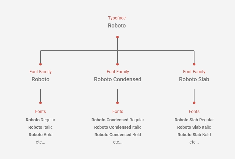
Many fonts can originate from one typeface and could be grouped into font families, depending on their style. Here’s an example:
We are all familiar with Roboto by Google. Roboto is a typeface and each individual version of it is a font. For example, different fonts are Roboto Thin, Roboto Thin Italic, Roboto Light, and the others. These fonts are part of Roboto’s Regular Font family.
There are several font families that originate from Roboto Typeface. They are stylistically different from each other: Roboto Regular Font family, Roboto Condensed, and Roboto Slab. Each of these font families includes a set of fonts. Today, each individual font comes in a different digital file.
Let’s visualize the example.

Typefaces Classification in Fonts Theory
We classify typefaces by their stylistic features or by technical specifications. The most popular styles of typefaces that we all know are Serif and Sans Serif types.
Serif Typefaces

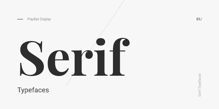
As the name suggests, the serifs on the glyphs are what distinguish serif typefaces. These small details that finalize the strokes of the characters can be vague or more noticeable, depending on the serif typeface itself.
Usually, serif typefaces look more classic, elegant, and sophisticated. They are usually preferable for projects that convey these characteristics. You will often see serif fonts in large blocks in newspapers and books. When it comes to online use, however, serif fonts create just the headlines and subheadlines. The reason for this is their readability in digital formats. The additional details make them feel heavier, so it’s better to avoid using them for big body texts.
Serif fonts have various subcategories such as Old style, Modern, and Slab Serifs. The main difference between the types is the thickness between the horizontal, vertical, diagonal, and rounded strokes, as well as the width of the characters.
Sans Serif Typefaces


Sans serif typefaces, logically, are the ones“without” serifs. This makes the glyphs look cleaner and much more readable in long paragraphs. In comparison to the Serifs, Sans serifs look simpler and more minimalistic. With the boom of minimalism and flat design, Sans serif typefaces dominate headings and subheadings in the online presence, which makes them feel more modern in general. They can also be divided into subcategories – Grotesque, Neo-grotesque, Humanist, and Geometric.
Script Typefaces

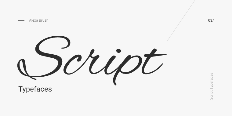
Script typefaces resemble handwriting. They can be very diverse but usually fall into just two categories: formal and casual. Formal script typefaces look like traditional handwritings from the 18th century. Such typefaces look incredibly neat and elegant. Casual script typefaces, on the other hand, resemble modern handwriting – they can look messy, playful, and effortless.
While script typefaces look great for headlines and subheadlines, they have really poor readability in small sizes which is why designers avoid using them in paragraphs.
Display Typefaces

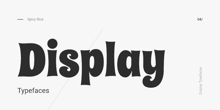
Display typefaces form the most diverse and eccentric category of typefaces. They are creative typefaces whose purpose is to form very short text lines, usually bigger headlines that aim to catch the attention. In small sizes, their readability is extremely poor which disrupts the cool effect they usually have.
Dingbat Typefaces

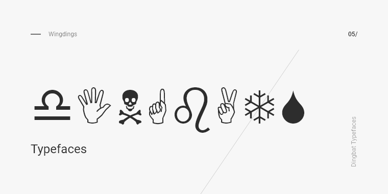
Dingbats are special typefaces that have specific mathematical or scientific uses. They consist of symbols and icons instead of letters. Dingbats can be quite diverse and usually follow specific themes.
Proportional and Monospaced Typefaces


To make it easier, typefaces could also classify themselves by technical specifications. Such spec can be the proportion of the spaces in the glyphs. In proportional typefaces, each letter takes up space proportionate to its size. In monospaced typefaces, all letters take up equal amounts of space regardless of its size.
Weights and Styles of Typefaces
When a specific weight and style is applied to a typeface, we call it a font.

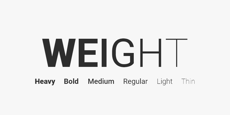
The weight of the font refers to the thickness of the letter’s strokes (the stroke width) relative to its height. There are universal labels of the most common weights in fonts – you will recognize them by the names “regular”, “medium”, “light”, “thin”, “bold”, “heavy”, etc.

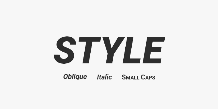
When it comes to style, there are three universal styles that are present for most typefaces. These are italic, oblique, and small caps.
Although they look similar, italic and oblique are two different styles characterized by letters tilted forward. While oblique is a slightly modified version of the regular font (skewed by 8-12 degrees forwards), italic is a separate font developed by the designer.

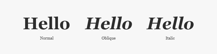
As the example shows, the italic font may contain stylistically different letters while the oblique uses the same letter style as the regular font, only slanted forward.
Small caps refer to a style of the typeface that is usually used for headings and subheadings to make the title more interesting and attractive.


A Deeper Look Into the Typeface in Fonts Theory
Typefaces can be extremely diverse. In their core, however, they have the same characteristics. This is why I’d like to talk a little bit about the structure of a glyph and explain what the typeface is in-depth.
All typefaces have a baseline, a mean line, an x-height, and a cap-height. The baseline is the imaginary line on which the characters sit. The mean line is the upper line that determines the height of (most) lower case letters. Usually, the letter “x” determines this value which is why the space between the baseline and mean line is called an x-height. Naturally, the cap height is the imaginary line that sets the height of the uppercase letters, starting from the baseline.
Let’s visualize the terminology and explain the other terms.

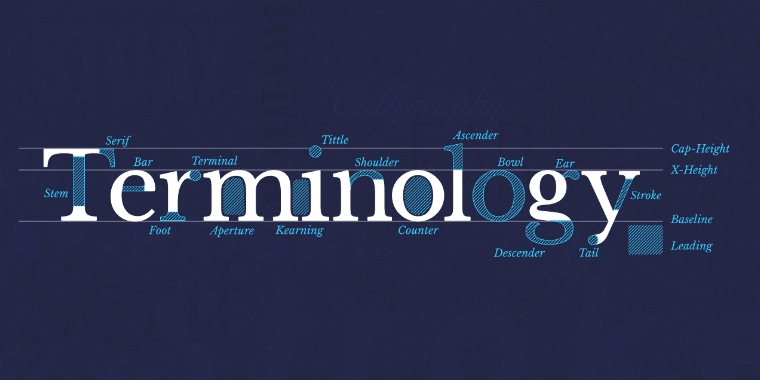
Screenshot from Type Terms – www.supremo.co.uk/typeterms/
- Stem – the main vertical or diagonal stroke of a letterform. (e.g. in I, H, W)
- Crossbars and bars (arms) – the horizontal lines found on capital letters that connect two stems (e.g. in H and A) or are connected to one stem (in F, E, T).
- Bowl – the rounded stroke in a letterform (in c, d, q, b, etc.)
- Ascender and descender – the extensions of lowercase letterforms that go above the mean line (h, b, l, etc) and below the baseline (q, p, y, etc.)
- Counter – the empty space inside a letter formed by bowls or other stroke types. It could be either fully enclosed (e.g. A, p, b, o, etc.) or non enclosed (e.g. G, c, n, etc.)
- Legs or tails – angled strokes used on some letters (R, K, Q)
- Cross stroke – a horizontal line that crosses the main stroke in some letters (e.g. t, f)
- Tittle – the little dot on the lowercase j and i.
Popular Websites and Libraries
You’ve just learned or refreshed your knowledge about fonts theory. Now, let’s see also the most popular libraries that offer fonts.
Google Fonts

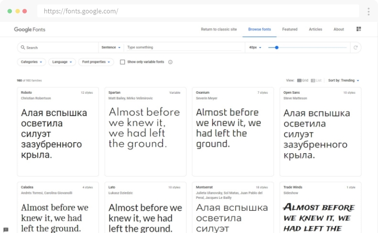
Probably the classic of the classics, Google Fonts contains a massive library of free and open-source fonts that you could use for personal and commercial projects.
Dafont

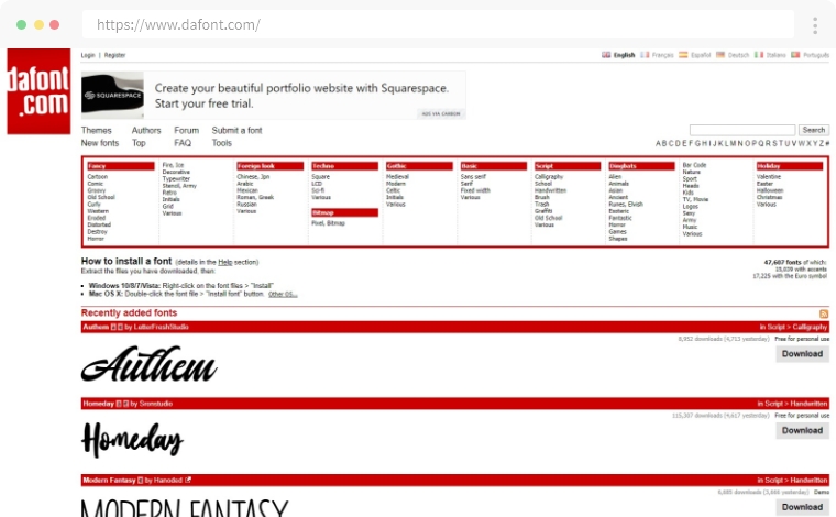
This is a great library of fonts either for personal and commercial use. The website offers a great category system that allows you to search for fonts by style.
FontSquirrel

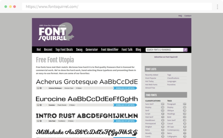
This is another popular website that offers free fonts with commercial licenses. The navigation on the right will help you narrow down your search by category, language, font family and more.
FontSpace


FontSpace has a huge collection of over 60 000 designer fonts. The site offers a font classification to help you find fonts faster. However, make sure to check out the license of each font before downloading it.
UrbanFonts

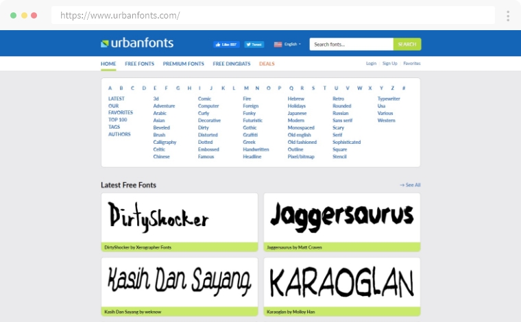
This one is a platform for free and premium fonts that offers a variety of unconventional typefaces. Each font comes with a different license and a detailed description to read before downloading.
Popular Modern Fonts
The following fonts are amongst the most popular and definitely a must for every designer’s font library.
Poppins

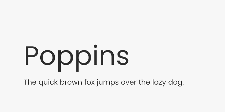
Poppins is a modern geometric sans serif font and goes perfectly with the modern web design. It’s great for headlines and subheadlines on branding websites, digital media websites, and more. It has high readability which makes it look great on paragraphs as well. You could download it and use it for free from Google Fonts.
Helvetica Neue

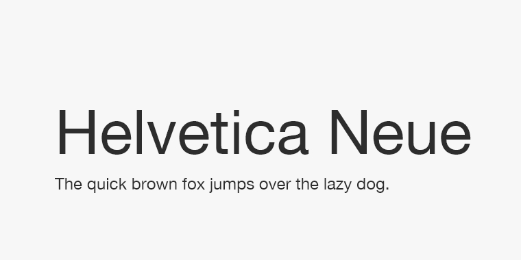
Helvetica Neue is a grotesque sans serif font that is a modernized interpretation of the classic Helvetica font. It’s a premium typeface but it contains 8 font families and over 200 different font styles.
Raleway

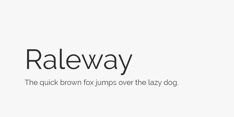
Raleway is a modern sans serif that was initially a single thin weight style font. As it grew in popularity, it later became a font family with 18 elegant font styles, suitable for modern digital and print design.
Playfair Display

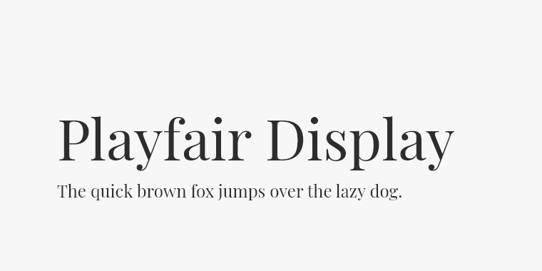
Playfair Display is a serif display that is ideal for elegant and classy headlines. The font is great for media and publishing both for web and print purposes. In addition, the designer also developed Playfair Display SC – a small caps fonts family.
Merriweather

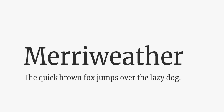
Merriweather is another essential popular modern serif font that designers include in their libraries. It also has a sans serif version: Merriweather Sans font. The duo goes great together and is a perfect choice if you are wondering on how to make headline and body text font combinations.
Final Words
In conclusion, fonts theory is an important subject that every designer is familiar with. The combination of fonts is another very important matter and skill that designers develop through their careers. I’ll cover the topic in more depth in another article.
In the meantime, you could also check the continuation of this topic where I go through the different types of fonts.