If you’re about to create a website for your food-related endeavors then you’re probably on the hunt for amazing food website examples. Whether you want to start a food blog, build your restaurant’s online presence, or create a site to present and sell the goods you produce, having a good food website is a must for your success. That is because creating an engaging and functional food website can significantly boost brand visibility and customer engagement.
In today’s article, we have prepared a list of 23 food website examples with various design styles and functionalities to inspire your next web project. These food website examples highlight some of the best practices in aesthetics, user experience, and content presentation. Oh, and make sure to stay till the end, where we provide valuable tips for anyone looking to create an amazing food website for their culinary brand.
1. Chobani
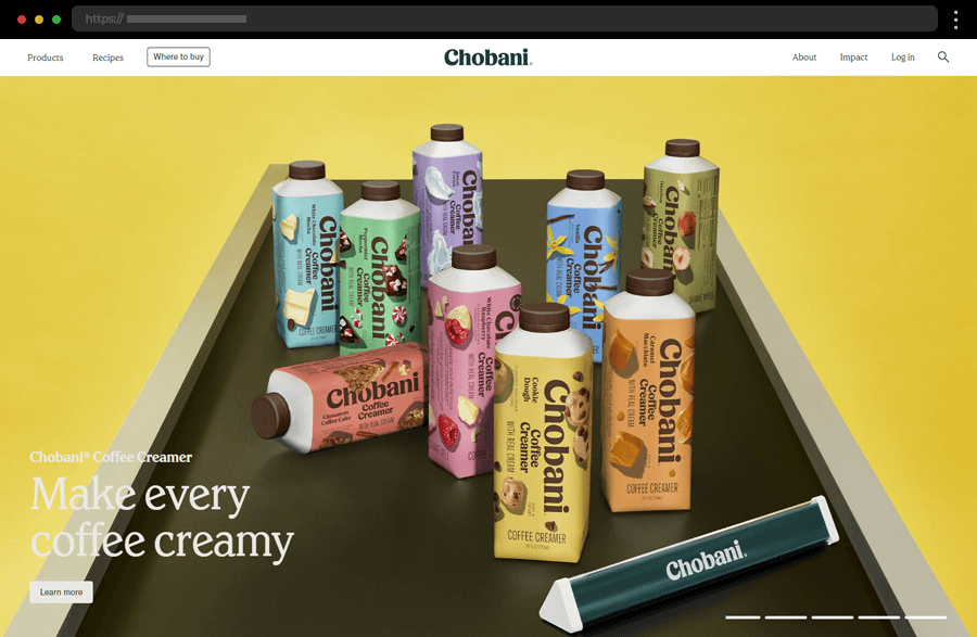
One of the greatest examples, Chobani, a food-and-wellness-focused company, sports a website with a fresh, colorful, and well-organized design, exuding professionalism and credibility. With striking visuals, key highlights, and an integrated search box with instant results, the homepage quickly captivates visitors. The site features also a Recipes section and comprehensive information on products and the brand’s values. In addition, many interactive elements facilitate the web journey and ensure engagement, reinforcing this food website’s status as an amazing example.
2. La Crema
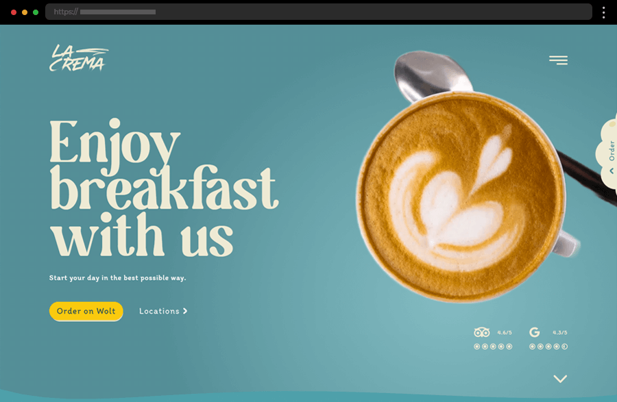
La Crema’s website exudes calmness and sophistication with its immersive and elegant design with muted, soft colors. The site’s clear layout leaves the focus on the concise messaging and impressive imagery of the cafe’s delicious offerings while the seamless, intuitive navigation with many CTAs and detailed descriptions further enhances the pleasant web journey. Providing one of the smoothest and most amazing user experiences, La Crema’s food website example certainly lures users to visit the place.
3. AGRO Power Jerky
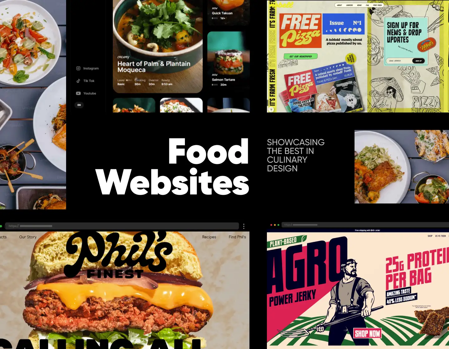
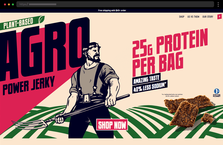
Agro’s website carries a solid and powerful vibe, depicting the strength and energy that come with the brand’s products’ consumption. The site uses a dynamic, colorful design that smartly highlights important details and sections. In addition, the distinct CTAs along with the captivating illustrations subtly engage the users, provoking them to explore further and shop online. Overall, this inspiring food website example efficiently presents the company’s focus on healthy products, transparency, and environmental responsibility.
4. Sea Harvest Fresh Seafood Market
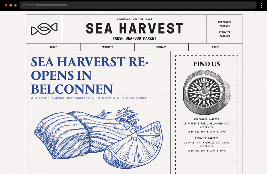
Sea Harvest is a fresh seafood market, boasting a unique and inspiring food website design. Its layout, illustrations, typography, and overall style resemble a vintage newspaper, thus producing a great effect on visitors’ minds. The site is easy to navigate and has some amazing interactive functionalities, providing a smooth, pleasant, and engaging web journey. With its clean, nautical-themed design complementing its seafood offerings, Sea Harvest stands as one of the greatest food website examples.
5. Phil’s Finest
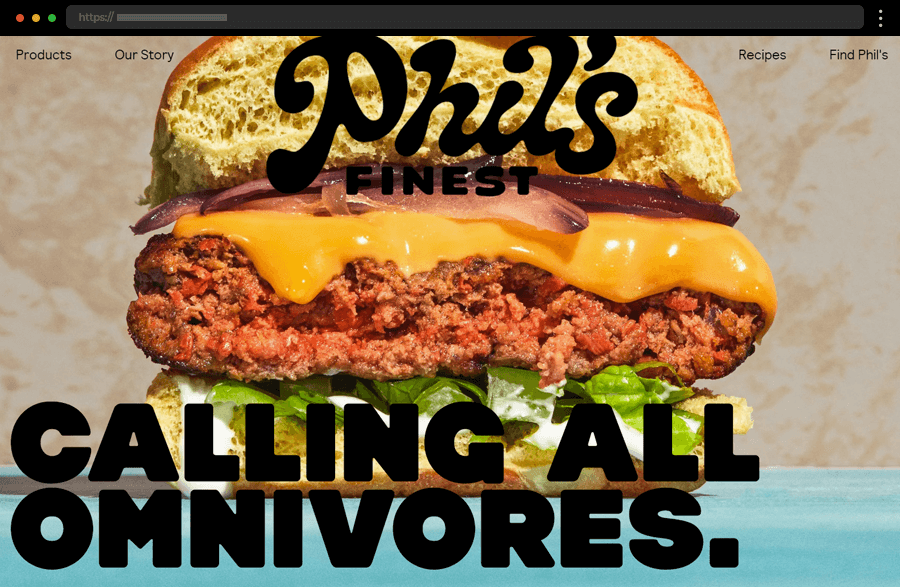
Phil’s Finest comes next to provide us with another cool, colorful food website example. With its vibrant color palette, playful typography, catchy graphics, and many animations, the site is an absolute pleasure to explore. The funny approach with which the brand presents its high-quality, natural ingredients builds an instant connection with the site’s visitors. As a result, the website is visually appealing and captivating, missing only the feature to shop online.
6. Ottolenghi
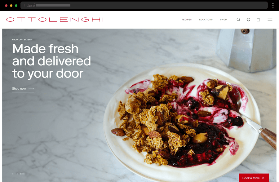
Ottolenghi restaurant’s website is as rich, sophisticated, and refined as its culinary creations. Its clean design, elegant typography, and beautiful food photography certainly succeed in creating a luxurious feel and attracting customers to the restaurant. The site’s neat organization and extensive content, including recipes, an online shop, stories, and many more make browsing it an inspiring experience. Thus, Ottolenghi gives us an amazing food website example, worth looking after.
7. Yellowbird Foods
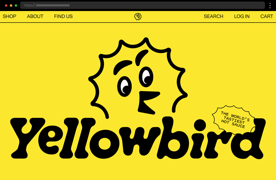
Yellowbird Foods’ website is bright, bold, and vibrant, much like its hot sauce products. The yellow design and playful typography create a positive and fun browsing experience. Animated illustrations of the brand’s mascot and catchy images and videos ensure the web journey is also fun and engaging. Overall, this inspiring food website example boasts an intuitive layout, with well-organized product information and easy-to-navigate sections, highlighting the brand’s unique offerings.
8. DITALIA
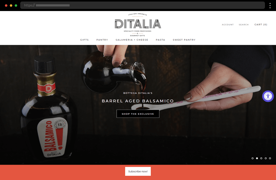
Our next example, DITALIA’s food website, immerses us in the charm of Italian cuisine. It exudes tradition and professionalism which perfectly aligns with the company’s mission of bringing authentic Italian foods to the United States. The elegant design, with a user-friendly interface, detailed product categories, and vivid, mouth-watering visuals, facilitates customers in exploring DITALIA’s offerings. In addition, the site’s storytelling elements enhance the shopping experience by introducing users to the rich heritage behind the products.
9. Nobell Foods
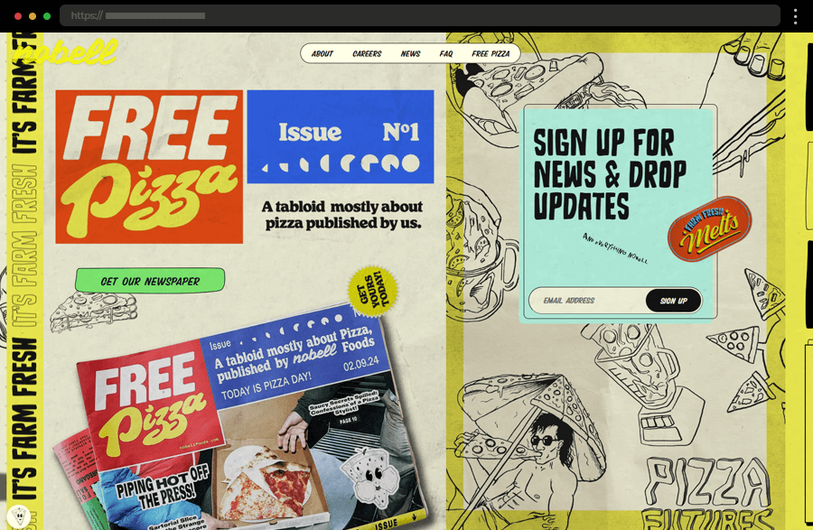
Nobell’s food website example immerses us in the creative and forward-thinking atmosphere of the brand’s plant-based, sustainable cheese products. Full of many custom graphics and animations, entertaining and informative content, and equipped with side-scrolling, the site instantly engages visitors keeping their attention until the end. All this results in a memorable online presence, that communicates the brand’s mission and product benefits clearly and stands out among the competition.
10. Simply Chocolate
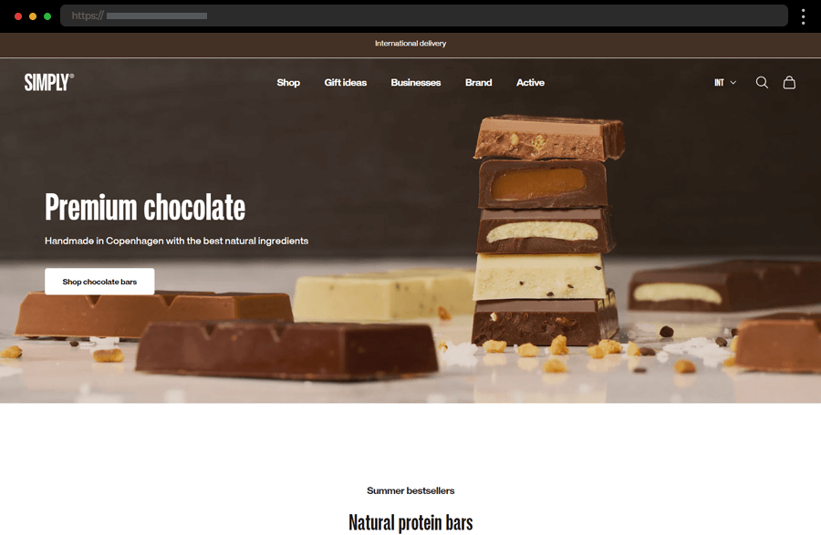
Simply Chocolate combines Scandinavian minimalism with delicious visuals, creating a stylish and appetizing online shopping experience. Sporting a brown-and-white color palette the site hints at the brand’s essence and mission to produce all-natural chocolate. Further, the website uses a clean, uncluttered design with high-quality product images and straightforward navigation. The overall sophisticated feel that the compelling imagery and brand storytelling create, beautifully presents Simply’s focus on premium chocolate.
11. Costa Vida
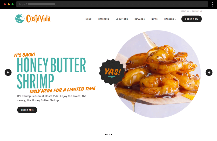
Next comes Costa Vida with a vibrant and dynamic food website, reflecting the lively spirit of its Mexican-inspired cuisine. The design’s bright colors create a happy and energetic beach-like atmosphere, aligning with the brand’s name and image. The engaging visuals encapture visitors, while the intuitive layout with many CTAs and internal links makes it easy to explore the menu and find locations. As a result, the site provides a great user experience and effectively conveys the freshness and flavor of the brand’s offerings.
12. BEHAVE
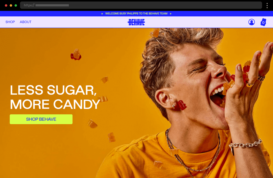
BEHAVE’s website captivates its visitors with its fun and energetic design, reflecting the brand’s healthy take on gummy candies. The site’s bright colors, interactive features, and dynamic visuals create an engaging and playful atmosphere. In addition, the clear product information, intuitive navigation, and overall ease of use greatly enhance the user experience, ensuring BEHAVE’s place among the great food website examples.
13. Supernormal Greens
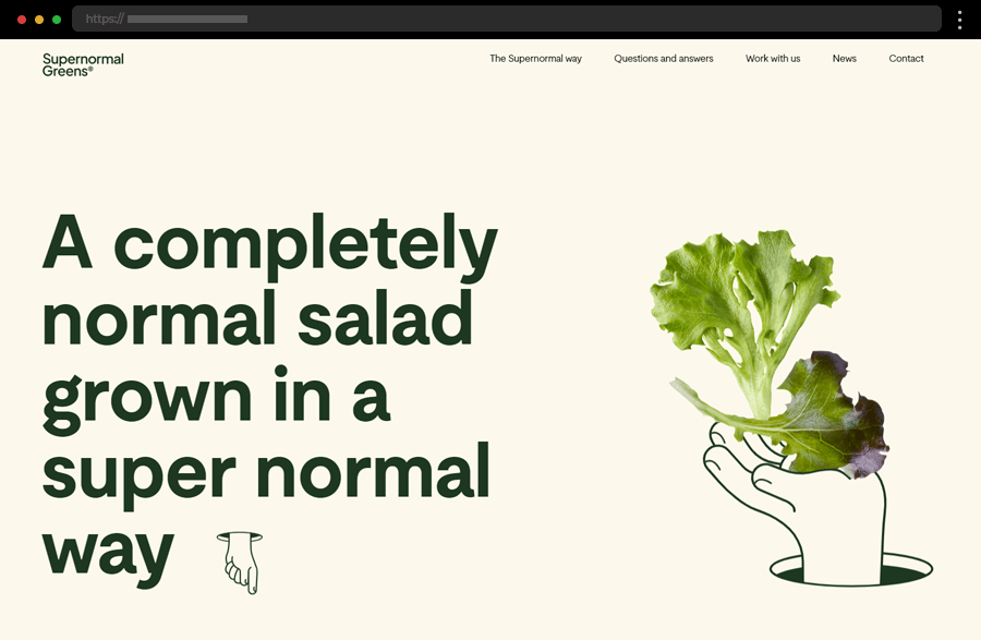
The Supernormal Greens website stands out with its modern and playful appearance and natural color scheme. It combines a minimalist, easy-to-follow layout with engaging animations and catchy, comprehensive messaging, making the user journey enjoyable and intuitive. As a result, the site is attractive and informative, successfully communicating the brand’s emphasis on organic, sustainable products through both design and content.
14. Cafe Frida
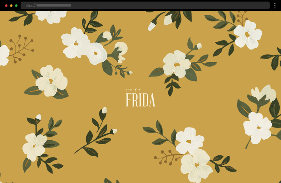
Cafe Frida’s food website is another single-paged example, coming with a cozy and inviting design, reflecting the cafe’s warm atmosphere. The animated, painting-like flowers, the subtle colors, and the welcoming imagery create a soft brand image and a pleasant user experience. The site satisfies the visitors’ interest with the featured full menu, operating hours, brand story, and contact information, easily accessed through the facilitated navigation.
15. Sakara
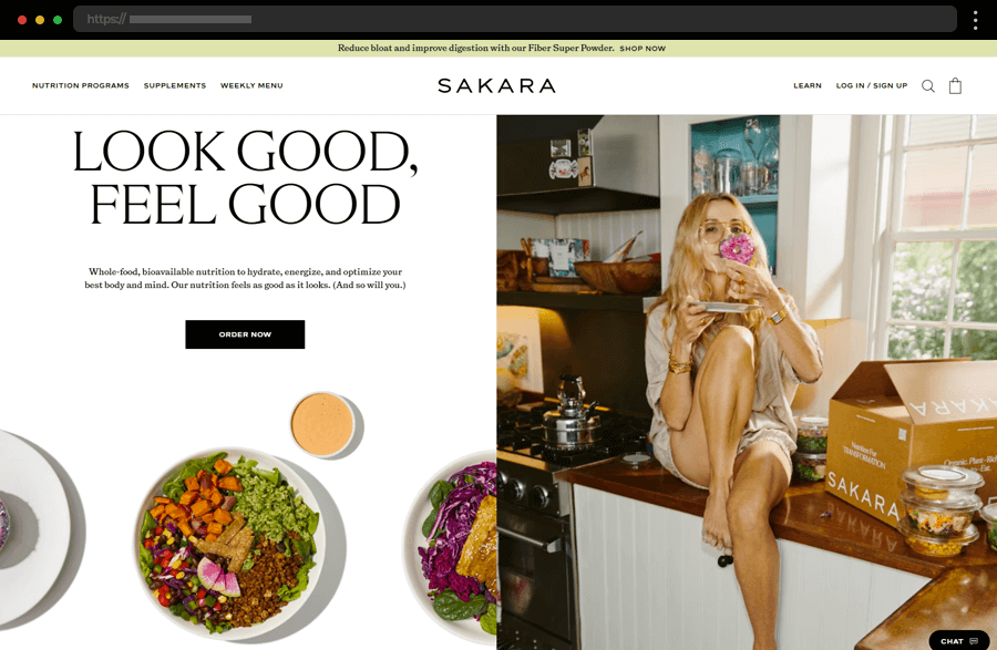
Our next example, Sakara’s website, beautifully presents its whole food nutrition programs with a fresh color palette, vibrant, high-quality visuals, and wellness-focused content. Providing detailed descriptions, a weekly menu, and product comparisons, and using striking photographs and interactive elements within its clean website design, this example succeeds in conveying the mission of its health-conscious food brand.
16. Cacao 70
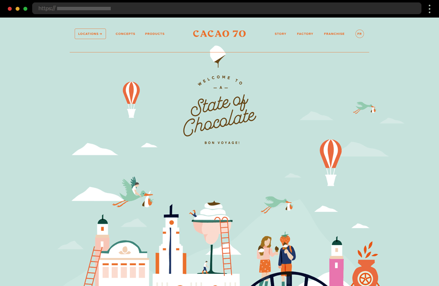
Cacao 70 greets us in the welcoming atmosphere of its fresh, pastel-colored site. Its homepage grabs the visitors’ attention with an animated, catchy illustration while the straightforward menu provides smooth and easy navigation. The products are nicely presented within the site’s centralized layout with a clear structure and well-thought-out content. As a result, Cacao 70 gives us another food website example with an immersive and satisfying experience, much like the company’s chocolate offerings.
17. Graza
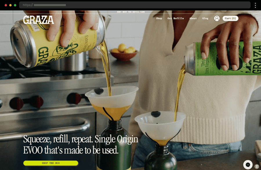
Graza’s website is minimalist yet vibrant, using neutral colors, sleek typography, and funny animated graphics to create a modern feel. The site’s design focuses on presenting the brand’s mission to produce high-quality olive oil. It also provides a streamlined shopping experience and informative and entertaining content that educates and helps customers in their journey. With its emphasis on simplicity and quality, this food website example’s design perfectly resonates with the high-quality products it offers.
18. Creme
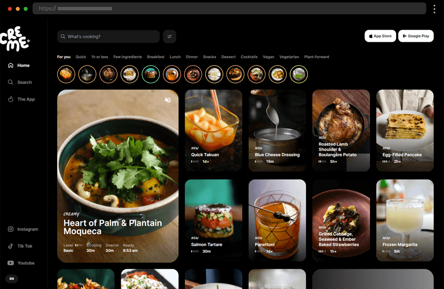
Creme’s website is sleek, modern, and dark, leaving the focus on the content it shares. The site provides a super useful and convenient video recipe platform for cooking enthusiasts. With its user-friendly navigation, it gives visitors the option to filter the recipes by type, ingredients, and difficulty level. In addition, the site’s non-obtrusive design and high-quality, step-by-step videos help users with their culinary attempts, while links to social media and app stores ensure their further engagement.
19. Matheson Food Company
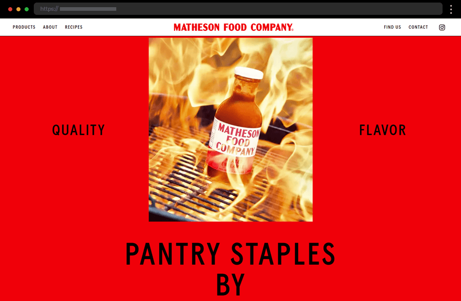
Our next food website example is of Matty Matheson, a famous Canadian chef. His single-page site shines with boldness and simplicity, betting on vibrant colors and huge fonts to effectively showcase the brand’s products and story. The navigation works smoothly helping users hop from one section to another and enjoy the fun experience. In general, with its hover effects, colorful design, and catchy imagery, this example is an on-point presentation of Matty Matheson’s fun personality and original products.
20. Taste Atlas
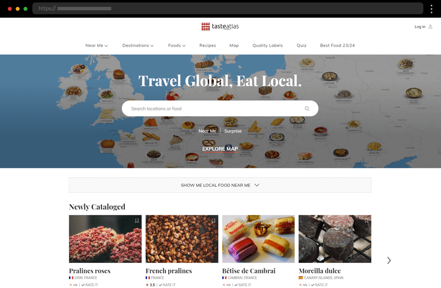
Taste Atlas offers a comprehensive and visually appealing guide to traditional foods from around the world. The site is engaging, educational, and fun to explore with rich content and an interactive map dividing dishes by country and region. It is also easily navigated with the help of various filters, search options, and the menu which disappears and re-appears as you scroll up and down. Overall, with its clean and informative design, this website example is a valuable resource for food explorers and enthusiasts.
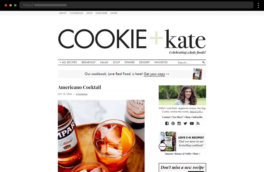
21. Cookie And Kate
Cookie and Kate’s cooking blog website is straightforward and inviting, with a personal touch that resonates with home cooks. Using clean design, beautiful photography, and approachable content creates a friendly and accessible feel. The website’s simple layout, easy navigation, organization, and detailed recipes make it a breeze to explore and a go-to resource for healthy, vegetarian cooking.
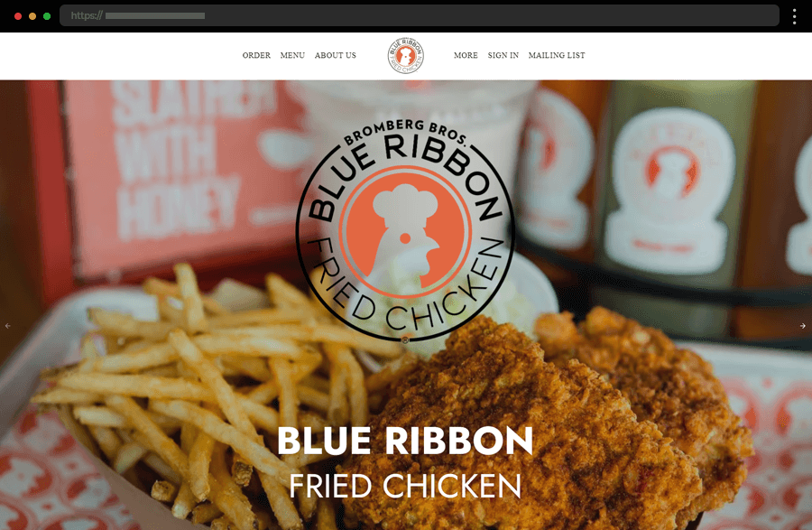
22. Blue Ribbon Fried Chicken
Blue Ribbon Fried Chicken’s website creates an approachable and friendly brand image, with a design focusing on the casual nature of its food. With concise messaging and a high-quality gallery, the homepage introduces visitors to the restaurant’s essence and key information. The site’s easy-to-use interface, straightforward navigation, and clear menu presentation enhance the user experience, also mirroring the restaurant’s inviting atmosphere.
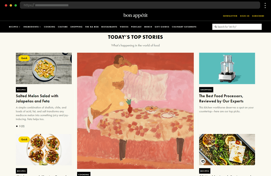
23. Bon Appetit
Bon Appétit’s website is an endless source of culinary inspiration, featuring a sleek, intuitive design and extensive content. The high-quality visuals and well-organized sections make it easy to find recipes, cooking tips, and culinary-related articles, videos, and podcasts. In addition, the engaging multimedia elements enhance the overall user experience of our last inspiring food website example.
Tips for crafting example-worthy food websites
- Firstly, use professional, high-quality images that showcase your products in the best light. Thus you will not only enhance your site’s aesthetic appeal but will also create a strong visual identity.
- Then, ensure that the website is easy to navigate with a clear, intuitive menu structure. This will certainly improve the user experience and help visitors find what they are looking for quickly.
- Incorporate engaging and informative content that creates a trustworthy and reliable brand image and builds a connection with the site’s visitors. For example, detailed product descriptions, stories behind the brand, articles, and testimonials strongly elevate the brand’s authority.
- Design your website to be quick-loading and responsive so that it looks and functions well on all devices.
- Use clear and compelling calls to action to guide visitors toward desired actions, like making a purchase, signing up for a newsletter, or booking a table, for example.
- Optimize your website for search engines by using relevant keywords, meta descriptions, and alt tags for images to improve visibility and attract more organic traffic.
- Also, if you’re going to be selling products online, ensure that your e-commerce platform is seamless, secure, and user-friendly.
Final words
To sum up, a compelling online presence is essential for businesses across all industries, and the food sector is no exception. The food websites highlighted in this article serve beautifully as examples of how to effectively combine visual appeal, functional design, and engaging content. So, gather inspiration from them, embrace the best practices for such designs, and go create the culinary website that will make your brand flourish online.
So, we hope our set of food website examples has inspired you to start with your design! Still, if you need more ideas to spark your creativity, check out these articles:


