


Nowadays, hamburger menus have become a key design feature on websites everywhere. Simple yet effective, they allow for clean, minimal navigation that doesn’t overwhelm the user. But when done right, they can do so much more – transforming the way we interact with a website. In this post, we’re showcasing 30 cool hamburger menu examples that show just how creative and functional these little tools can be. Let’s jump into these stunning designs and get inspired!
1. Yard – Stylish Hamburger Menu for a Creative House

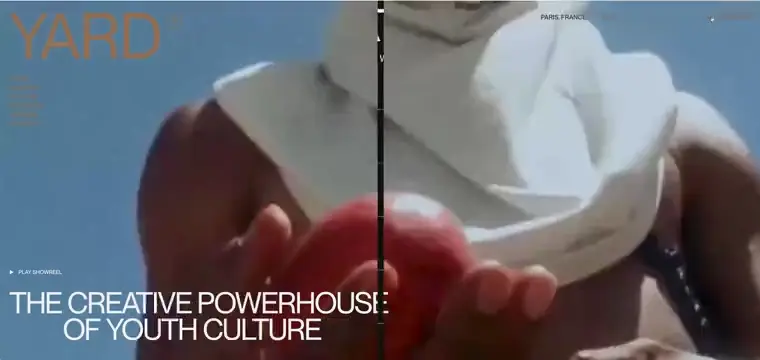
Yard is a creative house that combines art and technology to create exceptional experiences. The hamburger menu features three simple dots turning into lines on hover. Upon clicking, a full-screen overlay with a simple, black background slides in, showcasing bold, easy-to-read white text. When hovered, each link shows a video in the background. The hamburger menu design is minimalistic in mind and does an excellent job of achieving it.
💟 What we like:
- Minimalist three-dot icon.
- Full-screen black overlay.
- Bold, white menu items with cool hover effects.
2. Zahra Ziaei – Elegant Hamburger Menu Website Example for a Photography Portfolio


Zahra’s website showcases stunning images through an elegant website design. The hamburger icon is a simple three-line button placed in the top center. When clicked, it opens a clean, dark menu with subtle, modern animations and white links. The design’s simplicity allows the beautiful photography to take center stage while keeping navigation intuitive and seamless.
💟 What we like:
- Simple elegant triple bar icon.
- Smooth hover animations and transitions.
3. Faubourg – Cinematic Hamburger Menu for a Parisian VFX Studio

Faubourg’s retro-styled button opens a previously hidden menu with an irregular shape and large, bold links. The hover animations add a modern, interactive touch. The unique design enhances the cinematic feel, making the menu an exciting part of the experience.
💟 What we like:
- Retro “menu” button centered on the page.
-
Unique, irregularly shaped drop down menu.
- Interactive hover animations.
4. Grab and Go – Functional Hamburger Menu for a Food Delivery Service

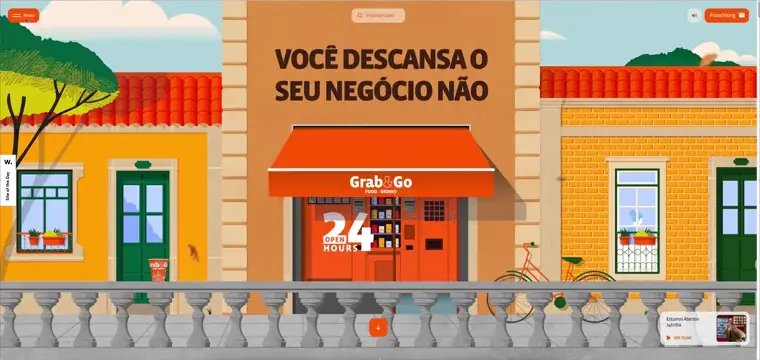
Grab and Go offers healthy, ready-to-eat meals delivered straight to your door. The hamburger menu is represented by an orange button with three white lines and the word “MENU” next to it. When clicked, a small dropdown opens with a unique design: a timeline-like menu on the left with a dot that follows the mouse hover.
💟 What we like:
- Cool design of the orange button with three white lines.
- Timeline-like menu with a dynamic hover effect.
- Smooth dropdown animation.
5. Casa Vicens – Artistic Hamburger Menu for a Historic Monument

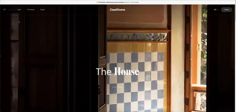
Casa Vicens is a historic house designed by Antoni Gaudí, now open to the public as a museum. We see three simple horizontal lines at the top left corner representing the menu. When clicked, a clean red panel opens from the left with large white links. As you hover over each link, an additional image appears on the right, enhancing the interactive experience. Smaller links and social media icons are also included at the bottom, giving users quick access to more details.
💟 What we like:
- Social links placed at the bottom.
- Clean red menu with large white menu options.
- Links hover effect that displays additional images.
6. Bertani – Sleek Hamburger Menu for a Timeless Winery


Bertani’s minimalist hamburger menu features a clean, three-line icon and expands into a full-screen overlay with simple, elegant white links. The soft fade-in effect and serif font add a touch of sophistication. It’s a perfect fit for the brand’s premium feel.
💟 What we like:
- Minimalist, elegant three-line icon.
- Full-screen overlay with a fade-in effect.
- Stylish serif font for links.
7. The Halal Guys – Simple Hamburger Menu for a Popular Food Chain

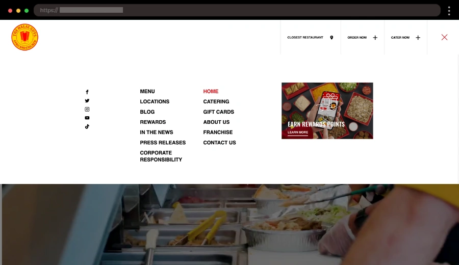
The Halal Guys website hamburger menu is represented by the classic three-line icon in the top right corner. Upon clicking, a straightforward dropdown appears with clean, black links on a white background. They are easy to read, and the dropdown is simple but effective for quick navigation through the site, from the menu to the locations and social media links.
💟 What we like:
- Classic three-line icon for a familiar and clean look.
- Simple dropdown design.
- White background with black links for clear visibility.
8. Oggy Story – Playful Hamburger Menu for a Children’s Tale


Oggy Story uses a hand-drawn burger icon that opens colorful sliding rectangles representing different parts of the story and also acting as links. The smooth animations and vibrant design keep the user engaged while exploring the site. It’s a fun, interactive way to navigate the content.
💟 What we like:
- Playful hand-drawn burger icon.
- Colorful sliding rectangles for links.
- Smooth, interactive animations.
9. Corepla – Modern Hamburger Menu For Recycling Organization

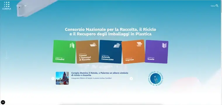
Corepla focuses on raising awareness about recycling in Italy through its engaging website. The hamburger navigation icon features two lines next to the logo. When clicked, a sidebar menu with a modern white and blue color scheme slides in from the left. Bold links guide users to sections on sustainability and recycling tips.
💟 What we like:
- Sidebar menu with a fresh white and green palette
- Simple three-line menu icon
- Bold, well-organized links for seamless navigation
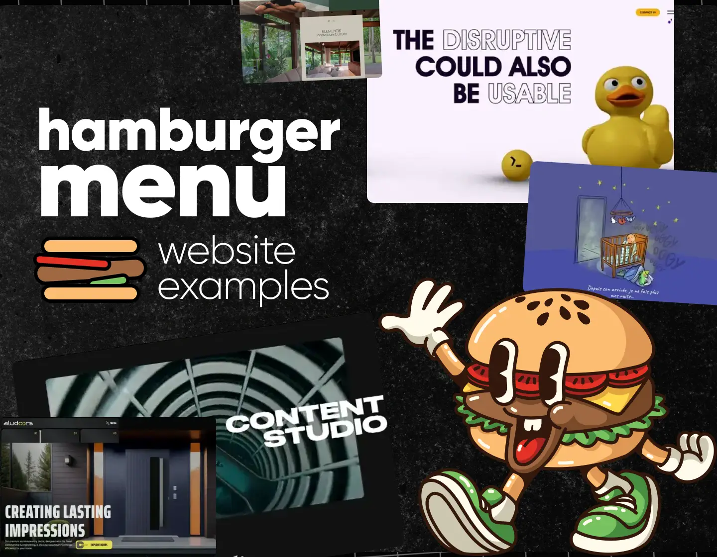
10. Alu Doors – Innovative Hamburger Menu For a Door Company

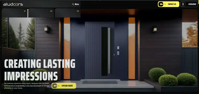
Alu Doors, a premium Australian door manufacturer, highlights its products with a modern, elegant website and their menu is no different. The burger icon consists of three lines with different lengths and when clicked, it opens a stylish dropdown. Each link is styled as a black rectangle with rounded corners, accompanied by text and numbers. The standout element is the contrasting yellow Contact link, drawing attention with its bold color choice.
💟 What we like:
- Stylish menu with minimalist design
- Slim, sleek three-line menu icon
- Rectangle links with text and number for each.
11. 27 Km – Minimalist Hamburger Menu For Creative Content Studio

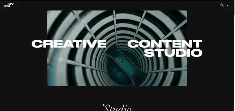
27 Km, a creative studio specializing in visual storytelling, uses a minimalist menu icon design consisting of three simple lines. When clicked, a black full-height menu slides in from the top, featuring white links spaced generously for readability. When hovered, we see a cool quality video next to each link. A small logo appears at the top for branding.
💟 What we like:
- Full-height black menu with a minimalist vibe.
- Clean three-line icon for simplicity.
- Videos appearing on link hover.
12. dim t – Asian-Inspired Burger Menu for a Modern Restaurant

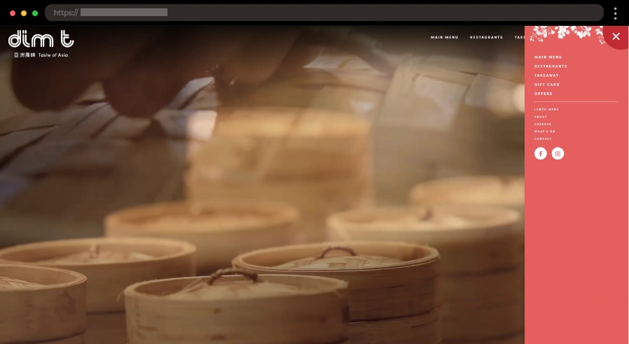
For this Asian restaurant, the hamburger menu is represented by a reddish sun-like icon with two lines, one of which is slightly rotated. When clicked, a beautiful full-height menu opens on the right in the same reddish color as the sun icon, with large white links. At the top, there’s a subtle flower ornament that adds a decorative touch to the clean and refined layout.
💟 What we like:
- Reddish sun-like hamburger icon with a unique rotation.
- Full-height dropdown in the same warm color.
- Asian-inspired flower ornament adding elegance to the menu.
13. Enpower Trading – Simple Hamburger Menu for an Energy Trading Platform


Enpower Trading simplifies the South African energy market by providing green energy solutions. Their hamburger menu uses a straightforward two-line icon, which opens a clean dropdown of black square links that turn white when hovered. The design’s minimalist approach echoes the brand’s focus on clarity and efficiency.
💟 What we like:
- Simple two-line hamburger menu icon.
- Bold black square links that change to white.
- A clean, efficient dropdown menu.
14. Tuxdi – Functional Hamburger Menu For a Digital Agency

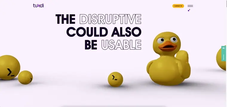
Tuxdi, a creative digital agency, delivers cutting-edge solutions with a sleek, user-friendly website. The menu is a clean two-line icon located at the top right. Upon clicking, a full-screen dark menu slides in, showcasing large, outlined links. A subtle hover effect changes the text color and reveals additional text for each one.
💟 What we like:
- Full-screen menu with clean, bold design.
- Contact information and socials added to the menu.
- Subtle hover effect that changes link color.
15. The Baldwin-Emerson Elders Project – Creative Hamburger Menu for a Community Initiative

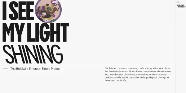
The Baldwin-Emerson Elders Project highlights the voices of activists and community leaders who shaped American history. The menu uses four sleek black lines, and when tapped, a full-height black panel slides in from the right, offering a clean and easy-to-navigate interface. As users hover over the links, colorful arrows and dynamic lines appear, adding a touch of vibrancy. A search bar sits at the top, making it even easier to find specific content.
💟 What we like:
- Full-height black panel that slides in from right.
- Numbers at the top left of links.
- Colorful hover effects with arrows and lines.
16. Pear – Streamlined Hamburger Menu for a Telecom Provider

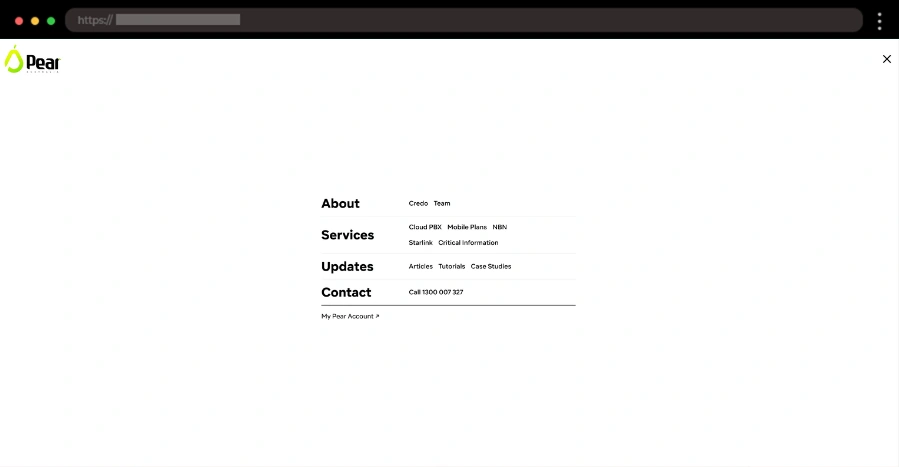
Pear is a company connecting people with reliable telecommunication services. For their menu, they’ve chosen a simple three-line icon that sits at the top right of the screen. When tapped, a smooth, full-screen white menu appears with black links that guide you to service categories, contact details, etc. The minimalist design ensures everything is accessible and uncluttered, perfectly aligning with the company’s professional image.
💟 What we like:
- Full-screen dropdown with bold black links.
- Easy access to key sections like services and contact.
- Simple hover animation of the burger button.
17. Utsubo – Dynamic Creative Studio Hamburger Menu Example

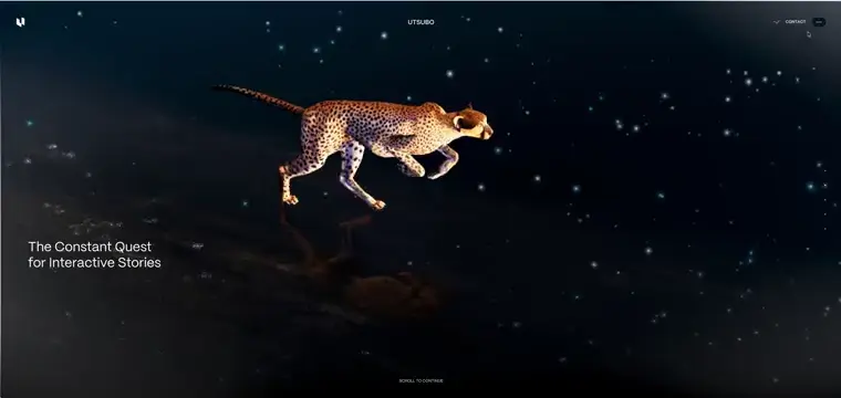
Utsubo is a cutting-edge creative studio focused on innovative design. Instead of the usual three-line icon, the menu is represented by three dots. When clicked, the 3D animated cheetah emerges in the center of the screen, seamlessly integrated with the company’s logo. The link interactions are enhanced with smooth hover effects and dynamic 3D animations that bring the design to life.
💟 What we like:
- 3D cheetah animation.
- Links on both sides of the logo.
- Smooth hover effects.
18. Elementis – Sophisticated Hamburger Menu for a Wellness Sanctuary

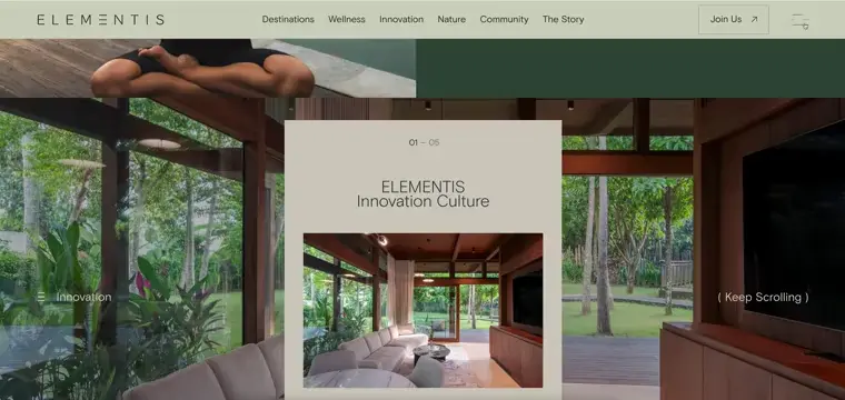
Elementis offers health and wellness resorts and residences in some of the world’s most breathtaking locations. Their hamburger menu features a sleek three-line icon with a stylish hover animation. When clicked, a full-screen menu slides open, showcasing a clean design with links, contact info, and social media icons. The left side of the screen features a dynamic image that changes as you hover over each link.
💟 What we like:
- Full-screen menu with well-organized links and socials.
- Dynamic left-side image that changes with each link hover.
- Subtle smooth animations.
19. Alex’s Fabulous Site – Personal Portfolio Hamburger Menu Example


Alex’s Fabulous Site is a personal portfolio full of quirky designs. Their hamburger menu stands out with a white vertical square and three gray lines on the right side of the page. When clicked, a dropdown reveals stacked white rectangular links, each glowing with a vibrant orange hover effect that keeps the interaction fun and engaging.
💟 What we like:
- Stacked white rectangular links in the dropdown.
- Bold orange hover effect for a dynamic feel.
- A minimalist and straightforward design.
20. Sea Trees – Eco-Friendly Burger Example for a Sustainability Initiative

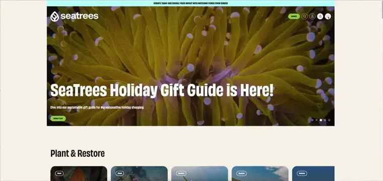
Sea Trees’ hamburger menu is represented by a simple, white minimalist icon with three evenly spaced black lines. When clicked, the dropdown fades in with a nice transition, offering differently sized links. On the right, we also see clickable widgets with beautiful sea-related images and cool hover effects. The design’s simplicity and subtle animations ensure a seamless user experience that highlights the organization’s mission to protect the planet.
💟 What we like:
- Smooth left-side menu slide-in effect
- Green-toned links matching the eco-friendly theme.
- Modern and legible fonts.
21. Ahadi Foundation – Empowering Hamburger Menu for a Global Initiative

The AHADI Foundation connects women with disabilities worldwide in a space for support and collaboration. The website’s menu features three dark-red, wave-like lines. Clicking it reveals a vibrant yellow dropdown that slides in from the top, with large green links placed prominently. A bold, circular X button on the right adds an intuitive closing option, keeping the design accessible and user-friendly.
💟 What we like:
- Unique wave-inspired menu icon.
- Bright yellow dropdown with bold green links.
- Large circular X button for easy menu closure.
22. The Directors Bureau – Filmmaker’s Space Website Hamburger Menu


The Directors Bureau serves as a platform for filmmakers to showcase their projects. The hamburger button stands out with its retro-inspired white and blue square, featuring a “+” symbol. When clicked, a dropdown reveals bold blue and white links for key sections, while smaller, colorful social media and extra links add personality to the design. This playful menu reflects the creative energy of the platform.
💟 What we like:
- Retro-inspired square with a “+” button
- Large, bold blue and white links
- Fun, colorful links for social media
23. The July – Elegant Hamburger Menu for a Luxury Apartment-Hotels Brand

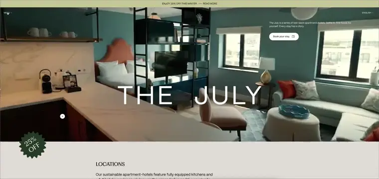
The July’s hotel website features an elegant and sophisticated hamburger menu that matches the luxurious feel of the brand. The minimalist design opens to a full-screen pink menu with stylish black links. The hover effects transform the background color of the menu, and additionally different images show up depending on the hovered link. The aesthetic and streamlined navigation perfectly reflect the hotel’s premium offerings.
💟 What we like:
- Minimalist, luxurious design that reflects the brand’s identity
- Full-screen menu with neatly arranged links
- Subtle hover effects for a smooth, refined user experience
24. Cask Exchange – Fun Hamburger Menu for Wine Trading

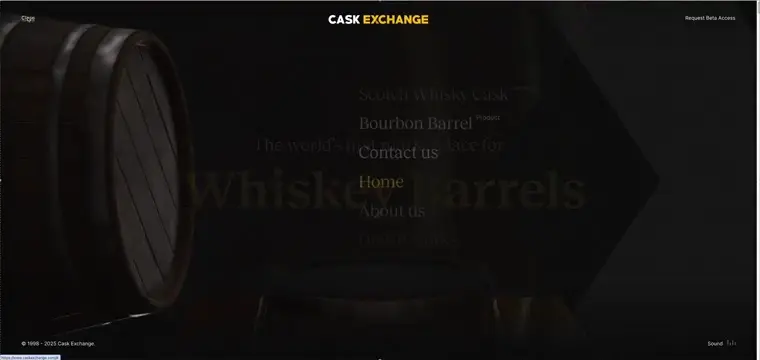
Cask Exchange offers a unique platform for wine trading with a playful touch. The menu is initiated by the word “Menu” on the left side of the page. Upon clicking, it reveals a full-screen menu with light, modern links. At the bottom, contact information is displayed, and on the left, a cool 3D barrel animation adds a touch of fun. The site also features light background music, enhancing the quirky atmosphere.
💟 What we like:
- Full-screen menu with light, modern links.
- Fun 3D barrel animation on the left.
- Serene background music.
25. Polecat Agency – Original Hamburger Menu for Digital Agency

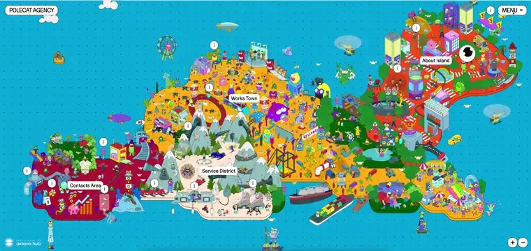
The Polecat Agency site combines fun and functionality with a playful design. The “Menu” hamburger icon is located at the top right. Upon clicking, a large white menu appears on the right with bold text links. Each link features dynamic hover effects: the background changes and the text lifts, creating a cool interactive experience.
💟 What we like:
- Bold text links with dynamic hover effects.
- Burger button matching the company’s logo design.
- Clean large white menu.
26. Essentia Safari – Adventure Brand Burger Menu Example


Essentia Safari’s website features an exciting hamburger menu that blends functionality with adventure. The icon consists of three dark lines, leading to a cool animated, full-height menu with large, bold text links on the left. The menu has an earthy color scheme reflecting the brand’s core idea, and each link comes with a smooth hover animation.
💟 What we like:
- Full-height menu with bold text links
- Smooth hover animations for links.
- Birds singing audio playing in the background.
27. Ocean – Sleek Hamburger Menu for a Modern Agency

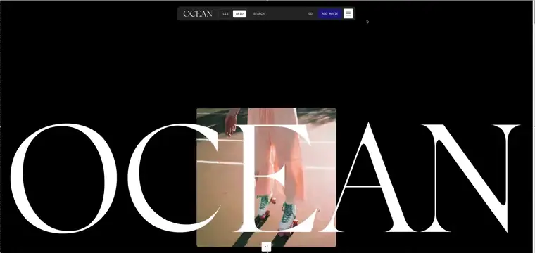
Ocean LDN’s website offers a stylish, clean look with a minimalistic hamburger menu. The icon is a simple white square with three black lines that opens a full-screen menu. The black background contrasts with the white text links, and the hovering effect highlights each link as it animates, adding an extra layer of interactivity.
💟 What we like:
- Simple and sleek hamburger icon.
- Full-screen minimalist black background menu.
28. Les Burgers de Colette – Playful Hamburger Menu for a Fun Restaurant

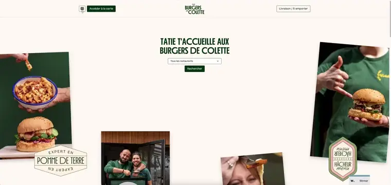
Les Burgers de Colette’s website features a quirky, playful menu icon in the shape of a hamburger. The menu opens up with colorful, large text links on the left. When hovering over them, an image on the right dynamically changes based on the hovered link, adding a visual touch to the interaction. The overall look is vibrant and fun, matching the restaurant’s lively personality.
💟 What we like:
- Fun, colorful text links with pop-up animation
- Playful, lively vibe matching the restaurant theme
29. Yadoito – Creative Hamburger Menu for a Japanese Villa Website

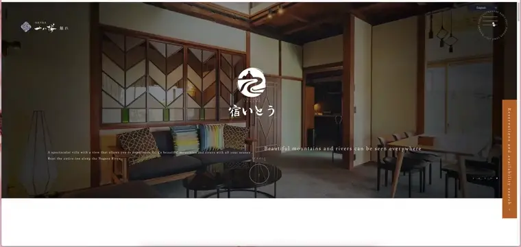
Yadoito’s website presents a creative hamburger menu that perfectly complements its artistic and unique design. The simple hamburger icon blends seamlessly with the overall aesthetic. Upon clicking, the full-screen menu fades in, showcasing sleek white links with a calm, minimal color scheme. The layout remains clean, with smooth transitions.
💟 What we like:
- Full-screen menu with smooth animations.
- Address and phone information added.
30. XV Spanish Biennial of Architecture and Urbanism – Creative Burger Menu for Architecture Event

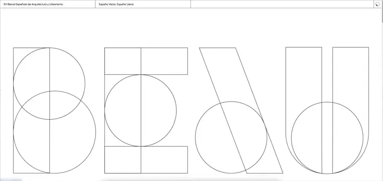
The XV Bienal’s website showcases a minimalist, creative design that complements the event’s theme. The hamburger menu features a simple white circle with a black outline, staying consistent with the website’s clean aesthetic. Clicking the icon reveals a full-screen menu with a white background and links on the left. As users hover over each link, the corresponding animated image on the right changes, adding an interactive and engaging element to the navigation.
💟 What we like:
- Simple white circle icon with a black outline.
- Full-screen menu with white background.
- Animated images on the right that change with hover interactions.
➡️ FAQ: Let’s Talk About Hamburger Menus
Here are some common questions you may ask yourself when it comes to the special guest of this article:
❓Why do they call it a hamburger menu?
It’s pretty simple – the three lines look like a little hamburger! Think bun, patty, bun. The name just stuck because it’s easy to remember.
❓Are hamburger menus just for mobile devices?
Not at all! While they’re handy on mobile because space is tight, they also show up on desktops -especially on clean, minimalist websites.
❓Do hamburger menus hurt user experience?
Only if they’re done poorly! A good hamburger menu is simple, clear, and keeps navigation smooth. But hiding important links? That’s a no-go.
❓What’s the alternative to a hamburger menu?
You’ve got options! Tab bars, horizontal navigation bars, or even big mega menus with all the links in one place. Get creative – there are no rules here!
❓How can I make my hamburger menu stand out?
Animations, bold icons, fun hover effects – these all add personality. And if you throw in something unique, like images or 3D effects, it’ll really stick out.
❓What are the most common mistakes?
- Hiding links users actually need.
- Making the icon too small or hard to tap.
- Cramming the menu with way too many options.
- Forgetting accessibility (everyone should be able to use it).
❓How do I make my menu accessible?
Label your menu for screen readers (like “open menu”), make it keyboard-friendly, and don’t forget those focus indicators for navigating links.
Final Words
There you have it – 30 killer examples that prove how creative, functional, and unique you can get with your design! A well-executed hamburger menu can make navigating a site a breeze with just a few clicks. Whether you’re all about sleek simplicity or bold, interactive elements, there’s a hamburger menu style out there that can elevate any site. The key is to match your design to the vibe of your brand and make sure it’s easy for your visitors to navigate. So, go ahead and explore these examples for some fresh inspiration, and who knows? You might just find the perfect hamburger menu that makes your site stand out in all the right ways.
Don’t forget to check out some of our other articles, too: