

![When to Send Emails? [Complete Guide to Success]](https://reallygooddesigns.com/wp-content/uploads/2025/02/when_to_send_emails-193x150.webp)
Email header and footer design are what differentiates a good email from a great email. You can think of the header and the footer as the wrapping to your email and if you’ve been interested in product design you know how important packaging is – The importance of packaging, a case study.
This is why it’s important to get the banner and footer design right. Your emails will look a lot more professional and differentiate you from your competition. A good footer and header will also go a long way in branding your products and services a lot better.
In this article, we will go over what makes a good email banner and footer design and give you some examples of how companies have pulled it off.
Article overview:
1. What are Email Header and Footer?
2. What Are the Best Practices for Designing them?
3. 7 Examples of Great Email Header and Footer Design
1. What are Email Header and Footer?
The email header is a piece of HTML code that contains authentication signatures and other details. This header is not visible to recipients. However, in the context of marketing and email design, the email header is simply the upper part of an email design.
The email footer is commonly confused with the email signature. The footer is simply the bottom part of the e-mail. Unlike the signature, it’s not personalized depending on who is sending the email.
2. What Are the Best Practices for Designing them?
The header is the first thing users will see. This is where you want to showcase your brand. Most companies opt for a simple design showcasing the logo, the name of the company, and the branding colors.
With time users will get familiar with your design and start recognizing your brand. Eventually, whenever email readers see your header they will recognize it and engage more with the content of your email.
The footer is often used to close out the email. It’s most often positioned right under the email signature. This is a good place to put links to your social media. A lot of companies also use this section to place a quick sentence about a sale or a product. This is especially good when you send non-sales-related emails.
3. 7 Examples of Great Email Header and Footer Design
Example 1. Salomon

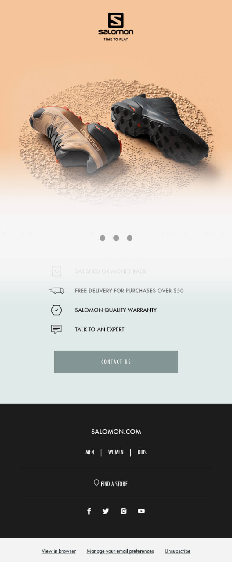
Salomon is a shoe company that designs shoes for heavy outdoor use. In this email, they are promoting one of their new shoes.
The header. The header in this email seamlessly blends in with the rest of the design. The space is used to showcase the logo of the brand and its slogan.
The footer. The footer of the email serves an important function. Similar to a nav menu on a website the footer allows users to navigate to different pages of the website. Since this is a sales-focused email there is an option to browse for products or locate a store near you.
Example 2. Helpdesk

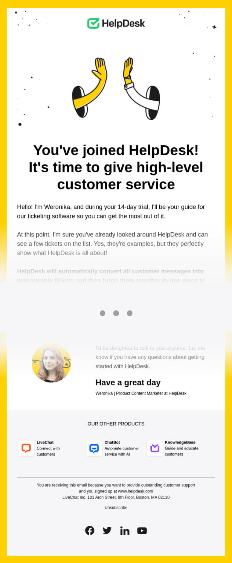
Helpdesk is software that enables companies to improve their customer support. This email is sent right after a user registers for a free trial.
The header. The header of this email is a combination of the logo of the company and a graphic. The graphic is used to visually convey the slogan of the company which is to bring customers and companies together.
The footer. The footer of the email is used to promote the other products that Helpdesk is offering. Since this is an e-mail sent to free trial users the company makes an effort to showcase its full range of products and help customers find value and become regular subscribers.
Example 3. Forever 21

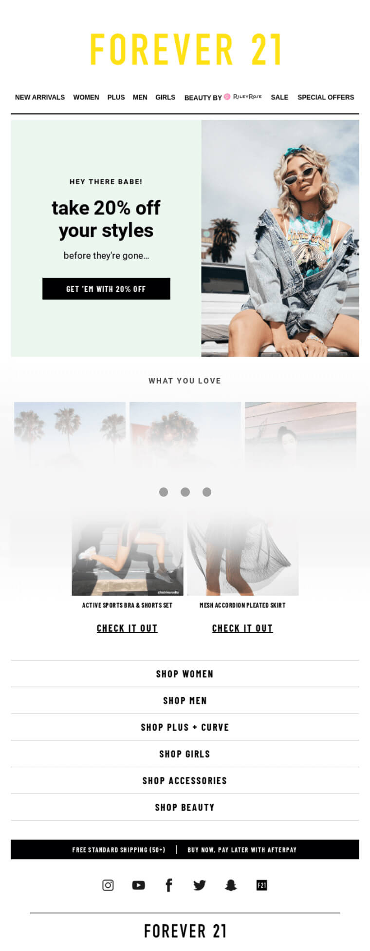
Forever 21 is an online store that offers casual clothing for men and women. This email is a cold email sent out to introduce people to the recent offers and products they are offering.
The header. The header of this email is used to establish the brand so a big portion of it is used up by the logo. After that, we also have individual links to different categories of the products offered.
The footer. The footer expands on the idea of acting as a navigation menu. It offers more options to the user and even encourages readers to download the store app.
Example 4. Tough Mudder


Tough Mudder is an event that features a tracking course where participants have to go through multiple obstacles to get to the finish line. In this email, they’re promoting a special discount for first-time participants.
The header. The header is simple and only features the logo of the company. This header is a great example of a very pronounced and clearly defined header.
The footer. The footer of the email is designated for social media promotion. It features links to all of the social accounts of the company and provides information about the sponsors.
Example 5. Videoask


Videoask is a unique messaging service designed around the idea of answering questions and generally engaging with your audience using video. In this email, they are offering some advice for their users about how to act on camera.
The header. The seamless header is integrated with the rest of the email, it features the logo of the company.
The footer. The footer of the email provides the option for users to contact the support of the company. It also features their slogan.
Example 6. Output

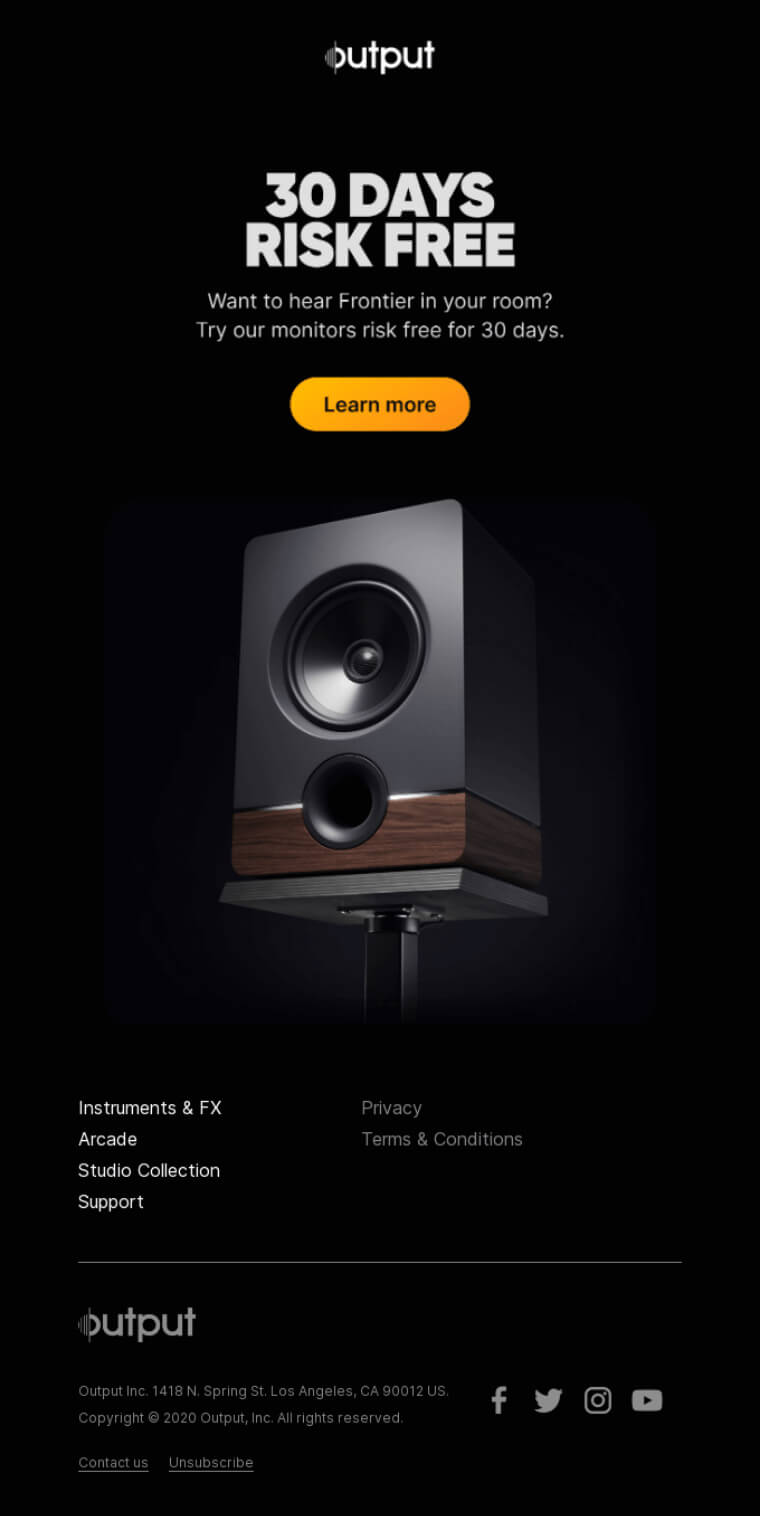
Output is a company that produces speakers. In this email, they are promoting a 30-day trial promotion for their speaker products.
The header. The header of this email follows the clean and uncluttered design of the entire email. It only features the logo of the company.
The footer. The footer of the email features the same design logic of minimalism. It only features a copyright statement and links to the social media of the company.
Example 7. Pulp and Press

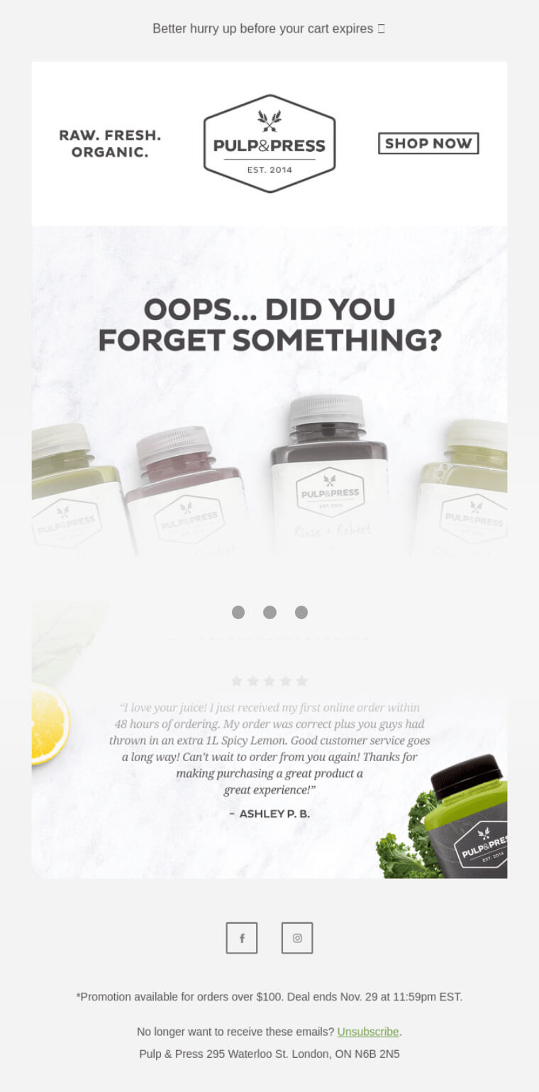
P&P is a company selling organic smoothies and juices. In this email, they’re reminding the shopper about an abandoned cart.
The header. The header of the email features 3 sections. The first section features their slogan, the second is dedicated to the logo and the third is a CTA.
The footer. The footer is dedicated to the social media links and gives users more information about the promotion that is currently running.
Conclusion
After examining all of these examples we can come to several conclusions on what makes a great footer and header.
The header should be kept for branding purposes. It’s not a bad idea to put small CTA’s there or links to product pages.
The footer is where you have a bit more freedom. At the least provide social media links to the pages of the companies. If you want to go the extra mile you can also use it to feature links to different pages of your website or feature a promotion.
In the meantime, why not take a look at the related articles to get some more inspiration or grab a couple of freebies: